
6 tips to design a magazine like National Geographic
In the publishing world, stakes are very high and there’s not much room for making mistakes. With a plethora of magazines to choose from, if you’re considering releasing a new one, you need to take a step back and really think things through. One of the timeless magazines that have been around what feels like forever is the National Geographic. Astonishing pictures of wild landscapes, dramatic scenes from countries in deep turmoil, expressive portraits of people all over the world and breathtaking outer space stills are just some of the things that first come to mind when talking about this magazine.
Ever since it first launched in 1888, National Geographic has kept most of the attributes that made it stand out for over a century now. But let’s see what aspects you should keep in mind when trying to design a magazine the National Geographic style.
How to design a magazine like National Geographic in 6 easy steps:
- Do your research

Given that you’ve already assessed the situation, defined your target audience and chosen the type of magazine you’d like to create, what’s left is to get your research game high. There’s quite a lot to cover here since the magazine has been selling for 130 years. However, there’s no need to run through all the issues. You can randomly pick a few from different decades and flip through them to see patterns, evolution, changes. The idea is to get the feel of the magazine and see what elements you can take and adjust to your own publication.
Trying to create a magazine like National Geographic it’s no walk in the park. This is why you need to make sure that you really get a grip on its apparently simple complexity and this comprehensive guide we have on how to start a digital magazine should prove extremely useful. A misconception people have is that classic equals old fashioned and they couldn’t be more wrong about that. In fact, National Geographic has redesigned their print version last year. Starting with its May issue, they’re delivering “the same sense of wonder but with a bolder and more captivating look.”
“National Geographic has helped readers explore the world for 130 years, and we thought it was important to move forward by embracing our heritage in new and modern ways,” said Susan Goldberg, Editorial Director of National Geographic Partners and Editor in Chief of National Geographic magazine.
- Front cover matters… a lot
The front cover is probably one of the most important aspects of your magazine. It’s the first thing the readers see and recognize your publication after in a sea of magazines. What will stick in their minds and always associate your brand with. It’s the doorway to the world of your content. Whether it be printed or digital, the front cover of your magazine will always have the greatest impact on readers. Your magazine will probably not only be judged by its cover. The cover will also have a big say in whether you convince readers and convert them.
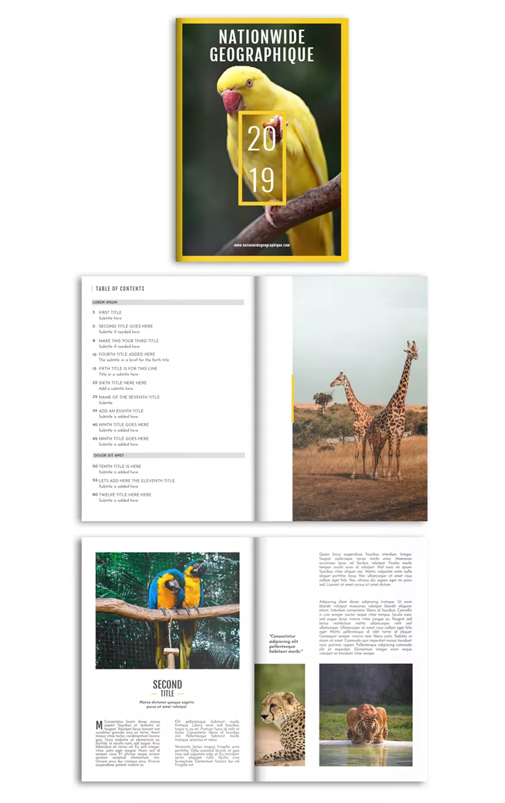
If we take a look at what National Geographic has done in terms of front covers over the course of more than a decade, there’s one thing that really stands out. And that is consistency. Following the rule “less is more”, National Geographic’s front cover is a very good example of how a clean and simple branding can be tied to a message. Their iconic yellow border has become by far their strongest piece of branding, even stronger than their logotype. Some love it, others find it disturbing. But what’s certain is that this yellow border has managed remain engraved in people’s mind. So, in your quest to design a magazine like National Geographic, I’d say you need to find an emblematic element to display on your front cover and stick to it.
- Structure your contents page
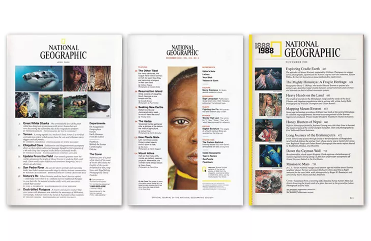
Even though there was a time when National Geographic Magazine was something to read as part of a set, it still kept a table of contents that would appear on the cover. I think that this pretty much sums up the importance that it has in a publication. One thing that sticks out when taking a look at their table contents is how they intertwine suggestive images with writing. Whether it be a few representative images for their chapters, or just one expressive image across the whole contents, the visual aspect is a very important one.
So, if you want to design a magazine like National Geographic, I’d say pay extra attention to your contents page. Try to make it not only easy-to-follow by using bold headlines or hanging numbers for a clutter-free layout, but also display images along the text in a way that makes it easy to follow for the reader, while still stirring an emotion.
- Finding the right balance: content – layout
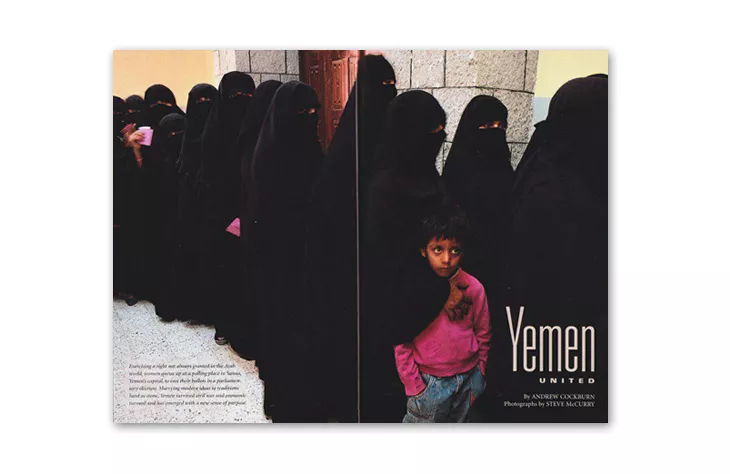
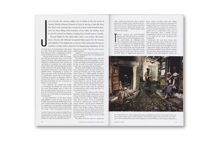
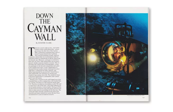
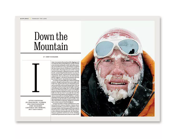
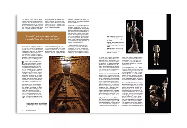
Perhaps one of the most difficult tasks is how to organize and present the content of your magazine. But if we take a look at how National Geographic has done things, there are a few guidelines that you can follow. One is double page layouts. Most of their articles are introduced on double pages and have an impactful photograph framed by portions of text. This method is great to use if you want to grab the attention of your readers from the very start.
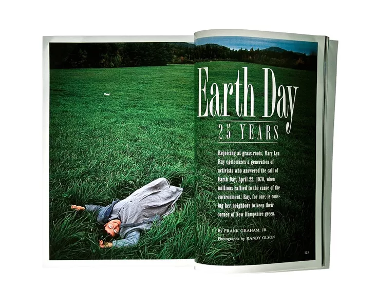
Another one would be drop-caps from which the opening paragraph grows. These are perfect if you wish to add some depth to the structure of any article and mark their beginning.
It can be quite overwhelming to find just the right balance. To start with, you can use magazine templates to make your job easier and also to take inspiration from. Flipsnack offers quite a few travel magazine templates to choose from and you can easily customize them in a matter of minutes.
- Choose the imagery wisely
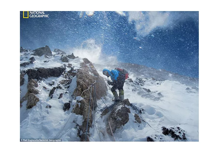
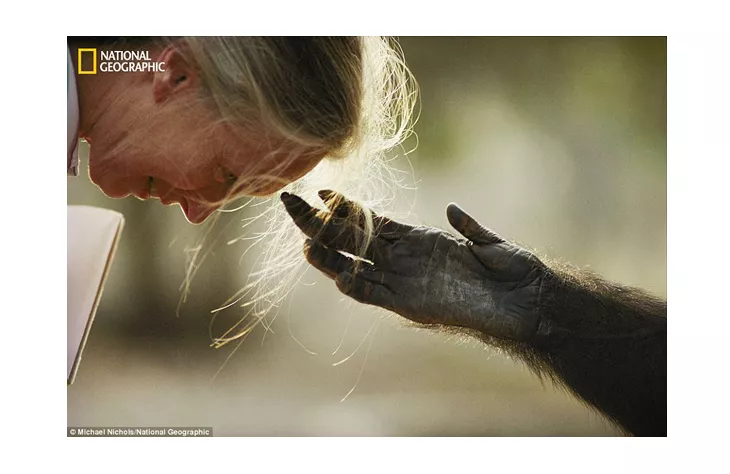
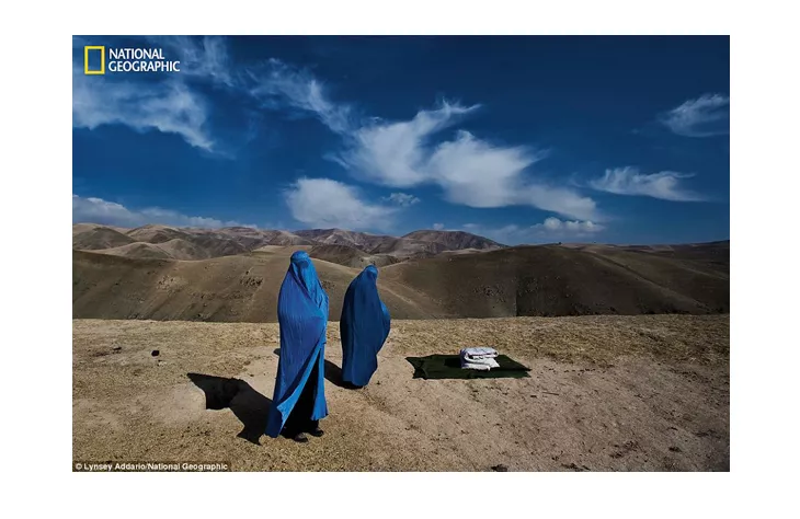
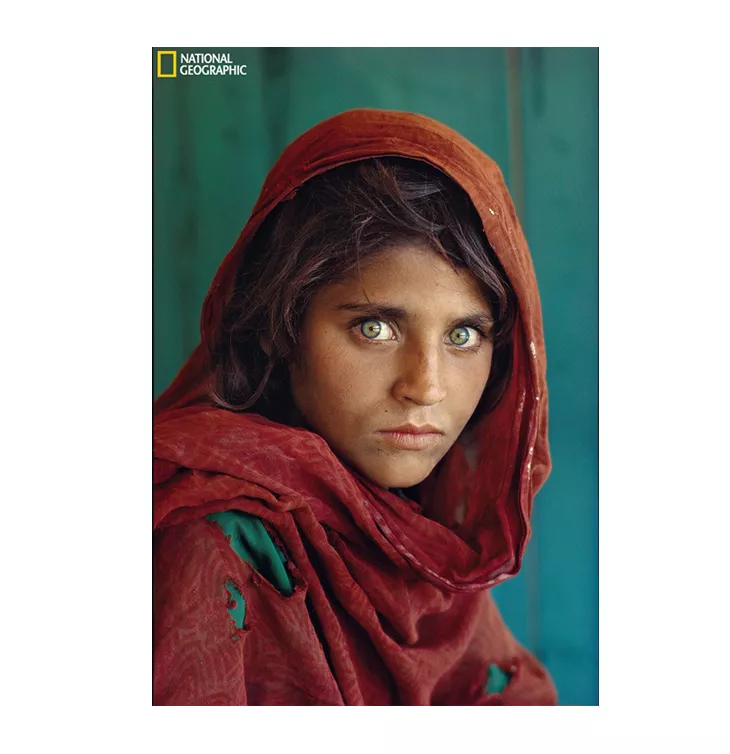
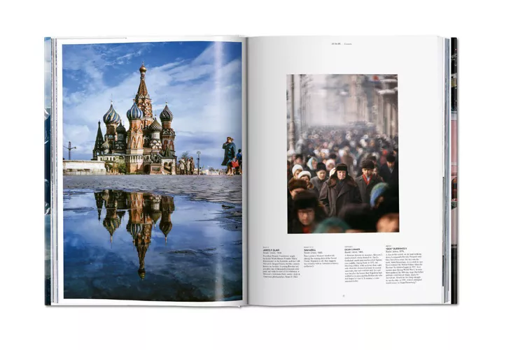
If there is something that most of us associate the National Geographic magazine to, that would be incredible photography. And I am not just talking about the quality of the pictures which is always one of high quality. But also about the way in which they tell a story. It’s like almost all their photographs encapsulate a tale and diffuse such emotions that transport you right to those places. Another visual trait of the National Geographic would be their iconic portraits that make you instantly empathize with those people.
So if you’re thinking to design a magazine the National Geographic style, pay extra attention to the photography aspect. Besides of the quality (which should always be high), you need to make sure that all the visuals tie well with the content that you have and manage to give readers a sense of something. Since “a picture is worth a thousand words”, always make sure that the ones you’re choosing to display in your magazine tell the right story.
- Timeless design – the art of being invisibly noticeable
Withstanding the test of time
If there’s one thing that has remained solid across all these years and has helped National Geographic magazine stand the test of time, that has been its design. While it might not be something extraordinary or unseen before, it has this timeless attribute. And makes it as relevant now as it was 10, 50 or even 100 years ago. This magazine is beautiful in all its simplicity. And even though design-wise it has evolved since its first issue, the focus has been kept on what it has always worked for them: well-documented content and amazing photography. Its design doesn’t interfere with any other elements and in fact, is almost hardly noticeable. There isn’t any fancy typography or sophisticated layouts that will catch the reader’s eye. Instead, the design gracefully sits behind the content and I think this is what makes this magazine so beautiful and timeless.
So if you want to design a magazine like National Geographic, pay an extra attention to this detail. Let your content speak for itself instead of burying it in a super complex design.
I’ve always thought that when trying to do something very well, the best thing to do is see what the big ones are doing. And more important, how they are doing it. There is no point in reinventing the wheel, right? Sourcing your inspiration from all time classics that have stood the test of time doesn’t mean you’ll automatically achieve the same results. However, it does give you clean guidelines regarding what path to take when creating something. And when that something is a magazine, then even more so.
It has been quite a ride and I hope you enjoyed it. If this left you eager to read more, you can also check our article on how to create a magazine like Vogue.
Amazing tips ! Magazine are read by every age group and its a kind of entertainment with so many information and graphic pictures which make it more attractive and beautiful.