From Information to Inclusion: A Guide to Accessible Digital Booklets
Published on: February 20, 2026
Today, information is everywhere online—but is it actually accessible to everyone?
Whether it’s a critical employee handbook, a detailed product manual, or an educational guide, booklets are the workhorse of information sharing. They aren’t just meant to be “seen”; they are meant to be used, understood, and navigated. However, for the millions of users who rely on screen readers, keyboard navigation, or high-contrast displays, a standard digital PDF can often feel like a locked door.
Prioritizing accessibility isn’t just about checking a box for ADA Title II compliance or meeting the latest WCAG 2.2 standards. It’s about empowerment. When you create an accessible digital booklet, you aren’t just avoiding a “compliance headache”—you are actively expanding your reach. You are ensuring that a new hire can navigate their onboarding manual with ease, that a student can study a guide without barriers, and that every customer feels valued by your brand.
By framing accessibility as a core benefit rather than a technical chore, you transform your content from a static file into a dynamic, inclusive tool. In this guide, we’ll explore how modern flipbook maker features—like AI-driven summaries and intuitive navigation—can help you build booklets that truly work for everyone.
Why accessibility is your best business asset
In the past, accessibility was often tucked away in the “technical requirements” folder. In 2026, it moved to the front office. Making your booklets accessible isn’t just a favor to a minority of users; it is a strategic move that elevates your entire digital presence.
The “curb-cut effect” for digital content
Think of the dropped curbs on city sidewalks. Originally designed for wheelchair users, they ended up benefiting parents with strollers, travelers with suitcases, and delivery workers. Digital accessibility works the same way.
When you optimize a booklet for a screen reader, you are also optimizing it for:
- Mobile Users: High-contrast text is easier to read on a smartphone in direct sunlight.
- A Growing Global Audience: Clear, logical heading structures help non-native speakers and those using translation software.
- Cognitive Focus: Simplified layouts and consistent navigation reduce “brain fog” and fatigue for all readers.
Future-proofing for the April 2026 deadlines
With the ADA Title II and European Accessibility Act (EAA) deadlines now upon us, the landscape has shifted. Compliance is no longer a “someday” project; it is a current necessity. However, the real benefit here is peace of mind.
By adopting inclusive standards now, you aren’t just avoiding a “compliance headache”—you are positioning your organization as a modern, empathetic leader that values every user’s experience.
Search engine visibility (The hidden SEO boost)
Search engines and screen readers “see” content in very similar ways. By using proper tagging, descriptive alt-text, and a clean hierarchy, you are essentially giving Google a roadmap of your booklet. Accessible booklets are findable booklets. When you make your content easier for a screen reader to parse, you’re simultaneously making it easier for search engines to index and rank.
Designing with intent: key principles for accessible booklets
Creating an accessible booklet doesn’t mean sacrificing your brand’s aesthetic. In fact, the cleanest designs are often the most inclusive. By focusing on a few core principles, you can ensure your content is as functional as it is beautiful.
1. Structure for effortless navigation
The layout of a booklet is its roadmap. For a reader using a screen reader, a logical heading hierarchy (using H1, H2, and H3 tags) is the difference between a seamless experience and a confusing wall of text.
- The benefit: This allows all readers to “skim” your booklet and jump directly to the information they need, saving time and reducing frustration.
2. Readability and typography for clarity
Text is the heart of your booklet. To make it accessible, prioritize sans-serif fonts and generous line spacing. Avoid “justified” text alignment, which can create awkward gaps that are difficult for people with dyslexia to navigate.
- The benefit: When your typography is clear, your content becomes approachable. You reduce the cognitive load on your reader, making your message easier to digest and remember.
3. Color and contrast for any environment
Accessibility isn’t just about vision impairment; it’s about lighting and hardware. High color contrast between your text and background is essential for WCAG compliance, but it serves a much broader purpose.
- The benefit: Your booklet remains perfectly legible whether someone is viewing it on a high-end office monitor, an older tablet, or a smartphone in the middle of a sunny park.
How Flipsnack turns accessibility into a seamless part of your workflow
When we talk about “accessible tech,” it shouldn’t feel like you’re adding a heavy layer of extra work to your plate. The goal is to make inclusion feel like a natural extension of your publishing process. With Flipsnack, the tools are built-in so that you can focus on your content while the platform handles the technical heavy lifting.
Automating the context with AI summaries
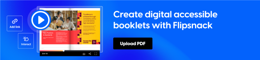
If you’ve ever had to manually write descriptions for a 40-page technical manual, you know how daunting it feels. We’ve all been there. Flipsnack’s AI-generated page summaries are a massive time-saver here. Instead of spending hours tagging every individual page, the AI quickly crafts a concise overview of your content. It’s a win-win: visually impaired readers get an instant, clear narrative of what’s on the page, and you get your afternoon back.
A player that speaks the right language
For someone navigating with a screen reader or just using a keyboard, the “player”—the frame your booklet sits in—is everything. Flipsnack’s player is designed to be “invisible” in the best way possible. It supports standard keyboard shortcuts and uses ARIA labels behind the scenes. This means your readers don’t have to fight with the interface to get to your information; it just works, providing a level of independence that every user deserves.
Keeping the hard work you’ve already done
Many of us already put a lot of effort into creating “tagged” PDFs in tools like Adobe InDesign. The last thing you want is to upload that file to a digital platform and lose all that accessibility metadata. Flipsnack is built to respect that effort. When you upload an accessible PDF, the platform maintains those tags, ensuring that your PDF flipbook is just as compliant and readable as the original source file.
Making every click count
In a booklet, links usually lead to something important—a signup sheet, a source, or a contact email. Instead of the vague “click here” buttons that often plague digital documents, Flipsnack makes it easy to add descriptive labels to your interactive elements. It’s a small detail that makes a world of difference for someone using assistive tech, ensuring they always know exactly where they’re headed before they click.
Your quick checklist for an inclusive booklet
Before you hit that publish button, take a second to run through this mental (or physical) checklist. It’s not about being a perfectionist; it’s about making sure your content is as welcoming as possible.
- Can a screen reader find its way? Check that your headings follow a logical order. If you’ve used Flipsnack’s AI summaries, give them a quick read to make sure they capture the essence of your pages.
- Is the text comfortable to read? Look at your booklet on a smaller screen. If you find yourself squinting or if the text blends into the background, a quick contrast adjustment can make a world of difference.
- Does the keyboard do the walking? Try navigating your booklet using just the Tab and Enter keys. If you can get from cover to cover without a mouse, your readers using assistive tech will be able to, too.
- Are your links descriptive? Swap out any “Click here” or “Read more” buttons for something like “Download the full report” or “Contact our support team.” It’s a small tweak that provides a lot of clarity.
- Is your PDF already tagged? If you’ve spent time making your original PDF accessible, make sure you’re uploading that version so Flipsnack can carry that hard work over into the flipbook format.
Final thoughts: accessibility is just good publishing
At the end of the day, creating an accessible booklet isn’t about jumping through legal hoops or satisfying a technical requirement. It’s about communication. A booklet is designed to share knowledge, and that knowledge loses its power if it’s only available to a portion of your audience.
By leaning on tools like Flipsnack to handle the heavy lifting—whether that’s through AI-driven context or a keyboard-friendly player—you’re doing more than just staying compliant. You’re building a brand that values every reader’s time and effort.
In a digital world that can often feel fragmented, making your information accessible is one of the simplest ways to show your audience that you’ve built something with them in mind.