Best Annual Report Templates for Businesses
Last updated: 20th March, 2025
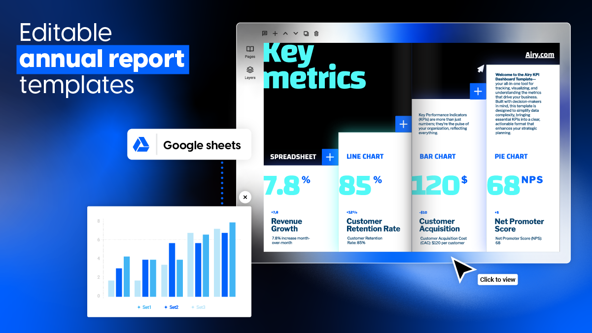
Creating digital reports that are both informative and engaging is a challenge for many businesses. Whether in need of KPI reports, internal annual reports, or expense reports, having the best annual report templates can save time and enhance communication.
Flipsnack makes it easy to create fully customized digital reports that reflect your brand. By using interactive annual report templates, HR teams, managers and marketers can showcase data through charts, videos, and forms. All this while ensuring secure sharing with teams and stakeholders. Plus, Flipsnack’s built-in analytics help you track engagement and optimize your reports for better communication and decision-making.

Best annual report templates to customize
An annual report template is essential for businesses looking to create professional, well-structured reports without starting from scratch. It ensures consistency in branding, streamlines the design process, and helps present financial data, company achievements, and key metrics in a clear, engaging way. With a pre-designed template, businesses can save time, maintain accuracy and create reports that are more engaging and easier to understand and navigate.
The templates I’m going to present are not all annual report templates. However, each report template is easy-to-edit, so you can quickly adapt them to fit your business’s specific reporting needs.
Let’s discuss them one by one.
Table of contents
- Best annual report templates to customize
- 1. Customizable Annual Report Template
- 2. Colorful Annual Business Report Template
- 3. Editable KPI Report Example
- 4. Editable Marketing Report Template
- 5. Interactive Financial Report Template
- 6. Editable Progress Report Template
- 7. Professional Business Report Template
- 8. Interactive Expense Report Template
- 9. Customizable Weekly Report Template
- 10. Online KPI Report Template
- Turn numbers into insights with the best annual report templates
1. Customizable Annual Report Template
A well-structured annual report template is essential for HR reporting managers, marketing professionals looking to communicate performance data clearly and effectively. This template provides a comprehensive overview of a company’s yearly achievements, including a detailed analysis of financial performance, key metrics, and milestones. All presented through dynamic line, bar, and pie charts for better data visualization.
So edit this annual report template in our Design Studio and take your report to the next level with interactive elements. Add videos, captions, links and pop-ups to make complex information more engaging and easier to understand. Then easily ensure brand consistency by incorporating your company’s logo, colors, and fonts throughout the template. Once finalized, securely share it with your entire organization or stakeholders for seamless collaboration and transparency.
2. Colorful Annual Business Report Template
Make your annual report template stand out with this colorful annual business report template. With Flipsnack’s Design Studio, you have complete creative control. Edit everything from the text, logo, colors, and fonts to background gradients and interactive elements.
Take engagement to the next level by adding go-to-page buttons for seamless navigation, slow-paced GIFs for subtle movement, and photo slideshows to bring your data to life. Alternate between light and dark backgrounds to create a visually striking contrast that makes key insights pop.
And in Flipsnack, you can keep all your annual report templates in one visually appealing, digital bookshelf. Easily browse, access, and share reports with stakeholders – all in a neatly organized, interactive bookshelf that enhances readability and professionalism. Whether you’re managing multiple reports for different departments or creating an archive of past reports, the digital bookshelf keeps everything structured and easy to find. It’s the perfect solution for an effective content management system that stores all your digital reports, from fundraising reports to profit reports and more.
3. Editable KPI Report Example
Tracking key performance indicators is essential for HR teams and managers looking to make data-driven decisions and optimize workforce performance. This editable KPI report template is designed to present key metrics in a visually engaging and easy-to-read format. Making performance tracking more efficient than ever.
With a modern pastel color palette of green, pink, and yellow, this template strikes the perfect balance between professionalism and readability. But it’s more than just a static report. It includes interactive features like:
- Go-to-page buttons for seamless navigation
- Embedded Google Spreadsheets in pop-up frames
- Quizzes to increase engagement and reinforce key insights
- Clickable links and captions for context and in-depth analysis
Whether you’re monitoring employee performance, HR metrics, or business goals, this KPI report template helps streamline reporting, improve data accuracy, and enhance internal communication. With Flipsnack, you can control access to your report templates by sharing them privately with specific team members or stakeholders. You can also send it through a password protected link and maintain a secure share.
Start transforming your KPI reports into dynamic, interactive digital reports that keep your team informed and engaged!
4. Editable Marketing Report Template
Give your marketing team the tools they need to analyze and present campaign performance with this fully customizable interactive marketing report template. Designed for marketing managers and teams, this template makes it easy to track key metrics, showcase results, and refine future strategies. All in one professional, engaging report.
Make your reports more dynamic by adding videos, links, charts, and even embed a Google spreadsheet with-in a pop-up. Personalize it with your brand colors, logo, and fonts, ensuring a consistent and professional look. The template includes essential report sections like campaign metrics, ROI, audience engagement, and conversion rates, helping your team identify trends, optimize performance, and drive better results.
With Flipsnack’s collaboration features, your team can work together in real time, leave comments, and make updates instantly, ensuring accuracy and efficiency. Plus, you control how reports are shared: distribute them privately to key stakeholders or share publicly across your entire organization.
5. Interactive Financial Report Template
Presenting financial data doesn’t have to be overwhelming. With our interactive financial report template, finance teams, CFOs, and business managers can transform complex numbers into engaging, easy-to-read visuals. Instead of static, text-heavy reports, use charts, captions, photo slideshows, and videos. By using these elements, you bring key financial planning sections like financial ratios, segment reporting, and cash flow statements to life.
Flipsnack makes it easy to turn financial reports into dynamic, interactive documents that improve decision-making and stakeholder communication. Plus, with built-in statistics, you can track engagement, see who’s reading, and measure how your audience interacts with the report, helping you optimize content for better impact. When it’s time to share, you’re in control.
Distribute your report securely with a password-protected link, ensuring only the right people have access. Create a financial report that not only informs but captivates.
6. Editable Progress Report Template
Tracking progress is essential for keeping projects on course and stakeholders informed. With this editable progress report template, you can easily highlight key milestones, showcase achievements, and outline next steps, all in a clear and engaging format. Whether you’re reporting on company growth, project developments, or internal goals, this template helps you present updates in a way that’s both professional and easy to understand.
Customize it with your own data, add pop-ups and captions to provide additional context without cluttering the report, and use interactive elements to make insights more accessible. With Flipsnack’s real-time updates, you can instantly edit and refine your progress report without the hassle of re-uploading or resending files. This ensures that HR managers, marketing teams, and executives always share the most accurate and up-to-date information, keeping stakeholders aligned and informed at all times.
Keep your audience engaged, updated and informative yet visually appealing progress report. And easily download your report template as a PDF for web/print, HTML5, GIF, JPEG, or PNG format.
7. Professional Business Report Template
Create impactful business reports that inform, engage, and impress with this professional report template. Whether you’re addressing key business challenges, financial updates, or strategic goals, this template is designed to keep your audience focused and invested.
With Flipsnack’s Design Studio, you can easily customize every element in real time—from headlines and text to colors, fonts, and logos. Add videos, photo slideshows, infographics and interactive elements to transform complex data into a clear, engaging narrative that resonates with stakeholders.
Designed for modern businesses, this interactive report template helps teams communicate insights more effectively. Whether you need to share updates with internal teams or external partners, this template it’s a great choice. So, elevate your business reporting with a professional, dynamic, and fully customizable template that keeps your audience engaged.
8. Interactive Expense Report Template
Managing business expenses doesn’t have to be a hassle. This interactive expense report template is designed to help employees and finance teams efficiently track, organize, and report company-related expenses with ease. Featuring pre-structured sections for itemized expenses, transaction dates, categories, and total amounts, this template ensures a clear and organized financial overview.
With Flipsnack, you can go beyond static spreadsheets and create an engaging, easy-to-use expense report. Add interactive elements like clickable categories, expandable pop-ups for additional details, and auto-calculating fields to streamline the reporting process. Employees can quickly enter reimbursement details, while finance teams can review expenses more efficiently. This will reduce errors and speeding up approvals.
Customize this expense report template with your company’s brand book elements, adjust the layout to fit your needs, and turn a routine process into a seamless, digital experience.
9. Customizable Weekly Report Template
Give your weekly reports a professional, engaging touch with this customizable weekly report template. Designed for teams, managers, and executives, this template makes it easy to summarize completed tasks, outline upcoming priorities, and highlight challenges that may impact your projects.
With Flipsnack’s designer-made templates, you don’t have to start from scratch. Simply customize the layout, add your company branding, and make it your own. Keep your team engaged with visual elements like videos, line, bar and pie charts to showcase key performance metrics in a clear, visual way.
Want to gather team feedback? Embed an interactive quiz directly into your report to collect insights on project progress, challenges, or areas for improvement. This ensures that your reports don’t just inform but also encourage collaboration and better decision-making.
Make reporting more than just a routine, turn it into an interactive experience that keeps your team informed and engaged.
10. Online KPI Report Template
This professional KPI report template is the perfect tool for business owners, managers, and analysts to track and present key performance indicators in a structured yet visually engaging way. Designed to bring energy to your reports, this template features a bold, professional layout that makes complex data easy to digest.
With Flipsnack’s professionally designed templates, you can customize everything. From colors and fonts to branding elements it’s easy to ensure a polished, on-brand report every time. And showcase key metrics in a more engaging format by adding interactive elements like dynamic charts, slideshows, and embedded social media buttons.
Keep your team aligned and informed by using sections dedicated to goals, metrics, and results, ensuring clarity in performance tracking. Want deeper insights? Then embed a survey to gather feedback from teams or stakeholders, making your KPI report a tool for both reporting and collaboration. And the best part about Flipnack’s report templates? They feature a responsive design, ensuring mobile-friendly compatibility, so your reports look great and function seamlessly on any device.
Turn your KPI reports into an interactive, visually compelling experience that drives informed decision-making.
Turn numbers into insights with the best annual report templates
Creating an engaging, professional annual report doesn’t have to be time-consuming or complicated. With Flipsnack’s annual report templates, HR managers and marketing professionals can turn complex data into visually compelling, interactive reports.
From customizable branding and interactive elements like videos, charts, and go-to-page buttons to secure sharing and real-time updates, Flipsnack provides everything you need for an effective reporting process. No more struggling with outdated formats or disconnected design tools. Flipsnack makes it easy to design, edit, and distribute branded reports that keep stakeholders engaged and informed.

Ready to take your annual reports to the next level? Start creating with Flipsnack today and experience the power of interactive, data-driven reporting!


