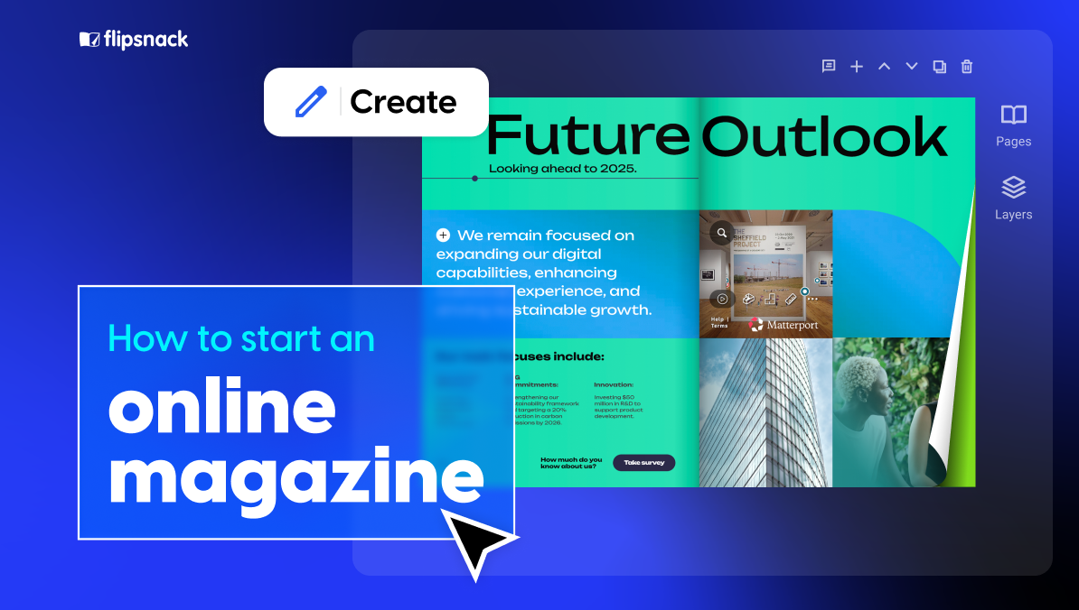
How to Start an Online Magazine: Create, Design, and Publish with Flipsnack
Published on: May 17, 2022
Last updated: November 12, 2025
You’ve probably felt it: print just doesn’t go as far as it used to.
Whether you’re running campaigns, pitching creative ideas, or trying to connect with audiences in a saturated market, static formats often fall short. While print still has its place in certain industries, the publishing landscape has dramatically shifted toward digital consumption.
But this disruption has opened the door for a new solution: digital magazines.
Visually rich, interactive, and instantly shareable, these online publications aren’t just modern replacements for print; they’re effective engagement tools that help brands captivate, convert, and connect in ways static media can’t.
So if you’re wondering what it takes to start an online magazine that grows with your content strategy and meets audiences where they are, this step-by-step guide to launching a digital magazine is for you.
We’ll explore what online magazines are, how they differ from traditional formats, and most importantly, how you can start creating, designing, and publishing your own with ease using Flipsnack.
Table of contents
- What is a digital magazine?
- Why create an online magazine ?
- Types of digital magazines
- How to start an online magazine
- How My Resource Library uses Flipsnack for online magazines
- How to make a magazine with Flipsnack
- Why choose a digital publishing platform like Flipsnack?
- Frequently asked questions about digital magazines
What is a digital magazine?
A digital magazine (also called an online magazine, or an e-magazine) is a periodical publication designed specifically for digital consumption through websites, apps, or online platforms. When you create an online magazine, you’re building a curated, branded publication that combines editorial content, visual design, and multimedia elements in a web-based format.
How digital magazines differ from blogs and newspapers
While blogs typically feature frequently updated, informal posts in reverse chronological order, digital magazines maintain the curated, designed aesthetic of traditional print publications.
Unlike newspapers that prioritize breaking news and daily updates, creating an online magazine means focusing on feature stories, in-depth articles, and visual layouts released on a regular schedule (monthly, quarterly, etc.).
Web-native vs. PDF magazines
Digital magazines are web-native experiences—meaning they’re built specifically for online viewing with responsive design, interactive elements, and embedded multimedia. This differs from simple PDF facsimiles of print magazines, which are essentially static documents that don’t adapt to different screen sizes or take advantage of digital capabilities.
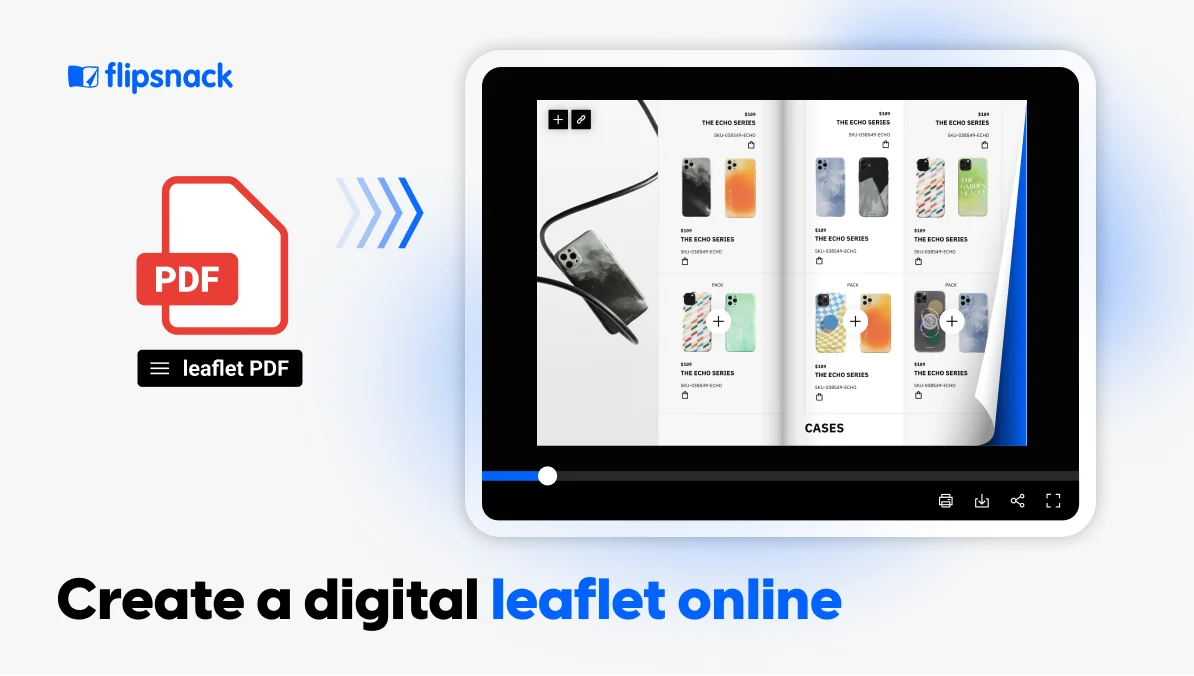
But, as we’ll see in a short while, you can turn a PDF into a responsive e-magazine using Flipsnack.
Why create an online magazine?
From reach and interactivity to data and design, here are a few solid reasons why more creative and communications teams are moving their publications online:
1. Instant global distribution
With digital, there’s no waiting on print runs or shipping schedules. Your magazine can be published and shared instantly, whether it’s going to internal stakeholders or an external subscriber base.
You can:
- Share it via a direct link
- Send it through email campaigns
- Embed it on a microsite, blog, or client portal
- Even distribute it via QR codes for in-person events
This speed and flexibility allow teams to move fast, stay relevant, and respond to opportunities as they arise.
Online magazines can be accessed anytime, from anywhere, on any device, making your content far more discoverable than print ever could be. With just a link, you can embed your magazine on a website, share it via email, or post it on social media.
This increased accessibility not only improves distribution but also strengthens your brand authority by making your content visible in the spaces your audience already inhabits.
For agencies and publishers looking to extend their influence or showcase creative campaigns, digital formats open the door to a much larger and more diverse audience.
2. Interactivity that drives engagement
Unlike static PDFs or printed copies, digital magazines allow for interactive experiences that keep readers engaged and encourage action. You can embed:
- Videos to bring stories or campaigns to life
- Forms to collect feedback or capture leads
- Clickable CTAs to direct readers to landing pages, portfolios, or product pages
They can reduce bounce rates, extend time on page, and create pathways for deeper interaction. Ideal for marketing-driven teams who want more than just passive views.

3. Built-in analytics to guide strategy
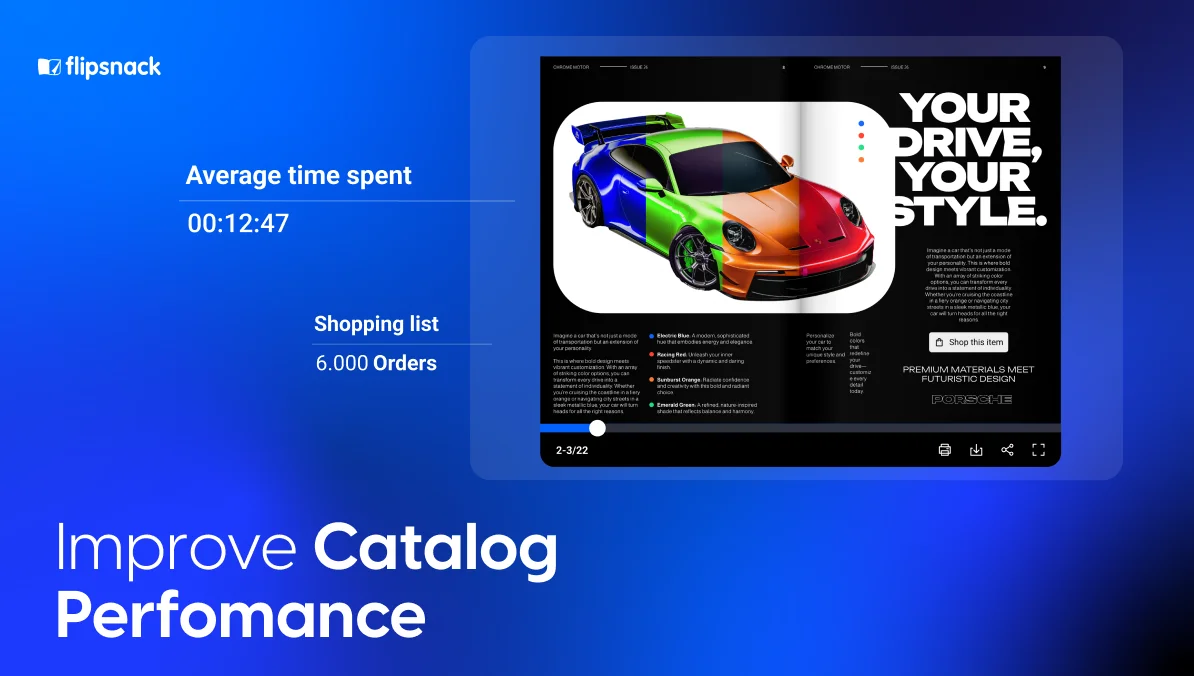
Digital publishing gives you access to real data, not just guesses. Platforms like Flipsnack provide built-in analytics that track:
- Page views
- Time spent per page
- Clicks on interactive elements
- Drop-off points
- Engagement with lead forms
These metrics help you understand what resonates and what doesn’t, so you can optimize future editions and prove the value of your content strategy, whether to clients, stakeholders, or internal leadership.
4. No-code design with team collaboration
Designing a digital magazine no longer requires a dedicated web developer or advanced software. Many platforms, including Flipsnack, offer drag-and-drop editors and pre-built templates that make layout and branding easy.
Even better, with Flipsnack, your team can work together in real time:
- Designers can build branded templates
- Editors can lock styles and approve content
- Writers and collaborators can work in one shared workspace
Types of digital magazines
Here’s a short list of the different types of digital magazines that you can read or create.
- HTML5 magazines: Magazines built using HTML5 technology, which makes them web-based, fast-loading, and accessible across all devices. Platforms like Flipsnack let you create an online magazine in HTML5 format without writing any code—just use their drag-and-drop editor. These magazines can include interactive elements, are mobile-responsive, and can be indexed by search engines.
- Interactive PDF magazines: PDFs enhanced with clickable links, buttons, and embedded media. Easy to create with a platform like Flipsnack if you’re already designing in InDesign or similar tools.
- Digital flipbooks: Magazines with a page-turning effect that mimics print. They feel familiar and work well for both public and internal audiences, and most platforms let you add interactive elements.
- Blog-style magazines: Content published as web articles with magazine-like design and navigation. Highly discoverable through search engines and easy to update. Works if you want the content strategy of a magazine but the structure of a website.
- Mobile app magazines: Standalone apps for iOS or Android. Best for established publications with dedicated audiences willing to download an app. Higher development cost, but offers push notifications and offline reading.
How to start an online magazine
1. Define your niche and audience
Start with clarity. Ask yourself: Who are we trying to reach, and what matters to them most? Here, it depends on the type of magazine you’re planning to publish:
- Public magazines: Choose a specific niche (food trends, fashion, B2B tech) to stand out and build a loyal readership
- Internal magazines: Define your purpose—employee engagement, company updates, knowledge sharing, or culture building
A clear focus makes your content sharper and your publication more valuable to readers.
2. Create a content plan and publishing schedule
Outline your content types (feature stories, interviews, how-tos, department spotlights) and set a realistic publishing frequency—monthly, quarterly, or biannually.
Use an editorial calendar to organize topics, deadlines, and contributors. Digital platforms let you update issues under the same link, so readers always access the latest version without managing multiple files.
3. Assign roles & build a scalable workflow
Big or small teams alike need structure. Identify who’s responsible for writing, editing, designing, and reviewing. Clear ownership reduces bottlenecks and helps you publish on time, every time.
You can solve this with role-based collaboration tools that allow you to assign permissions and manage reviews in one centralized workspace—no messy back-and-forths needed.
4. Pick a digital publishing platform
YYou don’t need to hire a web developer or invest in complex software to bring your online magazine to life. Today’s digital publishing platforms are built to be accessible, even for non-designers, while still offering professional-grade results.
When evaluating platforms, look for features like:
- Drag-and-drop design tools that let your team build without code
- Templates to jumpstart layout design
- Interactive capabilities (video embeds, clickable CTAs, forms) to keep readers engaged
- Collaboration tools for seamless teamwork and approvals
- Analytics to help you measure what’s working and what’s not
Choosing the right platform will depend on your goals, budget, and how hands-on you want to be, but a good one should remove friction, not add it.

5. Build a marketing strategy
If your goal is to drive brand visibility, generate leads, or support client campaigns, distribution must be part of the plan from the start. Some publishers even explore AI app builders to extend their magazine experience into mobile apps, opening up new distribution channels.
Whether you’re publishing internally or for external audiences, a clear marketing strategy ensures your content reaches the right people at the right time with measurable impact.
You can also choose to gate your magazine with a lead form, especially if it contains premium content (Flipsnack can help you with that).
This way, you’re not just distributing content, you’re also capturing qualified leads, building your mailing list, and showing ROI for every publication.
For public magazines, optimize for search
If you want people to find your e-magazine organically, treat it like any other web content. Use descriptive titles and headings that include relevant keywords (like “how to start a magazine” or the specific niche you’re covering). Write alt text for images, keep URLs clean and readable, and make sure your platform produces HTML5 magazines that search engines can actually crawl—PDF-only publications won’t show up in Google.
You can also repurpose individual articles from your magazine as standalone blog posts, linking back to the full issue. This creates more entry points for search traffic and positions your magazine as a resource hub, not just a one-time read.
6. Distribute and measure to improve
One of the biggest advantages of digital publishing is what comes after you hit “publish”: the data. Instead of guessing which stories resonated or how long readers spent on a page, you get clear insights into:
- Views and unique readers
- Engagement time and scroll depth
- Clicks on CTAs, links, or embedded forms
- Drop-off points across pages or sections
With these metrics, you can make smarter editorial and design choices for future issues, doubling down on what works and refining what doesn’t.
A digital publishing platform, like Flipsnack, includes built-in analytics, so you don’t need a separate tool or data specialist to start learning from your readers. And when you’re presenting results to stakeholders or clients, these numbers can help justify your strategy, or even spark new ideas for campaign extensions.
Real-world uses of digital magazines across industries
Digital magazines aren’t one-size-fits-all—they’re versatile tools used by companies across sectors to inform, engage, and connect with their audiences in more dynamic ways.
Companies across sectors—such as My Resource Library (furniture and design), and Signature Wealth (financial services), use Flipsnack to publish interactive monthly magazines and newsletters.
Additionally, PR and Communications agencies use Flipsnack to create and distribute digital publications like newsletters, magazines, and event guides for their clients. These agencies simplify how they reach and engage audiences by sharing links to immersive content, making it easier to promote events and showcase businesses.
For example, publications like PennDel News, TALK Magazine, and the BCW Annual Dinner guides demonstrate how visually compelling and interactive formats elevate traditional communication efforts.
How My Resource Library uses Flipsnack for online magazines
My Resource Library, a well-known digital hub in the commercial interiors industry, has adopted digital publishing not just as a format, but as a strategy.
Together with B.Digital, they produce Delve, a monthly digital publication that delivers the latest trends, insights, and company spotlights from the commercial design world. True to MRL’s forward-thinking reputation, Delve is built as a tech-forward, interactive experience, far away from the static PDFs.
With Flipsnack, My Resource Library can:
- Publish Delve monthly on both their website and virtual bookshelf
- Embed lead capture forms for advertisers
- Add rich media like videos, GIFs, and product showcases
- Track ad performance and reader engagement with analytics
The result? A modern, measurable publication that delivers value to both readers and advertisers, while positioning MRL as a leader in content innovation for their industry.
How to make a magazine with Flipsnack
Now, let’s see how easy it is to make your own magazine using Flipsnack.
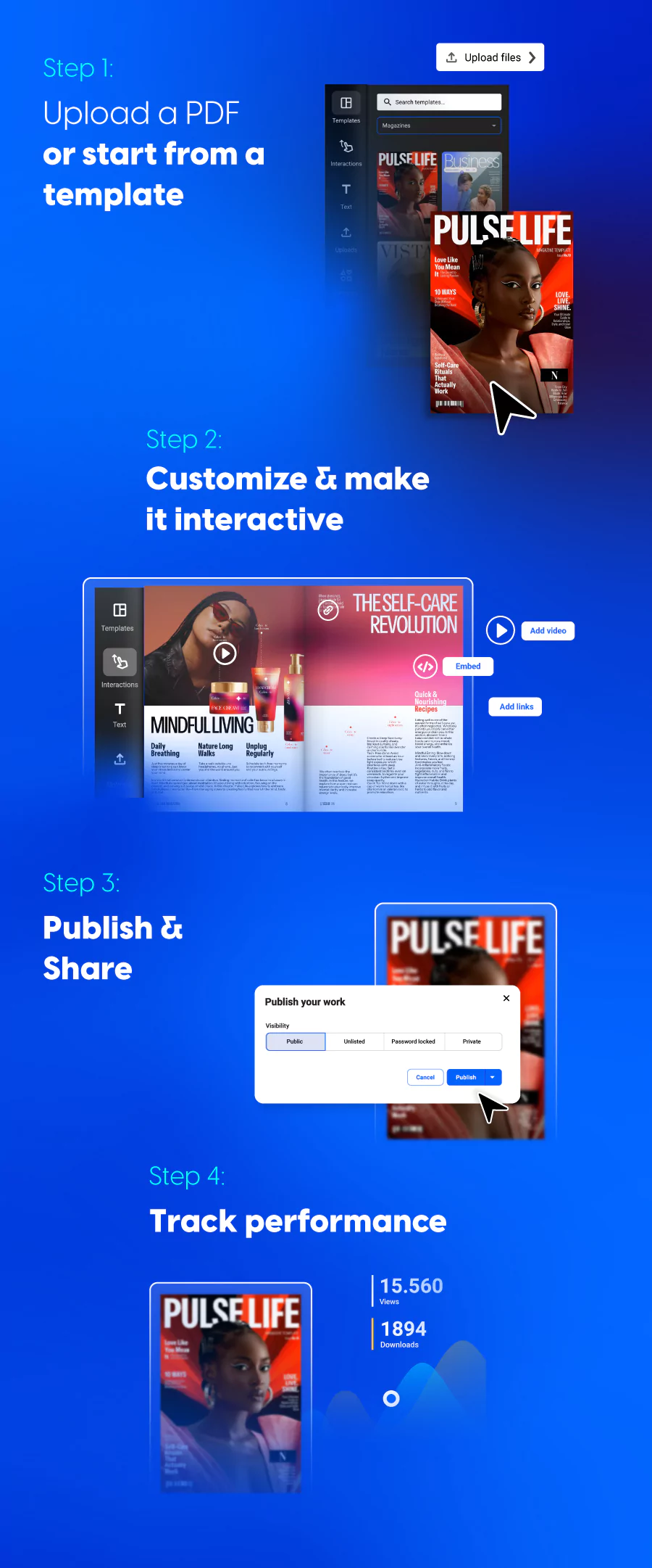
You don’t need to start from scratch to create something that looks professionally designed and works beautifully across devices. Flipsnack is built with simplicity in mind, whether you’re a solo creator, part of a small marketing team, or leading an enterprise content operation.
However, if you want to build an online magazine from the ground up, its intuitive drag-and-drop editor, customizable templates, and no-code tools make it easy for anyone, regardless of design or tech experience.
1. Upload a PDF or start from a template
Already have your magazine designed? Just upload your PDF and enhance it from there. If you’re starting fresh, Flipsnack offers a wide range of professionally designed templates for magazines, newsletters, reports, and more, fully customizable to match your brand.
2. Customize & make it interactive
Add interactive elements to bring your content to life:
- Embed videos and slideshows
- Add external links, product tags, or shopping buttons
- Insert lead capture forms or feedback surveys
- Use page transitions and GIFs to make navigation more engaging
Interactivity transforms passive reading into active engagement.
Even better, you can create branded templates that ensure every issue aligns with your visual identity. Designers can build the foundation once, then lock down key elements like logos, fonts, and layouts, so your team can scale content production without sacrificing brand consistency. Your design and marketing teams can now use AI to edit images, streamlining the design process and making it faster while maintaining brand consistency.
3. Publish & share
Once you’re ready, publish your magazine and share it with the world:
- Via a direct link
- Embedded on your website
- Through email campaigns or social media
- On a virtual bookshelf for an entire collection
If you’re distributing an internal magazine that works as a newsletter, you can use the secure sharing options Flipsnack has:
- Keep them unlisted and share them only with a few teammates via link
- Password-protect them
- Use a one-time passcode that resets each time someone accesses the document
- Use your company’s SSO credentials
You can even update the content post-publication under the same link. So it’s ideal for recurring issues or dynamic newsletters.
4. Track performance
Use Flipsnack’s built-in analytics to monitor:
- Views and time-on-page
- Clicks on interactive elements
- Form submissions and engagement drops
This data helps you understand what content performs best and how to improve your future editions.
Why choose a digital publishing platform like Flipsnack?
If you’re looking for a better way to create digital magazines, this is it. Digital magazines give you the freedom to design professional publications without relying on developers, the tools to make them interactive and engaging, and the data to understand what’s working.
Whether you’re building monthly newsletters, branded magazines, or internal training materials, platforms like Flipsnack make the entire process easier, from first draft to final share. It’s faster, smarter, and built for teams who want their content to stand out and deliver results. Ready to see how starting a magazine can be easy?

Frequently asked questions about digital magazines
What is the best online magazine maker?
It depends on your needs. If you value ease of use, interactivity, and built-in analytics, platforms like Flipsnack are a great choice.
How do I distribute my digital magazine?
You can share it via a public or private link, embed it on your website, send it through email, post it on social media, or add it to a virtual bookshelf. Distribution is flexible and immediate.
How do I ensure my digital magazine is accessible to all readers?
Use accessible design principles—such as readable fonts, sufficient contrast, and alt text for visuals. Flipsnack also offers features that extract and structure text to improve accessibility across devices and assistive technologies.
How successful are digital magazines?
Success depends on strategy, content quality, and distribution—but digital magazines offer clear advantages: real-time updates, actionable data, global reach, and lower production costs. With the right platform and audience alignment, they can drive real business results, from engagement to lead generation
