How to Make Event Brochures: Design Tips, Templates & Corporate Examples
Last updated: March 5, 2026
Creating an event brochure is a critical step in promoting and organizing a successful event. Whether you’re planning a conference, festival, corporate gala, or creating brochures for programmes and events, a well-designed brochure informs attendees, highlights key details, and leaves a lasting impression.
But before diving into design, let’s clarify one thing: what is a brochure? A brochure is a promotional document designed to inform, persuade, and guide readers toward a specific action, such as registering for an event, purchasing tickets, or learning more about a program. In the context of events, it becomes one of the most important pieces of your event marketing strategy.
Whether you’re creating an event management brochure, a corporate event presentation, or simply learning how to make a brochure, this guide will walk you through everything step by step, from layout and brochure design to content creation and distribution.
By the end, you’ll know exactly how to design a brochure that reflects your event’s purpose and engages your audience.

So, keep on reading to discover design tips & tricks you can use, and also event brochure templates that you can easily customize in Flipsnack. Let’s get started.
Table of contents
Event marketing materials checklist
An event brochure is just one component of your strategy. Before finding out how to make an event brochure, it’s important to understand how it fits into your overall event marketing plan.
Here’s a practical event marketing materials checklist:
- Event brochure (digital or print)
- Event website or landing page
- Email marketing assets
- Social media graphics
- Registration forms
- Event badges and programs
- Sponsor kits
- Follow-up materials
A strong event management brochure should align visually with all other marketing materials.
How to make event brochures? Tips & tricks
From catchy headlines and strong visuals to layout balance and compelling content, event brochures must be both impactful and informative.
Whether you’re creating a festival flyer, a corporate agenda, or an event management brochure guide for clients, the same design principles apply.
However, there should be a healthy balance between impactful and informative, especially when it comes to your event badges which you will be wearing at all times.
Here are the main steps for making event brochures, plus tips & tricks that hopefully will inspire you to create successful brochures:
- Understand the purpose of your event brochure
- Plan your brochure layout
- Choose a design theme and colors
- Write clear and concise content
- Incorporate high-quality visuals and images
- Add essential event information
- Proofread and finalize the event brochure
- Share and distribute your event brochure
Let’s take them one by one and get into more details.
1. Understand the purpose of your event brochure
Before you start working on the brochure design, define its goal.
Before you dive into the design and layout of your event brochure, it’s crucial to first understand its purpose. An event brochure serves as a key communication tool, helping your audience grasp the most important details of your event quickly and clearly. Whether you’re promoting a business conference, a music festival, or a charity fundraiser, your brochure should be tailored to meet the specific needs of your attendees. Ask yourself:
- What information does my audience need to know?
- How can I make the event as enticing and easy to understand as possible?
The primary goal of your event brochure might be to provide logistical details like the event schedule, speaker bios, and venue information. Or it could focus more on generating excitement and encouraging sign-ups. By clearly defining your brochure’s purpose, you’ll have a solid foundation to guide the rest of the design and content decisions.
For instance, a conference brochure might prioritize the agenda, speaker profiles, and sponsor details, while a festival brochure might emphasize performers, stages, and ticketing information. Aligning your design and content with the event’s goals ensures that your brochure meets both practical and promotional needs, all while keeping the audience engaged.
2. Plan your brochure layout
A well-thought-out layout ensures your event brochure flows logically and guides readers through the content. The layout sets the tone, helping attendees quickly access the most important information without feeling overwhelmed.
The front cover of your brochure is your first chance to grab attention. It should be visually striking and clearly communicate the event’s main message. Focus on bold, large fonts for the headline and complementary colors that align with the event’s theme. However, avoid cluttering the cover with too much information—save the details for the inside pages.
Once you’ve captured attention with the front cover, the inside pages should be organized in a way that guides readers effortlessly through the content. For example, you could have these sections: event overview, schedule, and speakers and Guests: Introduce key speakers, presenters, or special guests, briefly outlining their role and importance to the event. And possibly sponsors.
Ensure that each event brochure content flows logically from one to the next, making it easy for readers to find the information they need without backtracking or getting lost in the details. Maintaining a consistent format—such as using the same font size for section headers or consistent color themes—ensures a professional look and feel.
Lastly, don’t forget to balance text with visuals. A good layout includes enough white space to make reading comfortable, allowing important sections to stand out without overcrowding the design. But more on this in the following steps.
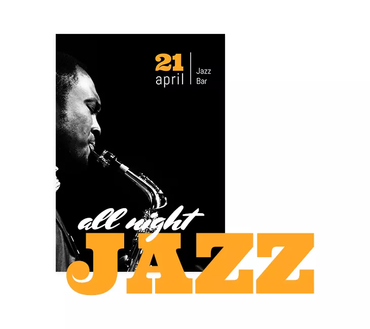
In this event brochure cover example, there are also other elements that are captivating. The bright orange color alongside the combination of fonts and the representative black & white image make it a music event brochure that intrigues the readers.
3. Choose a design theme and colors
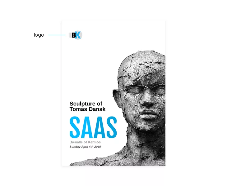
If your event has a logo, make it a key visual element in your design. Think of iconic event logos like those for the Olympic Games, TEDx, or the Untold Festival. These logos are instantly recognizable and can be more memorable than the event’s name. Why? Because the brain processes visuals far more quickly than text—a majority of our communication is visual, and images are processed a lot faster than words.
Capitalize on this by placing your logo prominently, perhaps on the front cover’s left side, in the corner. Make it large enough to be noticeable but don’t clutter it with other elements. This is especially easy to do with tools like Flipsnack, which allow you to upload and position your brand’s logo effortlessly. By giving your logo prime real estate, you ensure that it stands out and sticks in the minds of your audience.
Just like in this event brochure example over here:
4. Write clear and concise content
When writing your event brochure, always include essential logistical details like the event’s date, location, and contact information. Think of these details as the anchors that guide your attendees through the event. Use bold text, bright colors, or even highlight these details to make sure they stand out.
For example, in an effective event brochure, the date and location might be highlighted in white against a bright background for maximum visibility. You can go the extra mile and embed a map with the precise location on the back cover of your digital brochure. This way, you make sure that your attendees won’t get lost on the way.
Additionally, provide contact details such as your company’s name, website, email, and social media handles. Consider adding a QR code for readers to easily find more information online.
Every event brochure should include the necessary conditions of participation, such as ticket prices, fees, or entry requirements. Also, provide any deadlines, such as when tickets go on sale or registration closes. Adding calls to action like “Don’t miss out!” or “Apply before…” encourages urgency, making readers more likely to act quickly. This section provides clear information while driving potential attendees to take the next step.
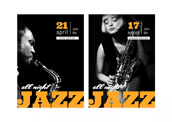
For instance, in this event brochure example, the date and the location are highlighted in white. Looks professional, right?
But that’s not all when it comes to this tip. You can go the extra mile and embed a map with the precise location on the back cover of your digital brochure. This way, you make sure that your attendees won’t get lost on the way.
5. Incorporate high-quality visuals and images
Visuals are a crucial part of any event brochure, as they can convey the tone and theme of your event instantly. High-quality images or illustrations help break up text, making your brochure more engaging and easier to digest. Use visuals strategically to enhance key points, whether it’s photos of past events, product images, or custom graphics.
For strong corporate event brochure examples, visuals typically include:
- Professional speaker portraits
- Branded backgrounds
- Clean layout compositions
High-quality visuals enhance credibility and engagement.
However, in many event brochures — especially digital ones — visuals often remain static. Even when you add links, videos, and CTAs, your most important images may still feel flat. Static visuals don’t guide attention, don’t differentiate the experience, and don’t necessarily increase dwell time.
If you’re creating a digital brochure in Flipsnack, you can go one step further by using Living visuals, an AI-powered engagement layer that allows you to turn static images into subtle, auto-playing motion elements directly inside your flipbook. With just one click in the Design Studio using the AI Animate option, you can animate an image without exporting files, editing timelines, or needing video skills.
6. Proofread and finalize your event brochure
Finally, test your digital brochures on different devices to ensure the visuals, links, and interactive elements function properly. Luckily, when creating an event brochure in Flipsnack, you can rest assured that it will look exactly the same regardless of the device used.
Once your brochure design and content are complete, the final step is proofreading. Carefully review all text for spelling and grammatical errors, as well as inconsistencies in formatting, font usage, and alignment. Typos or formatting issues can distract from the overall professionalism of your brochure, so take the time to ensure everything is polished. If you uploaded a PDF and spot a mistake, you can easily edit the PDF directly in Flipsnack without re-exporting it.
It’s also a good idea to check the brochure’s layout and flow. Are the sections logically organized? Does the design make it easy for readers to find key information? Reviewing these elements ensures your brochure looks clean, professional, and easy to navigate. If you’re working in a team, collaborating directly inside Flipsnack can streamline this process.
Team members can review, edit, and leave feedback within the same project, making approvals faster and reducing version confusion, especially useful when creating an event management brochure that requires input from marketing, sales, or event coordinators.
Finally, test your digital brochures on different devices to ensure the visuals, links, and interactive elements function properly. Luckily, when creating an event brochure in Flipsnack, you can rest assured that it will look exactly the same regardless of the device used, ensuring a consistent experience for all readers.
7. Share and distribute your event brochure
Once your brochure is ready, it’s time to share it with your audience. For digital brochures, consider distributing them via email campaigns, embedding them on your website, or sharing them across social media platforms. Ensure that your brochure is optimized for viewing on various devices, from desktops to mobile phones, so your audience can easily access it wherever they are. Flipsnack makes it easy to share your event brochure design in one click by copy and pasting the full-view link of your flipbook.
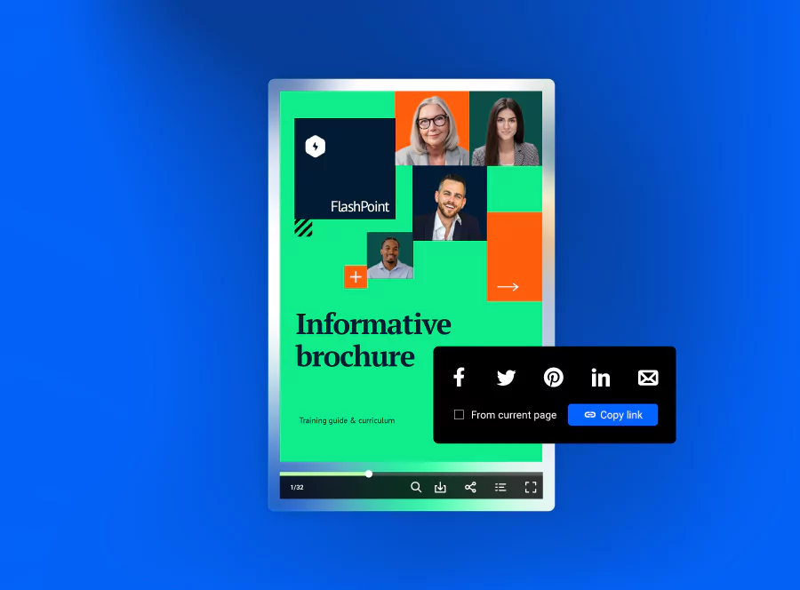
Finally, don’t forget to track engagement with your digital brochure. If you’re using a platform like Flipsnack, you can monitor how many people viewed your brochure, how long they spent reading it, and which sections drew the most attention. This data can be invaluable for improving future brochures and marketing strategies.
An event brochure can still miss its objective to inform if it’s not digitally accessible by everyone. Regardless of the type of event you are promoting through a brochure, you can use our accessible AI brochure enhancer to automatically generate alt text summaries for each page, making the content visible to screen readers. Using keyboard navigation, people online will be able to browse through your products or services in a logical order, with clear labels and names for each existing element. Other AI solutions include translating text boxes or entire flipbooks to reach more diverse audiences. Put your precious time to better use and let Flipsnack take part of the load off.

Event brochure templates
Now that you know the practical steps of how to make event brochures, how about you start creating your own event brochure with the help of a template? Whether you’re looking for music event brochures, charity event brochures, or even cultural event brochures, you’ll find anything you need by just browsing through our wide gallery of brochure templates.
To give you an idea of what you can find in Flipsnack, I’ve made a selection of three different, yet professional event brochures. Feel free to select your favorite and personalize it to your own wish.
Sales brochure template example
The first one on my list is this sales brochure template. This is the perfect way to announce any sale, big or small. The cool images featuring denim clothing, altogether with the catchy headings and playful fonts make it an event brochure-like no other.
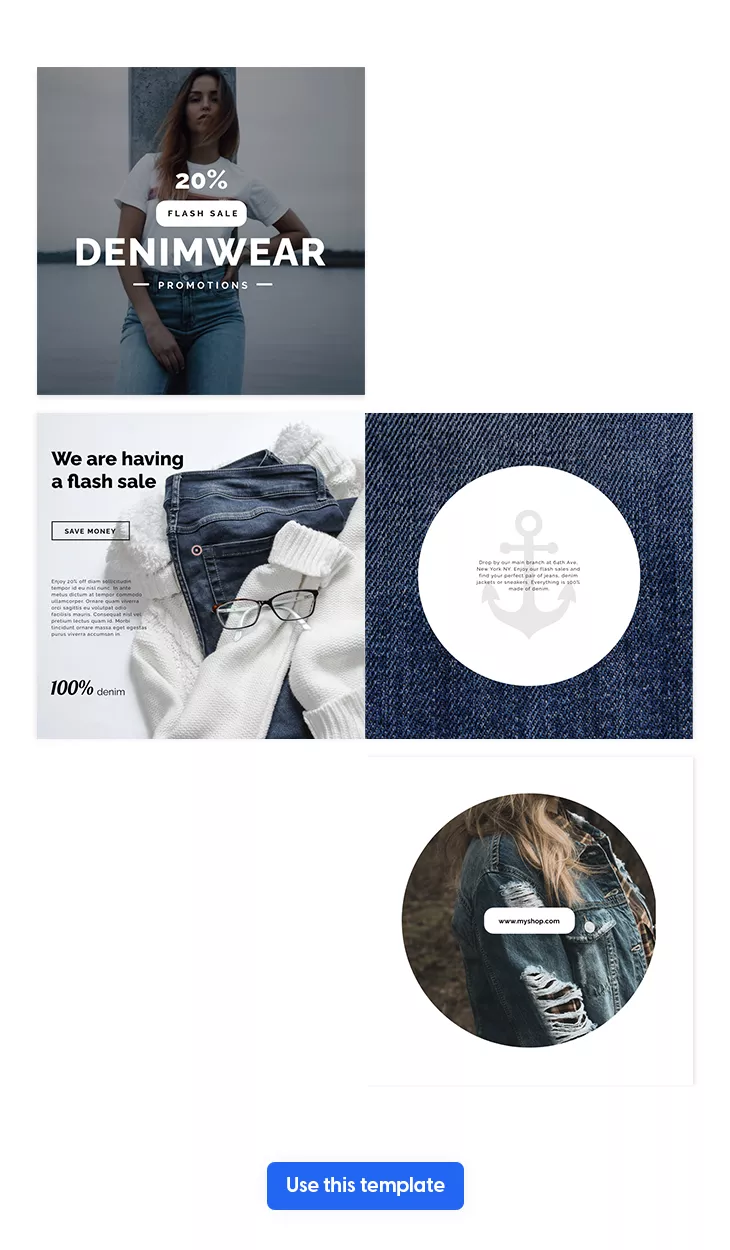
And the best part about it is that you can customize this brochure to your own needs, regardless of the type of sales you’re organizing. Just make sure to insert a discount in the headline – this is highly important! and to populate this brochure with your most wanted products or services. Also, add only high-quality and professional photos, with a short description of each product. With Flipsnack, it’s really easy to do it. By inserting product tags, you can write any further details of your products, and also encourage customers to shop directly from your sales brochure.
Besides product tags and professional photos, a sales brochure is nothing without its brand logo, fonts and colors. Therefore, make sure to upload them and use them throughout your entire brochure. Your readers need to recognize your brand from the start, so give them this opportunity as many times as you can.
Before you’re going to launch your sales, make sure to add a call to action on the back cover of your brochure. Write something like “More sales here” or “Hurry up and shop” and link this button to your website. This way, you compel your customers to take action.
Red & white Christmas event brochure design
Yes, I know, summer is coming, but you know what they say: it’s good to prepare things in advance. That being said, if you’re going to organize a Christmas carols concert, then you should think about choosing this red & white Christmas brochure template from Flipsnack.
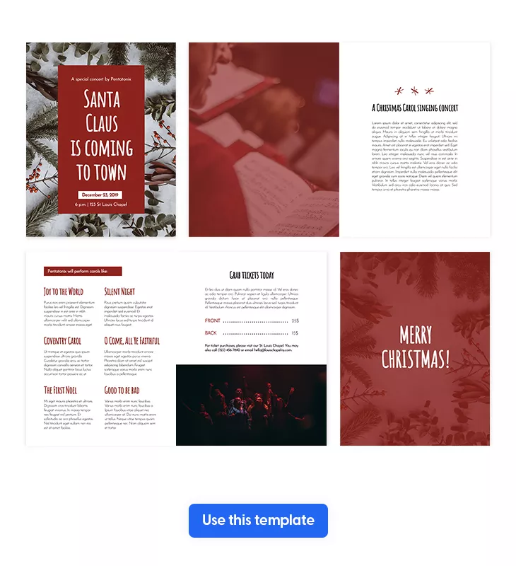
Make it yours within minutes by taking advantage of our powerful Design Studio. You can upload your own fonts and colors, although I highly recommend you keep the red and white colors. In fact, these two are very representative of this holiday. But I suggest you should add your own photos. Realistic images such as those with choirs singing are always a feast to the readers’ eyes.
And that’s not all that you can do with this event brochure. You should also insert a timetable, so that readers know what to expect. Write exactly what songs are they going to hear, when it’s the coffee break, and so on. Also, don’t forget to include a section with tickets’ price and other conditions of participation.
Another important thing when it comes to cultural event brochures is that you should clarify the date and precise location of the event. Go the extra mile and embed a map on the back cover of your brochure, so that your readers will be able to find the exact location.
Music festival brochure template
Last, but not least, here is a music festival brochure template from Flipsnack. It comes just handy since summer has just arrived and the season of music festivals begins.
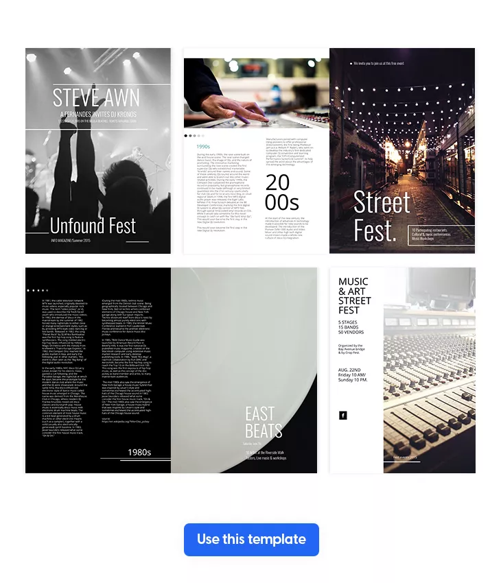
Take this example over here and transform it exactly how you want. Start by thinking about the main ingredients of a sensational music festival: great music, good food, and fun company. Make sure to emphasize all these on the front cover of your event brochure, so that your readers know from the start what to expect. Write a catchy headline that gives you a hint of what type of music is going to be, and also mention that there’s food, cold drinks, and the possibility to have fun while being in your friends’ company.
Then, you should focus on inserting some cool and professional photos from the previous editions. People enjoy seeing real things. And they’re also eager to know how the previous music festival editions were organized.
Besides the photos, the content part and the way you’re transmitting the information is also important. Assure yourself to create a special section for the performers, sponsors, schedule, and whatever else you find necessary. Also, insert all the contact details regarding the date and location of the event. Highlight them or bold them so that they’re easy to find.
Right before you hit the publish button and share your music festival brochure with the entire internet, keep in mind to insert a call to action on the back cover. Something like “Buy tickets here” would be a great example and it could lead to your website. Also, insert some social media buttons, so that people follow you on every channel.
Eco-friendly event brochure printing options
If sustainability is important to your organization, choosing eco-friendly event brochure printing options can help reduce environmental impact while maintaining a professional look. Many companies creating brochures for programmes and events are now aligning their printed materials with their corporate social responsibility goals.
Sustainable printing options may include:
- Recycled or FSC-certified paper
- Soy-based or vegetable-based inks
- Carbon-neutral printing services
- Local print providers to reduce transportation emissions
If you decide to print your brochure, Flipsnack also offers built-in printing options directly from your design, allowing you to properly prepare your file with crop marks, bleed settings, and high-resolution output. This way, you can seamlessly combine the convenience of digital creation with professional print-ready production whenever physical brochures are needed.
How to design a brochure in Flipsnack
Here’s a step by step tutorial on how to create your own digital brochure in Flipsnack. It’s super easy, you’ll see!
- Sign up to Flipsnack and then choose your template. Let’s take this Thanksgiving bi fold brochure template. As we mentioned, it’s good to plan things in advance, so make sure you’re prepared for November, which will be here sooner than you think.
- Secondly, start with the front cover. Upload a stunning and representative photo, then write a catchy and inviting headline something like “Join our mouth-watering Thanksgiving”.
- Then, insert the event’s program with the meals and activities that are going to happen. Make sure to highlight them with a bright color such as orange or light pink or bold them in order to be noticed with ease by the potential attendees. My advice is to choose a simple and clear Serif font.
- Upload other professional and good-looking photos featuring some goodies, so that people say yes to your event. If you can’t find anything suitable enough, you could take advantage of our stock photos. Or, add an extra layer of interactivity and upload stock videos with appetizing desserts and steak.
- On the back cover of your event brochure, make sure to add the exact date and location. Include a map if you think it will help people find you easier.
- As a final step, share your event brochure with future attendees directly via email or on social media and wait for them to respond.

Start creating your digital event brochure with Flipsnack
Designing an event brochure doesn’t have to be complicated. With the right approach, you can create a professional, visually stunning brochure that captures attention, provides essential information, and drives engagement. By following the steps outlined in this guide— from planning your layout and incorporating high-quality visuals to finalizing and distributing your brochure—you’re well on your way to creating a brochure that stands out.
Now that you know how to make event brochures, why not make the process even easier with Flipsnack? Our platform offers intuitive, easy-to-use tools that allow you to design professional brochures in just a few clicks. Whether you’re uploading your own logos, adding custom images, or choosing from a variety of templates, Flipsnack has everything you need to bring your vision to life.

[…] https://blog.flipsnack.com/how-to-make-event-brochures/ […]
[…] https://blog.flipsnack.com/how-to-make-event-brochures/ […]
[…] https://blog.flipsnack.com/how-to-make-event-brochures/ […]