How to Create a Pitch Deck: The 11 Slides Investors Expect
Last time updated: August 25, 2026
Thirty investors received the pitch deck on Tuesday. By Friday four had replied, none had committed, and the founder still had no idea whether the other twenty-six ever opened the attachment.
Silence like that is worse than rejection. Rejection at least carries information. An interactive pitch deck at least tells you who opened it.
Most guides on this subject describe a presentation delivered live, in a room, with you narrating. Reality looks different. A typical investor spends two to three minutes on a deck. Only five to ten percent of them lead to a meeting, according to Michael Tefula.
Your business idea is probably fine. Knowing how to create a pitch deck today means designing for somebody skimming alone, on a phone, two weeks after you hit send.
Below you’ll find the slide-by-slide structure investors expect, which slide-count rules survive contact with reality, the errors that end a review inside ninety seconds, and how to build an interactive pitch deck you can actually track.
Table of contents
- What is the purpose of an investor pitch deck?
- How many slides should a pitch deck have?
- What to include in a pitch deck, slide by slide
- What pitch deck mistakes should you avoid?
- How should you send a pitch deck to investors?
- Create a pitch deck in Flipsnack in 5 steps
- Start your pitch deck from a template
- Frequently asked questions about creating a pitch deck
- Build your pitch deck for how investors actually read it
What is the purpose of an investor pitch deck?
A pitch deck is a short visual presentation, usually ten to fifteen slides, that explains a business opportunity to investors or buyers and requests one specific decision, such as funding, a partnership or a follow-up conversation.
Notice what that definition excludes. Nothing about persuasion theory, nothing about design trends. One opportunity, one decision, one ask. Decks that blur into general business presentations usually do so because nobody decided which single decision they were asking for.
Getting that ask right is the part no tool solves for you. Plenty of platforms now handle production, cutting work that once needed a designer, rather as a courier service cuts the logistics work for a small retailer. Tooling stopped being the bottleneck years ago. Deciding what goes on each slide, and in what order, is still the job.
How many slides should a pitch deck have?
Ten to fifteen slides for a first investor meeting, with anything beyond that pushed into an appendix. Founders usually hear a different number, though, because at least four competing conventions circulate and the blog posts quoting them contradict each other. Here is what each one actually prescribes.
| Rule | What it prescribes | Where it helps | Where it breaks |
| 10/20/30 | 10 slides, 20 minutes, no font under 30 points | Keeping a live pitch focused, leaving time to talk | Too rigid for emailed decks or rounds needing an appendix |
| 5×5 | Max 5 words per line, 5 lines per slide | Slides that stay readable while you speak | Too sparse for an investor reading it alone |
| 7×7 | Max 7 lines per slide, 7 words per line | More room than 5×5, still readable live | Encourages bullet lists over visual evidence |
| 1-6-6 | 1 topic per slide, 6 bullets, 6 words each | Forcing one main point onto each slide | Can still produce repetitive, unconvincing slides |
Only one principle survives all four: a single idea per slide. Word counts are just a way of getting there.
Notice that every rule was written for a room, with someone standing beside the screen explaining the gaps. Your deck will more likely be read alone, over email. When that happens, a slightly denser slide beats a beautiful one nobody can decode.
What to include in a pitch deck, slide by slide
Eleven slides cover almost every early-stage raise: cover, problem, solution, market, business model, traction, competition, go-to-market, team, the ask, and closing. Order matters more than count, because each slide should make the next one feel inevitable.
Treat the sequence below as a spine, not a script. Some rounds justify merging two slides. None justify skipping the ask.
Every screenshot below comes from a fictional investor deck we created in Flipsnack using a pitch deck template. LAB.TECH and its figures are invented, but each slide shows how the advice can work in practice.
Slide 1: Cover
Company name, logo, one line describing what you do in plain language. Add the date and the name of the investor you’re meeting, which signals the deck was prepared rather than mass-mailed.
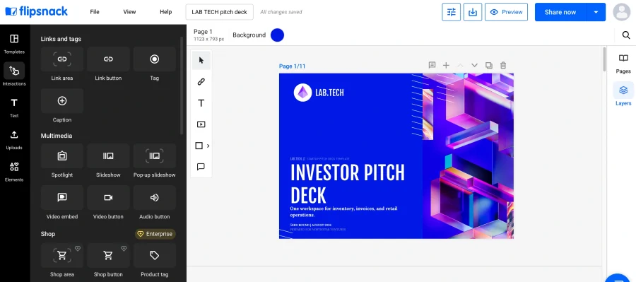
A cover slide gets roughly one second, according to startup advisor Ed Kang. Spend that second on clarity, never on cleverness.
If you’d rather begin from a designed base, roundups of Gamma alternatives survey the current generation of AI slide builders.
Fails when: the one-liner needs a second sentence to make sense.
Slide 2: Problem
Name one problem. Say who has it, what it costs, and how often it happens. “Regional retail groups reconcile POS, accounting and supplier data by hand, losing 18 hours a week per team” beats any statement about operational inefficiency.
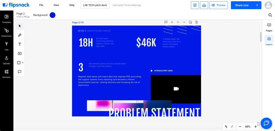
Evidence belongs here: a customer quotation, an industry figure with its source, your own research.
Fails when: the problem could describe forty other companies.
Slide 3: Solution
Show the fix. Screenshots, a short product video, a mockup. Avoid jargon entirely, since early-stage investors are generalists relative to you.
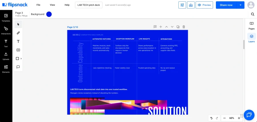
Suppose you operate as an Employer of Record, handling international hiring compliance for other businesses. A thirty-second clip walking through onboarding a contractor in Portugal communicates more than four bullets ever will.
Fails when: you describe capabilities instead of demonstrating outcomes.
Slide 4: Market opportunity
Size the market from the bottom up. Number of realistic buyers multiplied by realistic annual spend, with your assumptions visible.
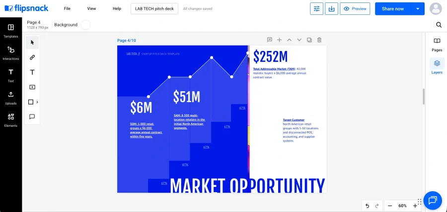
Top-down claims about capturing one percent of an enormous category are among the oldest tells in fundraising. Investors have heard that sentence thousands of times.
Fails when: the arithmetic isn’t shown.
Slide 5: Business model
Explain how revenue arrives. Pricing, contract length, gross margin, and any second revenue stream worth mentioning.
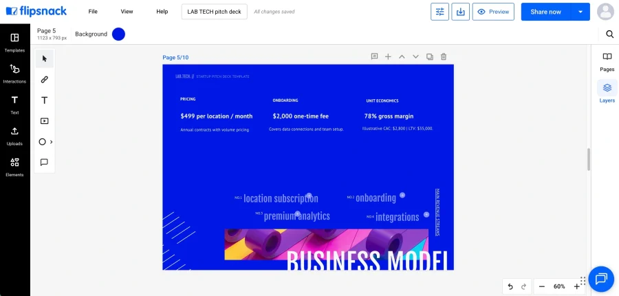
Keep numbers few and legible. Four figures somebody remembers outperform twenty nobody reads.
Fails when: pricing appears without unit economics behind it.
Slide 6: Traction
Bring proof forward. Revenue growth, retention curves, cohort behavior, named customers, signed pilots.
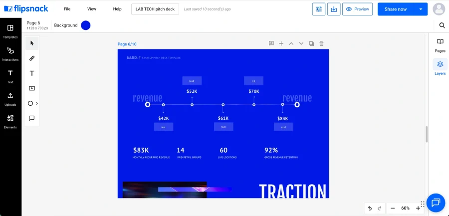
Downloads and follower counts are vanity metrics, and experienced reviewers discount them instantly. Retention persuades; volume rarely does.
Fails when: growth is shown without whether anyone stayed.
Slide 7: Competition
Acknowledge rivals by name. Claiming none exist reads as inexperience rather than confidence.
Skip the feature grid where you score every tick and competitors collect crosses. Investors flag that pattern as a red flag precisely because it measures features rather than strategy. A two-axis positioning map, plotting something genuinely differentiating such as enterprise versus SMB against manual versus automated, communicates judgment.
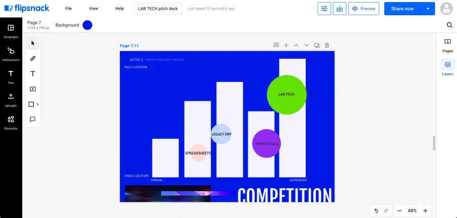
Monitoring where rivals rank is straightforward enough now, whether through a Serp Api or ordinary competitive research.
Fails when: your matrix flatters you and nothing else.
Slide 8: Go-to-market strategy
Name your channels, their cost, and the sequence you’ll run them in. Acquisition cost per channel carries far more weight than a list of tactics.
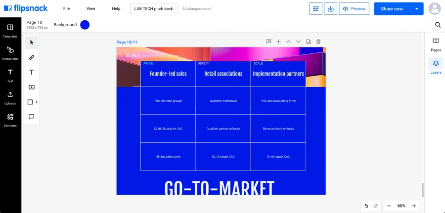
Fails when: every channel appears and none carries a number.
Slide 9: Team
Founders, relevant experience, why this particular group solves this particular problem. Advisors and notable backers belong here too.
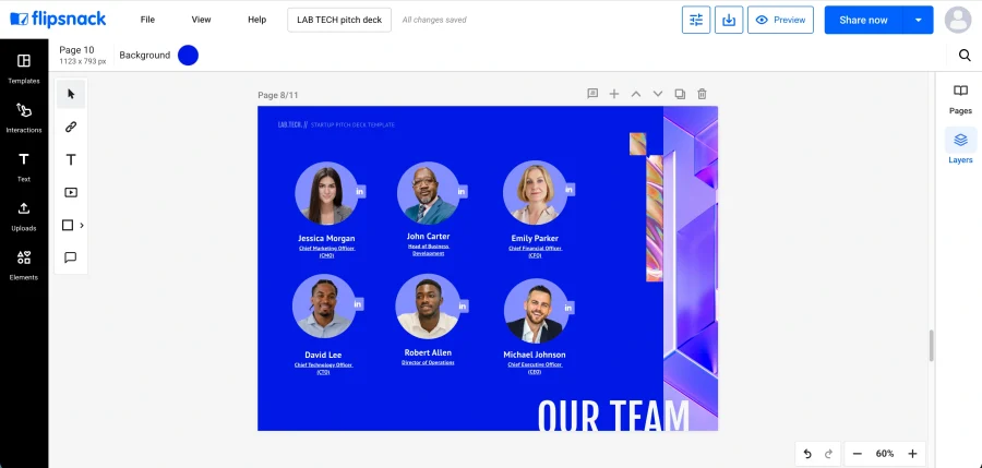
Nine is where most decks put it, and that works when the product carries the argument. When the team is your strongest asset, move it to slide three instead. Investors at seed stage back people more than products, because the product usually changes and the founders don’t.
Fails when: it sits at the back as an afterthought.
Slide 10: Use of funds
State the amount, the runway it buys, and the milestones it unlocks. Break the allocation into three or four lines.
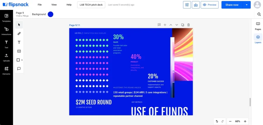
Skipping this is astonishingly common. Haje Jan Kamps analyzed several thousand decks for TechCrunch and found 56 percent lacked a credible use-of-funds narrative, while 54 percent scored a low overall likelihood of raising.
Fails when: you request money without saying what it buys.
Slide 11: Contact details
One memorable line restating why this matters, then your contact details. Email, website, and a direct link to the deck itself if it lives online.
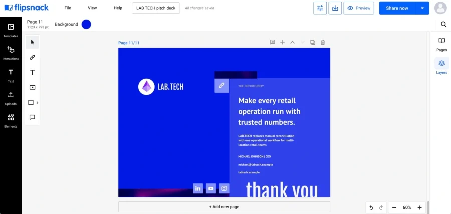
Fails when: the reader has to hunt for a way to respond.
What pitch deck mistakes should you avoid?
Most decks get rejected for being confusing, not for having a weak idea. The same errors keep showing up: a vague problem, buried traction, a missing ask, vanity metrics, jargon in the opening slides, and design so busy the argument disappears.
- Vague problem. A reviewer who cannot name your customer after slide two stops reading. Specificity is the whole game.
- Buried team. Nine slides of product before anyone learns who you are wastes the credibility you already possess.
- Missing ask. More than half of analyzed decks omit a coherent use of funds, per that TechCrunch review. Silence on the ask reads as uncertainty about the plan.
- Vanity metrics. Downloads, impressions and press mentions invite the obvious follow-up question about whether anybody stayed or paid.
- Jargon opening. If the first slide requires domain fluency, a generalist investor disengages before your strongest material arrives.
- Cluttered design. One reviewer who examined fifty early-stage decks reported design working against founders in 93 percent of submissions. Legibility is not decoration.
Fixing all six costs an afternoon. Diagnosing which one is costing you meetings takes considerably longer, unless you can see where readers stop.
How should you send a pitch deck to investors?
Send it as a link, not an attachment. Build the deck wherever you like, because that part is settled long before you hit send. What you can’t undo is the format: a flat file goes dark the moment it leaves your outbox, and you lose the ability to fix a figure, control who forwards it, or see which slide lost the room.
| What you need | PDF or PowerPoint attachment | Deck sent as a link |
| Update after sending | New file, new email | Same URL, edited content |
| Know who opened it | No signal | Per-recipient view data |
| See which slide lost them | No signal | Page-level time and drop-off |
| Take access back | Forwarded copies live on | Password, unlisted or private |
| File size limits | Large decks bounce | Nothing to attach |
| Works offline | Yes | Needs a connection |
| Accepted everywhere | Universally | Some funds require a file |
Read those last two rows carefully. Attachments genuinely win when you’re pitching somewhere with no reliable connection, or applying to a fund whose intake form demands an uploaded file. Several do. Keep an exported PDF ready either way.
Everywhere else the link wins on the thing founders complain about most, which is the silence after sending.
Create a pitch deck in Flipsnack in 5 steps
Building the deck takes an afternoon. Sending it well is what changes the reply rate.
- Upload your PDF or start with a design. Bring an existing deck in as a PDF, or build from a pitch deck template, so you’re not rebuilding work you’ve already done.
- Edit the content and add supporting media. Replace copy, visuals and charts, and drop in a product video where showing beats explaining, so your solution slide demonstrates instead of describes.
- Apply consistent branding. Set fonts, colors and logo treatment once and apply them across every page, so a deck assembled quickly still reads as deliberate.
- Publish with the right access settings. Choose public, unlisted, password protected or private sharing depending on how sensitive the financials are, and correct any figure later without sending a new link.
- Track engagement and fix the weak slides. Analytics show you who opened the deck, how long each page held them, and where they stopped reading. If four investors quit at your market slide, you know exactly what to rebuild before the next send. No attachment will ever tell you that.
Start your pitch deck from a template
Four templates cover most early-stage situations. Each carries a trade-off worth naming before you commit.
1. Startup pitch deck template
The Startup pitch deck presentation template runs 11 pages covering the problem, platform, business model, market opportunity, team, financials, use of funds and growth plans.
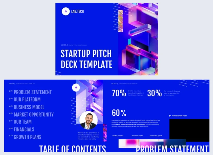

Best for: startup founders who want a broada structure they can adapt to their raise.
How to use it: replace the sample content with your problem, solution, market and financial assumptions, then add traction, competition or a specific funding ask if your story needs them.
Common mistake to avoid: keeping every page because it’s there. Eleven pages is a starting point, not a quota.
2. Venture capital pitch deck template
The Venture capital pitch deck presentation template runs 13 pages and adds emphasis on scalability and exit strategy to a standard startup story.
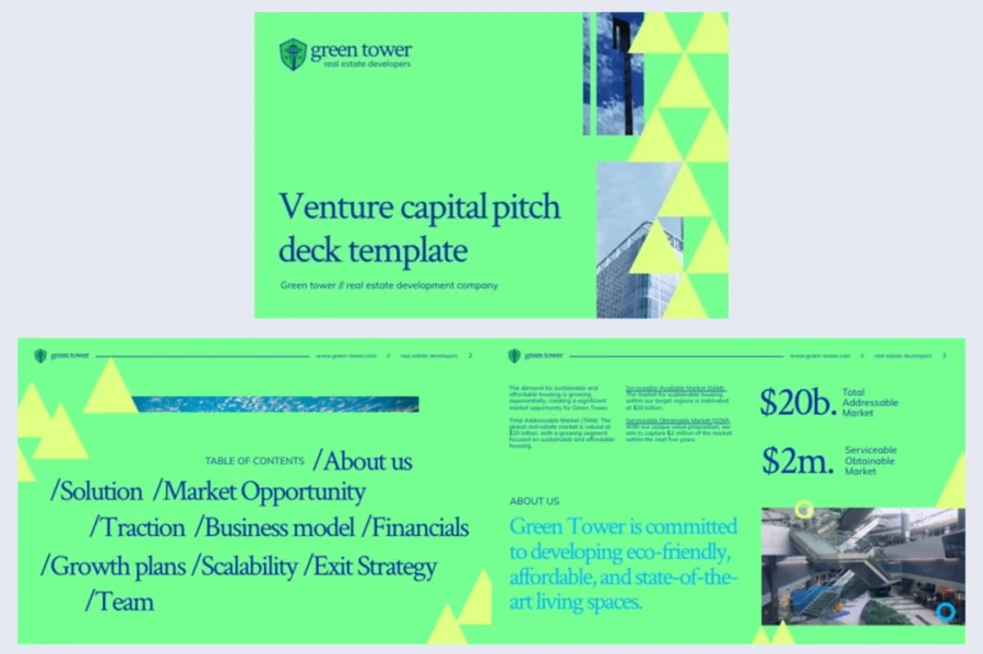
Best for: startups approaching VC firms that need to show growth potential and a credible path to scale.
How to use it: replace the sample content with your market, traction and projections, then explain how the business grows without costs rising at the same rate. Add a dedicated funding ask and use-of-funds page before the close.
Common mistake to avoid: presenting projected growth as traction. Keep achieved results separate from forecasts and label both clearly.
3. Investor pitch deck template
The Investor pitch deck presentation template frames an established company’s expansion as an investment opportunity, covering market position, investment thesis, projections, risks and the proposal itself.
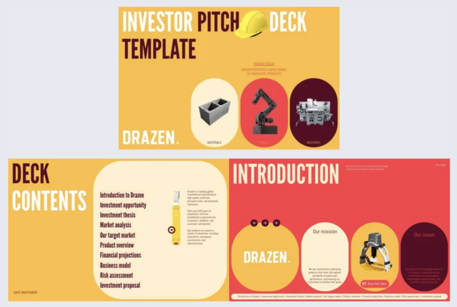
Best for: established businesses seeking capital to expand into new products or markets.
How to use it: replace the manufacturing example with your current performance, growth opportunity and clearly labeled forecasts, then adapt the risk and proposal pages to the type of investor you’re approaching.
Common mistake to avoid: treating the risk page as a formality. A thin risk section reads as a plan nobody has stress-tested.
4. Competition slide template
The Competition slide pitch deck presentation template runs 12 pages, with separate sections for competitive positioning, competitive advantages and your unique selling proposition.
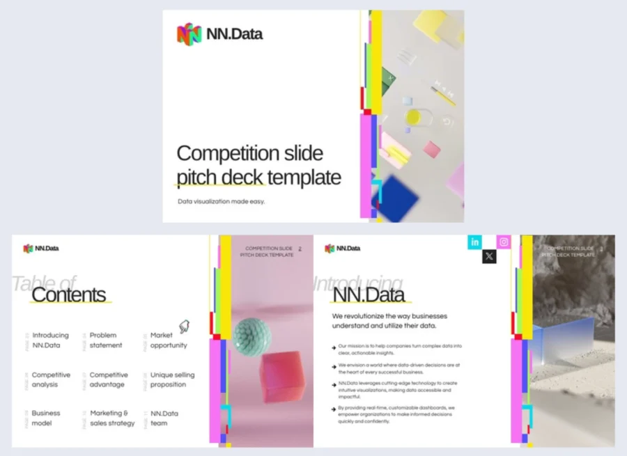
Best for: startups in crowded categories where differentiation needs more than a feature checklist.
How to use it: define the two dimensions behind the positioning matrix, then place yourself and your rivals honestly, including where they beat you.
Common mistake to avoid: designing the comparison so you win everywhere. Investors read that as weak research rather than market dominance.
Frequently asked questions about creating a pitch deck
Yes, and they remain the standard first document in almost every early-stage fundraise. The real question is what happens afterwards, since most decks are reviewed alone and never presented live. Sending yours as a Flipsnack link lets you correct a figure without the original going stale.
An investor deck is a pitch deck aimed at funders rather than at customers or partners, so the two terms describe the same document and are used interchangeably. The distinction worth knowing is between an investor deck and a sales deck: one argues that a business is worth backing, the other argues that a product is worth buying.
Clarity about what you do, evidence that the problem is real, and a reason to keep reading. Those opening slides get seconds, not minutes, so the cover line has to work without explanation. Jargon, abstraction and unsupported superlatives all cost you the attention you had left.
Yes. Starting from a structured template removes most layout decisions, and a brand kit applies your fonts, colors and logo across every page at once. In Flipsnack, that means you set branding once rather than fixing it slide by slide. Being easy to read matters far more than looking sophisticated.
Send it as a shareable link rather than a file. Flipsnack shows views, average reading time and page-level engagement, so a wave of drop-offs at your market slide tells you precisely what to rebuild. Organizations that need to connect engagement to specific recipients can use individual reader tracking. File attachments give you no signal at all once they leave your outbox.
Build your pitch deck for how investors actually read it
Structure earns the meeting. Distribution earns the follow-up.
Give your deck eleven slides that each carry one argument, put the team where it argues hardest, and never leave the ask unstated. That handles the reading. Then send it as a link rather than a file, because the alternative leaves you refreshing an inbox with no idea whether slide four or slide nine lost them.
Choose a PDF attachment when connectivity is unreliable or a fund’s intake demands one. Choose a tracked link everywhere else. Plenty of founders keep both, and that is a perfectly sensible answer.
A deck you can measure is a deck you can fix.