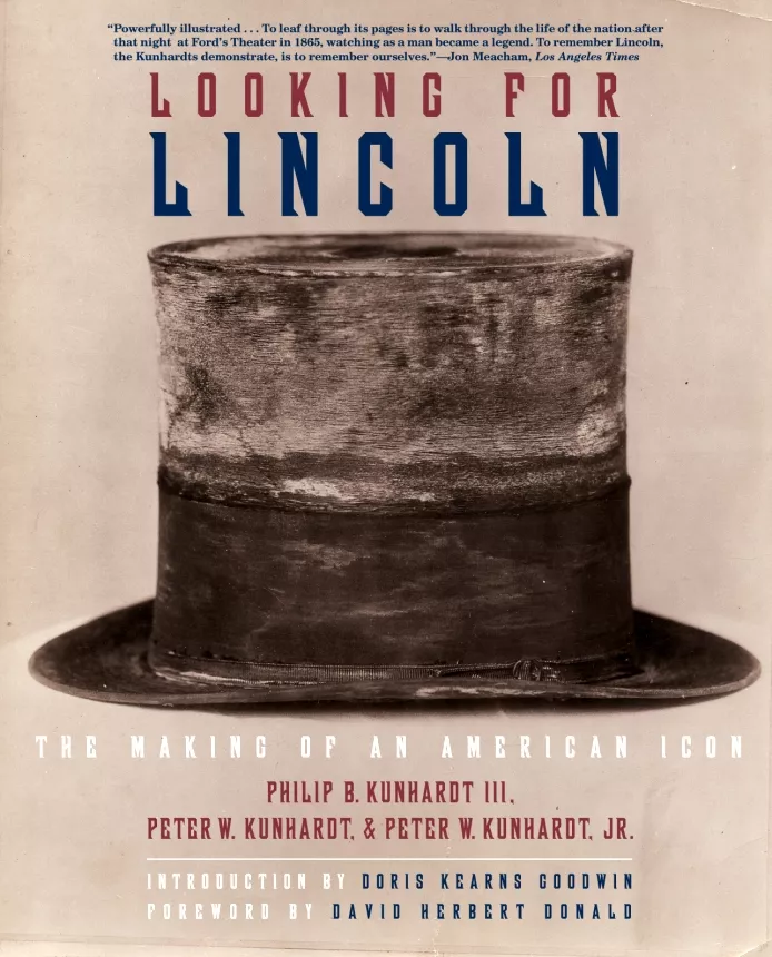
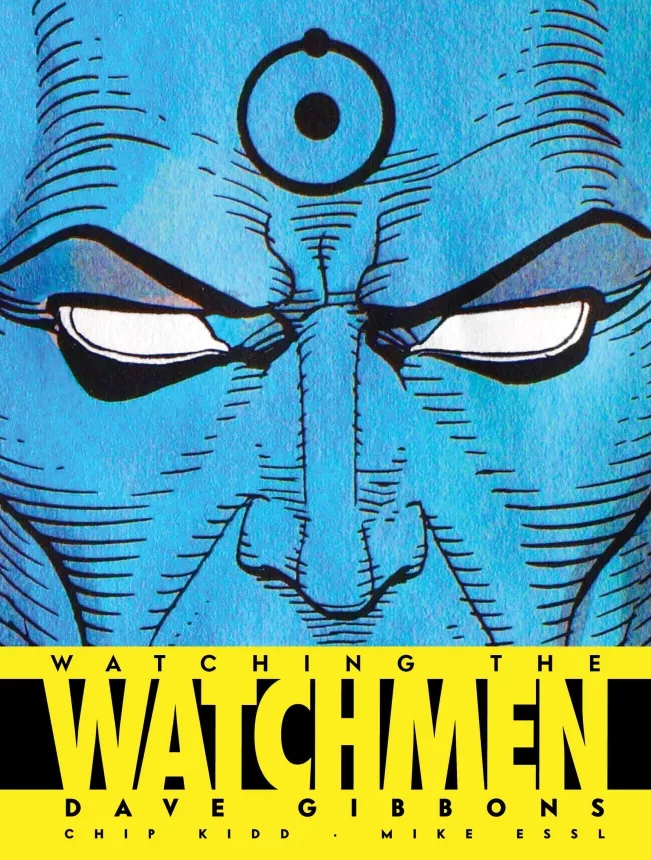
5 tips to create an unusual book cover, Chip Kidd style
Chip Kidd studied graphic design at Penn State, one of the biggest universities in the US.
In 1986, at 22 years old, he started designing for Knopf, and he still works there as an art director.
Kidd is the author of many books: fiction, non-fiction, comics and one graphic novel. Some popular titles include “The Cheese Monkeys”,” Batman: Death by Design”, “Go: A Kidd’s guide to Graphic Design”. He designs more than 70 book covers per year. He worked with some well-known authors: Bret Easton Ellis, Haruki Murakami, Dean Koontz, Cormac McCarthy and many others.
Kidd designed the cover of Michael Crichton’s Jurassic Park, which became one of the most recognizable book covers of the time. He is considered a rock star in the world of graphic design and is appreciated for his understanding of narrative.
What do you say to the axiom “Don’t judge a book by it’s cover”?
My reaction is, Oh go ahead.
This is the atipic answer, that Chip Kidd, “the rock star of dust jacket” gave during an interview. It’s a clear pointer to his bold personality, which shines in real life as much as it does through his designs.
All his book covers are unique and intriguing. He doesn’t have a signature style but he left a mark on the history of book cover design and inspired many designers. There’s a lot to learn from him if you want to make an unusual book cover that will stand out.
What is the philosophy behind his book covers? Below you will find a list of 5 principles that guide Chip Kidd’s designs, and which could be used by any book cover illustrator or designer.
1. First impression counts
Chip Kidd talked about how important the first impression is, in his book “Judge This” and in his TED talk. There are two ways to illustrate a concept: with clarity and mystery. Clarity means revealing the message all at once. Mystery is making the viewer search for the meaning. Kidd’s opinion is that the best way to show the message is to combine both approaches in the same design.

2. Read the book before
Before he starts to design a book cover, Chip Kidd reads the manuscript and tries to illustrate the main idea of the book. He designs for people, so he wants people to get the message of the book. Following his example, you should also ask yourself “What does the story look like?” and try to make the narrative visual.

3. Understand what the author wants
Being both designer and writer helped Chip understand what authors want. Understanding the publishing process from an author’s perspective helped him be more perceptive. Of course, you don’t have to be a writer to be able to work well with authors. Just try to resonate with the author’s message and viewpoint.

4. Let your hobbies influence you
Chip Kidd is a big admirer of comic books since his childhood. He wrote some comics for DC Comics and designed their covers. If you take a look at his works you’ll notice the underlying influence of comics. What can you take from this? Think about how your passion or hobby could inspire you when you design. It will bring a personal touch on your book covers.

5. Be different
Uninterested in design trends and fashion, Chip Kidd doesn’t design for a target audience. He designs for people and anyone will get the message. He doesn’t have a style, he has a sensibility. That’s how he creates book covers with a sense of meaning. Take a look at the book cover featured below. It’s not just unusual, it’s also very suggestive.
When you design don’t think about trends or what is cool at the moment. Dare to be different. Dare to be bold. That’s how you will create an unusual book cover, one that stands out.

I’ll end this article with a powerful quote from Chip Kidd himself:
Designing books covers is like making a library that will record your existence.


Very Fine Article. I really love this Book Cover Designs. I am also professional in Book Cover Design