18 Magazine Cover Templates Guaranteed to Inspire You
Published on: December 19, 2018
Last update: April 22, 2026
How much of an impact can a great magazine cover really have? More than you might expect. A well-designed cover doesn’t just look good—it sets the tone for your publication, sparks curiosity, and gives your audience a sense of what’s inside. If you’re thinking about creating a digital magazine and need a place to start, the cover can be a surprisingly powerful first step.
This article isn’t about teaching you how to design covers from scratch. Instead, it’s about helping you picture what your next digital magazine could become—by showing you 10 standout covers that are part of full, ready-to-edit templates. Each one leads to a complete magazine design you can open, tweak, and make your own in Flipsnack. From internal newsletters to trend roundups, these templates are built to help you move from idea to polished publication faster.
We’ve gathered a mix of styles to suit different needs—some clean and corporate, others bold and creative. All of them are fully customizable and easy to edit, even if you don’t have any design experience.
Scroll down to explore and see which one sparks your next big idea. Your magazine might be just a few clicks away from done.
Table of contents
- How to build a magazine cover that actually works
- Quick comparison: choose your ideal magazine cover template
- What customers say about Flipsnack templates
- Professional magazine cover templates to customize
- 1. Sleek Lifestyle Magazine
- 2. Interactive Fashion Magazine
- 3. Digital Business Magazine
- 4. Digital Company Magazine
- 5. Dynamic Lifestyle Magazine
- 6. Digital Company Insights Magazine
- 7. Impactful Digital Magazine
- 8. Business Technology Magazine
- 9. Customizable Tech Magazine
- 10. Digital Design Magazine
- 11. Interactive Online Fashion Magazine Template
- 12. Artistic Magazine Template
- 13. Interactive Lifestyle Magazine Template
- 14. Engaging Business Magazine Template
- 15. Interactive Design Magazine Template
- 16. Marketing & Advertising Interactive Magazine Sample
- 17. Interactive Wedding Magazine Template
- 18. Creative Digital Magazine Template
- How to create a magazine cover in Flipsnack
- Start designing with magazine cover templates
- FAQs on magazine covers
How to build a magazine cover that actually works
Start with one strong image. The cover is a single moment that has to stop someone mid-scroll. Pick one photo or visual that’s bold, high-quality, and tells a story on its own. Busy covers with multiple images compete for attention and lose.
Make the headline impossible to skip. Your main headline should be short, specific, and make the reader want to open the magazine. Vague titles like “Our Latest Issue” say nothing. “How We Grew Revenue 3x in 12 Months” says everything.
Keep the layout simple. A cover needs three things: an image, a headline, and your logo. Everything else is optional. If you’re adding subheadlines or callouts, limit them to two or three max. White space isn’t wasted space. It’s what makes the rest stand out.
Use contrast to guide the eye. Light text on a dark image. Dark text on a light background. If the reader has to squint to read the headline, the cover isn’t working. Make sure the text pops against whatever sits behind it.
Stay on brand. Your cover should be instantly recognizable as yours. Same logo placement, same font family, same color palette across every issue. Consistency builds familiarity, and familiarity builds trust.
Design for the format. A print cover and a digital cover have different rules. Print needs bleed margins and spine space. Digital needs to look sharp as a thumbnail. If most of your audience sees the cover on a screen, make sure the headline is readable at small sizes.
End with a reason to open it. The cover’s only job is to get someone inside. A compelling headline, a striking image, or a teaser that creates curiosity. If the cover doesn’t make someone want to turn the page, nothing else matters.
Quick comparison: choose your ideal magazine cover template
| Template Name | Primary Industry | Best For | Main Focus | Key Benefits |
|---|---|---|---|---|
| Sleek Lifestyle Magazine | Lifestyle / Culture | Journalists, editors, designers | Trend-driven lifestyle, culture, and wellness content | Bold typography, fresh color combo; embedded videos, product tags, shopping buttons; brand customization. |
| Interactive Fashion Magazine | Fashion | Fashion editors, photographers, stylists | Fashion collections, editorial features, interviews | Bold yellow and brown design; 10 editable pages; photo slideshows, videos, social media buttons; page-flipping effect. |
| Digital Business Magazine | Business / Tech | Journalists, editors, designers | Thought leadership, industry trends, interviews | White background with red border; 12 pages; go-to-page buttons, GIFs, stickers, videos; statistics tracking. |
| Digital Company Magazine | Business / Finance | Business journalists, financial analysts, designers | Corporate insights, financial trends, leadership features | Professional neutral tones; 10 pages; go-to-page buttons, GIFs, stickers, videos; statistics tracking. |
| Dynamic Lifestyle Magazine | Fashion / Lifestyle | Fashion and lifestyle brands | Fashion collections, product showcases, catalog-style issues | Dramatic visuals; 10 pages; shopping buttons, shopping list feature; embedded videos, links, product tags. |
| Digital Company Insights Magazine | Corporate Communications | Internal comms teams, HR | Company updates, team achievements, culture highlights | Bold shapes, vibrant color blocks; 10 pages; GIFs, slow-paced animations, embedded videos; page-flipping effects. |
| Impactful Digital Magazine | Creative / Editorial | Creatives, editors, business leaders | Design trends, industry interviews, cultural commentary | High-contrast minimalist design; 10 pages; videos, product tags, pop-ups; public sharing via link, social media, email, website embed. |
| Business Technology Magazine | Tech / Corporate | Tech-forward companies, internal comms teams | Internal newsletters, innovation updates, team highlights | Geometric modern design; 12 pages; slideshows, pop-up images, videos, interactive charts; social media buttons; built-in analytics. |
| Customizable Tech Magazine | Technology | Tech publishers, innovation teams | Gadgets, digital trends, product breakthroughs | Futuristic black background; 14 pages; spotlight features, videos, product tags; page-flipping effect; engagement statistics. |
| Digital Design Magazine | Design / Art | Creative teams, art directors, editors | Design magazines, art publications, visual essays | Artistic abstract cover; 18 pages; photo slideshows, GIFs, stickers, videos; layered visual storytelling. |
| Interactive Online Fashion Magazine Template | Fashion | Fashion editors, photographers, publishers | High-fashion editorial, collection launches, trend coverage | Minimalist black and white design; performance tracking with Flipsnack statistics; real-time content adjustments. |
| Artistic Magazine Template | Automotive / Lifestyle | Publishers covering cars, design, tech | Automotive features, design trends, edgy editorial content | High-contrast black and white; chunky typography; videos, photo slideshows; fully customizable in Design Studio. |
| Interactive Lifestyle Magazine Template | Entertainment / Lifestyle | Event guides, lifestyle and entertainment publishers | Events, culture, entertainment, community content | Warm orange gradient; layered headlines; video interviews, slideshows; view and impression tracking. |
| Engaging Business Magazine Template | Business / Finance | Business publishers, corporate comms teams | Economic indicators, market trends, leadership features | Soft blue gradient; professional photography; social media icons; Flipsnack analytics for performance tracking. |
| Interactive Design Magazine Template | Design / Art | Design magazines, art publications, creative brands | Design trends, innovation, visual culture | Pink gradient, gallery-quality aesthetic; photo slideshows, stickers, slow-paced GIFs; clean white borders. |
| Marketing & Advertising Interactive Magazine | Marketing / Advertising | Marketing agencies, advertising teams, industry publishers | Marketing trends, interviews, industry content | Vibrant green with orange accents; photo slideshows, GIFs, go-to-page buttons; email distribution to subscribers. |
| Interactive Wedding Magazine Template | Wedding / Lifestyle | Bridal publications, wedding planners, lifestyle publishers | Wedding features, bridal trends, event planning guides | Soft blue romantic design; elegant serif typography; QR code and website link on cover; email and website embed sharing. |
| Creative Digital Magazine Template | Fashion / Entertainment | Celebrity, entertainment, fashion, culture publishers | Celebrity interviews, fashion editorials, culture features | Premium gray backdrop; mixed typography styles; AI-powered alt text and translations; public sharing across platforms. |
What customers say about Flipsnack templates
The best flipbook tool I have used
Flipsnack is easy to use and offers all the features a small business needs, at a very affordable price. There are plenty of templates to choose from to speed up the project. Each template is easily tailored to your needs. The support is good and fast through the chat function, and they also provide a phone number (infrequently these days) in case you prefer a phone call.
Leonardo Soto
President of SotoNets Cloud Solutions
Reviewed on G2
Professional magazine cover templates to customize
1. Sleek Lifestyle Magazine
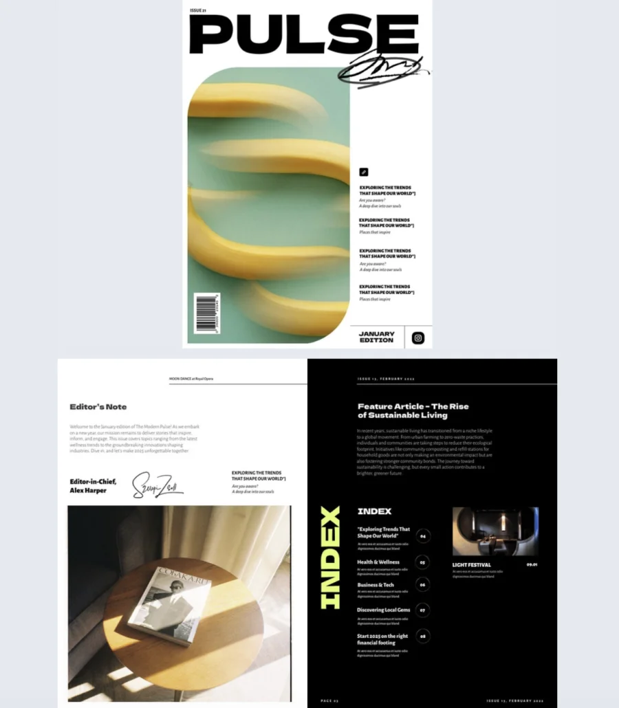

A magazine cover that plays it safe gets scrolled past. This one doesn’t. Bold typography, a fresh color combo, and a quirky banana visual give it a creative, slightly offbeat energy that grabs attention before anyone reads a word.
Best for: Journalists, editors, and designers creating lifestyle, culture, or trend-focused publications that want a cover with personality, not just polish.
Real-world application: A digital lifestyle magazine covering topics like work culture, tech trends, and wellness can use this cover to set an editorial tone that feels current and confident. The playful design signals to readers that the content inside won’t be dry or predictable. Customize the cover with your own imagery and headlines, then carry the style through with interactive elements like embedded videos, product tags, and shopping buttons throughout the magazine.
Common mistake to avoid: Don’t let a bold cover mislead readers about what’s inside. If the cover feels playful and creative, the content should match. A mismatch between cover energy and interior tone makes the whole magazine feel disjointed.
2. Interactive Fashion Magazine
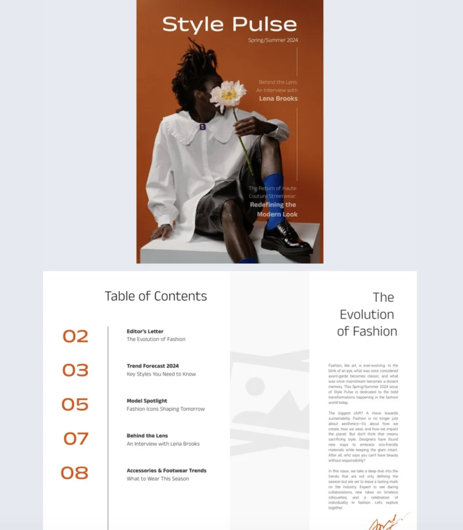
This cover looks like it belongs on a newsstand, not a template library. Clean lines, bold colors, and a striking editorial layout give it the kind of high-end feel that makes readers stop and pay attention. The playful flower detail adds personality without breaking the minimalist aesthetic.
Best for: Fashion editors, photographers, stylists, and brands who want a cover that signals style and credibility before the reader even opens the magazine.
Real-world application: A fashion brand publishing a seasonal digital magazine can use this cover to set an editorial tone for interviews, trend pieces, or lookbook-style features. The bold bright yellow background with brown accents creates a contemporary, eye-catching first impression. Inside, 10 fully editable pages support digital-first storytelling with photo slideshows, videos, and social media buttons on the back cover to boost engagement and shareability.
Common mistake to avoid: Don’t overcrowd a minimalist cover. If the design is clean and editorial, resist the urge to add more headlines, badges, or callouts. One image, one headline, and your logo is enough. The white space is doing the work.
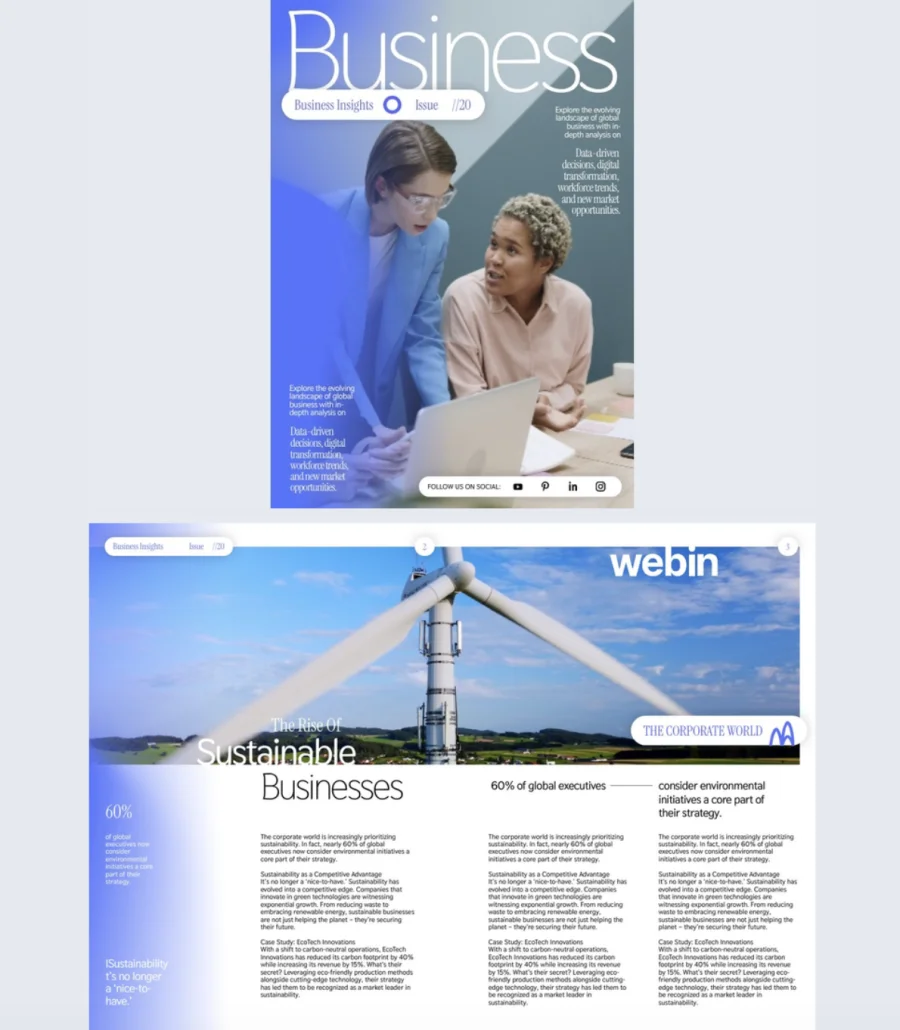
3. Digital Business Magazine
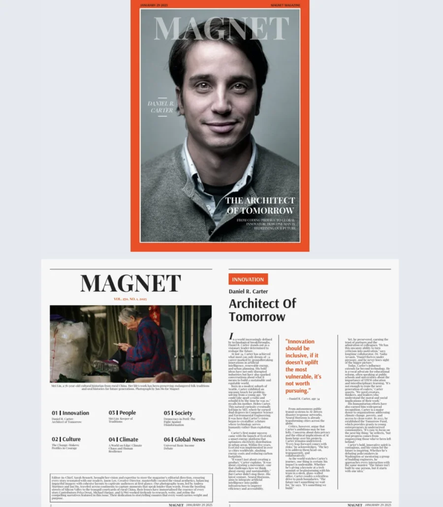
Some covers try to be clever. This one just looks like a magazine. The classic layout puts your subject front and center with sharp typography, a white background, and a bold red border that adds just enough energy to catch the eye without trying too hard.
Best for: Journalists, editors, and designers creating business, tech, or thought leadership magazines that need a professional, credible first impression.
Real-world application: A company publishing a quarterly thought leadership magazine can use this cover for spotlight stories on industry leaders, feature interviews with executives, or deep dives into market trends. The clean, authoritative design tells readers the content inside is serious and worth their time. With 12 customizable pages, build out full issues with go-to-page buttons for navigation, embedded videos for interviews, and GIFs or stickers for visual variety. Track performance with built-in statistics to see what content resonates most.
Common mistake to avoid: Don’t put a generic stock photo on a cover designed for editorial credibility. If you’re featuring a person, use a real photo. If you’re covering a topic, use original imagery. A professional layout with a lazy cover image undermines the whole magazine.
4. Digital Company Magazine
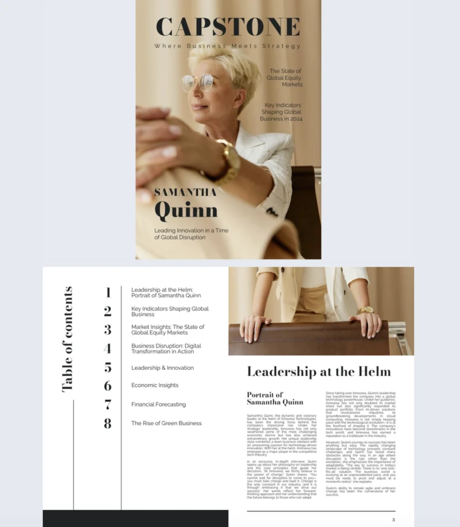
Not every magazine cover needs to shout. This one earns attention through polish and restraint. Neutral tones, a confident subject, and a clean layout give it the kind of quiet authority that works for business, finance, and corporate content.
Best for: Business journalists, financial analysts, and designers creating company publications, industry reports, or finance-focused magazines that need a premium, trustworthy look.
Real-world application: A company producing a quarterly magazine for investors and partners can use this cover for leadership features, global market analysis, or financial trend pieces. The polished design and subtle visual hierarchy signal credibility before anyone reads a headline. Inside, 10 customizable pages support embedded videos, product tags, and go-to-page buttons for smooth navigation. Track reader engagement with built-in statistics to see which sections perform best.
Common mistake to avoid: Don’t confuse polished with boring. A clean, professional cover still needs a compelling headline that gives readers a reason to open it. “Q3 Report” is a file name, not a cover line. Lead with the insight, not the label.
5. Dynamic Lifestyle Magazine
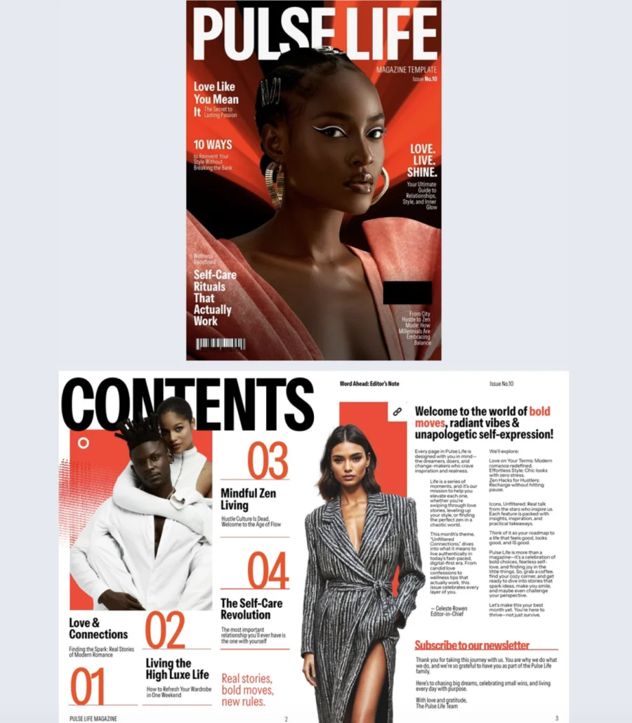
This cover doesn’t whisper. A dramatic background, a striking portrait, and clean headline placement give it the kind of visual punch that stops people mid-scroll. It’s bold without being loud, polished without being stiff.
Best for: Fashion, wellness, and lifestyle brands that want a cover with editorial impact and a magazine that doubles as a sales tool.
Real-world application: A fashion brand producing a seasonal digital magazine can use this cover to lead with high-impact imagery that sets the tone for the full issue. Inside, 10 customizable pages support product showcases, collection highlights, and trend features. Add shopping buttons so readers buy directly from the page and use Flipsnack’s shopping list feature so wholesale buyers build quotes and send them straight from the catalog. One publication that works as both editorial content and a revenue driver.
Common mistake to avoid: Don’t treat a shoppable magazine like a product grid with a cover on top. The editorial content is what keeps readers engaged. Weave products into the storytelling naturally. If every page feels like an ad, readers bounce before they buy.
6. Digital Company Insights Magazine
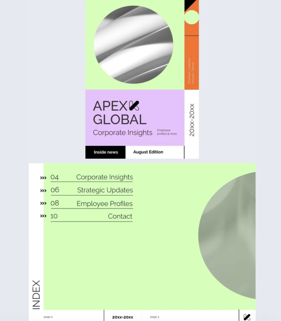
Corporate magazines don’t have to look corporate. This cover breaks the mold with bold shapes, vibrant color blocks, and a sleek layout that feels creative without sacrificing clarity. It signals to employees that what’s inside is worth reading, not just another internal email dressed up.
Best for: Companies that want their internal communications to feel modern and engaging. Works for internal newsletters, executive updates, quarterly insight reports, or culture-focused publications.
Real-world application: An internal comms team publishing a quarterly company magazine can use this cover to set a tone that’s fresh and approachable. Inside, 10 customizable pages give space for employee spotlights, team milestones, leadership messages, and culture highlights. Add GIFs and slow-paced animations to keep the energy up, embed videos of company events or leadership updates, and use page-flipping effects so the experience feels like a real magazine, not a memo with pictures.
Common mistake to avoid: Don’t use a vibrant, creative cover and then fill the inside with walls of text and corporate jargon. If the cover promises energy, the content has to deliver. Match the editorial tone to the visual tone throughout.
7. Impactful Digital Magazine
High contrast, confident typography, and a minimalist layout. This cover does a lot with very little, and that’s exactly why it works. It grabs attention through bold design choices, not clutter.
Best for: Creatives, editors, and business leaders who want a magazine cover that feels energetic and modern. Works for design trends, industry interviews, cultural commentary, or any content that needs to make an impression.
Real-world application: A creative agency publishing a digital magazine on industry trends can use this cover to make a statement before the reader opens a single page. The high-contrast design and confident text layout set the tone for content that’s sharp and opinionated. Inside, 10 interactive pages support video embeds, product tags, and pop-ups to layer in depth without overcrowding the layout. Use Flipsnack’s public sharing options to distribute across social media, email, and websites so the magazine reaches audiences wherever they are.
Common mistake to avoid: Don’t let a bold cover carry a weak headline. Minimalist design amplifies whatever text is on the page. If the headline is generic, the simplicity highlights it for the wrong reasons. Make every word on the cover count.
8. Business Technology Magazine
Internal magazines shouldn’t feel like homework. This cover’s geometric design and clean layout give company updates a tech-savvy, modern feel that makes employees want to open it instead of ignoring it in their inbox.
Best for: Companies that want their internal newsletters, innovation updates, or team highlights to feel polished and current. Ideal for tech-forward organizations where the comms should match the culture.
Real-world application: A tech company publishing a quarterly internal magazine can use this cover to set a professional but approachable tone. Inside, 12 customizable pages give room for project spotlights, team milestones, and end-of-quarter data presented through interactive charts instead of flat tables. Add slideshows, pop-up images, and videos to keep employees engaged throughout. Include social media buttons on the back cover to encourage engagement beyond the magazine itself.
The template features a geometric, modern design with 12 customizable pages. Add slideshows, pop-up images, videos, interactive charts, tags, and captions for extra detail. Include social media buttons for extended engagement. Track performance with built-in analytics.
Common mistake to avoid: Don’t fill an internal magazine with content employees could get from a Slack message. If it’s in the magazine, it should deserve the space. Project deep dives, leadership interviews, and data-driven insights belong here. Quick announcements don’t.
9. Customizable Tech Magazine
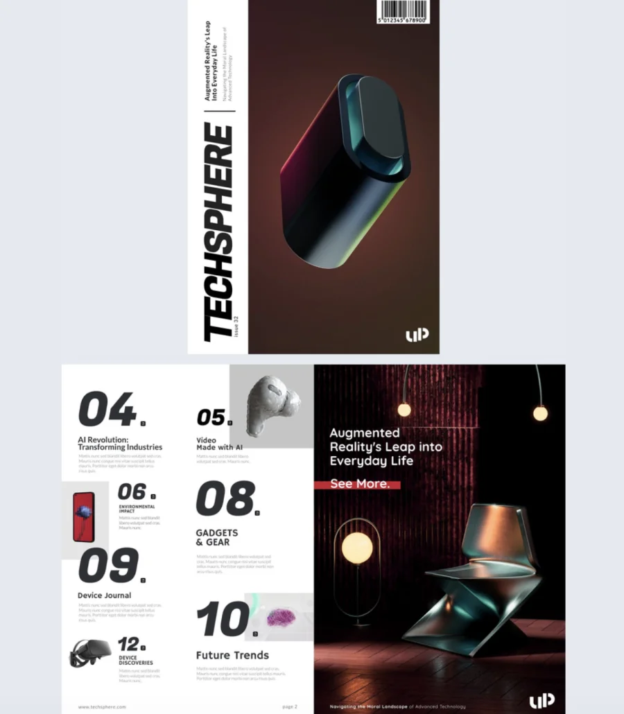
This cover looks like it came from the future. The vertical title layout, abstract 3D visual, and black background give it a high-tech edge that immediately signals innovation. If your content is about what’s next, this cover makes that promise before anyone reads a word.
Best for: Tech publishers, innovation teams, and brands covering gadgets, digital trends, or product breakthroughs. Works for external tech magazines or internal innovation digests.
Real-world application: A tech publication covering the latest product launches can use this cover to set a forward-thinking tone that matches the content. Inside, 14 interactive pages give room for spotlight features on new gadgets, embedded product videos, and detailed breakdowns with product tags. The page-flipping effect keeps the reading experience immersive. After sharing, track engagement through Flipsnack’s built-in statistics to see which features and products readers spent the most time on.
Common mistake to avoid: Don’t let a futuristic cover design age badly. Abstract visuals and dark backgrounds stay timeless. But if you add trendy design elements that date quickly, the cover feels stale by the next issue. Keep the aesthetic clean and let the content carry the novelty.
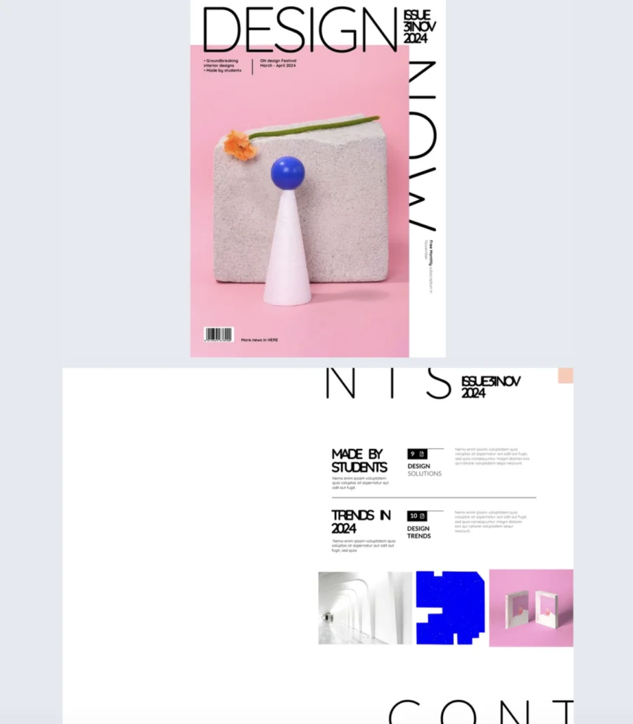
10. Digital Design Magazine
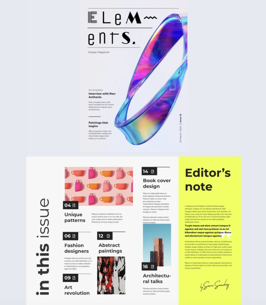
Rules are meant to be broken, and this cover knows it. A unique typeface, an abstract ribbon design, and an artistic layout give it the kind of creative energy that makes other magazine covers look predictable. It’s minimal but expressive, clean but full of personality.
Best for: Creative teams, art directors, and editors producing design magazines, art publications, or editorial projects that need to look as inventive as the content inside.
Real-world application: A design magazine featuring artist interviews and visual essays can use this cover to signal creativity from the first glance. Inside, 18 fully editable pages give room to spotlight artists with overlapping images and text for added dimension, layer in photo slideshows and GIFs, and embed videos that bring creative work to life. The generous page count supports long-form visual storytelling without cramming. Overlap pictures and text to create depth, use dark backgrounds for contrast, and keep the viewing direction natural from top left to bottom right so readers follow the story intuitively.
Common mistake to avoid: Don’t mistake creative design for confusing design. Artistic layouts still need a clear reading path. If a reader can’t tell where to look first or what’s a headline versus a caption, the creativity is working against you, not for you.
11. Interactive Online Fashion Magazine Template
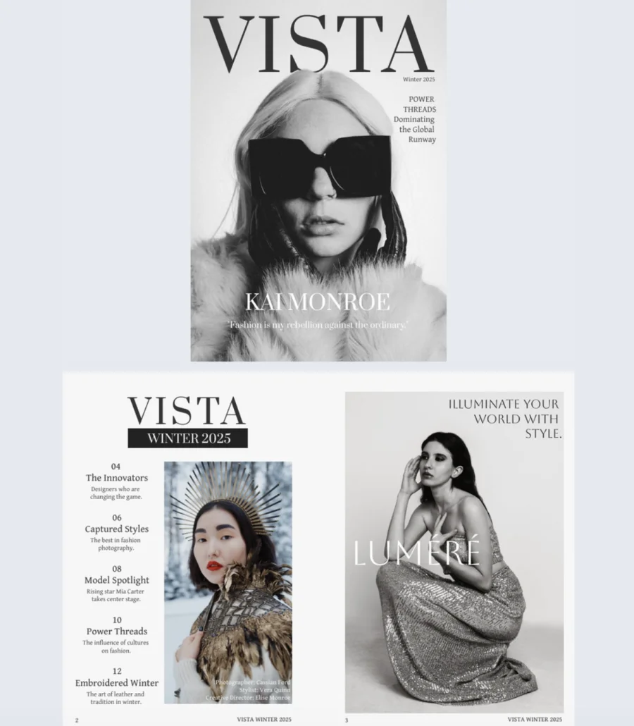
Sometimes less really is more. Bold black and white photography, oversized sunglasses, clean typography, and generous white space. This cover proves that restraint is the most powerful design choice in fashion editorial. The simple hierarchy, title at the top, featured name at the bottom, cover story on the right, makes it instantly readable and endlessly customizable.
Best for: Fashion editors, photographers, and publishers creating high-fashion or lifestyle magazines that want a cover with editorial authority and visual impact.
Real-world application: A fashion magazine launching a new issue can use this cover to let the photography lead. The minimalist black and white palette keeps the focus on the subject, not the design. Inside, add dynamic interactive features and track performance with Flipsnack’s statistics to see who’s reading, how long they engage, and which pages capture the most attention. Use that data to make real-time adjustments that sharpen the next issue’s content strategy.
Common mistake to avoid: Don’t add color accents or extra graphic elements to a minimalist cover just because it feels “too simple.” The white space and restraint are what make it feel high-end. The moment you start filling gaps, it loses the editorial quality that makes it work.
12. Artistic Magazine Template
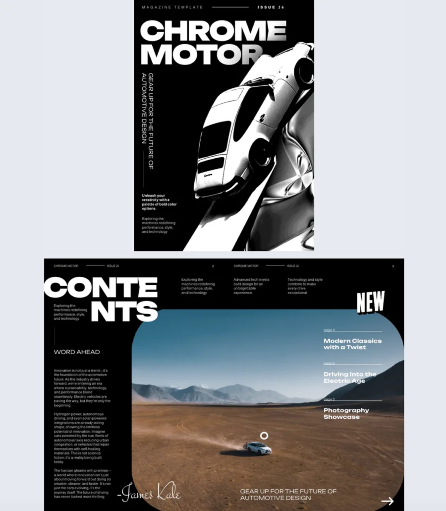
High contrast, dramatic angles, and chunky typography that dominates the page. This cover hits hard and doesn’t apologize for it. The sleek car shot creates movement, the vertical text on the left adds visual depth, and the black background keeps everything sharp. It’s edgy, modern, and built to grab attention fast.
Best for: Publishers and brands covering automotive, design, tech, or lifestyle content that needs a cover with energy and attitude. Works for both editorial magazines and branded publications.
Real-world application: An automotive magazine covering new releases and industry trends can use this cover to match the energy of the content inside. The “CHROME MOTOR” style layout works for any bold title that needs to own the page. Inside, add videos of test drives or product reveals, photo slideshows of featured vehicles or events, and portraits of industry newsmakers. Customize every detail in Flipsnack’s Design Studio to match the publication’s identity without losing the punchy, high-contrast feel.
Common mistake to avoid: Don’t pair a high-energy cover with flat, lifeless interior pages. If the cover promises drama and movement, the inside needs to deliver. Match the editorial pace to the cover’s intensity or readers feel let down by page three.
13. Interactive Lifestyle Magazine Template
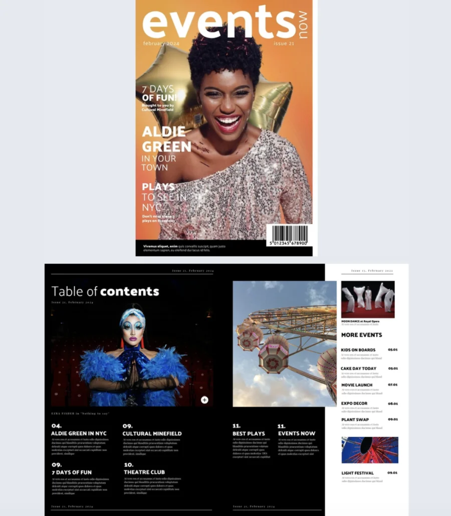
Warm, vibrant, and impossible to scroll past. The orange gradient background, layered headlines, and celebratory imagery give this cover the kind of upbeat energy that makes readers feel like they’re missing out if they don’t open it. The text hierarchy is clear: main feature up top, supporting stories below, everything scannable in seconds.
Best for: Publishers and brands creating event guides, entertainment magazines, or lifestyle publications that need a cover with personality and warmth. Ideal for local culture, community events, or seasonal content.
Real-world application: A local events magazine promoting an upcoming festival season can use this cover to set an energetic, accessible tone. The layered headline structure lets you tease multiple stories on the cover without it feeling cluttered. Inside, add video interviews for feature profiles, slideshows on lifestyle topics, and interactive elements that keep readers engaged beyond the first page. After sharing, track views and impressions through Flipsnack’s metrics to see what content resonates and adjust future issues accordingly.
Common mistake to avoid: Don’t use a warm, playful cover for content that’s dry or overly formal inside. If the cover says “fun,” the tone throughout should deliver on that promise. A mismatch between cover energy and content voice confuses readers and undercuts trust.
14. Engaging Business Magazine Template
Professional doesn’t have to mean stiff. This cover finds the balance with a soft blue gradient, clean typography, and plenty of white space that lets the design breathe. The central image stays uncluttered, text blocks sit neatly along the sides, and social media icons at the bottom add a modern, connected feel.
Best for: Business and finance publishers, corporate communications teams, and editors who want a cover that’s polished and credible but still approachable enough to invite readers in.
Real-world application: A finance publication producing a monthly business magazine can use this cover to present economic indicators, market trends, and leadership features with a calm, organized layout that builds trust. The strategic text placement lets you highlight multiple stories without overwhelming the cover. After publishing, use Flipsnack’s analytics to track who’s reading, how long they engage, and which pages hold attention. Use that data to refine content decisions for the next issue in real time.
Common mistake to avoid: Don’t mistake calming design for forgettable design. A soft color palette still needs a headline that pulls readers in. If the cover looks professional but the headline is bland, readers will respect the design and still not open it.
15. Interactive Design Magazine Template
This cover feels like it belongs in a gallery, not a template library. Bold typography, a pink gradient, and playful still-life photography with geometric objects create a contemporary aesthetic that signals creativity and sophistication before anyone reads a single headline.
Best for: Design magazines, art publications, and creative brands that want a cover with an art-forward, gallery-quality feel. Works for editorial content about design, architecture, innovation, or visual culture.
Real-world application: A design publication featuring emerging artists and creative trends can use this cover to set an aesthetic that matches the content’s ambition. The large “DESIGN” title commands the top of the page while vertical text on the right creates visual rhythm. Clean white borders frame the content and leave room for issue details and feature headlines without competing with the imagery. Inside, add photo slideshows, subtle stickers, and slow-paced GIFs that complement the brand’s visual identity without overwhelming it.
Common mistake to avoid: Don’t clutter an art-forward cover with too many headlines or callouts. This layout works because of the breathing room. The moment you start filling the white space with extra text, it loses the gallery feel and starts looking like a flyer.
16. Marketing & Advertising Interactive Magazine Sample
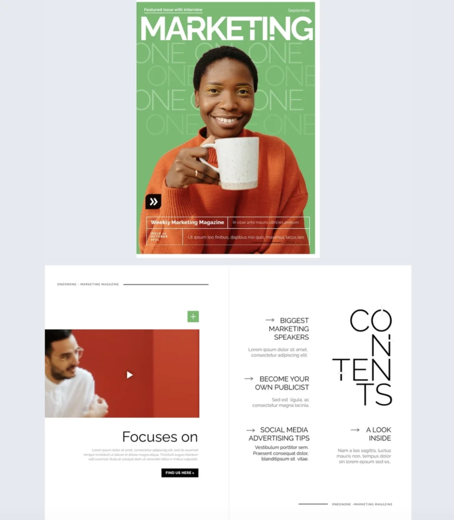
Vibrant green background, repeating text that creates texture, and warm photography with orange accents. This cover manages to be both eye-catching and organized, which is exactly what marketing content needs to be. The bottom section uses color blocks to separate feature headlines and issue details cleanly, so everything has its place without feeling rigid.
Best for: Marketing agencies, advertising teams, and industry publishers creating magazines, newsletters, or branded content that needs to feel credible but human. Not corporate, not casual, right in between.
Real-world application: A marketing agency publishing a quarterly industry magazine can use this cover to balance personality with professionalism. The bright palette stands out in crowded inboxes while the structured layout keeps headlines, images, and metadata organized. Inside, add photo slideshows, GIFs, and go-to-page buttons for smooth navigation. Plan content ahead to include interview videos and high-quality images that give readers a richer, more engaging experience with each issue.
Common mistake to avoid: Don’t publish a marketing magazine with generic stock imagery and filler content. Your audience works in marketing. They spot lazy execution immediately. Every spread should reflect the same creative standards you’d apply to client work.
17. Interactive Wedding Magazine Template
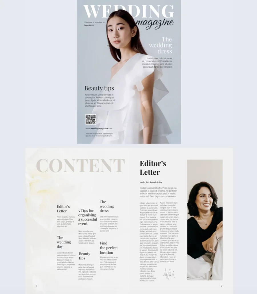
Soft blue tones, elegant serif typography, and a romantic layout that feels timeless without being outdated. This cover sets an aspirational tone that makes brides-to-be stop scrolling and start reading. The balance between large bridal photography and dedicated text zones gives you room to tease multiple features without the cover feeling crowded.
Best for: Bridal publications, wedding planners, and lifestyle publishers creating wedding-focused magazines, event planning guides, or seasonal bridal content.
Real-world application: A wedding magazine publishing a seasonal issue can use this cover to feature stories on dress trends, beauty tips, and venue guides with a polished, aspirational feel. Inside, go beyond the usual advice by integrating interactive elements. Embed videos of real wedding venues, add slideshows of bridal looks, and create sections with real bride quotes and lessons learned. That personal touch adds credibility and sets the content apart from what readers find everywhere else. Include a QR code and website link directly on the cover so readers connect with you instantly.
Common mistake to avoid: Don’t fill a wedding magazine with only vendor promotions disguised as editorial. Readers want honest advice, real stories, and practical tips. If every article reads like a sponsored post, trust drops and so does readership.
18. Creative Digital Magazine Template
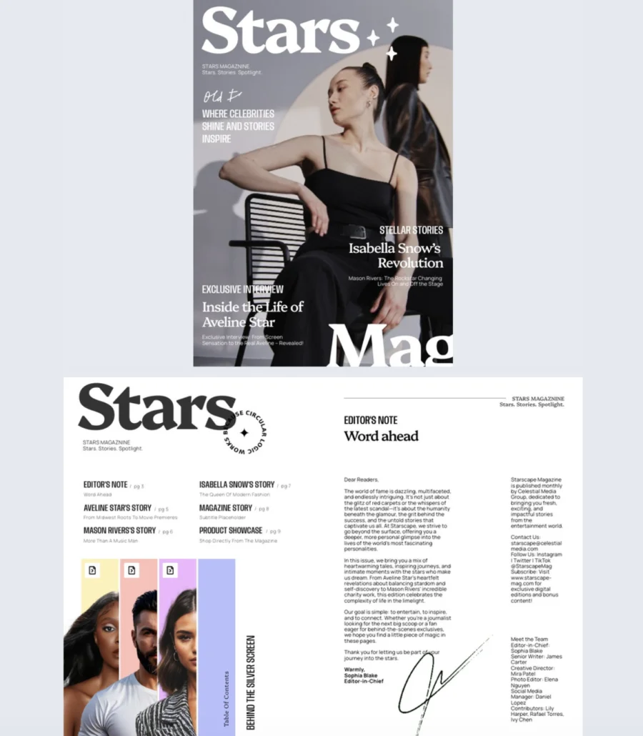
This cover looks like it was designed for a newsstand, not a template gallery. A clean gray backdrop, bold white serif masthead, and dramatic portrait lighting give it the kind of premium, fashion-forward feel that signals serious editorial content. The intentional mix of typography styles, heavy classic title, high-contrast serif for feature names, condensed uppercase for supporting lines, and a handwritten accent, creates visual hierarchy that guides the eye naturally.
Best for: Publishers and editors creating celebrity, entertainment, fashion, music, or culture magazines that need a cover with presence, confidence, and a sharp minimalist vibe.
Real-world application: A fashion magazine featuring an exclusive celebrity interview can use this cover to lead with a dramatic portrait, tease the main feature with a banner-style label, and add secondary headlines and short teasers in clear zones on either side. The layout gives room for a main feature, a secondary headline, and supporting lines without crowding the image. Use Flipsnack’s AI-powered features to auto-generate alt text for accessibility and translate content for multilingual audiences, expanding reach without extra production work.
Common mistake to avoid: Don’t use this layout with a weak portrait. The cover is built around the photo. If the image lacks drama, lighting, or personality, the entire design falls flat. Invest in the hero shot and let the typography frame it.
How to create a magazine cover in Flipsnack
1. Start with a template Browse Flipsnack’s library of professionally designed magazine cover templates. From minimalist editorial layouts to bold, colorful designs, you’ll find covers for fashion, business, lifestyle, tech, and more. Click the template that fits your publication’s tone to start editing, or choose one from this list.
2. Customize every detail Use Flipsnack’s Design Studio to make the cover your own. Replace the placeholder image with your hero photo, adjust the headline and subheadlines, and apply your brand’s logo, colors, and fonts. Mix typography styles for visual hierarchy, keeping the title dominant and supporting text secondary. Upload your own visuals or pull from Flipsnack’s stock image library.
3. Carry the design inside A cover sets expectations, so the interior pages need to deliver. Extend your cover’s visual style across the full magazine with consistent fonts, colors, and layout choices. Add interactive elements like embedded videos, photo slideshows, GIFs, product tags, and go-to-page buttons to turn static pages into an engaging reading experience.
4. Share and track performance Once your magazine is ready, share it however fits your audience. Distribute via direct link, email, or social media. Embed it on your website or send a private link with password protection. Use Flipsnack’s built-in analytics to track views, time spent, and which pages capture the most attention. Use that data to refine your cover and content strategy for future issues.
Start designing with magazine cover templates
You’ve just seen 18 different ways your next digital magazine could look. Some lean professional, others feel creative and bold—but they all share one thing: they’re built to save you time and help you publish something you’re proud of.
The best part? You don’t need to start from scratch or hire a designer. Each of these templates is fully customizable in Flipsnack, so you can adjust colors, swap images, update text, and add interactive features like videos or product tags—all without touching a single line of code.
Whether you’re launching an internal newsletter, building a customer-facing publication, or experimenting with something new, the hard part is already done. Pick a template that fits your vision, open it up, and start making it yours. Your magazine is closer to done than you think.
FAQs on magazine covers
A well-designed magazine cover typically includes:
– One hero image that sets the tone
– A headline that makes readers want to open it
– Your magazine’s logo or masthead
– One or two supporting subheadlines or teasers
– Issue details like date or volume number
– Consistent branding (fonts, colors, layout)
The cover is the front page. Its only job is to get someone to open the magazine. The layout refers to the interior design: how text, images, and white space are arranged across all the pages inside. Both matter, but the cover comes first.
A good headline is short, specific, and creates curiosity. It tells the reader what they’ll get without giving everything away. “How One Startup Changed an Industry” works. “Our Latest Issue” doesn’t. The headline should make someone want to turn the page.
Common mistakes include:
– Using too many headlines that compete for attention
– Choosing a weak or generic hero image
– Overcrowding the cover with text and graphics
– Inconsistent branding across issues
– Designing for print dimensions when the audience is digital
– Writing vague headlines that don’t give readers a reason to open it