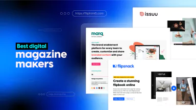
30+ Creative Magazine Layout Ideas to Captivate Your Readers
Published on: May 24, 2022
Last updated: November 20, 2025
We know the pressure. Your clients expect bold creativity, sharp messaging, and flawless visual storytelling—delivered at speed. Whether you’re crafting a pitch deck for a global campaign, an in-house client publication, or a high-converting branded magazine, you don’t have hours to reinvent the wheel with every new layout.
But here’s the thing: good design doesn’t have to start from scratch. And with digital publishing evolving fast, you need to spread ideas that aren’t just pretty. They need to be strategic, interactive, and easy to adapt to each client or campaign.
That’s why we created this guide with magazine ideas to help you deliver impressive editorial content, streamline production, and improve your agency’s creative output.
Before we dive into specific tips, let’s address a common challenge:
Table of contents
What makes a good magazine layout design?
The truth is, great design doesn’t always mean starting from scratch. With the right principles and proven shortcuts, you can simplify your layout process and still deliver standout work that captivates your audience and reflects your brand’s identity.
At the core of every great magazine spread is a strong sense of structure: a thoughtful balance between text, imagery, white space, and visual flow. When these elements work in harmony, the result is a magazine layout that’s not only beautiful but also easy to navigate and engaging to read.
We understand your challenges in creating compelling magazine layouts that captivate readers and convey your brand’s essence. Let’s explore the techniques and creative magazine design ideas that will help you elevate your editorial work, whether designing for clients, campaigns, or internal publications.
5 tips to improve your creative magazine spread designs
This brings us to the first tip, which talks about how you can master this balance for future magazine issues.
1. Design covers that demand attention
Your magazine cover is your first and most powerful hook. In a digital sea of swipeable content, bold design choices are your best chance at stopping the scroll or drawing a reader in from a stand in a showroom, agency pitch, or stakeholder meeting.
Your cover should echo your client’s brand personality, align with your audience’s aspirations, and offer a strong visual cue about what’s inside. Combine bold typography with high-impact imagery to form a visually cohesive, that reflects modern taste.
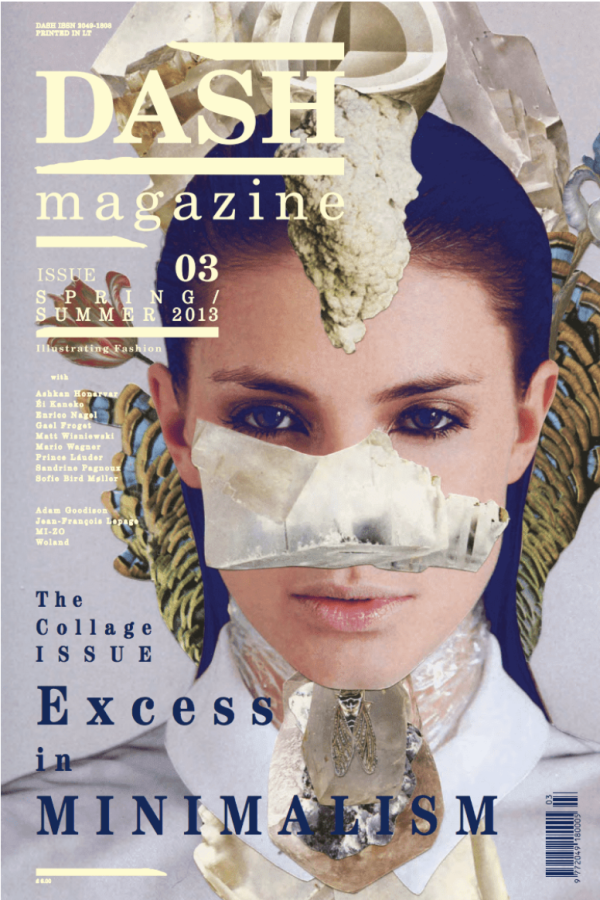
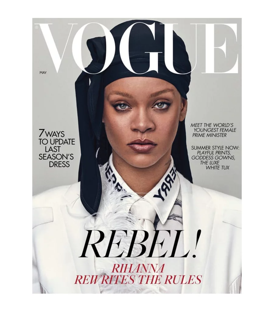
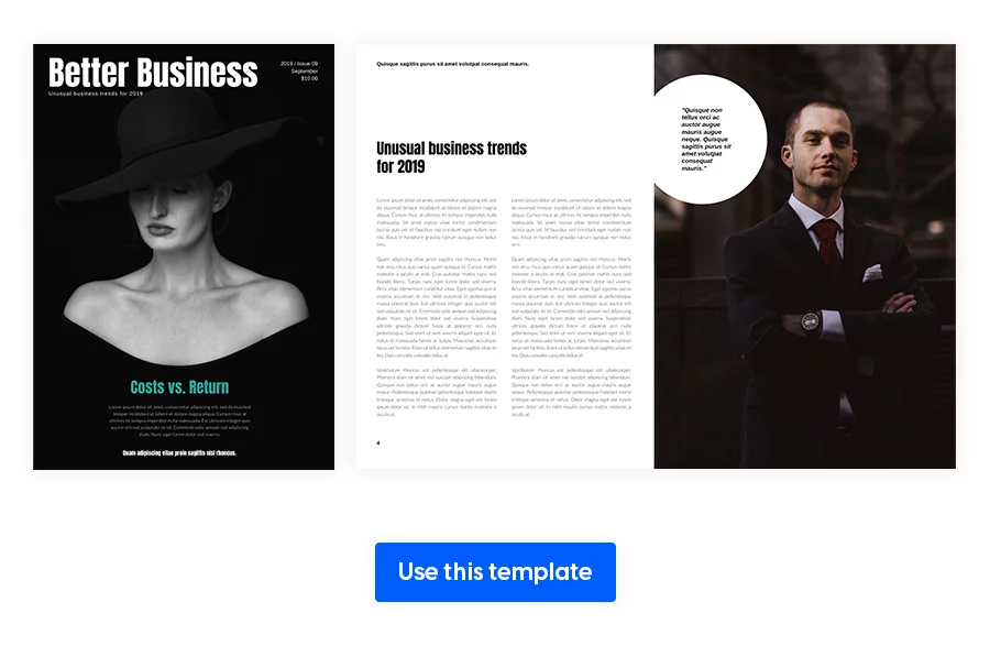
For example, Dash Magazine’s glamorous cover design stays on top of the trend wave via creative image arrangement.
2. Make copy for content and design work as a team
When constructing a magazine page layout, you’ll want to achieve a good balance of white space, photographs, and text. A useful method is to opt for an image with a lot of “empty” or “white” space; space around the topic provides the same goal as white space.
Choose photography that leaves room to play—images with negative space can double as elegant backgrounds while keeping the design clean. Use spacing and alignment to create a visual hierarchy that feels intuitive. Remember, the main image and headline aren’t just focal points—they’re visual entry points that invite readers to engage with the full story.
Whether you’re working on a detailed magazine article or curating a highly visual magazine double-page spread, designing with clarity and breathing room helps ensure the entire layout feels intentional, refined, and easy to navigate.
3. Plan out the contents page
Since no one wants to read lines with long text and no visuals, focus on catching attention without being misleading. Use a gradient if it works well with your magazine style. It’s a great way to draw attention to that spread.
Another idea would be to feature a beautiful image on either side of the two-page spread to give a preview of that month’s focus. For those beautiful visuals, you can even consider using AI images to create striking, on-brand graphics without the need for traditional photoshoots. And of course, you can’t go wrong with columns, which makes everything very well-organized.
4. Add interactions to your magazine
Interactivity in a digital magazine spread transforms static content into an immersive, engaging experience. Instead of simply reading, your audience can click, watch, shop, and explore directly within the layout—whether it’s through embedded videos, clickable CTAs, product tags, or photo slideshows. With platforms like Flipsnack, you can create spreads that don’t just look great; they do more, capturing attention and encouraging action.
For creative agencies, PR teams, and publishers, this means turning your magazine into a dynamic platform for storytelling, brand engagement, and measurable impact. Then, you can check out the statistics section of Flipsnack, and make sure you take advantage of every opportunity to speak your readers’ preferred language.
5. Have a consistent magazine style
When it comes to magazine design, consistency is more than a style choice, and it’s considered a branding strategy.
The most recognizable publications in the world don’t just have compelling content—they have a distinct look and feel that readers remember when it comes to their magazine layout. That visual identity is shaped by three essential elements: fonts, color, and layout style.
Start by choosing fonts that align with your magazine’s personality. Whether elegant and serifed or modern and minimal, typography plays a critical role in tone-setting. Select one or two font pairings and stick to them across spreads, headlines, and body text to keep the design professional and intentional.
Next, remember that with color, less is usually more. Bold choices work well on covers or special features, but too many competing hues across magazine pages can overwhelm the reader. A well-chosen, consistent palette not only supports brand recognition but also helps images and text work together more harmoniously.
Start your digital magazine layout with these 30+ magazine layout templates
Whether you’re building a pitch-perfect publication for a client or launching your agency’s own branded editorial, having access to professionally designed templates gives you a clear creative head start.
That’s why we’ve handpicked 30+ magazine layout templates, categorized by industry, to inspire your next project. From interactive business magazine spreads to creative fashion layouts and one-page editorial designs, these templates showcase a range of styles, tones, and use cases—offering magazine examples and double-page spread examples you can customize for your needs.
Organizations across industries are already using Flipsnack to produce standout digital magazines and promotional materials. For example, the Mastercard Foundation creates interactive newsletters and publications that include branded elements, custom domains, and engaging features like links and GIFs—ideal for sharing their mission-driven work with diverse audiences.
Similarly, XPO Logistics designs sleek, interactive brochures and magazines with embedded videos and links to strengthen their marketing communications across global teams. These examples show just how powerful a professionally designed, interactive magazine can be in both nonprofit and enterprise settings.
Regardless of your audience—B2B, lifestyle, tech, food, or fashion—each template offers a practical example of the best layouts for magazines: balanced structure, strong visual rhythm, and thoughtful storytelling. And when you’re in a creative rut, browsing through magazine theme ideas from different industries can spark fresh ideas fast.
Flipsnack offers a free trial so you can try most premium features. After that, you can stick with the free plan (includes templates) if you only need basic PDF interactivity and plan to create a limited number of flipbooks.
Business Magazine Layout Templates
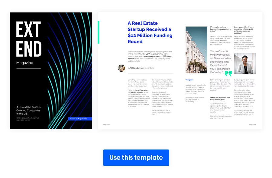
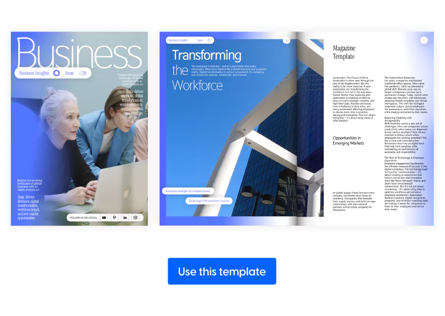
1. Interactive Business Magazine Template
Starting off on a strong note, we have this interactive business magazine template. Have your brand set the tone and start from your most used color palette to remain consistent with the message. Add go-to-page buttons on the contents page, short GIFs or photo slideshows to save space. We can notice that the magazine layout is clean, with plenty of white space to balance out the pictures and text. Try alternating between a light and dark background to create a pleasant dynamic.
2. Digital Business Magazine Template
It’s crucial to plan the viewing direction from the start (usually top left to bottom right) so you don’t overcomplicate the flow. A clean, professional magazine layout designed to communicate trust, expertise, and brand clarity. It features ample white space, balanced typography, and interactive elements like clickable links and embedded media. Ideal for company updates or thought leadership content.
3. Digital Financial Magazine Template
Remember that a good business design starts with a strong brand. This digital financial magazine template shows that you don’t always have to include so many visuals in order to attract the reader’s attention. Instead, you can play with the text angle, narrow text boxes for some articles. You can play around with any elements from your magazine layout that you think would go well with the audience in question.
4. Gray Business Magazine Template
Different text angles presented in this gray business magazine layout are a fun way to add complexity to your layout. Take one more step in this direction and overlap quotes over pictures to create dimension. Even though this is a monochrome theme, you can sparingly use a pop of color for emphasis. In this template, our graphic designer chose to do that with diagrams, but you can add the color wherever you want.
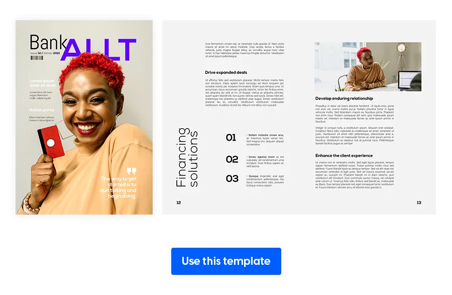
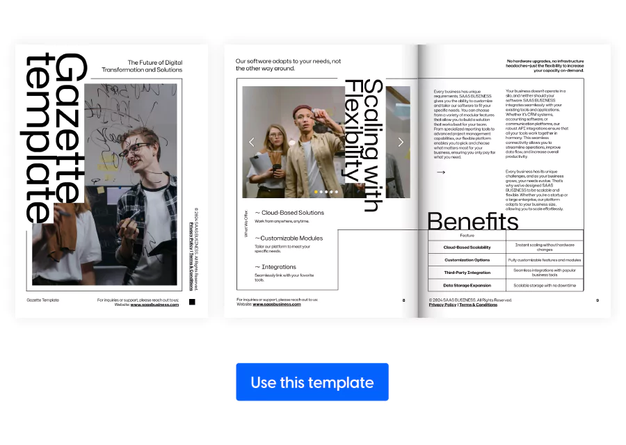
5. Monthly Business Gazette Template
If your organization publishes recurring updates, thought leadership pieces, or internal communications, this magazine page layout is perfect. Its structured layout offers a clean grid system and well-organized sections, making it easy to showcase articles, team updates, or feature stories.
With room for charts, photography, and interactive elements like embedded links or videos, this magazine layout is a great choice for both digital and print formats. This template is perfect for agencies managing multiple client publications or corporate teams looking to maintain consistency across monthly editions.
6. Engaging Business Magazine Template
You can combine a professional structure with dynamic visual storytelling. This two-page spread magazine features bold headlines, modular layouts, and smart use of white space—perfect for highlighting interviews, industry insights, or campaign results. Built with interactivity in mind, you can easily embed links, videos, and clickable calls-to-action to drive engagement.
This template works especially well for marketing teams or communications agencies looking to deliver high-impact publications with ease.
Fashion Magazine Spread Design Templates
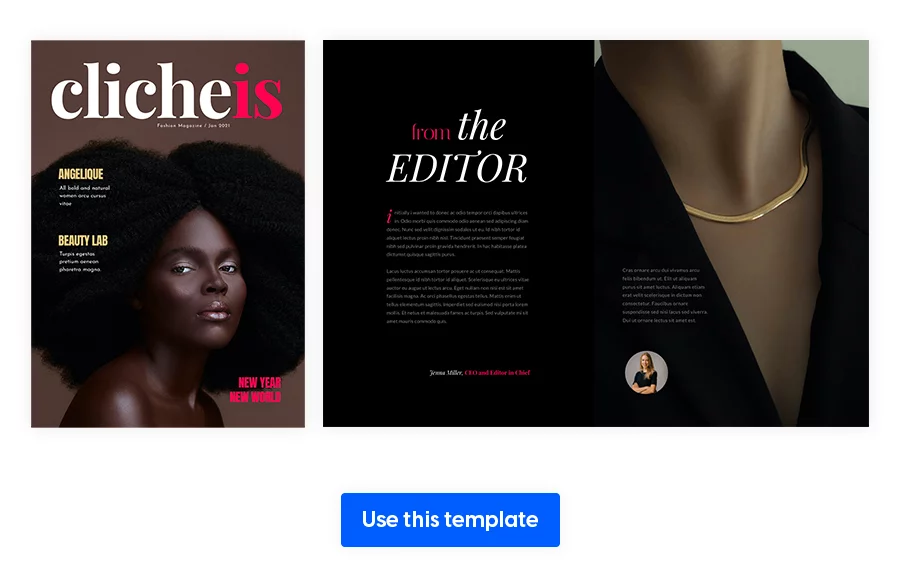
7. Interactive Fashion Magazine Template
Fashion magazines are part of a unique category of their own, with so many colorful and bold design possibilities. This is not the place to be reserved, but to experiment with different patterns and magazine spread layouts. However, try not to overdo it, because too many textures and styles result in utter chaos for your audience.
Make your magazine layout cohesive by choosing a base color palette and having it stand out on every spread, like in our example.
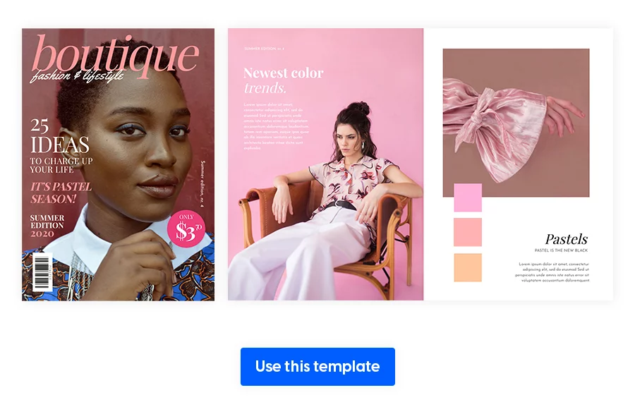
8. Fashion Magazine Design Template
In this next example of a fashion magazine layout, we can notice how well the color palette ties the design. Some shade of pink can be found throughout the magazine, without distracting from the text. That ticks a lot of magazine layout requirements in my book!
If you’re announcing a new collection, you can try showing the color palette next to a piece. It makes the reader understand the creative process better, and it strengthens the connection between you, the designer, and your audience.
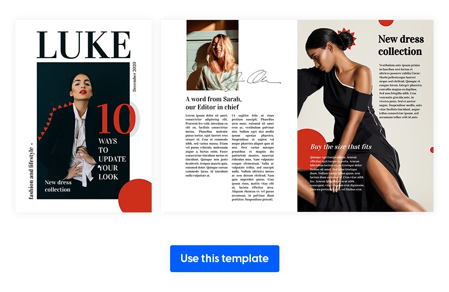
9. Influencer Fashion Magazine Layout
You’ve probably wondered, “How can I make my magazine more attractive?” The answer is interactivity. Upload your pictures, videos, GIFs, and text before making this influencer fashion magazine layout truly your own. Outlining models or featured people is a fun way to add more personality to a magazine double-page spread on fashion.
A step forward would be 3D visuals, which are easier to do than you might think. Simply overlap a headline with your model, like in the example below. And bam, you’ve created that out of the screen effect.
Lifestyle Magazine Layout Examples
10. Interactive Lifestyle Magazine Layout
Depending on your magazine’s style, you can start using the primary color in your cover. It’s a subtle way of offering qualitative design to your readers.
Think in spreads and not pages, to make sure every individual page ties well with what comes before it and after. Always choose the pictures carefully, in order to properly offer a preview of the article before any word has been read.
11. Interactive Lifestyle Magazine Template
This next interactive lifestyle magazine template introduces a new type of interactivity: embeds.
With Flipsnack’s Design Studio, you can embed YouTube videos straight into this magazine. This helps to minimize the external links, which would draw your readers to other pages, creating distractions. Create simple image borders for more elements, providing a different way of presenting visuals across your magazine pages.
12. Digital Interactive Lifestyle Magazine
Try to create a sketch of your magazine layout before getting into the fine-tuning process. You can do so by writing down the contents page and giving a ballpark figure for each article or topic. The interactive elements from this magazine layout help bring the text to life. So, don’t forget about product tags if you’re offering reviews in this digital interactive lifestyle magazine layout.
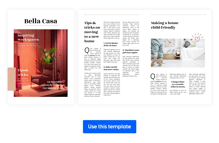
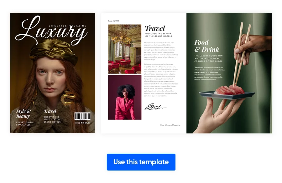
13. Luxury Lifestyle Magazine Template
When we talk about a luxury lifestyle magazine, it’s clear that its readers are interested in luxury experiences and services that complement their lifestyle. Try to meet these standards of your sophisticated consumers by including top-tier destinations, products, and cars.
However, be consistent with the magazine layout you’ve created so far, since that’s familiar to your audience. Remember to take these magazine templates with a pinch of salt, and avoid adding too many new elements at once.
14. Dynamic Lifestyle Magazine Template
Whether you’re producing content for a wellness brand, personal development agency, or creative lifestyle blog, some of the best layouts for magazines are dynamic. Such as this one. Its bold type choices and alternating full-bleed visuals give every spread a lively rhythm, perfect for highlighting features like interviews, trends, or editorial stories.
Use this layout to keep your content visually fluid while maintaining enough white space for readability. It’s especially useful when you want your magazine to feel energetic and fresh, without overwhelming the reader. Add interactive elements like video intros or product tags to increase engagement and create a more immersive experience.
Sports Magazine Layout Design Templates
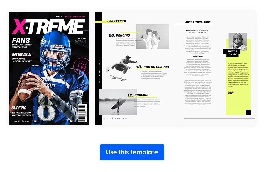
15. Page-Flipping Interactive Sports Magazine Template
Consider relying more on visuals to convey your message, rather than having a lot of text on every spread. Get creative with the contents page to build anticipation for what’s inside the magazine. If your style allows it, you can even use uneven image borders, which are normally used for scrapbooks. The sky’s the limit, so don’t settle for anything mediocre.
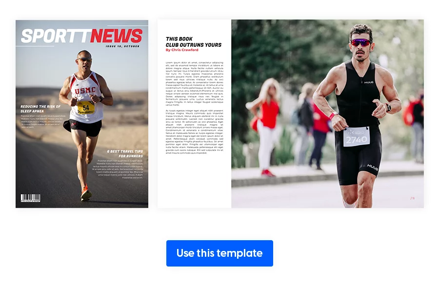
16. Digital Interactive Sports Magazine Layout
To make your magazine easier to flip through, add the essential information in the form of a list. Again, alternating between long-form and short content will have a positive effect on your readers.
Even though it’s a well known and used technique, you can still drag an image over an entire two page spread, leaving just a bit of room for the text. Take a look at this digital interactive sports magazine layout to see how these tips are applied.
Internal Communication Magazine Templates
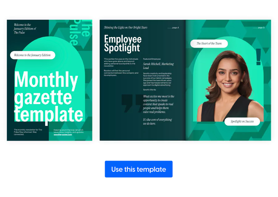
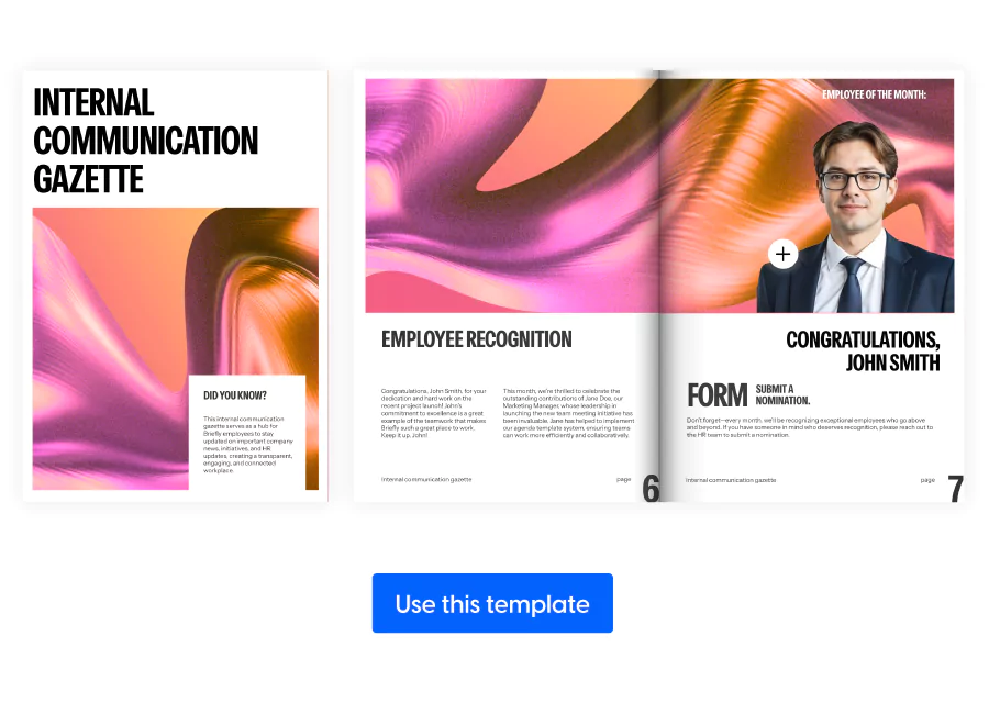
17. Internal Communication Gazette Template
When your company’s internal updates get overlooked, design becomes your ally. This layout offers a fresh, readable format that encourages employees to engage with the content. Use it for leadership messages, company milestones, or team spotlights—delivered in a format that looks as good as it reads.
The intuitive magazine spread creates a visual flow, and with the right touch of branding, your internal comms will feel as intentional as your external ones.
18. Interactive Gazette Design Template
If your HR or comms team manages announcements, policy updates, and employee programs in scattered formats, it’s time to streamline. This interactive magazine design transforms static newsletters into dynamic digital publications.
Embed HR videos, add clickable event sign-ups powered by an online event ticketing software, or link to onboarding resources—all in one cohesive experience that teams can flip through on any device. The result? More visibility and better alignment across departments.
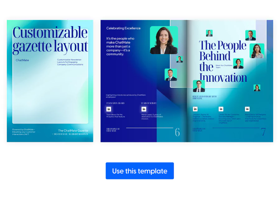
19. Customizable Gazette Layout Template
For businesses that need consistency across global offices or departments, this magazine design idea solves the formatting headache. Its modular structure makes it easy to scale communications while keeping everything aligned with your brand.
Feature quarterly results next to employee achievements, or include interactive charts and surveys to collect feedback instantly. It’s a reliable foundation for delivering clear, professional updates that don’t get lost in the shuffle.
News Magazine Page Layout Templates for Digital Publishing
20. Interactive News Magazine Template
As a news magazine, it’s crucial to inform your readers about all the latest events around the world. But you also need to create a sense of trust with your audience in order to grow it and gain more online visibility. Do this by offering additional information, getting them involved through surveys, focusing on the local angle, and more. Add extra interactivity to encourage them to interact with your magazine, forming an emotional connection.
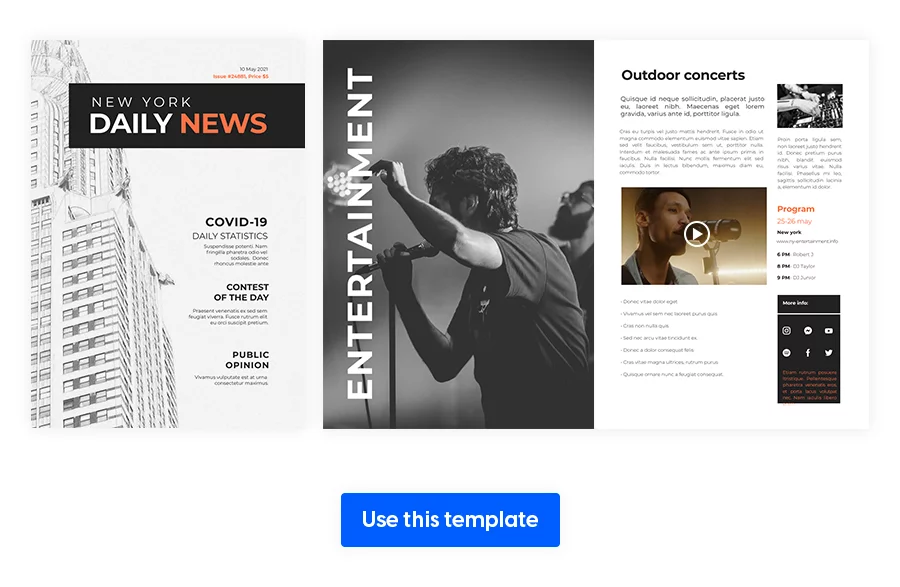
21. News Magazine Design Template
Opt for keeping the magazine relatively short, especially when you also have a news website. You can easily include its link in one of the articles, driving more traffic to your site. Split the paragraphs into little text boxes, with the corresponding subtitle.
Alternate between the light and dark backgrounds and make sure to preview the magazine before sharing it with your readers. Once you establish the primary topics, it’ll be easy to follow the same format for future magazine issues.
Healthcare Magazine Templates for Healthcare Publishing
22. Interactive HIPAA Medical Guide Template
If you’re publishing a recurring digital health publication, you need a flexible structure for organizing multiple types of content—think wellness features, expert interviews, patient testimonials, or campaign spotlights. The layout is approachable but professional, using photo-led pages and white space to ensure readability.

23. Modern HIPAA-Compliant Medical Magazine Template
For healthcare organizations and medical marketing teams that need to communicate sensitive information with clarity, professionalism, and trust. Its clean, structured magazine spread is perfect for showcasing clinical updates, wellness programs, or patient-focused campaigns—all while maintaining a polished brand presence.
With Flipsnack’s secure platform and customizable features, this template helps you stay aligned with HIPAA compliance standards, especially when embedding interactive elements like private video content, appointment links, or downloadable PDFs.
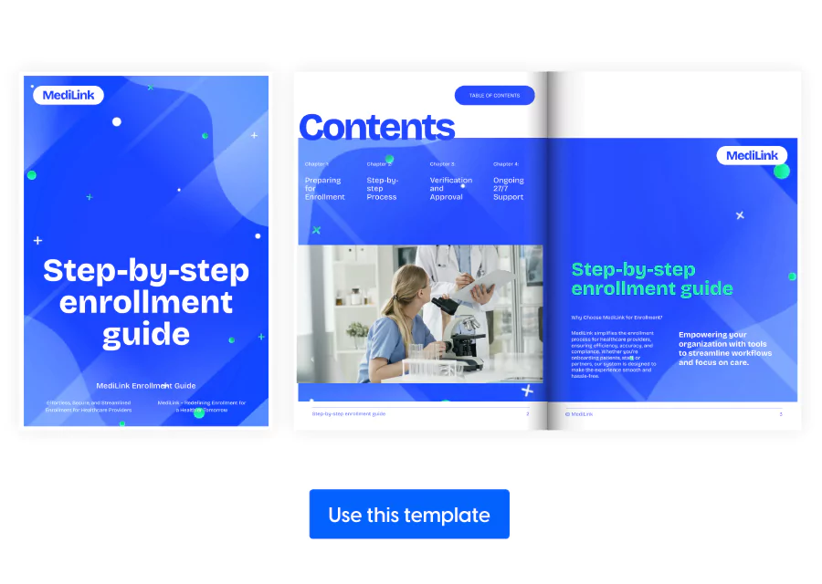
24. HIPAA Compliance Enrollment Guide Template
Healthcare marketers often struggle to make complex, regulation-heavy content engaging and accessible. This clean, professional magazine page layout helps solve that by offering structured sections for articles, charts, and case studies, designed to enhance readability without sacrificing credibility. Add interactive elements like video explainers or downloadable resources to make dense information easier to digest while reinforcing your brand’s authority.
Tech Magazine Layout Design Templates
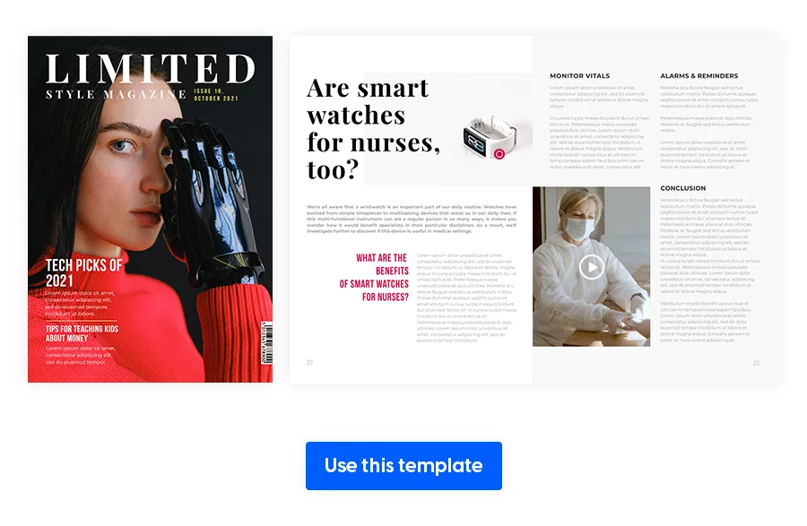
25. Interactive Technology Magazine Template
A good tech magazine layout design relies on the bright, colorful visuals to attract the reader’s attention. More than that, an expert’s opinion or product recommendation weighs a lot more than just the writer in charge of an article of this type.
These certified opinions help grow your authority on a certain tech subject. Include interactivity, such as short videos or GIFs of a product or a shopping area. This allows your readers to create a shopping list directly in your catalog, which they later send to you via a custom email.
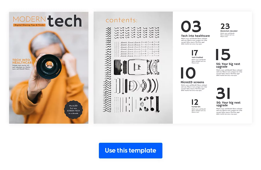
26. Modern Tech Magazine Template
The great news about every type of magazine presented in this article is that you can define for yourself what “modern” or “creative” means. And work towards that personal vision that you have for your magazine. This modern tech magazine template is just an example of what it can be, but the sky is truly the limit. Pick a bigger font size for the contents page to really emphasize the primary topics and create an imaginary white border for every spread.
27. Digital Technology Magazine Layout
At first glance, we notice the balance between the amount of text per page and how much the visual takes up. You can make as much or as little space for either of these elements as you want. Make sure you decide what’s the focus point on each magazine double page spread so it doesn’t get confusing for the reader.
Travel Magazine Spread Templates
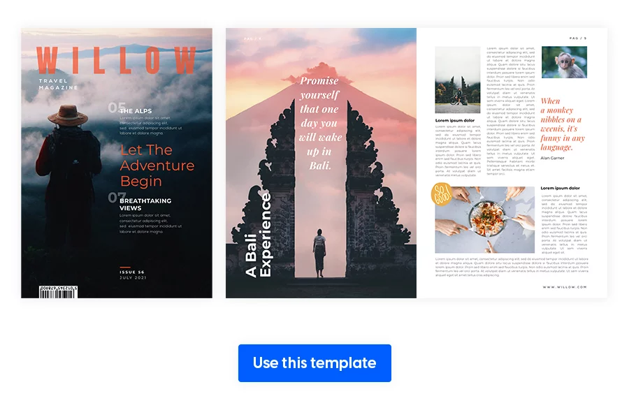
28. Interactive Destination Travel Magazine
Wondering how to organize a magazine layout for this industry? One of the many design challenges is finding the right destination pictures, so that their color doesn’t clash with the other spreads. Once you finish with that part, the text will be easy to fit alongside the images.
I found that inspiration hits when the visuals are picked out, because you don’t have to imagine what text angles to use or where to place it. The pictures are right in front of you.
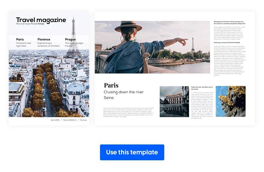
29. Modern Travel Magazine Design
Another great twist you can give to your travel magazine is to show the travel pictures using the bird’s-eye view. This will offer a fresh perspective, almost instantly capturing the reader’s attention. Aerial photography is quite the trend since it absorbs the viewer into whatever destination you choose to feature.
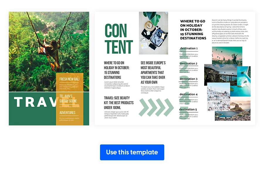
30. Travel Destination Magazine Template
For the sake of keeping everything short and sweet, you can try presenting multiple travel destinations on a single spread. Use photo slideshows to truly sell a specific trip by creating this anticipation.
You can even experiment with different housing layouts, to offer your clients a better perspective on what to expect when renting out an apartment for their holiday. Use photo slideshows to include more pictures or even a 3D virtual tour, if possible.
Final words about magazine spread ideas design
Everything I’ve shared with you, from tips and tricks for a good magazine layout design to a variety of templates, you can apply to your magazine. If I were to summarize the essential information, it would sound like this: pay extra attention to white space, main image, and the headline.
Those are the three features that engage your readers to spend more time on a spread.
Ultimately, a great magazine starts with its layout and finishes with amazingly thought-out content.
From business to fashion to healthcare, crafting an effective magazine page layout is no longer just a creative challenge—it’s a strategic advantage. With the right templates, interactivity, and structure, your team can turn every spread into an opportunity to inform, inspire, and convert.
Whether you’re producing polished client deliverables, high-impact internal publications, or branded editorial content, Flipsnack gives you the flexibility to move fast without sacrificing quality.
Explore our collection of magazine design ideas and magazine examples to find inspiration for your next project. Ultimately, a great magazine starts with its layout and finishes with amazingly thought-out content.