5 useful design tips from the “Father of Grunge” – David Carson
In a time when all designers were respecting the grid, along came a free spirit who wasn’t afraid to break the rules. His name is David Carson and he is one of the fathers of the Grunge art movement. Let’s discover together the philosophy behind Carson’s style and how we can apply it to our contemporary design projects.
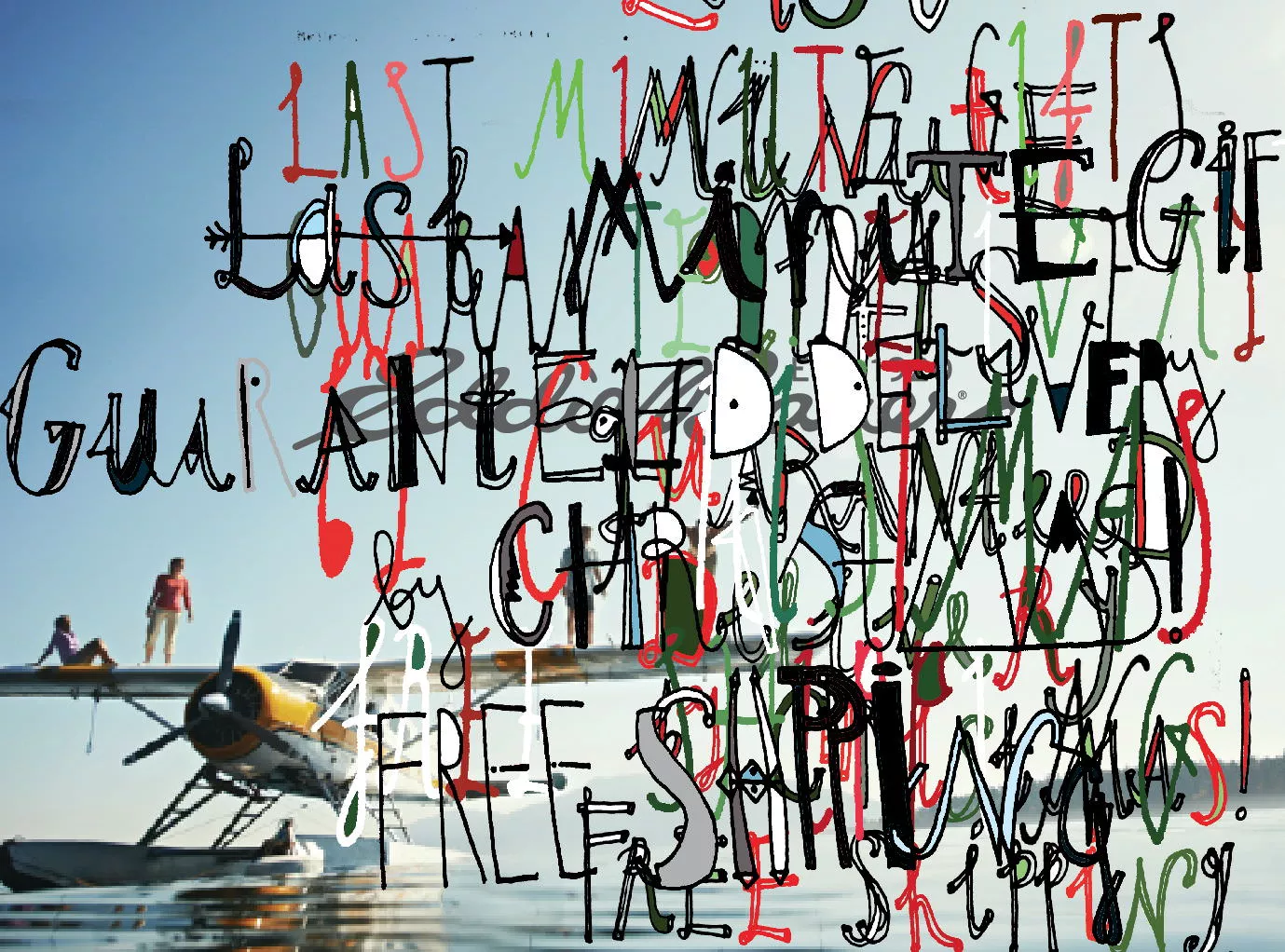
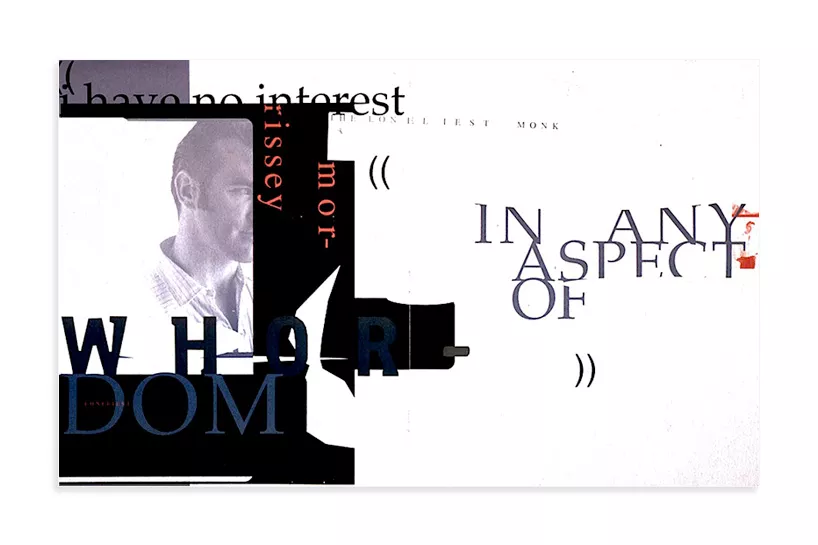
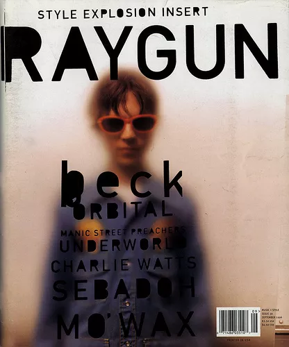
The Grunge style was very popular in the 90’s. It appeared to be a messy and chaotic design, in the way the typography, backgrounds and textures were combined to form posters and magazines. The most iconic example of the Grunge style is the Ray Gun magazine, designed by Carson when he was an art director (1992-1993). David Carson inspired a new generation of young designers to express themselves and experiment with new techniques.
The story of how David Carson became a designer is a bit unusual, since he went to Design School after becoming a designer. He had degree in sociology and a passion for surfing, when he attended a design workshop, which marked a turning point in his career. He worked for many important companies such as Pepsi Cola, Ray Ban, Nike, Microsoft, MTV, Quiksilver. In 2014 Carson won the AIGA Medal for breaking the rules and inspiring a generation.
Here are a few principles that Carson applied to his design projects:
1. Knowing your audience
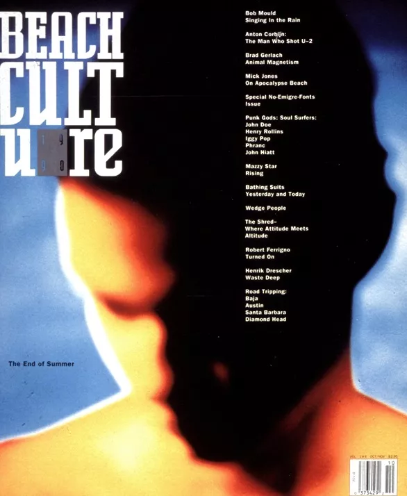
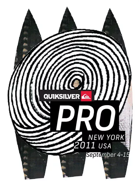
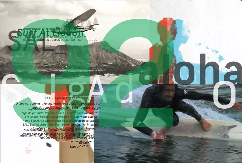
His different backgrounds played an important role in his career. Being a professional surfer himself, he knows the culture of the target audiences of magazines and companies such as Beach Culture and Quicksilver. He understands the needs of the young people who love extreme sports, and he knows how to address them.
2. Emotional typography
Studying sociology gave David Carson insight in understanding people’s emotions. That’s the reason why you’ll probably resonate at an emotional level with his works.
If you take a look at the layouts made by David for the Ray Gun magazine, you’ll notice that all of them typography based and express the unconventional feelings of the 90’s music. He knows that letterforms can communicate a certain emotion, depending of the shape, size, color and how they are placed in the composition. He wanted his work to be connected with people emotionally, because it creates more impact.
3. Visual Communication
When David Carson had to design a layout for a magazine, he first read the article and then tried to visually reproduce the message and recreate the concept. Working at the Ray Gun was a period of visual experimentation, without any rules. He says that he didn’t have to follow any layout or grid guidelines. The designers just let the music communicate the direction of how the magazine looked.
As a useful exercise that will boost your creativity, you should listen to your favorite song and draw what you feel about the song. Feel free to use every technique you want and don’t forget to have fun while doing it.
4. Get inspiration from your daily life
Our environment has a big impact on us, it shapes us as human beings. As a designer it is very important to pour a bit of your personality into your work. By doing that, you’ll improve the design and you’ll also enjoy work more. If you look through David’s works you can notice the influence of the ocean, which played a big part in his life.
A good exercise that David Carson does and you can do as well, is to take photos of your environment and surroundings. You never know what shape or colour from your daily life will inspire you in your next project.
5. Break the rules, but still respect them
The Grunge style is known as a design movement that doesn’t respect any rule of composition. Even Carson admits that his design is experimental, personal and intuitive and it has nothing to do with formal design. But if you look closely at Grunge posters you’ll notice some rules of composition and proportion. There is a visible contrast and proportional ratio between elements, type and background.
Now that you know the philosophy behind David Carson’s work don’t hesitate to apply it in your designs. Feel free to add your personal input in every project, because this will shape your style.