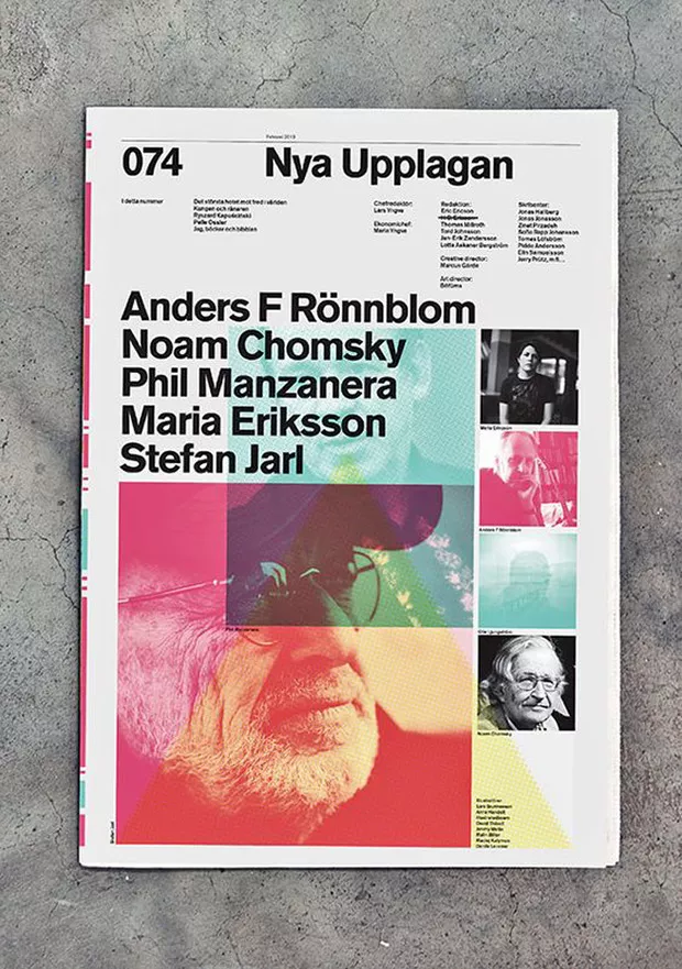
7 tips for a better typography in design projects
Each new design project comes with its own set of questions. Who are we designing for? What do they like? How can we connect with them? How can we get their attention?
While the answer to these questions can be provided through data, interviews and other sources, there is one question that puzzles even the most experienced of designers. What fonts should I use for this particular design?
Because each font has its own unique characteristics and its own personality, choosing the right ones is probably one of the hardest things designers need to master. This is why you need some typography tips.
Designers need to train their eyes to look for the details that matter in a typeface to see if they match your project requirements.
What’s more, choosing the right font is just one step of the way. Combining fonts is even harder, but if done correctly, there is an even higher degree of visual harmony, unity and balance within a design.
So, what can you do to make sure that you choose and pair the right fonts? Read the guidelines below.
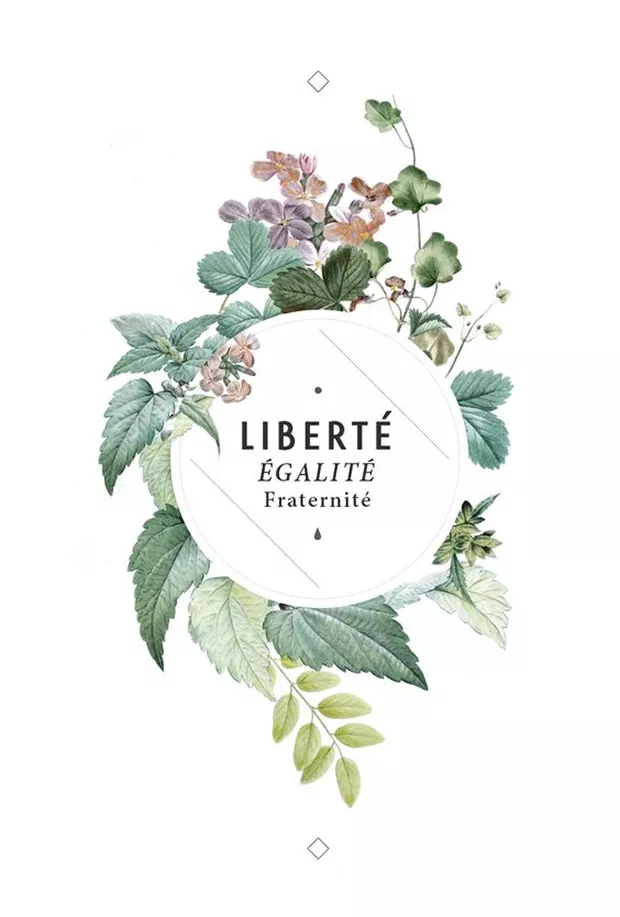
1. Choose fonts that reflect the mood you want to convey
This is the first rule of thumb – choose a font that reflects the personality and the characteristics you want to convey. Like images, fonts have the power to build an image and to strengthen it. The fonts that you choose should reflect the message, the mood and the characteristics you want to convey.
If you’re aiming for a sober, somewhat elevated mood, go for classic fonts – serifs or scripts such as Baskerville or Adobe Garamond. If you want to convey a light, modern look, choose sans serif fonts like Helvetica, Roboto, Futura.
2. Use typography to create contrast
Contrast is one of the basic principles in graphic design. Our eyes are naturally attuned to look for clarity, and contrast is one way to achieve it.
You can create contrast in any number of ways. You can vary the font size and the colors or you can combine different forms, weights and styles.
If you want to combine forms and styles, look for typefaces that are different, but share a few similar characteristics such as the same proportions or the same x-height for lowercase letters. Go for fonts that both contrast and compliment each other at the same time.
Again – keep contrast in mind. If the typefaces you select are too similar, conflict arises because it’s hard to tell the difference between them. This in turn, renders your design confusing.
Here’s how to tell if you have a match. Place the font-faces side by side on your screen, then sit back and squint. If the fonts look basically the same, start looking for fonts that have a greater amount of contrast between them.
Also – don’t over do it. Selecting typefaces that are too different one from the other will create a visual imbalance that works against the overall design. Total opposites cannot help you achieve unity and harmony in your design.

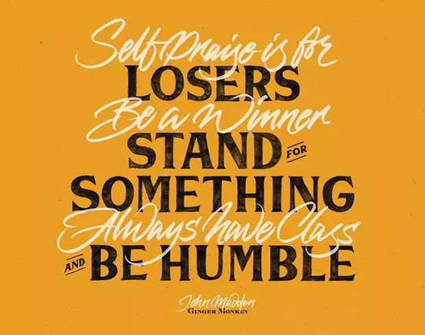
3. Play with font weights
One sure way to achieve a nice, harmonious look for your design is to contrast the overall weight of the fonts. This provides a nice typographic contrast and create a visually pleasing look. Take, for example Didot and Rockwell.
Additionally, you can contrast different weights from the same family – for example bold and regular, regular and thin. This works as fonts that belong to the same family have a high degree of visual compatibility by default, and you’re just adding to that by contrasting width to create a harmonious look.
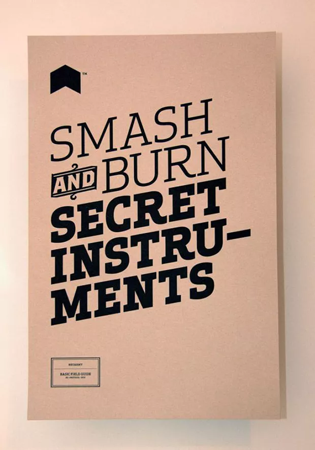
4. Serifs and sans serifs
Pressed with time? Pair a serif with a sans serif typeface – it’s one of the most popular typeface combinations.
Pairing serifs and sans serifs is a classic combination, easy to get right because of there is a good amount of contrast between the letters. Remember to stay away from fonts that have personalities that are much too different – it’s both about looks and personalities.
Also, don’t use fonts from the same classification, but different typeface families as their distinct personalities might not go well combined.
5. Don’t mix moods and personalities
Typefaces have their own mood personality, moulded by the width and the shape of the letters. Mixing moods will result only in confusion and unintended tension. Likewise, two strong personalities only clash in a competition for attention. Besides visual contrast, the fonts you choose also need to match in terms of personality and mood.
If one of your fonts has a strong personality, select a secondary, neutral typeface to reinforce and support it instead of competing with it.
6. Stick to two font families
The key here again is balance, you don’t want to overdo it. Three fonts will make your design look crowded, so stick to two font families at most.
7. Establish a clear hierarchy with typography
Each of the fonts you choose needs to have a clearly assigned role within your design. If viewers have a hard time distinguishing the hierarchy of fonts in your design, they will be confused and won’t read through. Make sure that there is enough variation in size and that each typeface has a specific role assigned for it within your design.
Fonts and typefaces are very powerful tools as they create a distinct, unique design every time. Learn the rules so you know how to break them. And use the force wisely.
Maintaining a specific typography is very important for your brand. So with that in mind, Flipsnack created the typography feature. You can manually set text styles to use for your headers, sub-headers, and paragraphs. You can read more about it here.
We hope this typography tips guide will help you. What other rules should we include in this post? Let us know in comments!