The most creative magazine covers of 2017
This year is fast approaching its end. It’s been excellent for some and it’s also been awful for others, so take your pick. However, there’s one thing that we can all agree on: 2017 has been a year of incredible creativity in the publishing industry. This is why we thought it would be a great idea to make a selection of some of the most creative magazine covers of the year.
January 2017
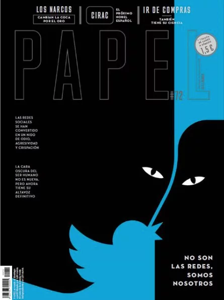
Papel (ES)
The Spanish newspaper El Mundo (now closed) and its Sunday magazine supplement, Papel, have published many creative magazine covers over the years. This one is one of my favorites! The January issue of Papel focuses on the topic of online trolling, and we think the idea was brilliantly depicted by the cover illustration.
February 2017
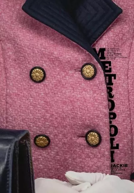
Metropoli (ES)
Metrópoli magazine is the cultural weekly supplement of the same Spanish newspaper. It seems that there’s a lot of creativity in the offices of El Mundo. This creative magazine cover will instantly get noticed because it’s so unusual. It’s a cropped picture of the iconic pink Chanel suit worn by Jackie Kennedy when her husband, President John F. Kennedy was assassinated.
March 2017
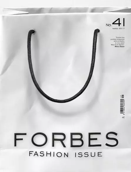
Forbes fashion (IT)
Every fashionista likes shopping for clothes and shoes. The creative mind behind this cover chose to go with an all-white shopping bag to get the attention of readers. We are certain it stood out on the rack, because most magazine covers are a lot more colorful and busy.
April 2017
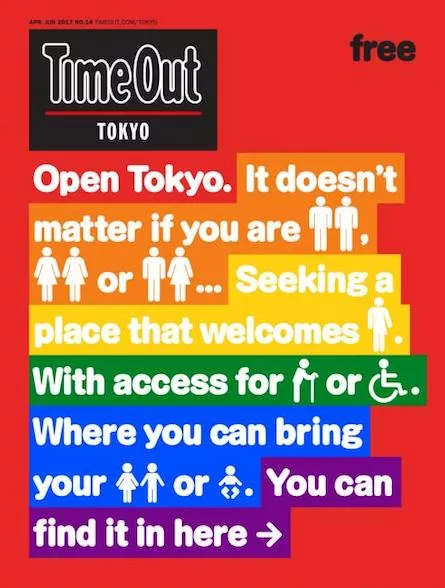
TimeOut (JP)
The April-June issue of TimeOut Tokye is very clear about one thing: it is all about acceptance, addressing some very hot topics, like gender equality, sexual orientation, feminism and disabilities. The cover sends the message across using rainbow colors and several international symbols.
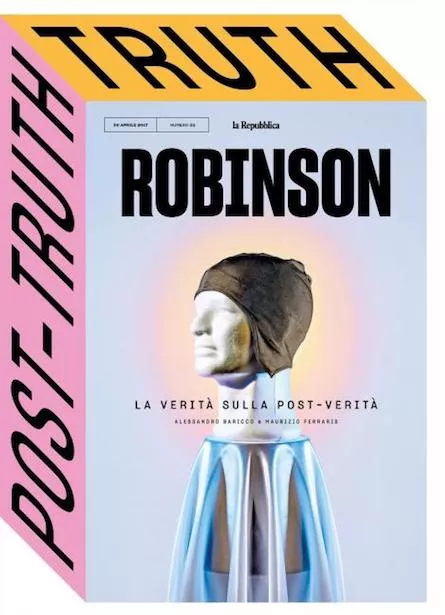
Robinson (IT)
Robinson is the Sunday cultural supplement of La Repubblica, an Italian newspaper. The creative concept belongs to the Design Director Francesco Franchi, who has successfully created the illusion of a 3D cover, using only colors and type.
May 2017
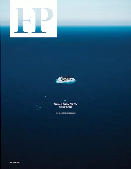
Foreign Policy magazine (US)
A picture is worth 1 000 words, they say. When you take a look at this creative magazine cover it’s hard to argue. This cover uses a compelling photography to raise awareness about the climate change and how catastrophic it can become. It’s impossible to ignore the message.
June 2017
Time (US)
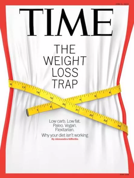
Over the year, Time magazine released many creative covers, so it was difficult to select just one or two. But this cover stood out in a big way. It’s impossible to think about a better way to illustrate the topic of weight loss. The creator of this cover is pure genius.
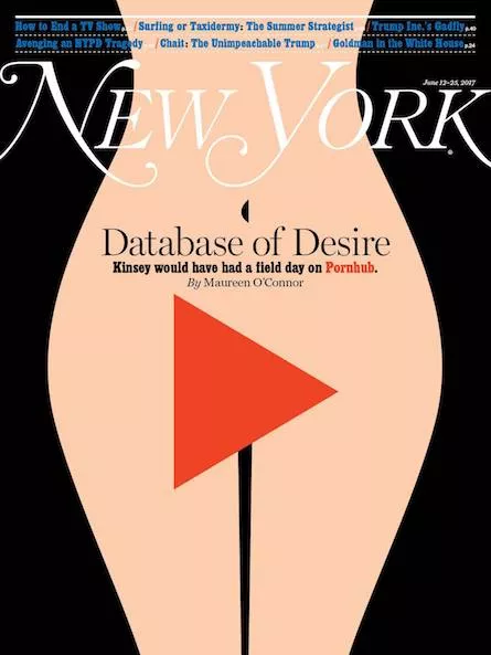
New York magazine (US)
We’ve become used to creative magazine covers for the New York Magazine, but this one deserves a special place. The issue is about Pornhub, and the cover depicts a woman’s silhouette and a play symbol over the crotch area. Without being graphic, the cover design is extremely explicit.
August 2017
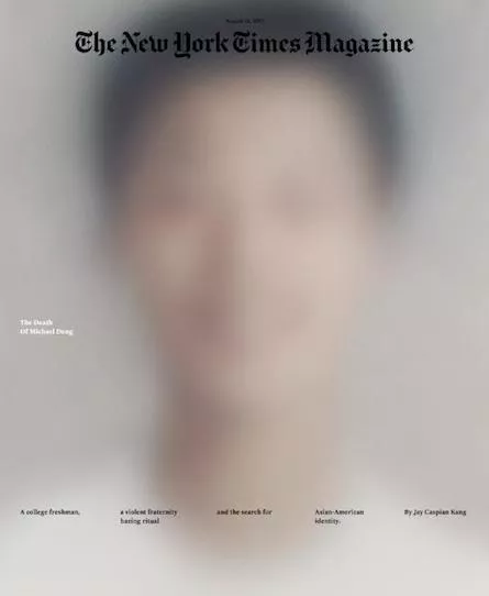
New York Times Mag (US)
This has to be one of the best magazine cover designs of the year. The magazine’s cover story is the death of Michael Deng, a college freshman who underwent a brutal hazing ritual and got killed. Michael’s portrait is extremely blurred to the point of no recognition and there are just a few words on the cover, all about this tragic story.
September 2017
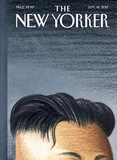
The New Yorker (US)
This cover is entitled “warhead”. The dictionary definition for this word is “the explosive head of a missile, torpedo, or similar weapon”. It’s easy to understand how the designer used this illustration to add a new meaning.
October 2017
Time (US)
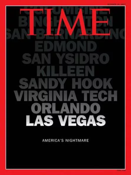
Over the last years, we’ve heard of so many acts of terrorism over America (and over the world as well). The October issue of Time commemorates the victims of these sad sad events. There’s no illustration on the cover because none is needed. It’s just a list of locations where these horrible events happened, against an all-black cover.
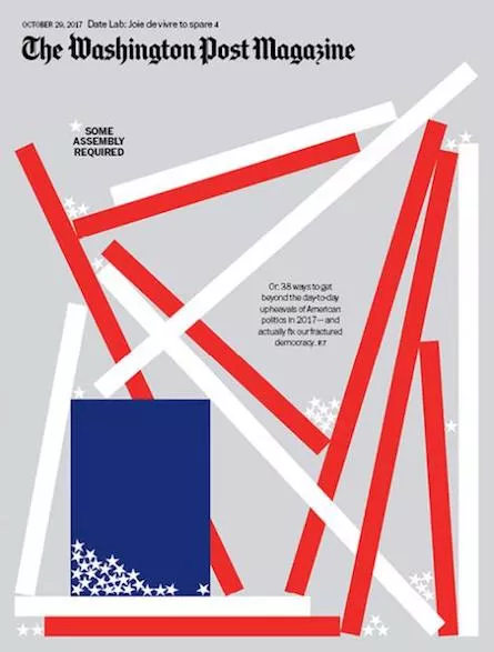
Washington Post (US)
The creative minds of The Washington Post have illustrated the fractured democracy of the American society as a deconstructed American flag. The stripes and stars that make up the flag look dislodged from the flag and tossed to the ground.
November 2017
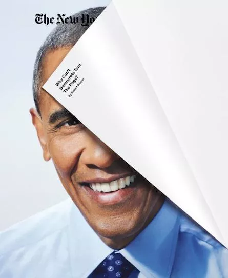
New York Times Magazine (US)
This creative magazine cover plays upon the double meaning of the “page turn”. It suggests democrats to turn the page in a figurative way, by making the cover look as if it is literally turned.
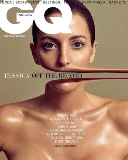
GQ (Portugal)
This has to be one of the best ways to illustrate the meaning of the “Off the record” expression. The designer has removed Jessica’s mouth from her face, suggesting the fact that some parts of her statement are not to be published (or at least I imagine this is the hidden meaning of the cover, because I do not speak Portuguese).
December 2017
Empire (UK)
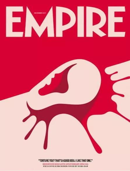
It’s not December yet, but we luckily we have a contender for the title of the most creative cover magazine of December. Empire has shared their December 2017 Reservoir Dogs anniversary magazine cover and I love it! Depending on how you look at it, you can see an ear, or you can see the contour of a woman’s profile.
You can follow some of these publishers on Instagram, to see more of their creative magazine covers and other inspiring designs! Or you could start designing a magazine online yourself.. either from scratch or by choosing one of our professionally designed magazine cover templates.
Which one of these is your favorite magazine cover of the year? Share your opinion in the comments section below!

