Modern Sponsorship Prospectus Templates For Events, Brands, And Media
Published on: August 6, 2019
Last updated: April 22, 2026
What is a business prospectus?
A sponsorship prospectus is a document that presents a partnership opportunity to potential sponsors. It outlines who your audience is, what sponsors receive in return for their investment, and why aligning with your event, platform, or organization is worth their budget.
Unlike a general business prospectus focused on investment or financial returns, a sponsorship prospectus is built around visibility, audience reach, and brand alignment. The goal is not just to inform, it is to make a sponsor confident enough to say yes.

Table of contents
- What is a business prospectus?
- Find how to build a sponsorship prospectus that actually closes deals
- Quick comparison: Choose your ideal sponsorship prospectus template
- What customers say about Flipsnack
- Professional sponsorship prospectus templates to customize
- 1. Virtual Event Sponsorship Prospectus Template
- 2. Conference Sponsorship Prospectus Template
- 3. Corporate Sponsorship Prospectus Template
- 4. Startup Sponsorship Prospectus Template
- 5. Media Sponsorship Prospectus Template
- 6. Sponsorship Prospectus Template for Leadership Events
- 7. Sponsorship Prospectus Template for Brand Partnerships
- 8. Digital Sponsorship Prospectus Template
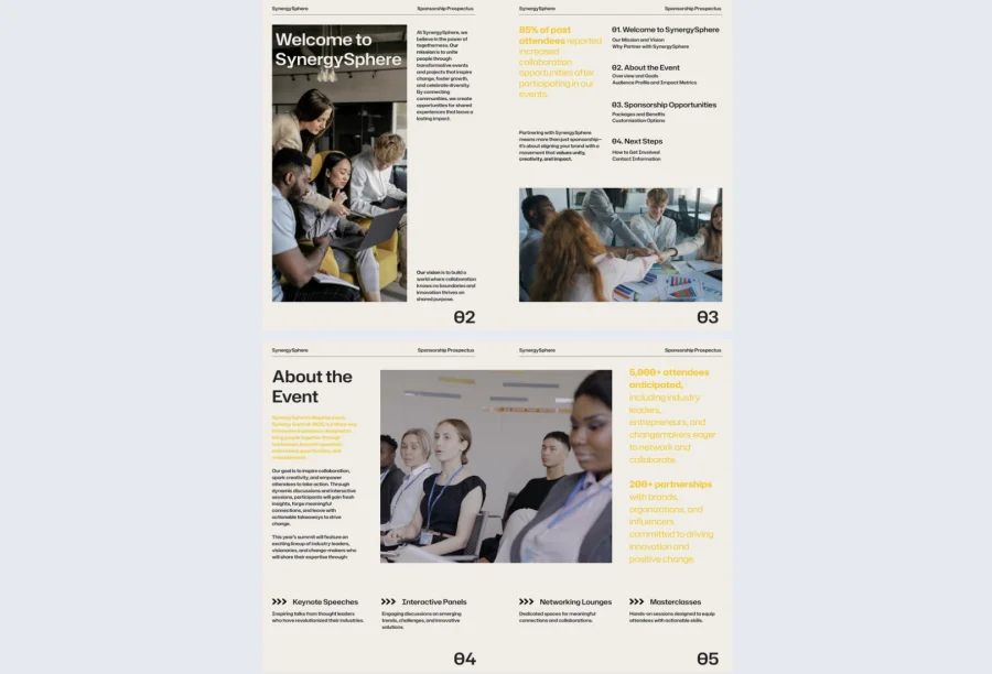
- 9. SynergySphere Sponsorship Prospectus Template
- How to create a sponsorship prospectus with Flipsnack
- Close more sponsorships with a prospectus that works as hard as you do
- Frequently asked questions
Find how to build a sponsorship prospectus that actually closes deals
Most sponsorship prospectuses fail not because the opportunity is weak, but because the document undersells it. A static PDF with a tiered package table and a logo grid is rarely enough to move a decision-maker at a brand with dozens of sponsorship requests landing in their inbox every week. And we, at Flipsnack, can confirm that with our own data.
The difference between a prospectus that gets a response and one that gets filed away comes down to how clearly it communicates value, how easy it is to navigate, and whether it gives sponsors enough confidence to move forward without a lengthy back-and-forth. In this guide, you’ll find 9 professionally designed sponsorship prospectus templates covering virtual events, conferences, media partnerships, brand collaborations, and more, each fully customizable in Flipsnack.
Quick comparison: Choose your ideal sponsorship prospectus template
| Template name | Best for | Main focus | Key benefits |
|---|---|---|---|
| Virtual Event Sponsorship Prospectus | Online summits, webinars, digital conferences | Audience demographics, sponsorship tiers, ROI projections | Interactive format; embed video highlights; shareable as a private or public link |
| Conference Sponsorship Prospectus | Tech summits, leadership forums, industry events | Attendee stats, speaker credentials, tiered sponsor benefits | Fast to customize; trackable per-sponsor links; no design tools required |
| Corporate Sponsorship Prospectus | Brand partnerships with ROI-focused sponsors | Sponsorship tiers, audience insights, measurable returns | Strategic and credible format; fully brandable; interactive alternative to static PDF |
| Startup Sponsorship Prospectus | Early-stage founders pitching corporate partners | Mission, momentum, co-branded partnership opportunities | Frames vision over ad space; editable tiers and ROI projections; fast to deploy |
| Media Sponsorship Prospectus | Branded content, ad packages, media partnerships | Audience energy, campaign previews, advertising ROI | Bold visual design; supports GIFs and video embeds; stands out in crowded inboxes |
| Leadership Event Sponsorship Prospectus | Innovation forums, industry summits, executive events | Attendee profiles, event themes, tiered benefits | Individual trackable links per sponsor; engagement analytics; private or public sharing |
| Brand Partnership Sponsorship Prospectus | Formal brand partnership pitches | Partnership tiers, clickable packages, feedback forms | Interactive elements within a formal structure; trackable links; built-in engagement data |
| Digital Sponsorship Prospectus | Virtual campaigns, hybrid events, online launches | Event dates, packages, audience reach | Bold attention-grabbing design; embeds video and sign-up forms; fast and flexible |
| SynergySphere Sponsorship Prospectus | Multi-day summits, community events, creative workshops | Mission, audience profile, partnership tiers | Supports surveys and video highlights; trackable per-sponsor links; community-focused layout |
What customers say about Flipsnack
The best flipbook tool I have used
Flipsnack is easy to use and offers all the features a small business needs, at a very affordable price. There are plenty of templates to choose from to speed up the project. Each template is easily tailored to your needs. The support is good and fast through the chat function, and they also provide a phone number (infrequently these days) in case you prefer a phone call.
Leonardo Soto, President of SotoNets Cloud Solutions
Reviewed on G2
One of the standout features is their exceptional customer service. I had multiple questions while building my book, and the team was fantastic in providing bespoke support tailored to my needs. They responded quickly, patiently guided me through the process, and ensured I had all the information necessary to create a professional-looking e-book.
Ryan Akram, Administrator
Professional sponsorship prospectus templates to customize
A sponsorship prospectus is only as effective as the impression it makes on first open. The templates below cover the full range of sponsorship contexts, from virtual events and corporate partnerships to media deals and community-driven gatherings, each fully customizable in Flipsnack with support for interactive elements, trackable sharing, and real-time updates.
1. Virtual Event Sponsorship Prospectus Template
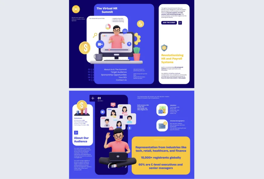
Virtual events have matured significantly, but many sponsorship prospectuses for them still look like they were designed for an in-person conference with a webpage bolted on. This virtual event sponsorship prospectus template is built specifically for online summits, webinars, and digital conferences, with space for audience demographics, digital reach metrics, and tiered sponsor packages that reflect the actual value of a virtual audience.
Best for: Event organizers running online or hybrid summits who need a prospectus that communicates the scale and engagement of a virtual audience as credibly as an in-person event would.
Real-world application: One of the latest Flipsnack customers is an event team running a 3,000-attendee virtual industry summit that used this template to replace a slide deck they had been repurposing for two years. Embedding a highlight reel from the previous event directly inside the prospectus gave sponsors visual proof of audience engagement before any call, and per-sponsor trackable links told the team which prospects had opened it and when — making follow-up conversations significantly more targeted.
Add event highlight videos, embed clickable sponsor tier breakdowns, and use Flipsnack’s statistics to track exactly how each prospect is engaging with the document before you pick up the phone.
Common mistake to avoid: Don’t present virtual audience metrics without context. A raw attendee number means little to a sponsor without engagement rates, session completion data, or geographic breakdown. Show the quality of the audience, not just the size.

2. Conference Sponsorship Prospectus Template
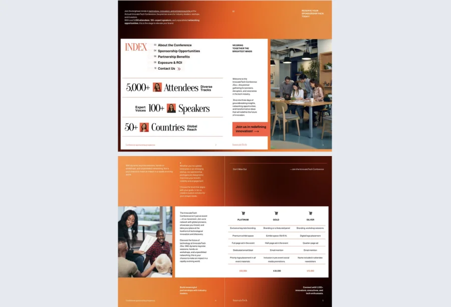
Conference sponsorship decisions are rarely made by one person, and they rarely happen after a single document review. This conference sponsorship prospectus template is built to make that internal championing process easier — giving the person who received your prospectus everything they need to present it convincingly to their own leadership without additional formatting work.
Best for: Event organizers running tech summits, leadership forums, or global industry conferences who are competing against multiple sponsorship requests from comparable events simultaneously.
Real-world application: One of the latest Flipsnack customers is a conference organizer at a 2,500-attendee annual industry event who used this template to standardize their sponsorship outreach for the first time. Shortlisting from prospective sponsors improved after switching to a structured interactive format, with several sponsors citing the clarity of the tiered benefits breakdown as the reason they progressed to a negotiation call.
Include attendee statistics, speaker credentials, and exposure opportunities in clearly structured sections. Generate individual trackable links for each prospect using Flipsnack’s sharing features so you know exactly who has engaged and where they spent the most time.

Common mistake to avoid: Don’t bury your headline number. The total expected attendance, the caliber of your keynote speakers, or the seniority level of your audience should be front and center. If a sponsor has to read three pages to find the most compelling data point, they may not get that far.
3. Corporate Sponsorship Prospectus Template
Corporate sponsors evaluate sponsorship opportunities the same way they evaluate any marketing investment — by the numbers, the strategic fit, and the measurability of return. This corporate sponsorship prospectus template is built for teams pitching to brand managers and marketing directors who need a clear, data-backed case before taking anything to their CMO.
Best for: Organizations pitching to corporate brand partners where the decision-maker needs a professionally structured document that stands up to internal scrutiny and communicates ROI in the language of a marketing budget holder.
Real-world application: One of the latest Flipsnack customers is a non-profit organization that used this template to approach corporate sponsors for their annual flagship event for the first time. Structuring the proposal around measurable brand exposure metrics rather than general goodwill framing resulted in three confirmed corporate sponsors at a higher average contribution than in any previous year.
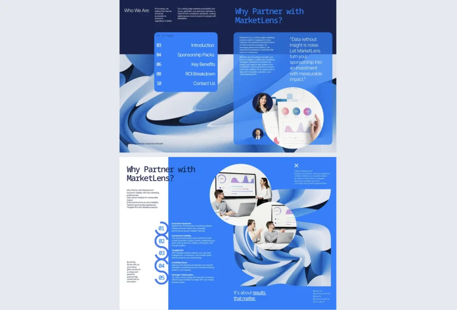
Present sponsorship tiers, audience insights, and ROI breakdowns in clearly structured sections. Use Flipsnack’s privacy options to share tailored versions with different corporate prospects without making commercially sensitive package details publicly accessible.

Common mistake to avoid: Don’t lead with what the sponsor gets before establishing why your audience is worth reaching. Corporate sponsors are buying access to a specific group of people. Lead with the audience profile and let the package benefits follow naturally once you’ve established the value of who will see their brand.
4. Startup Sponsorship Prospectus Template
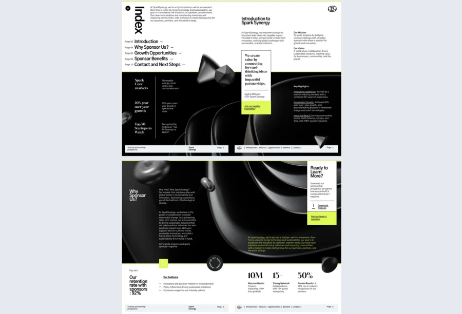
Early-stage companies pitching corporate sponsors face a credibility gap that a poorly structured prospectus can make significantly worse. This startup sponsorship prospectus template is built to close that gap — framing the partnership around mission, momentum, and mutual value rather than just ad placement and logo visibility.
Best for: Early-stage founders and startup event teams pitching corporate partners who want to align with an emerging brand rather than simply buy inventory in an established one.
Real-world application: One of the latest Flipsnack customers is a founder running a community event series who used this template to approach their first corporate sponsor. Framing the proposal around co-creation and early brand alignment rather than traditional sponsorship tiers resulted in a partnership that included both financial support and in-kind product contribution, which the founder credited to the prospectus making the opportunity feel genuinely collaborative rather than transactional.
Add co-branding opportunity sections, embed a short founder video to bring the mission to life, and use Flipsnack’s engagement interactions to include a contact form so interested sponsors can express interest without leaving the document.
Common mistake to avoid: Don’t apologize for being early stage. Sponsors who back early-stage organizations do so because of the upside and the story, not despite the size. Frame your traction and trajectory with confidence and let the prospectus communicate ambition clearly.

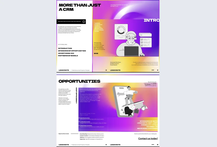
5. Media Sponsorship Prospectus Template
Media sponsorship pitches compete in a crowded space where every publisher, podcast, and platform is vying for the same brand budgets. This media sponsorship prospectus template is built to stand out — with a bold, gradient-driven design and full support for embedded campaign previews, audience data, and interactive content that feels more like a media kit than a PDF.
Best for: Media companies, publishers, podcasters, and content platforms pitching branded content deals or advertising partnerships to marketing teams who receive dozens of sponsorship requests a week.
Real-world application: One of the latest Flipsnack customers is a digital media brand that used this template to pitch an integrated content partnership to three consumer brands simultaneously. Embedding campaign preview videos and audience demographic breakdowns directly inside the prospectus gave each brand enough context to evaluate fit independently, and the media team used per-link tracking to identify which brand had engaged most deeply before prioritizing their follow-up.
Add GIFs of past campaign work, embed audience analytics visuals, and use Flipsnack’s branding customization to ensure the prospectus itself demonstrates the same creative quality as the content you are selling.
Common mistake to avoid: Don’t present media sponsorship packages as fixed inventory. Modern media buyers want flexibility and co-creation. Frame your packages as starting points for a conversation rather than line items on a rate card, and make it easy for them to indicate interest in specific formats directly inside the document.

6. Sponsorship Prospectus Template for Leadership Events
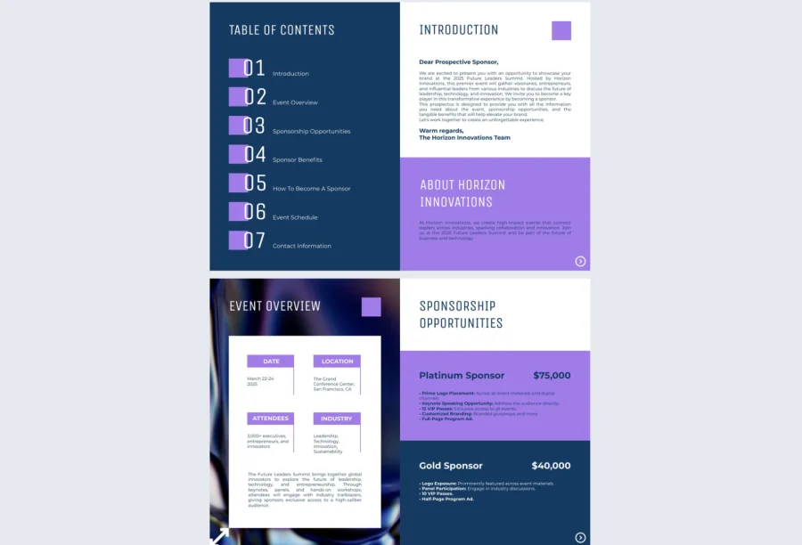
Leadership and innovation events attract a senior audience — which is precisely what makes them attractive to sponsors and precisely why the prospectus needs to reflect that caliber from the first page. This sponsorship prospectus template for leadership events gives organizers a clean, credible format for presenting attendee profiles, event themes, and tiered benefits to sponsors who are evaluating executive-level brand alignment.
Best for: Organizers running leadership forums, innovation summits, and executive-focused industry events where the seniority of the audience is the primary sponsorship value proposition.
Real-world application: One of the latest Flipsnack customers is an event team running an annual C-suite leadership forum that used this template to approach sponsors for the first time with a fully structured prospectus rather than an informal email with an attached PDF. Response rates from prospective sponsors improved significantly, and the team credited the document’s clarity and professional format with shortening the negotiation timeline considerably.
Send individual trackable links to each sponsor prospect and use Flipsnack’s statistics to see who opened, how long they spent on each section, and what they clicked — giving you sharper intelligence before every follow-up conversation.
Common mistake to avoid: Don’t overload a leadership event prospectus with operational detail. Senior sponsors want to understand the audience, the brand alignment, and the return. Save logistics and production detail for the contract stage and keep the prospectus focused on strategic value.

7. Sponsorship Prospectus Template for Brand Partnerships
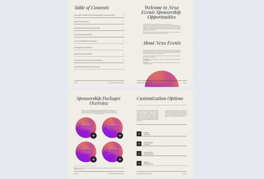
Some sponsors still expect to receive a PDF, and there is nothing wrong with meeting that expectation — as long as the document does more than a static PDF ever could. This sponsorship prospectus template for brand partnerships has the formal structure and professional tone that corporate partners expect, with the interactivity and engagement tracking that gives your team a significant advantage after the document is sent.
Best for: Organizations pitching formal brand partnership agreements to established companies where the prospectus needs to feel structured and credible while still standing out from the stack of PDFs a brand manager reviews each week.
Real-world application: One of the latest Flipsnack customers is a sports organization that used this template to approach five brand partners simultaneously for a season-long sponsorship program. Adding clickable package tiers and an embedded feedback form meant interested partners could indicate their preferred package directly inside the document, which the team used to enter every follow-up call already knowing which tier the partner was considering.
Add interactive poll questions, clickable package comparisons, and embedded feedback forms using Flipsnack’s engagement interactions. Generate individual trackable links for each prospect so you know exactly who has reviewed your proposal and what they engaged with most.

Common mistake to avoid: Don’t make the package tiers the first thing a sponsor sees. Brand partners need to understand why your audience matters to them before they evaluate what they are buying. Lead with audience alignment, then present the packages once you have established the case for the partnership.
8. Digital Sponsorship Prospectus Template
For virtual campaigns, hybrid events, and online launches, the sponsorship prospectus needs to work as hard digitally as the event itself. This digital sponsorship prospectus template gives marketers and event teams a bold, structured format that communicates digital reach and online audience value in a way that a traditional event prospectus simply was not built to do.
Best for: Marketing teams and event organizers running virtual or hybrid events who need a prospectus that frames digital audience metrics as confidently as a live event prospectus would frame a room count.
Real-world application: One of the latest Flipsnack customers is a marketing team running a hybrid product launch event that used this template to approach digital-first brand sponsors. The bold visual format and embedded interactive elements made the prospectus feel native to a digital context, and the team used Flipsnack’s collaboration features to get internal sign-off from legal and brand teams before sharing externally without a single email chain.
Outline event dates and digital reach clearly up front, embed video previews of past events or campaign work, and add clickable sign-up forms so interested sponsors can register intent directly inside the document.
Common mistake to avoid: Don’t present digital metrics without translating them into business value. Session views, email open rates, and social impressions are data points. What a sponsor wants to understand is how those numbers translate into brand exposure for a specific type of buyer. Make that connection explicit.

9. SynergySphere Sponsorship Prospectus Template
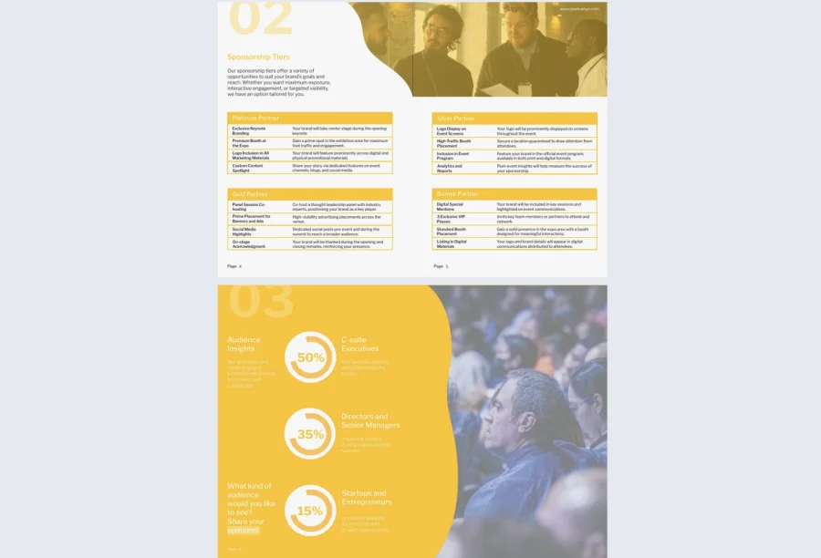
Community-driven events have a sponsorship value proposition that is genuinely different from traditional conferences or media placements. But only if the prospectus communicates it clearly. This SynergySphere sponsorship prospectus template gives organizers of multi-day summits, creative workshops, and diversity-focused gatherings a format that leads with mission and community before presenting the commercial case.
Best for: Organizers of community-driven events, innovation gatherings, and diversity-focused summits where the cultural alignment between the sponsor and the audience is as important as the reach metrics.
Real-world application: One of the latest Flipsnack customers is an organization running an annual multi-day summit focused on underrepresented founders that used this template to approach sponsors for whom community alignment was a stated priority. Leading with the audience story and mission before presenting the commercial tiers resulted in two sponsors increasing their initial package commitment after reviewing the prospectus, citing the strength of the community narrative as the deciding factor.
Embed survey interactions so sponsors can indicate areas of interest before any call, add video highlights from previous editions to bring the community experience to life, and use Flipsnack’s privacy options to share tailored versions with different sponsor categories without exposing full commercial terms publicly.
Common mistake to avoid: Don’t bury the mission in the introduction and then pivot immediately to packages. For community events, the mission is the product. Sponsors who are the right fit will lean in when they understand who the community is and why it matters — keep that thread running throughout the entire document, not just the opening paragraph.

How to create a sponsorship prospectus with Flipsnack
Note: You can start with a free trial to explore most premium features. We also have a free plan if you only need basic PDF interactivity and up to three flipbooks.
1. Choose a template that fits your sponsorship context
Identify who you are pitching and what the core value proposition is. A corporate brand partnership needs a different structure than a community event sponsorship or a media content deal. Browse the templates above and pick the one that best matches your audience type and sponsor profile.
Already have an existing prospectus? Upload it directly into Flipsnack as a PDF and enhance it with interactivity without rebuilding from scratch.
2. Customize with your content, branding, and data
Open your chosen template in Flipsnack’s Design Studio and replace placeholder content with your own. Everything is editable directly in the browser with no design experience required:
- Add your event name, audience metrics, and sponsorship tiers
- Upload your logo and apply your brand colors
- Adjust typography and layout to match your visual identity
3. Add interactive elements
This is where a Flipsnack prospectus pulls ahead of a static PDF. Consider adding:
- Embedded highlight videos from previous events
- Clickable package tier buttons linking to inquiry forms
- Photo slideshows of past sponsor activations
- Contact forms so sponsors can express interest without leaving the document
Every element you add reduces the friction between reading and responding.
4. Set up trackable links for each sponsor
Before sending, generate individual trackable links for each prospect using Flipsnack’s sharing features. This gives you visibility into who opened the prospectus, how long they spent on each section, and what they clicked — making every follow-up conversation sharper and more targeted.
5. Send and follow up with data, not guesswork
Share via direct link, embed in an email, or include in an outreach sequence. Before each follow-up call, check your analytics dashboard:
- If a sponsor spent time on the tiered packages section, lead with that conversation
- If they opened but only read the first two pages, rethink your opening for the next prospect
- If they clicked the contact form but didn’t submit, follow up directly
Close more sponsorships with a prospectus that works as hard as you do
A sponsorship prospectus that sits unread in someone’s downloads folder is not a prosporship strategy. It is a missed opportunity.
Flipsnack gives you the tools to build a prospectus that sponsors actually engage with — interactive, trackable, and always presenting the most current version of your opportunity.
Choose a template, make it yours, and send something that earns a response.

Frequently asked questions
At minimum: an audience overview, event or platform details, sponsorship tiers with clear benefits for each, ROI or exposure projections, and contact information. The strongest prospectuses also include past event highlights, audience engagement data, and examples of previous sponsor activations. The goal is to give a decision-maker everything they need to say yes without a follow-up call.
Long enough to make a compelling case and no longer. Most effective sponsorship prospectuses run between 8 and 15 pages. If you find yourself going beyond that, the content is likely carrying detail that belongs in a follow-up conversation or a separate rate card rather than the prospectus itself.
No. The core document can stay consistent, but the framing, the highlighted package tier, and the audience alignment angle should be adapted for each prospect. A consumer brand and a B2B software company have entirely different reasons to sponsor the same event. Flipsnack makes it easy to duplicate a template and adjust the content for each audience without rebuilding the design.

thanks for sugg estions, but i really loo ked forward to seeing a finished product
Here you can see more finished products. :)