A walk through the logo history of famous brands
Walking through the logo history of some famous brands is somewhat of a poetic act. Whether we like it or not, some brands are directly responsible for what we perceive today as pop culture. Their history is, in part, our history. We associate certain emotions with logos and brands because we get the feeling that they’ve been around forever. I don’t know about you, but I’ve only been along with this world for a few decades.
The logos that I’m about to talk about with you precede me and, in some cases, make me reminisce about past times. Who here doesn’t think about polar bears, Christmas, and a red frenzy when thinking of Coca-Cola? Or at a comfy bed and a good night’s sleep when IKEA shows its head? These were brands created before the dawn of AI and free logo makers but have managed to remain timeless.
In this article, we will take a walk through history to see how today’s logos used to look. We take some of them for granted, but I promise that some of them will definitely surprise you. All of these brands have rebranded and designed new logos. But their original iconic logos tell a great story. Let’s embark on our famous brand’s logo history and see what lessons we can learn from them afterward.
1. Apple
If you were wondering what companies have changed their logo, then look no further than Apple.
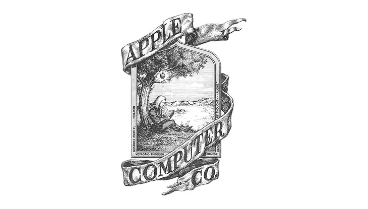
The image above may seem like something you would find in a medieval church, but it is in fact Apple’s first ever logo. Nowadays, logo design such as that is more of a relic. That’s precisely why the logo history of famous brands is fascinating. It gives us a more in-depth insight into what that brand stood and stands for.
Apple’s technological revolution is similar to Newton’s greatest revelation. Sounds a bit arrogant? Whatever your stance may be, we can’t help but admire the idea behind it. The world needed Newton then, and the world needs Apple’s innovation now. Simple yet elegant.
Fast forward more than four decades later, we get this:

The evolution is obvious. Apple’s first logo was more explicit, whereas this one is more abstract. Why? Because Apple only needed, well, the apple. Key concepts such as ‘innovation’ are by now synonymous with their brand. But what was the purpose of this rebranding? It’s threefold:
- Apple wanted something immediately and universally recognizable. Newton is great, but apples are more popular.
- It mirrors their overall design esthetic. Elegance and a premium look and feel are achieved through simplicity.
- The new logo better marks Apple’s status in the tech industry. They’re the challengers of the status quo, and the bite is a direct reference to the biblical Garden of Eden. A beautiful example of brand storytelling!
2. Mozilla Firefox
Maybe Apple’s logo didn’t impress you much. After all, it’s Apple. It only makes sense that they would align their logo branding with one of world history’s greatest minds. Next on our list of famous brands’ logo history is one of our favorite web browsers: Mozilla. For them, 2002 looked something like this:
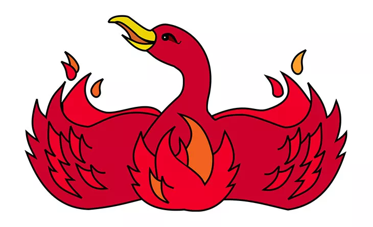
And it transformed into this:
Talk about a facelift! The red Phoenix from above isn’t Dumbledore’s office pet (there’s some Harry Potter trivia for the fans out there). It’s Mozilla’s first logo, and it appeared in 2002. Although we are big fans of the Phoenix and its undying nature, we cannot help but see that their current logo makes much more sense.
Being a web browser, Mozilla wanted to convey this universal, octopus-like reach. Their visual ambassador, the Firefox, conjures up the whole world, conveying the message that:
We all can be connected if we use Mozilla’s web browser!
Well done Mozilla, well done!
3. Shell
One of the most famous brands out there, Shell, has, at the same time, one of the most exciting logo histories.

One might ask himself, How can a seashell represent one of the biggest oil companies out there? I must take a slight historical detour to explain this.
You see, Shell originally started as a trading company specializing in, you guessed it, seashells. That’s why their original logo looks like something from a treasure island. The logo appeared in 1900, and it wasn’t until 1948 that we got to see the now iconic red and yellow colors.

Now we’re on more familiar ground. We have the iconic Shell shape and colors. And speaking of colors, why did the guys at Shell go for red and yellow? We usually associate these types of colors with the food industry, with McDonald’s being a prime example.
Apart from the general color psychology principle, where red and yellow are powerful, energetic colors, there is also one more argument for their choice.
Shell first appeared in California, a region strongly influenced by Hispanic culture. As such, their choice of colors aimed at a sense of solidarity with these ethnic groups. So we have both a psychological argument and a historical one. All the ingredients of an attractive brand story are there.
From 1948 to the present times, Shell’s logo pretty much remained the same.
The only things that changed are the company’s decision to get rid of the name. The logo itself is already firmly embedded in modern times. What’s your immediate reaction when you see a Shell sign? For most of us it’s not the sea, but to check how much gas we have left.
Going down famous brands’ logo history lane, let’s take a look at another popular contender.
4. Pepsi
Speaking of logo evolution, there is no other example quite like Pepsi. The nemesis of Coca-Cola had no less than twelve redesigns! Sure, given their more than hundred years history, that may not seem like a lot. But just take a look at their first logo:
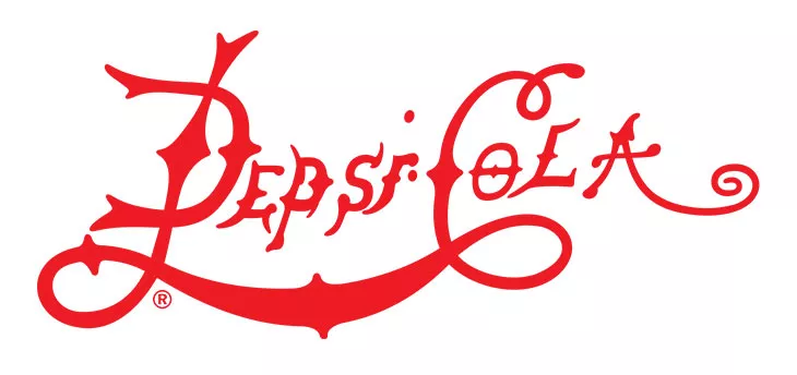
Their first logo debuted back in 1898, and it kinda’ looks like an angrier, metal version of Coca-Cola’s. By the 1940s, the similarities between the two were even more apparent:
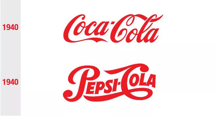
Now that’s what I call a rivalry! The modern one, the one that we all know, has a stronger identity. Pepsi got rid of the classic typographic logo and went for a more abstract, symbolic one.
And talking about symbolism, apart from representing the colors of America’s national flag, it is said that the logo also has a more occult meaning, going as far as to represent Earth’s magnetic fields, the golden ratio, and even Mona Lisa! They sure got their money’s worth out of their designers.
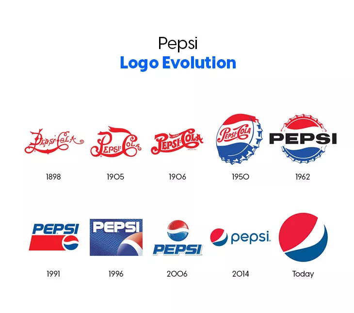
It looks like unraveling Pepsi’s logo symbolism requires somewhat of an archaeological effort, but it’s definitely worth a read for those of you interested in Pepsi’s complete logo history and meaning.
Pepsi’s inception came at a moment where chemistry was seeing unprecedented advancements. Why am I telling you this? Because Pepsi is actually the invention of a pharmacist named Caleb Bradham, who sought to create the world’s first energy drink. It was this ambition that resulted in what is one of today’s most popular beverages.
5. Coca-Cola
We can’t simply talk about Pepsi without mentioning Coca-Cola. Their feud is the beginning of modern advertising. We all remember those commercials where people climb on Cola cans to reach the blessing that is Pepsi.
But Coca-Cola is more than just a multinational beverage titan. Given its cultural status and significance, we can safely say that Coca-Cola is an icon.
Andy Warhol is known for taking mundane, pup-culture significant objects, such as Campbell cans or Cola bottles, and transforming them into art.
Whether or not you agree with his concept of art, that’s entirely up to you. But Andy Warhol and other artists aren’t the only ones responsible for Coca-Cola’s massive success and popularity. Let’s take a look at another example:

Coca-Cola basically popularized trucks even before Jean-Claude Van Dame showed us his flexibility with Volvo. Everyone can learn something about how to build their brand from Coca-Cola.
But why am I mentioning this? This is supposed to be a list of famous brands’ logo history, not marketing strategies. It’s because the logo is an integral part of Coca-Cola’s brand identity. As such, it is amongst the few brands that actually retained much of their original design. Take a look:
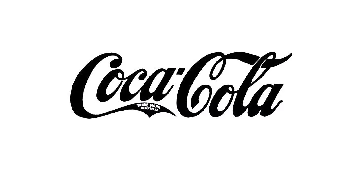
This logo dates back to 1887. The font used is Spencerian Script, and it already contains all the swirls that we usually associate with Coca-Cola. If you are looking for some famous brand logo fonts, then Coca-Cola’s is right down your alley.
Present times
Sure, there are some slight variations, but the overall style remains the same. What their current logo does is add even more dynamic and fluidity to the design. What can we learn from Coca Cola’s logo history?
- That logos are a constant when it comes to building your brand identity
- That typography is an essential graphic design basic when it comes to branding
- That drastic and radical design changes aren’t always necessary
The Coca-Cola logo is too well embedded in today’s pop culture for the company to simply change it. The brand, together with its logo, started the advertising revolution that today we take for granted. For Coca-Cola to change its logo would mean a complete shift in their overall strategy and culture.
The key takeaway? What Coca-Cola’s logo teaches us is that a logo rebranding usually occurs when there is an important shift in the overall marketing strategy. If your logo has reached icon status, then a change could be actually detrimental.
6. Nintendo

Who here thinks that Nintendo’s first logo looks like Marlboro’s? Originally Nintendo started out as a manufacturer of handmade playing cards. The logo kinda makes more sense now.
The kanji symbol spelling represents, in order, nin, ten, do. It is generally considered that Nintendo means “Leave luck to Heaven,” but that is historically and syntactically debatable.
Nevertheless, what caught our attention was the evolution of this famous brand’s logo. Their first logo debuted back in 1889 and, by most accounts, is nowadays nearly forgotten. The current one is the one we associate with the Japanese company.
There is an immediate difference between the two. Still simple in design, the current version is more universally understandable. For one, the ditching of kanji symbols means that more people can read the text. What are the principles behind Nintendo’s logo’s design?
- Universality
- Simplicity
- Effectiveness
Those three are the key factors behind any successful logo. Nintendo borrows the colors from Coca-Cola, which, in color psychology, express energy, action, youthfulness, and purity. Given that Nintendo is a console manufacturer, their choice of colors couldn’t be more inspired.
Let’s pause for a moment
Before going on with our logo history, let’s take a step back and see if we can outline the general direction these brands have taken to redesign their logos.
If you were to take a wild shot in the dark and name one defining characteristic of any famous brand’s logo, what would it be? I’ll go with simplicity.
All of the above examples seem to prove this one principle of design. That a logo must be eye-catching and immediately recognizable. How do you achieve this? Your safest bet is to make it as symbolic as possible. And how do you do that? By simplifying your design.
A convoluted masterpiece, such as Apple’s first logo, may be nice enough to hang on a wall, but it has a mortal flaw: distance! You want your logo to be recognized from afar. Not only that, but your logo must also emphasize the philosophy behind your brand. A beautiful house is worthless if you can’t live in it, right? The same goes for logos. Every design must serve your brand identity in order to be relevant.
So, to summarize, a logo must necessarily be:
- Recognizable
- Symbolic
- Unique
- Relevant
Moving on,
7. Levi’s
There are few clothing items as reliable as jeans. When you learn that even two horses pulling in different directions can’t rip them apart, that almost adds them a mystical attribute of durability. I’m talking about the famous Levi’s jeans logo:
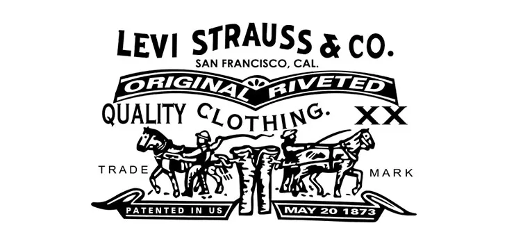
Granted, it’s not their first crack at logo making, but it’s definitely their first more relevant one. It is so relevant, in fact, that although the primary logo has changed dramatically over the years, this old one still holds its place in their current branding.
Although far too detailed for today’s standards, Levi’s had one thing in mind with this design: to promote their products’ durability.
We know that jeans were mainly associated with blue-collar jobs, particularly mining, so durability was a key aspect. As time passed and jeans became more of a fashion piece, Levi’s also turned their attention towards a more minimalist approach. Today’s clothing brand logo looks like this:
That bat wing formed underneath the Levi’s brand isn’t a reference to Batman, but to the stitches we find on the back pockets of jeans. The meaning? Levi’s not only produces denim clothing, they want us to identify denim with them.
But as I said, the original design still remains an integral part of their branding and can still be found on the back of their jeans or within their jackets’ interior. This is a classic example of logo updating, more than replacement, a Levi’s 2.0, if you will.
8. Volkswagen
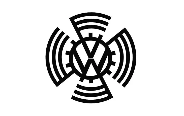
Volkswagen is one of the most popular car manufacturers globally, and its logo is nothing less than, let’s say, ‘interesting.’
Their first logo from the image above appeared in 1937, and we already can see some echoes of what would become a horrific regime.
Volkswagen was meant to be the ‘car of the people.’, and it was commissioned for this purpose by no other than Adolf Hitler. At first, the logo looks more like a radar, but the lines surrounding the now famous VW initials form a swastika upon closer inspection.
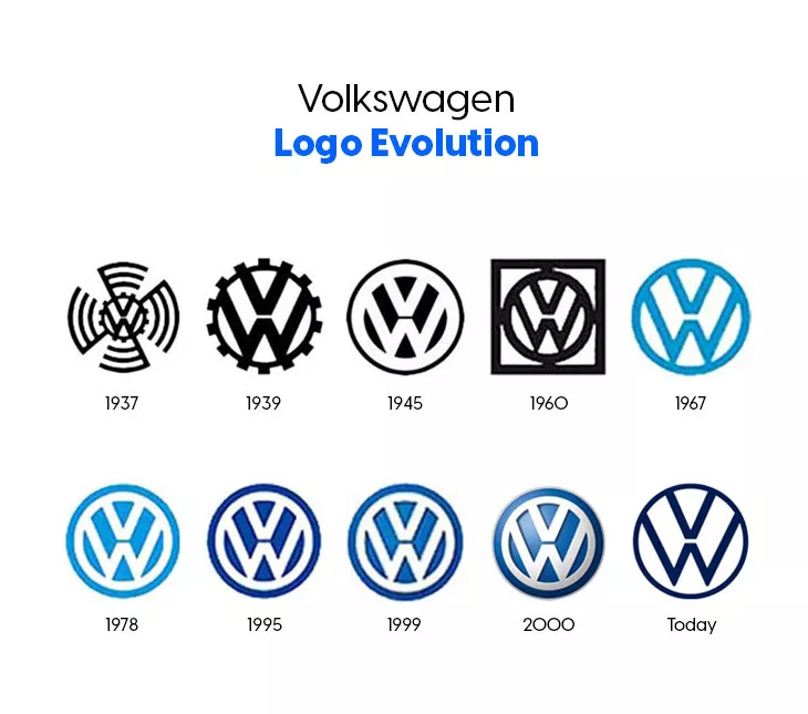
It’s no wonder then that right after the Second World War, the lines surrounding the VW were immediately gotten rid of, forming the basis of their current logo.

Volkswagen’s logo history is amongst the most interesting out there, so I encourage every history buff to definitely give it a read.
9. Nokia
Personally, the Finnish based telecommunications company, Nokia, surprised me the most. It’s not that their first logo is terrible or anything. It’s just…surprising.
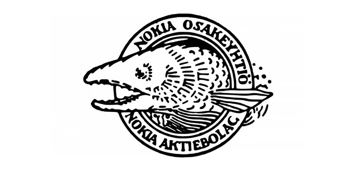
This was Nokia’s first-ever logo, back in 1866. Right, now you may say that a fish has more to do with The Godfather (caught the reference?) than with a telecommunications company. Let me offer you a bit of historical context.
Nokia first started as a pulp processing company. Their factories were based on hydropower resources and their first pulp mill was located near, you guessed it, a river. This river is called Nokianvirta. The guys at Nokia only kept the root of its name, and the rest is history.
As for the fish, well, the explanation is pretty simple, actually. The Nokianvirta river abounds in salmon, hence the design choice. Now let’s take a look at their current logo:
Now this is what I call a spectacular turn of events, or more precisely, of design. What can we learn from Nokia’s fascinating, fish-fueled logo history?
- As with other brands, Nokia has adapted their logo to be more suited for their new industry.
- That times change, and logos have to keep up with it.
- Finally, and I repeat, logos must represent the identity of your brand.
10. Windows
Bill Gates’ brainchild, the operating system we all know and partially love, has also gone through some changes over the years.
Windows is synonymous with the technological revolution. As times and software change, so did its logo. Let’s take a look:
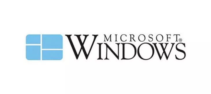
Released back in 1985, their first logo is a literal approach towards their brand name. If technology is like a new lens through which we can see the world, Windows is the provider of these lenses. But when talking about this brand’s famous logo history, this is not the one that comes to mind.
Yes, this is more like it! I fast-forwarded a decade, right up to 1995, because this is the logo encrusted in our collective imagery. These are the colors that shaped the brand’s identity in the ’90s and 2000’s.
What can be said about this logo? The ‘windows’ look more like a flag, and suddenly color appears. Much can be said about design in the ’90s. Let’s just note that straight lines were considered too rigid. The appearance of a flag is there to suggest mobility, motion.
Technology is ever-evolving, and so is Windows. Therefore, rigidity could no longer be the norm for Windows. You can see how big brands are always aligned with the design trends of their period.
But what about the colors? Let’s analyze them one by one, starting with:
Blue
Generally, we associate windows with the sky. Why is this important? We all know the phrase “Sky’s the limit.” and the guys at Windows know it all too well. Technology is limitless, and Windows, like I said, is ever-evolving. But that’s not all.
The psychology of blue is also essential. Otherwise, why would Windows pick it as the theme for their brand? Blue evokes calmness, security, tranquility. How does this translate for the user? It translated into stability. And we all want our operating system to be stable! Fact back then, a fact now!
Red
More aggressive and agitated than blue, Red signals a mental state of alertness. For Windows, red is meant to represent their Office suite. Red talks about the business aspect of the brand.
Green
Nowadays, Green is tied to Xbox, thus the tone of Green falling on fun and entertainment.
Yellow
Yellow is tied to Microsoft Bing and to Windows hardware.
The color theory that you choose for your brand’s design will significantly affect its impact. By choosing complementary colors, Windows impressively showcases all of its major products in the same design. Let’s jump to current times:
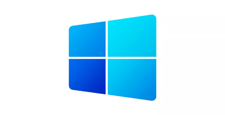
For its new update, the Windows 10X, the company turned back to its original design and kept only blue, albeit with different color versions. Different shades still mean different products, but now they are more explicitly held together under Blue. Products have evolved; now, the main goal is to make people trust that they’re dependable and stable. And that’s what the color blue tries to achieve: security and stability.
Why is the logo history of famous brands important?
We now know that behind every famous brand’s logo, there is a meaning. Well, you probably guessed that yourself, but now you know what that meaning is. Let’s pull it aside for a moment and focus on what we can learn from this evolution, in terms of branding our own materials:
- That brands, just like people, change over time.
- That you must adapt to the current situation
- That you must understand your consumers
Change may not always be right, but nevertheless, it’s a constant. Adapting to it doesn’t necessarily mean you have to make drastic changes. Just look at Coca-Cola. What it means is that you need to keep your options and eyes wide open. Create a customer persona worksheet and go from there. This will help you understand your new consumer market and, in turn, make your narrative more efficient.
Logos are oftentimes your brand’s first interaction with a potential customer. They are the face of your brand. Learn from those famous brands’ logo history and make the changes you consider for your situation. Stay flexible, and let your brand, as well your logo, evolve. It takes time to pull the perfect rabbit from the hat.
What other famous brands drastically changed their logo over the years? Feel free to leave a comment and tell us. Maybe we’ll even write a follow-up article with your suggestions.
