The 10 graphic design basics to get you started
Some of these 10 graphic design basics I’ll highlight in this article will seem very familiar. Straight fundamentals, such as lines and shapes, were first introduced to you in kindergarten. Whereas contrast, alignment, and the sort, came later on when you stumbled upon the glory that is Instagram.
The truth is design is everywhere. And although some of its basic principles may seem intuitive, they are often forgotten. This article will talk about what I consider to be the 10 most fundamental graphic design basics you need to know. But that’s not all. I would also like for you to challenge your notion of design. Why? Because design really is everywhere. From various business cards, the cover of the book you’re reading, to the shape of your monitor or mobile phone.
Everything that has a form has, to some extent, a design. In our day and age, the pursuit of making products, and even reality to some extent, more visually pleasing is boundless. We can find graphic design examples everywhere and at any time. So, what exactly does graphic design mean?
There’s a surprise waiting for you at the end of this top 10 list, an honorable mention definitely worth your attention. Let the games begin!
What is graphic design?
Think of graphic design as a language. It really doesn’t matter if we are talking about a UX designer, a book cover designer, or a web designer. They all try to do the same thing, to communicate.
Graphic design is all about communicating through the means of visual representations. It’s the visual link between the business, brand, or producer, and the consumer. Sure, maybe some branches of graphic design deal more with utility, instead of creative freedom.

UX designers come to mind here. You know, those guys responsible for the interaction between users and products, websites, apps. But their end goal is essentially the same: to beautifully and effectively communicate something. What this ‘something’ is is entirely irrelevant here. Leveraging UI UX design services, for example, can help brands craft intuitive, user-centric designs that seamlessly bridge the gap between functional and visual. What’s relevant is that they all have the same basics in mind. Basics that we’ll discover together.
To summarize:
- Everything around us is, to a certain extent, designed
- All types of designs must adhere to some rules or basics
- Design follows a purpose and is responsible for the visual translation of that purpose.
The 10 graphic design basics you need to know
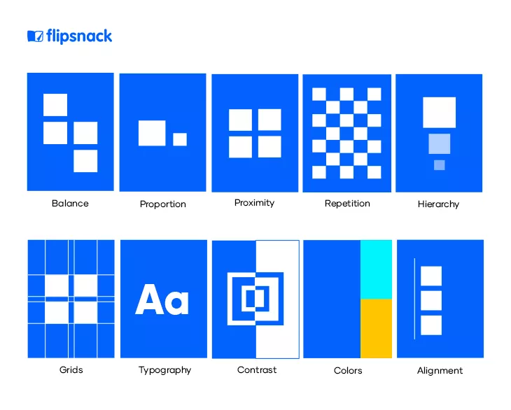
Some cite elements like lines, forms, shapes, etc., as part of their 10 graphic design basics, but in a sense, they are actually more than that. Modern artistic movements, such as abstract expressionism, focused on them because they were at the basis of any possible design or representation. So we must distinguish between elements and basics.
So, what are the basic elements of graphic design?
- Lines – the connection between two or more points
- Shapes – the outline of an object; they can be geometric, natural, or abstract
- Forms – shape plus dimension, a.i. Highlights and shadows
- Color – the quality of an object to reflect light back from itself
- Space – the possible area in which something appears or is constructed
These are the basic elements of graphic design. Every design is built around them, and in this sense, they are prior. That’s why I’ve wanted to mark this distinction from the start. We all know them. What’s important now is to see how, if manipulated, these elements can blossom into any of the following 10 graphic design basics.
1. Alignment
Imagine a working desk on a Friday. Pencils everywhere, notebooks thrown into oblivion, headsets playing a Spotify playlist and a coffee mug silently observing the chaos of the week. A design with no Alignment is the same. By aligning your visual elements into your design you create order.
Alignment can create visual connections between elements, it can balance out your entire design, and also guide the viewer’s eye. People more easily scan a page if the page’s elements are in order. This principle is vital in any design, so make sure to always have it in mind.
2. Balance
What is Balance? Imagine a scale. How do you keep the scale balanced? By placing equal weights on both sides. Balance in graphic design is exactly the same. To make your design feel stable and cohesive, visual elements must be balanced with each other.
Balance creates harmony in your design and makes the whole composition more comfortable to watch and easier to understand.
– Florentina Boc, Graphic Designer at Flipsnack
Equally distributing your visual elements’ weight on both sides of your design is what we call Balance. But that’s not all. Balance can be both symmetrical and asymmetrical.
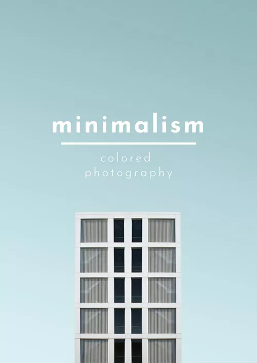
What is symmetrical balance? It’s the equal distribution of visual elements in your design. Imagine you draw a straight vertical line through the middle of your design. Did you get the same number of elements on both sides? Then your design is symmetrically balanced. Take a look at the below Minimalist Photography Magazine Template as an example:
What is asymmetrical balance? It’s the unequal distribution of visual elements in your design. Asymmetry doesn’t mean the absence of balance. It’s a play on object distribution with regards to weight.
Note: It’s critical to always remember that objects carry on a weight. Asymmetry is a little harder to pull off, so reading some more in-depth guides on asymmetrical designs can help you a lot if you’re a beginner.
3. Proportion
Proportion is the name we give to the relationship between objects within a design. Or, to be more precise, it’s the integral relationship of sizes within a composition.
Proportion is balancing each visual element to create a relationship with the whole. It plays a huge role in creating order and hierarchy in your design.
– Cristina Pecherle, Graphic Designer at Flipsnack
A prime example of Proportion comes in the form of architecture. Can you imagine those Greek temple columns? But Proportion is not only to be found in rocks and temples. I’m sure you’re all familiar with this:
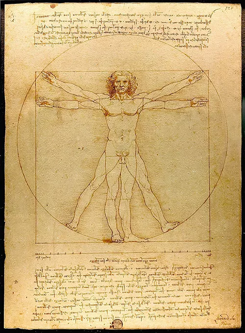
The above image depicts Da Vinci’s Vitruvian Man, a study on the ideal body’s proportions.
Why am I telling you this? To draw attention that as humans, we have an innate relationship with proportions. We are drawn to them because they represent order, stability, reason.
In a nutshell: Proportion is the relationship between the parts and the whole.
4. Proximity
Proximity is yet another relationship between visual elements, but this time referring to the physical distance between them. Basically, the principle of Proximity states that related items must be placed together to create the bigger whole. Take a look at the below example:
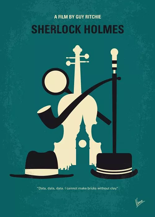
As you can see that in the example above, the visual elements are different. Still, they work together to form the notion of ‘Sherlock Holmes.’ Sure, we can say that they went a bit overboard, pouring everything British into the design, but heck, that’s the beauty of it.
So what does Proximity do? It creates a relationship, a dialogue between visual elements in order to form a composition and convey meaning.
5. Repetition
There isn’t much to be said here, Repetition is the process of repeating one or more elements in your design.
Why should you use Repetition in your designs? Let’s take a slight detour. In poetry, we have something called motif. The motif is the recurrent theme that appears throughout the poem. The same applies to design as well. By repeating certain elements you help your viewer form associations. So, as a graphic design basic, Repetition is not something to be avoided. On the contrary, it’s a graphic design basic that can help in building a brand identity, for instance.
How? By repeating visual elements you convey the idea that those elements are representative and belong to a brand, to a movie, to an idea.
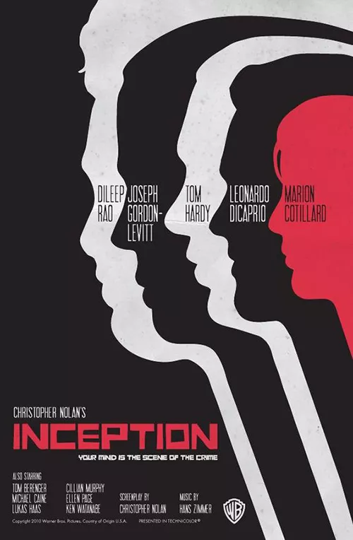
The above is a movie poster for Inception. Yes, the Christopher Nolan film. Now, we are not IMDb, so we’ll not dive into reviewing here. Just take a look at how the same visual element was repeated to convey the film’s idea. For those of you who have seen it, the association is clear. For those who didn’t, it’s 2020. You have no excuse.
6. Hierarchy
You guys still with me? We’re halfway through our 10 graphic design basics, and here is where things start to get interesting. With the first five graphic design principles, you probably figured out that they all roughly refer to Space and Positioning.
Excuse my evil side. I should’ve added a spoiler alert because Hierarchy also refers to Space and Positioning. Hierarchy represents the order in which you add elements to your design.
Why is Hierarchy important? Because it guides the eyes of the viewer in your desired direction. With Hierarchy, your primary responsibility is to set the tone of communication. The title will go first, headings later, asterisks later, and so on.
Remember this meme?
I know, it’s annoying. Many keyboards and monitors tragically lost their lives because of it. But, it’s a prime example of how Hierarchy influences the way you receive information. Now take a look at this brand concert program template to see how a graphic design basic is translated into design.

Naturally, you want your band’s name to go first, then the date, and afterward, the location. That, folks, is Hierarchy!
7. Grids
Think of the Grid as the blueprint of your design. Grids are there to help you structure your design efficiently. We’ll not go through every type of possible design grid, as this article deals with graphic design basics, but they’re definitely worth a more detailed read if you want to deepen your understanding of this principle.
Just remember this: Grids are a fundamental graphic design principle that helps you develop a system of organizing your elements. Like the old saying goes, ‘Each one has his own place in the scheme of things.’
8. Typography
We talked about visual elements and how to arrange them. Now let’s turn our attention to text as well. Typography is an art in itself. Imagine the cover of a Vogue magazine. You immediately envision that specific font. Now think of Coca-Cola. The same thing happens. Bygone, Pepsi fiends, because that font can only speak of Coca-Cola.
Typography is the practice of choosing and aligning the right font into your design. Selecting the best typography fonts for different mediums can be a tricky thing. The article highlighted delves into the subject, so be sure to check it out. For the moment, I would like to show you an example of beautiful typography:
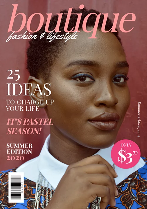
Take a look at our fashion magazine layout template. You see how the chosen font goes perfectly with the mood of the women on the cover.
Why is Typography important for graphic designers is an ample subject. It has become such an integral part of design that I’m inclined to write a piece about the 10 typography design basics. Talk about foreshadowing, right?
So, in a nutshell, what is Typography? It’s the way you use text in your design to help enforce your symbols and ideas.
9. Contrast
What can be said about Contrast? It’s that slider that people shamelessly max out on Instagram. Contrast is a relation between visual elements. It can be subtle or downright aggressive.
The main importance of Contrast is to establish hierarchy between visual elements. You can influence the user’s action and choice directing their attention to what you want to highlight. Besides this, good use of Contrast adds visual interest and dynamic to your work too.
– Erika Borza, Graphic Designer at Flipsnack
The purpose of using this graphic design basic is to attract the eye. Take a look at the example below:
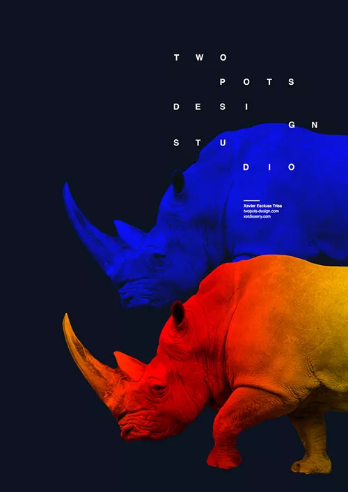
Thumbs up to those of you who thought of Dali when seeing the rhinoceros. You see how the image pops up immediately through the use of Contrast. Warm colors opposite cold ones is a classic example of Contrast. Light vs. Dark is not only a comic book or literary theme. It’s purely artistical, rooted deep into the realm of graphic design basics.
10. Colors
Color may just be the most fundamental graphic design principle you need to master. Colors convey meaning. They help set-up the mood, they help set-up entire identities. We’ll get to that in a moment. Just think about Netflix (most likely, it’s running in your background anyway).
Their logo is a beautiful example of how color can help form an identity. Netflix’s logo combines three of our 10 graphic design basics:
- Color
- Contrast
- Typography
When scrolling through various content platforms, that font, combined with those contrasting colors immediately speak: Netflix. The association formed in our minds is prior to the effective reading of the text. That, right there, is the true power of combining these graphic design principles.
Getting back to color, a practical example of its vital importance would concern branding. Understanding color theory means understanding that each color appeals to an emotion.
If you’re thinking about how to build your brand, then remember to match colors with your goals, with your brand’s identity.
An honorable mention
Until now we’ve talked about graphic design basics aimed at filling up space. Negative Space is exactly the opposite. It’s the blank space left between your visual elements or text with the purpose of highlighting your design elements.
The only reason I didn’t fit Negative Space in my 10 graphic design basics list is that, well, it’s not really basic. It does require a bit of mastery, so some graphic design courses may be required at some point. But nevertheless, once you get there, you most definitely should take this principle into consideration.
Negative Space may be most evident when the space around a subject, not the subject itself, forms an interesting or artistically relevant shape. Such space is occasionally used to artistic effect as the “real” subject of an image.
Think of it like this: Every design has a subject. The Negative space is the area surrounding your subject.
How do you use Negative Space? Sometimes the subject can be implied through the use of Negative Space. Take a look at the movie poster below:
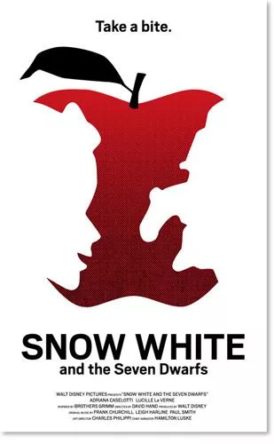
The Positive Space is the apple, that’s clear. But look closely at how the bites from the apple turn into the protagonists of the tale. Sure, the apple is thematically relevant to the story. Still, the actual subjects are implied through the use of Negative Space.
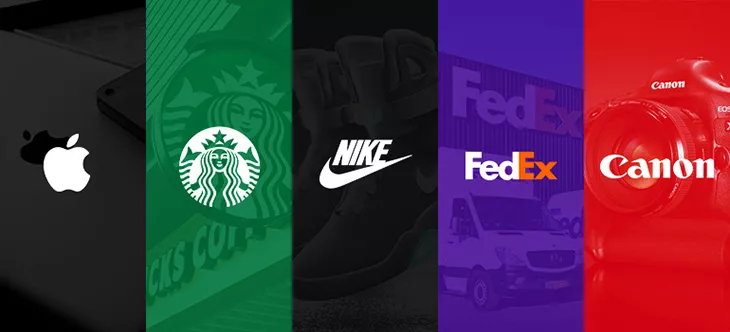
Think of brand logos as well. Let me show you a fantastic example:
We all know the FedEx logo, but have you ever seen the white arrow formed between the E and the X? All of FedEx’s values as a shipping company are in that arrow. They didn’t clutter their logo design with unnecessary elements. Instead, they opted to use Negative Space to suggest the meaning behind their service.
Conclusions
Those were the 10 graphic design basics that we think you need to master to create fantastic designs. And although we can’t infuse you with all the world’s design knowledge, we can offer you a powerful content creation tool to get you started.
What do I mean by a powerful content creation tool? That Flipsnack’s Design Studio is a graphic design tool that allows you to take all of the above principles and transform them into a gorgeous design. The range of options that we offer is impressive, so we’re pretty sure that whatever project you have in mind, our professional tool can help you out. But wait a minute. We’re talking about design, and I’m rambling here in text like an ancient scribe. Just take a look at the video below:
Don’t take the list above as an absolute guideline. Certain designs won’t even require adhering to that many principles. Nevertheless, they are the absolute principles that will guide any design on its road towards artistic plenitude. Sounds pompous? It’s true! Every graphic design portfolio will be constructed around at least some of them, and so should yours.
As humans, we are naturally attracted to certain aspects of design. Big, solid constructions appear more aesthetically pleasing for us than, say, wooden ones. That’s because rocks and bricks inspire stability, endurance, durability. Aspects we are hardwired to look out for. The aesthetic response comes prior to any reasoning.
That’s why stamping this list of 10 graphic design basics on your desk can be your coach, muse, and measurement of success. Your designs address humans. This, finally, is your absolute graphic design principle!