The best typography fonts for catalogs, brochures and magazines
Published on: September 19, 2019
Last updated: November 18th, 2025
Typography does far more than make your catalog or brochure look attractive; it shapes how customers perceive your brand, read your message, and decide to take action.
The right font enhances readability, communicates tone, and ensures your design feels cohesive and professional – whether you’re publishing it online or in print. But with so many options out there, how do you choose the best fonts for your next project?
This guide breaks down the best typography fonts for catalogs and brochures, shows you how to pair them effectively, and helps you create designs that look as good as they read, either on-screen or on paper.
How to choose the right font for your catalog, brochure, or magazine
Before diving into font lists, keep these quick guidelines in mind:
| Why it matters | What to consider | |
| Purpose | Fonts should match your publication’s goal | Retail vs. internal catalog, promotional vs. informational |
| Audience | Tailor tone to your readers | Corporate clients vs. consumer shoppers |
| Format | Print and digital require different clarity levels | Avoid thin fonts for small screens or print |
| Licensing | Ensure you can use fonts commercially | Google Fonts are free; Adobe Fonts often require licenses |
| Platform | The design tool’s limitations | Flipsnack allows you to use your own fonts directly in your projects and make sure your team can access them. |
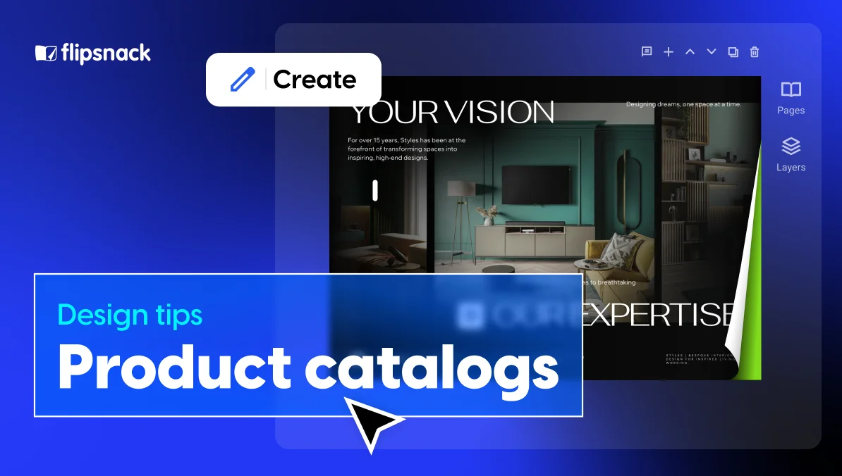
Best fonts for product catalogs
When choosing fonts for catalogs, prioritize legibility, versatility, and brand tone, especially if you’re designing a digital catalog. Using tools like an AI font generator can help you experiment with different type styles while maintaining clarity across digital and print formats. The key is to find a typeface that remains clear and easy to read even at smaller sizes. You never know how compact your layout might get, so it’s best to choose something simple, balanced, and adaptable across both print and screen.
Retail catalogs
Clean, modern, and easy to read, these fonts work beautifully for product listings and pricing details.
- Roboto – Balanced and professional; ideal for detailed product descriptions
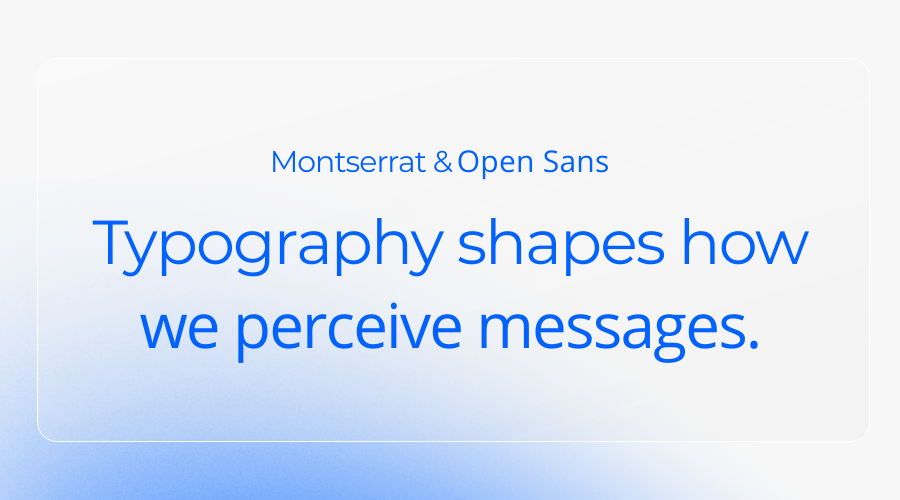
- Open Sans – Friendly and readable, great for multi-language catalogs
- Montserrat – Bold and geometric, perfect for modern retail brands
- Poppins – Rounded and contemporary; works well for headings and body text
- Inter – Designed for screens; excellent for digital catalogs
Retail and product catalogs pairing tip: Montserrat (titles) + Open Sans (body) creates a stylish yet highly readable layout.
Wholesale & B2B catalogs
Professional fonts that ensure clarity and precision for technical or manufacturing content.
- Futura – Simple, modern geometry ideal for data-heavy layouts
- Source Sans 3 – Highly legible; ideal for long product lists
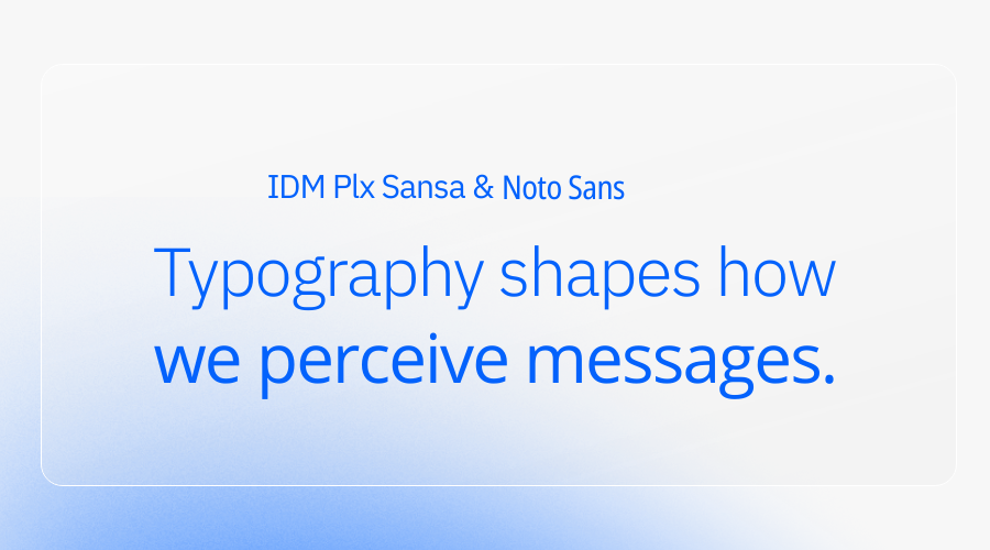
- IBM Plex Sans – Balanced and technical; perfect for B2B catalogs
- Noto Sans – Excellent multilingual support; used by brands like IKEA
- PT Sans – Clean and neutral, great for print and digital catalogs alike
Industrial & B2B catalogs pairing tip: Try Noto Sans Condensed (titles) with IBM Plex Sans (body) for a polished, business-ready catalog.
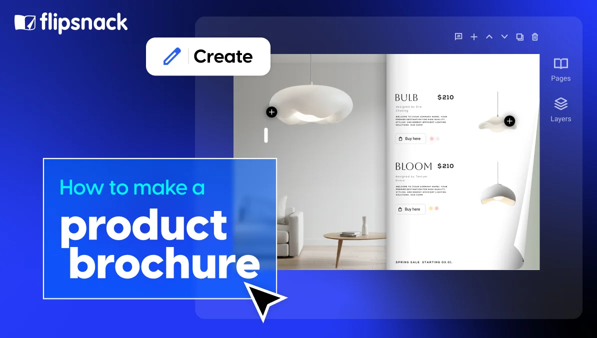
Best fonts for brochures
For brochures, the name of the game is eye-catching. A good brochure typography font will both complement the contents of the brochure and grab the attention of the reader. So, you really could say that there are infinite possibilities when it comes to picking a good brochure font.
But that’s not why you clicked on this article, is it? Even though the sky’s the limit with brochure fonts, here are some of my favorites:
For headlines
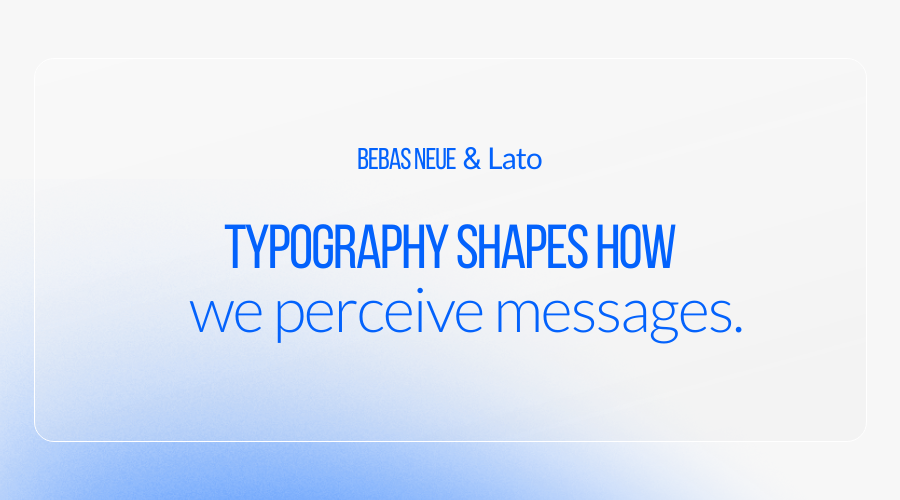
- Bebas Neue – All caps, impactful, great for short statements
- Oswald – Slim and powerful; excellent for vertical layouts
- Poppins Bold – Rounded, energetic, ideal for promotional campaigns
- Raleway Extra Bold – Adds personality without sacrificing readability
For body text
- Lato – Smooth and neutral; versatile for print and digital
- Merriweather – Classic serif that’s readable at smaller sizes
- Pontiac – Traditional and trustworthy; perfect for printed brochures
- Inter – Optimized for clarity in both web and app-based brochures
Brochure font pairing tip: Combine Bebas Neue (headlines) with Lato (body) for a clean, professional layout that balances personality with readability. Perfect for corporate or product brochures.
The best typography fonts for magazines
When it comes to digital magazines, typography is where creativity meets readability. Unlike catalogs or brochures, magazines often use a wider mix of typefaces to express personality, set tone, and establish a strong editorial identity. The font you choose depends heavily on your magazine’s niche and visual style.
For instance:
- A fashion or lifestyle magazine might use Playfair Display or Didot for its elegant, high-contrast serifs that evoke sophistication.
- A tech or design magazine could rely on Montserrat or Roboto for its clean, modern lines.
- Meanwhile, an independent culture or art magazine may mix expressive display fonts with minimalist sans serifs like Poppins or Raleway to create contrast and rhythm.
Every magazine genre has its own visual language, and typography helps define it. But don’t worry about finding the “one perfect” font; it’s more about the right combination that fits your story and audience.
If you’d like to dive deeper into the best typefaces and pairings for magazines, we’ve already covered the best magazine fonts in another article. It’s very in-depth, and I’m sure you’ll find something useful.
Typography formatting tips for better readability
Even the best fonts can fall flat without proper formatting. Use these rules to ensure your text always looks professional:
- Keep line spacing (leading) at 120–140% of your font size
- Stick to 10–12 pt for body text and 16–36 pt for titles
- Use left alignment for readability
- Ensure high color contrast between text and background
- Test both desktop and mobile readability for digital catalogs
- Never stretch or distort fonts — adjust weights instead
Five tips for choosing the right font for your catalog or brochure
Choosing typography doesn’t have to be complicated. These quick tips will help you pick fonts that look great in both digital and printed catalogs and stay consistent across your brand, while also remaining consistent with the fundamental principles of typography in branding.
1. Choose the right font format (TTF vs. OTF vs. WOFF)
Before thinking about style or aesthetics, make sure you’re using the correct font format, because it affects how your catalog renders, loads, and prints.
TTF (TrueType Font)
- Best for: Print and web
- Pros: Reliable, widely supported, consistent on screens and paper
- Why we recommend it: Efficient compression + stable rendering across all layouts
OTF (OpenType Font)
- Best for: Print
- Pros: Advanced typographic features (ligatures, alternates)
- Considerations:
- Optimized for print workflows
- May not render correctly on the web
- Generally, heavier file sizes. If your publication is mainly digital, OTF may not be ideal.
WOFF / WOFF2 (Web Open Font Format)
- Best for: Web-only publications
- Pros: Compressed specifically for fast online performance
- Considerations:
- Not suitable for print
- Less versatile than TTF
- Perfect for digital-only catalogs, but not for mixed-format workflows.
For most catalogs and brochures, especially those built in Flipsnack, TTF offers the best mix of performance, compatibility, and reliability.
2. Prioritize accessibility and readability
Choose fonts that stay clear at small sizes and work well across screens and devices. Sans-serif fonts like Inter, Roboto, or Open Sans are excellent for digital catalogs.
In Flipsnack, all built-in Design Studio fonts are Google Fonts, so they’re free, accessible, and optimized for online readability.
3. Pick typefaces with multiple weights
Look for fonts that offer several weights (Light, Regular, Bold, etc.). This makes it easier to build hierarchy for product titles, prices, and descriptions without switching fonts.
If your brand font has limited weights, Flipsnack’s Brand Kit lets you upload your own fonts and pair them with a more versatile Google Font when needed.
4. Choose fonts with strong multilingual support
If your catalog serves multiple regions, choose typefaces that support extended Latin, Cyrillic, Greek, or other language sets. Google Fonts, available in Flipsnack, are known for wide language coverage, keeping your text consistent across translations.
5. Take advantage of variable fonts
Variable fonts bundle multiple weights and widths into a single file, making them faster to load and more flexible, especially for interactive or mobile-first catalogs.
Adobe Fonts vs Google Fonts
Google Fonts are free, accessible, and ideal for online catalogs. Adobe Fonts offer premium styles for high-end editorial projects, but require licenses.
For most product catalogs, brochures, and digital publications created in Flipsnack, Google Fonts are the most practical and reliable choice.
Choosing the best fonts for your digital publications
Typography isn’t just a design choice; it’s a strategic tool that shapes how readers experience your brand. You can have the most stunning visuals and compelling content, but if the font feels off, your message loses impact.
The fonts and pairings we’ve covered above are safe, versatile starting points for any catalog or brochure, whether printed or digital. But remember, the best typography is always the one that fits your brand’s personality and supports your content’s purpose.
Stay consistent, test your fonts across formats, and don’t be afraid to experiment until everything feels just right.
And when you’re ready to bring your typography to life in an interactive format, Flipsnack helps you do it seamlessly, keeping your brand fonts, colors, and design perfectly aligned across every page and every project.
Frequently asked questions
Roboto, Open Sans, and Inter are all excellent for clarity, especially in detailed product catalogs.
Font choices significantly impact reader retention and engagement by affecting readability and the overall aesthetic of the brochure or catalog. A well-chosen font can make the text more accessible and enjoyable to read, leading to higher engagement levels. Fonts that are too complex or hard to read can deter readers, while those that are too common might not capture their interest. The right font enhances the message’s delivery, encouraging readers to spend more time with the content.
Yes, certain color combinations with fonts can significantly enhance readability and the aesthetic appeal of catalogs and brochures. High contrast between text and background, such as black on white or white on dark blue, improves readability. Colors can also be used to evoke emotions or highlight important information. However, it’s crucial to ensure that the color palette complements the font style and aligns with the brochure’s overall design theme to create a cohesive and attractive layout.
Licensing and font availability are critical considerations in selecting typography for commercial projects. Designers must ensure that they have the appropriate rights to use a font commercially to avoid legal issues. Some fonts may require the purchase of a license, while others might be freely available for commercial use. Availability can also be a concern, especially for unique or custom fonts that may not be widely supported across all platforms and devices, potentially limiting their use in diverse applications.