
20 best magazine fonts for any type of magazine
Published on: October 6, 2021
Vogue. Cosmopolitan. The New Yorker. Food & Wine. What do all these popular magazines have in common? The astonishing visuals? The catchy subjects? Or maybe the wonderful game of colors? All these answers are correct, but do you know what really catches my attention when I flip through one of these famous publications? Their unique font pairings that stand out in the crowd, catch the attention and make these magazines sell more.
Just think about it. Whenever you open a Vogue issue, you definitely can’t ignore the way they play around with fonts and typography and arrange everything in the right place, guided by core principles of design like hierarchy, balance, and contrast. The same applies to the other magazines, no matter if they’re about fashion, lifestyle, food, technology, and the list could go on. They all focus on using the perfect magazine font that most represents them, their message, and their brand.

Simply amazing, right? But what happens when it comes to creating your own magazine and choosing the right font to match it with your publication? Does it sound as amazing and simple as before? If you ask me, it’s already a challenge to create your own magazine, let alone pick a suitable font for your brand and content! Truth be told, scrolling through an endless list of fonts to find that perfect one could sometimes be a frustrating experience. And a never-ending story.
If I’m telling you this, it’s because I’ve been there, and you’ve probably been there also. That’s why today, I’ve put together a list of 20 free magazine fonts where you can take inspiration from. Some of these fonts are even used in the famous magazines I’ve mentioned in the beginning. Bold, italic, elegant, or even stylish, you’ll find anything you need right there, in this article.
So let’s get started.
20 best magazine fonts for all types of magazines:
- StagSans
- Paris Pro Typeface
- Butler
- Municipal
- Bebas Neue Pro
- Replica
- Didot
- Bodoni
- Montserrat
- League Spartan
- Saint Capital Modern Serif Typeface
- Brioche
- Baille Simpson
- Girly Moods Script
- Magnetico
- NY Irvin
- Isidora Sans
- Cheyenne Sans
- Franklin Gothic Std Extra Condensed
- Royal Acidbath
Let’s take them one by one and get into more details.
1. StagSans
I first came across this contemporary typeface in Esquire magazine.
Stag is a complex font packed with distinctive details, the perfect complementary font to the original Stag. A sans that is interesting enough for headlines but yet not distracting at text sizes. Publications that focus on fashion, style, and culture for men are a perfect match for this font.
I’d say that this font is the perfect typeface for an elegant and powerful men’s magazine like GQ or Esquire.
Stag Sans includes various styles, perfect for any fashion design project: Thin, Thin Italic, Light, Light Italic, Book, Book Italic, Medium, Medium Italic, Semibold, Semibold Italic, Bold, Bold Italic, Black, and Black Italic.
Get this magazine font.
2. Paris Pro Typeface
Ever wondered what fashion magazines like Vogue use as typography? Wonder no more, Paris typeface is one of the fashionable fonts Vogue is using in its editorial design. Designed by the Israeli type designer, Moshik Nadav, the Paris typeface is inspired by the world of fashion, of course. It includes awesome ligatures, sexy numerals, appealing curves, and fresh typographic posters.
As you might expect, this magazine font is luxurious, elegant, and stylish!
Paris typeface includes 9 different styles: Paris Regular, Paris Regular Exit, Paris Regular Strip, Paris Regular White, Paris Ultra Light, Paris Bold, Paris Bold Exit, Paris Bold, Strip, Paris Bold White.
Get this magazine font.
3. Butler
A free magazine font inspired by the Bodoni Family, Butler, is often used to bring a bit of modernism to any fashion, lifestyle, and even travel magazine. Its designer, Fabian De Smet, worked on the curves of classical serif fonts, adding an extra stencil family.
A headline font, for sure! However, Butler is versatile and perfect for any type of fancy content, thanks to the size of its character palette (it contains 334 characters). That being said, it is also perfect for many foreign languages with its added glyphs.
Get this magazine font.
4. Municipal
A solid and powerful retro font that makes a statement. Municipal is a great typeface when it comes to magazines that tackle more serious subjects, such as consumerism or politics today.
So, if you are looking to find a good magazine font that will speak louder than words, Municipal is the right magazine font for your next editorial design project. Best used for headlines or any other text that it’s supposed to be impactful.
Get this magazine font.
5. Bebas Neue Pro
The “Helvetica of the free fonts,” Bebas Neue, is a sans serif font originally designed by Ryoichi Tsunekawa. This font has been popular for 10 years as an uppercase-only font.
Now the family has four new members to help you add diversity to your typography fonts – Thin, Light, Book, and Regular – added by Fontfabric Type Foundry.
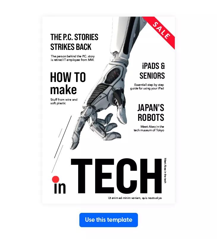
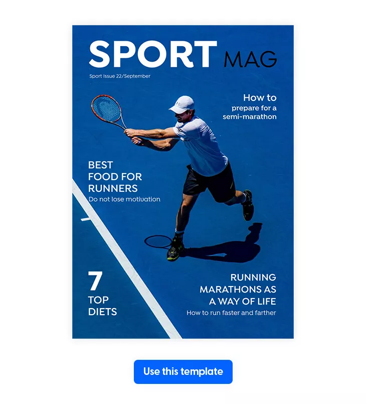
This font has a concise and clean form, which makes it excellent for headings. Its versatility also allows you to use it in a multitude of magazines such as fashion, technology, or science. Bebas Neue Pro can suit many styles, depending on what you pair it with.
Speaking of pairing fonts, Bebas Neue Pro goes well with Montserrat, Arial, Avenir, and Helvetica.
Here’s an example of how this font looks like in a technology magazine.
Get this magazine font.
6. Replica
Replica is a geometric and contemporary sans-serif typeface designed by Dimitri Bruni and Manuel Krebs. It could be the perfect font for a modern architectural magazine with a classic, grotesque feel. Or when branding a small, hip architecture business or design studio located in Berlin, Vienna, or New York. Like one of the biggest design studios in the world, SAGMEISTER & WALSH.
Replica is available in four weights with matching italics: Replica Bold, Replica Bold Italic, Replica Light, and Replica Light Italic.
Unfortunately, this is not a free magazine font. But don’t worry. Many free alternatives look exactly like Replica. One of them is Inter. This font has even the light and bold versions, just like Replica has.
However, you can always pay for the original version of Replica if you think it’s worth it.
7. Didot
One of the most popular font choices for fashion or beauty magazines is Didot. And for a good reason. Didot is a modern typeface font that gives an elegant and luxurious look to the entire content.
However, precisely because it is a modern font, it’s not suitable for body copy due to its high contrast level and hairline strokes, making the text difficult to read. So instead, use it for headlines and short pieces of text.
Tip: Assure yourself to always choose high-quality paper and professional printing equipment when printing your fashion magazine that features modern fonts such as Didot. Otherwise, your text might look crammed and unintelligible.
Dora Marchis, Graphic Designer @ Flipsnack
The famous Elle magazine uses this font for the branding of its fashion publication. In addition, the logo is often covered by cover photography. Nonetheless, the strength of the brand remains steadfast.
Elle magazine also likes to play with Sans Serif Didot for the rest of its cover lines to create a visual hierarchy. The most important is the text in Serif.
Didot pairs well with sans serif fonts with modern face proportions like Helvetica, Univers, or more American, grotesque fonts like Vectora or Trade Gothic.
Get this magazine font.
8. Bodoni
A classic font when it comes to magazine design, for sure. Whether we talk about an auto magazine or even a business magazine, Bodoni has many styles that you can work with. Is a great font for headlines, logos, and also decorative pieces of text.
With a narrow structure and overall geometric aspect, Bodoni is a serif font that looks very aesthetic-pleasing. It pairs well with Brandon Grotesque, Playfair Display, Graphik, DIN, Trade Gothic, PT Sans, Source Sans Pro, Gill Sans, and Sentinel.
Get this magazine font.
9. Montserrat
This geometric sans serif font was designed by Julieta Ulanovsky in 2011. She took inspiration from the posters around her historic neighborhood in Buenos Aires that has the same name: Montserrat.
With a contemporary yet cool appearance, this font can be used perfectly for headings and subheadings, as well as large parts of body text. Actually, you can add it everywhere thanks to its geometrical and elegant simplicity.
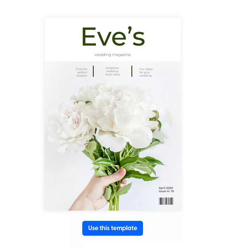
Moreover, Montserrat has a clean, structured, and easy-to-read layout, making it great for lifestyle or wedding magazines. And it pairs perfectly with the Playfair Display font.
Get this magazine font.
10. League Spartan
I really like this font, so I had to put it on my list of the 20 best magazine fonts you can use in your next publication.
League Spartan is a modern typeface that has a strong, bold, and geometric design. It can be used in many types of magazines due to its extensive character set – over 300 glyphs. However, I suggest you choose it for your following product or music magazine; it would fit just perfectly with the entire content.
Headings, subheadings, or even body copy, this font makes it easy to read any kind of information. And it pairs amazingly with the traditional style of the Libre Baskerville font.
Get this magazine font.
11. Saint Capital Modern Serif Typeface
A playful, happy, and modern serif typeface, this font is a great alternative to the New York magazine font. Mixing classic style fonts with minimalist ones, Saint Capital is suitable for many types of magazines, but especially for those related to news.
This font is also very versatile and can be used for quotes, logos, headers, and also short pieces of body text. No matter where you’re going to use it, make sure to pair it with Flora Serif font, Regionaire Modern Serif Typeface, Khalisa Typeface, or Erliana Modern Serif Typeface.
Get this magazine font.
12. Brioche
Harper’s Bazaar is a popular fashion magazine that uses a similar font to Vogue’s, called Brioche. This is a serif font inspired by modern typography, making it both luxurious and stylish. Moreover, it’s also elegant and delicate; that’s why you can use it in many different ways, such as logos, headings, and even body text.
If you’re still unsure where this font would fit best, I advise you to use it mainly in magazines that talk about fashion, beauty, and makeup tips & tricks. And, trust me, you can’t go wrong with this choice!
Get this magazine font.
13. Baille Simpson
Here is one of my favorite fonts on my list. A stylish, chic, and elegant script font, Baille Simpson gives you the feeling of a natural handwriting typeface and a feminine look.
This font contains uppercase and lowercase letters, numbers and punctuation, and ligatures and alternates, making it versatile and suitable for different pieces of text: logos, headings, body copy, and even quotes.
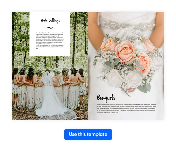
Use it in your next wedding magazine and pair it with Brioche or Paris pro typeface for a more girlish and soft look.
Get this magazine font.
14. Girly Moods Script
If you’ve been looking for a girlie or more feminist font for your next teenager magazine, then look no more! Girly Moods Script is the perfect and cute typeface for adolescents’ kind of projects.
A decorative and creative handwritten font, Girly Moods Script has many purposes. You can use it on your magazine cover, logo, body copy, and even main headlines. Its multi-language support and lots of stylistic letters make this font look very authentic and attractive.
Tip: Make sure to pair it with Julius Sans One, Yellowtail, or Cooper Hewitt Thin to make your teenage magazine pop!
Dora Marchis, Graphic Designer @ Flipsnack
Get this magazine font.
15. Magnetico
Have you ever been looking for ways to emphasize special parts of your magazine design, such as logo, title, main headings, or even quotes? Well, trust me, Magnetico is that kind of font that really stands out in the crowd.
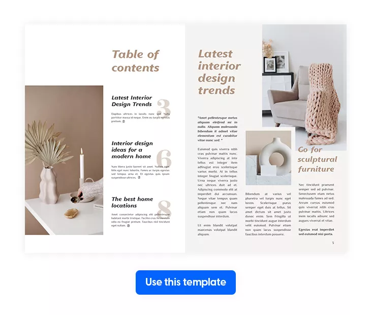
An italic sans serif font with a modern vibe, Magnetico can be used in many magazines, starting from lifestyle ones to home decor or interior design ones. It gives you a very relaxing feeling; that’s why this is the perfect font if you want to take your page layout to the next level.
Get this magazine font.
Also, watch this video to learn more about the anatomy of a magazine layout.
16. NY Irvin
I am convinced that you’ve all heard about the famous journalistic magazine called The New Yorker. You’ve just read this sentence and the unique logo comes in front of your eyes, right?
But weren’t you always curious about the font that it features? Weren’t you eager to know the name of this popular font? I sure was!
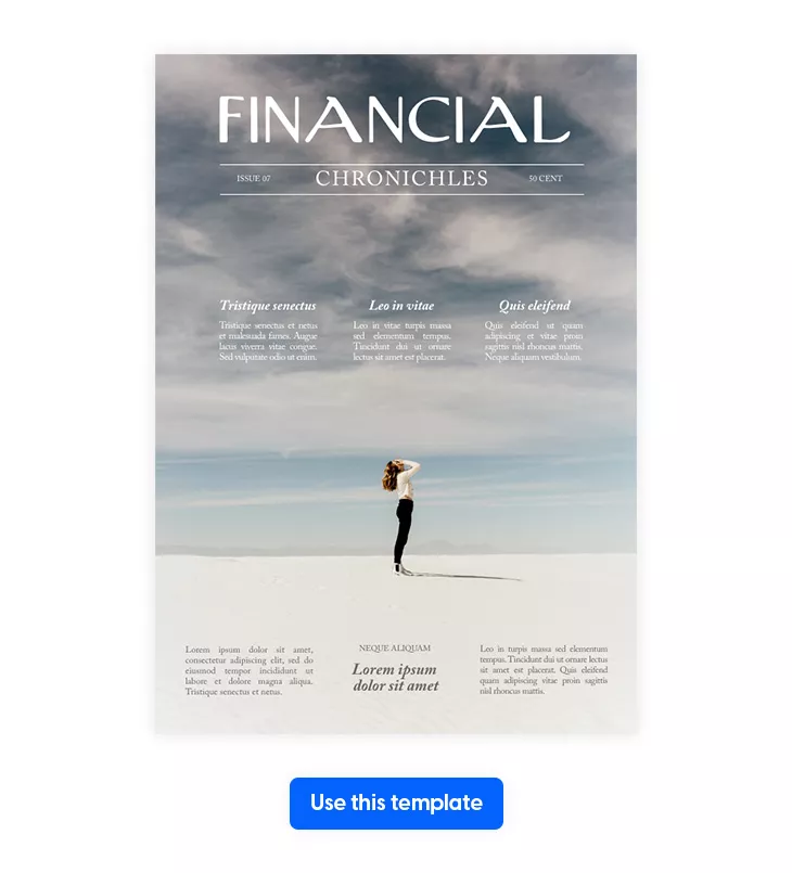
I don’t want to keep you in suspense anymore, so I’m sharing the information with you: the name’s font is NY Irvin. It’s a sans serif typeface created by Wiescher Design, and the best part is that there’s a free version available. So download this magazine font and inspire yourself for your next chronicle magazine.
However, NY Irvin would be nothing without its perfect pair, Adobe Caslon Pro, the other famous font that The New Yorker uses for their paragraphs. Opposite Ny Irvin, Adobe Caslon Pro is a serif font designed by Carol Twombly, which gives an elegant touch to the entire magazine.
This is also a free magazine font, so feel free to download it and use it however you like it. And keep in mind to also pair these two fonts together because they complement each other perfectly.
17. Isidora Sans
A modern geometric font inspired by the classic typefaces of the 20th century is Isidora. This family of fonts was designed by Enrique Hernandez, a designer from Chile.
With a contemporary and clean layout, there are 28 distinct fonts, including seven different weights. From thin and black to bold and italic, each of these fonts offers various qualities. Download all and try them. Just like that, you’ll figure out which suits you best for your next magazine issue.
Moreover, the Isidora font family is packed with 438 characters, supporting 207 different languages. They all look professional, friendly, and classy, thanks to their rounded terminals, which make them perfect for headlines, logos, and body copies.
Because of its versatility, this font is perfect for both technology or sports magazines.
Get this magazine font.
18. Cheyenne Sans
If you’re a food lover just like me, you also enjoy reading food magazines, cookbooks, menu recipes, and anything related to foodstuff.
Aren’t you just fascinated with the mouth-watering photos and delicious fonts that complement each other wonderfully? Let’s take a look at Food & Wine magazine, for example.
This famous food magazine is filled with amazing recipes, astonishing pictures, great tips & tricks regarding cooking, but do you know what catches my eye? The minimalist yet appetizing fonts make me wanna buy this magazine right away and start cooking all the meals that I’m finding.
Cheyenne Sans is the name of the font that Food & Wine magazine uses. Feel free to inspire yourself and also choose this font for your next publication about food, recipes, and so on. It’s a neo-grotesque sans serif font created by Cristiano Sobral, having 18 styles available. Cheyenne Sans Thin, Cheyenne Sans Thin Italic, Cheyenne Sans Regular, Cheyenne Sans Medium, Cheyenne Sans SemiBold, and Cheyenne Sans Extra Bold are just some of them. Feel free to download all and figure out which one suits you best.
Get this magazine font.
19. Franklin Gothic Std Extra Condensed
You’ve definitely seen the Franklin Gothic typeface many times without even realizing it. This well-known typeface is everywhere, from famous logos to billboards, movie screens to books, album covers, and video games.
Designed by Morris Fuller Benton in 1902, Franklin Gothic has been the ultimate American sans font for one hundred years.
This 18-font family offers both weights and true italics, but the most popular is the Franklin Gothic Std Extra Condensed font, used for the Cosmopolitan logo.
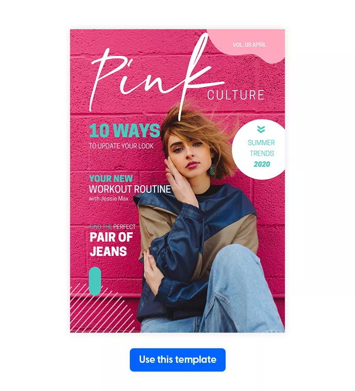
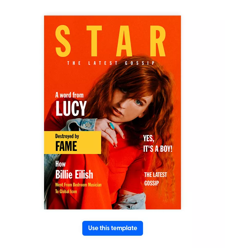
This font can be used both for headlines and logos with a bold yet modern layout, giving them a unique personality. Moreover, the bold letterform makes it a versatile font, suitable for more magazines such as beauty, gossip, or celebrity news.
Get this magazine font.
20. Royal Acidbath
I had to end this list of the 20 best magazine fonts with Royal Acidbath. And for a good reason.
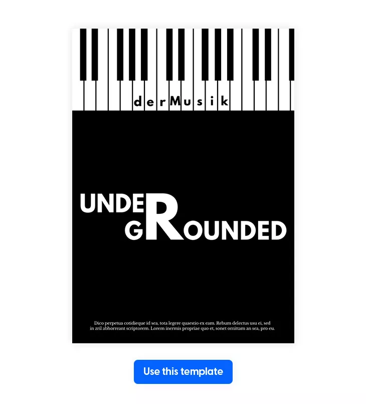
Close to the Rolling Stones magazine logo, Royal Acidbath is a retro rock n roll music-themed font that brings back 70s vibes. Suitable for any music magazine, this magazine letter font is bright, stylish, and fancy.
Designed by Sharkshock, this font has solid and outline versions, and all of them are available in uppercase and lowercase letters, with various punctuation marks.
Tip: Pair it with Medium Rosebud, Futura, or Bickham Script Pro for a more harmonious effect.
Dora Marchis, Graphic Designer @ Flipsnack
Get this magazine font.
Upload custom fonts and design a magazine with Flipsnack
There you have it—the best and free 20 magazine fonts that you can use in your following publication.
However, there might also occur the situation where you find another free font that you find more suitable for your magazine that’s not on this list. And I get it. Choosing the perfect font for your magazine is vital because only with the correct font will you communicate the right message of your brand.
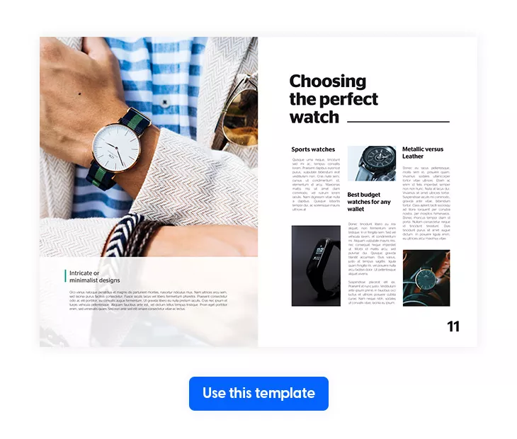
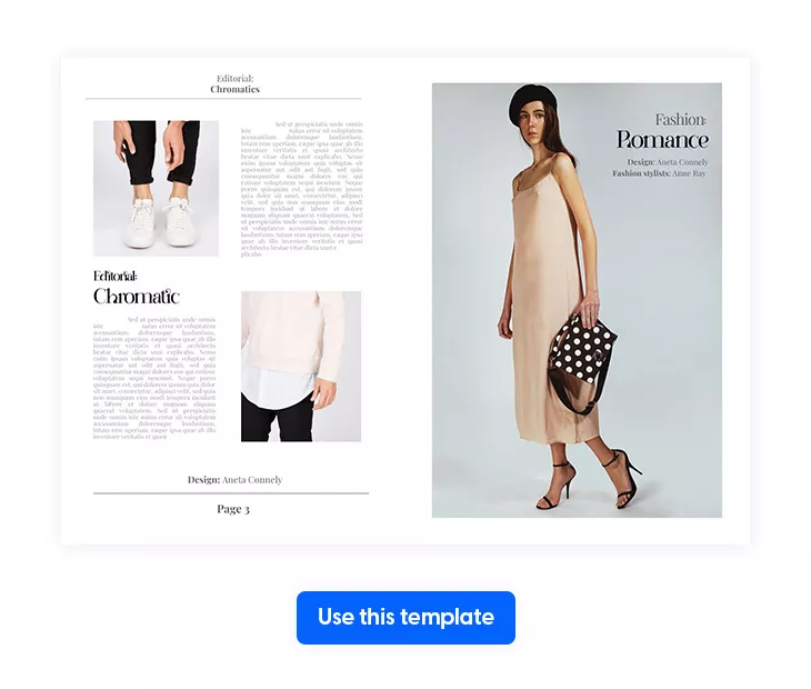
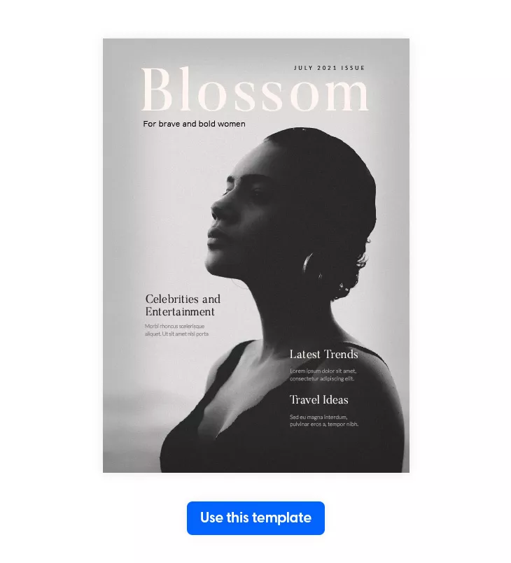
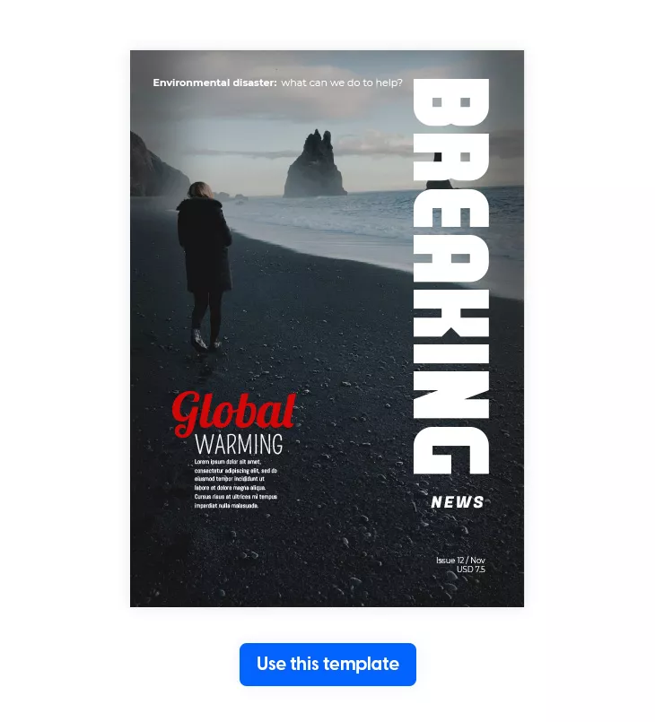
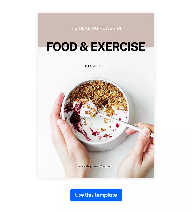
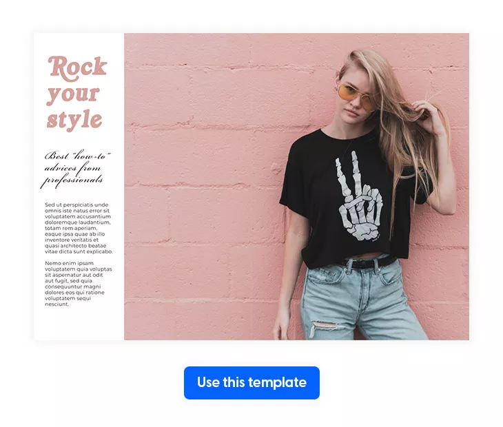
No need to worry about this. Flipsnack, the digital publishing platform right at your fingertips, is exactly what you need. Besides allowing you to upload your custom fonts and use them whenever you want in your publications, Flipsnack offers hundreds of free magazine templates that can help you quickly design your own. I’m pretty sure that you’ve noticed them when you read about each font.
So, what are you waiting for? Make your pick, customize to your liking, then choose one of today’s fonts or upload your own. It’s super easy and fun to do it.
How to upload your fonts in Flipsnack:
- Log in to Flipsnack, then access My Flipbooks.
- Go to Branding, then click on Fonts.
- Upload your font by clicking on the button with the same name.
- Confirm that you have the legal right to use it, and that’s it.
- You can now apply your font wherever you want.
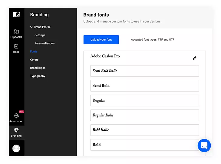
Flipsnack’s free plan supports simple interactivity and the built-in font library. However, keep in mind that you need a premium subscription to upload your own fonts. Also, make sure that every font you’re uploading is a TTF or OTF file. Unfortunately, we don’t accept any other formats.
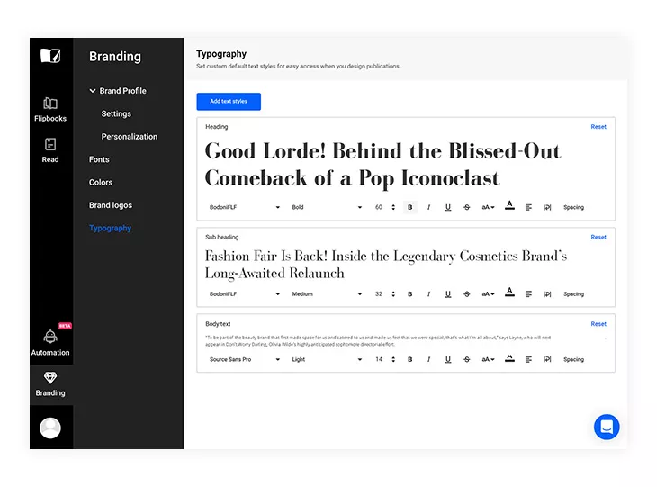
But that’s not all that you can do with Flipsnack. Besides having the freedom to upload your fonts, you can maintain your brand’s image even more with our typography feature—set text styles for specific text types with just a few clicks. For example, if you want all your headers to look the same, you can select your default header style to have the same font, size, and so on. You can do this once, and then all your preferences will be saved for later use.
To sum it all up
There is a seemingly endless amount of magazine fonts that you can use for your magazine layouts, be it about fashion, interior design, lifestyle, or even politics. Therefore, the key is to pick one that is both unique and one that fits your branding and the style of your magazine.
If one thing is for sure, the wrong font can easily turn a readable and entertaining magazine into one that someone might not even flip open. So, please take your time, and enjoy the process; you could be making the next big name in the magazine industry.
To make it easier for you, start with a magazine template that you can customize to fit your style. And only after this, pick the right font from today’s list, or choose to upload your own from your custom list of fonts. Don’t forget that Flipsnack is always here at your disposal whenever you’re ready to rock and roll the world with amazing realistic 3D flipping effect publications!


Paris Pro by Moshik Nadav has an extensive font license that only allows for personal use – at a very high cost ($80)
Hi,
Yes, Paris Pro by Moshik Nadav is not a free font. But if you feel like you need it in your projects, it’s definitely worth paying for. Or look for free alternatives.
Thank you for your comment and for reading Flipsnack’s blog.