
Flipsnack’s ultimate guide for finding your best font pairing
‘Don’t ever use Comic Sans’ they said, when I opened up the discussion about coming up with the best font pairing. What is it about Comic Sans that makes it the werewolf of the font industry?
Although answering that question won’t be the central theme of this article, reading it will offer you some insight on why you should NEVER choose that font! It may look great on a teenager’s Android phone, but that’s about it.
Whether you are building a website, creating a digital brochure, or digital catalog, then you know that typography does occupy a bit of space. After all, all modern digital scribes, copywriters, business owners, or whatever else you want to call them, use words to elicit attention. So it makes sense that when designing your magazine, for instance, you should use the best typography font for a magazine.
Below we’ve selected thirty of the best font pairings. We’ve kept out the technical aspects that went into choosing them, but for the more curious out there, just keep on scrolling. By the end of the article you’ll find everything there is to know about font pairing, font families, and other stuff like that. Meanwhile, enjoy some typography!
A comprehensive list of the best font pairings right now
1. Abril Fatface & Lato
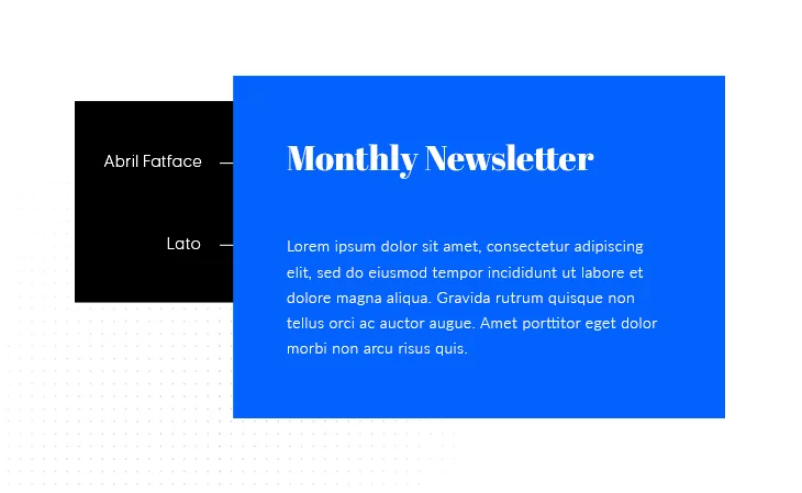
This Google font pair works for a multitude of scenarios, but where it really shines, in our humble opinion, at least, is in newsletters or blog articles. Abril Fatface allows for an imposing presence for your title and headings, which is contrasted by the more neutral but still elegant Lato.
You can download the fonts here: Abril Fatface and Lato
2. Archivo Black & Roboto
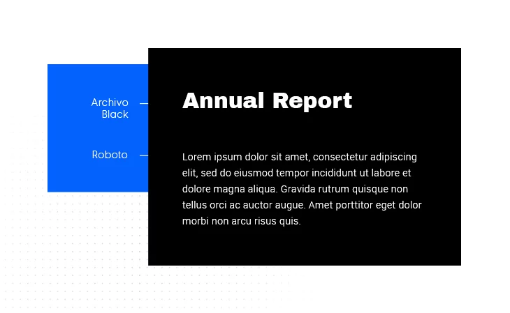
The Archivo Black font was specifically designed for titles and headlines. With a focus on legibility, this font draws the viewer in with its bold presence. This is complemented by Roboto’s robustness. Roboto is a geometric font with slight curves that give it a more friendly look. These two combined work best for posters and reports, as their main goal is to draw attention immediately.
You can download the fonts here: Archivo Black and Roboto
3. Josefin Sans Bold & Josefin Slab Semibold
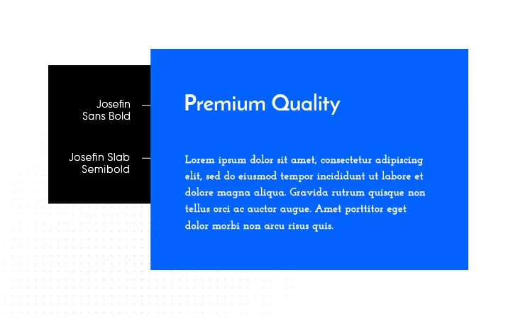
Another classical pair of Google fonts, these two belong to the same font family and it shows. The differences between them are slight, but enough for a well-rounded design. Combining them offers a fresh look, ideal for pamphlets, commercial stickers, or posters.
You can download them from here: Josefin Sans Bold and Josefin Slab Semibold
4. Oswald & Old Standard TT
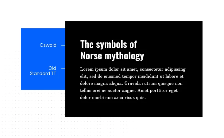
Already a classic, Oswald & Old Standard TT may just be the best font pairing for scientific papers. They strike at the nostalgic core, as these fonts resemble old typewriting. Nevertheless, they are incredibly effective, especially for literature, history, or the overall humanitarian sciences.
You can download them here: Oswald and Old Standard TT
5. Playfair Display & Raleway Thin
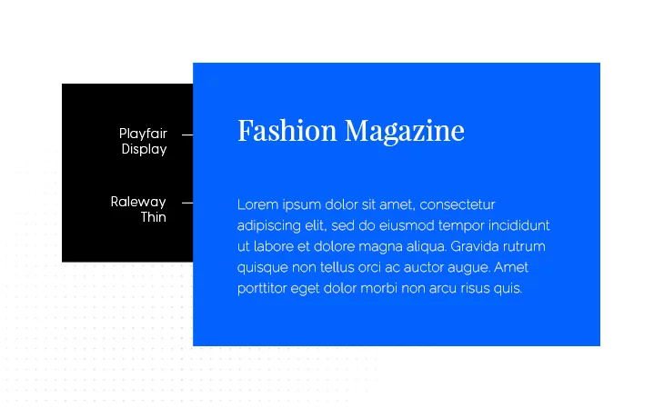
This ever-popular font combination is the ideal choice for fashion websites, fashion magazines. Their delicate lines perfectly emphasize beauty and elegance, making it our top pick for fashion.
You can download them from here: Playfair Display and Raleway Thin
6. Montserrat & Courier New
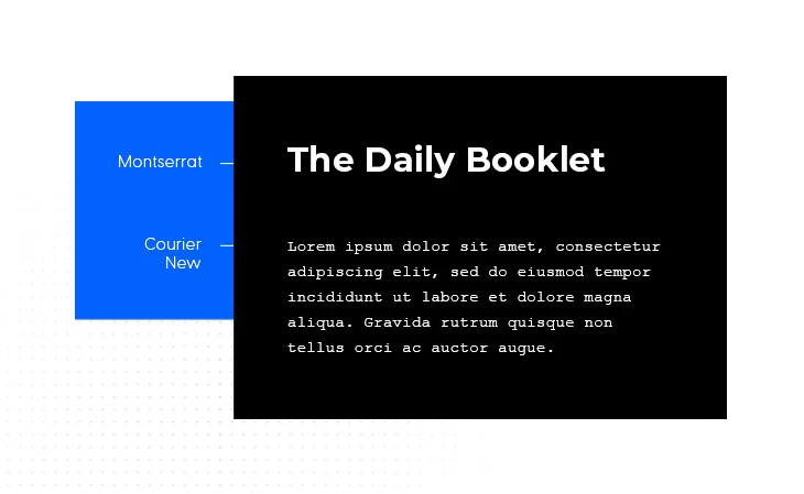
A Google font pairing worth a thousand words. Literally! This combination of fonts is excellent for a vintage typewriter look, sparkled with a bit of modernity. So if you’re in an Ernest Hemingway mood, this is the best font pairing for you. For digital books, essays, digital newspapers, this font combination meets all criteria for them.
Download the fonts here: Montserrat and Courier New
7. Pacifico & Quicksand
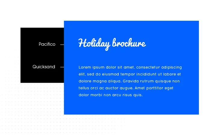
A jolly-be-happy combination of fonts, Pacifico and Quicksand, work great for holiday brochures, travel agencies, restaurants, dessert menus, and so on. They are playful in nature, so you understand where we’re coming from.
Download them from here: Pacifico and Quicksand
8. Minion & Poppl-Laudatio
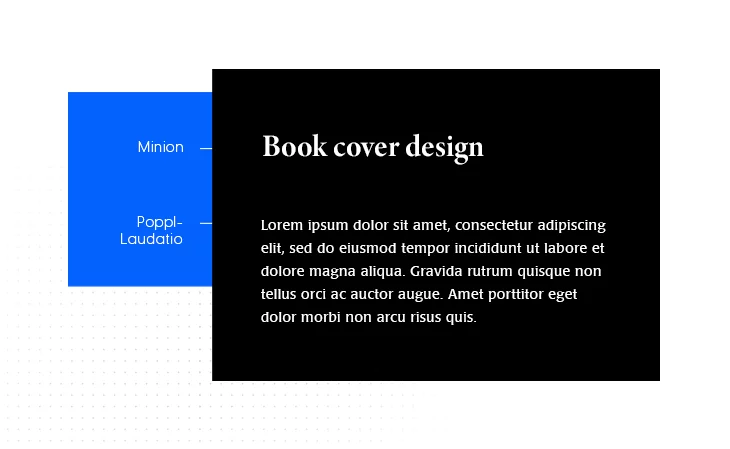
Minion and Laudatio. These are not some spells from Harry Potter. They are actual fonts and are incredibly effective together. Their best use is, in our opinion, in design, especially in book cover design.
You can download the fonts here: Minion and Poppl-Laudatio
9. Orpheus Pro Bold & Tw Cen MT
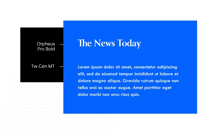
Another excellent choice for a more retro look, the Orpheus and Tw Cen MT combo works great for pretty much any type of headline, website, or news article.
You can find them here: Orpheus and Tw Cen MT
10. Rockwell Bold & Bembo
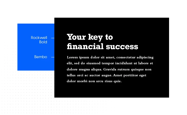
Rockwell Bold is that type of font that every headline, title, or website button likes. Coupled with Bembo, the end result is smooth, visually appealing, and highly professional. This is by far one of the best font pairings if you want to strike class.
You can find the fonts here: Rockwell Bold and Bembo
11. Libre Baskerville & Libre Baskerville
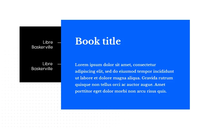
This is one of the best font pairings for creating a really dynamic layout. Although it’s not really a combination, being the same font for both header and body, this combination works magnificently for e-books. By simply changing the size or style (going for italic, for instance), you gain a lot of design flexibility and space.
Download the font from here: Libre Baskerville
12. Helvetica Neue & Garamond
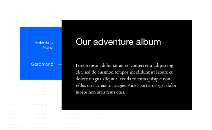
One of the most famous font pairings out there, Helvetica and Garamond, well deserve their popularity. Their combination works great for a multitude of different projects. Photo albums, portfolio designs, apps and blog posts, this Google font pairing really covers them all.
You can find them here: Helvetica Neue and Garamond
13. Super Grotesk & Minion Pro
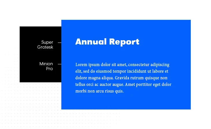
Don’t let their name fool you. These fonts work incredibly well together, the elegance of Minion Pro being aptly paired for success with the modern look of Super Grotesk.
You can download them here: Super Grotesk and Minion Pro
14. Century Gothic & PT Serif
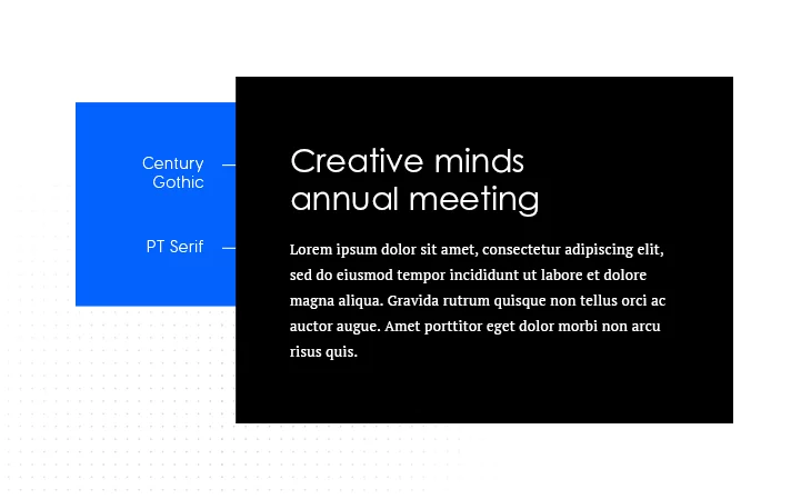
This sans serif and serif typeface combination seems timeless. There is a unique quality about these two fonts that makes them work perfectly together. Stylish, modern, visually appealing, this font pairing is a real eye-catcher.
You can download them here: Century Gothic and PT Serif
15. Source Sans Pro & Times New Roman
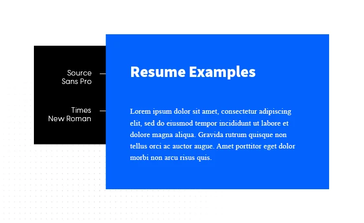
You already knew we’re talking about a classic when you’ve seen Times New Roman. This font pairing focuses on professionalism above anything else, which makes it an excellent choice for resumes.
Download the fonts here: Source Sans Pro and Times New Roman
16. Abril Fatface & Poppins Light
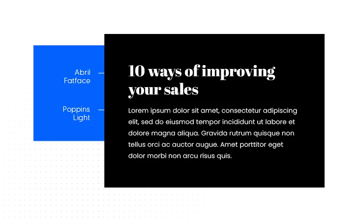
This is yet another great font pairing for the bloggers out there. Abril’s bold look will definitely catch the reader’s attention, while Poppins will keep the reading effort at a minimum.
You can download the fonts here: Abril Fatface and Poppins Light
17. Cormorant Garamond Bold Italic & Fira Sans Regular
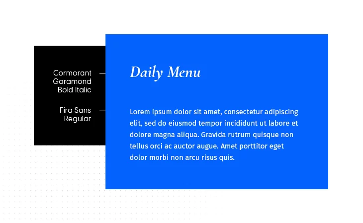
Another versatile font pairing, this one works great for menus, websites, books, and even resumes.
You can download them here: Cormorant Garamond Bold Italic and Fira Sans Regular
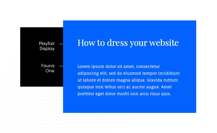
18. Cinzel Bold & Fauna One
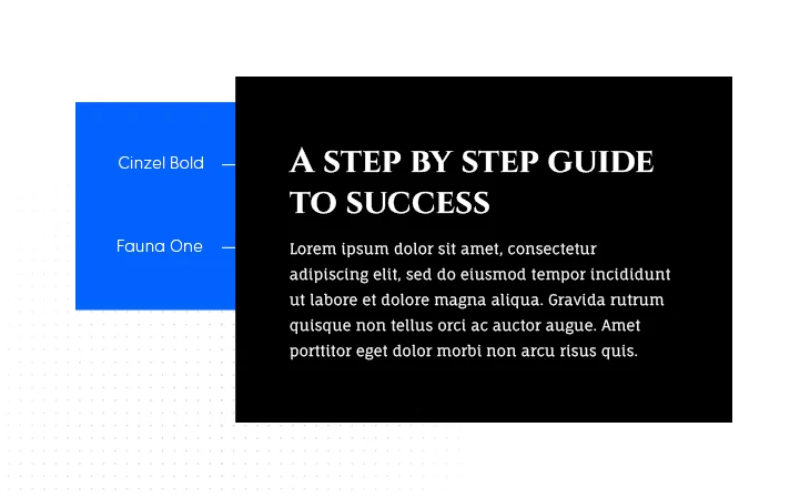
There is a certain beauty in combining classical features with more modern ones. Cinzel is that font reminiscent of old Roman inscriptions, whereas Fauna One strikes a contrast with a more contemporary finish. When combined, these two offer a unique reading experience for any blog enthusiast out there.
You can find the fonts here: Cinzel Bold and Fauna One
19. Oswald Regular & Quattrocento Regular
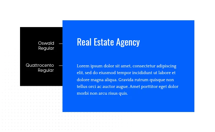
This pair of regulars feel and look like they’ve been put together by some divine force. They blend seamlessly into one another, elevating your typography efforts. They’re great for business, real estate, events and personal branding.
You can find the fonts here: Oswald and Quattrocento
20. Julius Sans One & Monda Regular
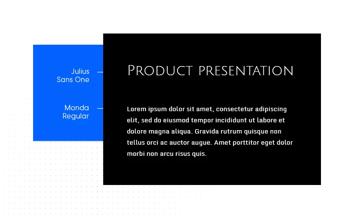
We all recognize the power and importance of a proper presentation. Regardless of your domain, this font pairing is sure to get the job done. We definitely recommend it, especially for product presentation brochures.
You can find the fonts here: Julius Sans One and Monda Regular
21. Rufina Bold & PT Serif Regular
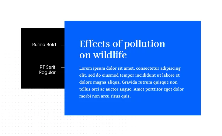
This font combination may strike you as a bit formal, but that’s precisely why we have included it. For writers, this is a great ebook font pairing, whereas, for students or college personnel, you can’t really go wrong with this pair for your academic or research papers.
You can find the fonts here: Rufina Bold and PT Serif Regular
22. Alfa Slab One & Gentium Book Basic
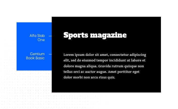
This font pairing is all about engaging the reader. Alfa Slab One’s density provides a contemporary look, whereas Gentium Book Basic contrasts it to provide clarity. The combination is perfect for magazines.
You can find the fonts here: Alfa Slab One and Gentium Book Basic
23. Lobster & Arimo
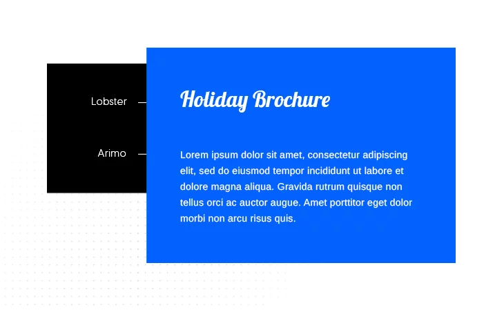
Although it slightly resembles Comic Sans, Lobster is a more visually pleasing, not at all hated, font. This in itself is a plus. Its playful nature, coupled with Arimo’s more grounded look, makes for one of the nicest Google font pairings out there. An ideal combination for menus or brochures.
You can find the fonts here: Lobster and Arimo
24. Raleway Bold & Roboto
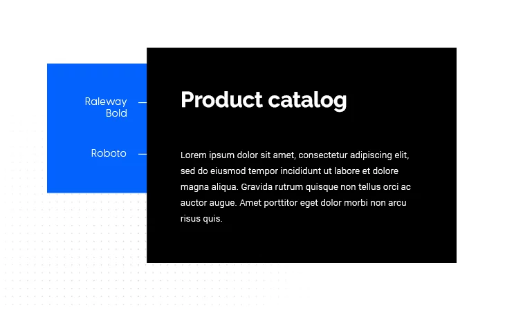
Another incredibly versatile font pairing, Raleway Bold and Roboto, can be used for magazines, product catalogs, or even for website pages.
You can find the fonts here: Raleway Bold and Roboto
25. Playfair Display & Fauna One
One of the more gentle and subtle font combinations out there, Playfair Display and Fauna One’s pairing, is ideal for feminine blogs or websites, or even, depending on the subject, blogs.
You can find the fonts here: Playfair Display and Fauna One
26. Quando & Judson
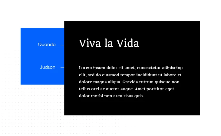
Quando is one of those classical fonts that seem to have been around forever. Its earliest broad depiction has been in World War 2 Italian posters. Its slightly handwritten look is complemented well by the more digital present Judson. Together they still work wonders for posters.
You can find the fonts here: Quando and Judson
27. Skolar Latin & Proxima Nova
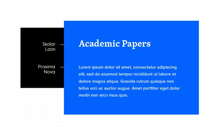
One of the best font pairings for the scholars out there. I mean, even their name suggests it. Skolar Latin and Proxima Nova are one of the best font pairs for any type of academic paper.
You can find them here: Skolar Latin and Proxima Nova
28. Playfair Display & Raleway

One of the Internet’s best all-rounder font pairings, Playfair Display and Raleway, works for wedding invitations, events, and websites. Most likely than not, if you’ve ever seen a wedding invitation, then you most likely already met at least one of these fonts.
You can find them here: Playfair Display and Raleway
29. Libre Franklin & Libre Baskerville
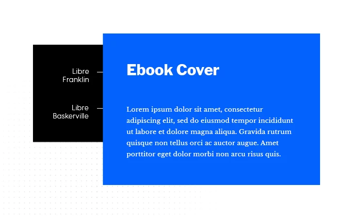
If you are somewhat of a typography puritan, Baskerville is amongst the best fonts you can choose for your written compositions. Its legibility and overall beauty work great with Libre Franklin’s slightly more classic look.
You can find the fonts here: Libre Franklin and Libre Baskerville
30. Oswald & Garamond Premier Pro
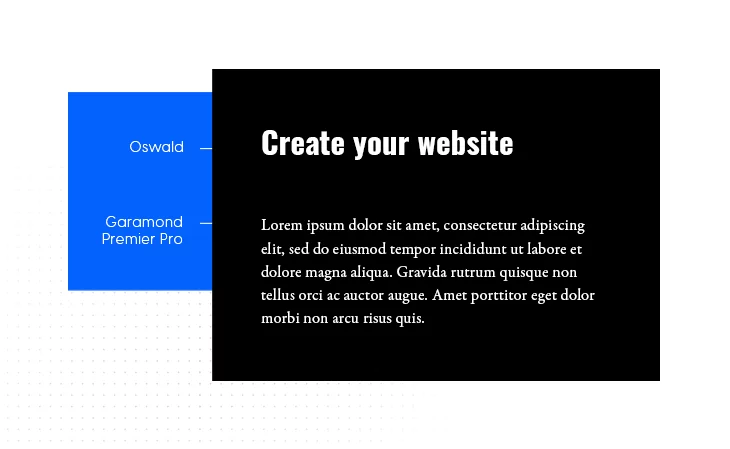
Finishing off with a font pairing for the digital age, Oswald and Garamond work beautifully together for website design. Readability, legibility, you are sure to tick all boxes by going with this pairing.
You can find them here: Oswald and Garamond Premier Pro
What to consider when searching for the best font pairing
Typography is a graphic design basic for a reason. The best font pairing is that that grabs attention and holds on to it. You want your readers engaged, with their eyeballs focused on the text. Glasses and eye surgeries are expensive, so it’s best not to tamper with your audience’s attention, and use that pair of fonts that make reading as engaging as possible.
But we’ll talk more about this in a minute. Before getting there a thought crossed my mind and I might as well share it with you:
Typography is pretty much all around us
Think about it. Do you remember the last concert you went to? Music festival posters have their distinctive look and feel to them, and that’s partly because of fonts. You wouldn’t want a Rammstein poster covered up in Celine Dion-like fonts. The best font pairing will help you tell the story, not bring about confusion.
Movie posters are another example. Behind every great poster’s design art there is a carefully chosen pair or combination of fonts that get the message across.
Just wanted to get that out of my system. Moving on.
What is font pairing?
This may be the first question that comes to mind when talking about the best font pairing out there.
Let’s break them down and stare at the soul of fonts!
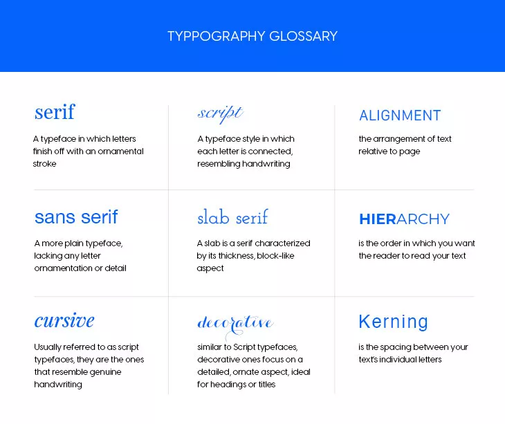
Basically, font pairing is coming up with a combination of fonts that complement each other. There are some general rules to be followed here. I will not insist on them, just merely name them. Although it’s an article about fonts, words, and typography, I don’t want to drown you in context. Right, here are the basic principles of font pairing:
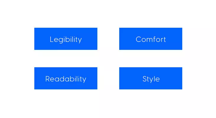
- Consider LEGIBILITY – or, in plain English, the ease with which your reader gets what you’ve written
- Don’t ever forget about READABILITY – this principle should answer the question, ‘Is my text easy to read? Or does it look like something from an ancient civilization?’
- It boils down to COMFORT – how do your readers feel when they’re going through your text? Are they relaxed, or are they on the brink of declaring war?
- Along came STYLE – serif, sans-serif, slabs, typewriter, etc., etc., these are all styles that you’ll see at work in the examples we provided.
Which font is most pleasing to the eye?
Generally speaking, people love sans serif fonts, such as Helvetica, Coolvetica, Lato, Roboto, and so on. They are easy to read, pleasing to the eye, and they stand the test of time pretty well.
But it entirely depends on what you are looking for and what you are trying to do. A wedding invitation, for instance, will be better fitted with a combination like Playfair Display and Montserrat Light.
Didot and Georgia work incredibly well for resumes. So you get the idea. The best font pairing, or the most pleasing one, will depend, in part, on its purpose.
As a final example, think about designing a book cover based on its genre. Choosing the right font for the title becomes paramount in terms of aesthetics. Why?
Note: Fonts need to elicit some kind of emotion. Can you imagine The Shining’s title written like Pride and Prejudice? No, because Jack Torrance isn’t a misunderstood Darcy.
Font families
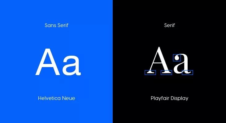
We’ve mentioned something about serifs and sans-serifs. What are these more exactly? They are called font families. Remember those history classes that had drawings of royal family trees? Or even Game of Thrones, for that matter. Well, font families are basically the same. There are five major families:
1. Serifs
Serifs fonts include:
- Times New Roman
- Baskerville
- Cambria
- Calisto
- Clarendon
- Didot
Famous example: The New York Times
2. Sans-Serifs
Sans-Serifs include:
- Helvetica
- Coolvetica
- News Gothic
- Monotype Grotesque
- Tahoma
- Calibri
Famous example: Facebook
3. Cursive
Cursive fonts include:
- Allura
- Caballero
- Hummingbird
- Belinda
- Benson Script
- Tangerine
Famous example: Kellog’s
4. Fantasy
Fantasy fonts include:
- Alpha Geometrique
- Critter
- Cottonwood
- Studz
Famous example: Blizzard Entertainment
5. Monospace
Monospace fonts include:
- Deja vu Sans Mono
- Droid Sans Mono
- IBM Plex Mono
- Lucida Console
- Letter Gothic
- Roboto Mono
Famous example: IBM
That’s all fine and dandy. But those are only logos, you might say. And you’re right. Those are logos, but already we see something happening there. Take another look at the Blizzard logo. You’ll notice a font combination there.
I wanted to show you how big brands use different fonts to create their identity. The best font pairings are the ones that don’t compete with each other but complement one another.
What fonts go good together?
As pointed earlier, choosing font pairs from the same family ensures that you’ll stay consistent and get your message across. The best font pairings don’t need to strike us as radically different. Whatever font you choose, be sure to respect the principles highlighted above and you should be all good.
The glossary above will, hopefully, shed some light on how you choose to go with your font pairing.
As you can see, the first column refers to the font family, the second to style, and the third to the design principles that go behind them. So you should always have in mind these three aspects:
- Family
- Style
- Design
Remember, even professional designers have a hard time figuring out what font works best for given scenarios. And sometimes, the best font pairing can be achieved with a single font.
Useful tools for Google font pairing
Below you will find some of the tools that I’ve found provide immense value when searching for the best font pairings.
Google Fonts
Google Fonts is an easy to use, readily available tool that doesn’t require any installation. You can preview a large number of fonts, and also see which are currently fresh.
Fontpair
This is yet another great resource for Google font pairings. There are hundreds of examples there, so if you lack inspiration to come up with your own, Fontpair can definitely throw in a hand.
Fontjoy
Fontjoy’s motto is ‘Font pairing made simple’, and that’s indeed the case with them. Their tool is highly intuitive, and it allows for a full preview of your future font combinations.
Typewolf
Typewolf abunds in font recommendations, and even paid guides, for those of you willing to do some investing. They also have a blog highlighting the various use of fonts across pop culture. So definitely check them out.
WhatFont
If you ever stumbled across a website with amazing fonts and didn’t know their name or how to find them, then WhatFont is your answer. WhatFont is a Google Chrome extension, free, and incredibly easy to use. Think of it as the Shazam of the font world.
Typing some conclusions
As you can see there are o multitude of options regarding the best font pairing out there. Depending on your objective and, in some cases, amount of patience, you can definitely find your own favorite font pairing. You know, the one that almost types itself for you.
We’ve highlighted the ones that we consider to be amongst the more popular out there. All of them are magnificent choices but, feel free to leave a comment if you feel like we’ve missed some.
thanks
Thank You!!
Good job. Thank you
your research details is amazing, thank you very much for doing this, it was of great help
I am very pleased to hear this! Thank you for these kind words.