The art of the music festival poster
There is a certain art that goes into music festival posters. Today, in the age of social media there is so much more than just the poster to promote music festivals. But in the middle of your marketing strategy, the music festival poster should be the headliner of your main stage.
Let’s take a look at how the art of music festival posters shaped the festival music industry over the years. Also, stay tuned for tips on how to design your own music poster for your next event and a VIDEO that pretty much sums up all this article. See it below.
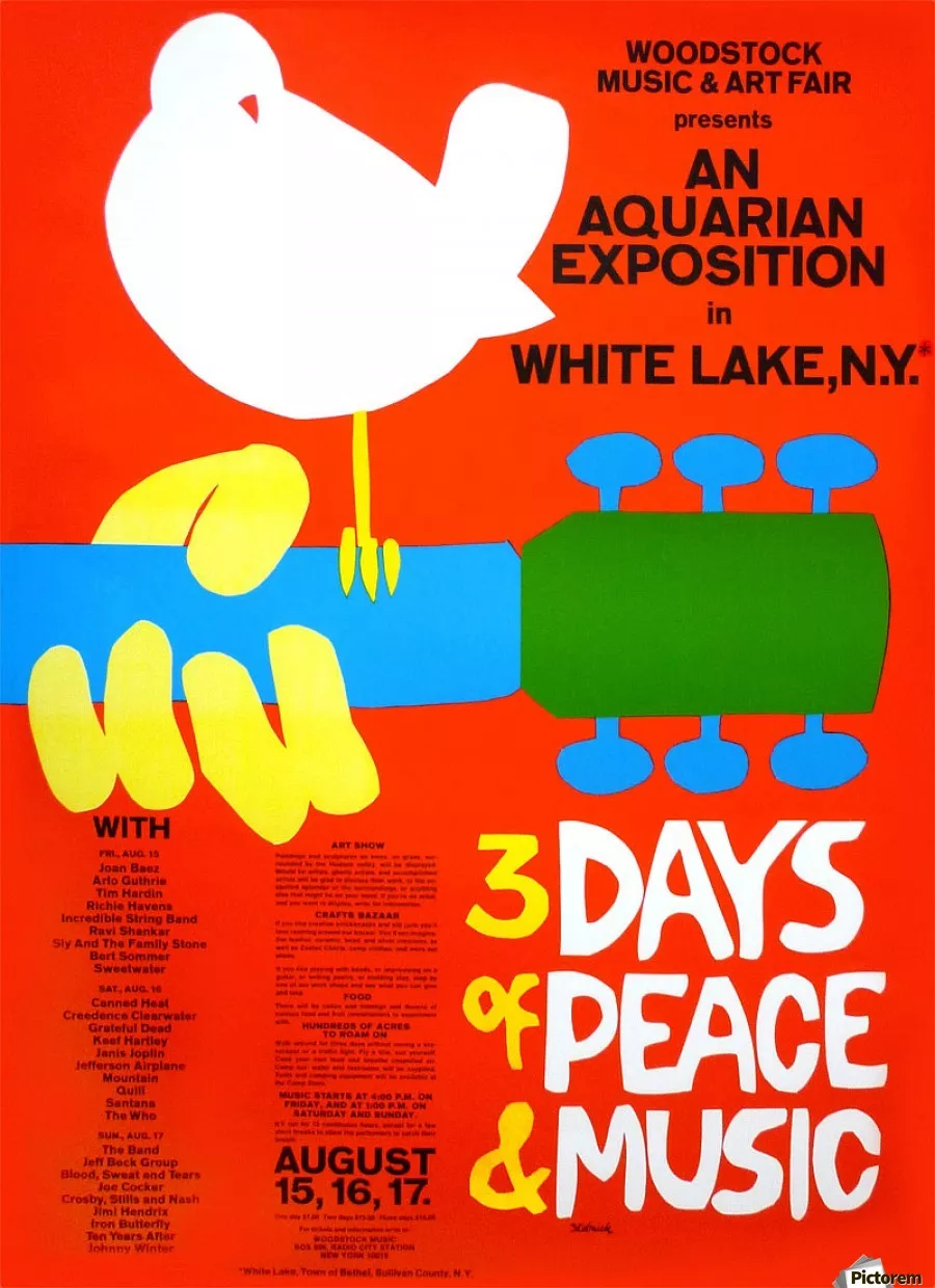
Think about legendary music festivals. What comes to mind? The 1969 Woodstock? Probably the best concert of all times!
The 1969 Woodstock
The Rolling Stone magazine calls it one of the “50 Moments that changed the history of rock and roll”. And for good reason.
The 3 days of music and peace concert was held on a dairy farm in upstate New York. The promise of 3 days of peace and music in a time when the war in Vietnam didn’t see an end in sight.

Probably the most famous image that people associate with this event is the vinyl album’s cover. The famous couple all wrapped up in a blanket. However, the Woodstock festival poster is a reference piece when it comes to the art of the music festival poster.
Designed by Arnold H. Skolnick, an American publisher, and graphic designer who was also involved in the To Kill A Mockingbird movie, the Woodstock music festival poster is an undeniable piece of music art.
The poster shows a white dove perched on the neck of an acoustic guitar clearly symbolizing the idea of peace and music altogether.
Skolnick cut the bird and the words from a paper and managed to deliver the poster in just 3 days. Legend says he only made $15 out of royalties for his design.
Using bold, strong hippie colors, the 1969 Woodstock music festival poster is a statement.
For its 40th year anniversary, Skolnick redid the design. Here’s how the 2009 version of the Woodstock music festival poster looks like.

It’s still got the bird and the hippie colors but with a more modern twist.
Glastonbury music festival poster through the years
Majorly inspired by the 70’s hippie festival culture started by Woodstock, Glastonbury is probably one of the biggest festivals in the world. Based in the UK, the festival is still running and has hosted big gigs with headliners like David Bowie in 1971 to Arctic Monkeys or Coldplay in 2016.
With over 40 years of activity, Glastonbury has made its mark on the art of the music festival poster. Let’s take a deep dive into 4 decades of music poster art. You’ll definitely notice a pattern here. A psychedelic pattern.
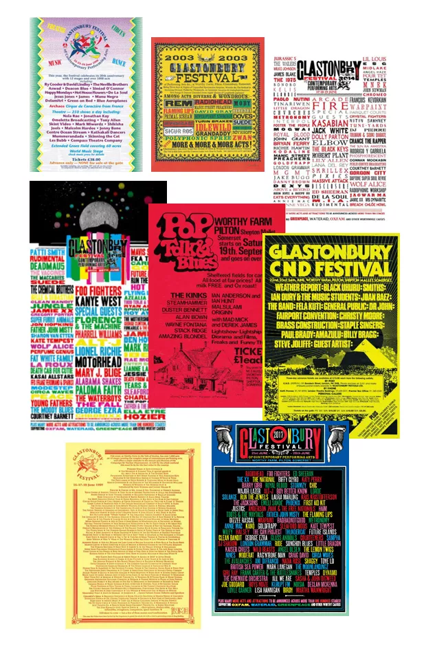
Typography and (once again) psychedelic, hippie colors are a big part of all these Glastonbury music festival posters. And for good reason. When talking about a well-established festival, typography is the one element once can play around with to emphasize the headliners of the festival. Make sure to choose a typeface to really make the names stand out.
Coachella
A music festival held in the middle of the Colorado desert, Coachella is a festival that first started in the late ‘90s. Back then, the main promotional tool to get the word out was the music festival’s poster and some MTV commercials. Now, in 2019 we talk about an army of influencers and a plethora of Instagram coverage to get the job done.
Probably why we see a consistency of Coachella’s music festival poster design.

Basically, the main design is the same since the fourth installment, in 2003. The festival’s lineup is broken up by day, with the font getting smaller starting from headliners to the lesser-known acts. A technique many designers use for designing a music festival poster.
Montreux Jazz Festival
A jazz festival founded in 1967, the Montreux Jazz Festival takes place in Switzerland. Undoubtedly, one of the biggest jazz festivals in the world, with headliners like Miles Davis, Keith Jarrett, Jack DeJohnette, Bill Evans, Nina Simone, Jan Garbarek, and Ella Fitzgerald, this festival is a cultural phenomenon. Originally a jazz festival only, it later opened its doors for more diverse musical styles.
Diverse is also the one adjective that best describes the art that goes into its music festival’s posters. Let’s take a look at some of the most beautiful Montreux Jazz festival’s posters.
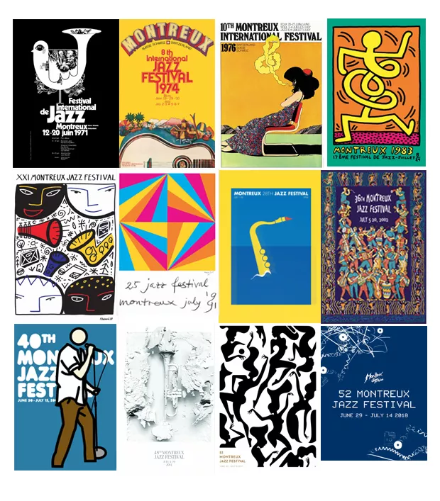
The 1976 Montreux Jazz Festival is probably one of the most famous posters of this festival. The artwork is by Milton Glaser, one of the biggest graphic designers of the 20th century. He’s also the guy who designed the I <3 NY logo.
With other posters designed by David Bowie or Phil Collins, the Montreux Jazz Festival posters are the kind of art you may want to hang on your walls.
Lollapalooza
Did you know that Lollapalooza means “an extraordinary or unusual thing, person, or event; an exceptional example or instance”? And I think the festival’s name pretty much sums up its philosophy.
The first edition of Lollapalooza took place in ‘91 when Jane’s Addiction singer Perry Farrell had a farewell tour for his band. It was this idea of a festival that promoted unique, strange and alternative music in one place.
With a break of 7 years, between 1997 to 2004, the festival has slowly spread its wings. Today we talk about a worldwide festival phenomenon with concerts in Berlin, Paris, Chicago, Chile, Argentina or Brazil.
You can see exactly how the festival evolved over time, just by taking a look at the music festival’s posters. If the first edition’s posters have more of an amateur feel to them, the recent ones are clearly designed by experts.
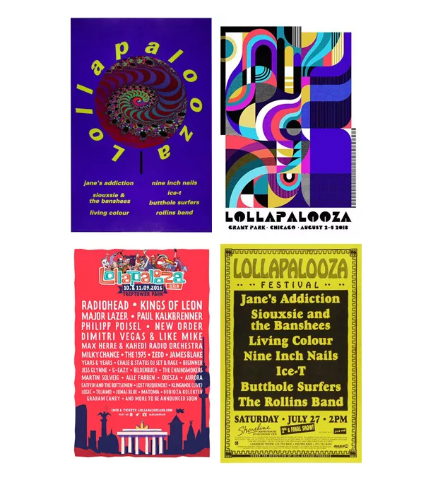
Like the 2018 Lollapalooza poster designed by Jessie Unterhalter and Katey Truhn, two Baltimore based artists who have a track record of transforming public spaces. These two brought street art into the design of the 2018 poster. Representing a bird’s eye view of Grant Park, where the music festival takes place, the poster uses a vintage font and bold, vivid colors.
This is a piece “inspired by the fluidity of music and its fans, this piece of art creates a juxtaposition of nature and the energy of the festival. “
Design tips to make your own music poster
Sure, there’s no secret recipe to success when it comes to designing your own music festival poster. But you can easily take inspiration from these 5 major music events. And so many other music festivals taking place all around the globe, embracing all sorts of diverse genres of music.
First and foremost, the biggest inspiration should be the theme of your event. Start from that. Let’s take for instance the first edition of Woodstock – 3 days of peace and music. Well, the poster portrays this theme exactly with the bird and the guitar.
Always think about the branding aspects that go into it. Especially when designing for the first edition of a music festival. Think in perspective. The event will probably (eventually) get bigger and better, and so will the design. Think about going for something unique, something that will make you stand out from the rest. While still being on trend.
- Always keep your brand in mind
- Emphasize your headliners.
- Stick to your theme
- Use fluid design
- Let the music inspire you
While for some music festivals it may make more sense to add a lot of text in order to sell tickets. For others, like the Montreux Jazz festival, it’s more about the art behind the poster.
Think about how you can incorporate the typography within your design. If you have a lot of text that absolutely needs to be placed on the poster, maybe start with that and arrange the illustrations or images accordingly.
One hard task designers have when creating the perfect music festival poster is to encapsulate the feel of the event without being too overwhelming with the text and colors.
Typography
As for typography, I would recommend sticking to 2 fonts. One for the headline and the other one for body text.
Also, a very used design technique is to have the headliners in bold, big text while the lesser known acts will usually have a smaller font. This will help you save some space on your design layout.
The ultimate suggestion is to get your inspiration from music and let your design flow. While it makes so much sense to use colorful, playful techniques when designing for an electronic music festival, for a more jazzy, classical music fest, the obvious route would be to go for something with a more artistic feel to it.
Here are two music festival templates you can start from when designing for your next gig:

To edit this jazz music festival poster template, simply click the image above.
Conclusion
For me, it’s fascinating to see how the art of the music festival poster evolved throughout the years. Music is one of those things that should spark creativity. So, let it inspire you and have fun while designing your next music festival poster.
What others music posters inspired you lately? Let me know in the comments down below.