A Complete Guide to Creating Accessible Digital Brochures (WCAG & ADA)
Published on: September 11th, 2025
Last update: March 10, 2026
The U.S. has seen a significant rise in accessibility lawsuits in recent years, reinforcing what forward-thinking marketers already understand: accessibility isn’t optional, it’s essential.
Brochures remain one of the most widely used content formats across industries, from education and healthcare to finance and hospitality. Yet many brochures still unintentionally exclude audiences with visual, cognitive, or motor impairments. When accessibility isn’t considered, the consequences go beyond poor user experience. Organizations may face reputational damage, financial penalties, and legal exposure under regulations such as ADA Title III and Section 508.
But accessible brochures aren’t only about compliance. They also improve usability, engagement, and content clarity for every reader. When marketing materials are clearly structured, easy to navigate, and compatible with assistive technologies, they perform better for everyone, not just people with disabilities. Accessible design leads to clearer communication, stronger engagement, and better reading experiences across devices.
In this guide, you’ll learn:
- A practical ADA-compliant brochure checklist for both digital and print materials
- Accessible brochure templates to help you get started faster
- Step-by-step strategies for designing accessible brochures
- How Flipsnack helps you create and publish accessible digital brochures

Why accessible digital brochures matter for your business
Designing an accessible brochure is about removing real-world barriers that make everyday materials unreadable or unusable for millions. Whether it’s a tri-fold at a doctor’s office, an informational flyer at a library, or a downloadable product catalog, ADA compliance ensures everyone can interact with your content, regardless of ability.
To support organizations across healthcare, government, education, retail, and nonprofits, we’ve created a checklist for ADA-compliant print marketing materials and digital brochures. These requirements follow WCAG 2.1 Level AA standards and help you confidently meet legal accessibility expectations in the US.
Use this checklist for ADA-compliant brochures (2025-ready) as your go-to resource every time you design or audit marketing content:
Text & Typography
- Use sans-serif fonts like Arial, Helvetica, or Calibri for clean readability.
- Set body text to a minimum of 12pt (print) or 16px (digital) to support those with low vision or aging eyesight.
- Avoid decorative or script fonts that hinder legibility for people with dyslexia or cognitive disabilities.
- Maintain consistent font use throughout the layout to minimize confusion and cognitive overload.
Color & Contrast
- Ensure a minimum contrast ratio of 4.5:1 for normal text, and 3:1 for large text to meet WCAG guidelines.
- Use color contrast checkers to test text-background combinations before publishing or printing.
- Never use color as the sole way to convey information (e.g., don’t say “see the red icon”- use labels, shapes, or icons too).
- Choose accessible color palettes designed to support colorblind readers—tools like Flipsnack’s or Venngage’s color palette generators make this easy.
Structure & Layout
- Use a logical reading order—screen readers follow the content top-down and left-right unless you manually correct this.
- Apply headings (H1, H2, etc.) to break up content and make navigation easier for assistive tech users.
- Add white space and ample margins to reduce visual fatigue.
Visual Elements
- Provide alt text for all meaningful graphics, charts, logos, or illustrations.
- If images are decorative, mark them as such to avoid disrupting screen reader flow.
- Choose icons or symbols that reinforce meaning and improve visual clarity.
- For PDFs or digital brochures, test using tools like NVDA, VoiceOver, or JAWS.
Links & Navigation
- Use descriptive link text: Instead of “Click here,” write “Download the accessibility guide.”
- Ensure all buttons, videos, and embedded links are fully keyboard navigable.
- Include skip navigation links or anchors for long documents.
Avoid auto-playing videos or audio—include clear pause/stop controls if used.
Language & Comprehension
- Write using plain, concise language. If someone with a cognitive disability or a second-language learner reads your content, will they understand it the first time?
- Break up long sentences and use bulleted lists for digestibility.
- Provide visual aids like charts, infographics, or icons to enhance clarity—just remember to make them accessible too.
Alternate Formats
- Always have an accessible PDF version with tagged content and alt texts for download.
- Offer large-print, audio, and HTML versions where applicable.
ADA and WCAG requirements for digital brochures
Digital brochures fall under the broader category of accessible digital documents, which includes PDFs, downloadable marketing materials, and online publications. Under the Americans with Disabilities Act (ADA), organizations must ensure their digital content is accessible to people with disabilities.
In practice, most organizations follow the Web Content Accessibility Guidelines (WCAG) 2.1 Level AA, which serves as the widely recognized standard for accessibility compliance. These guidelines help ensure that digital brochures can be accessed by people using assistive technologies such as screen readers, keyboard navigation, or alternative input devices.
WCAG accessibility is based on four core principles:
- Perceivable – Information must be presented in ways users can perceive, whether visually or through assistive technology.
- Operable – Users must be able to navigate the brochure using keyboards or assistive devices.
- Understandable – Content should be written clearly and structured logically.
- Robust – Digital materials should work reliably with screen readers and accessibility tools.
For organizations distributing brochures online, following WCAG standards helps ensure that marketing materials, product catalogs, reports, and informational guides remain accessible to all users while reducing legal and compliance risks.
However, meeting accessibility standards can feel complex without the right tools. That’s why many teams rely on platforms that integrate accessibility features directly into the content creation process.
How Flipsnack is the best platform for creating accessible brochures
Flipsnack integrates accessibility directly into your workflow. Flipsnack builds this tool to comply with ADA and WCAG standards, helping teams ensure both usability and design quality. When you create digital brochures, Flipsnack makes sure every user can navigate and understand your publication.
Key accessibility features in Flipsnack
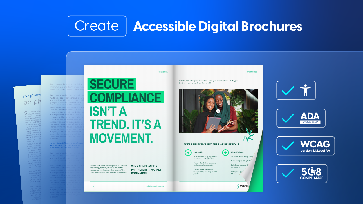
Flipsnack goes far beyond basic compliance; it embeds accessibility into the very foundation of your digital publishing workflow. Whether you’re uploading a finished PDF or designing from scratch, the platform provides a robust suite of tools that empower you to meet ADA, WCAG 2.1 AA, and Section 508 standards with clarity and ease.
These features, from screen reader compatibility to AI-powered content summaries, go beyond checking boxes. They make your brochures readable, navigable, and inclusive from the first interaction to the last. Below are the core capabilities that make Flipsnack one of the most accessible digital brochure platforms available today. Here’s a closer look at the essential accessibility features Flipsnack offers:
Flipbook player with full keyboard navigation
All navigation buttons and controls are screen reader-friendly and TAB-key navigable.
Accessible content layer
Use the Accessibility tab to add page titles and descriptions. The text is read aloud by assistive software like VoiceOver or JAWS.
AI-Generated summaries
Enable Flipsnack’s AI-powered content extraction to auto-generate page summaries. Proofread, edit, then save; no manual work needed.
Text extraction for exact reading order
Automatically pull exact text from your flipbook into the Accessibility tab. A time-saving dream, especially for high-volume publications.
Upload fully accessible PDFs
Already created an accessible PDF? Upload it and allow users to download directly from your flipbook, complete with tagged content, alt-texts, and contrast control.
How to make a digital brochure accessible (step-by-step)
Creating an accessible brochure is easier when accessibility is considered from the beginning of the design process. Instead of trying to fix issues later, build accessibility directly into your workflow.
Follow these steps to design a brochure that works for everyone.
1. Start with an accessible source document
Design accessibility into your brochure from the start. Use structured headings, readable typography, and high-contrast colors whether you’re designing from scratch or editing an uploaded PDF in Flipsnack.
2. Use semantic structure
Organize your brochure with clear heading levels (H1, H2, H3), bullet lists, and structured sections. This helps assistive technologies interpret the content correctly and improves readability for all users.
3. Make visuals accessible
Images, charts, and graphics should include descriptive alt text explaining their meaning. For complex visuals like data charts, provide a short text explanation to ensure the information is understandable without relying on visuals alone.
4. Ensure keyboard navigation
Interactive elements such as buttons, links, and forms must be usable with keyboard navigation. This allows users who cannot operate a mouse to interact with your brochure.
5. Test accessibility before publishing
Before sharing your brochure, test it using accessibility tools such as:
- NVDA
- VoiceOver
- WAVE
- Axe
- Adobe Acrobat Accessibility Checker
These tools help identify issues with contrast, structure, and screen reader compatibility.
6. Provide alternative formats
Whenever possible, offer alternate formats to ensure accessibility across different needs. These may include:
- Accessible PDFs – Provide a downloadable, structured PDF with proper tags, alt text, and readable formatting. In Flipsnack, you can upload or edit an accessible PDF and allow readers to download it directly from the flipbook player.
- HTML versions – A web-based version that can be easily interpreted by screen readers and assistive technologies.
- Large-print versions – Documents designed with larger fonts and simplified layouts for readers with low vision.
- Audio versions – Narrated versions of the content for users who prefer listening over reading.
Providing multiple formats helps ensure your information is accessible, flexible, and available to the widest possible audience.
Accessible brochure templates in Flipsnack
Creating an accessible brochure doesn’t have to mean starting from a blank page. Flipsnack offers a curated library of professionally designed, accessibility-ready templates—each crafted to help you meet WCAG 2.1 AA and ADA standards without compromising on creativity or visual impact.
Jewelry Company Brochure Example
This interactive template is more than stylish; it’s built for sensory inclusivity. Featuring high-contrast visual layouts and clean, readable typography, it allows marketing and sales teams to showcase luxury collections without compromising accessibility. Embedded videos and GIFs are paired with captioning fields and alt-text support, ensuring content remains meaningful for screen reader users.
Interactive elements like clickable link buttons and product tags are fully keyboard-navigable and can be labeled descriptively to support assistive technologies. The built-in contact form aligns with ADA input standards, making it easy for clients or partners with motor impairments to reach out.
Perfect for digital brochures requiring WCAG 2.1 AA compliance, this template blends beauty with barrier-free engagement—making it a compelling choice for B2B presentations or inclusive promotional campaigns.
Corporate Profile Brochure Example
Ideal for investor briefings, board meetings, and high-stakes introductions, this template offers more than corporate polish it’s built with accessibility in mind. Clean heading structures, semantic layout sections, and consistent visual hierarchy ensure content can be interpreted accurately by screen readers and keyboard users.
With space for embedded video summaries, alt-text-ready infographics, and interactive elements, this template allows stakeholders with disabilities to engage meaningfully. Use descriptive labels for navigation buttons and ensure all performance visuals include textual explanations for users with visual impairments.
Whether you’re creating a public-facing company overview or an internal governance report, this accessible brochure ensures that transparency and inclusion go hand in hand.
Digital Informative Brochure Template
This template is ideal for organizations committed to equity in information delivery. Built for clarity, it uses high-contrast text blocks, legible font choices, and consistent spacing, all essential for readers with low vision or cognitive disabilities.
Infographics and charts are integrated with alt-text fields and contextual descriptions, enabling users of assistive technologies to grasp key data points. Layouts follow a logical reading order, and the design is screen-reader and keyboard-friendly from page one.
Perfect for distributing ADA-compliant curriculum overviews, policy guides, or professional development resources, this brochure can be customized to meet the needs of all readers, whether in digital or print form. For non-profits, government agencies, and educators alike, it’s a ready-to-deploy, accessible communication tool that respects every user’s right to understand.
Non-profit organization brochure template
This accessible digital brochure template for non-profits helps organizations share their mission while keeping content inclusive and easy to navigate. The layout uses clear structure, readable typography, and high-contrast sections to support accessibility and improve readability.
You can add photos from your programs along with alt text descriptions, ensuring screen reader users understand the context. Interactive elements like links, videos, and social media buttons can also be included to encourage engagement with your cause.
Ideal for charities and NGOs, this template makes it easy to create accessible digital brochures that inform, inspire, and connect with supporters.

Design your first accessible brochure with Flipsnack
Making your brochure accessible isn’t just the right thing to do; it’s the strategic thing to do. Inaccessible brochures alienate audiences, limit reach, and invite legal risk. Accessible brochures, on the other hand, build trust, expand engagement, and ensure your message reaches everyone it’s meant for.
Accessibility is not a hurdle; it’s a bridge to better communication. It empowers your brand to connect with people of all abilities while aligning with ADA, WCAG 2.1 AA, and Section 508 standards. Flipsnack makes that possible and practical.


