
Digital Booklet Design: Layout Ideas, Tips & Best Practices
Published on: August 7, 2024
Last updated: December 3, 2025
Digital booklets have become essential in how we share information and connect with audiences. Whether you’re creating product catalogs, educational materials, company reports, or creative portfolios, effective booklet design transforms static content into engaging, interactive experiences.
Modern digital booklets combine compelling visuals, strategic layout design, and interactive elements to communicate messages more effectively than traditional printed materials. From choosing the right booklet layouts and color palettes to incorporating your brand story, thoughtful design elevates your content and keeps readers engaged.
This comprehensive guide explores everything you need to create professional digital booklets. You’ll discover best practices for booklet layout design, color palette and typography tips, real-world digital flipbook examples, and actionable design ideas to make your booklets stand out—whether you’re a business showcasing products, an educator creating course materials, or a creative professional building your portfolio.
Table of contents
- Essential elements that make your booklet work
- Essential design practices for digital booklets
- Digital booklet examples and modern design inspiration
- How to make an effective digital booklet in Flipsnack – quick and easy
- Benefits of using online booklets
- Conclusion: Apply the best design booklet principles
Essential elements that make your booklet work
When designing a digital booklet, knowing what information to include and where to place it is crucial for effective communication. Your booklet layout design should guide readers naturally from the cover through to your call to action, with each element serving a specific purpose.
Here are the essential elements every well-designed booklet should include.
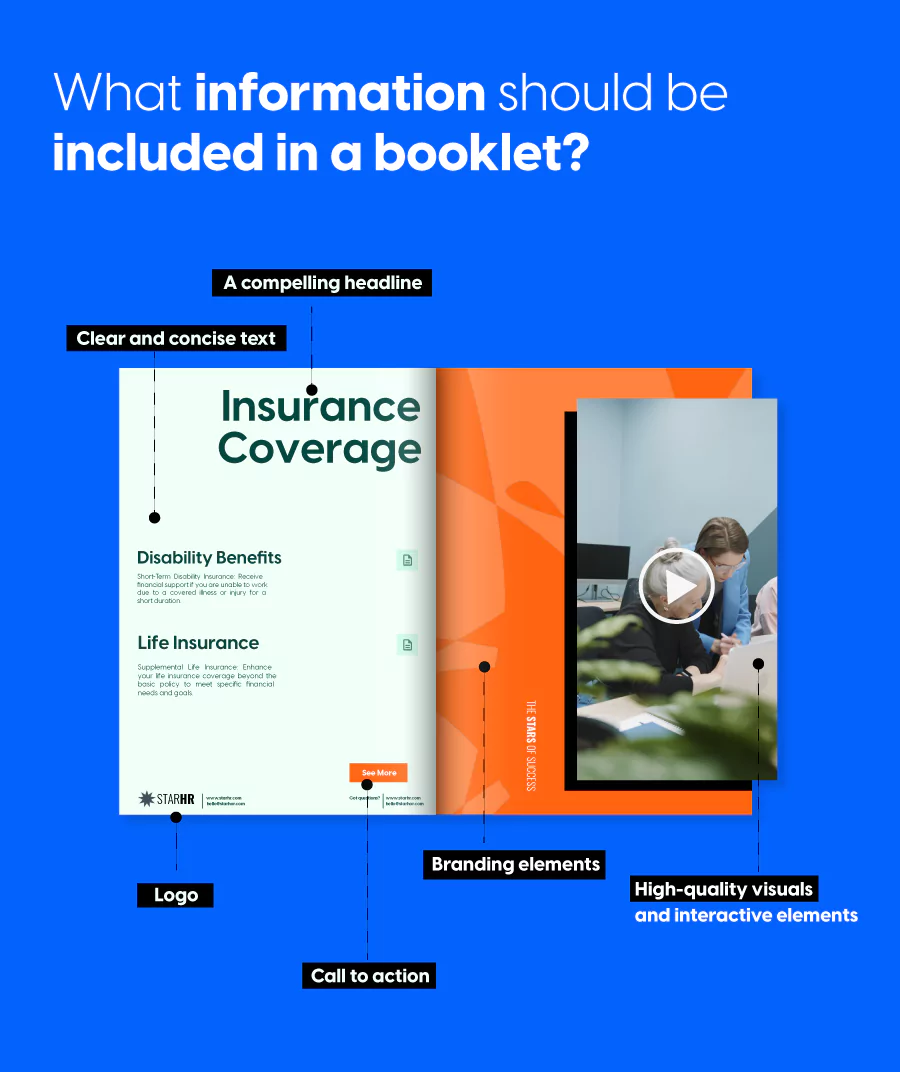
1. Your headline is your hook
The headline is the first thing readers see, so it needs to capture attention immediately. Keep it short, clear, and engaging to transform casual browsers into invested readers.
A great headline tells readers exactly what value they’ll get from your booklet while reflecting your brand’s voice. Whether you’re showcasing products, sharing insights, or telling a story, your headline sets expectations and draws people in.
2. Visuals and interactivity bring your content to life
Visuals are what make digital booklets stand out from traditional documents. High-resolution images, graphics, and interactive elements like videos, audio clips, and clickable links transform static information into an engaging experience. You can also create an infographic in PowerPoint to present key ideas, processes, or data in a clear, visually appealing way.
For product catalogs, use professional product photography that showcases details and benefits. For educational booklets, include diagrams, charts, and visual examples that clarify complex concepts. Interactive elements like embedded videos or clickable product links can turn passive readers into active participants, driving deeper engagement with your content.
The key is ensuring every visual serves a purpose and maintains consistent quality throughout your booklet.
3. Text that speaks directly to your reader
Your text delivers your core message, so clarity is essential. Start by defining your goals and key points, then use concise language that speaks directly to your target audience.
Break up long paragraphs, use subheadings to improve scannability, and align your tone with your brand voice. Whether you’re informing, persuading, or entertaining, well-crafted text keeps readers engaged and ensures your message lands effectively.
4. Branding that creates instant recognition
Consistent branding throughout your booklet reinforces recognition and professionalism. Your logo, color palette, and typography should appear cohesively across every page, creating a unified visual identity.
These branding elements do more than make your booklet look polished—they communicate your brand’s values and personality. Strategic placement of your logo, consistent use of brand colors, and typography that reflects your brand character all work together to make your booklet instantly recognizable.
5. Strategic calls to action that drive results
Every effective booklet guides readers toward a next step. Whether you want them to visit your website, sign up for a newsletter, request a quote, or contact your team, clear calls to action are essential.
Make your CTAs specific and action-oriented. Instead of generic phrases, use compelling language like “Explore Our Full Catalog,” “Schedule Your Free Consultation,” or “Download the Complete Guide.” Include clickable links in your digital booklet to make these actions effortless for readers, and place CTAs strategically throughout—not just at the end.
Best booklet layout design ideas
The right booklet layout can make or break your reader’s experience. A well-planned layout guides the eye, emphasizes key information, and keeps your audience engaged from cover to back page. Whether you’re creating a product catalog, educational guide, or creative portfolio, choosing the right layout approach sets the foundation for effective design.
Grid layouts: organized and easy to scan
Grid-based layouts provide a clean, organized framework that makes information easy to digest. By dividing pages into columns and rows, grids create visual rhythm and help readers navigate content intuitively.
This layout works exceptionally well for:
- Product catalogs with multiple items per page
- Educational materials with text and supporting images
- Reports and guides requiring clear information hierarchy
The beauty of grid layouts lies in their flexibility. You can use symmetrical grids for a traditional, formal feel, or break the grid selectively to create visual interest while maintaining overall structure.
Magazine-style layouts: editorial and engaging
Magazine-style layouts bring editorial flair to your booklet design, using varied column widths, pull quotes, and creative image placement to create visual energy. This approach works beautifully when you want to blend storytelling with information.
Key elements of magazine layouts include varied column structures that prevent monotony, large feature images that anchor each spread, pull quotes or callouts that highlight key messages, and white space used strategically to let content breathe.
This layout style is perfect for brand stories, annual reports, travel guides, and lifestyle-focused booklets where engagement and visual appeal are priorities.
Minimalist layouts: clean and focused
Sometimes less truly is more. Minimalist booklet layouts strip away unnecessary elements, focusing attention on what matters most. Clean lines, generous white space, and intentional typography create a sophisticated, modern aesthetic.
Minimalist layouts excel when your content is strong enough to stand alone—think high-end product photography, impactful headlines, or powerful data visualizations. This approach works particularly well for luxury brands, architecture portfolios, and thought leadership content where elegance and clarity are paramount.
Image-heavy layouts: let visuals take center stage
When your images are the star of the show, visual-heavy layouts give them room to make an impact. These designs prioritize large, bold imagery with minimal text, creating an immersive visual experience.
Best practices for visual-heavy layouts:
- Use full-bleed images that extend to page edges
- Limit text to short captions or minimal descriptions
- Create rhythm by alternating between single large images and multi-image spreads
- Maintain consistent margins even when images vary in size
This layout approach is ideal for photography portfolios, fashion lookbooks, real estate showcases, and creative work where visuals communicate more effectively than words.
Asymmetrical layouts: bold and contemporary
Asymmetrical layouts break away from traditional centered designs, creating unexpected visual interest through intentional imbalance. By placing elements off-center or using uneven spacing, these layouts feel contemporary and dynamic.
This design approach captures attention and creates movement across pages, making it perfect for brands that want to stand out. Fashion brands, tech companies, and creative agencies often embrace asymmetrical layouts to communicate innovation and forward thinking.
The key to successful asymmetrical design is maintaining visual weight and balance even when elements aren’t symmetrically placed—it should feel intentional, not haphazard.
Choosing the right layout for your booklet
Your ideal booklet layout depends on your content, audience, and goals. Consider these factors when deciding:
- Content type: Is it text-heavy, image-focused, or balanced?
- Brand personality: Are you traditional and professional, or modern and creative?
- Reader experience: Will readers skim quickly or read thoroughly?
- Purpose: Are you informing, selling, or inspiring?
Don’t be afraid to combine layout approaches within a single booklet. You might use a grid layout for product pages but switch to a magazine style for feature stories, creating variety while maintaining cohesion through consistent typography and color choices.
Color palette and typography tips for digital booklets
Color and typography are the visual foundation of your booklet design. Together, they set the mood, reinforce your brand identity, and guide readers through your content. The right combinations create harmony and readability, while poor choices can distract or confuse your audience.
Building a color palette that works
Your color palette should communicate the right message and create visual hierarchy. Select 3-5 colors that work together: a dominant brand color, an accent color for calls to action, neutral colors for backgrounds and text, and supporting colors for section dividers.
Consider color psychology when making selections. Blue conveys trust and professionalism for corporate materials. Green suggests growth and wellness for sustainability or healthcare content. Bold colors like red and orange create energy and urgency for promotional catalogs.
Choosing fonts for readability and hierarchy
Typography establishes visual hierarchy and ensures comfortable reading. Use 2-3 fonts maximum—one for headlines, another for body text, and optionally a third for accents.
For body text, sans-serif fonts like Open Sans or Roboto work well for digital reading. Serif fonts like Georgia can add sophistication for longer passages. Headlines should have personality that aligns with your brand while remaining legible at all sizes.
Create clear hierarchy through size and weight. Headlines should be 2-3 times larger than body text, with subheadings falling between. Use font weight variations (bold, regular, light) to add emphasis without introducing more fonts.
Pairing colors and fonts effectively
Great combinations create visual interest while maintaining cohesion. Successful font pairings often combine a distinctive headline font with a simple body font—contrast without conflict.
For colors, ensure strong contrast between text and backgrounds for readability across devices. Use high-contrast colors for important elements like headlines and calls to action. Test your choices on multiple screens to verify legibility.
Keep consistency throughout your booklet by using chosen colors and fonts in predictable patterns. Leave adequate white space around text and between elements to prevent a cramped appearance. Remember that restraint creates stronger design—limiting your palette and fonts results in cleaner, more professional booklets.
Essential design practices for digital booklets
Creating an effective digital booklet requires more than visual appeal—it demands strategic planning, design consistency, and thoughtful distribution. These practices ensure your booklet not only looks professional but also reaches and engages your intended audience.
1. Define your purpose and audience first
Before touching any design tools, clarify what you want to achieve and who you’re creating this booklet for. A product catalog for retail customers requires a completely different approach than an internal training manual or a creative portfolio.
Understanding your audience shapes every decision—from tone and layout complexity to the types of interactive elements you include. A clear objective keeps your design focused and prevents feature creep that dilutes your message.
2. Maintain consistency across all design elements
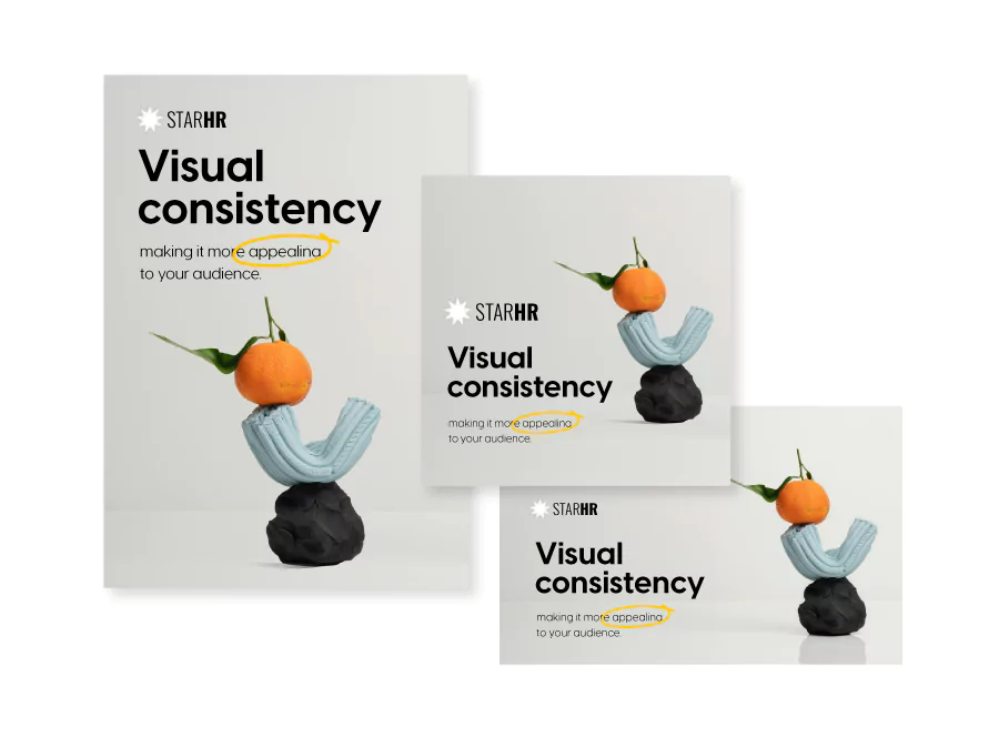
Consistency across your booklet signals quality and builds trust with readers. Maintain uniformity in several key areas to achieve a polished, cohesive look.
Fonts: Use 1-2 fonts maximum throughout your booklet. Choose one for headings and titles, another for body content. Consistent typography makes your booklet easier to read and more visually organized.
Colors: Create a color palette before you start designing and stick to it. Use these colors consistently for backgrounds, text, headers, and design elements. Your palette should reflect your brand identity and appear predictably across all pages.
Page margins and spacing: Keep margins identical on all pages for symmetry and balance. Consistent spacing between text, images, and other elements prevents clutter and gives each element breathing room.
Visuals: Use high-quality images and graphics that align with your content and brand. Maintain consistent visual styles, shapes, and iconography throughout to enhance the overall cohesion.
Layouts: Design with two-page spreads in mind, as that’s how readers view your booklet. Pay attention to how elements flow across facing pages, ensuring text and images are well-aligned and balanced.
3. Design for accessibility and inclusivity
Making your digital booklet accessible ensures everyone can engage with your content, regardless of abilities or devices. Accessibility isn’t just ethical—it expands your reach and improves the experience for all readers.
Follow WCAG guidelines by ensuring sufficient color contrast between text and backgrounds. Use readable font sizes (minimum 12pt for body text) and clear, simple language. Add alternative text descriptions for images so screen readers can convey visual information to visually impaired users.
Structure your content with proper heading hierarchy, making it easier for assistive technologies to navigate. Ensure interactive elements like buttons and links are clearly labeled and keyboard-accessible. Test your booklet on multiple devices and screen sizes to verify readability across platforms.
4. Share strategically to maximize reach
Once your booklet is designed, choosing the right distribution method ensures it reaches your audience effectively. Digital booklets offer flexible sharing options that traditional print can’t match.
For public distribution, embed your booklet directly on your website to keep visitors engaged without requiring downloads. Share via link through social media, email campaigns, or QR codes for easy access across channels.
For private or sensitive content, use password-protected links to control who views your booklet. One-time passcodes (OTP) add an extra security layer for highly confidential materials like financial reports or internal communications. Email distribution allows you to share booklets directly with specific recipients while tracking engagement.
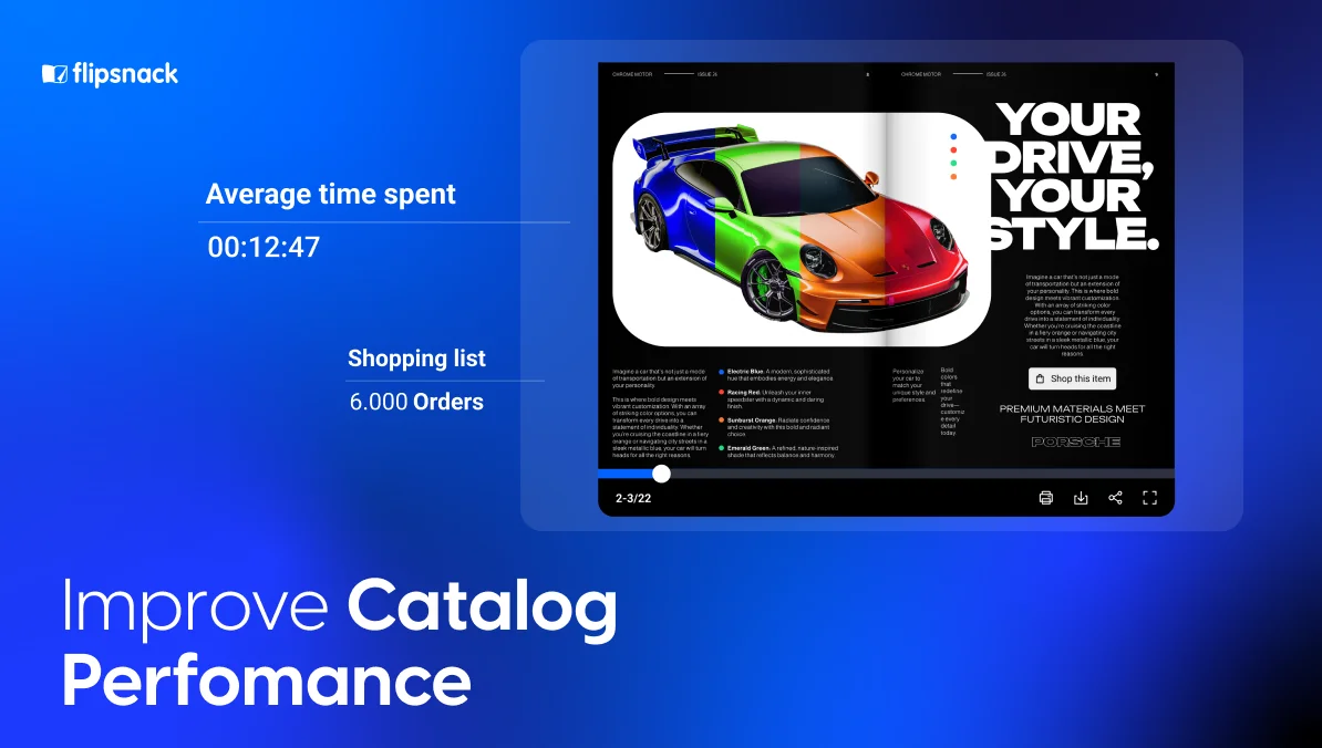
Digital platforms like Flipsnack provide analytics that show how many people viewed your booklet, which pages received the most attention, what interactive elements were clicked, and where readers are located geographically. You can also see which devices they used—desktop, tablet, or mobile—helping you optimize future booklets for your audience’s preferred viewing experience.
These insights transform your booklet from a static document into a measurable marketing tool, letting you refine your approach based on real engagement data.
Digital booklet examples and modern design inspiration
Sometimes the best way to understand effective booklet design is to see it in action. These professionally designed templates showcase different approaches to layout, typography, and visual storytelling across various business applications. Each demonstrates how strategic design choices create engaging, functional digital booklets.
1. Interactive training manual booklet template
This training manual template combines clear instructional design with interactive elements that enhance learning retention. The layout uses a structured grid system to organize complex information into digestible sections, with consistent typography that distinguishes between main concepts, procedures, and supporting details.

Visual hierarchy guides learners through step-by-step processes, while designated spaces for diagrams and screenshots help illustrate key points. The design balances professionalism with approachability, making technical content accessible for diverse learning styles.
2. Partnership program booklet template
Designed to attract and onboard strategic partners, this template presents partnership opportunities with clarity and visual appeal. The layout emphasizes benefits and program structure through strategic use of white space and compelling visuals.
Clean typography ensures partnership tiers, requirements, and incentives are immediately understandable, while branded color accents draw attention to key value propositions. The professional aesthetic communicates credibility and established market presence, essential for building partner confidence.
3. Interactive industry report booklet template
This industry report template transforms dense data and market analysis into an engaging visual narrative. The design incorporates space for charts, graphs, and infographics that make complex statistics accessible at a glance.
A sophisticated color palette and elegant typography convey authority and expertise, while thoughtful layout choices guide readers through findings, trends, and recommendations. The template structure supports both executive summaries for quick scanning and detailed analysis for deeper exploration.
4. Company profile booklet template
A comprehensive company profile template that tells your brand story while showcasing capabilities and achievements. The design flows from company history through services, team introductions, and client success stories in a cohesive narrative arc. Visual elements including photo galleries, timeline graphics, and testimonial highlights break up text-heavy sections while reinforcing brand identity. The layout balances promotional content with authentic storytelling, creating a profile that feels informative rather than sales-driven.
5. Architecture booklet template
This architecture template provides a stunning canvas for showcasing design projects with the visual impact they deserve. Large, full-bleed image layouts let architectural photography take center stage, while minimalist typography ensures project details enhance rather than compete with visuals.
The grid structure accommodates multiple project presentations while maintaining consistent flow, and dedicated sections for concept sketches, floor plans, and finished photography tell complete project stories. The sophisticated, modern aesthetic reflects contemporary architectural sensibilities.
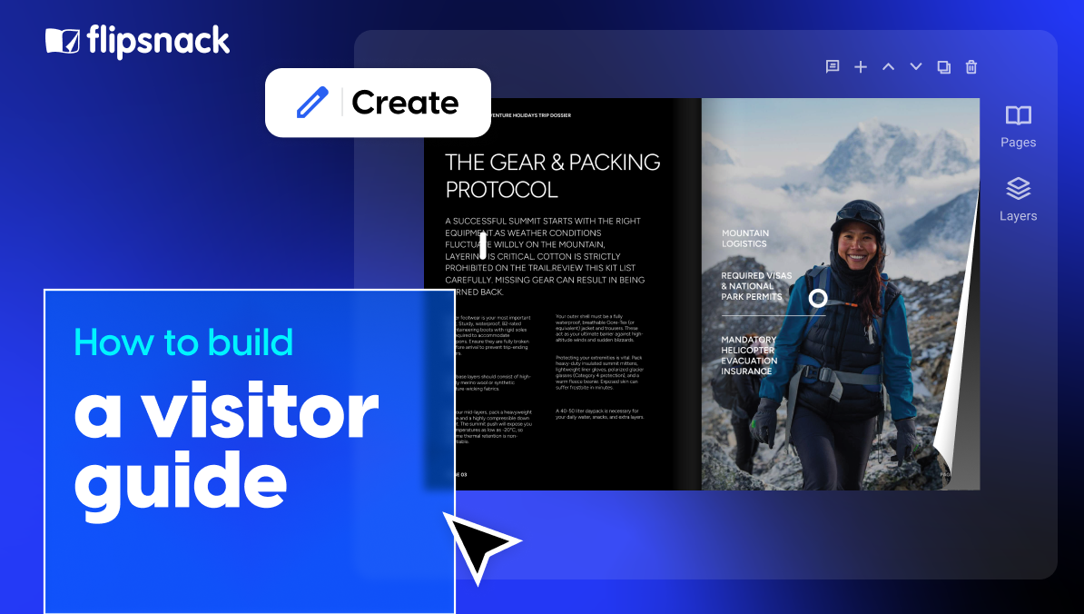
How to make an effective digital booklet in Flipsnack – quick and easy
Now that we’ve talked about a few tips and tricks on how to easily create a digital booklet, let’s get to practice.
Our online booklet maker offers a wide range of templates and a user-friendly editor to make the process as smooth as possible.
Follow these quick steps to create and customize your booklet:
- Select your preferred booklet template or upload your information through a PDF.
- Open it in our Design Studio and adjust it to your own needs.
- Customize the text by selecting your fonts, color palette, size, spacing, and proceed to write down your message.
- Upload the images or videos you’d like to share with your readers, or go to our stock photos sections and select the ones that fit your needs best.
- Spice up your digital booklet and add some dynamic elements from our wide selection of interactive features.
- Give your booklet design a personal touch by incorporating your branding elements. Upload your brand’s colors, fonts, and logos.
- Now that you’re all settled, save your booklet and share it with your audience via email, share it as a PDF link, or embed it on your website to engage your readers even more.
And that’s it! Use Flipsnack’s booklet maker to create and share your online booklets.
Benefits of using online booklets
Online booklets offer a large variety of benefits that make them an appealing alternative to traditional printed materials. Booklets provide a modern and dynamic way to engage readers, allowing you to keep your audience informed and connected with your content.
Moreover, online booklets are incredibly versatile, allowing easy updates and quick distribution. Whether you’re sharing the latest product catalog, the company’s newsletter, or educational materials, digital booklets ensure the convenience of instant distribution across digital platforms.
Overall, online booklets are an effective tool for sharing information, offering an interactive and engaging way to deliver your message to a broad audience.
Conclusion: Apply the best design booklet principles
Effective booklet design combines strategic planning, visual consistency, and thoughtful execution. From choosing the right layout and color palette to ensuring accessibility and measuring engagement through analytics, every decision shapes how your audience experiences your content.
The templates and principles covered in this guide give you a solid foundation to create professional digital booklets that serve your specific goals—whether that’s educating employees, showcasing products, presenting research, or building your brand story. Start with a clear purpose, maintain design consistency, and leverage the interactive capabilities that make digital booklets more engaging than static PDFs.
Ready to put these design ideas into practice? Flipsnack’s booklet maker provides the tools and templates you need to create, customize, and share professional digital booklets that capture attention and drive results.
Very good info. Lucky me I recently found your website by chance (stumbleupon).
I have bookmarked it for later!