How to Create a Pitch Deck Design That Gets Funded
Published on: September 7, 2026
You may have a great product, a huge market, and strong traction. None of it matters if an investor has to work to find it.
Investors don’t spend much time reviewing a pitch deck. A 2026 analysis of 1.3 million pitch deck sessions by Storydoc found that 31% of investors leave within the first 10 seconds of opening a deck, while another 15% leave within the first minute.
That means investors aren’t reading every word. They’re scanning your slides, deciding quickly what deserves their attention, and forming an opinion about your business along the way.
Your pitch deck has to make your case clear before attention runs out.
Let’s break down pitch deck design slide by slide. We’ll look at what each slide needs to accomplish, where founders often get it wrong, what a stronger version looks like, and how you can track engagement after you send your deck.
What makes a pitch deck effective?
Before getting into individual slides, it’s worth defining what you’re trying to achieve with your design. An effective pitch deck balances three things.
1. Clarity
Investors shouldn’t have to decode your slides. They should quickly understand what they’re looking at and why it matters.
This means clear headlines, readable typography, simple layouts, and visuals that explain rather than decorate.
Here’s a good test: look at a slide for a few seconds and ask, “What’s the one thing I’m supposed to take away from this?” If the answer isn’t obvious, the slide needs another round of editing.
2. Credibility
Your deck is also a reflection of how you operate. It shouldn’t look like something is missing or the opposite – cluttered with mismatched fonts and random layout choices.
Use consistent fonts and spacing, a restrained color palette, strong alignment, and fewer elements per slide. Choose visuals that support the message.
Maybe design isn’t a strength on your team. In that case, it’s best to work with a professional designer or agency that can help you create a pitch deck. It also helps to have your narrative aligned before you fundraise — many founders bring in a tech PR agency early to shape the same story that will later appear in press coverage of the raise, so investors see a consistent message across the deck, the website, and any media hits.
Your deck needs to look intentional and powerful. You’re asking someone to write a check, and a sloppy deck can quietly suggest that you don’t sweat the details.
3. Visual engagement
Clarity doesn’t mean walls of text.
Charts, product screenshots, diagrams, customer logos, and photography can help investors understand your business faster. But every visual needs a purpose. If a visual doesn’t help explain the product, prove a claim, or reinforce your story, cut it.
Design should make your business easier to understand. It shouldn’t exist just to make investors admire the design.
12 of the most common investor pitch deck slides
There is no universal pitch deck structure. Your slides should reflect your company, stage, and fundraising story. Most investor decks cover some version of the problem, solution, market, business model, traction, competition, go-to-market, team, financials, and ask.
Before getting into the design details, here’s a quick overview of what each slide needs to accomplish and the key information it should contain.
| Slide type | Why it matters | What to show |
| Title slide | Gives investors immediate context and tells them what your company does. | Company name, clear value proposition, product visual, contact info |
| Problem slide | Shows that you’re solving a real, painful problem for a specific audience. | The problem, target audience, key evidence |
| Solution slide | Helps investors understand how your product solves the problem and why it matters. | Customer outcome, product explanation, screenshot or workflow |
| Why now | Explains why the opportunity exists today. | Market shift, relevant trend, supporting evidence |
| Market opportunity | Shows that the company has room to become a meaningful business. | Market size, target customer, sizing methodology, assumptions |
| Business model | Shows how the company makes money and whether the model can scale. | Customers, pricing, revenue model, growth model |
| Traction slide | Provides evidence that customers want the product and the business is gaining momentum. | Key metrics, growth, customers, partnerships |
| Competition | Helps investors understand the alternatives and why your company can win. | Competitors, key differentiators, positioning |
| Go-to-market | Shows how you’ll turn the market opportunity into customers and revenue. | Target segment, acquisition channels, sales motion, distribution |
| Team slide | Builds confidence that the team can execute. | Key team members, relevant experience, expertise, founder-market fit |
| Financials | Shows where the business is going and whether the growth story is believable. | Key metrics, projections, growth trajectory, growth drivers |
| The ask | Makes the fundraising request clear and shows what the investment will accomplish. | Funding amount, use of funds, milestones, goals, timeframe |
Now let’s look at each slide more closely, including the design goal, common pitfalls, and what a stronger version looks like.
1. Title slide
The design goal: Tell investors what your company does before they have to ask.
The title slide doesn’t need to tell your entire story. It needs to establish context. Within a few seconds, investors should know your company name, what you do, and ideally why they should keep reading.
Where founders go wrong: Treating it like a corporate cover page.
Just a logo, a generic stock image, and a vague tagline that explains nothing won’t give investors much context.
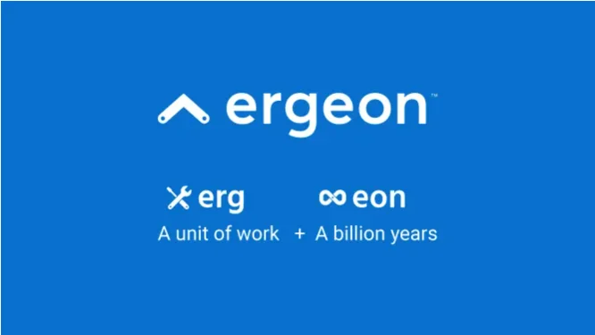
One example that gets this wrong is Ergeon. Its deck spends an entire slide explaining the origin of the company name. The story behind the name may be interesting, but it doesn’t help an investor understand the business or evaluate the opportunity.
What better looks like: Company name, one clear sentence describing what you do, and a single strong visual or product cue.
Skip the hashtags, too. Make sure your name and contact information are actually on the slide. You’d be surprised how often founders forget this and make investors hunt for a way to follow up.
A strong example from Launchrock uses a dramatic black background, high-contrast white text, a few graphic elements, and a bold statement. Nothing more. Now the investor knows what you’re building before they reach slide two.

What founders should keep in mind:
- Don’t use the title slide to explain your company’s name.
- Avoid vague taglines that could belong to almost any startup.
- Say what you actually do.
- Keep the layout simple enough that the company name and core message are immediately visible.
- Include contact information so investors don’t have to hunt for it later.
Your opening slide doesn’t need to impress investors with complexity. It needs to make them understand you.
2. Problem slide
The design goal: Make investors understand the pain, who experiences it, and why it matters.
The problem slide is where your fundraising story starts to become concrete. Yet founders often make the problem so broad that it stops feeling like a real problem.
Where founders go wrong: Look at the statement like this one:
“Businesses today face many challenges when it comes to productivity, communication, collaboration, and efficiency.”
It’s difficult to disagree with it and that is also why it’s weak. It could describe thousands of companies, and it doesn’t give investors a reason to care about your problem.
Mixpanel’s early pitch deck is a useful reference point here. It was simple, even a little too simple, and it lacked excitement. Still, it worked well enough to succeed.

What better looks like: The best problem slides usually combine a strong conclusion with a small amount of evidence. That could be a customer quote, a sharp statistic, or a visual showing the frustrating process you’re trying to change.
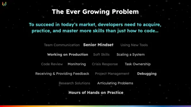
Wilco takes a more focused approach. Instead of trying to communicate several problems at once, the slide gives the investor one clear point to understand.
What founders should keep in mind:
- Don’t list every problem your product could solve.
- Don’t start with a generic industry statistic unless it directly supports the problem.
- Use the headline to state the conclusion.
- Support the claim with one or two pieces of evidence.
- Don’t confuse minimal design with weak design.
Your investor shouldn’t finish the slide thinking, “Okay, there are problems in this industry.” They should understand that it’s a painful problem and know exactly who has it.
3. Solution slide
The design goal: Make the value of your product obvious before explaining its mechanics.
This is where founders often get too close to their own product. They know every feature, technical detail, integration, workflow, and capability. So they try to put all of it on the slide.
The result is often a product tour instead of a compelling explanation of the solution.
Where founders go wrong: Glambook provides a useful example. Its deck introduces the idea that the problem remains unsolved because existing solutions are largely B2B and the market is fragmented, a potentially important investor concern. The problem is that the following product slide doesn’t directly answer that concern. Instead, it moves straight into product features.
That’s a crucial pitch deck design lesson: if your previous slide creates an objection, your next slide should resolve it.

What better looks like: Compare that with Lumigo.
Its solution slide reduces the product to one memorable outcome: customers get an early warning system when problems occur and a head start in resolving them.
The product may do much more, but the slide doesn’t force investors to understand every feature. The design isn’t trying to show everything the product can do. It’s showing why the product matters.
That’s much stronger communication.

What founders should keep in mind:
- Lead with the customer outcome, not the technology.
- Don’t show every feature.
- If you’ve raised a major objection on the previous slide, address it.
- Use screenshots or workflows to demonstrate the solution after you’ve explained its value.
- Ask yourself: “What is the one thing I want an investor to remember from this slide?”
Your solution slide is about explaining what changes for the customer, not how impressive your tech stack is.
4. Why now
The design goal: Show why this company has an opportunity today that may not have existed a few years ago.
Investors also want to understand why now is the right time for your company.
Where founders go wrong: This is a slide founders often skip entirely. When they do include it, they tend to rely on vague statements such as “AI is changing everything” or “The world is becoming increasingly digital.” These statements may be true, but they’re not specific enough to explain your opportunity.
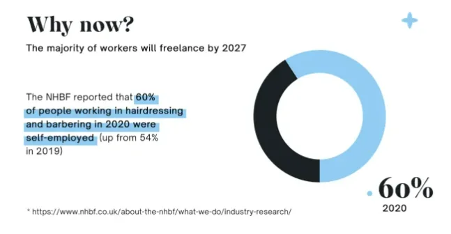
What better looks like: Glambook does something more useful. Its deck shows the market changing: the share of hairdressing and barbering professionals who were self-employed rose from 54% in 2019 to 60% in 2020. The slide supports a larger story about an industry in transition. The story becomes even more compelling when founders connect macroeconomic or societal changes directly to their company’s opportunity — that’s the difference between saying “the market is changing” and showing investors “the market is changing in a way that creates our opportunity.”
The original teardown notes that the story becomes even more compelling when founders connect macroeconomic or societal changes directly to their company’s opportunity.
What founders should keep in mind:
- Identify a specific change that created the opportunity.
- Avoid generic trend statements.
- Use a timeline, trend line, or before-and-after comparison when possible.
- Connect the change directly to your product.
- Make the slide feel like evidence that you’ve caught a wave, not simply noticed that the market exists.
5. Market opportunity
The design goal: Convince investors that the opportunity is large enough and that you understand it well enough to build a profitable company.
Market sizing is one of those areas where impressive-looking design can actually make a weak argument more obvious.
The classic version is a giant TAM number surrounded by three concentric circles labelled TAM, SAM, and SOM. It looks like a pitch deck slide, but if the numbers aren’t supported by clear logic, the graphic doesn’t make the market more believable.
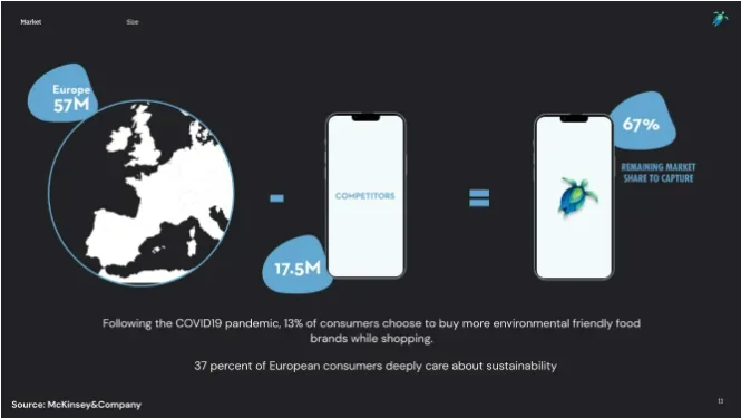
Where founders go wrong: One notable example suggested a market of 57 million people, with competitors already serving 17.5 million. That left the company targeting the remaining two-thirds.
There were no dollar figures, no clear top-down or bottom-up calculation, and no convincing explanation of who the competitors actually were.
It’s true that marketing sizing is based on assumptions and the estimate can be wrong, but this slide doesn’t demonstrate that the founders understand those assumptions.
If your competitors have already captured the easy third of the market, such as early adopters and customers who care most about the problem, you’re left with a harder segment to win.
A good market slide should show that you understand this.
Unfortunately, a weak slide can undermine your credibility instead of supporting your pitch.
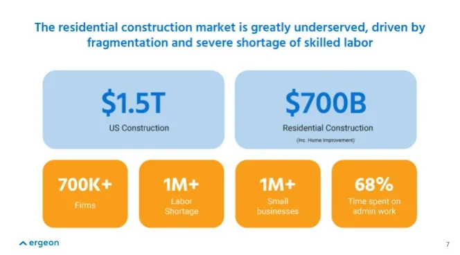
What better looks like: Compare that with a stronger example from Ergeon, which combines large market numbers with additional evidence: a fragmented industry, hundreds of thousands of firms, a labor shortage, independent contractors struggling with efficiency, and significant administrative overhead. Together, the numbers tell a story about why the market is both large and ripe for disruption.
This is what good market slide design does: it turns numbers into an argument.
What founders should keep in mind:
- Show your math.
- Make your assumptions visible.
- Use a bottom-up or top-down approach you can defend.
- Connect the market size to a real customer.
- Don’t rely on TAM/SAM/SOM circles simply because they’re familiar.
- Use supporting numbers to explain why the market is attractive.
A large number gets attention, but a believable calculation earns trust.
6. Business model
The design goal: Explain how the company makes money without making investors read a wall of text.
Your business model should be one of the easiest slides to understand.
Yet founders often try to explain every pricing tier, revenue stream, customer segment, and future monetization opportunity at once. That creates visual clutter and makes the core model harder to see.
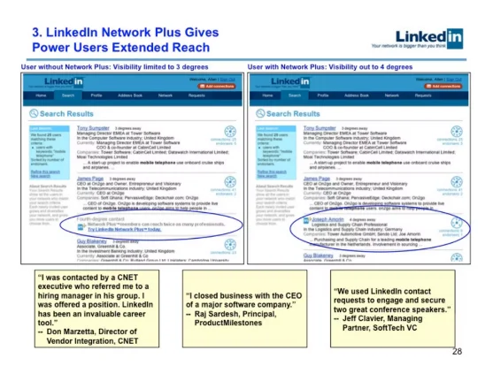
Where founders go wrong: LinkedIn’s early pitch decks are a well-known example of this problem. They included text-heavy slides that attempted to explain the business model through dense paragraphs.
Even if the underlying business model was strong, investors had to work too hard to find the important information.
What better looks like: BoxedUp takes a much simpler approach.
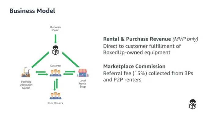
Its business model is tied directly to its marketplace strategy. It solves the supply-side problem by buying equipment it can rent out. This lets the company focus on renters and control the customer experience.
Once it has traction, the information gathered from customers can then help it work with the supply side. Notice what makes this effective. The model isn’t presented as an abstract pricing structure. It’s connected to the company’s strategy.
What founders should keep in mind:
- Show the simplest version of how you make money.
- Lead with the revenue stream that matters today.
- Explain the relationship between customers, pricing, and revenue.
- Don’t force investors to read paragraphs.
- Move secondary revenue streams and detailed pricing into the appendix.
If investors can’t explain your business model after looking at the slide for a few seconds, simplify it.
7. Traction slide
The design goal: Turn evidence into confidence.
Traction is where you stop telling investors that your company could work and start showing them evidence that it already does.
And traction doesn’t only mean revenue. Depending on your stage, it could mean users, pilots, waitlist growth, letters of intent, customer retention, partnerships, or other meaningful signals of demand.
Where founders go wrong: One of the weakest approaches is to turn the slide into a wall of logos.
The example from the teardown shows a small “5,000 users and growing” statement surrounded by blue-chip logos and broad labels such as government, enterprise, supply chain, and education.
The logos are not the problem, but leaving them hanging in the slide doesn’t tell investors what they represent. Are they customers, partners, prospects, or something else?

What better looks like: If you have 5,000 users, show the growth.
That’s why the Buffer example works better. Its traction slide makes the numbers the story. It shows multiple metrics growing over time instead of asking investors to infer traction from a collection of logos.

What founders should keep in mind:
- Choose two or three metrics that matter most.
- Show growth over time where possible.
- Label logos clearly if you use them.
- Don’t use logos as a substitute for actual traction.
- Bring compelling evidence forward instead of burying it at the end.
- Make the headline communicate the result, not simply say “Traction.”
A slide full of numbers isn’t necessarily persuasive. The right numbers, presented as a clear trend, can be.
8. Competition
The design goal: Help investors understand where you fit in the market and why you can win.
A competition slide should demonstrate that you understand the alternatives customers have today. It should not demonstrate how many competitors you could fit onto one slide.
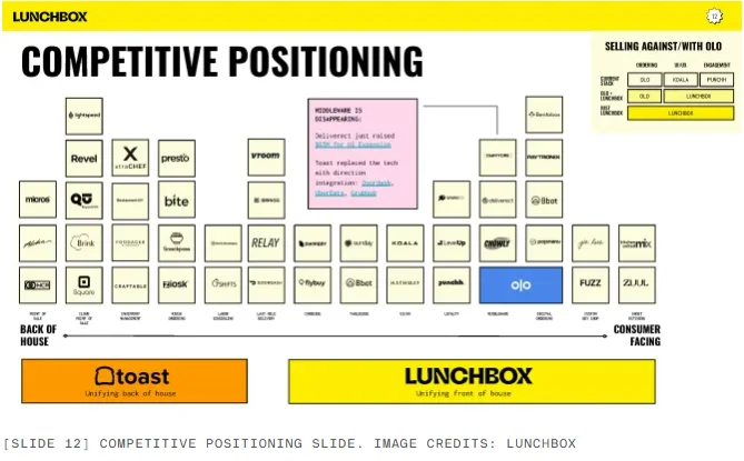
Where founders go wrong: Lunchbox is a good example of what happens when competitive analysis becomes too dense.
Its slide includes over 40 competitors. While there’s a strategic idea behind the positioning, the sheer number of elements makes the slide extremely difficult to read.The viewer has to spend more time decoding the chart than thinking about the actual competitive advantage.
What better looks like: Simba Chain takes a more focused approach.
Its positioning benefits from the company’s association with DARPA and respected academic organizations, and the competitive slide uses those advantages to start a conversation about why the company is particularly well positioned for government and enterprise customers.
The important part is that the competitive advantage is connected to a real customer need.

What founders should keep in mind:
- Include the competitors that customers actually consider.
- Don’t try to include everyone.
- Choose two meaningful dimensions if you’re using a positioning map.
- Use three or four real differentiators in a comparison table.
- Don’t manufacture advantages.
- Explain why your differences matter to customers.
The goal is to make your position understandable, not that you are great at everything.
9. Go-to-market
The design goal: Show investors exactly how you plan to turn your market opportunity into customers and revenue.
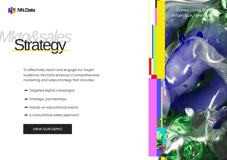
A go-to-market slide shouldn’t be a list of marketing channels. SEO, social media, content marketing, and partnerships tells investors how you might promote the product, but nothing about how you plan to bring it to market.
What better looks like: A Flipsnack template offers a good example of how to do this visually: instead of putting every detail of the go-to-market strategy on one slide, it uses arrows as interactive elements that link out to additional detail.
The slide stays easy to scan, while investors who want to dig deeper can explore the strategy behind each part.
10. Team slide
The design goal: Answer the investor’s question: “Why is this the team to build this company?”
Investors aren’t only evaluating the business. They’re evaluating whether the founders have the experience, skills, and insight to execute the plan.
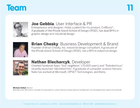
Where founders go wrong: A row of headshots with names and current job titles doesn’t answer that question.
One Momentum slide, for example, introduces five team members but only states their current roles. It doesn’t say what they’ve done before, what expertise they bring, or why they’re the right people to build this company.

What better looks like: Airbnb’s original pitch deck is a strong example.
It highlighted the founders’ backgrounds and relevant experience, helping investors understand who was behind the company and why the team had credibility. The difference is relevance: a founder doesn’t need to list every job they’ve ever had. They need to show the experience that makes them particularly qualified to solve this problem.
What founders should keep in mind:
- Keep bios short.
- Highlight relevant experience.
- Explain founder-market fit.
- Use readable headshots.
- Don’t overcrowd the slide with every employee.
- Don’t reproduce LinkedIn profiles.
Your team slide should make investors think your people have an unfair advantage in solving the problem.
11. Financials
The design goal: Show where the business is going and make the growth story believable.
Financial slides are particularly vulnerable to bad pitch deck design because founders often paste an entire spreadsheet onto the slide.
Tiny numbers, dozens of rows, unclear labels, and five-year projections may technically contain everything an investor needs — but they don’t make the story easy to understand.
Where founders go wrong: Theranos is a useful cautionary example, though for a different reason.
The company presented ambitious technology claims alongside unrealistic timelines and revenue projections. The eventual failure of those promises became central to the company’s collapse.
Investors expect startups to have ambitious goals, but your numbers need to be connected to believable assumptions.

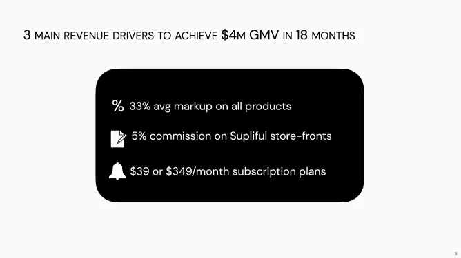
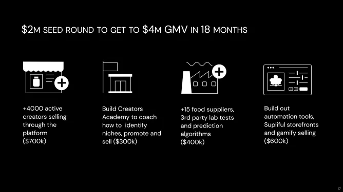
What better looks like: The Supliful example demonstrates this better.
Its slide sets a clear 18-month goal of reaching $4 million in GMV and then explains the levers that could make that target possible, including increasing average markup, earning commissions on storefronts, and introducing subscriptions.
The numbers connect goal → growth drivers → expected outcomes.
That’s what makes the projection easier to believe.
What founders should keep in mind:
- Pull out the numbers that matter most.
- Show the trajectory visually.
- Connect projections to specific growth drivers.
- Avoid tiny spreadsheet screenshots.
- Don’t make unrealistic numbers look precise simply because they’re in a spreadsheet.
- Put detailed assumptions in the appendix.
The main financial slide should answer one question: how does this business grow, and what drives that growth?
12. The ask
The design goal: Tell investors exactly what you’re raising and what it will accomplish.
After spending the entire deck explaining the opportunity, don’t finish with “Questions?” or “Thank you!”
Those are polite endings, but they don’t move the fundraising conversation forward.
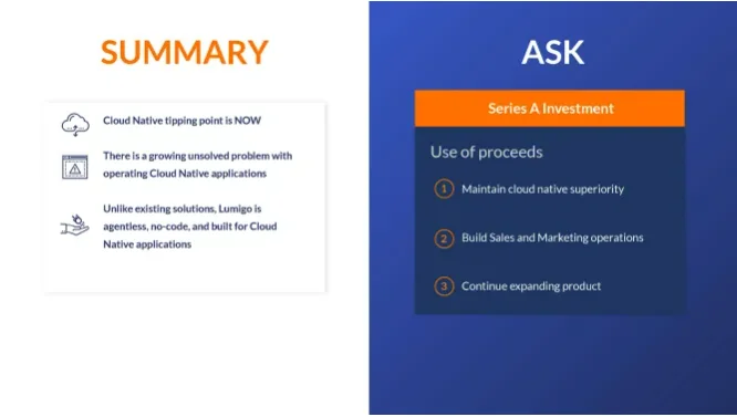
Where founders go wrong: Lumigo gets an important part right by including both a summary and an ask.
The summary helps investors remember the story before Q&A. The ask makes the fundraising purpose clear. But its slide has a significant weakness: it doesn’t actually state the amount being raised.
That’s a missed opportunity.
If you’re raising $20 million, say $20 million.
What better looks like: The stronger Supliful example does exactly that.
It clearly states how much the company is raising and connects the capital to specific, measurable outcomes: 4,000 active creators, 15 suppliers, an education program, testing capabilities, and automation tools.
The investor can immediately see the connection: capital → actions → measurable outcomes.
The specificity also makes the founders accountable. “Build sales and marketing” can mean almost anything, but “Reach 4,000 active creators” is much easier to evaluate.
That’s why founders should consider using SMART goals on the ask slide: specific, measurable, achievable, relevant, and time-bound.
What founders should keep in mind:
- State exactly how much you’re raising.
- Explain what the money will fund.
- Connect spending to business milestones.
- Make the goals measurable.
- Use time frames where possible.
- Don’t hide behind vague phrases such as “continue expanding.”
Your final slide is the last thing investors see.
Make it the clearest statement of what you want to happen next.
How investors actually experience a pitch deck
You may imagine your pitch deck being presented in a room, with you there to explain every slide. But that’s not always how investors will see it. They might skim it on a laptop between meetings, open it on a tablet, forward it to a colleague, or revisit it before a partner discussion.
Your pitch deck design needs to work even when you’re not there to explain it.
Make your deck easy to scan
Investors should be able to skim your deck and understand the argument without reading every word. Make the main point visible at a glance with:
- Short, takeaway-driven headlines
- Large key numbers
- Concise text
- Strong contrast
- Generous whitespace
- Clear labels
- Consistent layouts
And remember: design can’t fix an unclear argument. If a slide contains five competing ideas, changing the font won’t make it clearer. If your market calculation doesn’t hold up, a better-looking chart won’t make it credible. Good pitch deck design makes a strong argument easier to see.
Design for every screen
Your deck might be presented on a large screen, reviewed on a laptop, skimmed on a tablet, or opened on a phone. Check that your type remains readable, charts aren’t too detailed, and screenshots can still be understood when they’re smaller. Most importantly, ask yourself whether someone could understand each slide without your narration. If not, simplify.
Digital sharing can also give you more control over the experience. Instead of sending the exact same deck to every investor, you can personalize the content for different recipients and share it through a private link.
With a trackable digital deck, you can also see whether someone opened it, how many times they returned, and how they engaged with the content. That turns your pitch deck from a file you send into a piece of investor content you can actually learn from.
Turn your pitch deck into a trackable investor experience
Great pitch deck design doesn’t stop when the slides are finished. Once your deck is ready, you still need to distribute it, keep your branded materials consistent, and understand what happens after you hit send.
That’s where Flipsnack can become more than a pitch deck creation tool. It can act as a content enablement and tracking platform for your fundraising materials — giving you a central place to create, manage, share, and measure engagement with your deck.
Start with the deck you already have
You don’t have to redesign your pitch deck from scratch. If your team or design agency has already created the presentation, you can upload the PDF to Flipsnack and turn it into a polished digital experience.
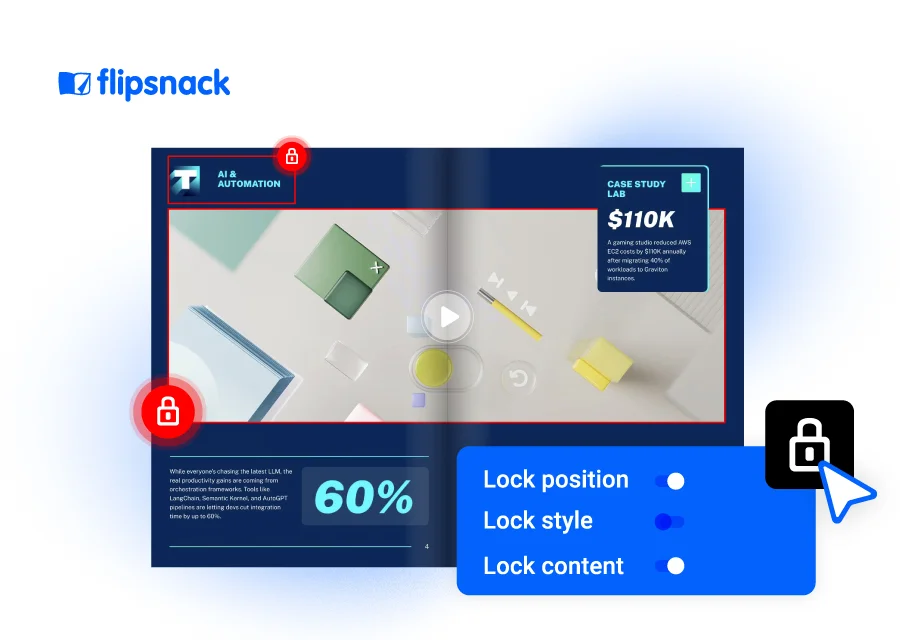
You can also create locked, branded templates for your fundraising materials. This is useful when you need to personalize your pitch deck for different types of investors. Instead of rebuilding the deck from scratch every time, your team can work from an on-brand template and quickly customize the content that matters to each investor.
And if you don’t have an in-house designer, you can use Flipsnack to find and work with a design agency, making it easier to bring the right expertise into the process without losing control of your content.
Share one link instead of another PDF attachment
Once your pitch deck is ready, you can publish it and share it through a dedicated link instead of sending yet another PDF attachment.
This matters because investor decks often contain sensitive information. With Flipsnack, you can control access to your content with options such as password protection and private sharing, giving you more control over who can view your fundraising materials.
More importantly, a link gives you something a static attachment can’t: visibility into what happens after you share it.
See what investors actually read
You’ve already designed your deck for scanning. Now you can find out whether investors are actually engaging with it that way.
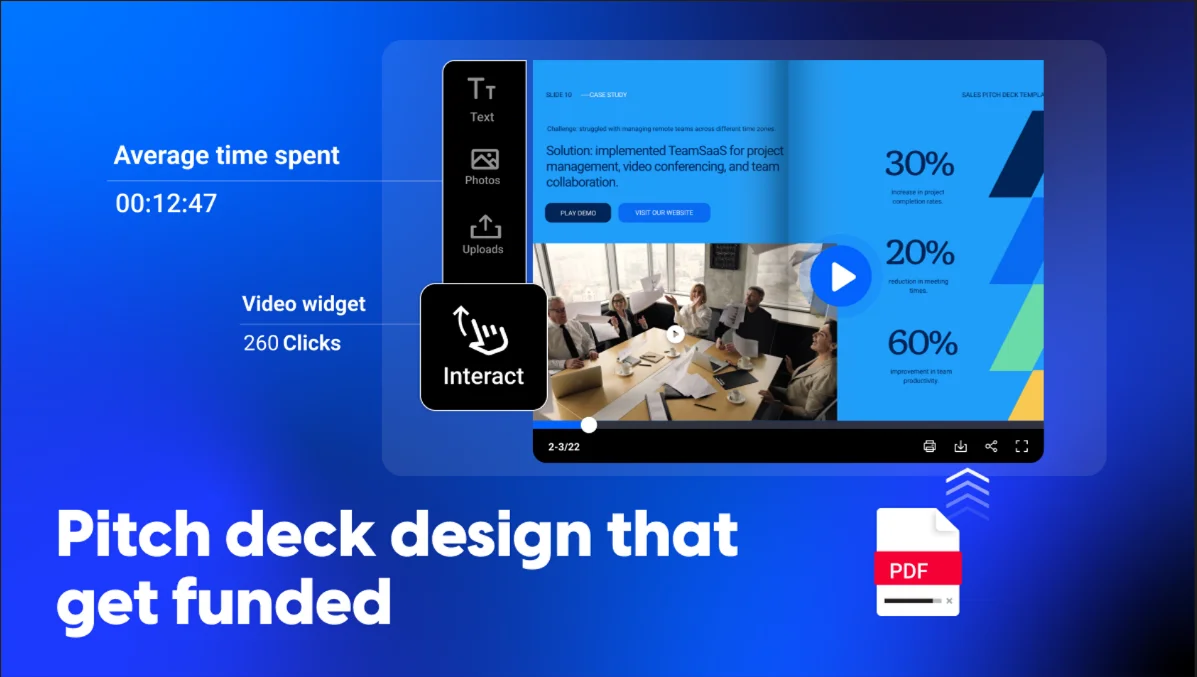
Flipsnack provides analytics that can show you how people interact with your pitch deck, including views, clicks, and time spent on individual pages. That can give you useful context for your follow-ups.
For example, if an investor spends more time on your traction, financials, and market slides but barely looks at your product section, you have a much better idea of what caught their attention.
You can also share your deck through a specific link for a specific recipient, making it possible to understand engagement at a more granular level. Instead of wondering whether someone opened the deck, you can see how they interacted with it.
That’s valuable feedback for fundraising especially when you’re sending the same core story to multiple investors and want to understand which parts resonate.

Keep the detail without overcrowding the deck
Remember the principle behind the slide-by-slide teardowns above: don’t make investors work harder than necessary.
That doesn’t mean you have to leave useful information out. With a digital pitch deck, you can keep the main presentation focused while giving interested readers access to more information when they need it.
Add links to supporting resources, embed video or other interactive content, or direct investors to additional information without turning every slide into a wall of text.
For example, instead of filling your solution slide with product details, you could use a short product demo. Instead of squeezing every market-sizing assumption onto one slide, you could link to supporting research.
The result is a pitch deck that’s designed for the way investors actually experience content today.
Design for the decision, not the decoration
Good pitch deck design makes the opportunity easier to understand.
Every slide should answer a question. Every visual should have a job. Every headline should move the story forward. And by the end, an investor should be able to follow the argument without decoding it.
Once your story and content are ready, you can upload your pitch deck to Flipsnack and turn it into an interactive presentation that’s easy to share. Use analytics to see how investors interact with your deck, from who opened it to which sections they explored, giving you valuable insights for your follow-up conversations.
FAQs about pitch deck design
Can I upload my pitch deck into Flipsnack? Yes. You can upload your existing pitch deck as a PDF to Flipsnack and turn it into an interactive, shareable presentation. From there, you can add videos, clickable links, and other interactive elements, customize the design, and share your deck securely with potential investors.
How many slides should a pitch deck have? There’s no fixed number, but most effective investor decks land somewhere around 10 slides. That’s enough to cover what investors need, without padding for the sake of feeling complete.
What are pitch deck design mistakes? Among the most common pitch deck mistakes there are overcrowded slides, tiny text, weak visual hierarchy, inconsistent fonts and colors, generic headlines, overcomplicated diagrams, filler stock or AI-generated visuals, and charts that need too much explanation to land.
Should I design my pitch deck before or after writing the content? Start with the story and key messages. Once you know what each slide needs to communicate, design the layout around that message — designing before you know what you want investors to understand almost always produces crowded, unfocused slides.
Can I create an investor pitch deck without being a designer? Yes. Starting from a professional template gives you a strong visual structure without requiring advanced design skills. Tools like Flipsnack let you customize templates, branding, and interactive elements without building every slide from scratch.