10 foolproof layout examples for editorial design
Editorial design is a field of graphic design that includes book design, newspaper publication, magazine design and online media. These publications should communicate clearly through design and images to be successful.
Behind every beautiful editorial design there’s a rigorous application of grid layouts and visual hierarchies. These rules have the purpose to keep the readers entertained while they are reading the content.
If you are not an experienced designer and you need some inspiration for a magazine or a brochure design, here are some foolproof layout examples for you:
1. Image and text layout
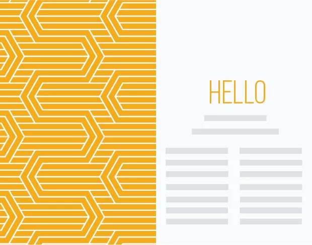
This layout has a nice balanced composition. The big image from the left side captures the reader’s attention and the body copy from the right will make him curious about the image and willing to know more. This layout can used for every kind of magazine, you can’t go wrong with it.
2. Photo collage and text
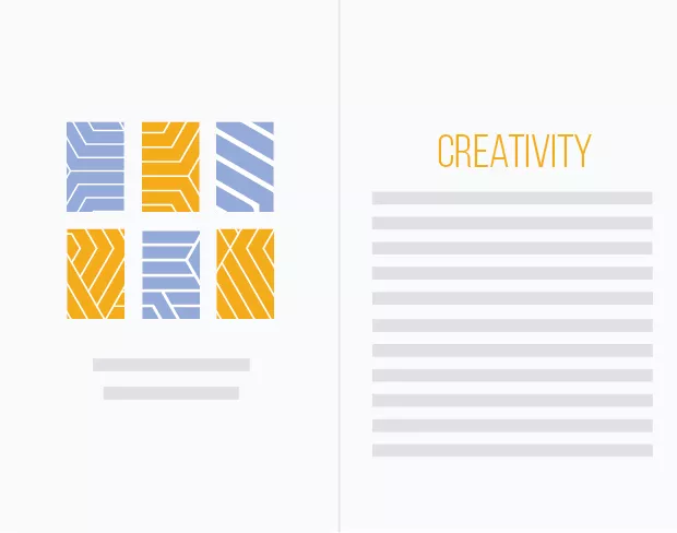
Images play an important role on layout design. If you have to insert many photos in your design, find a nice way to present them, instead of placing them into the body copy. Making a collage of photos can be a great idea, it’s expressive and eye-catchy.
3. Big type layout. Oversized title
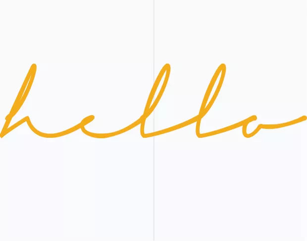
Typography can express an idea just as a well as an image. This layout consists of just one word that covers both pages, creating a big visual impact. Experiment with big typography, interesting fonts and break the rules.
4. Not quite symmetrical
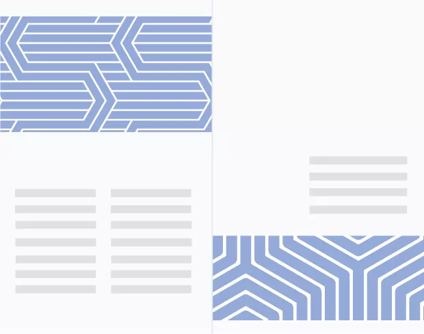
Balance your layout with images. Place one up on the first page and the other one on the bottom of the second page. This layout can be used in an article for a magazine. The images and text are arranged in such a way that makes the article easy to read.
5. Image across 2 pages, with description
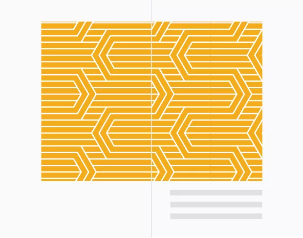
Create a minimalistic design using just one image that spreads on both pages. You can add a short small text below as description and forget about other elements. This type of layout works well for a magazine, brochure, catalog or booklet.
6. Quote layout for editorial design
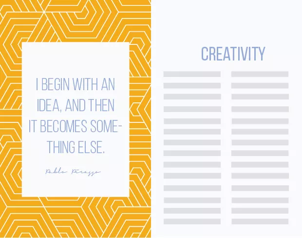
If you want to highlight a quote or an important phrase in an article, choose this kind of layout design. You need a background image and a shape layer over it, where you can place your text. It will bring diversity to your design.
7. Playful layout
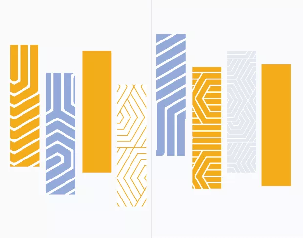
If you have to design a layout for a nonconventional magazine, my advice is to play with images. Cut your images in different shapes and arrange them in playful collage. The shapes are not the only important element in making your layout unique, the colors are also important. Try using contrasting colors, which go well together.
8. Image layers
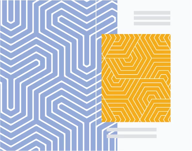
Use image layers for your layout. You can use photos from the same photoshooting but different frames or angles. Play with colors, contrasts and shapes. This kind of layout goes well for a fashion magazine or a fashion catalog.
9. A bit of everything
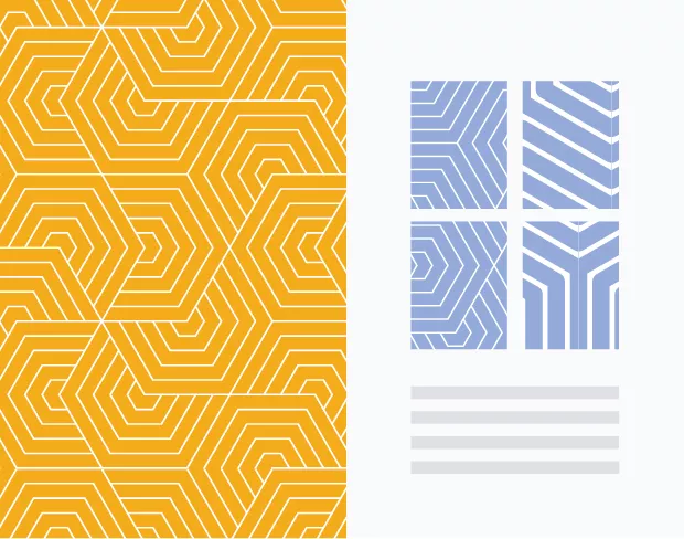
This layout consists of an image, image collage and text. Even though it has many elements it doesn’t look chaotic. It has a clean aspect and it can be used in different publication designs.
10. More images, less text
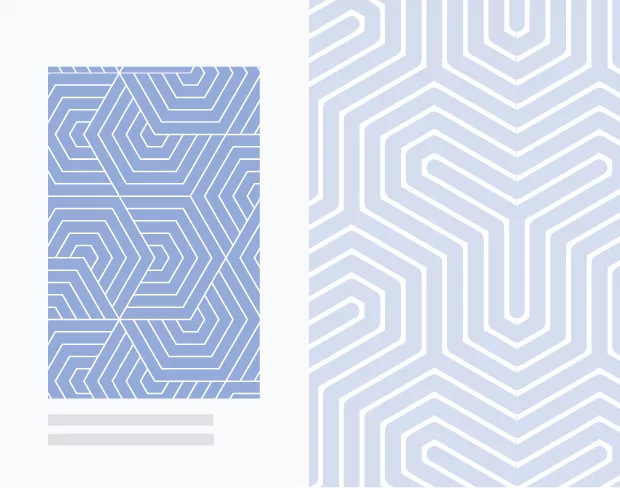
Usually lookbooks, portfolios and catalogs feature more images than text, because the visual aspect is very important in these cases. Try this classic layout in your next visual project!
Use Flipsnack to re-create and publish these layouts!
Do you know any other foolproof design layouts for editorial design? Let us know in comments!

This was really helpful, gave me some very good ideas, and yes, these are foolproof indeed. Thank you!!! :)
really helpful guide. thank you for the great ideas!