6 tips to create an architect portfolio
As an architect, one of your most powerful tools is your portfolio. Since your job and success completely depend on visuals and functionality, it makes sense that your portfolio holds such a high position in your arsenal. That’s why you should make an active effort to not only keep your architect portfolio up to date but to make sure it’s the best it can possibly be.
I’m sure there are lots of things running through your head, as it can be a tricky process to compile your projects into one document in a comprehensive and somewhat stylish manner. Don’t worry, it’s not as stressful as you think. Today, we’ll cover 6 ways that you can build up your architect portfolio (pun intended).
Keep in mind that as we go through all of these tips and tricks, a lot of them will be design related. Although you’re probably amazing at designing structures, portfolio layouts may not be your strong suit. We’ve gone over similar topics like how to create a graphic design portfolio, but today’s focus is primarily going to be on architect portfolios.
We’ve created some beautiful architect portfolio templates as well as other templates in general. Check out the banner link below.
Visuals in an architect portfolio
As I said above, visuals are incredibly important in your line of business. Unfortunately, you can describe a design that you made until you turn blue, and some people just won’t get it. What they will get, however, are images of your work.
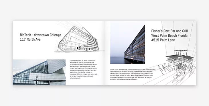
Whether these visuals are drawings that you created, digital renderings, or the actual complete structure, is up to you.
It’s worth mentioning at this point that you should always try to include your most recent projects. Not that older ones are any less important, but employers often look at the most recent work as the most relevant. Lots of things can change as time goes on, so it’s definitely a good idea to keep your portfolio updated with current projects.
Keep it short and to the point
A lot of people make the mistake of throwing every single project they’ve ever worked on into their architect portfolio. You might be led to believe that this is a good thing, but it can actually hurt your success.
On the contrary, you want to keep your portfolio short and to the point. Oftentimes, architect firms and contractors get dozens of portfolios and resumes at once. And even when they use something like Joist, a contractor management tool, to make their lives easier, they still don’t have all the time in the world to look through your portfolio. The last thing you want them to do is see your portfolio and get discouraged from reading it because it’s too long.
The best practice in this situation would be to limit yourself to somewhere around 5 major projects that you’ve worked on. Throw in all the nice details, the drawings, before and after images, and so on.
Embrace blank space
Another common misconception is that all voids must be filled. I’ll be honest, sometimes it is necessary to fill in white space, but not this time.
For your architect portfolio, the best thing to do sometimes is to let your drawings and visuals do the talking for you. If you add too much detail, it can be easy for the reader to get lost and give up completely.
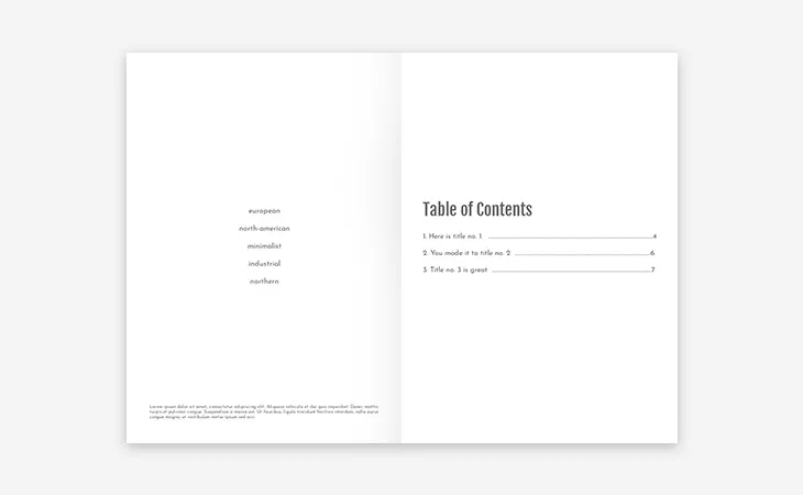
Backgrounds should be clean and neutral. Since you’re most likely going to be using a lot of visuals, avoid using bright or vibrant colors at all. They can quickly distract from your work, and even become exhausting to look at.
Another way to exhaust the reader is to be inconsistent with your use of white space. Keep a common theme through your architect portfolio, but don’t overdo it. There has to be a balance in order to convey your message and to be visually pleasing.
PDF or architect portfolio website?
In truth, there are applications for both a PDF and website portfolio. On one hand, it’s nice to have all your work in one place online at all times. You can also update such a portfolio as you continue in your career.
That being said, sometimes things just don’t go as planned. Even though sending a link to your own personal website is very impressive, you’ll want to have an updated interactive PDF portfolio on hand at all times.
With Flipsnack, you can embed your portfolio on your own website to give readers that very pleasing flipping effect. But, if you need, you can also download it as a PDF to distribute it digitally, or print it. All-in-all, we want you to be prepared when it comes to landing your next big project.
Pay attention to your theme
Themes are very important in your architect portfolio. For example, if you have an impressive background of designing modern office buildings, your portfolio will definitely need to go the modern route.
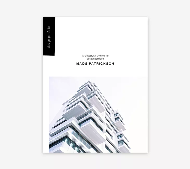
What do I mean by modern route? Fonts, colors, and layout. These are 3 very important aspects of any portfolio, but especially one for an architect.
Let’s take the example a little further. Let’s say that you are indeed creating a rich portfolio filled with modern designs. The last thing you want to do is make the cover hot pink and use a comic sans font. It would immediately come off as unprofessional, and most likely wouldn’t even be opened.
Instead, you might want to go for a nice clean white or grey, with something like Merriweather or Helvetica. This sort of combination fits the modern theme and will most likely catch more eyes.
Create a sample architect portfolio
When applying to a company or employer who may have a lot of applicants, they’ll often ask for a sample portfolio first. This way, they can quickly shoot through a lot of applicants in a short time, and figure out which ones they like the most.
Your sample architect portfolio doesn’t have to be anything fancy, but it should most certainly contain everything that a normal portfolio would, just in a shorter format. How do you do that? Simple: use fewer project examples.
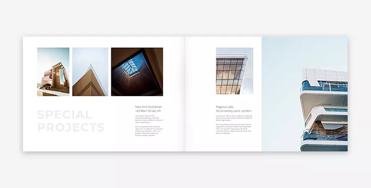
Of course, you’ll want to use your most favorite projects. If you put projects that you aren’t necessarily proud of in your sample portfolio, odds are that the employer won’t be impressed, either.
Having multiple sample architect portfolios might prove to be useful, too. Depending on your experience and the job you’re applying to, you might need to change things up. For this, I would definitely suggest having multiple themed samples. One sample could be themed around modern design, while another could be more of a suburban design. It’s really up to you and your past projects.
Wrapping it up
There you have it – 6 tips to create an architect portfolio. To be honest, an architect portfolio isn’t all that different from a normal portfolio. Sure, an architect portfolio will be focused mainly on visuals, but the layout is almost entirely dependent on the person creating it.
All that being said, having an updated portfolio is vital in any industry. Not only will it be a good archive of all your achievements, but it will be ready to go in a moment’s notice.
