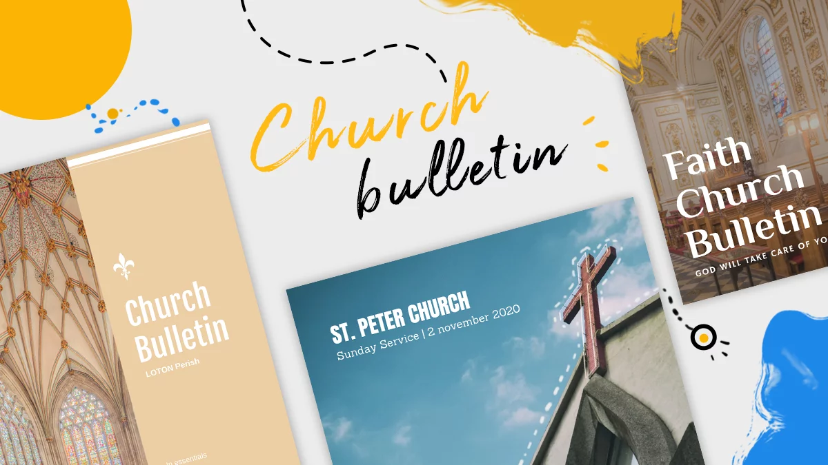
Everything you need to know about church bulletins
Church bulletins, also known as service guides, commonly serve as communication tools, broadcasting a variety of information to everyone in attendance. They say a lot of things about a church, its ministry, its worship, and its community.
For some people, the church bulletin is the very first bit of information they read about the church. Their first introduction to Jesus lies in the way you’re building these church bulletins, so it’s important to pay more attention when creating and designing them.
What’s the purpose of a church bulletin?

As we’ve already mentioned before, bulletins are a great tool when they’re used properly and effectively. Why? Because they capture the attention of both regular members and first-time visitors from the beginning. Generally, church bulletins should incite conversations after the service, highlight announcements and inform people about past or upcoming church events. But there are also some specific purposes every church has and includes in their bulletins: lyrics of a particular song, encouraging verses and even a blank section where people can take notes from the message.
Nowadays, church bulletins seem to be such a trivial issue, that people easily forget how much impact they might have upon somebody’s life. That’s why many churches miss this valuable opportunity to use bulletins as an outreach tool. If you think your church is in the same boat, then you should reconsider the whole process of creating and designing the bulletins. Yes, we know, this whooooole process can be stressful and time-consuming, but we are here to help you. Let’s discover what to add in our church bulletins, what to avoid and how to design them as accurately and attractively as possible.
What to include in a church bulletin?
It’s time you evaluate your bulletin and look for ways to make it better and more efficient. Here are some ideas that might increase the effectiveness of your church bulletin:
A welcome message

This should be the first thing a reader sees. No matter if it’s a long or short message, it should always be genuine and reflect your church’s personality. Put this welcome message before anything else. I’ve seen that many churches put it on the second page or on the back, and trust me, it really doesn’t make any sense.
Order of service/worship
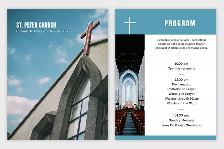
This topic is a must when it comes to church bulletins. An order of service/worship is essential, especially for visitors who have no idea what to expect and how things work in your church. People like to know what is coming up next and how the service is organized.
Church news

Make sure any news you’re going to announce answers the 5Ws: who, what, when, where and why. Give enough information so that people understand completely everything they read. Let’s say your church wants to set up a particular event. It’s important to clarify who is organizing the event, what is going on, where it’s at, what time it starts and ends, and why are you organizing it.
It might surprise you, but often, the reason why people don’t show up for an event is not because they don’t want to or don’t have any interest in God; but because it wasn’t clear where the location was or at what hour it starts.
Prayer requests
This is something new that I’ve seen only in a few church bulletins and I think it should be present in all of them. Churches should promote prayers during the week by providing members with a list of prayer needs or a daily prayer guide (a listing of prayer things for each day). Place the list on one page so it’s easier for people to put it in their Bibles for their daily devotions.
A place for testimonies and information on how to become a Christian

Everybody knows that personal examples work best. It’s important for people to read somebody’s conversion to Christianity because it gives them the courage to do the same. After sharing with them the testimonies, go on and encourage them to respond to the message of salvation, tell them where to find more information by giving them a phone number or email to contact for further questions. Don’t tell them to contact Brother John after the service…your visitors have no idea who that guy is!
Links to your website and other digital resources
When creating and designing a printed church bulletin, don’t forget about technology. The church website and the printed bulletin can go hand in hand because many people who visit your church don’t know about your website. The bulletin will tell them how to get on your page and why it is important to visit it. Insert your Facebook and Instagram church page and also the physical address of your church, so that visitors will find it faster next time.
What to avoid?
We’ve talked about topics that you must include in the church bulletin, but there are also some issues that you should avoid. Let’s discuss them briefly.
Too many fonts

If you need to avoid too little white space, you also need to avoid the tendency of using too many fonts. They can overwhelm and tire the eyes. My advice is to never use more than three different fonts. Two is the ideal number: use one for the headlines and another for the body text. Serif fonts such as Garamond or Times New Roman are more readable (each letter is distinctive), shorter and larger. They are best suitable for body text. Sans serif fonts such as Helvetica or Geneva are appropriate for headlines.
Too little white space
You should pay attention to white space when creating the church bulletins. Readers’ eyes also need to breathe and the white space makes this possible. Set ample margins and avoid the habit of reducing margins to squeeze in too much writing.
Too much information

Always keep this in mind when creating church bulletins. Keep the content short, clear and concise. Truth is, an overwhelming amount of text will keep people away from reading the information. Don’t bore people with unimportant details about unknown people. It’s really not necessary to list every staff member of your church altogether with their title, phone or email address. Select only the staff members who people are most likely to contact.
Abbreviations and Christian jargon
Please do consider my advice – never introduce abbreviations or jargon in your church bulletin. These are inside aspects within your church community and your first-visitors will feel out of the loop and confused. You have to make them feel welcome to your church so that they will set their feet upon your doors again.
Tips & tricks for designing a successful church bulletin. With church bulletin templates
Pictures > Words

The phrase “A picture is worth a thousand words” also applies in this case. We live in a visual world where people want to see more pictures than to read more text. Insert some pictures from the events you had last week or with your staff member you’re going to mention in the church bulletin. People like to associate photos with names. Get bold and use images to draw people’s eyes to the ideas you want to communicate. Keep in mind to always choose professional pictures with high clarity.
Branded to the message
Branding is important even when we talk about church bulletins. Design your church bulletin around your church logo, church colors and around the messages your Pastor gives every Sunday. This helps visitors recognize your church from the beginning when seeing many bulletins together.
Neatness

It’s important to be organized with your content and maintain a minimal approach throughout the entire church bulletin. Don’t pour all the information in one place. Break it into different sections and group related sections together. Use margins and simple grids for a more accurate approach.
Use colors

Colors capture everybody’s eyes and ease readability. I know it might get pretty pricey to print a colorful church bulletin every week, but trust me, it is worth every single penny. Contrast is one of the primary principles of design, so you must take this advice into account. The light and dark colors will guide the readers’ eyes through different sections more quickly.
Ask for a designer’s advice
As a final note, I really suggest you should work with a graphic designer for creating amazing church bulletins. It’s good to have a designer’s eyes throughout this entire process. They can help you with your church brand, logo, color palette, and fonts. Trust me, it will only improve your church bulletin.
Church bulletin templates
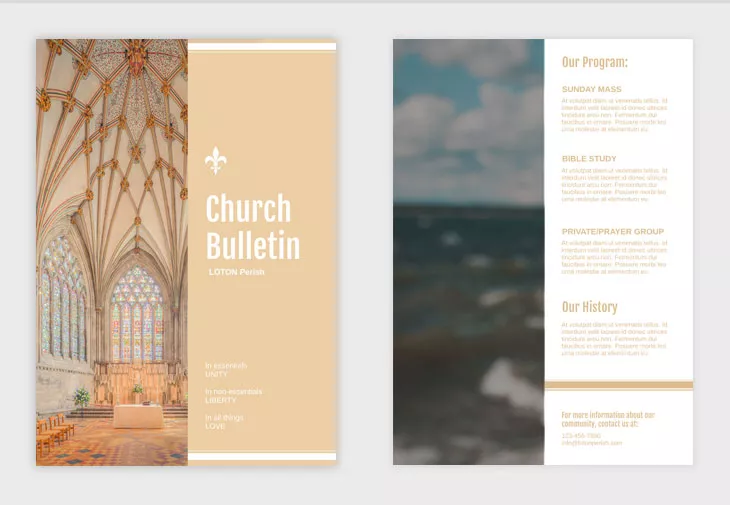
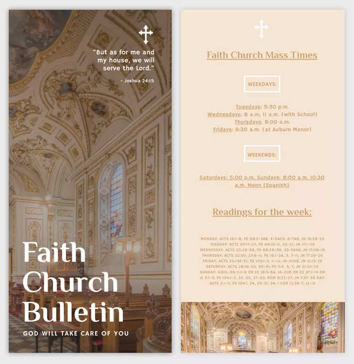
If you’ve never created a church bulletin and need a starting point, don’t worry, you’ve landed in the right place! We are always here to ease your job. Customize one of these three church bulletin templates from Flipsnack to your own liking. Easy and free!
Conclusion
It’s time to consider church bulletins more seriously and give them a facelift. They can really work as the best communication tools when done correctly. Inspire yourself from today’s article and create church bulletins that are catchy, interesting and fascinating for both church members and first-time visitors. What do you think? Do you have the courage to revolutionize the world of church bulletins? We dare you!
