
Trifold Brochure Design: Tips & Free Templates
Last update: June 2, 2026
Brochures are among the most versatile and effective tools in marketing and communication. Whether used at events, shared digitally, or embedded in campaigns, brochures offer a compact and structured way to present information about a product, service, or organization.
A trifold brochure layout is one of the most popular formats thanks to its clear structure and balanced information flow. With three panels on each side, it allows you to guide readers step by step through your message, without overwhelming them.
Traditionally, trifold brochures are associated with print. However, today, many businesses use digital trifold-style layouts to create interactive brochures that are easy to share online and track in terms of engagement.
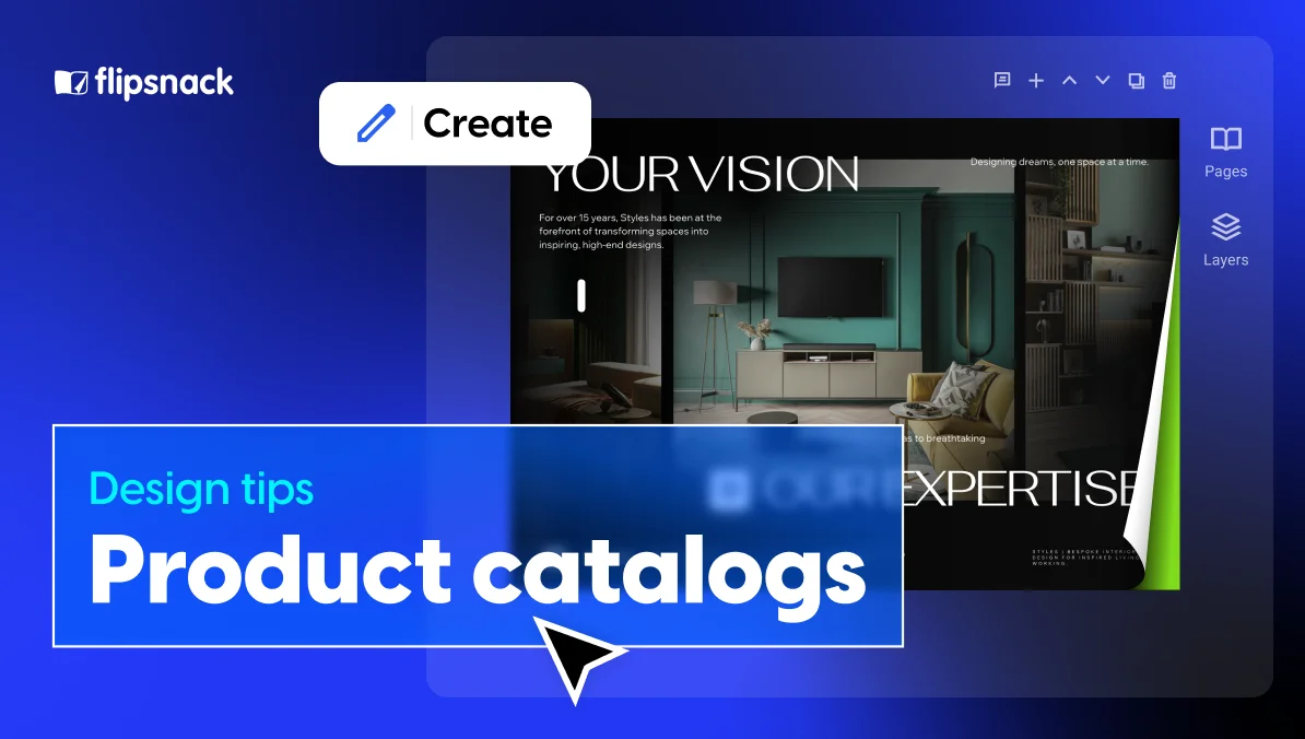
In this guide, you’ll learn how to design an effective trifold brochure layout and how Flipsnack’s brochure maker helps you recreate the classic three-panel structure in a digital format. While Flipsnack is optimized for interactive and online publishing, it also supports professional print-ready exports, making it easy to mirror a traditional trifold design and use it both digitally and in print.

Table of contents
- What is a trifold brochure?
- Why choose a trifold brochure layout?
- Planning your trifold brochure structure
- Essential trifold brochure design tips
- Choose a design theme that represents your brand
- Try a black-and-white minimalist design for a more serious approach
- But also, don’t be afraid of colors
- Choose the right typography to complement your images
- But don’t overdo the content
- Use the same image on at least two panels
- Choose the right images
- Use visual elements to emphasize your trifold brochure structure
- How to design a trifold brochure in Flipsnack
- FAQ
- Conclusion
What is a trifold brochure?
A trifold brochure is a type of document, printed or digital, that’s folded twice, creating three sections (or “panels”) on each side, for a total of six panels. More engaging than a flyer or a postcard, a trifold brochure gives you six areas to distribute your information, offering an effective and organized brochure structure.
Trifold brochures go by several names: tri-fold brochure, three-fold brochure, 3-fold brochure, or simply trifold. They’re sometimes confused with a pamphlet or leaflet, but the defining characteristic is always the same: one sheet of paper, folded twice into thirds.
Trifold brochure structure: panels, sections, and page order
Understanding the parts of a trifold brochure is essential before you start designing. When a trifold brochure is laid flat and unfolded, you’re looking at six panels total — three on the front side and three on the back.
Here’s how the panels are typically numbered and arranged:
Outside (what people see when the brochure is closed):
- Panel 1 — Front cover: The first thing your reader sees. This is where your headline, logo, and main visual go. It needs to be strong enough to make someone want to open the brochure.
- Panel 2 — Back panel: Typically contains contact details, a call to action, or a QR code.
- Panel 3 — Inside flap (right side of back): Often used for a secondary message, tagline, or introductory text.
Inside (what people see when the brochure is fully open):
- Panels 4, 5, 6: The full interior spread. This is where you place your most detailed content — services, features, descriptions, pricing, or event details — laid out across the three inside panels.
Trifold brochure page order for print
One of the most common mistakes in trifold brochure layout is getting the panel order wrong when preparing files for print. For a standard letter-fold trifold brochure, the print setup requires two separate pages:
- Page 1 (outside): Right panel = front cover, middle = back panel, left = inside flap
- Page 2 (inside): Left to right = inside panels in reading order
Always confirm the panel arrangement with your printer before sending files. If you’re designing in Flipsnack, exporting for print includes 300 DPI resolution, CMYK color space, and bleed and crop marks ready for any professional print shop.
How to fold a trifold brochure (letter fold vs. Z-fold)
There are two classic folding methods used in trifold brochures.
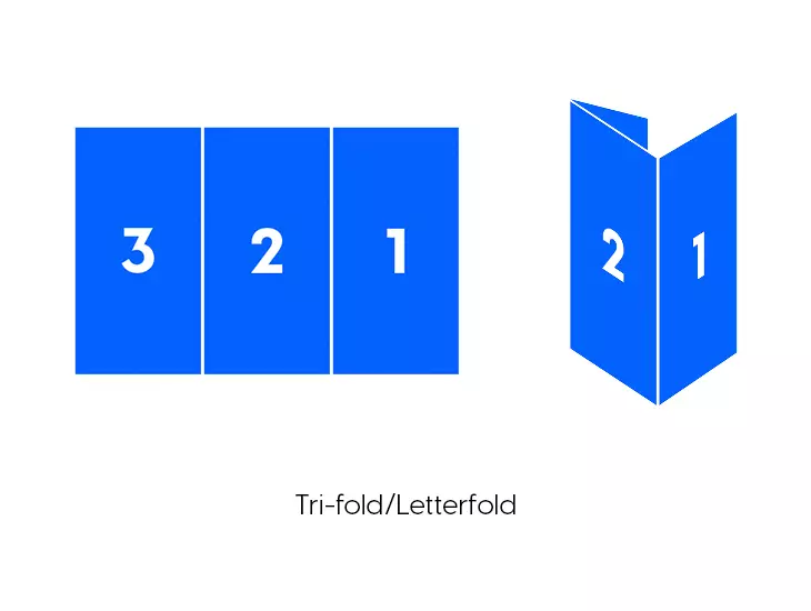
Letter fold (the most common trifold)
The letter fold is the standard trifold format. The two outer panels fold inward over the middle panel, creating a compact booklet shape. When you open it, the content unfolds from left to right. This is the folding style most people picture when they think of a trifold brochure.
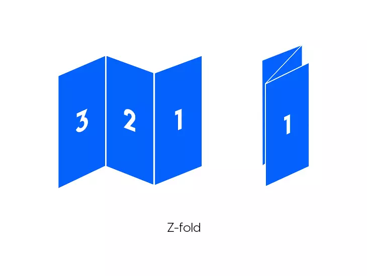
Z-fold brochure
The Z-fold (also called accordion fold) is the second common option. Instead of both panels folding inward, the panels fold back and forth in a zigzag pattern — like the letter Z. When fully extended, a Z-fold brochure creates one long horizontal strip.
The Z-fold works particularly well for sequential content, timelines, or step-by-step guides, because readers can unfold the brochure one section at a time.
Z-fold vs. trifold: which should you use?
| Letter fold (trifold) | Z-fold | |
| Best for | General marketing, services, events | Sequential content, timelines, maps |
| How it opens | Inward, like a booklet | Accordion-style, left to right |
| Panel independence | Panels 1–3 are visually connected when open | Each panel is more independent |
| Print complexity | Standard | Requires careful panel alignment |
Designer tip: Start by choosing the trifold structure you want, letter fold or Z-fold, then build a design system that complements it. A strong trifold brochure layout combines creative typography, a cohesive color palette, clear branding, and compelling imagery. Just as important is how text is distributed across panels, guiding readers naturally through your message.
The best way to grab attention is to use a stunning brochure design that integrates everything: creative typography, a cohesive color scheme, your logo, and compelling photography. And don’t forget, how the text is arranged within your design is just as important.
Trifold brochure size and measurements
The most common trifold brochure size for print is based on a standard letter sheet (8.5″ × 11″), divided into three equal panels of approximately 3.67″ × 8.5″ each. In metric, this is typically done on A4 paper (210 × 297 mm), with each panel measuring around 99 × 210 mm.
Standard trifold brochure measurements:
| Paper size | Full sheet | Each panel (approx.) |
| US Letter | 8.5″ × 11″ | 3.67″ × 8.5″ |
| A4 | 210 × 297 mm | 99 × 210 mm |
Print setup tips for trifold brochure measurements
- Bleed: Add at least 0.125″ (3 mm) bleed on all outer edges so images or colored backgrounds extend to the trimmed edge without white gaps.
- Safe zone: Keep all important text and logos at least 0.125″ (3 mm) away from fold lines and trim edges.
- Resolution: Use 300 DPI for all images to ensure sharp print output.
- Color mode: Set files to CMYK before sending to print.
For digital trifold brochures, exact measurements are less critical, but maintaining a 3:1 panel ratio keeps the visual structure clean and readable on screen.
Why choose a trifold brochure layout?
The trifold brochure layout originates in print, but its clear structure makes it just as effective in digital formats. It’s popular because it balances space and compactness extremely well, allowing you to include plenty of information without overwhelming the reader. That’s why trifold layouts work so well for corporate brochures, events, and product presentations, both on paper and online.
In a traditional trifold structure, each panel has a defined role. The front panel acts as the cover and grabs attention, the inside panels are used for detailed information, and the back panel typically includes contact details or a clear call to action. This logical flow translates seamlessly into digital trifold-style layouts, where readers move through the content in a guided, intuitive way.
Planning your trifold brochure structure
Before jumping into design, planning the brochure structure is essential for ensuring the final product is effective. Here are the key factors to consider:
- Define your audience: Understanding who your brochure is for will guide your content and design choices. For example, a brochure for corporate clients might use a more formal trifold brochure format, while a festival brochure can have a playful and colorful layout.
- Know the purpose: Are you promoting a product, service, or event? Identifying the goal of your brochure will help you determine the layout and content.
- Outline your content: Break your content into sections that fit naturally across the six panels. The cover should grab attention, the inside panels should provide valuable details, and the back panel should encourage readers to take action or contact you.
- Decide on the fold type early: As covered above, the letter fold and Z-fold require different panel arrangements. Locking this in before designing saves significant rework later.
- Choose print vs. digital (or both): If you’re designing for print, set up your document at the correct trifold measurements from the start. If you’re designing for digital distribution, prioritize readability on screen and consider adding interactive elements.
Moving on, let’s take a look at some tips on how to design a trifold brochure.
Essential trifold brochure design tips & free templates
Branding and visual consistency
Branding is critical in any brochure because it defines how your business is perceived and helps establish a consistent, recognizable identity. A brochure serves as an extension of your brand, conveying not only your message but also the values, personality, and professionalism of your business.
1. Choose a design theme that represents your brand
I cannot stress this enough: How your brand communicates through design says a lot about your company. A McKinsey study found that companies that integrated and put effort into their design did way better than the ones that didn’t.
You must build a brand kit from the early days of your business. It will save you a lot of time and headaches. The design theme is usually represented through the brand kit that you already have.
It comprises logos, color schemes, fonts, shapes, etc. It ensures consistency across the company’s platforms, including product packaging, social media platforms, advertising campaigns, and all the other communicational aspects of a brand.
So, designing a trifold brochure for a medical clinic will definitely be different from designing a brochure for a coffee shop, for example. Let’s see some concrete examples.
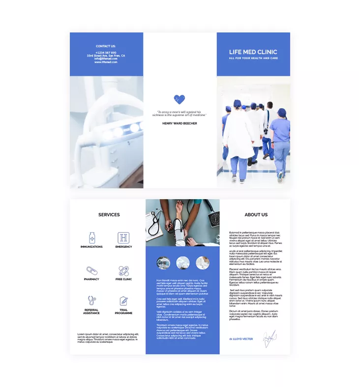
Take a look at this medical and care trifold brochure template below. The white and blue colors create a clean and professional look, precisely what you would expect from the medical field.
The name is placed upfront and center, above all the other design elements, followed by the statement “All for your health and care.” It also includes the services and a brief statement about the clinic.

Pick a suitable color scheme
Choose colors that align with your brand and purpose. For example, a brochure for a law firm might benefit from neutral, professional tones, while a brochure for a summer festival could feature bright, energetic colors. Make sure the colors complement each other and create enough contrast for text readability.
2. Try a black-and-white minimalist design for a more serious approach
What about a more minimalist design? Not all brochures need images with bright colors and loads of text. You can try a timeless black-and-white design if you want to achieve a minimalist style for your trifold brochure.
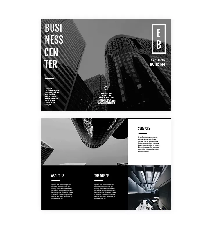
Let me show you this modern black-and-white trifold template. The images’ black-and-white look offers a contemporary look, making the text stand out more.
The template also incorporates sans-serif fonts (without strokes) that give a clean and professional look. If you’re not quite sure how to use fonts, do a little research on some of the best typography fonts for catalogs and brochures. Use the advice given to see what significant difference fonts can make.
Like in most trifold brochures, the back cover contains contact details: address, phone number, website, and social media platforms.
Tip: Integrate some icons with the contact details to make them stand out. And don’t forget to always double-check before sending your trifold brochure to print.
3. But also, don’t be afraid of colors
However, bright and vibrant colors are the way to go if you design a trifold brochure for a music festival, concert, or art gallery.
For example, you can use the music festival trifold template below for an impressive look. See the contrast colors pink and yellow? They make the entire design stand out, and they allow space for the most important information:
- Who?
- What?
- Where?
- When?
These colors are perfectly chosen because they represent exactly what the event is all about: summer, young people, music, and a lot of positive energy.
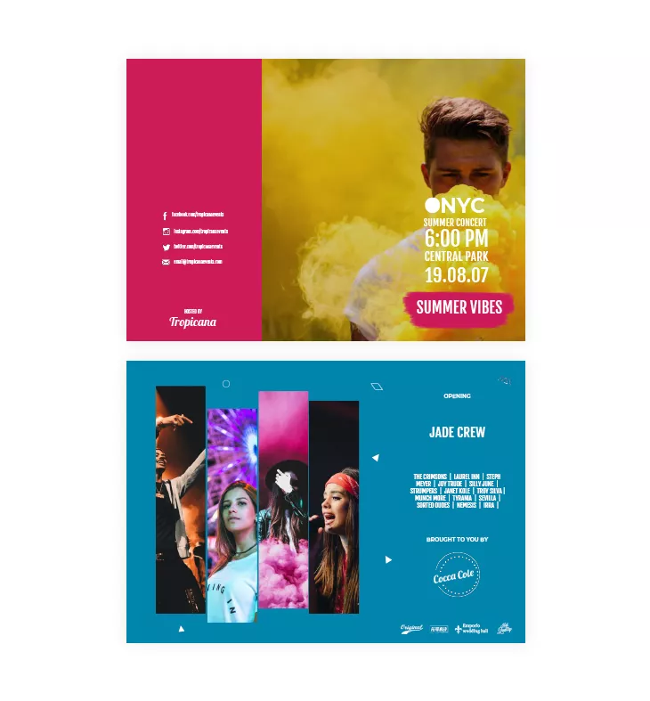
What’s great about designing colorful trifold brochures is that you don’t need a lot of text. You just have to write short and catchy headlines that easily grab readers’ attention, with the help of vibrant color design.

Typography matters
Text and typography are essential elements in a brochure because they convey the core message and help guide the reader through the information. While images draw attention and create an emotional connection, the text provides the necessary details, explanations, and calls to action that ultimately drive engagement. Your chosen words must be clear, concise, and purposeful, ensuring your message is informative and persuasive.
4. Choose the right typography to complement your images
Our designers used images and a short title for each dessert category in this dessert trifold template. And it is pretty obvious that the fonts complement the images’ aesthetic perfectly.
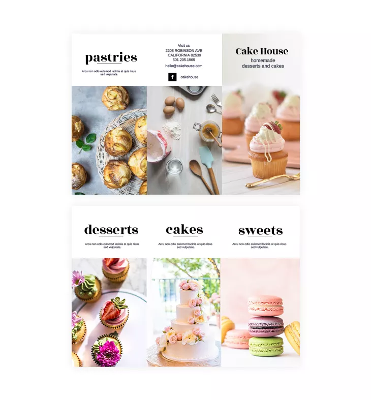
For typography, limit yourself to two or three fonts, using a combination of serif fonts for headings and sans-serif fonts for body text. This will ensure your trifold layout remains clean and easy to read.
Here is the difference between the two:
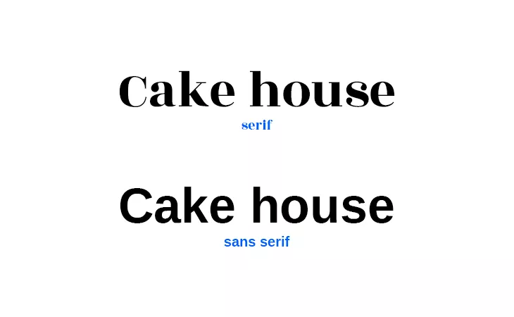
Of course, you can always experiment and choose the font that best complements your images and overall theme.
5. But don’t overdo the content
Trifold brochures must get straight to the point. Don’t get lost in details that are irrelevant to the reader. Use enticing headlines to tell people the essential information shortly and concisely. Too much text can overwhelm the reader.
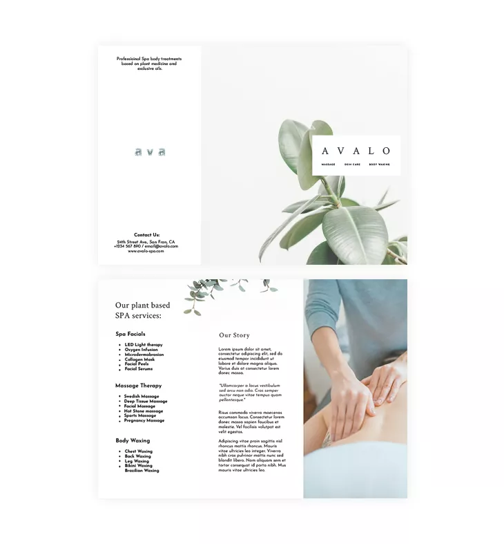
Let’s say your trifold brochure is informative because you just opened a new spa, for example. Because you are new on the market, you must include information about your spa services to raise awareness.
Take a look at the spa trifold brochure template below. You’ll notice that our designers added a section about its story and made room to present the spa services.
However, it doesn’t seem like too much text, right? How did they do that? Simple. They mapped out the text correctly. The headline “Our plant-based SPA services” was in a bigger and thinner font. The subheadings are marked and divided into three categories: spa facials, massage therapy, and body waxing. They also used bullet points to make the following texts easy to read.
Our designer’s tip: Focus on readability and use paragraphs between sections. Also, if you can use graphics or icons to represent some parts of the text, go for it!
The importance of images
Images play a crucial role in any brochure, as they are often the first to capture a reader’s attention. High-quality visuals enhance the overall design and communicate your message more effectively than words alone.
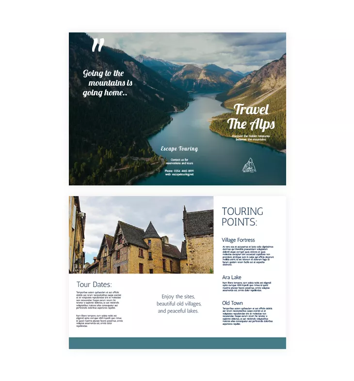
6. Use the same image on at least two panels
Let’s say you own a travel agency and want to advertise some great holiday vacations. This travel brochure template will do the job for you!
The beautiful image catches the eye instantly, right? If you have a photo that does the talking for you, then use it smartly. Notice that the photo is placed on all three panels of the trifold brochure. This is usually called a double-page spread. So when people open it entirely, they get a stunning view of the Alps mountains.
The text is added in bold italic fonts. On the same spread, there’s a quote and the logo. You don’t want to stuff a lot of details and information on such a beautiful image. So, use the remaining three panels to give people descriptions and tourist points. Let them imagine what an immersive experience they could have!
Also, see the second image—the old village buildings placed on two panels. This also breaks the text when the trifold brochure design is opened. Click on this template and make it your own. The whole design process is easy with drag, drop, and replace!
Our designer’s tip: Use bold titles or quotes on the front cover of your trifold brochure. Make sure that you only use high-quality photos, especially when you do a spread or place an image on two panels.
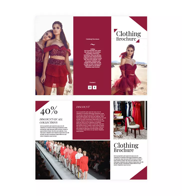
7. Choose the right images
Images are a powerful tool in any tri-fold brochure format. High-quality images can instantly elevate the design, making your brochure more engaging. Ensure the images you use are relevant to your content and aligned correctly within the layout to avoid crowding the panels.
Let’s take a look at the clothing trifold template below. A professional photographer took these photos.
Clothing brands must hire a professional to take photos of the new clothes they’re selling. These images will convince potential buyers to make the purchase.
The images used in this template inspired the whole design theme. The burgundy color is picked from the dress and used throughout the entire brochure. There aren’t any other colors that might steal the reader’s attention from the images.
The main purpose and selling point here is to put the images in the spotlight.
So, if you don’t consider yourself a skilled photographer, hire one. You’ll find having professional photos handy. You can use them in your trifold brochure design and share them on your digital platforms.
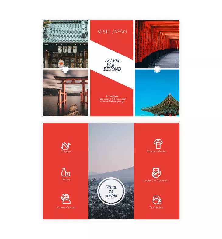
8. Use visual elements to emphasize your trifold brochure structure
Graphics, icons, and other visual elements can help break up text and guide readers through the brochure.
Not only are they visually more pleasing to look at, but they make any brochure easier to read.
Take a look at this tourist trifold brochure. As you can see, the activities are represented by icons: Origami—a swan icon; Pottery—vases icon; Tea Nights—a pot and a cup of tea. Instead of having long and detailed headlines, they went for icons to help readers visualize the topic and to offer them some context.
There are a lot of websites that offer free icons that you can integrate into your trifold brochure design. So take advantage of that and make your trifold brochure design more visually appealing.
Also, do you notice the grid style used here? The design is inspired by Japan’s flag colors: red and white. Sometimes, simple design is more than enough. Balance is the key, right?
You can easily customize this template. Open our Design Studio, and under the Shapes section, you will find many shapes you can use as icons to balance your trifold brochure design. On top of that, if you need this layout for advertising something else, simply change the colors and add your logo and text. It’s just that fast and easy.
If you need custom visuals but don’t have a designer on hand, Flipsnack’s built-in AI image generator lets you create unique images directly inside the Design Studio. Describe what you need, and the tool generates visuals you can drop straight into your brochure panels, no external tools required.
How to design a digital trifold brochure layout in Flipsnack
Flipsnack makes it easy to design digital trifold brochure layouts that follow the classic three-panel structure in the flipbook format, optimized for online sharing and interactive experiences. While Flipsnack is not a print-layout tool, it allows you to recreate the trifold format visually and turn it into an engaging digital brochure.
Here’s how to create a trifold-style brochure layout in Flipsnack:
1. Choose a trifold-inspired brochure template
Browse Flipsnack’s brochure templates and select one that follows a three-panel layout structure. These templates are designed to visually mirror traditional trifold brochures while remaining digital-first.
2. Customize the layout and content
Use Flipsnack’s drag-and-drop editor to add your text, images, icons, and branding elements. Arrange content across panels so it flows naturally, just like a printed trifold brochure would when unfolded.
3. Review the structure and readability
Make sure each panel has a clear purpose—cover, information sections, and a call to action. Use preview mode to check spacing, hierarchy, and visual balance.
4. Publish and share your brochure digitally
Once ready, share your trifold brochure layout via link, email, QR code, or embed it on your website. You can also distribute it through social media or direct messaging.
5. Measure performance and engagement
Unlike a printed brochure, Flipsnack analytics shows you exactly how your audience reads it. Not just whether they opened it, but how far they got, which panel held their attention, and where they dropped off. For a marketing manager, this turns every brochure into a feedback loop.
From trifold layout to interactive digital brochure
A trifold brochure remains a powerful format for organizing information clearly and guiding readers through a message. While traditionally associated with print, the trifold structure translates extremely well into digital experiences, especially when engagement, distribution, and measurability matter.
With Flipsnack, you can design a trifold-style brochure layout that looks professional, stays on brand, and is ready to be shared. Beyond layout and design, Flipsnack gives you something print can’t: interactive elements, easy online sharing, and insights into how your audience actually engages with your content.
Whether you’re adapting a classic print brochure for the digital world or creating a brochure meant to be experienced online from the start, Flipsnack helps you move faster and reach further. Use the tips and examples in this guide to turn your next trifold brochure layout into a modern, effective communication tool.
Frequently asked questions
1. Can I use Flipsnack to create a trifold brochure without design experience?
You can use Flipsnack to design a brochure layout that visually follows a trifold structure, even if you don’t have design experience. Flipsnack’s drag-and-drop editor and pre-designed templates make it easy to arrange content in three-panel sections that can later be folded after printing.
Flipsnack does not create physical folds automatically, but it allows you to export your design as a print-ready PDF optimized for professional printing. Interactive elements such as links or buttons are automatically removed, files are exported in CMYK color mode at 300 DPI, and you can include bleed and crop marks — ensuring your brochure is clean and ready to send directly to the printer.
2. What’s the best layout for a trifold brochure?
A traditional trifold brochure consists of six panels created by folding a single sheet of paper. Common folding styles include the letter fold and the Z-fold.
When designing in Flipsnack, the key is to plan your content as six distinct panels in the correct reading order. This ensures that, once printed and folded, the brochure reads naturally from cover to interior panels and finishes with a clear call to action.
3. Can I customize the trifold brochure format in Flipsnack?
You can fully customize the design of a trifold-style brochure layout in Flipsnack, including colors, fonts, images, text, and branding elements.
While Flipsnack focuses primarily on digital layout design and interactive publishing, it also supports professional print exports. Your final brochure can be downloaded as a properly optimized print-ready PDF, and the folding is handled during the physical printing process.
4. What’s the difference between a trifold and a Z-fold brochure? Both use one sheet folded twice. The difference is the direction of the folds: a trifold (letter fold) folds both outer panels inward over the center, while a Z-fold folds them in alternating directions to create a zigzag. Z-folds work better for sequential or timeline content; letter folds are better for general marketing materials.
5. What should each panel of a trifold brochure contain?
In a standard letter-fold trifold, each panel has a conventional role. The front panel (cover) should grab attention with a strong headline, key visual, and your brand name. The two inside panels carry the bulk of your content, services, features, or details, organized so readers move naturally from left to right. The back panel typically holds contact information, a QR code, or a clear call to action. When designing digitally in Flipsnack, you can also add clickable links and embedded media to any panel, turning static content into an interactive experience.
6. Can I print a trifold brochure made in Flipsnack?
Yes. Flipsnack supports print-ready PDF export optimized for professional printing, including CMYK color mode at 300 DPI, bleed marks, and crop marks. Interactive elements such as links and buttons are automatically removed from the print export. The physical folding is done at the printing stage, not in the software. This means you can design once and use your brochure both digitally (shareable link, embedded on your website) and in print.
Nice information thanks for sharing.
this is so useful
love it!!!!!!!!!!!!!!!!!!!!!!
i am gonna be the class topper now