How to build a branding kit
Any business, small or large, has a story and it is driven by a set of values. It is important for those values to reach the audience, as it leads to brand consistency, which then leads to brand recognition. Consistency and recognition are essential when it comes to developing a brand’s image.
What better way to maintain and present your brand’s image, than with the help of a branding kit? In what follows, I am going to offer you some information about what a branding kit is, what to include in it, and how you can integrate one in Flipsnack.
Without further ado, let’s get things started.
What is a brand kit?
In short, a brand kit is a collection of all the important elements that constitute a brand’s visual identity: logo, fonts, typography, colors.
Each of these elements plays an important role individually, but to be effective, they need to be flawlessly combined. They need to have the same style and they should be on the same page with the message a company wants to deliver. It takes time and dedication to build a brand, but when you reach that perfect combination, the results are spectacular.
Think about Coca-Cola, one of the most famous brands in the world. Can you imagine the company with a different color combination? Blue and yellow for example? Or with a different font choice for the logo?
How about a different logo altogether? It is pretty difficult to imagine it, right? Changing only one of these elements would result in something different visually. You would notice any slight change in an instant. You would swear that something is off, even if you couldn’t put your finger on it. Coca-Cola changed its logo over time, but the current one did not suffer any major changes.
Here are Coca-Cola’s branding kit elements:
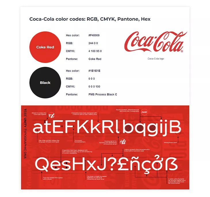
All of these elements are part of their brand kit, and they had great importance in establishing their brand identity. Coca-Cola used its visual elements perfectly to make an emotional connection with its customers. For many, Coca-Cola equals celebrations with family and friends.
In what follows, we’re going to dive deeper into how important a branding kit is for a business and why it’s crucial to create one.
Why do you need a branding kit?
“Most entrepreneurs and small business owners don’t really think about their brand image until there’s a problem with the image they’re developing.” That’s why it is important to develop your brand image with the help of a branding kit.
Forbes
A branding kit will help you store your company’s visual elements, to be able to share them effortlessly internally and externally. People from different departments can use your branding elements in the same way, thus making sure that branding consistency is achieved. Any respectable company should have a brand kit accompanied by brand guidelines.
Simply put, a branding kit will help your business thrive. It helps you with exposure, which in time will help you with developing and maintaining brand consistency. This will eventually lead to brand recognition and finally to brand trust.
It assures visual recognition
People are visually oriented, and a brand kit with well-designed elements will surely draw attention to your business.
Think of Nike, Apple, Windows, Starbucks, and other companies with recognizable logos and colors. When you see them, you know who they are and what products and services they offer. Just by hearing their names, you can envision their logos, colors, or fonts in your mind. This is what a good brand kit does for your brand: it helps people instantly recognize your business simply by hearing your name.
Let’s say your company is seeking global expansion, for example. With a distinct visual identity anchored by a recognizable logo and color palette, your brand will become unmistakable to consumers in any global location, bridging cultural and language barriers and enabling you to conquer new markets.
Some of these companies perfected their logos over time, with minor or major changes, but what matters most is that they did not change their core values. Speaking of which…
It helps with brand value recognition
Branding is more than just a visual representation though, as it speaks for a company’s mentality, beliefs, story. People recognize a company by its visuals first, and then they associate the visual elements with values and brand stories. A branding kit leads to what any company desires: instant brand recognition, which is essential in brand marketing. Recognition regarding the quality of the company, the products, and the service it offers. It helps people establish an emotional connection with the brand.
What do you think about when you see the Nike logo? You probably think of something sports-related, athletes running on the field, high-quality products. And of course, “Just do it.”.
What about Starbucks? You probably imagine a coffee spot, lots of people drinking their daily coffee while browsing their phones or laptops. A place where you can be surrounded by people, but alone with your tasks.
Brand recognition over time leads to brand loyalty. If people have positive experiences regarding a company, they will be loyal to that company in time. They will buy its products, knowing that they won’t be disappointed. A company’s decisions will influence the way it is perceived by the public. Brand recognition and loyalty don’t happen overnight, but the process starts with a well-designed brand kit.
The difference between a brand kit and brand guidelines
While the brand kit represents the “what”, the brand guidelines represent the “how”.
What do I mean by that? They are different, but they are dependent on each other. The brand kit needs to contain the brand guidelines, otherwise, it won’t achieve its purpose: brand consistency and recognition.
Imagine that you have created a branding kit for your eCommerce company. All the elements are included, the branding kit is ready to be shared with others. But in order to protect your brand consistency, you need to establish some guidelines on how these elements should be used.
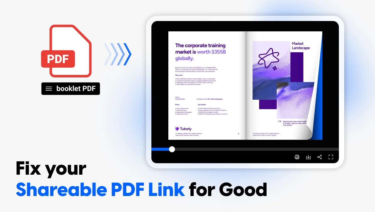
So, gather all the guidelines within a document that you can share externally with other companies which might want to use your branding kit, or more importantly, with your employees and teammates to make sure everyone’s on the same page. Just upload your PDF in Flipsnack, then choose to share it directly via email or a direct link.
If you don’t have a PDF, don’t worry. Here’s a brand guideline template from us that you can customize to your own needs.
See? This is exactly what a brand guideline does: it offers clear rules on the dos and the don’ts of your intellectual property (your brand kit). While the branding kit is strictly related to the visual aspect, the branding guidelines are applied to the way you communicate as a brand, the way you write copy for ads, your social media posts, the way your digital flyers look, and so on.
Here’s an example of a brand nomenclature guideline from IMDb to make you understand the differences even better:
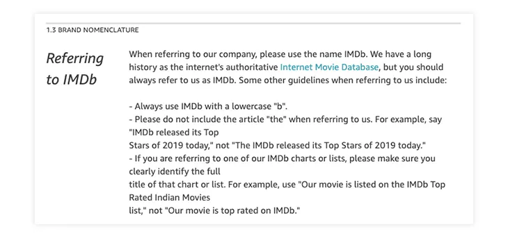
Let’s say that you’ve found the perfect font pairing for your logo, and someone wants to use your logo on their website. They either use the logo according to the guidelines you’ve created, or they can’t use it at all.
To make things easier, offer solutions for different situations. In this case, provide logo versions for both desktop and mobile. This will make it usable on screens regardless of the size. They will have options to choose from, but they won’t be allowed to modify them, as your brand guidelines won’t allow it.
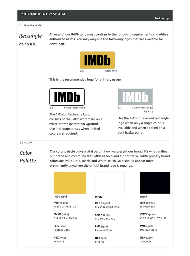
Here is an example of brand guidelines applied to the IMDb branding kit:
What does a brand kit include?
- Logo
- Font
- Colors
- Typography
Logo
When it comes to building a brand, the logo is an important part of the process. It is what represents your company, from a visual point of view, but besides that, it can do much more. A strong logo design can leave a lasting impression and help differentiate your brand in a crowded market.
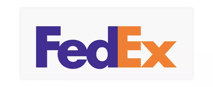
A logo grabs attention. Did it ever happen to you to see a logo, then take a few moments to analyze it? Maybe it used an interesting shape or a unique color combination. Or maybe it included a hidden message, such as the hidden arrow in FedEx’s case?
Chances are that if a logo grabs your attention, and you find it interesting, you are more likely to look up the company and see what it has to offer. Maybe you aren’t interested in their products, but someone else might be. Badly designed logos might also grab attention, but it is better to make a positive impression.
Besides grabbing attention, a logo will also be an ambassador of your company’s values. In this case, the arrow represents “getting from point A to point B reliably with speed and precision.”
Moving on to the fonts.
Font
Fonts have their role, and choosing the right font for your brand is important. It might be intimidating to choose the right one since there are too many options to choose from. However, there are a few things to keep in mind when making your selection.
What type of business do you run? You can choose the font based on that. Is your business modern? A sans-serif font like Spotify uses might be the choice for you.

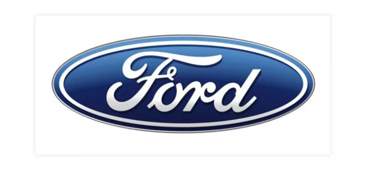
If you want your font to be distinctive, choose a script font, just like the Ford one.
Maybe a handwritten artistic font is more suitable, or a bold slab serif one. Regardless of the font type you choose, it should complement your business, not work against it. Just like in the case of logos, there are bad font options as well.
Fonts can help your business in different ways. Whether you use the fonts for your logo, your business cards, or other purposes, an interesting font choice will draw more attention than a regular bland one.
Fonts are important not only for your logo but for other marketing materials too. The right font can increase the value of a text, which means that the message you try to convey will have a bigger impact on readers. You can try utilizing a font generator to enhance your marketing materials and logo.
As I stated, each element of the branding kit plays an important role, but these elements need to be compatible to be effective. This takes us to the colors.
Brand Colors
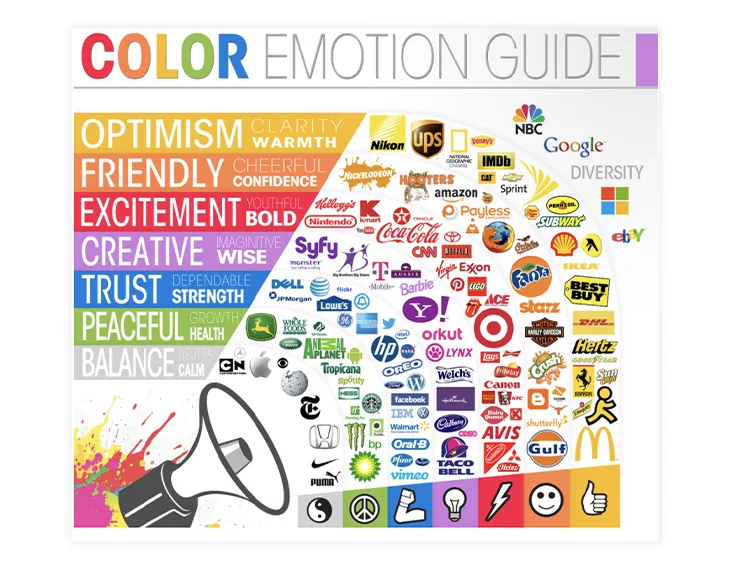
Choosing the right colors for your brand is essential, but it isn’t an easy task. The psychology of colors is a well-studied domain, and the results shouldn’t be ignored.
Colors have different meanings, send different messages, set different moods. A color such as blue can inspire trust and strength, while a red one can inspire passion and energy. Yellow is the color of optimism, while gray represents calm and balance. It is important for the colors you choose to be on par with the message you want to deliver.
As part of our redesign process, we too have also made some changes to our brand’s colors.
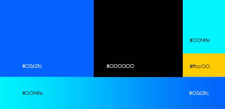
“We took our signature color, blue, and amped it up a little. We went from a more pale, calm shade, to a more vibrant one. One that makes a statement! We also introduced black in the equation. Black ensures an elegant contrast that further solidifies the presence of blue. White, on the other hand, is there to bring homage to the ancestors of digital flipbooks: papers!”
Besides changing the perception regarding your business, colors can also have a direct impact on your sales. If you have a product catalog, for example, use yellow to highlight certain products. For children’s products, use primary colors, as these draw their attention.
Pink is often used for menus, as it increases appetite. A red call to action message could have a bigger impact than a blue one. The list goes on and on. Regardless of the domain you work in, there surely is a color you can use to your advantage.
Color is important for text also. A blue text increases retention, while other colors increase comprehension or learning. Colors, when combined with fonts, and typography, as you will see, can completely change the impact a text has.
Once you have identified your colors, it is important to maintain consistency. Use the same color schemes for all the channels: newsletters, websites, social media. Color consistency leads to brand consistency, and after all, this is what a branding kit should help you achieve. As a heads up, colors evoke negative feelings as well, so keep that in mind when making your choice.
Typography
Last but not least, we have typography. Equally important as the other elements, it is often the most ignored.
Typography is more than the font you use, it’s about “the art and technique of arranging type to make written language legible, readable and appealing when displayed.”
Wikipedia
The size of the text, the line height, the negative space in the text, all matter. These aspects might seem irrelevant, but in reality, they are far from it.
Kerning or letter spacing can greatly affect the overall design, and in some cases, it can even result in different words altogether.

Making mistakes such as these looks unprofessional, and it will surely turn people away. If you won’t bother fixing your text, how will you guarantee great quality?
Typography, when used with a great font and color combination maximizes a text’s potential.
A well-written text can easily be ruined by a hard-to-read font or with a color combination that strains your eyes. Good typography enhances the user experience, and that leads to a positive influence on your brand. A bad one will do the opposite.
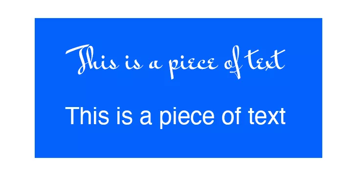
In this example, both the fonts and the background share a common color. However, the first text is more difficult to read because of the font, when applied to a longer piece of text. This is why choosing the perfect font, color and typography is so important.
In what follows I’ll offer some examples of brand kits that perfectly combine all these elements.
Brand kit examples
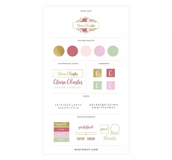
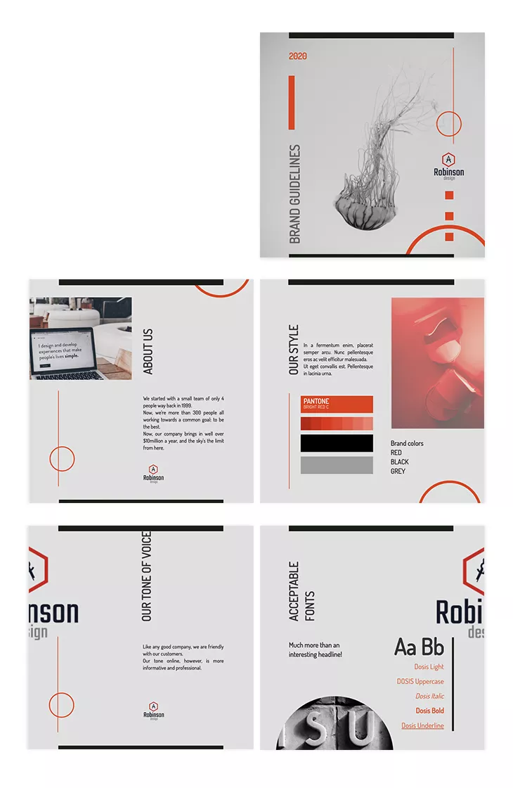
Here is a branding kit example that uses all the elements I mentioned, and combines them cheerfully and playfully. You can see the logo variations, and a submark, which is to be used when the main logo is not the best option.
There are also font options and you can see how these colors look when applied to different design elements. The color choice is a happy one, suitable for a pastry shop or maybe a flower business. As Gregg Weisstein, Co-Founder of BloomNation, notes, “A strong brand identity isn’t just about aesthetics—it’s about creating an emotional connection that resonates with your audience.
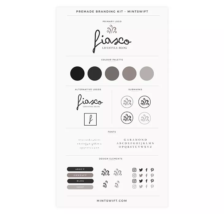
Here is another example from the same designer. The same elements are included in the branding kit, but this time, the tone is completely different. It uses a more somber color palette choice, and it highlights the difference the color choice can make.
The designer envisioned a lifestyle blog for this branding kit. Grey is a neutral color, it represents calm and balance, so any business that identifies with these values could use this color combination.
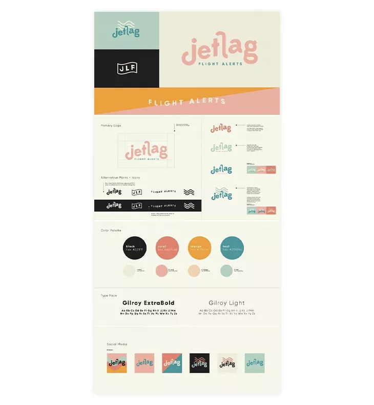
A third example, this time from a different designer. Once again, the same elements, with a different selection of colors. However, the designer has also included various color combinations for the social media icons.
The funky logo font choice and the color palette that reminisces of the 80s, make it a perfect choice for a travel agency, just as the designer envisioned.
Each of these examples has proven that a great combination of logo, fonts, colors, and typography can lead to something beautiful.
How to use your brand kit in Flipsnack
I already mentioned the importance of a brand kit and how each of its elements can help your business. Whether you’re creating a brochure or a restaurant menu, you need to maintain brand consistency. With Flipsnack, it is enough to add these elements once, and they will be saved on your profile; accessible to everyone who has access to your workspace.
Now I’ll offer you some information on how you can upload your brand kit elements in Flipsnack and then include them in your publications. Let’s get things started.
First thing first, you need to create an account on Flipsnack and choose the Professional plan. Once that is set up, go to your Flipbooks page and click on Branding.
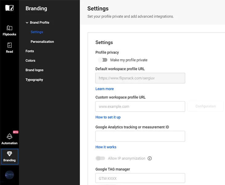
Here is where you can start customizing your brand. Let’s proceed with the elements, starting with the logo.
- Brand logos
In order to add your brand logo, click on brand logos, and upload your .png, .jpg, or .jpeg file. The maximum size should not exceed 2MB.
Once the file is uploaded, you will be able to apply it to your documents during the publishing process. You only need to upload it once, and after that, it will be readily available each time you create a new publication.
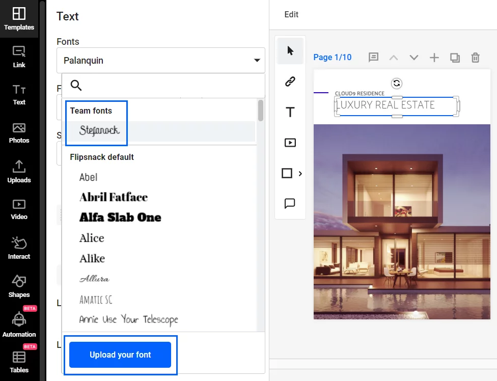
- Custom fonts
If you want to use and upload your fonts when on the Branding page, click on Fonts, and then on the Upload your font button. You can upload both TTF and OTF formats.
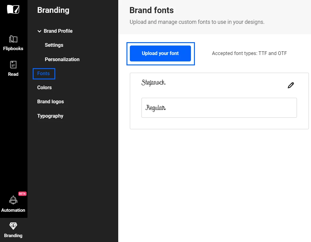
In order to use the font you’ve uploaded, click on any text in the document, then in the newly opened menu click on Fonts. The uploaded font will appear in the dropdown menu. In case you need to upload a different font, you can click on the Upload your font button, and it will take you to the branding page where you can repeat the first step.
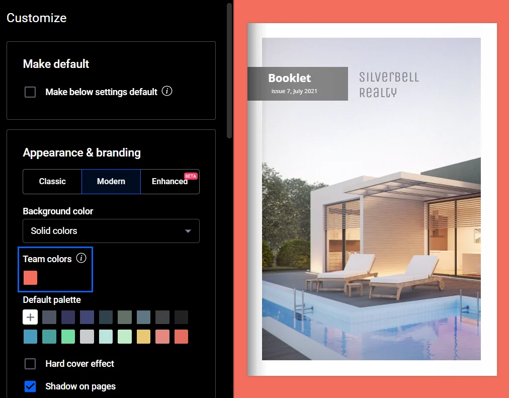
- Colors
On the Branding page, click on Colors and then on the Add color button to upload your brand colors. You can choose from the RGB, HSL, or HEX color systems. You can add more than one color, and hovering over an added color will allow you to quickly modify, or delete it.
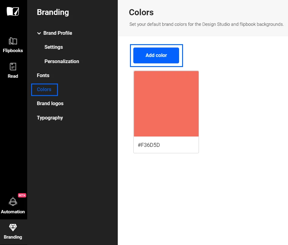
Similar to the logo, the team color will be accessible during the publishing stage.
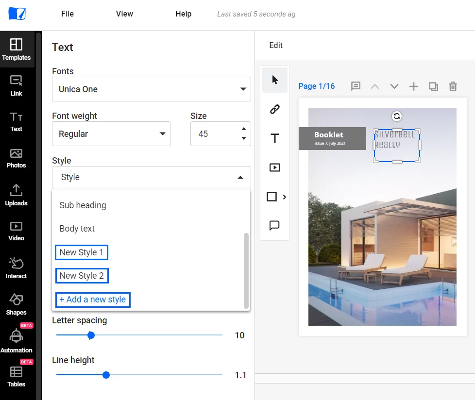
- Typography
Go to Branding, then click on Typography to modify it. There are three pre-entered typography options for the heading, subheading, and body text. You can customize it in different ways: change the font, size, line height, letter spacing, and more. You can also add more text styles by clicking on the Add text styles button.
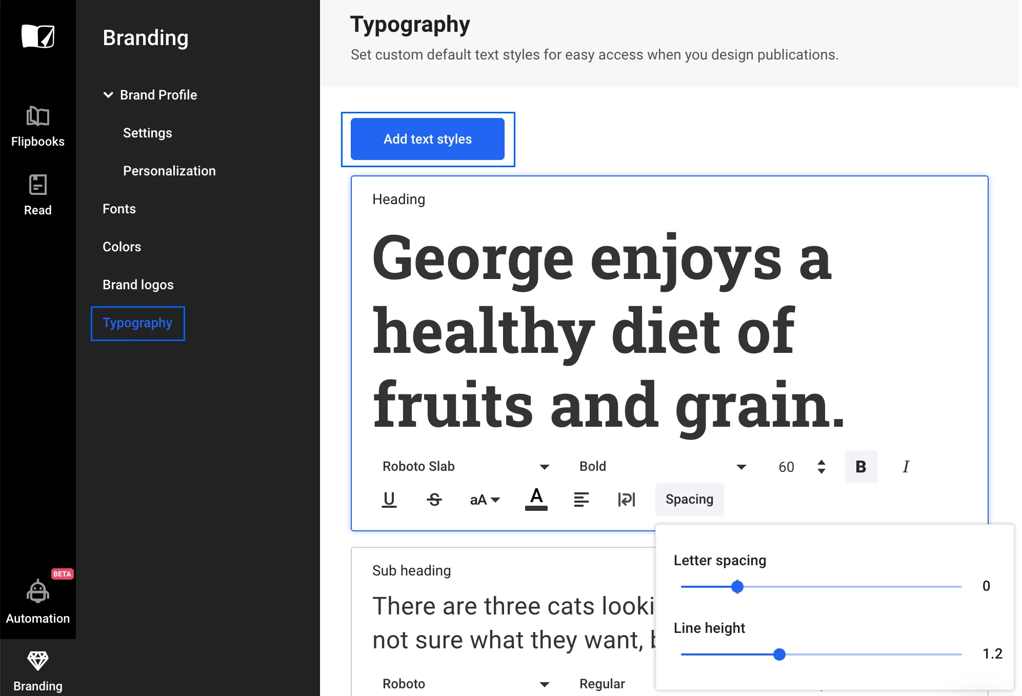
Similar to the font, you can choose the typography during the editing stage. Click on a text, then Style, then choose the typography. If you click on Add new style during this stage, a new tab will take you to the branding page, where you can click on the Add text style button.
Bonus step
By using your brand kit in Flipsnack, you ensure brand consistency. To make sure that your documents will have the same tone and style, and will deliver the same message, you can use the new advanced lock feature. How does this work?
Let’s say that you want a specific element, such as your logo in a certain position on the page. You can place it in the desired position, then you can choose to lock the position, content, or style. By locking the position, the logo will remain where you’ve placed it. Choosing to lock the content ensures that no other image can replace the logo image. Finally, locking the style prevents others from altering the transparency, radius, border, and other styling options.
This feature applies to any element placed on-page, including text, videos, and other interactive elements you can use in Flipsnack. The feature is available to all users, regardless of the plan.
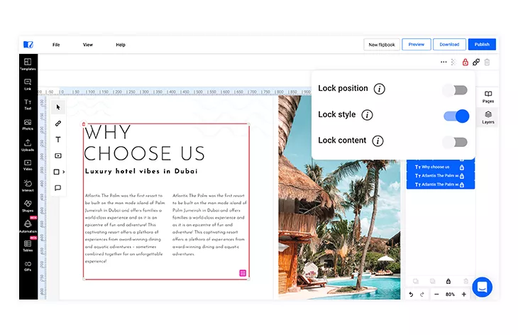
For extra control, as part of the Professional plan, you can use our locked template feature. It allows you to design a template and lock the position of elements on the page, and then save the templates for later use. People will be able to use the templates, but they won’t be able to modify the locked elements.
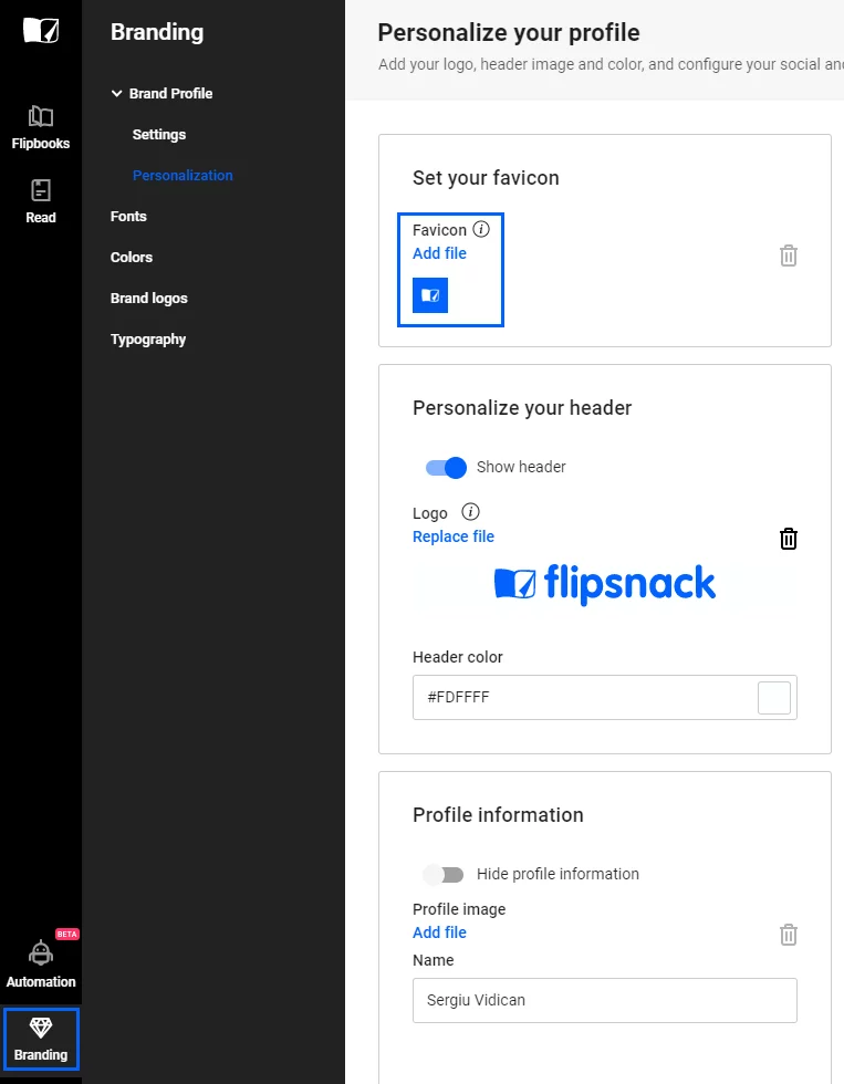
On top of that, once you have published your brand kit in Flipsnack, you can go the extra mile and customize it even more. There are different branding customization options to choose from. As part of our Enterprise plan, you can remove all Flipsnack branding and make your publication look as custom-built as possible. Set your own custom URL, or upload your own favicon for an extra touch of personality. In order to see all these premium features, click on Branding, then Personalization.
Conclusion
A branding kit is a very important aspect of a company’s business strategy. It helps a company maintain brand consistency, by delivering its message both internally and externally in a uniform way. Never forget how important all of the elements of the branding kit are, and how necessary it is to combine them wisely to attain the desired results.
Now that you know all these things, it’s time to get to work and create your own documents in Flipsnack. You can then integrate your branding kit elements in your digital magazines, brochures, catalogs, and more. Just create an account and start designing!