Flipsnack 10. The story of how we aligned our design processes
10 years have passed since we launched Flipsnack. With age came maturity. Constantly looking for new ways to improve our product, functionalities and technologies, the technical aspect of our product grew immensely, but design was somewhat still in the past. Always having our customers in mind, we took what we considered to be a pragmatic and organic approach. To build a beautiful house, you must first have a solid foundation.
That being said, we have to admit that our design was inconsistent, not communicating to our target audiences the way we wanted to. Read on to unfold the story of how we gave our flipbook app a refreshment, aligning all our design processes and rediscovering who we are today.
The need for a new design voice
Our main goal was to build a new design language to better reflect both our product and our customers. We wanted to bring our visual language in the present because we did our research and understood how most of our users interact with our product. We aimed for a design that was both reflective of the present and flexible enough to withstand future upgrades.
Rebrand or redesign? That was the question we asked ourselves at the beginning of this entire process.
We soon decided that instead of building something entirely from scratch, we would give our brand some new clothes. This is not a story of a product rebranding, because that wasn’t our goal. We still felt there was no reason to change our name or communication strategy, but to visually align our entire design communication.
What you see today, reflected on all our communication channels, is the final result. A visual identity that allows for further tweaks and changes, depending on how our product will grow.
We designed for the present, but with our minds open for the future.
And speaking of design that passes the test of time, let’s uncover all the steps we took in this visual alignment process:
- Understanding where we got stuck
- Defining our users
- Aligning their needs with our vision
- Establishing an efficient design system
As you can see, we started with:
Understanding where we got stuck
We know who we are, our main strengths and weaknesses. We already had our mission and values very well established. We also knew a lot about our competition and we were quite confident with the way we communicated.
However, aligning all our design processes and refreshing our brand was a long and difficult mission. And it was one that we had already started a few times before. But somehow we got stuck.
This time was different. Why?
We started by defining the entire process. Product people, graphic designers, marketers, we all sat down at one table and defined what was needed to actually get it done. And, most importantly, we established a process.
Our top priority was to:
Define our users
Getting to know your users is the first step of any successful enterprise. We knew who our users were, how to address them, but we needed something more. Our mission was to find a way to reach out to them visually, as well.
In marketing, we call this a customer persona. Although each individual is different, humans are not solitary creatures. By all means, rob someone of their social circle and you immediately shorten their lifespan.
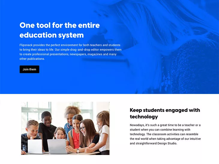
Representing every category of our target users was a challenge. From students and teachers using Flipsnack as an online education tool, all the way to business owners, we had to accommodate each one of them to the fullest.
As such, we know that for marketers, for instance, the language must be different than for teachers.
The same goes for design. By determining the dominant age and domain activity of our main categories of users, we came up with a new visual identity that was meant to appeal to all of them. As a customer-oriented company, our main goal was to start with the customer in mind and only afterward move on to all the other essential parts of our redesign story. And we would recommend the same to anyone interested in giving their brand a refreshment.
The challenge of aligning their needs with our vision
In theory, this entire process may seem like a walk in the park. In practice, the most challenging part was to find an efficient way to target multiple personas and make the design appeal to all of them equally.
How do you actually target multiple personas?
Our customers view and use us differently, so we adapted our design to focus on those features most relevant to each user persona. The main goal was to align ourselves with the specificity of their profession, and reflect that in our new visual identity.
When you are dealing with multiple, somehow different target audiences, the first step is to figure out what their common ground is. Their professions may not have much in common, but ultimately they all use Flipsnack for the same thing: interactivity.
Some come to us to breathe more life into their PDFs and transform them into full digital experiences. Others simply want to enjoy the perks of our Design Studio and create amazing publications, either from scratch or by starting from our templates. Our design aesthetic provided us with a good canvas to highlight all those features that make Flipsnack great. By going for a clean look with clear colors, our goal was to highlight our strongest assets.
One example of this can already be found on our homepage. The main star of the show, the page flip effect, is beautifully brought to life with contrasting colors that mimic the motion of a real page.
With this in mind, our main mission was to communicate all our best assets, even before the user decided to sign up and try out our features.
Our brand’s new visual identity
Like we’ve mentioned earlier, this isn’t a classical tale of product rebranding. Our mission, values, communication strategies, haven’t changed, they just needed a better way to be visually represented.
We saw this as an opportunity to redefine ourselves through our visuals. After all, for ten years that’s all we’ve been saying to you: edit, customize, be unique. We did the same! We’ve taken our old appearance and treated it with our own blend of creative steroids. We started by creating:
Different Stylescapes for different users
As with any other good story, ours too started with our main characters. By this, we mean our main target personas. Basically, we had our team of designers come up with different Stylescapes to match each of our personas.
What was interesting about this whole process was seeing what common elements we could trace in each design. Some were more colorful. One of them was centered around typography, while others had a more clean approach.
Ultimately, we chose a visual identity found somewhere at the intersection of all our user personas, mission statement, values, and lastly, our business goals.
So it might come as no surprise that the entire process of matching a visual language to represent each persona was stressful.
And what makes up the vocabulary of a visual language?
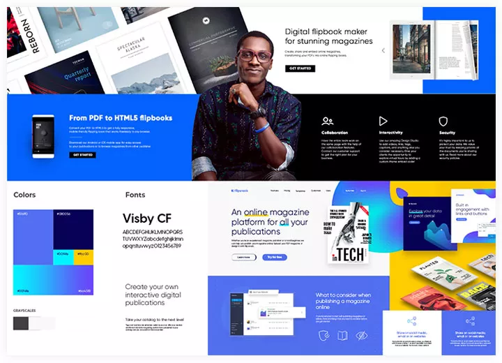
Colors
We took our signature color, blue, and amped it up a little. We went from a more pale, calm shade, to a more vibrant one. Why blue and why a more vibrant tone? Great questions!
Although the marketing literature is vast on color psychology and why it matters, we’ll resume by saying that blue evokes stability and calmness which are among our strongest points. After all, we have been in the online publishing platforms market for 10 years now, so we already have a certified position in our niche.
But we went for a more vibrant type of blue. One that makes a statement!
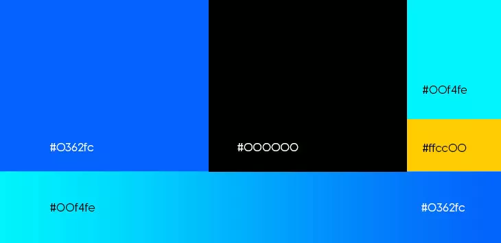
And speaking of standing out, we also introduced black in the equation. Black ensures an elegant contrast that further solidifies the presence of blue.
White, on the other hand, is there to bring homage to the ancestors of digital flipbooks: papers! Sounds ancestral? Well, then we’re guilty as charged. White also contrasts beautifully with black while also complementing the blue tones that we have on our pages. The end result of this color system is simple, appealing, easy to the eye, and universal.
Fonts
For fonts, it’s a similar story. We wanted something to embody the prime characteristics of a digital flipbook.
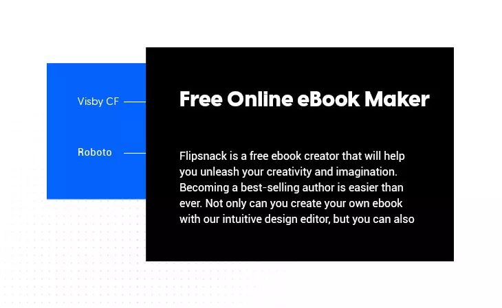
Upon various brainstorming sessions and 3 other font options, we chose Visby CF for headlines, again to make a statement. There’s a lot to take into consideration when choosing the right typeface for your brand redesign or rebranding process. Just to give you an idea of how complicated it can get, think about the fact that Flipsnack’s website is translated into 6 languages. That means that you have a lot of special characters, therefore, the fonts chosen must comply.
Now, you may wonder, what is it about this font that makes it immediately appropriate for a digital flipbook maker?
The core of digital flipbooks, mainly that page-flip effect is, well, code. We wanted a geometric font that could tell the story of the mathematical principles that lie at the heart of our page-flip effect.
Visby CF is a font that beautifully embodies the matrimony between sharp edges and cursive, human touches. Nature meeting science at its finest!
While for body text, we opted for Roboto, a clean and modern font, a very versatile typeface. It’s very easy to read, translates well in various languages, and is highly compatible with any type of browser.
Establishing an efficient design system
Looks are crucial, but they also need their allies! A brand’s crown is held not only by appearance but also by functionality. So, after going through a design process that brought changes to Flipsnack’s overall appearance, we had to make sure that this new design system was also efficient.
The graphic design team and the UX/UI designers joined forces to create something not only appealing to people but also functional. We’re here talking mostly about our website where things like page speed, load time, and other important SEO elements are vital to be taken into consideration. Quite unexpectedly, our main challenge was not coming up with a new visual identity, but actually implementing it.
For a design to be great, it’s crucial to be functional.
A user spends no more than 4 seconds scrolling a new page. Therefore, he needs to be able to search and find the most relevant information for him, and that needs to happen super fast. The top priority was making sure that all our website’s pages look similar while keeping their content original. We worked with a modular website, where we designed over 25 reusable sections, each with 2,3 color variations.
Great for both efficiency and consistency!
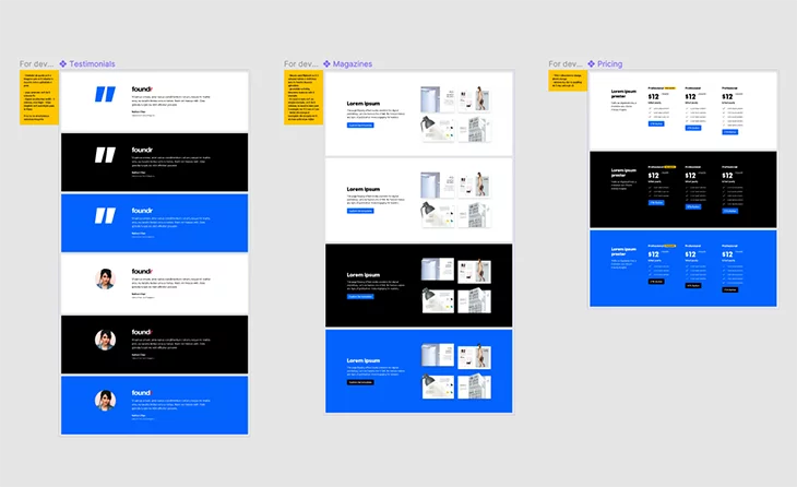
This way, when the user browses through the various pages of our website, he will feel like everything is part of the same story, making it easy to find what he’s looking for.
Personality vs Design
Some of our challenges revolved around educating the entire design team to align their design personalities with the new visual identity, implementing new tools to help us be more productive and learn how to create a design system that everyone feels comfortable working with. We had to ensure that each of our designers was on the same page when it came to our visual language. So the challenge, now that we came up with a design strategy, was to make sure that everyone knew and understood what this brand stands for. How to implement it for each pillar.
It only makes sense if you think about it. Every designer involved in the project is, well, human. As such, he has his own view on how to implement this newly formed visual identity. That’s what we would call a positive conflict. It’s that type of conflict that allows for growth and development of new ideas.
So, although there were a few creative conflicts, by the end of this entire branding chapter, we identify this as an alignment process, vital to this entire story.
After we found our visual path, it was time to make sure that every team member -would align their work with the new identity. We created specific guidelines and set some boundaries to ensure that our brand would remain consistent. But, by staying focused on every detail that makes Flipsnack great and by aligning everything with our customer personas, together we managed to build the brand identity that fitted our product best. –
Tina Boc, Graphic Designers Team Lead.
Creating a design framework for every designer
After getting all the designers on the same boat, we had to establish some best practices. Some guidelines for everyday tasks.
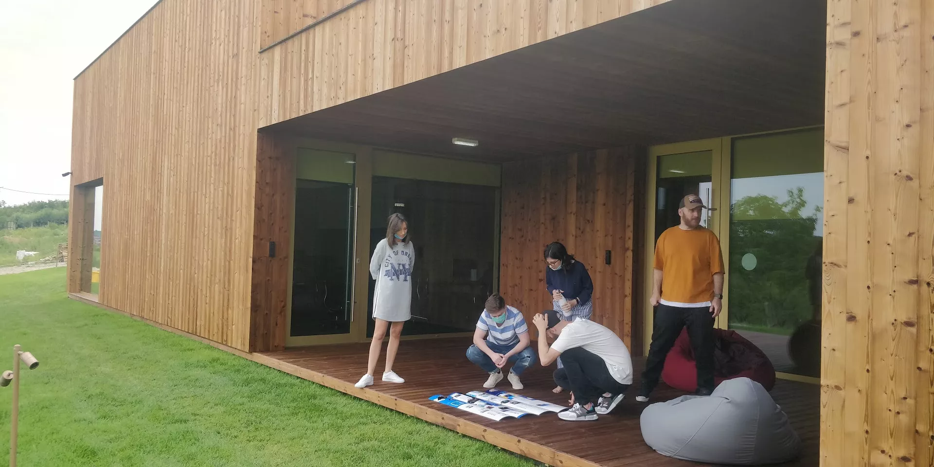
Awareness was crucial in this phase, as we didn’t want processes repeating themselves, and we definitely didn’t want people working on the same tasks without knowing so. A more granular control was needed, for everyone to be constantly aware of their, and their colleagues’ work. All tasks have been equally distributed and a timeframe was created for each and every one of them. It may not sound like much, but when entire teams are involved, and the number of total tasks is around the hundreds margin, things can spiral out of control. You went skiing and suddenly, instead of beautiful cliffs, you are surrounded by an avalanche yelling after a Saint-Bernard.
How can you stay on top of this challenge?
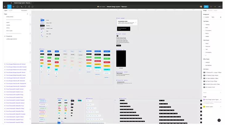
Implementing Figma
Figma is that software beloved by UX/UI designers. Truth be told, it’s an amazing program that allows you to do so much.
Using Figma we’ve outlined the future look of Flipsnack, by coming up with button design and user interactions. Figma allowed us to push things further and go from concept to visualization. Now we had a more clear, practical view of how Flipsnack would look and feel.
We can all agree by now that we simply loved using Figma for this project. It allowed us to truly understand the meaning of collaborative design. Having every designer using the same tool, sharing the same assets, and components, allowed for a synchronized communication all throughout the process.
Implementing Figma was life-changing. Having everyone, from graphic designers, UI/UX designers, marketers, QA testers and developers, in the same place, at the same time, really helped streamline the entire process. Would highly recommend this design tool to everyone who works in a project like this one, where multiple departments are involved. – Daniel Bondas, UX Designer.
Daniel Bondas, UX designer.
Given that our visual alignment process started in the year of the pandemic, that proved to be an incredible advantage, one that we immediately grabbed.
Unifying the user experience with our new design
When it came to the actual launch phase of our new visual identity we had two things in mind: speed and efficiency. And for this to happen, we had to implement a new design system that would actually make our lives easier. Because, all of our website’s pages, from homepage to landing pages, contact pages and so on, needed to be updated simultaneously, to reflect the new design.
As we previously mentioned, we dissected each of our pages into their containing parts, coming up with different reusable sections that allowed us to carry on this process. Modularity and scalability were the core assets of our website which allowed us to perform this operation. By the end, everything, from templates to testimonials, was updated to reflect what you see today.
Perfecting our front-end development
Establishing a new visual identity is all fun and games until you have to implement it, and you have to make sure you do so without compromising any of the technical aspects of a website, especially when it comes to a complex infrastructure like Flipsanck.
For this to happen, we worked super hard to implement the new website in a correct manner. From adding new colors, optimizing the fonts, the new modules that we just talked about, it was also a good time to do some spring cleaning and remove unnecessary old code.
All of this was performed while having one clear mission in mind at every moment: to stay consistent and on-brand, and to keep our SEO health intact. For this to come to fruition, the combined efforts of the marketing, design, SEO teams, and product owners were needed to ensure success.
But not only, but a brand is also reflected everywhere, from our social media posts to emails and everything in between. So, it took a village to make it happen.
We have to admit, it was a daunting process, and we couldn’t have done it without being really organized. As mentioned before, this entire process was run by a multidisciplinary team, so that every aspect would be taken into account. And yes, sometimes things didn’t necessarily go as planned, but we learned a lot all throughout this process. For example, we soon learned that we need someone to be in charge of things and keep people accountable. Or, that it was crucial to have daily meetings with the team so that everyone is on the same page.
We didn’t come this far to only come this far
Brands grow and evolve over time. But this can only happen if you pay close attention to what’s surrounding you.
At the end of this journey, the most precious lesson learned is that a brand is a living organism.
Think of markets as forests in which each brand is a tree. All of them compete for the same thing: light. The analogy is appropriate as many brands do tend to act as trees and stay completely put. Roots are great and offer stability, but sometimes the light is better at the edge of the forest. Move, stay active, always listen, and always adapt your strategy to stay on top of current trends. In order to stay competitive, one must always adapt!
We followed the same principle and updated our look to better reflect our target audience. We wanted a premium look to reflect a mature product. Why? Because we felt that it was time to show off our true colors.
But it doesn’t stop here.
Like we’ve said, a brand’s story is a never-ending one. We have established a framework, a well-defined brand kit, so the creative journey is only beginning.
We didn’t come this far to only come this far.