Double page layouts in editorial design
If you’re new to the publishing world or just never put a name to what you were already doing, you might ask yourself what is editorial design? If you publish content regularly, try to maintain a creative unity across all your content and have a strategy to share this content with your readers then you’re already practicing editorial design.
What is editorial design?
So let’s see what exactly is editorial design.
Editorial design encompasses quite a few elements, from smart compositions, creative typography to editorial layout and suggestive imagery. All this to create a unity in transmitting content to readers, this is why during this process, you need to follow certain guidelines and rules.
Therefore, editorial design is closely linked to a brand’s ethos and is a huge part of the success or unsuccess of a publication since a clear communication and storytelling is based on rigorous applications of grid layouts and visual elements. After all, what publishers want is to keep readers entertained while consuming their content because as we all know, a happy reader is a returning reader.
Standing out from the rest
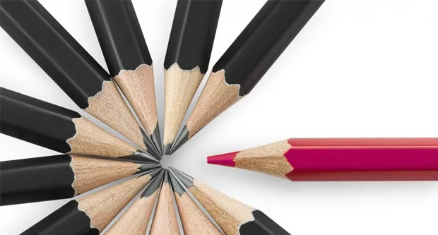
But keeping readers entertained is quite hard, especially in the digital space.
Designing magazines, catalogs, newspapers, books, and so on has become rather challenging since technology is changing at such a fast pace. In a sea of publications is hard to stand out from the rest and bring something new to the table.
The process of creating a magazine, for instance, can be an overwhelming one with so many details to take into account and when it comes to the editorial design one can feel a bit lost since there is so much that can be done.
The “less is more” rule might not be applied as a general rule here with so many options to choose from regarding editorial design. And gaining your audience’s attention is not exactly a stroll in the park these days, but if there is something that I have learned is that going back to basics never gets old-fashioned. Because you can always add your personal touch and make it a brand.
Double page spread design
Here is where good old “double-page layout” or “double-page spread design” comes into the spotlight.
This type of editorial design was always a classic. Something that doesn’t go out of fashion. And for good reason. You can always add new elements, use new techniques, and create something fresh.
If you somehow landed here thinking, ok but more precisely, what is a double page spread?
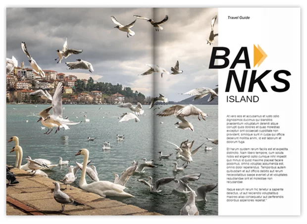
A simple definition of a double-page spread states that it represents two pages treated as one in a publication, with images or text extending across the binding.
The whole image (meaning both pages) has to be unitary and suggestive. Even though a double page design is meant to break the monotony of a publication, it also has to be in perfect harmony with the rest of the editorial layout.
You might say “easier said than done”. So, I’ve asked Cristina, one of our designer colleagues, to kindly share some of her best-kept secret tips.
Here’s how to make a double page spread:
- Look at the spread as a unit
- Always use a grid (Always!)
- Maintain a consistent internal margin
- Pay attention to kerning (the adjustment of space between two unique letters)
- Use the same fonts, color tones on both pages
- Don’t forget about readability for aesthetic reasons
- Find photos with the same vibe and characteristics.
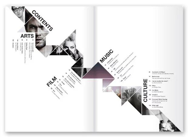
Creative double page spread examples
There are plenty of double page spread examples to draw inspiration from. The Internet is packed with them and you can find inspiration everywhere. So, buckle up, you’re about to get inspired!
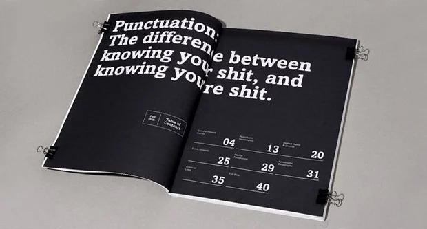
For the first magazine double page spread example below, you’ll see a creative manner to present an, otherwise boring, table of contents. With a black and white minimalist design, this layout lets the numbers speak. 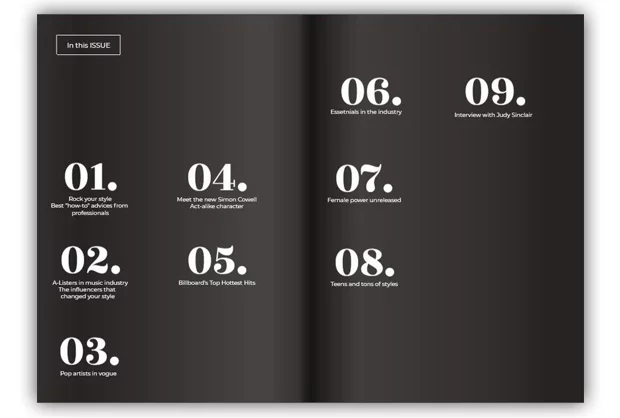
Designers will usually use double page design to mark the beginning of an article in a magazine, for example.
To present products in a more detailed manner, showcase delicious food photography or simply to break the monotony of a lengthy article.
Double page magazine ads are also frequent and a good source of inspiration:
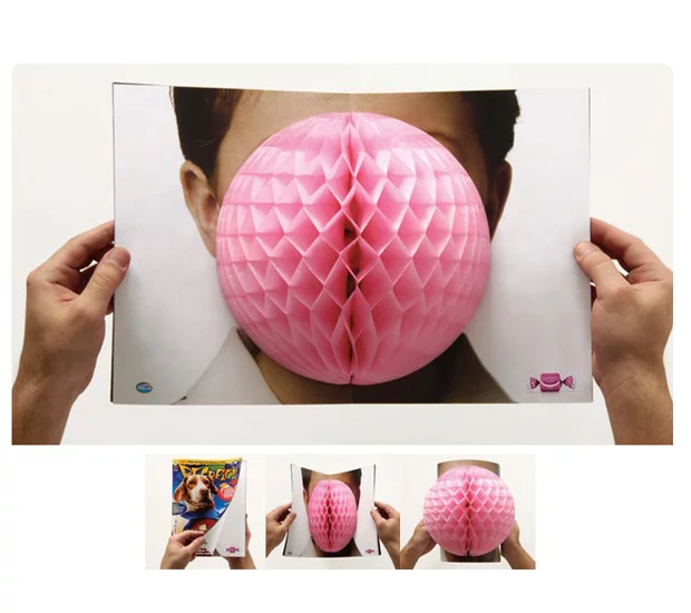
Arcor: Bubble Gum – Advertising Agency: Leo Burnett, Sao Paulo, Brazil
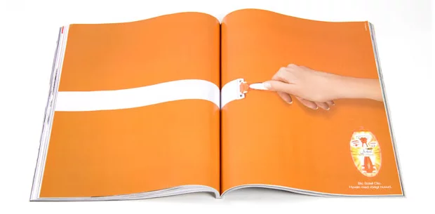
Bic Soleil Clic – Advertising Agency: Dragster, Gothenburg, Sweden
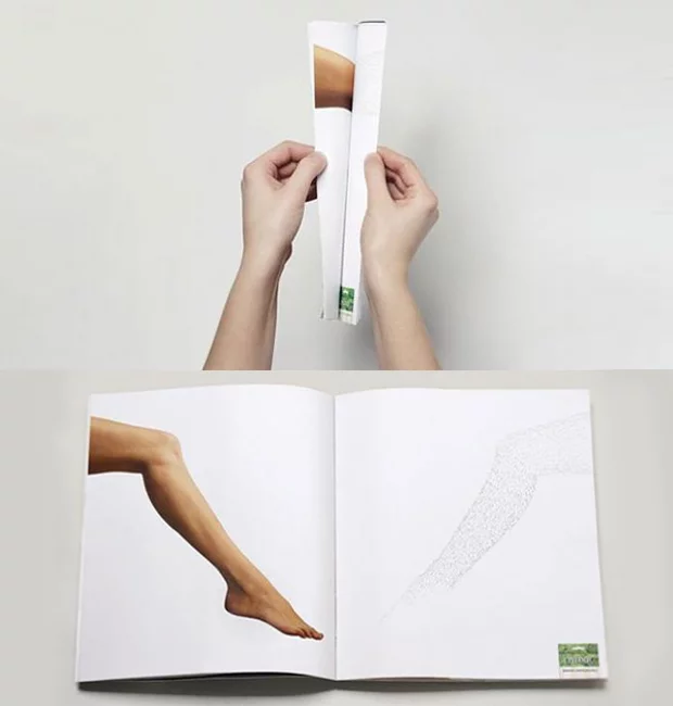
Depilatory Strips: EPILDOU – Advertising Agency: Lg2, Quebec, Canada
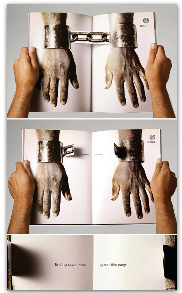
Awareness Campaign about modern-day slavery – The International Labour Organization Ad by AlmapBBDO
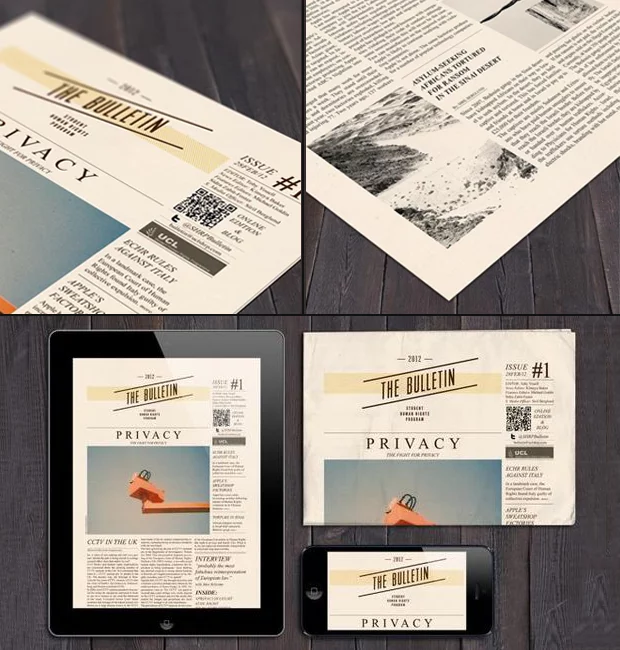
Magazine double page spread template
There is something so special about flipping the pages of a magazine and stopping to admire a cool double-page spread.
Because here at Flipsnack we know the importance of a well-designed spread, we made it easier to create one. From scratch, using one of our many magazine templates.
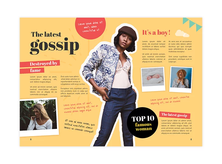
You can simply grab this gossip magazine template and have fun with it. In our design studio, you can change anything from images, play around with text, fonts, colors and make it yours.
All in all, use this chance to get creative and create your own magazine spread. It was never easier to create and publish your own magazine. Trust me!
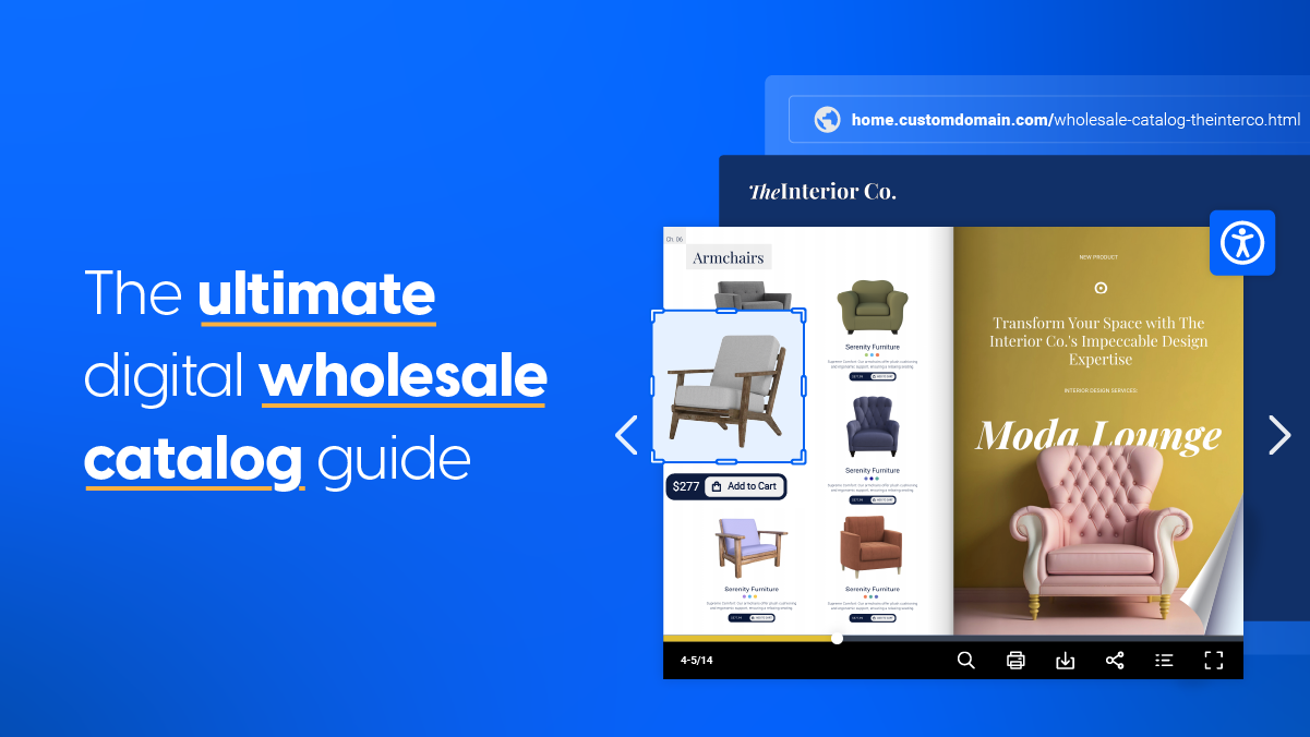
Catalog template
Who said you can’t get creative with your catalog design? Because you can and you should!
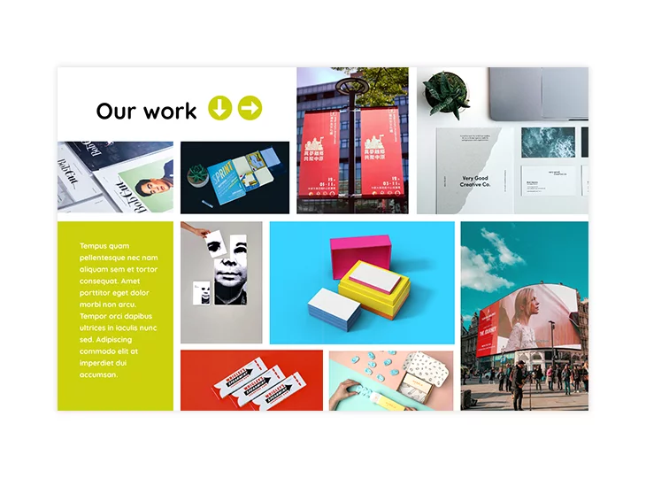
And honestly, what a better way to display your products and services than by using double-page design? Start with this catalog template above and make a cool collage of your products and services.
Online double page editing
We want our users to have more freedom for their creativity.
And when you’re able to edit two pages at the same time, you are more precise with your layout and get to see the big picture (pun intended). Want to learn more? Check out the quick video below that shows you exactly how you can create your own double-page layout in Flipsnack.
So, why not take advantage of it? You really don’t have to be a designer to see your magazine spread come to life. Start designing with Flipsnack!