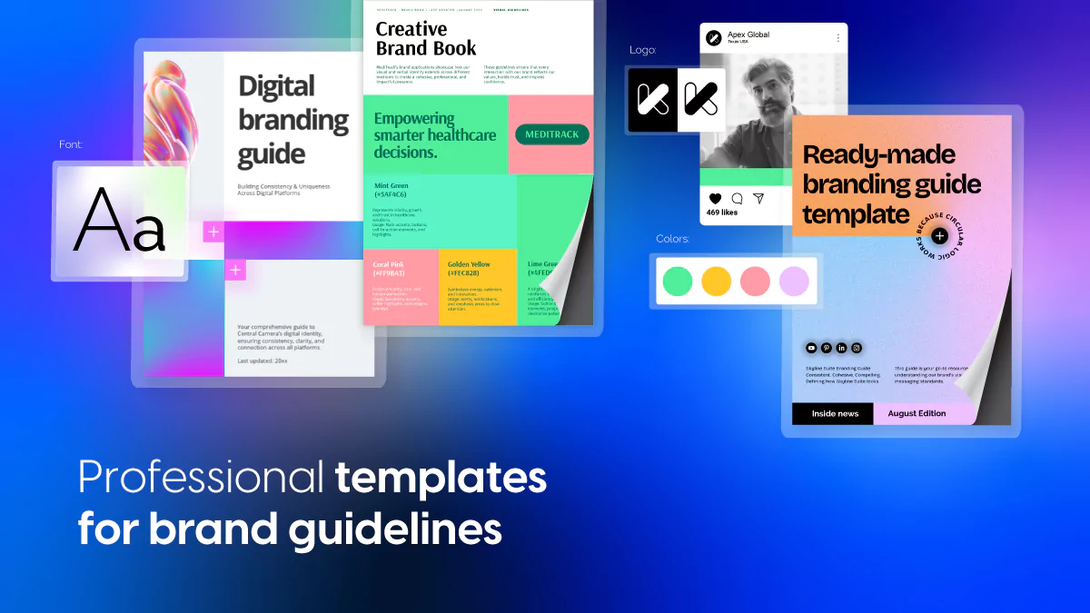
Brand Guidelines Templates to Keep Your Identity Consistent
Published on: August 31, 2021
Last updated: April 22, 2026
What are brand guidelines?
Brand guidelines are a set of rules that define how a brand looks, sounds, and presents itself across every platform. They cover logos, color palettes, typography, imagery, and tone of voice, giving teams and external collaborators a single reference point for everything they create.
Without them, things drift. Logos appear in the wrong colors, fonts change between departments, and messaging feels inconsistent across channels. This is especially costly at scale — the larger the organization, the more people are creating content, and the higher the risk of the brand fragmenting quietly over time.
Apple, the world’s most valuable brand, has a brand worth over $408 billion — more than Microsoft and Google combined. That kind of recognition doesn’t happen without obsessive consistency in how the brand is presented at every touchpoint.
Most companies still document their brand guidelines in static PDFs that get buried in shared drives and go out of date within months. A flipbook-style brand guide is a better approach — interactive, always current, and easy to share with anyone who needs it.

Table of contents
- What are brand guidelines?
- Find how to build brand guidelines that actually get used
- Quick comparison: Choose your ideal brand guidelines template
- What customers say about Flipsnack
- Professional brand guidelines templates to customize
- 1. Online Branding Guide Template
- 2. Modern Brand Guidelines Template
- 3. Startup Branding Guide Template
- 4. Creative Brand Book Template
- 5. Digital Branding Guide Template
- 6. Simple Brand Guidelines Template
- 7. Colorful Brand Guidelines Template
- 8. Modern Corporate Style Guide Template
- 9. Minimalist Brand Guidelines Template
- 10. Branding Guide Template
- 11. Professional Brand Typography Guide Template
- 12. Creative Branding Guide Template
- 13. Urban Brand Guidelines Template
- 14. Interactive Company Branding Guide Template
- 15. Editable Branding Color Palette Guide Template
- Build a stronger, more consistent brand with Flipsnack
- Frequently asked questions
Find how to build brand guidelines that actually get used
Brand guidelines only work when people can find them, understand them, and apply them without interpretation. And we, at Flipsnack, can confirm that with our own data. The most common failure isn’t a lack of documentation — it’s documentation that lives somewhere nobody checks.
The difference between brand guidelines that protect your identity and ones that collect dust comes down to format, accessibility, and how easy it is to keep them current. In this guide, you’ll find professionally designed brand guidelines templates covering everything from minimalist startup style guides to bold, industry-specific brand books, each fully customizable in Flipsnack.
Quick comparison: Choose your ideal brand guidelines template
| Template name | Best for | Visual style | Key benefits |
|---|---|---|---|
| Online Branding Guide | Apparel, sports, and lifestyle brands | Bold, energetic, movement-driven | Embed videos and product tags; shareable with teams and partners |
| Modern Brand Guidelines | Skincare, wellness, and clean beauty brands | Earthy, minimalist, nature-inspired | Interactive color and typography sections; links to product and ingredient pages |
| Startup Branding Guide | Fintech and financial services brands | Bold typography, tech-inspired palette | Private sharing for investors; structured for digital and financial touchpoints |
| Creative Brand Book | Healthtech and medical startups | Fresh gradients, structured layout | Links to compliance docs and product demos; professional and credible design |
| Digital Branding Guide | SaaS and tech companies | Vibrant gradients, clean typography | Links to UI kits and design assets; ideal for multi-team distribution |
| Simple Brand Guidelines | Consulting firms, legal, enterprise | Clean, professional, structured | Real-time updates; consistent across global teams and external partners |
| Colorful Brand Guidelines | Tech startups, media, digital agencies | Bright palette, fluid design elements | Embed motion graphics and campaign visuals; links to design assets |
| Modern Corporate Style Guide | Financial institutions, corporate brands | Navy, blue, and green; sophisticated | Precision color and typography rules; structured for global offices |
| Minimalist Brand Guidelines | Startups and direct-to-consumer brands | Red-accented, bold, structured | Clear logo and messaging rules; links to packaging and media kit guidelines |
| Branding Guide | Tech, gaming, and digital media brands | Neon gradients, high contrast, futuristic | Animated logo showcases; embeds video tutorials; motion-friendly format |
| Professional Brand Typography Guide | Creative agencies, fashion, editorial | Oversized type, striking contrast | Font hierarchy and usage rules; real-world typography applications |
| Creative Branding Guide | Food, wellness, and lifestyle brands | Soft pastels, bold typography, playful | Slideshows, GIFs, and animated captions; tags for logo and color usage |
| Urban Brand Guidelines | Streetwear, music, creative agencies | Handwritten type, high-contrast, collage | Animated overlays; embed brand storytelling videos; social and packaging examples |
| Interactive Company Branding Guide | Tech, fintech, and esports brands | Black and white with neon accents | Animated logo display; motion typography; GIFs for digital brand applications |
| Editable Branding Color Palette Guide | Fashion, creative agencies, media brands | Electric neon, dynamic, high-energy | Interactive color callouts; embedded GIFs; clickable motion graphics |
What customers say about Flipsnack
The best flipbook tool I have used
Flipsnack is easy to use and offers all the features a small business needs, at a very affordable price. There are plenty of templates to choose from to speed up the project. Each template is easily tailored to your needs. The support is good and fast through the chat function, and they also provide a phone number (infrequently these days) in case you prefer a phone call.
Leonardo Soto, President of SotoNets Cloud Solutions
Reviewed on G2
One of the standout features is their exceptional customer service. I had multiple questions while building my book, and the team was fantastic in providing bespoke support tailored to my needs. They responded quickly, patiently guided me through the process, and ensured I had all the information necessary to create a professional-looking e-book.
Ryan Akram, Administrator
Professional brand guidelines templates to customize
Brand guidelines are only as useful as they are accessible and engaging. The templates below cover a wide range of industries and visual styles, each fully customizable in Flipsnack with support for embedded media, interactive elements, and secure sharing. Whether you’re building your first brand book or replacing a static PDF that nobody opens, there’s a starting point here for every type of organization.
1. Online Branding Guide Template
For brands built on energy, movement, and bold visual identity, the guidelines document needs to match that spirit. This online branding guide template gives apparel, sports, and lifestyle brands a dynamic format to present logo rules, color systems, typography, and brand storytelling in a way that feels as alive as the brand itself.
Best for: Apparel, sports, and lifestyle brands with strong visual identities that need guidelines engaging enough for creative teams, retail partners, and external agencies to actually use.
Real-world application: One of the latest Flipsnack customers is a sportswear brand that used this template to replace a static PDF brand guide they had been emailing to retail partners for years. Embedding campaign videos and product tag examples directly inside the guide meant partners had full visual context without needing a separate briefing call, and the team used Flipsnack’s analytics to confirm which sections were being accessed most before partner launches.
Add videos to showcase brand storytelling and campaign visuals, embed clickable links to collections or social media content, and apply your logo, colors, and fonts throughout using Flipsnack’s Design Studio.
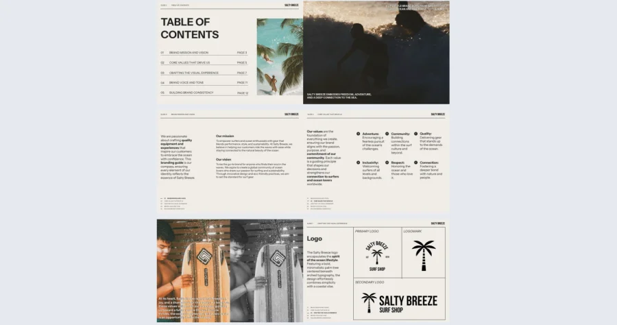
Common mistake to avoid: Don’t present brand guidelines as a list of restrictions. For creative industries especially, guidelines land better when they show what great looks like rather than just what’s not allowed. Lead with inspiring examples before laying out the rules.
2. Modern Brand Guidelines Template
A wellness or skincare brand’s identity should feel as calm and considered as the products it represents. This modern brand guidelines template uses earthy tones and a minimalist layout to give clean beauty, organic skincare, and wellness brands a format that communicates the same values their products do.
Best for: Skincare, wellness, and clean beauty brands that need guidelines reflecting the care and intentionality behind their products, particularly when working with retailers, packaging designers, or content creators who need to stay on-brand.

Real-world application: One of the latest Flipsnack customers is a clean beauty brand that used this template to onboard a new packaging supplier. Embedding links to ingredient glossaries and sustainability pages directly inside the brand guide gave the supplier full context without a lengthy briefing document, and the brand team used Flipsnack’s privacy options to share it securely without making proprietary formulation details publicly accessible.
Embed videos showcasing your brand philosophy and product rituals, add links to color palette specifications and typography files, and structure the guide so retailers and creative partners can navigate directly to the sections most relevant to them.
Common mistake to avoid: Don’t assume external collaborators will interpret your aesthetic correctly from color codes and font names alone. Show the brand in context — packaging mockups, campaign imagery, and real-world applications do more to communicate brand feel than any specification sheet.
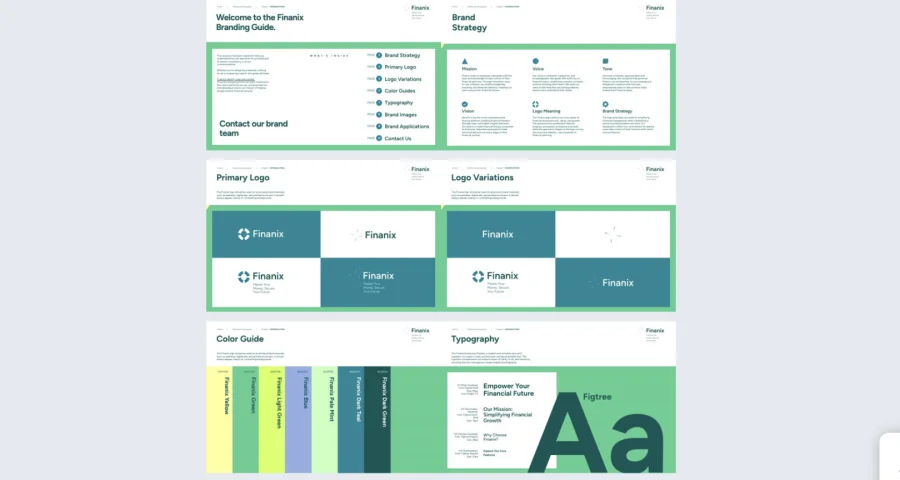
3. Startup Branding Guide Template
A fintech brand needs to balance innovation with trust, and the brand guidelines document is where that balance gets defined for everyone creating content on the brand’s behalf. This startup branding guide template gives financial startups and digital banking brands a bold, structured format to present their identity with the credibility their industry demands.
Best for: Fintech startups, digital banking services, and investment platforms that need brand guidelines professional enough to share with investors and precise enough to keep product and marketing teams fully aligned.
Real-world application: One of the latest Flipsnack customers is a fintech startup that used this template ahead of a Series A raise to formalize their brand identity for the first time. Having guidelines structured and shareable as a live flipbook rather than a Google Doc gave the brand instant credibility in investor conversations, and the team used Flipsnack’s collaboration features to get sign-off from legal and design simultaneously before sharing externally.
Add clickable links to compliance guidelines and investor materials, embed video explainers of your brand mission, and use private sharing to ensure sensitive brand strategy stays within approved audiences.
Common mistake to avoid: Don’t treat brand guidelines as a design-only document in a regulated industry. Fintech brands in particular need tone of voice, messaging standards, and compliance-related communication guidelines built into the same document. Brand consistency in financial services extends well beyond visuals.
4. Creative Brand Book Template
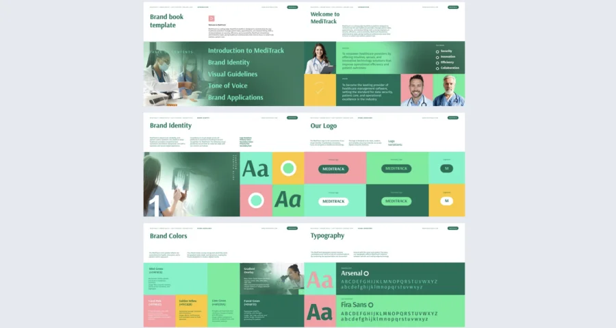
Healthcare and healthtech brands face a unique challenge: the identity needs to communicate both clinical credibility and human warmth at the same time. This creative brand book template gives medical startups and digital health platforms a fresh, gradient-driven format that projects innovation and care without feeling cold or overly corporate.
Best for: Healthtech startups, healthcare software companies, and digital health platforms that need brand guidelines detailed enough for regulatory environments but engaging enough for patient-facing and consumer marketing teams.
Real-world application: One of the latest Flipsnack customers is a digital health platform that used this template to align their internal design team, a third-party marketing agency, and a software development partner around a single brand reference. Having one live document accessible to all three teams eliminated the version conflicts that had previously led to inconsistent UI treatments across the platform and its marketing materials.
Embed videos explaining your company’s mission and proprietary technology, add links to compliance documents and product demos, and use Flipsnack’s sharing features to distribute different versions to internal and external audiences as needed.
Common mistake to avoid: Don’t conflate clinical communication standards with brand guidelines. They serve different purposes and audiences. Keep regulatory language in its own documentation and let the brand book focus on identity, tone, and visual standards that inspire rather than constrain.
5. Digital Branding Guide Template
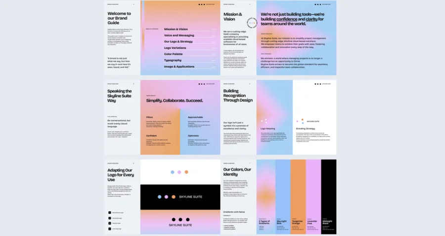
SaaS and tech brands often have the most complex distribution challenges for brand guidelines — developers, designers, marketers, and product teams all need access, but rarely to the same sections. This digital branding guide template gives tech companies a clean, structured format that works as both a creative reference and a technical specification document.
Best for: SaaS companies, cloud platforms, and tech startups managing brand consistency across product interfaces, marketing campaigns, and developer-facing materials simultaneously.
Real-world application: One of the latest Flipsnack customers is a SaaS company that used this template to centralize brand guidelines that had previously existed across four separate documents — a Figma file, a Google Doc, a Notion page, and an outdated PDF. Consolidating everything into one interactive flipbook with direct links to UI kits and design assets reduced the time designers spent answering brand questions from other teams significantly.
Add links to UI kits, embed product demo videos, and use Flipsnack’s branding customization to apply your visual identity consistently across every page so the guide itself demonstrates the standards it defines.
Common mistake to avoid: Don’t build one version of the brand guide and expect it to serve developers and campaign marketers equally well. Consider creating a core guide with department-specific sections, or use Flipsnack’s bookshelf to organize multiple versions of the same guidelines for different audiences.
6. Simple Brand Guidelines Template
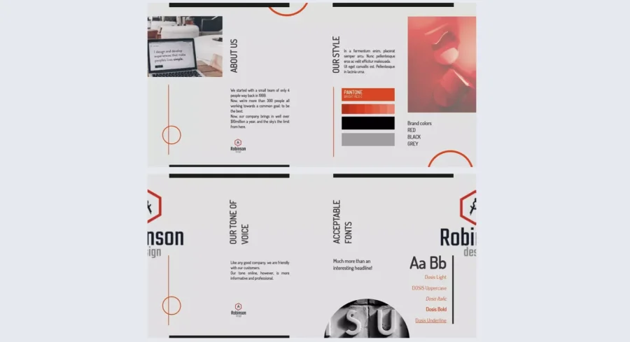
Not every brand needs a visually elaborate style guide. For consulting firms, legal practices, and enterprise businesses, clarity and structure carry more weight than bold aesthetics. This simple brand guidelines template gives professional services organizations a clean, authoritative format that maintains credibility across every touchpoint.
Best for: Consulting firms, legal services, financial institutions, and enterprise organizations where brand consistency across client communications, proposals, and corporate materials is critical but the guidelines themselves need to feel professional rather than creative.
Real-world application: One of the latest Flipsnack customers is a management consulting firm that used this template to standardize brand application across 12 regional offices for the first time. Using Flipsnack’s template locking feature to protect core brand elements meant regional teams could update office-specific content without altering the typography, color rules, or logo standards that had taken months to define.
Define logo usage, color systems, and typography standards with precision, and share instantly with designers, agencies, and global partners through a single always-current link. When guidelines update, every shared version reflects the change immediately.
Common mistake to avoid: Don’t underestimate the importance of tone of voice guidelines for professional services brands. How your firm writes is as much a part of its identity as how it looks. A brand guide that covers visuals but ignores communication style leaves one of the most client-facing elements of the brand undefined.
7. Colorful Brand Guidelines Template
Bold, vibrant, and full of personality — this colorful brand guidelines template gives tech startups, media companies, and digital agencies a playful yet structured format to present a brand identity that is as dynamic as the work they produce.
Best for: Tech startups, media brands, and creative agencies that need guidelines expressive enough to inspire internal creative teams while still being precise enough for external partners and content creators to apply consistently.
Real-world application: One of the latest Flipsnack customers is a digital media agency that used this template to onboard three new content partners simultaneously. Having brand colors, motion guidelines, and campaign visual examples in one interactive document meant partners could self-serve answers to most brand questions without back-and-forth, and the agency used engagement analytics to identify which sections partners returned to most before flagging them for expansion.
Embed campaign videos and motion graphics, add clickable links to design asset libraries and social media branding guidelines, and use Flipsnack’s interactivity features to bring the brand’s energy into the document itself.
Common mistake to avoid: Don’t let visual energy come at the expense of clarity. A colorful, animated brand guide that makes it hard to extract the actual specifications — hex codes, font weights, logo clearance rules — creates more confusion than a boring PDF. Structure the content clearly even when the design is bold.
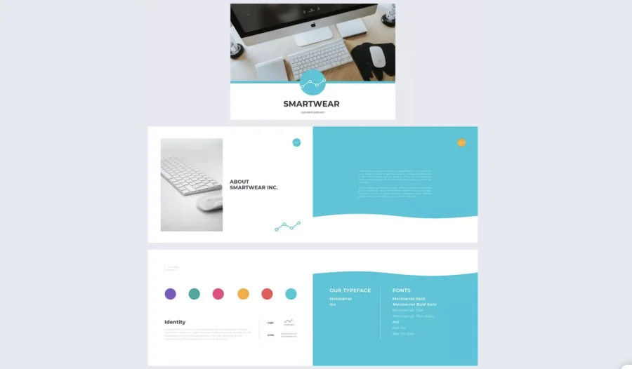
8. Modern Corporate Style Guide Template
For financial institutions, consulting firms, and enterprise brands, the style guide is as much a credibility document as it is a design reference. This modern corporate style guide template gives structured, sophisticated organizations a format that communicates stability and professionalism from the first page.
Best for: Financial institutions, tech enterprises, and corporate brands managing brand consistency across global offices, external agencies, and client-facing communications where precision and formality are non-negotiable.
Real-world application: One of the latest Flipsnack customers is a financial services firm with offices across six countries that used this template to replace a brand guide that existed as a 90-page PDF nobody had updated in three years. Publishing a live flipbook meant every office was working from the same current standards, and the brand team could push updates instantly without coordinating a global file distribution.
Define color palettes, typography hierarchies, and logo usage rules with precision. Embed links to brand assets and presentation templates so teams can access what they need without submitting requests to a central design function.
Common mistake to avoid: Don’t mistake comprehensiveness for usability. A corporate style guide that covers every possible scenario in exhaustive detail often goes unread. Prioritize the rules that matter most day-to-day and link to supplementary detail for edge cases rather than front-loading everything.

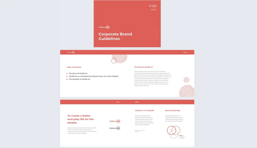
9. Minimalist Brand Guidelines Template
Simplicity is a design choice, and it needs to be documented as carefully as any bold aesthetic. This minimalist brand guidelines template gives startups and direct-to-consumer brands a clean, confident format to present an identity built on clarity, consistency, and strong brand mission.
Best for: Startups, DTC brands, and modern retail companies that have built their identity around minimalism and need guidelines that reflect that restraint rather than undermining it with an overly complex document.
Real-world application: One of the latest Flipsnack customers is a DTC home goods brand that used this template to create their first formal brand guidelines document ahead of a retail partnership. Having clear logo rules, color specifications, and messaging guidelines in one shareable link gave the retail partner everything they needed to produce co-branded materials without a single revision round.
Add clickable links to packaging guidelines and media kits, define brand positioning and messaging standards alongside visual rules, and share instantly with designers and agencies through a private Flipsnack link.
Common mistake to avoid: Don’t document a minimalist brand identity using a maximalist document. The style guide should embody the same principles it defines. If your brand is built on white space and restraint, the guidelines should demonstrate that, not contradict it.
10. Branding Guide Template
High-contrast, neon-accented, and built for fast-moving digital industries, this branding guide template gives tech startups, gaming companies, and digital media brands a format that matches the energy and ambition of the industries they operate in.
Best for: Gaming companies, tech startups, and digital media brands whose visual identity relies heavily on motion, contrast, and digital-first aesthetics that are difficult to convey in a static document.
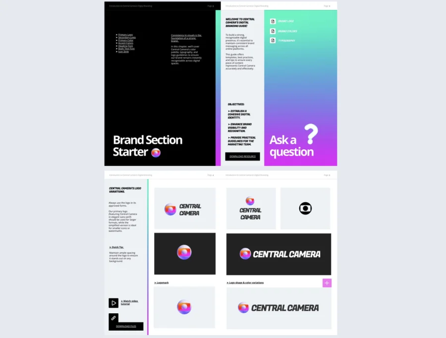
Real-world application: One of the latest Flipsnack customers is a gaming company that used this template to brief an external development studio on brand standards for an in-game UI project. Embedding animated logo variations and motion guideline videos directly inside the document gave the studio a level of visual context that a PDF specification sheet never could, and the project required significantly fewer revision cycles as a result.
Showcase logo variations with embedded video tutorials, add downloadable brand assets, and use Flipsnack’s engagement interactions to add contact forms so external partners can request assets directly inside the document.
Common mistake to avoid: Don’t document motion and animation guidelines using only static images. If your brand identity is defined by how things move, the guidelines need to show that movement. A static screenshot of an animated logo tells nobody anything useful about how the animation should behave.
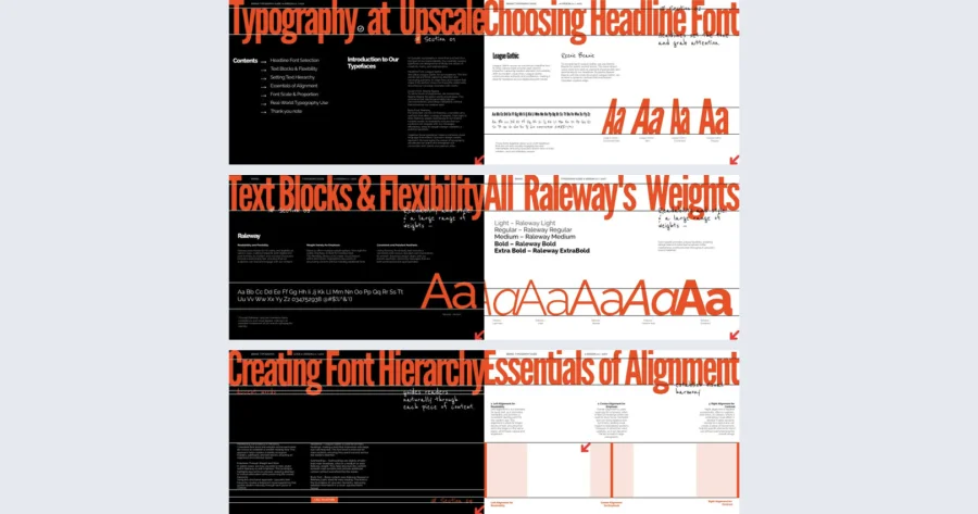
11. Professional Brand Typography Guide Template
Typography is one of the most powerful and most frequently misused elements of a brand identity. This professional brand typography guide template gives creative agencies, fashion brands, and editorial platforms a dedicated format for documenting typeface choices, hierarchy rules, and real-world application examples in a way that makes it impossible to misinterpret.
Best for: Creative agencies, fashion brands, and editorial platforms where typography is a primary brand differentiator and incorrect font usage or hierarchy inconsistency creates visible, damaging inconsistency.
Real-world application: One of the latest Flipsnack customers is a fashion editorial brand that used this template after a brand audit revealed significant typography inconsistency across their print, digital, and social channels. Having a dedicated typography guide with real-world application examples — not just font names — gave their content team and external contributors a reference they could apply without interpretation.
Define font families, weights, and usage rules, showcase typography across real marketing and editorial applications, and embed video tutorials for teams who need to understand the rationale behind the choices, not just the specifications.
Common mistake to avoid: Don’t document typography rules without showing hierarchy in context. Font names and point sizes mean very little to a non-designer. Show the headline, subheading, and body text working together in an actual layout and the rules become immediately clear.
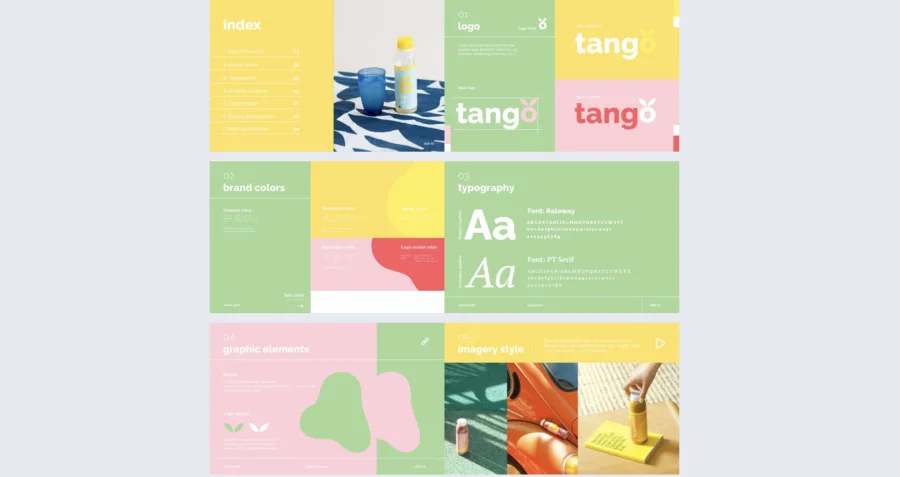
12. Creative Branding Guide Template
Playful, fresh, and warm — this creative branding guide template gives food brands, wellness companies, and lifestyle businesses a format that communicates the same approachable energy their products do. Soft pastels and bold typography create an aesthetic that feels inviting without sacrificing professionalism.
Best for: Food startups, wellness brands, and lifestyle companies whose brand identity is built on positivity, community, and a strong visual personality that needs to translate consistently across packaging, social media, and digital platforms.
Real-world application: One of the latest Flipsnack customers is a wellness food brand that used this template to brief a new social media agency. Embedding GIFs of the brand in motion and photo slideshows of approved visual treatments gave the agency a richer briefing than any written document could, and the brand team reported the first content batch required fewer revisions than any previous agency handover.
Use slideshows for logo variations and brand application examples, add GIFs and animations to show how the brand moves across digital platforms, and use tags and captions to highlight specific design details that are easy to overlook.
Common mistake to avoid: Don’t assume a vibrant, visual brand identity communicates itself. Even the most aesthetically clear brands need documented rules. Without them, collaborators default to their own interpretation of “playful” or “fresh,” which rarely matches yours.
13. Urban Brand Guidelines Template
Raw, expressive, and built on authenticity, this urban brand guidelines template gives streetwear labels, creative agencies, and music brands a format that reflects the same energy and attitude as the culture they operate in. Handwritten typography, high-contrast layouts, and a collage aesthetic make this one of the most distinctive templates in the collection.
Best for: Streetwear brands, music labels, creative agencies, and lifestyle companies whose brand identity is rooted in subculture, creative rebellion, and a visual language that feels earned rather than designed by committee.
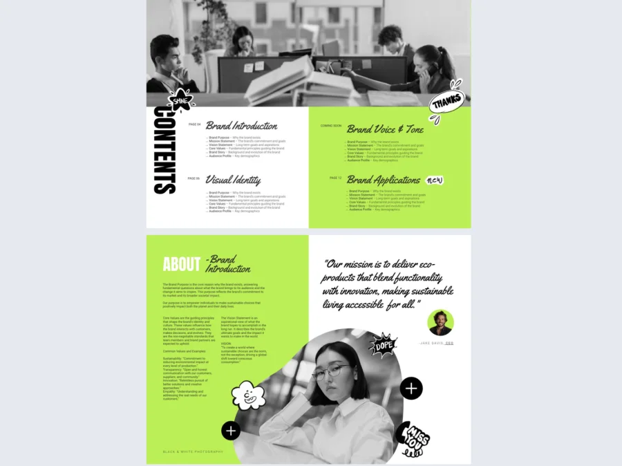
Real-world application: One of the latest Flipsnack customers is a streetwear label that used this template to brief collaborating artists and photographers on brand standards for a capsule collection campaign. Embedding brand storytelling videos and social media examples directly inside the guide gave collaborators the cultural context they needed to contribute work that felt genuinely on-brand rather than just technically correct.
Use animated text effects and overlays to reinforce the brand’s personality, tag key design elements to explain logo variations and color rules, and embed testimonial or brand storytelling videos to give external collaborators the cultural context behind the visual standards.
Common mistake to avoid: Don’t let the anti-establishment aesthetic of the brand translate into loose or undocumented guidelines. The most credible streetwear brands are obsessively consistent. Authenticity and precision are not mutually exclusive — document the rules clearly even when the brand feels rule-breaking.
14. Interactive Company Branding Guide Template
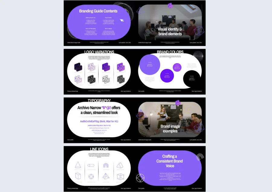
Sleek, motion-driven, and built for digital-first industries, this interactive company branding guide template gives tech startups, fintech companies, and esports brands a format that brings the brand’s kinetic energy into the guidelines document itself.
Best for: Tech startups, fintech brands, and esports organizations whose visual identity relies on motion, contrast, and digital sophistication — and whose teams need guidelines that demonstrate those qualities rather than just describing them.
Real-world application: One of the latest Flipsnack customers is an esports organization that used this template to align their in-house design team, a broadcast production partner, and three external merchandise collaborators around one brand reference. Having animated logo demonstrations and motion guidelines embedded in one accessible document eliminated the inconsistencies that had previously appeared across broadcast graphics and physical merchandise in the same season.
Showcase animated logos, use interactive typography displays to demonstrate font hierarchy in motion, and embed GIFs to illustrate how branding adapts across different digital surfaces and formats. Flipsnack’s collaboration tools let multiple stakeholders review and approve before the guide goes live.
Common mistake to avoid: Don’t publish motion-heavy brand guidelines without specifying the contexts where motion is and isn’t appropriate. Animated logos in a broadcast graphic and on a product label are very different applications. Define the rules for each environment explicitly.
15. Editable Branding Color Palette Guide Template
Color is often the most immediately recognizable element of a brand identity — and the most frequently misapplied. This editable branding color palette guide template gives fashion labels, creative agencies, and media brands a bold, high-energy format dedicated specifically to documenting how color works across every application of their brand.
Best for: Fashion brands, creative agencies, and media companies where color is a primary brand differentiator and precise, consistent color application across print, digital, and motion is essential to maintaining a strong visual identity.
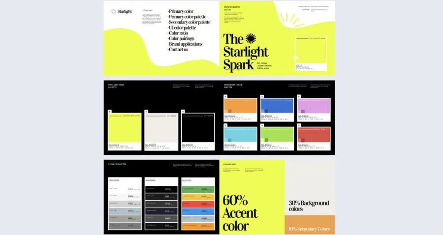
Real-world application: One of the latest Flipsnack customers is a fashion brand that used this template after a production error resulted in significantly off-brand color reproduction across a seasonal campaign. Building a dedicated color palette guide with interactive callouts for hex, CMYK, Pantone, and RGB values gave print and digital teams a single reference that eliminated ambiguity around color specifications for every subsequent campaign.
Use embedded GIFs to show color in motion, add interactive callouts that explain the strategic rationale behind each color choice, and use Flipsnack’s branding customization to ensure the guide itself is produced to the exact color standards it documents.
Common mistake to avoid: Don’t document brand colors using only digital hex values. A color that looks correct on screen can reproduce very differently in print. Always include Pantone and CMYK references alongside RGB and hex, and specify which color system applies to which medium.
Build a stronger, more consistent brand with Flipsnack
Brand consistency is what turns a logo into a recognizable identity and a company into a trusted name. Without documented guidelines, that consistency depends on individuals making the right call every time — which doesn’t scale.
The 15 templates in this guide give you a professional starting point for any industry, visual style, or organizational size. Customize in Flipsnack, share as a live link, and update in real time as your brand evolves. No more outdated PDFs, no more version confusion, no more brand drift.

Frequently asked questions
As soon as more than one person is creating content on the brand’s behalf. That could mean a second employee, a freelance designer, or an external agency. The moment brand decisions stop living in one person’s head and start being made by multiple people independently, inconsistencies appear. Guidelines prevent that from happening at the source rather than correcting it after the fact.
Typically the brand or marketing team, but ownership means more than just having the file. It means being responsible for keeping it current, communicating updates to stakeholders, and auditing whether the guidelines are actually being applied correctly. Without a named owner and a review cadence, even the best brand guidelines go stale.
Any time something material changes — a logo refresh, a new product line, a shift in tone of voice, or a significant market repositioning. Beyond that, an annual review is a reasonable baseline for most organizations. With a live Flipsnack document, updates are immediate and every shared link reflects the change automatically, so there is no lag between the decision and the teams applying it.
Brand guidelines tend to focus on the rules — how to use the logo, which colors are approved, which fonts to apply and when. A brand book is broader, covering the brand’s story, values, positioning, and personality alongside the visual standards. In practice, many organizations use the terms interchangeably, but the most effective documents combine both: the strategic context that explains why the brand looks the way it does, and the practical rules that govern how it should be applied.
