Annual Report Design: Tips for Creating a Report People Want to Read
Published on: April 30, 2026
Most annual reports get opened once. Then they get closed. Not because the content is wrong. Because the design makes it hard to stay.
Stakeholders scroll past dense columns of text. Investors lose the thread halfway through a financial summary. Board members skim to the numbers and miss everything in between. The report took weeks to produce. It gets minutes of attention.
Good annual report design changes that. It is not about making your report look impressive. It is about making it easy to read, easy to follow, and hard to put down.
In this guide, you will find practical design tips that work whether you are starting from scratch or upgrading an existing report. Here is what we cover:
- How to use layout and visual structure to keep readers oriented
- How to turn data into something people can actually absorb
- How to make your report work as an interactive annual report, not just a static document
- How to keep branding consistent across every page
The goal is simple: a report that gets read. Let’s get into it.
Table of contents
What a good annual report design actually does
Design is the reason someone keeps reading.
A well-designed report does something a poorly designed one cannot. It reduces the effort required to understand your content. When a reader does not have to work to follow the structure, they go further into the document. They retain more. They walk away with a clearer picture of your organization.
That has real consequences. Think about who reads annual reports:
- Investors deciding whether your numbers tell a confident story
- Board members looking for clarity, not volume
- Partners and clients forming an impression of how your organization operates
- Stakeholders who may only read one or two sections
Each of these readers has limited time and limited patience. Design is what makes your content accessible to all of them, not just the ones who are already motivated to dig in.
There is also a credibility dimension. A report that looks carefully put together signals that the organization behind it operates the same way. Inconsistent fonts, cluttered layouts, and unreadable charts do not just frustrate readers. They quietly undermine trust.
This is why annual report design is a strategic decision, not a visual one. The choices you make about layout, typography, color, and interactivity determine how much of your work actually lands. The sections below break down exactly where those choices matter most.
Annual report design tips that make a difference
1. Start with a cover that sets the tone
Your cover is the first design decision your reader notices. It shapes their expectations before they read a single word.
A good cover design does three things:
- It communicates your brand clearly, with the right logo placement, colors, and typography
- It signals the tone of the report, whether that is bold and data-forward or clean and editorial
- It gives the reader a reason to open it
That last point matters more than it sounds. A cover that feels generic or rushed sets a low bar for everything that follows. A cover that feels intentional does the opposite.You do not need a graphic designer to get this right. Flipsnack’s Design Studio includes annual report cover templates you can customize with your own brand colors, fonts, and imagery. The starting point is already structured. You are making it yours.
2. Use visual structure to guide the reader
A reader should never have to figure out where they are in your report. Good structure makes navigation feel effortless.
This comes down to a few consistent choices:
- Clear section headings that tell the reader what is coming
- White space that gives the eye somewhere to rest between dense content
- Consistent page layouts so the format does not change unexpectedly
- Page numbers and a table of contents for longer reports
The goal is to lower the cognitive load. When the layout is predictable, the reader can focus on the content instead of the format.
One thing worth paying attention to is hierarchy. Not everything on a page deserves equal visual weight. Pull out key figures, highlight important findings, and use size and contrast to direct attention where it matters most.
3. Turn data into something people can follow
Numbers are the backbone of any annual report. But raw numbers on a page are not the same as information.
The difference is visualization. A well-designed chart communicates a trend in seconds. A table of the same data might take a minute, or get skipped entirely.
A few principles that help:
- Use charts and graphs for trends, comparisons, and proportions
- Use tables only when exact figures matter and relationships are simple
- Label everything clearly, including axes, units, and time periods
- Do not overload a single visual. One insight per chart is a good rule.
Flipsnack’s report builder includes a chart tool that lets you add bar, line, and pie charts directly to your pages. You can also embed a live Google Spreadsheet, so the data in your report updates automatically when the source does. That is especially useful for teams managing multiple versions or publishing reports on a rolling basis.
4. Add interactivity where it earns its place
This is where a digital annual report separates itself from a PDF.
An interactive annual report does not just display content. It invites the reader to engage with it. Done well, interactivity reduces friction. It lets readers explore the sections that matter to them without wading through everything else.
Useful interactive elements include:
- Embedded video for messages from leadership, project highlights, or data explainers
- Clickable navigation so readers can jump between sections from a table of contents
- GIFs and animations to illustrate change over time without adding pages
- Pop-up captions and links for readers who want more detail on a specific point
The keyword here is “earns.” Not every page needs an interactive element. Add them where they genuinely help the reader, not to demonstrate that the tool supports them.
5. Keep branding consistent from cover to last page
Consistency is one of the most underrated design decisions in an annual report.
When fonts change unexpectedly, when colors shift between sections, or when the logo appears at three different sizes, it creates a subtle sense of disorder. Readers may not name it, but they feel it.
A good annual report design keeps the following consistent throughout:
- Logo placement and sizing
- A defined color palette used the same way on every page
- Two or three fonts maximum, used with clear rules for headings and body text
- Photo and illustration styles that match in tone and treatment
For teams where multiple people contribute to the same report, brand consistency is even harder to maintain. Flipsnack addresses this with a Brand Kit feature that locks in your colors, fonts, and logo at the account level. Anyone working on the report builds within the same visual framework, without needing to coordinate every detail manually.
Annual report design inspiration: what well-designed reports have in common
Looking at what works in annual report design reveals some clear patterns. The reports that hold attention are not necessarily the most elaborate ones.
Here are three examples of annual report templates that illustrate this well.
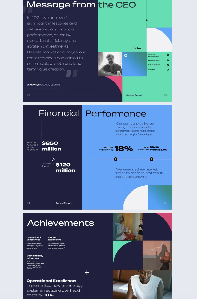
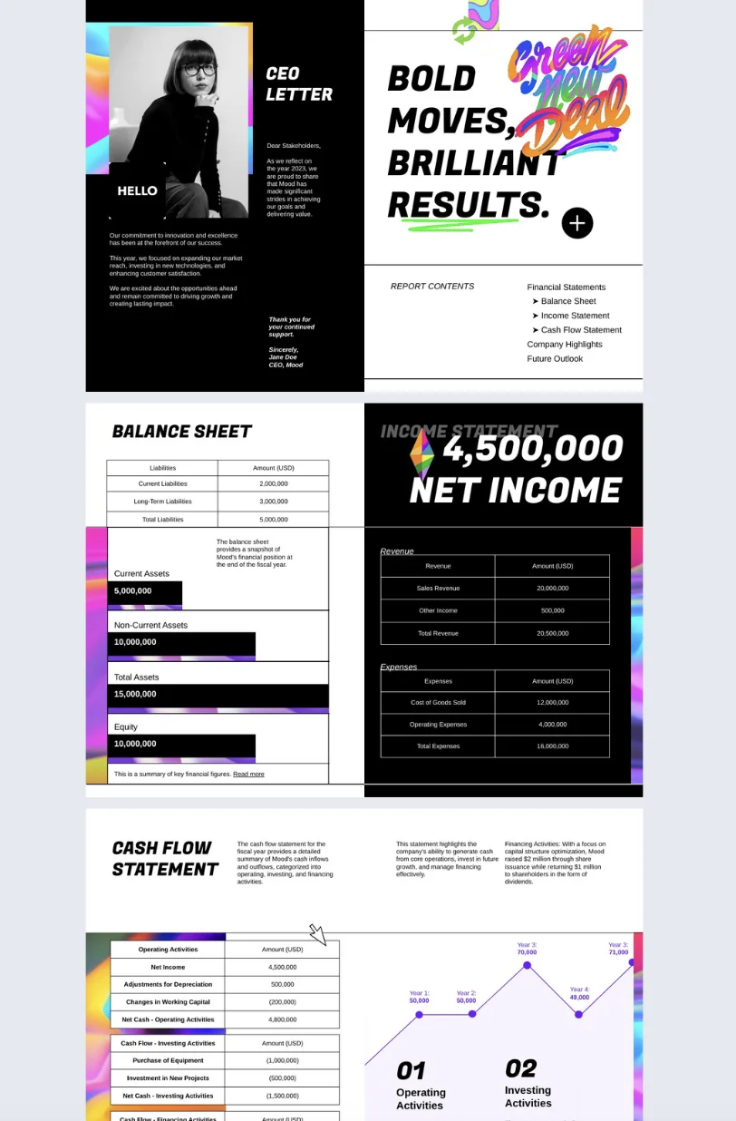
The report that leads with financial clarity
Flipsnack’s Interactive Annual Report Template is built for investor relations and CFO teams. The layout puts financial performance front and center, with dedicated sections for key achievements and future outlook. What it does well is sequencing. The reader always knows what they are looking at and why it matters. Charts and data visualizations carry the numbers. Text explains the context. Neither tries to do the other’s job.
This is a useful template if your primary audience is investors or board members who want clarity before anything else.

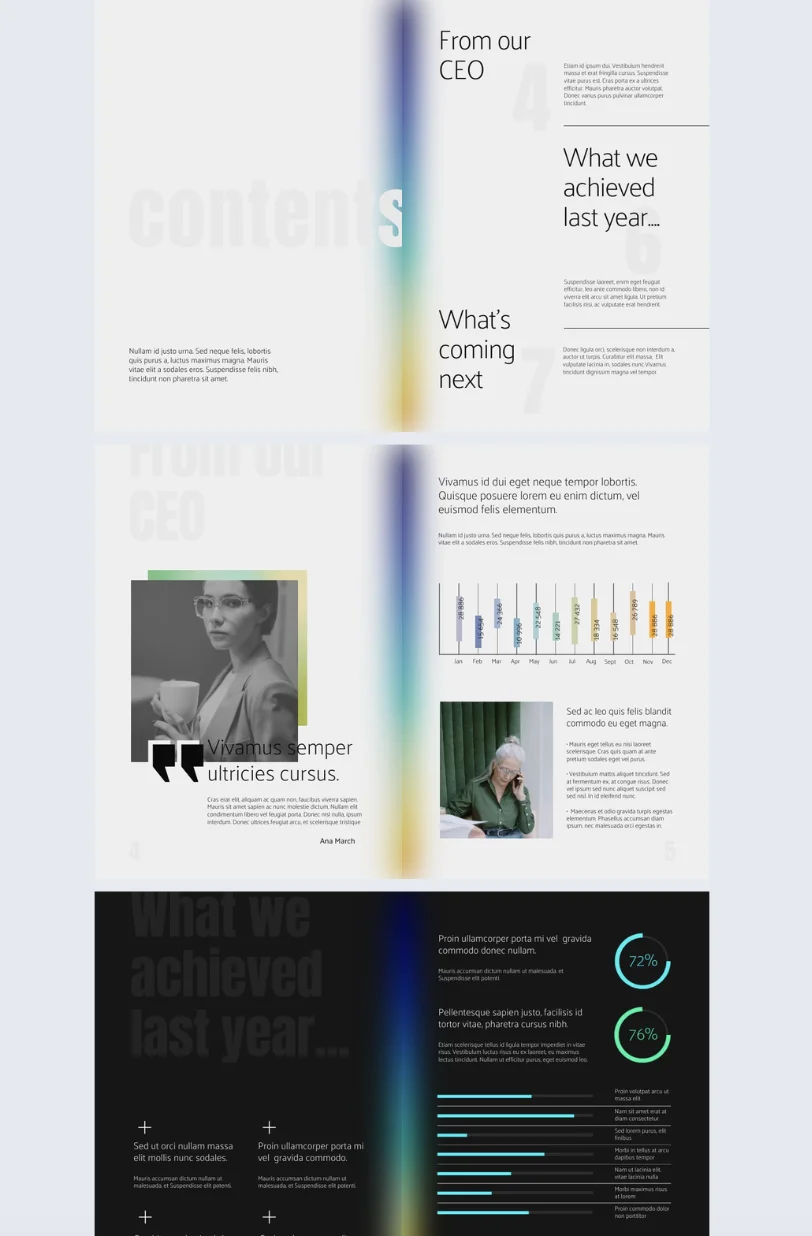
The report that uses interactivity with purpose
The Interactive Annual Business Report Template takes a different approach. It uses go-to-page navigation buttons, photo slideshows, and slow-paced GIFs to add movement without overwhelming the reader. The design stays clean throughout. The interactivity serves the content rather than competing with it.
This is a good example of how an interactive annual report can feel dynamic without becoming difficult to read. Every element has a reason to be there.
The report that lets branding do the work
The Professional Annual Report Template uses a defined color palette, consistent typography, and clear section breaks across every page. There are no surprises in the layout. The branding is present without being decorative. The result is a report that feels like it came from an organization that knows what it is doing.
That consistency is easy to replicate in Flipsnack. The Brand Kit locks in your colors, fonts, and logo at the account level, so the report looks the same whether one person built it or five.
The thread running through all three is intentionality. Every design choice, whether it is a chart format, a navigation element, or a color decision, exists to help the reader. That is the standard worth holding your own annual report design to.
Good annual report design extends to how it’s experienced
Every design choice you make in your report assumes something about your reader. It assumes they can see the full layout. It assumes the fonts render correctly. It assumes the charts are legible. If the format you distribute in breaks any of those assumptions, the design work stops mattering.
This is why format is a design decision.
1. Design for every screen, not just a desktop
A layout built for print or desktop falls apart on a phone. Columns collapse. Text becomes unreadable. Charts shrink to the point where the labels disappear. A significant portion of stakeholders will open your report on a mobile device, and a report that does not work on mobile is a report that does not get read on mobile.
Publishing your annual report design as a digital flipbook means the layout adapts to any screen size without breaking. The reader gets the same experience on a laptop, a tablet, or a phone.
2. Design for readers who use assistive technology
Accessibility is part of design, not a separate consideration. WCAG 2.1 AA and ADA standards cover things that are already good design practice: sufficient color contrast, readable font sizes, logical reading order, and navigation that does not depend on hover states. Meeting these standards means your report works for every reader, including those using screen readers or keyboard navigation.
It is also worth noting that accessibility requirements are becoming more common in compliance frameworks. Building them in from the start is easier than correcting them after the fact.
3. Design for how people actually receive documents
A PDF attachment is a friction point. It has a file size, an email client that may block it, and no way to know if it was opened. A shareable link has none of those problems. It opens instantly, works on any device, and can be updated after sending without resending anything.
It also gives you something a PDF never can: data. With Flipsnack analytics, you can see which pages your stakeholders actually read, how long they spent on each one, and where they dropped off. That is information you can use to design the next report better.
Your annual report is only as good as the experience it creates
Design is what stands between a report that gets read and one that gets closed.
The choices covered in this guide are not complicated. A cover that sets the right tone. A layout that guides the reader without making them think about it. Data presented visually. Interactivity used where it helps. Branding that holds together from the first page to the last. A format that works on any device, for any reader.
None of these decisions require a design background. They require intention.
That is what separates an annual report design that lands from one that sits in an inbox unopened. Not budget. Not software complexity. Intention.
Flipsnack gives you the tools to act on that intention. Start from a template, build in the Design Studio, add interactivity where it earns its place, and share a report your stakeholders will actually open. Explore Flipsnack’s annual report templates and see what your next report could look like.