Poster design art. Famous posters and the history behind
Poster design art evolved massively throughout the last century. We’re talking about the first movie posters, music festival posters, car advertisement posters, or even world war recruitment poster designs.
You see, posters were always meant to send out powerful messages and promote bold ideas. That being said, there are no rights or wrongs when designing the perfect one. Today, the possibilities are endless because posters can be designed for web, print or both. You can get as creative as you want, as long as your message is clear enough. A good poster should be both eye-catching and informative. Always keep this in mind.
To inspire you little further, we rounded up a collection of vintage posters, true works of art, some more famous than others. So, let’s find out more about the history of the poster design and maybe give you some creative ideas for your next design.
Famous vintage posters and the history behind
It seems like the modern poster grew in popularity in the mid-nineteenth century. That’s when the printing industry perfected color lithography and also made mass production of large and inexpensive images possible. Also, in countries such as France, the government lifted censorship of public spaces. So, it was only natural for artists like Toulouse Lautrec and Alphonse Mucha to start designing posters. Having been commissioned to produce a series of posters when the Moulin Rouge cabaret opened, it is said that Toulouse Lautrec is the father of the vintage French poster. Alongside other French artists like Jules Cheret or Eugene Grasset who needed a source of revenue to support themselves, this lithographic technique had spread all throughout Europe by the late 1890s.
Mouline Rouge poster design epoque
Cheret even founded a small lithography office in Paris in 1866 and created more than 1000 advertisements for all sorts of exhibitions, theatres, and products.
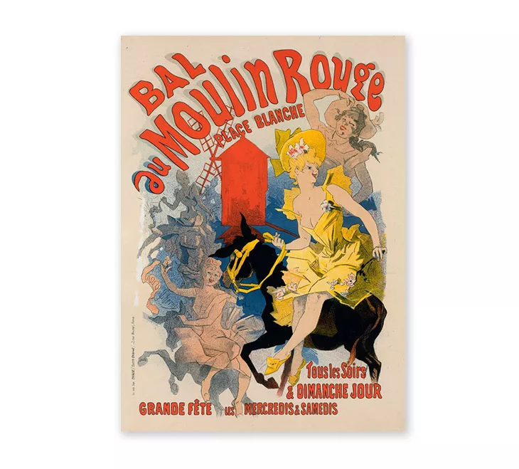
Since we already talked about Late nineteenth-century French art and the French artists who made the poster design art so popular, it only makes sense to start with a Moulin Rouge poster. One of the most famous ones being this one by Jules Cheret.
Cheret is known to have exploited the feminine image as an advertising ploy. Cheret’s laughing and provocative feminine figures were called “chérettes”. These posters are true pieces of Belle Epoque advertising art.
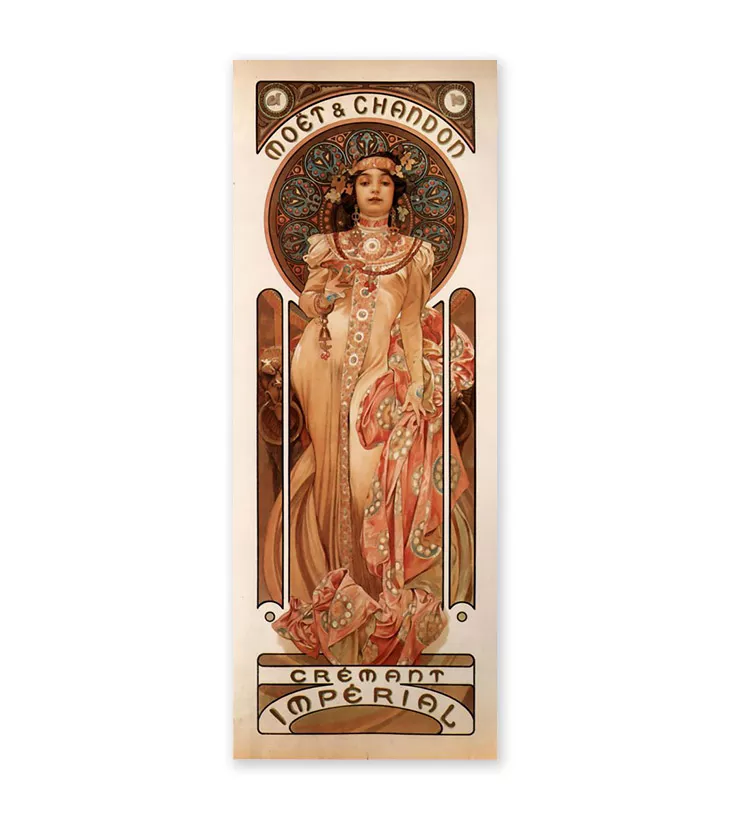
Also, we briefly talked about Alphonse Mucha, the Czech poster designer. His innovative approach to poster design art had a huge impact on the “Art Nouveau” current. He designed a lot of posters promoting mostly luxury liquours like absinthe or vermouth.
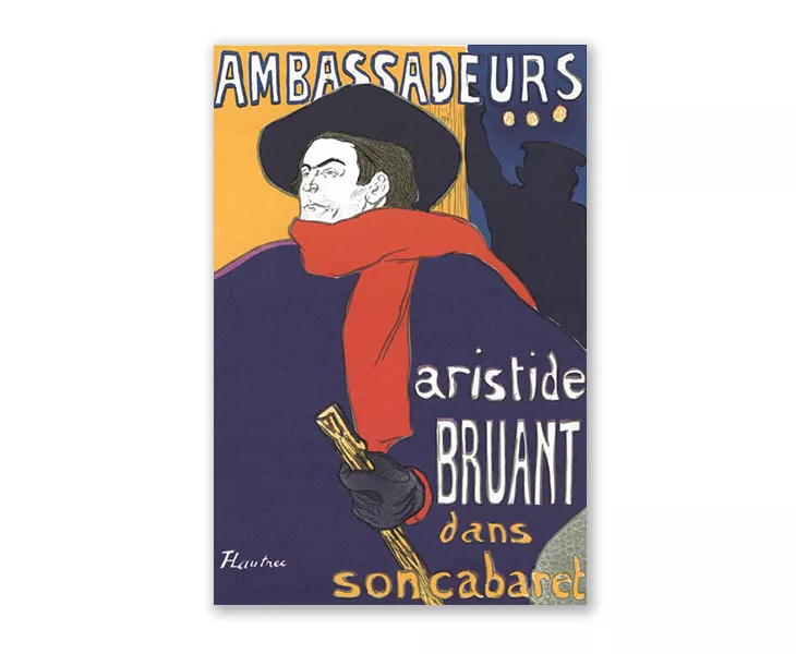
But probably the most recognizable piece of poster design art from this period is Aristide Bruant, the man in the red scarf and black cape. A poster designed by Henri de Toulouse- Lautrec. This was more of an ad poster that made Artistide Bruant famous. And so this poster made Toulouse Lautrec famous, too.
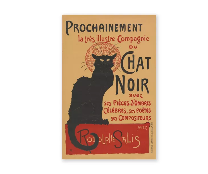
Le chat noir
Perhaps one of the most recognizable vintage poster design of all times, Le chat noir was created by Art Nouveau printmaker Théophile Steinlen. Le chat Noir is known to be the first modern cabaret and this poster was designed to promote an upcoming tour of the cabaret’s performers, in 1896.
Movie poster design art
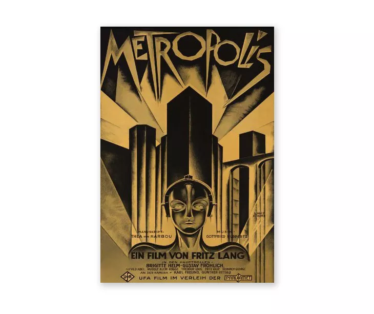
What’s the first old Sci-fi movie that comes to mind? No, not Star Wars. Long before that, there was a movie called Metropolis. It is considered to be the first true Sci-fi silent masterpiece. Here’s the poster design behind the movie. A true piece of art deco futurism. Designed by German graphic artist Heinz Schulz-Neudamm, this poster design art is something you may want to hang on your walls if you’re a cinema aficionado as I am.
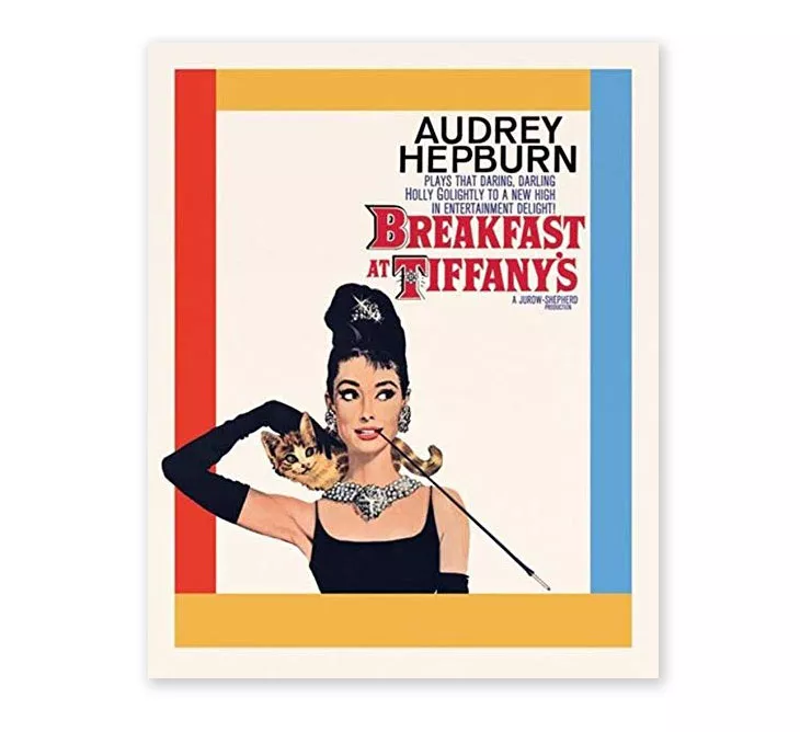
Anyone here who doesn’t recognize this movie poster? Then you must have been living under a rock. Breakfast at Tiffany’s and its poster design made Audrey Hepburn the fashion icon she is today.
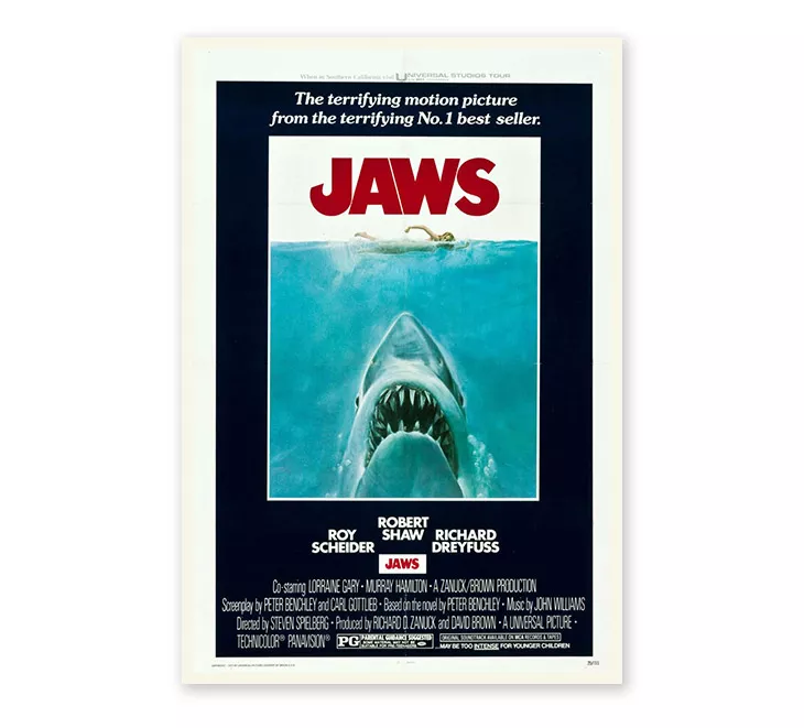
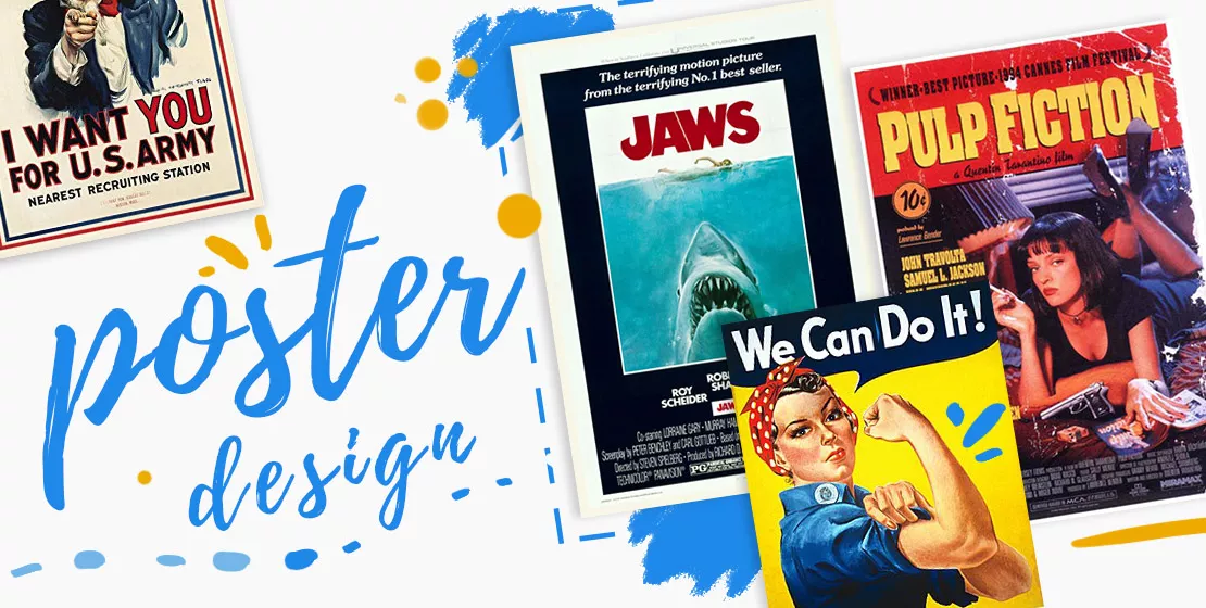
I recently bought a Jaws t-shirt. And it made me think about the impact this movie and its poster design had on all of us who watched it. Masterfully well designed, capturing our fear of the unknown, this is a movie poster that truly represents the Spielberg blockbuster.
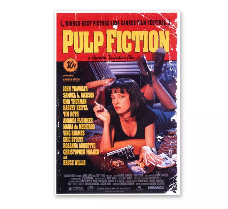
When you say 90’s movie pop culture what’s the first thing that crosses your mind? I think the unanimous answer to this question is without a doubt one of the biggest movies of that decade: Pulp Fiction. It’s so memorable that even now, almost 30 years after, most of us can easily recognize the dancing scene between Uma Thurman and John Travolta.
And of course the movie poster. It’s such a cool piece of poster design that so many of us growing up in the mid-90s must have, at least, seen this poster once hanging in one of our friend’s room.
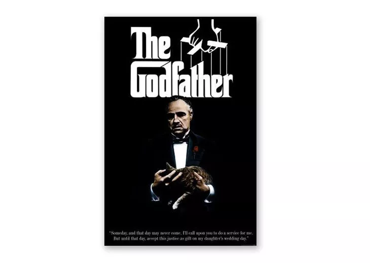
Can there be a list of movie poster designs without mentioning The Godfather? Undoubtedly, one of the best movies ever made, the star of the poster is not Marlon Brando, contrary to popular belief. But rather the puppeteer design used in typography that sends a very powerful message about this classic motion picture. Legendary graphic designer S.Neil Fujita used only black and white to design this movie poster. Its design is so powerful that it manages to tell us everything we need to know before watching the movie.
World war recruitment poster design
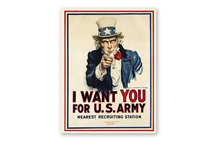
Everyone knows who Uncle Sam is. You may not necessarily know his name but you must have seen his iconic figure pointing at you, at least, once in your life. But do you know the story behind this poster design? It was used for recruiting purposes in World War I and World War II and fun fact, the artist used his own face as a model for Uncle Sam.
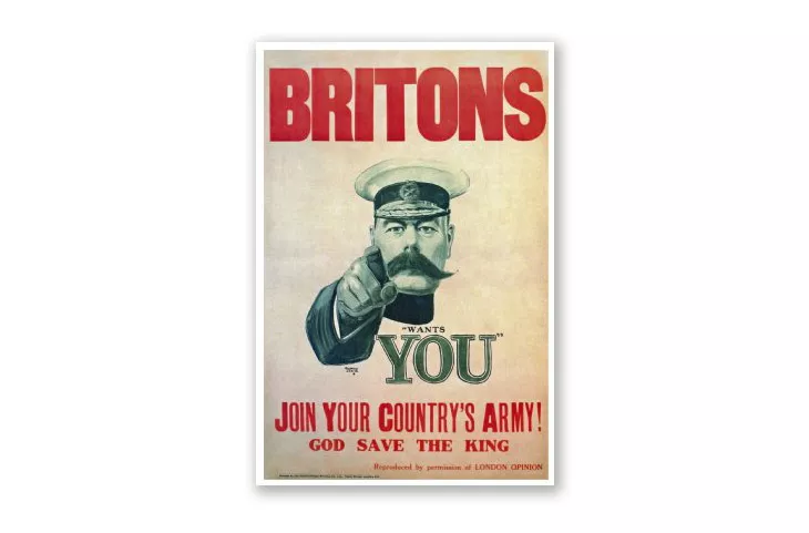
The British version of the World War recruitment poster was actually the inspiration for Uncle Sam. The face of the British version poster is the actual secretary of State for War, Lord Kitchener, calling young men to join the UK’s army in 1914.
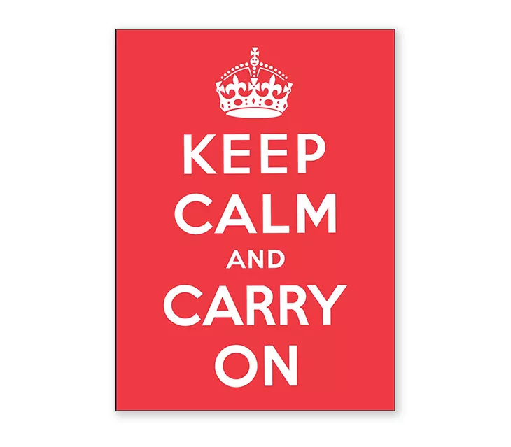
Keeping the same British theme, the “Keep calm and carry on” poster is probably the most popular message on a poster of all designs listed here. You’ve probably seen this message everywhere. But do you know of its origins? It was originally designed during the period of 27 June to 6 July 1939. It was intended to be distributed to strengthen the morale of soldiers fighting in the war. Very few were distributed then and this message became popular in the 2000s. I find it quite upsetting that such a powerful message is now being used as the decorative theme for a range of products.
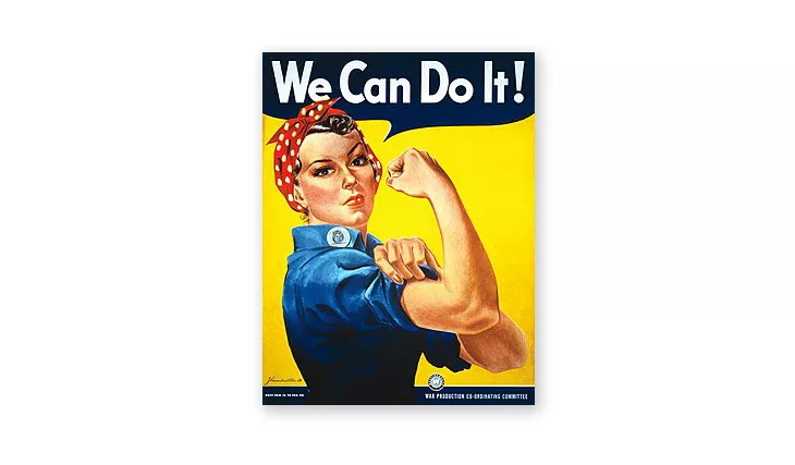
Rosie the Riveter is a true symbol of feminism. She represents all the women who worked in factories and shipyards during World War II, many of whom produced munitions and war supplies. A true cultural icon of her time.
Music Poster Design
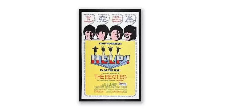
This article wouldn’t be one about famous poster designs if I didn’t mention music posters. Especially the more vintage ones like Woodstock music festival poster or the one advertising the Beatles’ movie “HELP!”. Iconic pieces of 60s poster design.
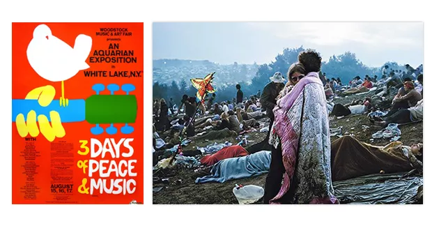
Head over to this cool article and video about music festival posters for more inspiration. It will be worth your time.
Advertising poster design
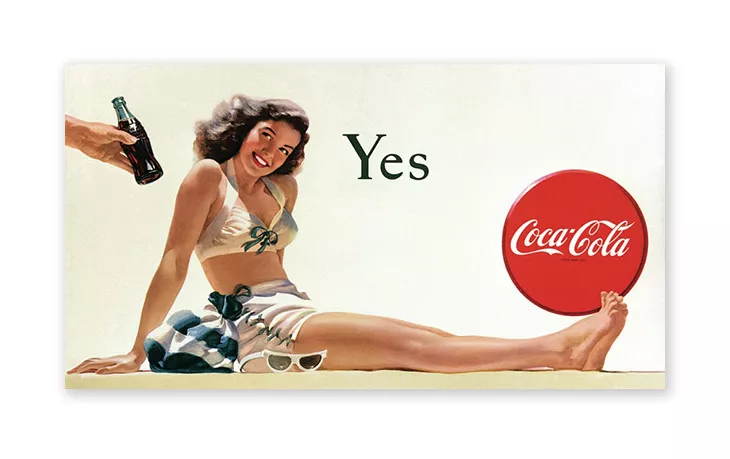
Between the 1890s and the 1960s, long before the days of the television advertising, vintage Coca Cola posters meant pin-up girls enjoying a coke on the beach. Often, Coca Cola used bathing beauties and even servicewomen from the World War in many of their ads.
The Coca Cola girls are often portrayed as being appealing and free-spirited, true icons of true Americana—a symbol of the homefront. Branding at its best!
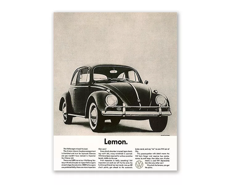
If you’re somewhat passionate about advertising, you must know how impactful this “Think small” Volkswagen ad was when it first came out. How do you adevetise a small, strange, cheap, foreign car made in Hitler’s Germany, to the American public?
Through a lot of creativity and good storytelling. Truly, an ad that changed advertising. And perceptions.
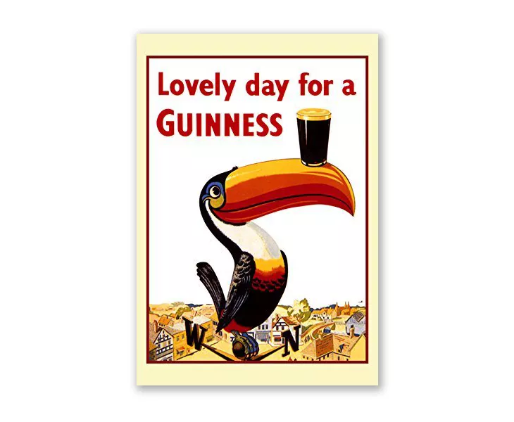
Ever walked into a pub and stumbled upon a toucan poster? The Guinness toucan. But what’s the link between a toucan and beer? Wonder no more. I’m here to solve this mystery.
It seems like back in the 1930s the Guinness family didn’t want a regular ad campaign for a beer. But something to emphasize the brew’s strength. And so they thought about including animals in their prints. They went for a sea lion, turtle, and other thirsty animals. None of which became as popular as the toucan. Why? Maybe because the bright orange color of the toucan is contrasting well with the dark glasses of Guinness. The copy was written by English poet and crime writer Dorothy Sayers.
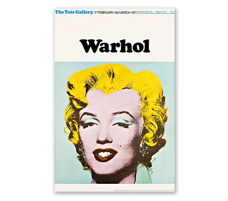
Rounding up this list of famous poster design, we absolutely need to mention Andy Warhol. He popularised screen printing in the ‘60s and is best known for his colorful pop art prints of celebrities like Marilyn Monroe that he designed after the death of the star. And let’s not even get started on the Campbell soup. It was named the third most influential piece of modern art. Poster design art.
Poster design template
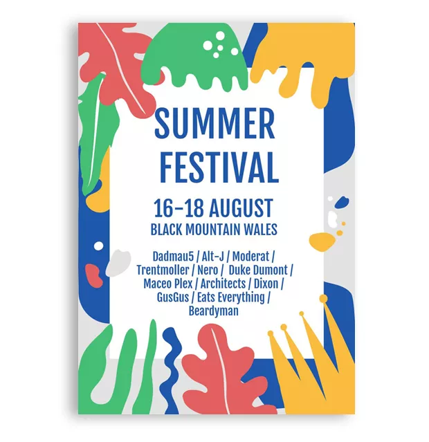
If you got here, thanks for sticking with me! Hope you got a bit of design inspiration for your next poster. In return, here’s a little help from Flipsnack: a music festival poster template you can easily edit for your next event. Let your creativity flow and design your next poster within minutes. Happy designing!
That’s all! Are there any other famous poster designs that I missed in this article? Let me know in the comments down below.
