How To Create a Catalog in InDesign: Designer Tips For a Smooth Process
Last updated: March 18th, 2025
If you’ve ever felt that InDesign is overwhelming and complex, you’re not alone. Many businesses hesitate to use it for catalog design due to common misconceptions. Yes, creating a catalog in InDesign can seem daunting, especially for those unfamiliar with the tool. However, its advanced features enable the creation of high-quality, professional marketing materials that drive engagement and conversions.
Another common myth is that InDesign is only for PDFs or books. In reality, businesses can design various marketing assets, including interactive digital catalogs, brochures, and sales collateral. All essential elements for sales and brand consistency.
If your team is just starting with InDesign for catalog creation, finding the right resources can be time-consuming.
That’s why, in this article, I’ll answer questions like how I create a catalog template in InDesign, how to make a catalog in InDesign and how Flipsnack’s extension can help you save time.
So whether you’re designing product catalogs, sales materials, or corporate brochures, this guide will help you streamline your process and achieve professional results.

Table of contents
- How to create a catalog in InDesign
- Step 1: Get inspired for your moodboard, color palettes
- Step 2: Edit your (product) pictures
- Step 3: Create the document in InDesign
- Step 4: Choose the right layout
- Step 5: Structure catalog information using elements
- Step 6: Add new pages, create a spread
- Step 7: Design the front and back cover
- Step 8: Export your digital catalog
- Step 9: Publish your catalog (via hosting service or a web app)
- Flipsnack’s InDesign catalog extension
- Frequently asked questions about creating catalogs in InDesign
How to create a catalog in InDesign
When it comes to creating your catalog design using InDesign, there are a couple of aspects that need extra attention. Even if you have the InDesign basics covered, we’ll take the catalog creation process step by step; highlighting a couple of best practices to abide by in order to have a smooth experience overall. Take a look at the following video that takes you through every step of the process, if you’re more of an audio learner.
I’m sure there are aspects you haven’t considered before, especially if you’re implementing a different publishing method. We wanted to make sure you can easily follow step-by-step guide for designing a catalog, so I’ve created a table of contents:
- Get inspiration for your moodboard & color palettes
- Edit your (product) pictures
- Create the document in InDesign
- Choose the right layout
- Structure catalog information using elements
- Add new pages, create a spread
- Design the front and back cover
- Export your digital catalog
- Publish your catalog using the right tools
Step 1: Get inspired for your moodboard, color palettes
Every design needs a moodboard in order to achieve its intended purpose. When we talk about digital catalogs, their purpose is to convert viewers into customers. So starting with the kind of products you will advertise, create a few design guidelines; making sure you stick to the color palettes used by the brand in question.
Even if you are a professional photographer, or are working with one, it’s important to keep up with the latest trends; checking what other people in the industry are doing. Product photography done properly could be the deciding factor between your products and another company’s. You can look for inspiration anywhere, starting with Pinterest, Behance, Dribble, and many other mediums where designers post their work. It’s important to remember that, as designers, you need not only to create visually appealing designs; but also make them functional and easy to navigate.
Here are a few design aspects you should consider when looking for inspiration for your own catalogs. First, the UX principles that puts the user or client first in terms of making the layout easy to grasp. And second, making sure your design solves a real problem (try to use the resources at hand to identify why a certain catalog performed better than others and apply the same principles to increase conversion). But we will tackle this subject of leveraging catalog statistics later on in this article.
Step 2: Edit your (product) pictures
After your moodboard is complete, it’s time to either create the visual elements (photograph the products alone or with models) or start editing the photos you’ve received from the client. Let’s say you’re going through this process for the first time.
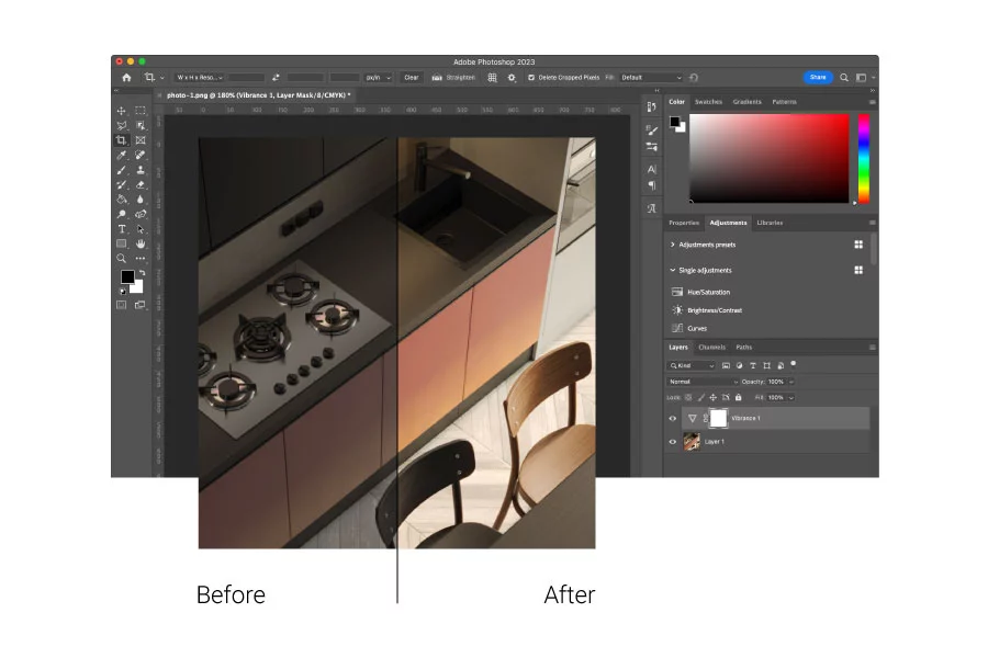
You need a professional editing program such as Lightroom or Adobe Photoshop to achieve the desired effect. Photoshop is a pixel editor, which means that any adjustments you make apply to the individual pixels of your digital file. Lightroom, on the other hand, is a global editing tool that makes adjustments to the whole file.
Then, you should learn how to interpret a histogram so you can make adjustments to the exposure and tones in your image. Depending on the image you’re after, you can make them darker or with a combination of dark and light. Crop and straighten your image before you spot remove elements from the image, if necessary. You can do all of this using Lightroom. Of course, we barely scratched the surface of what editing product photography entails, but it’s a good starting point.
Step 3: Create the document in InDesign
With your inspiration secured, your product images edited, it’s time to start creating your document in InDesign. The document size and settings depend on how you wish your catalog will look; and the way you will distribute it (digital or print). You can even start with an InDesign catalog template; if you see a structure that fits with the design catalog you have in mind.
Another really important aspect to decide from the beginning is how you want to publish your document. On the web or for print since it will influence the color scheme (RGB/CMYK/Pantone, and so on).
To print the finished Adobe InDesign catalog, choose the right page size for the print shop’s requirements. To publish the catalog on the web, consider the destination and in which particular mediums you will share the catalog (for example, if the catalog’s audience uses primarily mobile devices, then you would need to choose a larger height).
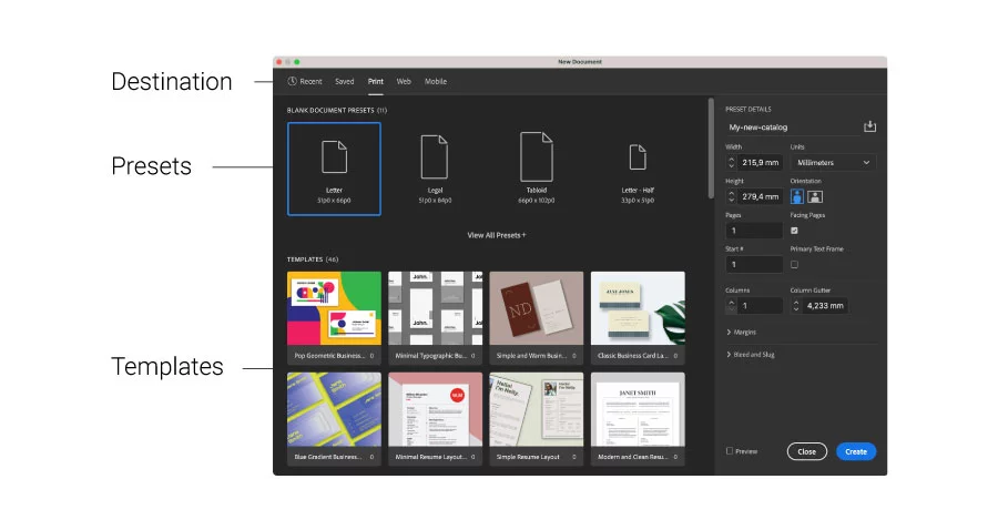
When creating your document in InDesign, specify the following:
- Document preset – You can leave the default settings untouched.
- Intent – select the intent of your document: print, web or digital publishing.
- Number of pages – Set the number of pages that your catalog will have. If you are not sure how many you want, you can add more later.
- Page size and orientation – There are many sizes that you can choose from, however let’s choose size A4 and for orientation I will choose portrait.
- Columns – I recommend to select one column
- Margins – Increase or decrease the margins as you wish. I’ll work with the default
- Bleed and Slug – The bleed is the parts of text that extend past the page boundary to account for slight inaccuracy when trimming. The slug is the area outside the page and bleed that contains printer instructions or job sign-off information. You can keep the default settings.
Step 4: Choose the right layout
The right layout depends on what type of pictures you use, how many products you want to include on a page; and on the style you want to use (minimalist, promotional, etc.). You also need to keep in mind the page size you chose at the step before; and on how much information (text) will appear for each product.
Designer’s tip: Be bold enough to test two text description variants, one considerably shorter than the other to see which one converts better. Also, create different layout spreads, for situations where:
- the left-side page has a full background image and the right-side page includes x number of products
- both pages have products
- one page includes a video and one product, while the other has three products
It helps to create all these variations of spreads from the beginning because you can duplicate them; and it gives you a clearer idea of what are the options you can combine throughout the catalog.
Crafting the InDesign catalog layout
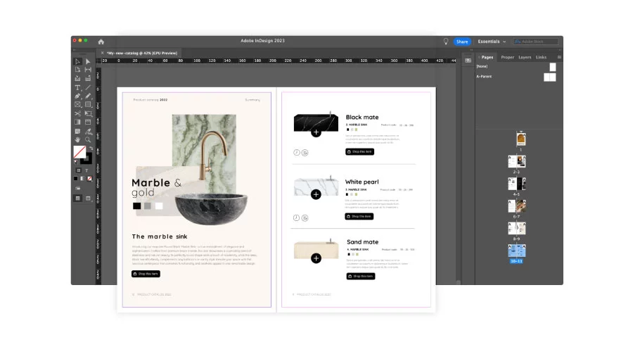
Creating the layout of the catalog is the most creative part since you decide the way in which elements will appear on each page.
- Add the best images: When you flip through a catalog, you definitely first notice the product photos. The photoshooting usually has a concept behind it and the photos are taken by experienced photographers. Feel free to apply the tips we already shared in the previous section to experiment and to make something awesome, creative and unique.
- Product details: Your catalog must contain a description and price for every product. This will give the client more information about the product and convince him to buy it. Make them visible, but don’t make them stand out on the page – that would be disturbing.
- White space is needed: Don’t use all the white space, let your layout breathe. If you add too many, unnecessary shapes, that could make the catalog cluttered; and your products will not get all the attention they deserve.
- Fonts: Every font tells a story. Choose the best pair of fonts that go well with your content; or the ones that are part of your brand’s kit. If your catalog has a target of women aged 20-50, the typefaces should have a fancy aspect. If your target is the young generation, choose extravagant and explosive typefaces; as long as you are within the guidelines of your client.
Colors: Colors represent an important element in design so that’s why you should choose the right ones for your catalog. If you sell eco products, go for a color palette inspired by nature. Tones of gray, brown or green should be appropriate. But stay tuned for more information on colors and how to automatically change different shades using an insider’s trick.
Step 5: Structure catalog information using elements
We are almost halfway into this tutorial of how to create a catalog in InDesign. With all your information in one place, you need to organize it in such a way to draw the attention of the viewer on specific parts of the catalog. Let’s talk about “Parent pages” first. These represent layouts (in this case, they are pages with grids and margins) or pages with repetitive elements; such as page numbers, chapter titles and subtitles, etc., which can be applied to all of the publication’s pages, later on.
Designer’s tip: From the beginning of your designing process; you should save a few paragraph styles to maintain consistency throughout your document. This will save you a lot of time. If at one point you want to modify a paragraph style, for example, that adjustment will be applied automatically to the whole document.
To say this using fewer words would be to not overlook formatting of repetitive elements; such as text styles since that is the most used element throughout any type of document. If you find some steps challenging, look for InDesign catalog tutorials to help you get started.
Using InDesign elements
Let’s see how this theory applies in InDesign and take it step by step together; starting with creating a catalog template using shapes, which you can later fill with images and text. Think outside the box, too, because not all types of catalogs need to be a square format. Differentiate your product catalog design from millions of other catalogs created in the same classic way.
The first step from this InDesign catalog tutorial is to create a rectangle frame tool, and to place it on one of your pages. To add the image box, you have to go to the tools bar and select it.
After that, go to File, then click on Place. Select the folder where you saved all your images. Choose the photo that you want to appear in the image box.
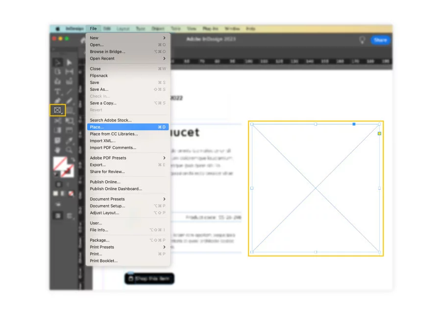
The image is placed inside the box that you have created. To select the photo only, you must click on the gray circle that appears over the image. Once selected, the image borders will change to red, meaning that you are modifying and moving only the image inside.
When you have images that don’t fit the box, make the box bigger; or use the fitting options, which will help fit the image box automatically.
Designer’s tip: If the program starts to work slower than before, switch to the fast display setting that provides a better performance, instead of using the high-quality one. In this case, don’t worry if your images are pixelated; because when you will export the catalog, they will be displayed in the high resolution you want.
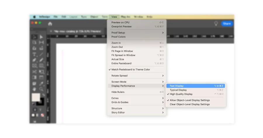
However, if your images are pixelated when using the high-quality setting; then you might have to relink your image or check to see if there are other problems with your links.
Text
When it comes to specific text adjustments, you can find the Text tool on the sidebar. When selected, click and drag on the sheet to create the text box. You can modify the text size exactly as you do in Word. To view the text menu, you have to select the text tool, the same as you did for drawing the box. It’s easier to create text styles from the beginning of your design process; because then you’ll effortlessly apply the same formatting to multiple text boxes at the same time.
Shapes
InDesign also lets you add different shapes as you like. You can find all these shapes on the left sidebar when you click right on the ellipse tool. You’ll see the line tool in the same bar, just a little higher. To change the color of a shape, go again to the top bar. Here you have options to fill the shape. You can change the stroke color or the thickness and choose the type of stroke you’re looking for.
Use your creativity to help your catalog stand out by designing it landscape style instead of the traditional portrait style, for example. You know best the guidelines you must follow, but never rule out creativity from every step of the design process.
Step 6: Add new pages, create a spread
Getting to know the world of pages in InDesign is how you can achieve visually captivating and structurally sound digital catalogs. There is a lot that can be debated and expressed about the basics of InDesign pages. But I think that what you would be most interested in is how you can become more productive when it comes to creativity and spend less time manually editing your catalog’s pages.
Types of pages in InDesign
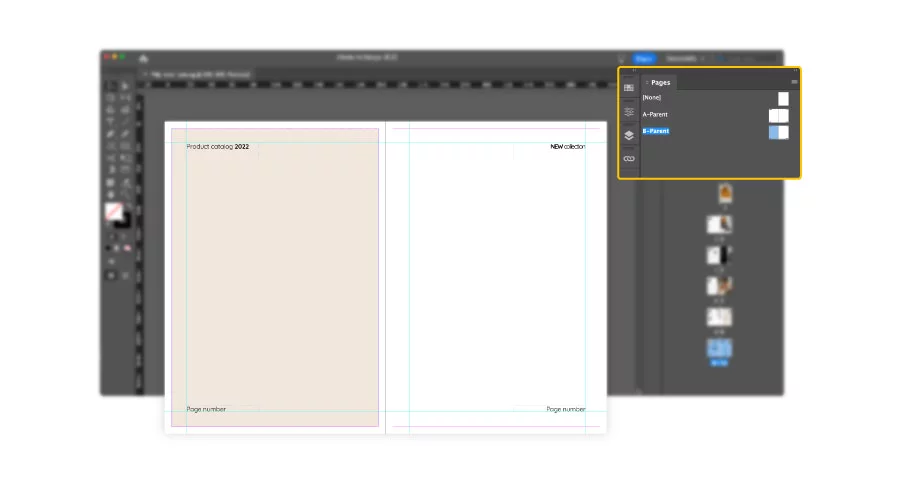
If you don’t know from the beginning how many pages your catalog will have, it’s not a problem. You can add more sheets at any time. First you have to open the pages panel, which shows how many pages and spreads you are working on. Click the Window button from the top bar, and choose Pages.
When the pages panel opens you will notice that there are two kinds of pages: None and Parent pages (formerly named “A-Master”). The first one is a regular page, to which you can add as many elements as you want; and they will appear only on that page.
The Parent page, however, will apply the elements that you place on this type of page to all the other pages, just like I mentioned previously. For example, you can add page numbers or a link to your website on the footer of all the pages of your catalog. Keep in mind that you can work with as many parent pages as you want.
Add pages manually or you can increase the page number automatically using the Pages panel and clicking on the plus button. To maintain the same layout, you can add individual pages, page spreads or duplicate spreads.
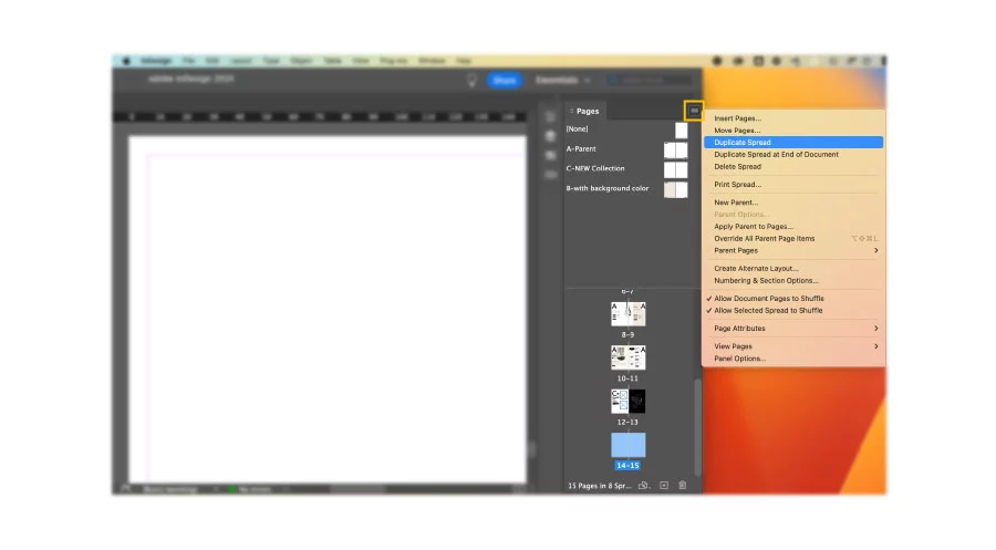
If you know how many pages you want your catalog to have, you can add several pages automatically. Open the Pages panel and click left on the submenu which is on the right corner. Fill the box with the number of pages you want to add. Select insert if the pages should precede or follow a certain page. Specify the page number you want these new pages to follow or precede. Choose the type of page, None or page parents, and click OK.
Color swatches vs unnamed colors
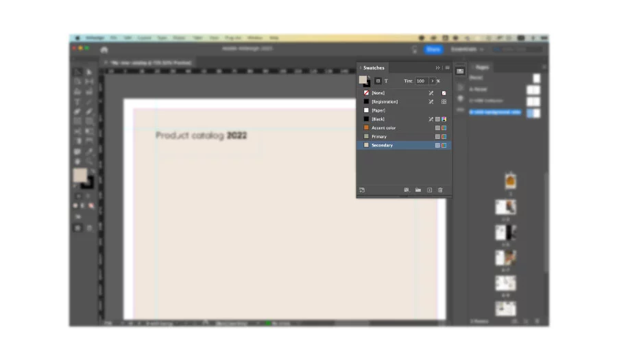
When creating design systems to ease your work , colors are a big part of the process. Apply color to objects in InDesign using several methods. First, use the Color picker, creating an unnamed color with limitations. And second, through creating swatches that give you increased flexibility.
Here is why using unnamed colors limits and slows down the creative process:
- It makes it difficult to easily use the same color again on another object
- When you apply the color to several objects, you can’t modify that specific color
- If you need to change the color throughout the document, you will have to do it manually.
Unnamed colors make your work much more time-consuming. Color swatches, on the other hand, allow you to change and apply the same color throughout your document easily. Follow the same method described above, with an extra step: when you are defining a color, there is a button that allows you to save that color as a swatch. This adds the color to the Swatches panel. Change the swatch properties by double-clicking on the swatch and renaming it to be easier to recognize when editing.
There is another way to create a color swatch by skipping the Color Picker. Click on the New Swatch button at the bottom of the Swatches panel. Hold down the Alt (Windows) or Option (Mac) key when clicking the New Swatch button to display the Swatch Options dialog box; so you can set all the properties of the swatch at that time.
With all the objects and elements added to Parent pages or regular pages, we’re approaching the finish line rapidly. A good practice is to leave the front and back cover for the end, using this opportunity strategically.
Step 7: Design the front and back cover
Once you have the layout and the spreads created, filled with images, videos, product descriptions, it’s time to tackle the front and back cover of your catalog. The cover is very important for every publication. It has to be catchy to hook the attention of the reader. I recommend using attractive color swatches and representative illustrations for what the viewer will find within the catalog.
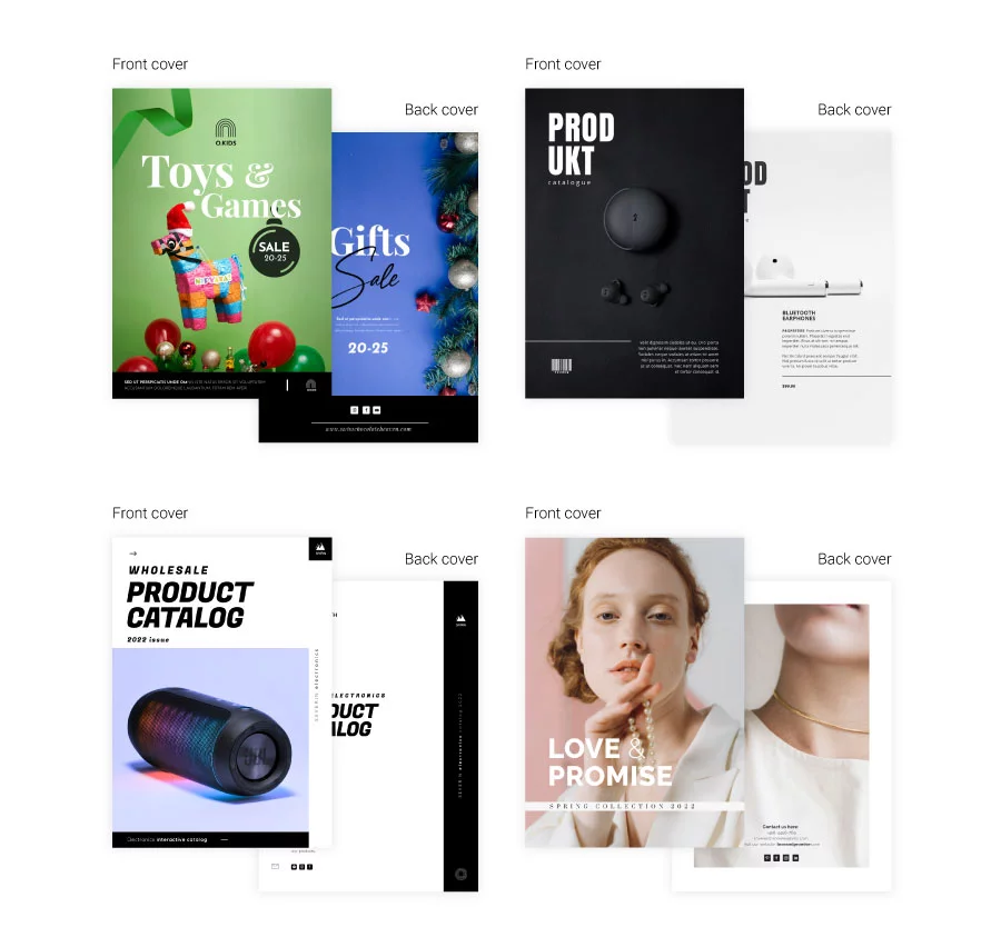
Include branding elements, such as logo and use the right font for the title of the catalog. To place the logo and the title on the image, create two boxes. Then, insert the desired elements and place the boxes on top of the photo.
To bring to front or send to back the boxes, click on the one that you want to move. Click right on the box and select arrange. You’ll have options like: bring to front, bring forward, send backward and send to back.
The back cover should be used for useful contact information like address, phone number and email; so that potential buyers know how to get in contact with you. As for the design, keep the same colors, fonts, layout as in the rest of the catalog.
Step 8: Export your digital catalog
You should take a moment to celebrate your (first) InDesign catalogue. It is not an easy task, and based on how many products you have to showcase, it can become overwhelming; or the design gets repetitive. Regardless of how much effort you put into creating your product catalog, we have reached the exporting stage.
Start from the purpose of your InDesign catalogue: print or digital. Once identified, you either need to abide by print shops’ requirements or take into consideration certain web presets if your catalog has interactions like product videos, embedded slideshows, etc.
How to export your catalog for print in InDesign
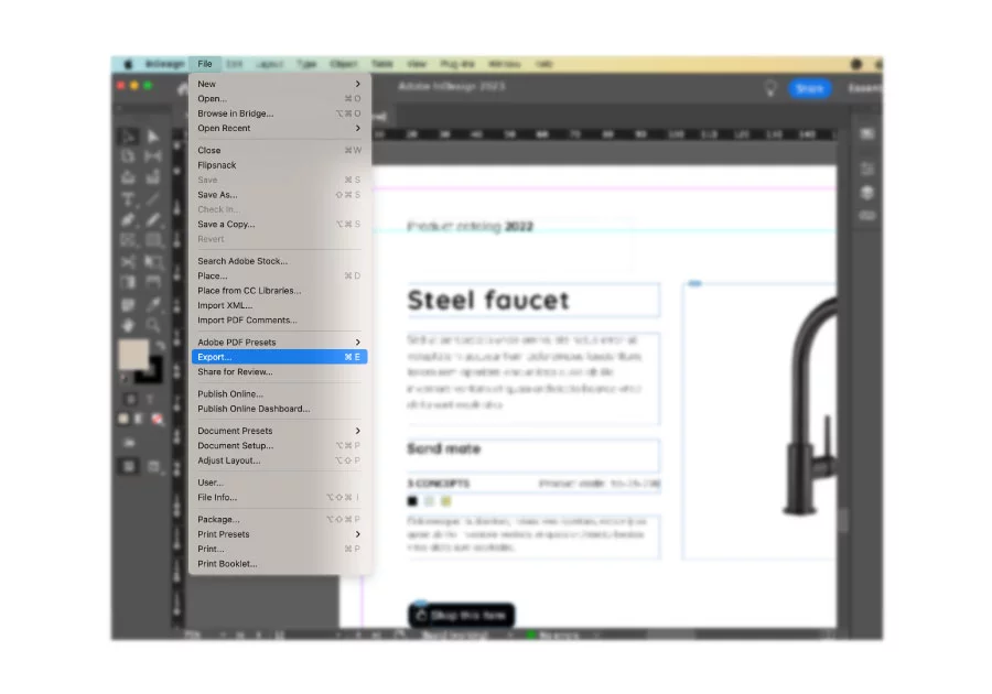
Go to File – Export. Name your document as you wish. Now, display the Format menu and choose Adobe PDF (Print). Next, click Export. When you save it, you will be presented with another export menu.
There are specific catalog requirements that you must respect if you want to print your design. If you open the PDF, you will notice some weird marks appear on the margins: they are just trim marks to show the printer where to cut the edges with the guillotine.
How to export your digital catalog from InDesign for web
To avoid any problems in the next steps, we will do a reset in the configuration of the document. Go to File/Document Setup. Uncheck the Facing Pages option and click OK.
Once you have done this, make a copy of this document with a different configuration: File/Save as. Give it a name that differentiates it from the document that has facing pages.
Now, go to File/Export. Give the document whatever name you want. Now, select the Form menu and choose Adobe PDF (interactive). When you save it, another export menu will appear.
In the newest versions of InDesign, the Export to Interactive PDF tab might appear a little different. Especially on the Resolution setup, where you can’t manually add a size, you can only choose from the dropdown menu. Now your digital InDesign catalog is finished. Check that everything is correct and that the links you have placed work, along with the videos (if applicable).
Step 9: Publish your catalog (via hosting service or a web app)
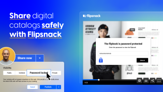
Once finished, share your professional InDesign catalogue online as a PDF link to see different statistics. All your hard work is about to be paid off if you have a clear catalog publishing and distribution strategy. If you want to upload your catalog on your website or online store (maybe even on social networks), there are two ways to do it.
A) Publish via hosting service
Your first option applies if your website has a hosting service such as InMotion. The only thing that you have to do in this case is to upload the file to the server, and use it directly from there.
B) Publish via specialized web app
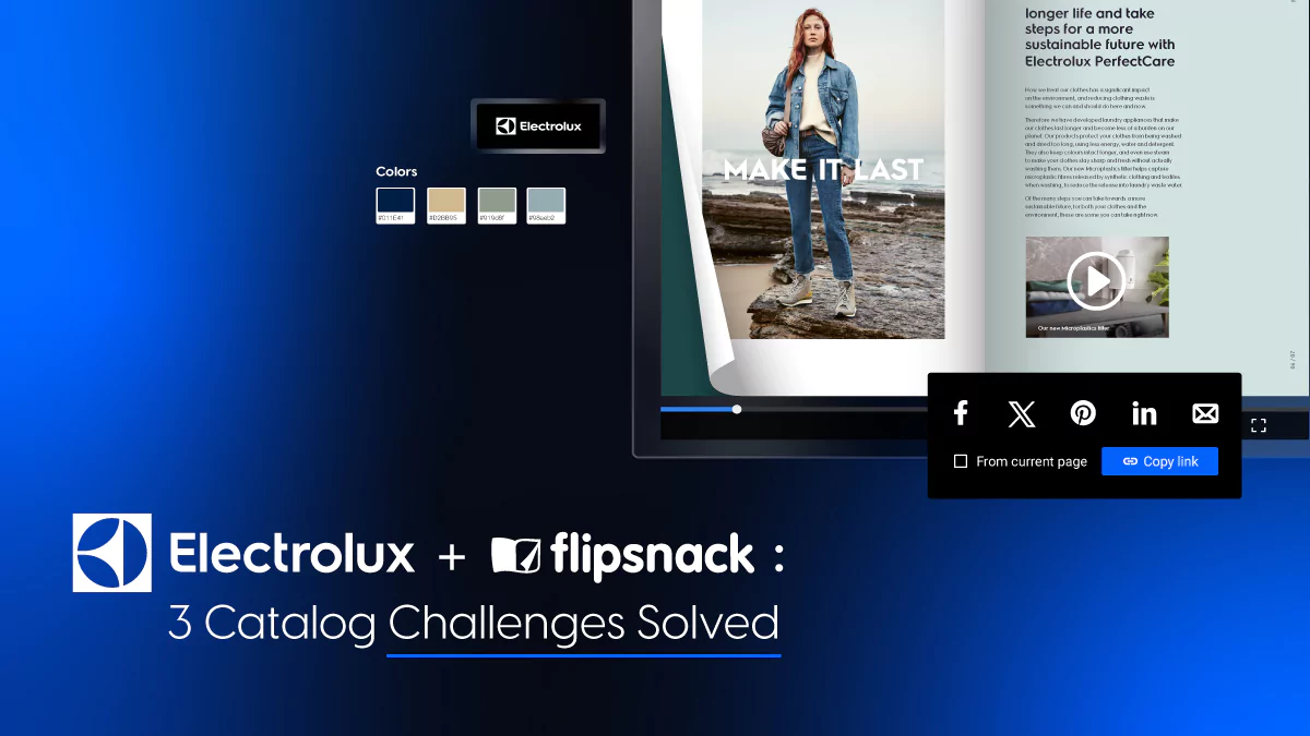
Your other option is using a web app specialized in digital catalogs, like Flipsnack. Flipsnack’s digital catalog maker, one of the best digital catalog creation and management tools available online, allows you to distribute your product catalog easily by sharing its full-view link with your intended audience.
The way this process works is by converting your PDF to flipbook first, once you upload the digital file to Flipsnack. A flipbook is an improved reading experience, which enhances the interactions you added to the former PDF, and simulates the page-flipping effect of a printed catalog.
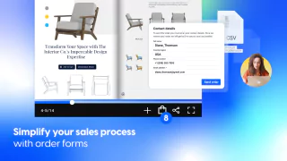
If you want to experience the power of Flipsnack’s interactivity in your InDesign catalog, check out the example below. From dynamic elements like captions for detailed product descriptions to shopping buttons that enable orders directly within the catalog, Flipsnack brings your catalog to life.
Your catalog can also be downloaded from there, while at the same time, you have the opportunity to check the catalog statistics.
Moreover, you can find inspiration in flipbook catalog examples; or use the product catalog templates to make your catalog look more professional. There are a lot of extra catalog interactions you can add to enhance the shopping experience. Some examples are: shopping list, product tags, photo slideshows, and more. You do not have to worry about this InDesign flipbook looking different based on the device used to access it. Share the catalog’s responsive link on any platform and reach your customers faster than with traditional distribution methods.
Flipsnack’s InDesign catalog extension
If you’d rather skip some of the steps we mentioned in the previous section, you can use our InDesign catalog extension. This extension saves you time by importing Adobe InDesign PDF files directly into your Flipsnack account.

Through a simple installation process, you’ll have access to this extension and your PDF file will be instantly exported to your Flipsnack account. The same principle applies with your original interactions available in Flipsnack.
Create a high-impact InDesign catalog with the right tools
Now that you know how to create a catalog in InDesign, it’s time to take it further. A professional B2B sales catalog needs more than great design. It needs the right tools to enhance engagement and simplify ordering.
With Flipsnack’s InDesign extension, you can seamlessly turn your static catalog into an interactive digital experience with embedded links, shopping buttons, and easy sharing options. Explore your options, optimize your workflow, and create catalogs that truly convert.
Frequently asked questions about creating catalogs in InDesign
Avoiding common mistakes such as neglecting the bleed settings, overusing fonts and colors, and not optimizing images for print can greatly improve the quality of a catalog. Ensuring consistency in design elements and maintaining a balance between text and images are also crucial for a professional look.
Making your catalog accessible involves using tagged PDF features, ensuring sufficient contrast between text and background, and using alt text for images. InDesign offers several tools to assist with creating accessible documents, emphasizing the importance of readability and navigability. And once you bring your InDesign document to Flipsnack, you can add alt text directly from our platform, as well.
InDesign integrates seamlessly with Adobe Creative Cloud apps such as Photoshop for image editing and Illustrator for vector graphics, enabling a streamlined workflow. This integration allows designers to easily incorporate various elements into their catalogs, enhancing creativity and efficiency. InDesign also integrates with Flipsnack’s platform to create InDesign flipbooks that are easy to track.