How to make academic, scientific & research posters
Making an academic, scientific, or research poster is the process of highlighting your objectives, premises, methodology and finally, results.
Sure, this may sound a bit pompous, but if we are to boil things down to a single, all-encompassing word, then I’ll go with rigor. And although all three share a fair amount of similarities, there are some differences between them that we’ll go through together. At the end of the article, you will have a more precise grasp of:
- What are these posters
- What’s the difference between them
- How do you make academic, scientific & research posters
Stay tuned, because in the end, you’ll learn everything there is to know about how to make professional academic, scientific, or research posters using Flipsnack’s Design Studio.

I’m not saying we’ve reinvented the wheel, but our Studio can act as your free online poster maker and help you find the proper aesthetic answer to your ideas. But before we get to that, we have some ground to cover, so let’s get moving.
What’s the benefit of creating posters for your presentations?
I remember having stumbled upon this question in my academic years. I do understand the horrors of having to present your work in front of an eager audience. Well, maybe not that eager, let’s say just present. But that being said, I came to learn that presenting a thesis in front of a crowd doesn’t necessarily have to be a daunting task.

People’s attention span is, for lack of a better word, limited. People hate being bored. Boredom means you get to spend too much time with your own thoughts. We don’t like that. Not at conferences, at least. That’s why an academic, scientific, or research poster can come in handy. Nobody expects you to perform a Shakespearean monologue on stage. The information you present must be:
- Condensed
- Relevant
- Logical
This is where academic, research or scientific posters really shine a bright light. They are a visual map for your audience, with the purpose of enforcing your ideas. By creating a good poster to showcase your work, you also help yourself by sketching your main ideas.
Have you ever experienced that moment when you simply forget your ‘lines’ in front of a crowd? Words seem to be held captive, and your throat swells up like a pufferfish. Trust me, I know the feeling. And that’s precisely why a poster is essential. Not only does it help your presentation be more appealing, but it also helps you pinpoint your most important ideas.
Right, now that our anxiety is out the window let’s take a closer look at each of our posters, see exactly what they are, and the differences between them.
What is an academic, research, or scientific poster?
Usually, when we think about posters, we associate them with things like music festivals, arts, and all sorts of colorful gatherings. Making academic, research, or scientific posters is different and involves an altogether different approach.
Summarizing the aforementioned things, these types of academic posters are brief, concise and relevant materials aimed at supporting your presentation. But before going on and defining each and every one of them, there is one last thing I would want to note: their purpose!
That exclamation mark is not just some kind of oratorical gimmick. Posters must have a purpose behind their creation. This purpose will guide you through the process of creating them. Depending on your field of study, these purposes can be numerous:
- You want to get financed
- You look for new collaborators
- Creating new network opportunities
- Maybe you simply want to present a thesis
- Or perhaps this is the product of an extended research
Without further ado, before learning how to make academic, scientific & research posters, let’s take a look at some definitions:
What is an Academic poster?
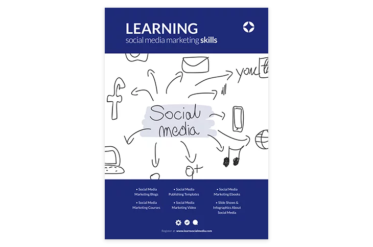
An academic poster is a condensed way of presenting your information through the means of text and graphics.
What is a Scientific poster?
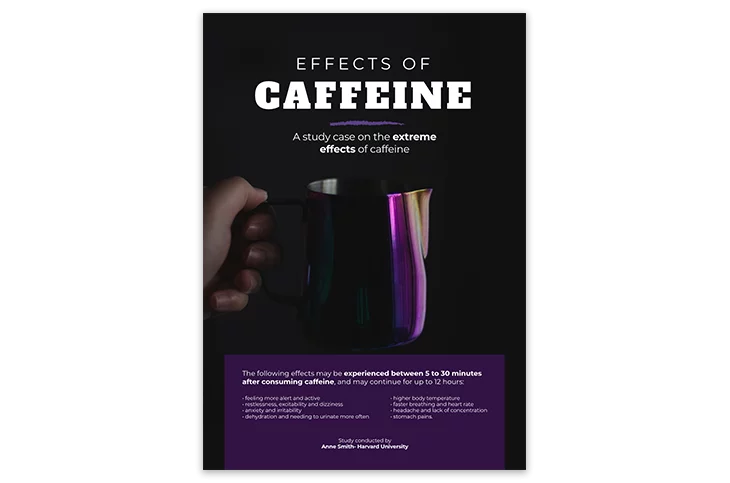
A scientific poster is a visual representation of your thesis, work methodology, and key findings. Like the academic poster, it also implies the use of text and graphic images in order to convey meaning.

What is a Research poster?
Similar to the scientific poster, the research poster is also a visual representation of your thesis, with a specific focus on graphics, statistics and other measurable metrics.
As you can see, all three of them are very similar in terms of definitions. This may come as no surprise given the fact that usually they are deployed together or as part of the same academic circles.
Nevertheless, if you choose to get a scientific illustration job, there will be some differences in how you format your information for each of them. Some will focus more on graphs and tables, whilst others will emphasize hypotheses more. Let’s take a look at how to make academic, scientific, and research posters step by step.
How do you make academic, scientific & research posters
What is a good Academic poster?
A good academic poster should, first and foremost, be concise and attractive. What does this mean?
Basically, when deciding how to make a good academic poster, you should make sure that all the information you want to pass on can be easily and rapidly understood. Refrain from long blocks of text as they can distract and make the audience lose interest in your presentation. Regardless of how worthy your subject matter is, here are some general guidelines for you to keep in mind when coming up with your poster:
- Use contrasting colors. You want your text to stand out from the background. At the same time, you don’t want to use too many colors. Too many colors are more often than not distracting. After all, we are aiming for an academic poster, not a funk one.
- Keep your text at a minimal level. Focus on highlighting, formatting, and succinctly present your information. Bullet-points are a very effective method of displaying essential information swiftly. Instead of long, convoluted phrases, focus on key ideas.
- Include visual representations of your ideas or findings. This can further help your audience get a sense of what’s going on in your presentation.
- Don’t turn your poster into a peacock. We touched upon this with colors, but you should also refrain from using too many images. Images are there to enforce your message, not replace it.
- When all is said and done, remember that your academic poster needs to be eye-catching. I know, it kinda’ sounds a bit counterintuitive given the principles above. But I will show you some examples of how you can still turn out a fantastic poster while also retaining that crisp, professional, academic look to it.

Taking a look at the above example, we can see all of the earlier principles we’ve discussed. Now that we have a visual representation of how such a poster should look, let’s break it down and see how you make an academic poster like this.
Naturally, the construction of any type of poster is a process that goes through some form of development. Mainly, there are some steps to be taken into consideration. What are these steps? Since you’ve asked, let’s start with the beginning:
- The visualization phase:
- Who is your audience?
- What are the materials you want to present
- How are you going to present them
- The development phase:
- Size
- Structure
- Design
- Logical consistency
- Review and bibliography:
- Collaborators
- References
- Perspectives and further reading
Generally speaking, you don’t want to pass the thousand-word benchmark when making your academic poster. Each big section (such as the Introduction and Key findings) should comprise about two hundred words. Here less is better. Cluttered information is the bane of any academic poster, so keep it clean and simple. Instead of an overabundance of information, leave room for questions.
Breaking down each phase
I started with the visualization phase because establishing who your target audience is fundamental. Who are you addressing? Is it teachers, academics, fellow students, and peers? Answering this will significantly influence your discourse and give you a better chance of effectively communicating your message.
The materials you want to represent must refer to your study. Here you will have to focus on your key-findings, getting rid of anything that you don’t deem necessary.
In terms of presentation, think about the visual aspect. How many graphs, charts, statistics will you add to your final result. Remember, they are there to complement your ideas, not replace them.
What size should your academic poster be? Generally speaking, you will aim for anything between A0 (841x1189mm), A1 (594x841mm), and A2 (420x594mm). But this isn’t a general rule. Depending on context and audience, academic posters can be of gargantuan lengths, such as 1250mm wide.
In terms of structure, there are multiple ways in which you can structure your poster. You can go for a more longitudinal approach or a transverse one. Landscape, or portrait orientation. It’s really up to you. The important thing is what you add into those frames of reference. Here’s an example of a possible poster structure:

H1: Title
H3: Author and collaborators
H2: Introduction
It shouldn’t be longer than 200 words.
H2: Methods or Methodology
Informs your audience about the method of your research
H2: Results
Key findings
H2: Conclusions
What are the merits of the study, how can it further be pursued?
H3: References
Bibliography and further reading
It goes without saying that whatever type of structure you choose, all sections must be linked with an internal logic. You don’t want your audience to feel as if they are a character from Lost. Let’s take a look at another example before moving on to scientific posters:
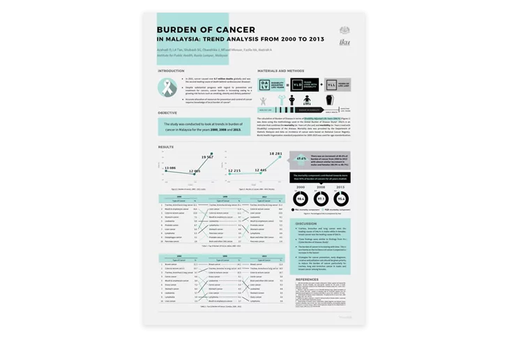
As you can see, this one is a bit different from the first one I’ve shown you. Why? Because the purpose of this poster is mainly to inform. Given the said purpose, it’s only logical for a Discussion section to exist. But that’s not the point here. The point is that both of them follow a logic. How do you determine this internal logic? Based on your audience and your purpose.
Who do you address and What are you trying to achieve will determine How the end result will look. You arrived at your destination, now all is left is for you to present your academic poster.
How do you make a scientific poster?
Academic posters usually tend to be of a broader approach, with their area of focus being available for both academics and laymen alike.
That’s not to say that academic posters should lack methodological rigor. On the contrary, their rigor is on par with any other type of scientific discipline.
What differentiates the scientific poster from the academic one is mainly its audience. Scientific posters address a niche. Usually, they are constructed to appeal to a smaller audience, to a smaller academic circle.
And although from a structural standpoint, they resemble the academic poster mentioned above, the information presented in them tends to be a bit more technical. And it makes sense. Apart from informing, scientific posters usually have another purpose: that of obtaining financing for further research.
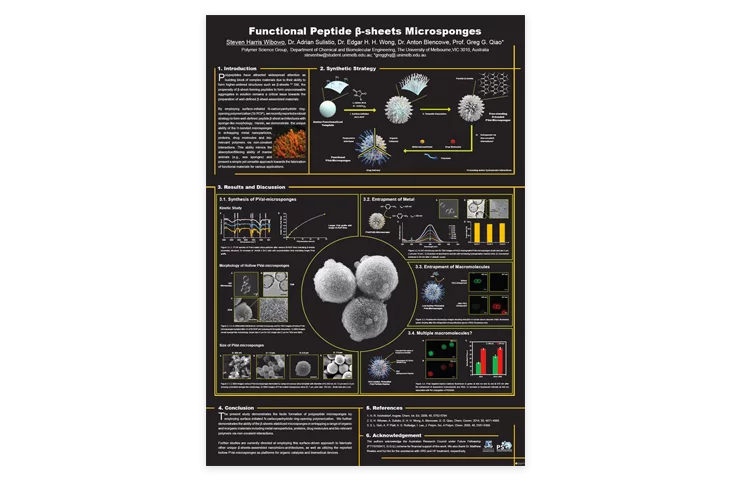
As you can see in the example above, the language of communication is somewhat different. For someone not familiar with molecular biology, the poster above may just as well be some form of contact sheet with an alien civilization. If that it is, in fact, molecular biology. I have no idea. But it really doesn’t matter. You understand the difference between them. One is more general, that being the academic one, whilst the other is more technical.
So, how do you write a scientific abstract, for instance? You focus on your key premise and highlight the value of your research. What are the main benefits and conclusions that we can derive from it? Academic posters had their Introductory part of around 200 words.
The same applies here. A scientific poster’s standard structure somewhat resembles that of a traditional storytelling structure: hook, setup, tension, climax, resolution. You will have a:
- Title
- Introduction
- Methods
- Results
- Analysis/discussion
- Conclusions
General principles:
- Here, more than anywhere else, logical consistency is vital. You want your data to flow in a logical, rational manner.
- Readable text and clear graphics. Your text needs to be razor-sharp and your charts or other data clear and precise. You want to send a clear, definitive message.
- Make headings out of your most important information. Your audience most likely won’t remember everything. Give them a fighting chance and highlight your most important ideas by turning them into headings.
- Make sure all the information you present is understandable. Your audience shouldn’t have to spend more than a few seconds on your tables and data in order to understand it. Sure, a more in-depth understanding is desirable, but this is the purpose of leaving room for questions, right?
- Leave room for questions. Don’t clutter your presentation, instead leave room for open questions. This way, you won’t have to guess what parts of your presentation your audience might be interested in. They ask, and you provide the answers. It’s a win-win situation.
Finally, what are the key aspects you should insist on? When deciding how you’re going to make your scientific poster, these are the main pillars that you should include:
- Abstract
- Background
- Objectives
- Methodology
- Results
- Recommendations
If you can check all of the above, then you can rest assured that you have a good scientific poster in your hands.
How to make a research poster
Research is a pretty broad term, encompassing both academic papers and scientific ones. If you think about it, every scientific discourse requires some sort of research.
Semantically, we can say that when talking about research, we focus more on theses. That’s why a research poster can be the starting point of a scientific one, for instance.
What should you structure your research poster?
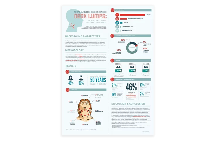
Generally speaking, a research poster will have the same structure and components as an academic one, but narrowed down to a tighter, even more concise presentation.
Your word count shouldn’t pass 800 words, and it could have as little as 300. That’s right, it’s pretty slim. That’s mainly because, as I’ve already mentioned, research posters tend to anticipate a more comprehensive study.
As you can see in the above example, there is much more emphasis on pictures, graphs, and charts than on words. That’s because the point of the research poster is to attract attention.
So, what should you include in your research poster?
- Title
- Authors
- Objectives
- Methods
- Results
- Conclusions
- Acknowledgments
The guys at Dartmouth did a terrific job at narrowing down these sections, so be sure to check their article on how to design your research poster.
What does a good research poster look like?
- Words count anywhere between 300 and 800 words.
- Information is presented in a crisp and clear fashion.
- Images and graphics should be properly aligned with the text.
- A good research poster should immediately draw attention to itself.
- Uses bullet-points so your audience can follow the information more easily.
- Precise headers and short sentences. Don’t pour the entire English lexicon in there.
- Follows a simple yet logically sound structure.
There are multiple ways to create a research poster. Whichever one you pick, just don’t forget to follow the principles highlighted above.
Summary
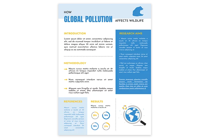
When thinking about how to make an academic, scientific, or research poster, focus on these three aspects:
- Structure
- Key ideas
- Conclusions
If you have a clear outline of who your audience is and what you are trying to convey, then the rest will pretty much take care of itself. In terms of the information you present, don’t forget to keep it simple, precise, condensed, and logically organized.
The internal logic and flow are vital for your audience to understand your reasoning and discourse. And, depending on your purpose, it can also be critical in grabbing funding or other resources.
Keep it no longer than a thousand words, and stick to a limited number of colors. Four should be your guideline, but you can juggle with this as long as the end result doesn’t become too distracting.
How to make Academic, Scientific & Research Posters using Flipsnack
If your emphasis when making your academic materials is on rigorosity and conciseness, ours is on offering answers. And by answers, we mean online solutions. Ideas are yours. Although we can definitely help you out if you’re running through a dry spell, we are here to offer you the means of translating those ideas. We pride ourselves on being a complete content creation tool and are ready to prove it to you.

You can take two paths when making an academic, scientific, or research poster with us. You can either design your poster from scratch or upload an already existing PDF and enhance it using our Design Studio.
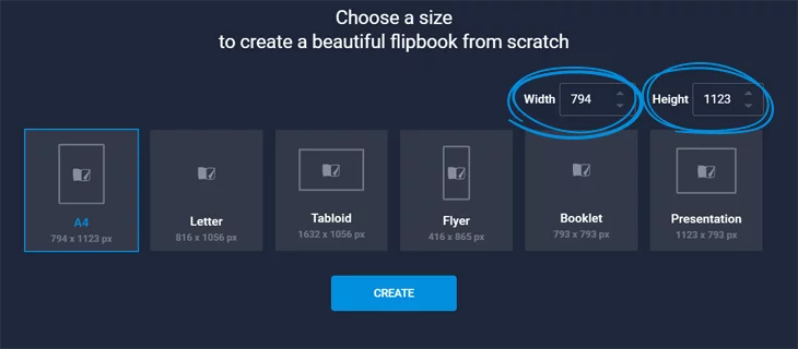
In the below image, you can see the standard formats that we offer. You can manually set the Width and Height to achieve the dimensions needed for your poster. As we’ve talked about earlier, the general dimensions of an academic, scientific & research poster vary between A0 (841x1189mm), A1 (594x841mm), and A2 (420x594mm). But these are only general guidelines. Maybe your context requires you to push the boundaries and fill up the room. If you choose to Create your poster from Scratch, the largest size possible with our Design Studio is A1 or A2. You will have to set the Width and Height in pixels, the translation from millimeters to pixels being:
- A1: 2245 x 3179 px
- A2: 1587 x 2245 px
But as I’ve said, these are only general guidelines. Sizes can vary depending on context, so if you want something bigger, then go for it. Our Design Studio supports anything up to a maximum limit of 3500 px.
Establish your own frames of work and make that poster happen! Hit Create, and then our Design Studio will open its gates.
On the left side menu, you will find all the options needed for creating your perfect design. If you choose to upload a PDF, then this will be an enhancing experience. By enhancing, we mean that you can make your poster interactive by adding videos, GIFs, links to further reading, tags, and many more. If you are thinking of sharing your poster via social media, direct mail, or embedding it on your website, then turning your poster into an interactive experience is definitely something worth pondering upon.
If, however, you decided to make your poster from scratch, then on the mentioned left menu, you will find all the tools needed. Text, pictures, headings, shapes, and many more. You can also upload your own files, so there’s basically no design limitations.
After you’re done editing, make sure to enable the Download and Print options and you’re done. Your poster is ready to meet the stage. Just take a look at the below example:
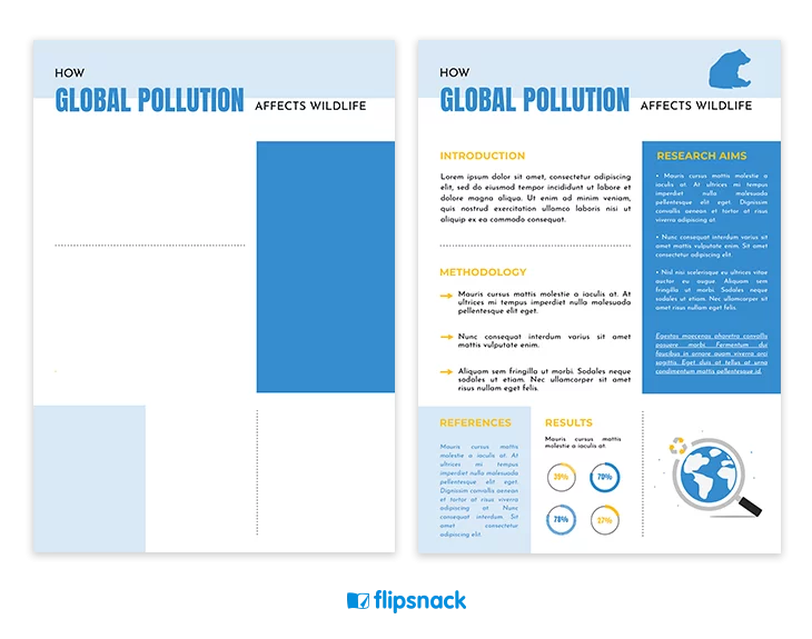
As you can see, we’ve transformed a blank canvas into more than just a presentation. Using our Design Studio and taking advantage of all our editing and creation options, you can also create an online poster like that. Or even better! Use your imagination fully. Our tool can definitely keep up the pace.
Making an academic, scientific, or research poster is transforming abstract ideas into a visual, comprehensive language. Just make sure to keep in mind the principles that we’ve highlighted. Otherwise, it would be like presenting a fantastic poster to an audience of cats.
When all is said and done, a professional-looking poster can help alleviate some of the horrors of being on stage. And although we’re not psychologists, we can definitely assure you that having a well-designed presentation can boost your confidence. You are the master of your information. Transform the making of an academic, scientific & research poster into a jaw-dropping experience! It’s your study, your area of expertise, your turn!
