How to Make a Feature-Worthy Magazine Cover Using Flipsnack
Published on: September 24, 2021
Last updated: November 18, 2025
Even with everything going digital, a well-designed magazine cover carries serious weight. It’s the first thing people see, and it needs to hook them fast.
If you’re putting together a magazine—whether it’s your first issue or your fiftieth—getting that magazine front cover right is crucial. And here’s the good news: you don’t need to be a design pro to make a magazine cover that looks amazing.
With Flipsnack’s magazine maker, you can make your magazine cover design interactive. Add videos, clickable links, and track how people engage with your content through built-in analytics.
Let’s dive in and see how to make a magazine cover that grabs attention (+ tips from designers on how to do it in Flipsnack).
However, we should start with the essentials –

Table of contents
What are the elements of a magazine cover?
Before you start designing, let’s talk about the parts of a magazine cover that matter. Every magazine cover—from Vogue to your local indie publication—uses these same building blocks. Get these right, and you’re halfway there with a great magazine cover design.
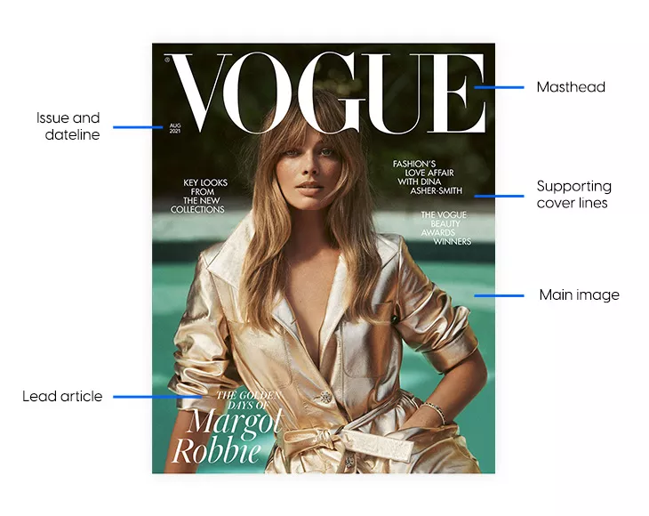
1. Masthead
This is your magazine’s name, and it should be impossible to miss. Make it big, make it bold, and stick it front and center. The masthead is how people recognize your publication instantly. Keep the placement consistent across issues, but feel free to play with colors to match each cover’s vibe.
Designer’s tip: The masthead uses the largest font size of all the elements on the magazine cover. Be consistent with the placement and size of the text throughout all the issues, and change colors to accommodate the different themes.
2. Main image
This is what stops people mid-scroll. Your magazine picture needs to be high-quality and instantly grab attention—whether it’s a striking portrait, a bold illustration, or something more abstract.
For digital magazines, this is even more critical since you’re competing with endless content online. Whatever you choose, make sure it hints at what’s inside without giving everything away. For example, some magazine issues have gone the abstract route with their main image.
Whatever you choose, make sure you invest in high-quality photos since this improves your chances of gaining more subscribers. For enhancing your images, consider using tools like Depositphotos, which offer excellent resources for upscaling and refining your photos.
Designer’s tip: Choosing the right image is an essential aspect when it comes to designing your magazine cover. Make sure it reflects the content within the magazine the best. Always use high-quality images, and be mindful of the background – keep it light and simple.
3. Lead article
The lead article reflects the central issue of the magazine. Maybe an interview with an artist, an expert on a subject, or any other matter you know will emotionally impact your audience.
Designer’s tip: Make sure you use a unique font for the lead article title to let the readers know the issue’s theme and main story. This will make it stand out and grab your readers’ attention.
4. Cover lines
These are the headlines that tease your content. You’ve got your lead article (the big story) and supporting cover lines (everything else worth mentioning). Keep them punchy and don’t overcrowd the page.
Your lead article should stand out with a bigger, bolder treatment, while supporting lines can be smaller and more subtle.
Designer’s tip: Try to make supporting cover lines clear, short, and concise. Also, go for a more subtle font and choose a smaller size to avoid distracting the reader from the lead article.
5. Issue details
Date, issue number, volume, they go somewhere discreet, usually at the top. It needs to be there, but it doesn’t need to compete for attention with your main content.
Designer’s tip: You can make this section as discreet as possible to not overcrowd the magazine cover with secondary elements.
Look at this issue and dateline design – discreet, yet strategic.
That’s the anatomy of a magazine front page design. Simple, right? Now let’s get into actually creating one.
How to make a magazine cover in Flipsnack
OK, let’s get practical. Here’s how to make a magazine cover using Flipsnack’s magazine maker. And, of course, you can build an entire magazine using the same platform.
1. Pick a template, upload a PDF, or start from scratch
You’ve got three ways to create your magazine cover in Flipsnack.
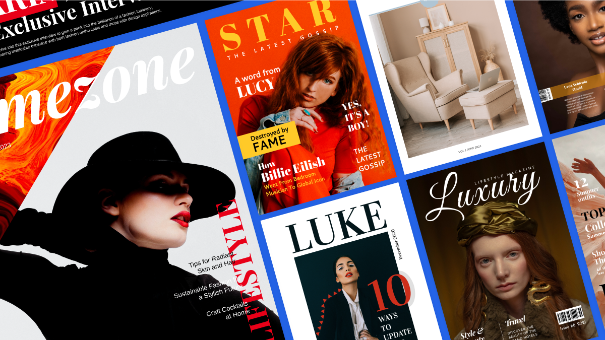
- Browse the magazine template library if you want a professional layout right out of the gate—just customize the images and text.
- Upload an existing PDF if you’ve already designed something and want to make it interactive.
- Or start with a blank canvas in standard sizes like A4 or Tabloid and build your magazine cover page from the ground up.
2. Brand your magazine
Upload your logo, brand colors, and custom fonts. This is where you make the masthead and headlines match your overall brand identity, not just this single magazine issue.
Consistency is what builds recognition, so get your brand elements locked in from the start. If you’re working with a team, save this as a branded template so everyone’s on the same page for future issues.
Speaking of consistency: keeping the same cover format for your following magazine issues helps your readers get used to your specific magazine layout and easily recognize it. Similarly, maintaining consistent, high-quality imagery is crucial for a professional look.
Most big brands do this. They mainly change the image cover, keep the name in the same place, and only adapt the colors to match the image. This is a tried-and-true method that works wonders. Looking at magazine cover examples from Vogue’s magazine front page shows exactly how effective this approach is.
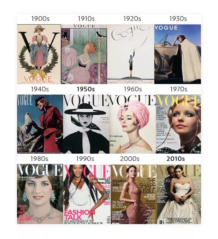
As a matter of fact, Vogue became such a big brand thanks to recognizable brand elements they share on all their platforms – website, social media accounts, printed magazines, etc.
You don’t have to use the same color all the time. You can always switch things up according to the issue’s particular theme, especially if it’s something special – this is common practice for fashion magazines. Just make sure to use recognizable elements still.
3. Edit the main image and cover lines
Replace the placeholder with your hero image—either upload your own high-quality photo or grab one from Flipsnack’s stock library. Then add your lead article headline and supporting cover lines using the text tools. Once you’ve finalized your magazine cover page design, you can save it as a template for future issues.
4. Add interactive elements (this is where it gets good)
Here’s where Flipsnack beats static design tools like Canva: you can make your magazine cover actually do something.
Link your cover story headline directly to that article inside the flipbook. Add clickable buttons, embed videos, or include audio clips right on the cover.
Your readers can interact with the content instead of just looking at it—and that makes a huge difference for engagement.
5. Collaborate with your team
If you’re not working solo, Flipsnack’s collaboration features are perfect for you. Set up workspaces for different projects, invite team members, and assign role-based permissions.
Leave comments directly on the design so feedback doesn’t get lost in email threads. Everyone can see updates in real-time, which keeps the whole process moving.
6. Publish, share, and track performance
When your magazine cover design and the rest of the magazine are ready, publish it as an interactive flipbook. Share it via a direct link, on your social media platforms, embed it on your website, or send it through email campaigns. Need a print version? Export a high-resolution PDF ready for the printing press.
Flipsnack’s analytics show you exactly how your magazine cover performs. Track views, see which cover elements get the most clicks, and monitor how many readers actually flip through to read the full issue.
This data helps you optimize your next magazine front cover for even better results.
Magazine cover design rules that still matter & templates that showcase them
Graphic design trends come and go, but some magazine cover design principles are timeless. Studying successful magazine covers can teach you what works across different industries and audiences.
The best part? Flipsnack’s magazine templates already follow these rules. Start with a magazine cover template that matches your content style, customize it with your brand and content, and you’re already ahead of the game.
1. Layout and hierarchy
Your magazine front cover needs a clear visual path. Readers should know exactly where to look first (usually the masthead), then where to go next (the main image), and finally what else is worth their attention (cover lines).
The masthead almost always sits at the top, centered or slightly off-center.
Use a grid system to keep everything aligned and balanced. Your focal point—whether it’s a face, an object, or text—should have breathing room around it. Don’t cram everything into one corner.
In Flipsnack: Use the alignment guides and grid tools in the Design Studio to keep elements properly spaced. Click on View in Design Studio → Show ruler → drag a line from the ruler onto your page. The snap-to-grid feature makes it easy to maintain balance across your magazine cover page without eyeballing it.

2. Typography and copy
Your font choices say as much as your words. Pair a bold, attention-grabbing font for the masthead and lead article with a cleaner, simpler font for supporting cover lines. Don’t use more than two or three fonts total because it can get messy fast.
Make the lead article pop with a larger, bolder font, and keep supporting lines smaller and more subtle. Font styles play a significant role in how a magazine cover looks; sometimes, they can make or break your entire magazine cover design.
Magazines feature the headlines of the most important stories on the cover, and using suitable font pairings can make a big difference in how the audience perceives them.
Don’t neglect the value of using specific words that usually appear in headlines. In the past, magazines used words like “NOW,” “FREE” and “EXCLUSIVE,” but today, you can generate more powerful words using new technology. You could use ChatGPT VPN to find new words for your magazine cover.
You’ll see this practice of using buzzwords in many fashion magazines. And even graphic design experts emphasize these words by adding a 3D effect or by playing with backgrounds to make them pop more.
In Flipsnack: Upload your brand fonts or choose from hundreds of built-in options. Use the text formatting tools to adjust size, weight, and color for maximum contrast. Layer text over semi-transparent shapes if your background image is too busy.

3. Imagery and backgrounds
The right image makes or breaks your magazine cover. Portraits work great for personality-driven content—think interviews, profiles, or thought leadership pieces. Illustrations give you more creative freedom and work well for conceptual topics. Abstract covers can look stunning, but need strong typography to anchor them.
Whatever style you choose, keep backgrounds clean. A busy background fights with your text and makes the whole magazine front page design feel cluttered. If you love a complex image, use it strategically and give your text clear space to breathe.
Historically speaking, photos do better than illustrations on the cover page. But, throughout time, there have been numerous publications that have used illustrations very wisely and had great success. A special magazine issue might be worth switching things up and using an illustration instead of your regular photo on the cover.
In Flipsnack: You don’t need Beyoncé on your cover to have success; you need great content. But a great image on your magazine cover is definitely important. Browse the built-in stock photo library or upload your own images. Use the background removal tool to isolate subjects, or add overlay shapes to create clean zones for text. You can also apply filters and adjustments directly in the editor without jumping to another app.

Design your next magazine cover in Flipsnack
Flipsnack’s magazine maker lets you design once and publish everywhere.
The real advantage is that your covers are clickable. Link cover stories directly to articles, embed videos, and track what actually gets people’s attention through built-in analytics.
If you’re managing multiple magazine issues or working with a team, branded locked templates keep everything consistent without slowing anyone down.
Flipsnack handles the entire workflow from design to distribution to tracking performance. Everything in one place, optimized for digital-first publishing.

FAQ about magazine cover design
Standard print sizes are 8.5″ x 11″ (US Letter) or A4 (8.27″ x 11.69″) for most magazines. Tabloid size is 11″ x 17″ if you want something bigger. For digital-only publications, you have more flexibility with dimensions since you’re not constrained by printing standards. Flipsnack offers magazine templates you can customize to your preferred size.
For print, use images that are at least 300 DPI (dots per inch). For digital magazine covers, 72-150 DPI is sufficient since screens display at lower resolutions than print. Flipsnack allows you to export high-resolution PDFs for print production.
Start with a magazine cover template that already has a professional layout, then customize it with your own content and brand elements. Focus on one strong image, a clear masthead, and concise cover lines. Flipsnack’s Design Studio has a drag-and-drop editor that lets you modify templates without design experience.
Design your first magazine cover and save it as a template. For each new magazine issue, use that template as your starting point and update the main image, cover lines, and issue details while keeping the masthead and overall layout consistent.
Internal magazines follow the same design principles—clear hierarchy, professional imagery, and readable headlines. In Flipsnack, you can control who sees your magazine through password protection or share it privately with specific team members through workspace permissions.

Thank you, this was very helpful!
I am very glad to hear you enjoyed this article!
This is awesome sause man
thes eis soa coooal and neace thanlk yoy sfo muach for wthis
this* is* so* cool* and* nice* thank* you* so* much* am this*