
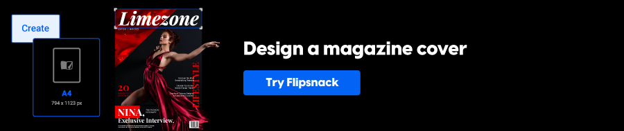
How to Design a Magazine Cover: A Complete Guide
Published on: September 24, 2021
Last updated: April 7, 2026
Your magazine cover does a lot of heavy lifting. Before a single article is read, the cover has already made a first impression, communicated your brand, and, on a newsstand or in a digital preview, decided whether someone picks it up or scrolls past.
That’s a lot of pressure for one page.
A well-designed cover drives sales, builds recognition across issues, and signals the quality of the content inside. A weak one, no matter how good the editorial is, can cost you readers before they even get started.
This guide to designing a professional magazine cover walks you through everything you need. You’ll learn the core magazine cover design principles, the steps to creating a magazine cover from scratch, how to use the right tools, and how to approach both print and digital formats, from your first layout decisions all the way to a finished, ready-to-publish file.
Whether you’re an independent publisher putting out your first issue, a designer working on a client brief, a marketing team creating a branded publication, or an educator producing a school magazine — this guide is written for you.
One thing worth noting upfront: print and digital magazine covers follow the same fundamental principles, but they have different technical requirements and different ways of reaching readers. This guide covers both.
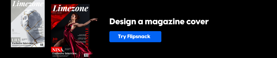
Table of contents
Why magazine covers matter
Most readers decide in seconds. A magazine cover earns attention (or it doesn’t) before anyone reads a single word inside.
That split-second judgment happens in more places than it used to.
A physical cover competes on a newsstand shelf, where it has roughly three seconds to stand out against dozens of other publications.
A digital cover competes in a thumbnail preview, a social media post, or an email campaign, where the stakes are just as high, and the viewing conditions are even less forgiving.
What makes someone stop? A strong cover works on several levels at once:
- it leads with a compelling image
- makes the brand immediately recognizable
- and gives the reader just enough information to feel curious about what’s inside.
It doesn’t try to explain everything. It creates a reason to open the magazine.
Beyond attracting new readers, a cover communicates your editorial positioning. A clean, typographic cover signals a different kind of publication than a bold, photograph-led one. Readers use these visual cues to decide whether a magazine is for them, often before they’re consciously aware of it.
Consistency matters too. When readers see a cover that looks and feels like past issues, trust builds. They recognize the masthead, the color palette, the tone. That recognition turns a one-time reader into a regular one. It’s how a magazine becomes a brand.
This is why magazine cover design is worth taking seriously — not just as an aesthetic exercise, but as a strategic one.
Always start with your audience
Before you open a design tool, it helps to know who you’re designing for. A cover that works for one audience can fall flat with another and the difference often comes down to decisions that feel instinctive but aren’t.
Demographics vs. psychographics
Most designers start with demographics: age, gender, profession, location. That’s a useful foundation. But psychographics go further. They tell you what your readers value, what they aspire to, and what problems they’re trying to solve.
A 35-year-old professional who reads a trade magazine and a 35-year-old who reads a lifestyle magazine may look the same on paper. Their expectations from a cover are completely different.
How audience type shapes design
Those expectations influence every design decision — layout, color, typography, and tone. Here’s how that plays out across three common magazine types:
- Lifestyle magazines — readers respond to warmth and aspiration. Think bold photography, confident color choices, and cover lines that feel personal and direct.
- Trade magazines — readers want credibility and clarity. Structured layouts, restrained color palettes, and headlines that get straight to the point signal that the content is serious.
- Academic publications — authority comes through typography and whitespace rather than imagery.
Getting this wrong doesn’t just make a cover look off. It makes readers feel the magazine isn’t for them.
How to gather audience insight
You don’t need a big research budget. A few reliable methods:
- Subscriber surveys — short, focused questions can surface preferences you’d never guess from metrics alone.
- Social media engagement — comments, saves, and shares reveal what your audience actually responds to.
- Competitor cover analysis — study who their readers are, what the covers promise, and where gaps exist that your publication could fill.
Turning insight into design decisions
Once you have a clearer picture of your audience, translate it into concrete choices. If your readers value expertise, lean into clean structure and typographic precision. If they value discovery and creativity, give the hero image more room to breathe.
Every layout choice, color selection, and font pairing should trace back to something you know about your reader, not just something that looks good on screen.
Key elements of a magazine cover
Every magazine cover is built from the same core components. How you combine them, and the decisions you make about each one, is what separates a cover that gets noticed from one that gets overlooked.
These elements make up the anatomy of a magazine front page. Understanding each one is the foundation of any good magazine cover page design.
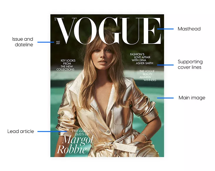
1. Masthead and logo placement
The masthead is your magazine’s name on the cover. It’s the most consistent element across every issue, and it does two jobs at once: it identifies the publication and reinforces the brand.
A strong masthead is instantly recognizable. Readers should be able to spot it at a distance, whether on a newsstand shelf or in a social media thumbnail. That means size and placement matter as much as the typeface itself.
Placement conventions
Top-left is the default position for a reason. When magazines are stacked or overlapping on a shelf, the top-left corner is almost always visible. Placing your masthead there protects brand visibility even in the worst display conditions. Top-center works well for publications that rely on symmetrical layouts or strong vertical imagery.
Breaking from convention is possible — some established magazines run their masthead partially behind the cover image to create depth — but this only works when the brand is already recognizable enough that readers don’t need to see the full name.
Font choice
Your masthead font should balance personality with legibility. A fashion magazine can afford a more stylized, high-contrast typeface. A trade or academic publication needs something clean and authoritative. Whatever you choose, keep it consistent. The masthead font becomes part of your visual identity, and changing it disrupts recognition.
Some publications vary masthead color seasonally while keeping the typeface fixed — a small change that adds freshness without sacrificing consistency.
2. Visual hierarchy
Hierarchy is what tells a reader where to look first, second, and third. Without it, a cover becomes a jumble of competing elements. With it, the reader’s eye moves through the design naturally and effortlessly.
The reading order
A well-structured magazine cover typically guides the eye in this sequence:
- Masthead — establishes who published this
- Hero image — creates emotional engagement
- Primary cover line — gives the reader a reason to open it
- Secondary cover lines — add supporting context and breadth
This isn’t a rigid rule, but it’s a reliable starting point. The masthead anchors the top. The hero image dominates the middle. Cover lines layer over or around the image without competing with it.
How to build hierarchy
Three tools do most of the work:
- Scale — larger elements read first. Your primary cover line should be noticeably larger than secondary lines.
- Weight — bold type pulls the eye before regular weight. Use it deliberately.
- Color — high contrast draws attention. A white headline over a dark image reads before a grey one does.
Writing cover lines
A primary cover line should be short, specific, and curiosity-driven. Lead with the hook, not the context. “The Designers Changing Everything” works harder than “A Feature on Emerging Designers.” Aim for one strong idea per line, and keep it to ten words or fewer where possible.
Secondary cover lines support the primary one. They add variety and signal the magazine’s range of content, but they should never fight for dominance. Smaller size, lighter weight, and lower color contrast keep them in their supporting role.
You’ll see this practice used in a lot of fashion magazines. And even graphic design experts emphasize these words by adding a 3D effect or playing with backgrounds to make them pop more. Using powerful words increases your chances of having a perfect magazine cover that will easily sell itself through all the ever-changing graphic design trends. In generating more powerful words, an AI bot can help you. For this, you may use a ChatGPT VPN to find new words for the magazine cover.
Testing your hierarchy
Squint at your cover. Reduce it to thumbnail size; you can do this manually or with an AI-written script and a screenshot API like Screenshot Scout if you need to generate multiple thumbnails. Step back from your screen. If your eye goes somewhere unexpected, or if nothing stands out at all, the hierarchy isn’t working yet. Fix the scale or contrast relationships before anything else.
3. Hero image and imagery
The hero image is usually the first thing a reader registers emotionally. It sets the mood before any text is read. Choosing the right one is one of the most important decisions in cover design.
What makes a strong cover image
Three qualities matter most:
- technical quality
- relevance
- emotional pull
A technically perfect image that feels disconnected from your magazine’s identity won’t work. Neither will a relevant but flat image that generates no response. The best cover images do all three — they’re sharp, they fit the publication, and they make the reader feel something.
Choosing your image type
Different image types suit different publications:
- Portraits — direct eye contact creates an immediate personal connection. Best suited to profile-led features, fashion, and human-interest publications.
- Scene or environmental images — show context and place. Work well for travel, lifestyle, and culture magazines.
- Abstract or conceptual images — signal sophistication and editorial ambition. Common in arts, design, and literary publications.
Custom vs. stock photography
Custom photography or commissioned illustration gives you full control over the image and guarantees exclusivity. If budget allows, it’s almost always the better choice for covers.
Stock photography can work but only if the image feels specific and purposeful, not generic. A stock image that looks like a stock image undermines the sense that your magazine has a distinct point of view.
Whatever you choose, make sure you invest in high-quality photos since this improves your chances of gaining more subscribers. For enhancing your images, consider using tools like Depositphotos, which offer excellent resources for upscaling and refining your photos.
Resolution
- Print: 300 DPI minimum at the final print size. Lower resolution images will appear soft or pixelated in print.
- Digital: 72–150 DPI is workable for screen display, but higher resolution is always preferable for retaining quality across different screen sizes and zoom levels.
4. Typography
Typography on a magazine cover goes beyond picking a font you like. Every typographic decision — typeface, size, weight, spacing, alignment — contributes to how the cover reads and what it communicates about the publication.
Matching fonts to magazine tone
Your typeface choices should reflect your editorial identity:
- Editorial and literary — classic serif fonts signal authority and tradition
- Lifestyle and consumer — modern sans-serifs feel accessible and contemporary
- Trade and B2B — clean, neutral sans-serifs communicate professionalism
- Creative and cultural — display or experimental fonts signal personality and originality
Font pairing
Most covers work with two or three fonts at most: one for the masthead, one for the primary cover line, and one for secondary text. More than that creates visual noise. Keep the pairing purposeful. A high-contrast serif and sans-serif combination is a reliable starting point, and it can produce results that are both bold and elegant depending on the typefaces chosen.
Spacing and kerning
Loose letter-spacing on all-caps cover lines improves legibility at large sizes. Tight kerning can feel sophisticated on a masthead, but becomes hard to read at body text sizes. Check spacing at the actual print or screen size — what looks right at 100% on screen may behave differently in print.
Custom lettering
A custom-drawn masthead or headline is one of the most effective ways to differentiate a magazine’s visual identity. It can’t be replicated by another publication using the same font. If budget allows, it’s worth the investment to hire a freelance designer who specializes in typography to craft something entirely unique for your brand.
Thumbnail legibility check
Reduce your cover to the size it would appear as an app icon or social media thumbnail. If the masthead and primary cover line are still readable at that size, your typography is working. If they’re not, increase weight or contrast before anything else.
5. Color palette and contrast
Color is one of the fastest ways a reader categorizes your magazine. Before they read a word, the palette tells them whether this publication is bold or restrained, warm or cool, modern or classic.
Choosing your palette
Your color choices should reflect your magazine’s identity and your audience’s expectations. A few broad principles:
- Warm palettes (reds, oranges, yellows) feel energetic, approachable, and urgent
- Cool palettes (blues, greens, greys) feel calm, authoritative, and considered
- Muted, desaturated tones suggest sophistication and editorial restraint
- Vibrant, saturated colors signal energy, creativity, and a broader audience appeal
Using contrast
Contrast is what makes elements legible and creates focal points. The most common form is color contrast between text and background — white type on a dark image, or a bold color headline over a neutral background.
But contrast works conceptually, too. Pairing a traditional image with a modern typeface creates a kind of visual tension that can make a cover more arresting.
CMYK vs. RGB
This is a technical distinction that has real-world consequences. RGB is the color mode for screens. It produces a wider, brighter range of colors. CMYK is the color mode for print. It has a narrower range, and some vivid RGB colors can’t be accurately reproduced in print.
If you’re designing for print, work in CMYK from the start. Converting an RGB file to CMYK at the end of the process often produces dull, unexpected color shifts. If you’re designing for digital only, RGB is fine.
Consistency across issues
Define your core cover palette and document it — hex codes for digital, CMYK values for print. Using the same primary brand colors across every issue reinforces recognition, even when the hero image and cover lines change completely.
6. Negative space
Negative space — sometimes called white space — is the area of a cover with no text or imagery. It’s one of the most misunderstood elements in cover design. Designers new to the craft often treat it as wasted space. It isn’t.
What negative space actually does
Empty areas on a cover give the eye somewhere to rest. They make the elements that are present feel more deliberate and more powerful. A masthead surrounded by breathing room reads more confidently than one crowded by cover lines. A hero image given space feels more impactful than one hemmed in by text on all sides.
Negative space also improves legibility. The more visual clutter surrounds a headline, the harder it is to read. Clearing space around key elements directs attention exactly where you want it.
Minimalist covers
Some of the most recognizable magazine covers use very little beyond a strong image, a masthead, and a single cover line. This approach works particularly well for fashion, arts, and literary publications, where the image is intended to speak for itself. It requires confidence in the hero image and trust in the reader — but when it works, it’s hard to beat.
Balancing space with content
Not every magazine can afford a minimalist cover. Publications with multiple features to promote need more cover lines, and that means less free space. The key is to be deliberate: designate a clear hierarchy, group related elements, and resist the temptation to fill every gap. A slightly spacious cover always reads better than an overfull one.
7. Lead article
The lead article is the editorial heart of an issue. It’s the story the cover is built around — an interview with a notable figure, a deep dive into a subject your audience cares about, or a piece with genuine emotional weight. Everything else on the cover supports it.
Choosing the right lead story shapes almost every other design decision: the hero image, the primary cover line, the dominant color. If the lead is strong and clearly communicated, the cover has a natural focal point to work from.
8. Cover lines
These are the headlines that tease your content. You’ve got your lead article (the big story) and supporting cover lines (everything else worth mentioning). Keep them punchy and don’t overcrowd the page.
Your lead article should stand out with a bigger, bolder treatment, while supporting lines can be smaller and more subtle.
9. Issue details
Date, issue number, volume — they go somewhere discreet, usually at the top of the magazine front page. It needs to be there, but it doesn’t need to compete for attention with your main content.
10. Aligning the cover with its interior design
A magazine cover makes a promise. The interior has to keep it.
When the cover design and the interior layout feel like they belong to the same publication, the reading experience is coherent and professional. When they feel disconnected — different tones, different typographic styles, a different color world — readers notice, even if they can’t articulate why.
Matching cover style to content type
- Long-form journalism magazines benefit from clean, typography-led covers. The restraint signals that the writing does the work. Helvetica, whitespace, and a single strong image are a natural fit.
- Photography-led magazines need covers that foreground the image above all else. Full-bleed photography, minimal text overlay, and a masthead that doesn’t compete with the picture.
- Lifestyle and consumer magazines tend toward warmer, more expressive covers — bolder color, more cover lines, a visual energy that matches the pace of the content inside.
Magazine cover ideas and visual styles
There’s no single right way to design a magazine cover. The style you choose should reflect your publication’s identity, your audience’s expectations, and the story you’re leading with in each issue. That said, most covers fall into a handful of proven visual styles — each with its own strengths and its own best-fit use cases.
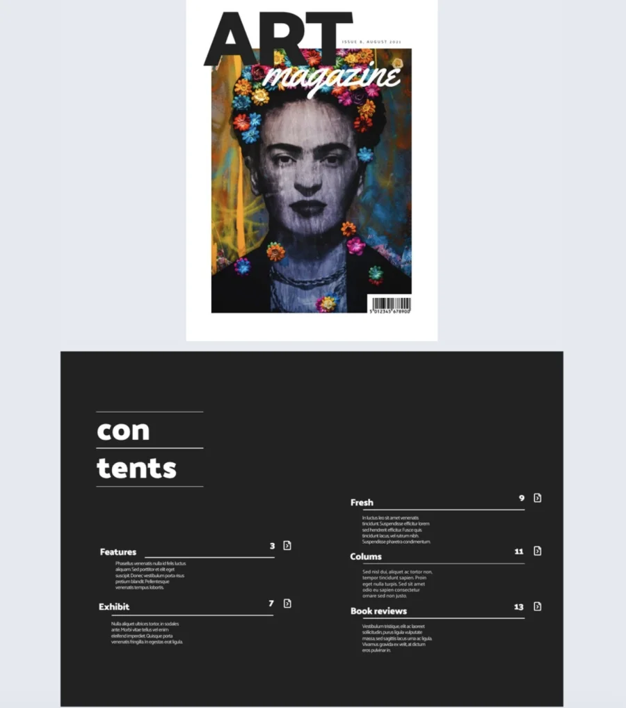
Big portrait with minimal text
A single, commanding portrait paired with very little text is one of the most enduring cover formats in magazine publishing. The image does most of the work. Text — usually just the masthead and a single cover line — stays out of the way.
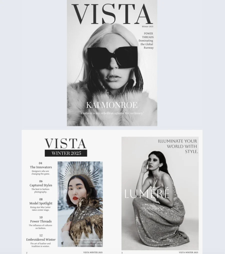

This style works best for fashion magazines, profile-led features, and personal story publications where the subject is the story. Direct eye contact from the cover subject creates an immediate connection with the reader. The minimal text keeps all the visual weight on the face, which is where the emotional pull lives.
The challenge is finding an image strong enough to carry the cover alone. When it works, though, it’s hard to beat for impact and memorability.
Bold color and block design
High-contrast color blocking trades photography for graphic impact. Strong shapes, limited color palettes, and solid fills create covers that are visually arresting even at a distance and highly recognizable across issues.
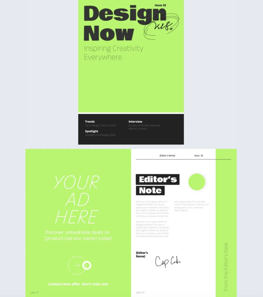
This style suits modern publications, design-forward brands, and magazines that want to stand apart from photography-heavy competitors on the shelf. It’s also a practical choice when a compelling hero image isn’t available for a particular issue.
The key is restraint. Bold color design works because it commits fully to simplicity. Too many colors or too many shapes and it becomes chaotic. One or two dominant colors, clean geometry, and confident typography are what make it land.
Collage grid
A collage grid arranges multiple images in a structured layout — rows, columns, or a combination of both. It signals variety and breadth, making it well suited to magazines that cover multiple topics in a single issue rather than leading with one dominant story.
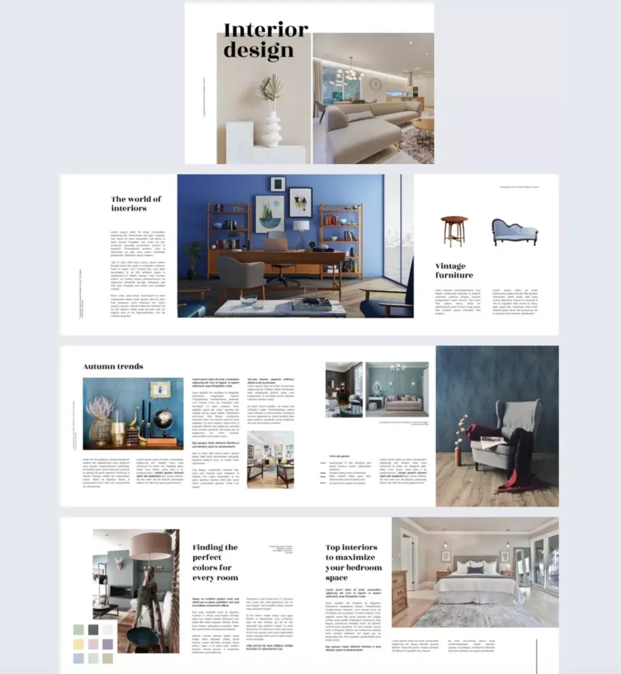
Design portfolios, arts and culture publications, and creative industry magazines use this style often. The grid format lets the cover preview the range of content inside without any single image needing to carry the full weight.
Getting it right requires careful attention to visual balance. Images need enough contrast with each other to create visual interest, but enough coherence — in tone, color, or subject matter — to feel like a deliberate composition rather than a random collection.
Full bleed photography
Full bleed means the image extends to every edge of the cover with no border or frame. At its best, it’s immersive. The reader feels drawn into the scene before they’ve processed anything else.
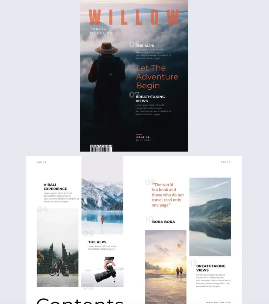
This style is a natural fit for travel, nature, and lifestyle magazines, where the image itself is the main draw. A sweeping landscape, an atmospheric street scene, or a beautifully lit product shot can make a full-bleed cover feel cinematic.
The main design challenge is text placement. Cover lines need to sit on areas of the image where they remain legible — which means avoiding busy, high-detail sections of the photo. A slight darkening or blurring of the background behind text, or choosing images with naturally clear areas, helps solve this.
Typography-led covers
Some covers dispense with photography almost entirely and let type do the work. A bold, expressive headline, which is sometimes the only element besides the masthead, becomes the visual itself.
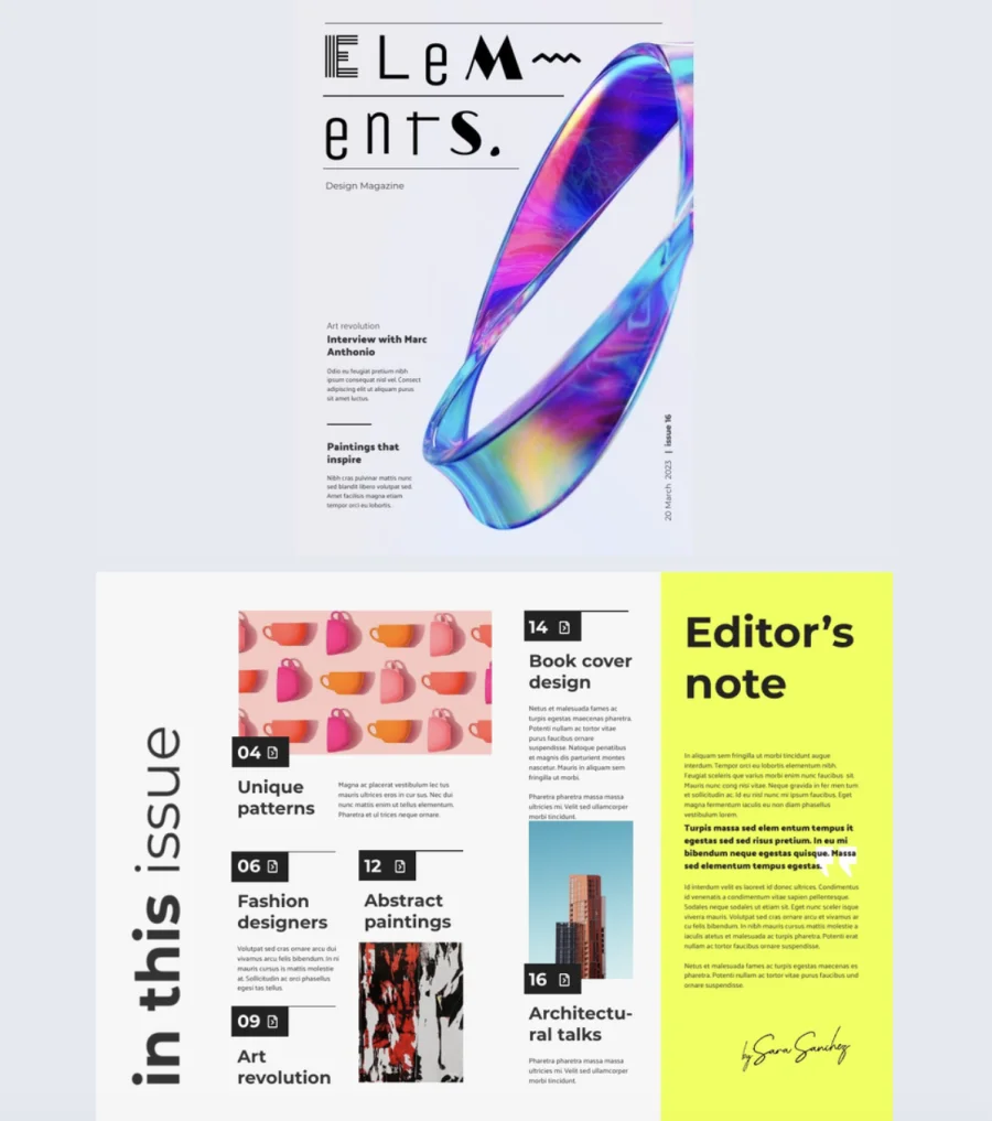
This approach works particularly well for literary magazines, academic publications, and avant-garde or experimental titles where the writing is the product and the design signals intellectual confidence. It can also work as an occasional departure from a photography-led identity, especially for themed issues.
Typography-led covers require genuine typographic skill to execute. The typeface, size, weight, layout, and color all need to be precise. A weak typographic cover looks like a design that ran out of images. A strong one looks entirely intentional — and often more memorable than a photographic alternative.
Illustrated covers
Hand-drawn or digitally illustrated covers bring a warmth and distinctiveness that photography can’t always replicate. An illustration is inherently unique. It can’t be found in a stock library or replicated with a different subject. That exclusivity has real value for publications building a recognizable visual identity.
Illustrated covers are common in niche, cultural, and independent publications — literary magazines, specialist hobby titles, arts journals, and long-running institutions like The New Yorker, which has made illustrated covers a defining part of its identity.
Commissioning a cover illustration takes more lead time than sourcing a photograph, and the cost depends heavily on the illustrator’s profile and style. But for publications where originality and distinctiveness matter, it’s often the most effective choice of all.
Design principles that make covers work
Good magazine cover design isn’t just about aesthetics. It’s about deliberate choices that serve the reader. These principles apply regardless of your visual style.
Less is more. Every element you add competes for attention. Lead with one dominant story, support it with two or three secondary cover lines, and cut everything else. A useful test: remove an element and see if the cover still communicates what it needs to. If it does, it wasn’t necessary.
Stay timely. Covers that align with a season, holiday, or cultural moment feel current. A seasonal color shift or a timely hero image is often enough. Keep your brand identity intact — seasonal relevance should add a layer to your visual identity, not replace it.
Make the lead story impossible to ignore. Size, weight, placement, and color should all point to the primary cover line. Write cover lines that create curiosity without giving the story away. “Why the rules of design are being rewritten” works harder than “A feature on modern design trends.”
Study your competitors. Look at what’s consistent across competing magazine covers: image style, color palettes, cover line tone. The publications that get noticed are usually doing something their competitors aren’t.
Test before you publish. Show two or three variations to a small group and focus the feedback on emotional response. “I’d read this” is more useful than “I like the blue one.” Even small adjustments to contrast, hierarchy, or copy can make a meaningful difference.
Take creative risks. The safest cover is rarely the most memorable one. Pushing against a convention — an unexpected image choice, a typography-led cover when photography is the norm — should feel deliberate, not random. The magazine covers that get remembered almost always took a risk worth taking.
Tools to design a magazine cover
1. Flipsnack
Flipsnack is purpose-built for digital magazine design and publishing. You design your cover inside the platform, and when you’re ready, you publish it directly from there as an interactive flipbook. There’s no need to export a file, convert a format, or move to a separate publishing tool.
For anyone creating digital magazines, that’s a significant advantage. The design and publishing workflow is handled in one place, which saves time and reduces the risk of formatting issues between steps. Flipsnack offers a library of customizable templates, interactive features like embedded links and video, and sharing options built into the platform.
Flipsnack also scales with your publication. Whether you’re producing a single issue or managing an ongoing publication with multiple contributors, the platform supports team collaboration, brand kit management, and publishing workflows that grow with you. If your magazine lives online, it’s the most complete option available without requiring any design background.
2. Canva
Canva is a free, easy drag-and-drop design tool with a large library of magazine cover templates. It’s well suited to beginners and to teams who need to turn around a design quickly. The interface is intuitive, the template range is wide, and the learning curve is low.
Canva works well for print covers exported as PDFs, and for digital covers shared as images. It doesn’t have a native publishing step for interactive digital magazines, so if you need your cover to be part of a fully interactive publication, you’ll need a separate platform to handle that.
3. Adobe InDesign
InDesign is the industry standard for magazine layout and cover design. It offers full control over typography, grids, margins, and bleed settings, and exports print-ready PDF files that meet professional print specifications. It has a steeper learning curve than browser-based tools, but for serious print production it’s a reliable option.
4. Affinity Publisher
Affinity Publisher is an alternative to InDesign at a significantly lower price. It handles page layout, typography, and print file preparation well, and it integrates with Affinity Photo and Designer for image editing and vector work within the same ecosystem. A good choice for independent publishers who need professional-grade tools without the Adobe subscription cost.
How to make a magazine cover in Flipsnack
Since Flipsnack handles both design and publishing in one place, these steps to creating a magazine cover take you from blank canvas to live publication without switching tools.
- Set up your publication. Choose a preset magazine size or set custom dimensions. Pick a template from the library or start from scratch. Upload your brand assets through Flipsnack’s Brand Kit to keep your cover consistent with your visual identity across every issue.
- Design your cover. Add your hero image, masthead, and cover lines. Adjust size, weight, color, and spacing to build a clear visual hierarchy.
- Add interactivity. Flipsnack lets you embed links, video, and other interactive elements directly into your cover. A cover line can link through to the full article. A video can autoplay when the publication opens. These features aren’t available in static PDF formats.
- Check accessibility. Before publishing, make sure your magazine is readable by the widest possible audience. Flipsnack includes accessibility features such as screen reader support and accessible text settings, so your cover and content meet the needs of readers with disabilities.
- Publish and track performance. When your cover is ready, publish it as an interactive flipbook without leaving the platform. Share it via link or embed it on your website. Flipsnack’s built-in analytics show you how readers are engaging with your publication, including where they enter, how long they spend, and which pages they visit most.
Conclusion
A great magazine cover isn’t the result of one good decision. It’s the result of many small ones made with intention: the right image, a clear hierarchy, a typeface that fits the publication, a color palette your audience recognizes, and a lead story that makes readers want to go further.
The fundamentals don’t change whether you’re designing for print or publishing digitally. What changes is the tool you use and the format you’re designing for.
If your magazine lives online, Flipsnack gives you everything you need in one place: a design environment, an interactive template library, and a publishing platform built specifically for digital publications. You can go from blank canvas to a live, shareable flipbook without switching tools or losing quality along the way.
Start with your audience. Build from the core elements. And don’t be afraid to push the design further than feels comfortable. The covers that get remembered almost always took a risk worth taking.
FAQ about magazine cover design
A good magazine cover combines a strong hero image, clear visual hierarchy, legible typography, and a color palette that reflects the magazine’s identity. It should communicate the magazine’s tone at a glance and make the reader want to look inside.
The most common sizes are A4 (210 × 297mm) for standard magazines and A5 (148 × 210mm) for compact publications. US publications typically use 8.5 × 11 inches. Custom sizes are possible but may affect printing costs and display options.
Print magazine covers should be 300 DPI. Digital covers for screen viewing can work at 72–150 DPI, though higher resolution is always preferable for retaining image quality across different screen sizes.
A masthead is the magazine’s title as displayed on the cover. It’s typically placed at the top of the cover, uses a consistent typeface, and is one of the most recognizable elements of a magazine’s brand identity.
A cover line should be short, specific, and curiosity-driven. Lead with the benefit or hook, keep it to one or two lines, and avoid giving away the full story. Strong cover lines make readers feel they’ll miss something important if they don’t open the magazine.
Thank you, this was very helpful!
I am very glad to hear you enjoyed this article!
This is awesome sause man
thes eis soa coooal and neace thanlk yoy sfo muach for wthis
this* is* so* cool* and* nice* thank* you* so* much* am this*