The most appetizing restaurant menu design practices
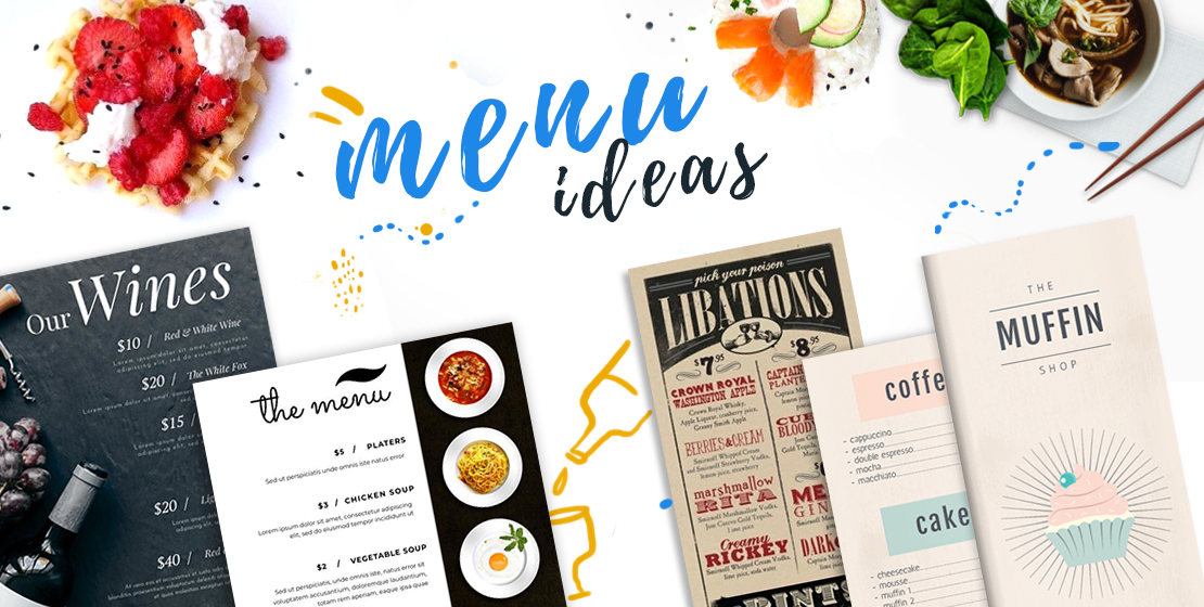
You’ve done it. You worked so hard to get your restaurant up and running and now the final step is to come up with a creative and attractive restaurant menu design. Or maybe you’re just looking for a little inspiration to give your old menus a little revamp.
Regardless of the situation, you’re in, your research has led you here, and it’s a good thing it has. Today, we’re going to be looking at a few design elements that go into making the perfect restaurant menu design. We’ll even go over a few examples to really get your taste buds wanting more.
It doesn’t matter if you’re a local brewery, small diner, or a Michelin star culinary museum, you might want to jot down a few of these restaurant menu design ideas for future reference.
The biggest elements of any restaurant menu design
Even though there are lots of different restaurants out there, most restaurants have similar elements in the design of their menus, and it’s by no coincidence. There are a few elements of a menu, some subtle, some not-so-subtle, that have been tried and tested over the years to be essential to a good restaurant menu design. Here are some of those elements:
- Images
- Color
- Font
- Descriptions
- Length
Believe it or not, it’s not really rocket science. It’s not really a science at all. All it is is the combination of the right elements. Of course, these combinations will vary depending on where you decide to eat, but the core elements remain the same.
In current times, the incorporation of health guidelines such as featuring ‘restaurant masks’ can also play a crucial role. Menus can include images or icons that signify mask policies, enhancing customer comfort and safety perceptions. This addition is particularly significant as it communicates adherence to health protocols, thus integrating practical health considerations into the aesthetic and functional aspects of menu design.
Let’s dive a little deeper and discuss these 5 elements a little further.
Perfect menu images
It’s probably not that big of a surprise to find out that images are one of the biggest deciding factors when someone is ordering from a restaurant menu. I mean, think about it. Would you rather order food based on a text that may or may not be what you’re picturing in your head, or would you rather open a menu, have a juicy burger greet you with its delicious golden-brown bun, and order with confidence?
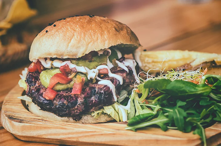
Let’s think about this a little deeper. Think about how many commercials you see with big fast-food chains promoting their latest creation. How good do those crispy french fries look? How about that refreshing soft drink?
Images sell products. Whether it’s a product image to let the people know what they’re getting, or a flashy image just to grab someone’s attention, images are always good.
Of course, you probably don’t want to have an image for every single item on your menu. Pick a few of your favorite dishes, get some really high-quality pictures of them, and use them to sell your food.
Special menu colors
Now, I know we said no science here, but this is a slight exception. Let’s think really quickly about all your favorite fast-food chains. What do all their logos have in common? If you said that they all have roughly the same color scheme, you’d be correct.
Not all restaurants have the same colors, but a lot of them do. Many of our favorite fast-food chains boast bright reds and yellows because they’re the colors that we most associate with food.
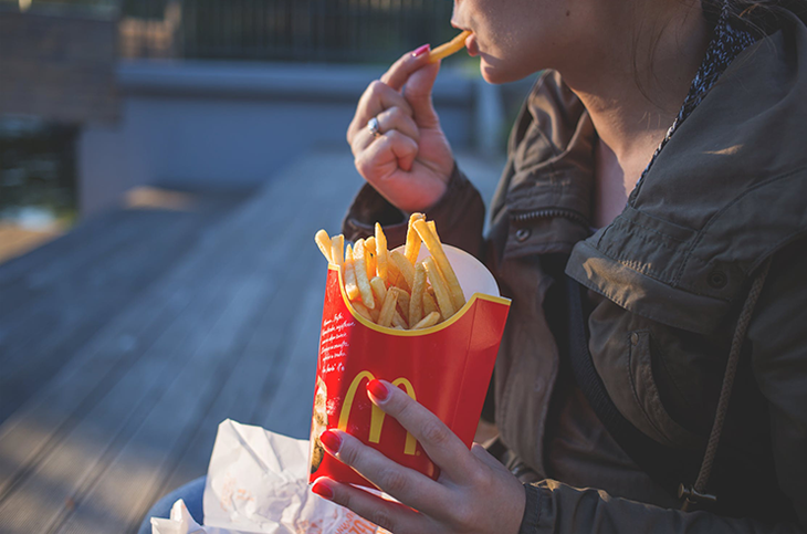
Now, I’m not saying to copy their color scheme. Nor am I saying to use those colors at all. What I am saying is that color matters. Like anything design-related, restaurant menus have to have a certain visual appeal (aside from the food). Anyone at any given time should be able to walk into your restaurant, pick up a menu, and not gag from a color explosion.
The colors that most often work best are the neutral ones. Black, grey, and white always work well in restaurant menu designs. Think about it. If your food is nice and vibrant, there’s no better way to show it off than with a nice, neutral background.
That being said, the moral of this story is to pick your colors wisely. If you try to get too crazy, people might get distracted from what they really came there for.
Menu font
Now, I know what you’re thinking: “Does font REALLY matter”? Well, to be honest, yes. Even though font doesn’t directly relate to food, menu fonts do help people put together the right dots and make them think about food. It’s not a super-advanced technique, but the right font can make a huge difference in the overall restaurant menu design.
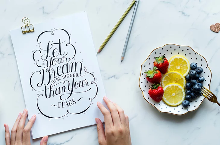
While we’re on this note, it’s best to stick to just one or two fonts. Much like the colors, too many different fonts can be a real turn-off. You can do something simple like one font for the name of the restaurant and one font for the rest of the menu, for example.
Keep it clean and simple, and you’ll thank yourself later.
Food descriptions
It’s true, images sell. But only when they’re paired with decent food descriptions. Your menu should not only boast the very best images of the food, but they should also perfectly describe it.
Remember those food items that don’t get a picture? Those are the ones that especially need a poetic description. This is probably one of the most important elements in any good restaurant menu design.
The combination of the right adjectives can really turn a mediocre dish into a bestseller. Words like tender and crispy are great examples of adjectives for food. Honestly, think about how much you would prefer to order the “Crispy french fries” over the normal fries.
Arguably, it’s the combination of all the elements above that really sets a menu apart. With the right images, colors, and descriptions, you can have guests drooling at the mouth without even taking a bite.
Restaurant menu length
One thing that is almost always overlooked in restaurant menu design is the length of the actual menu. This may be my inner Gordon Ramsey speaking, but a long menu can be quite overwhelming.
The key here is to keep it short and simple. You don’t want to keep things on your menu that don’t sell. They’re taking up space and wasting a lot of money in the process. People want to come into your restaurant and quickly find what they want, not search through a 10-page booklet for a mediocre meal.
That being said, it may be best to experiment a little. In addition to finding the right fonts, colors, and words to use, you should also play around with what should be offered on your menu. This process could take weeks, months, or even years to get right. But it’s incredibly worth it.
The best restaurant menu design examples
Now we’ll talk about what a lot of you have probably been waiting for. I’m quite a visual learner myself, so examples always have been and always will be my favorite part of any article. So with that said, here are a few of my favorite restaurant menu designs that I’ve found:
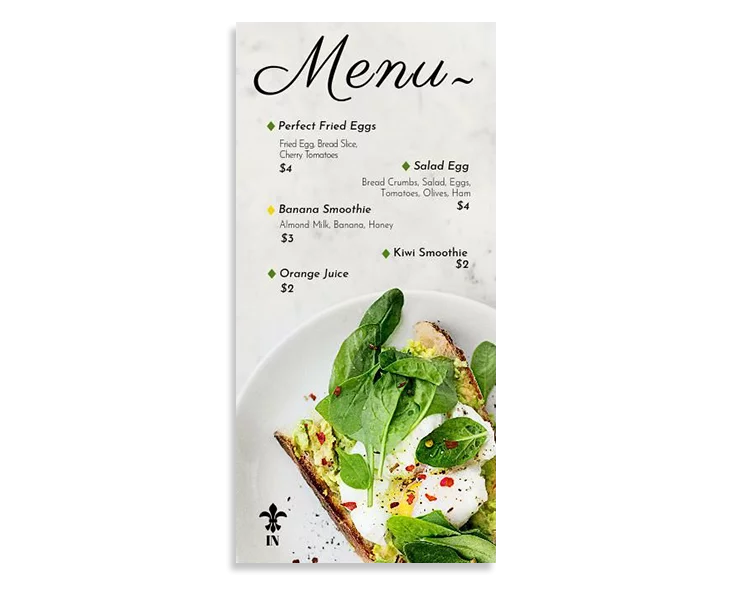
If you like this menu, click here to use and edit it for free!
I really like this design because it combines most of the restaurant menu design elements that we talked about above. You have a high-quality image right in the middle, simple and tasteful fonts, and a nice color palette that compliments the vibrant green in the image. To top it all off, the menu is simple and not too long. You can also download this particular template by following the link attached to the image.
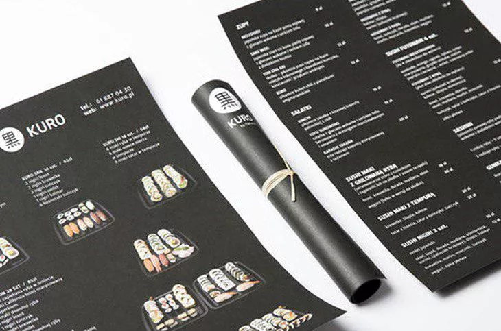
Black background, unique and visually stunning images, plus a simple design? What more could you want? This restaurant menu is a great example simply because it has a simplistic look to it, yet it still manages to pull off a unique appearance.
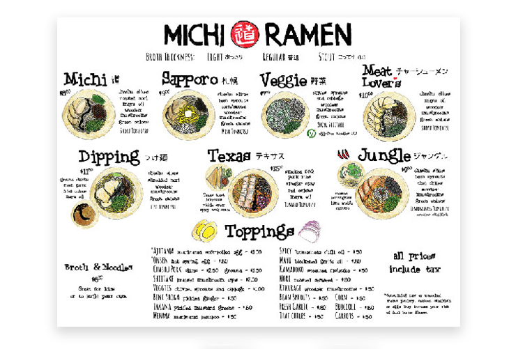
For such a simple dish, this ramen restaurant menu is so visually striking. It all fits on one page, plus the unique, handwritten font really sells the food. Just looking at this menu makes me want to eat some ramen for lunch today.
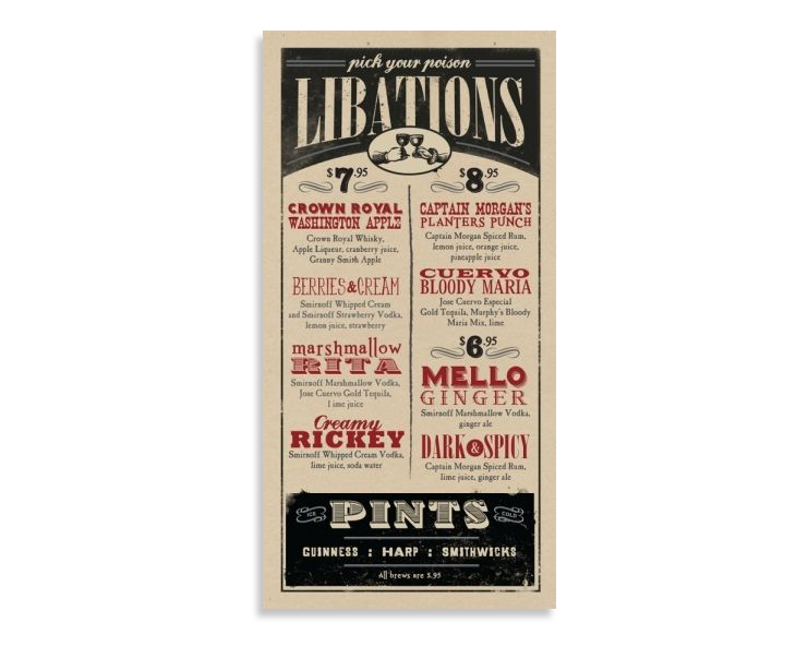
Now, I know what we said about images and fonts, but hear me out. This particular menu uses its fonts to help describe the food you’re ordering. The fonts themselves serve as visuals, fonts, and descriptions. Quite genius if you ask me.
Try a QR code for your restaurant’s menu
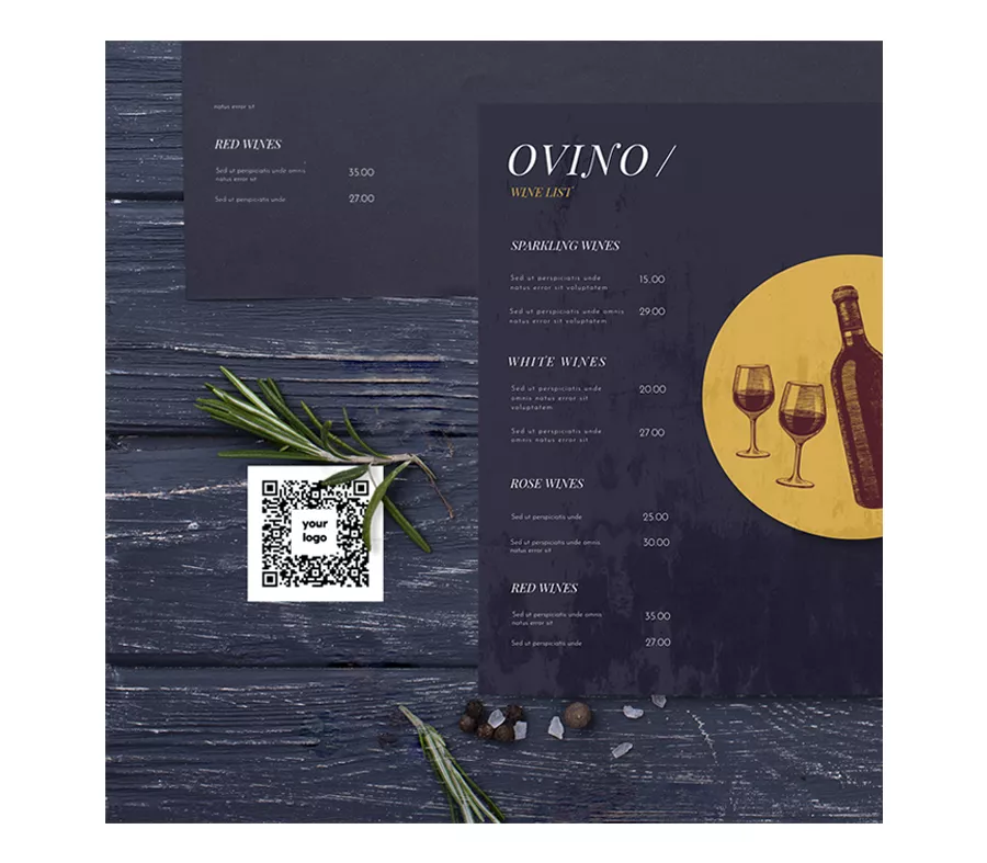
One thing that you should definitely consider, is to have a QR code for your restaurant’s menu. If you wonder why, first of all, having a Digital Menu is much more hygienic, especially after the pandemic context. Instead of having your clients always flipping through a printed menu that thousands of people had, allowing them to quickly scan a QR code on their mobile phones seems to be a pretty good idea. So one thing that you should definitely consider is to generate a dynamic QR code for your restaurant’s menu.
Bon appetit
So, what can we take away from this? Restaurant menu design is an art form. Not only is it a way to display your delicious foods, but it’s a way to make your restaurant stand out, especially as you move into digital-like building your own restaurant app. display your delicious foods, but it’s a way to make your restaurant stand out dramatically.
It doesn’t matter if you’re creating a menu for a brand new restaurant, or reworking an old menu for an established one, following these simple few tips will definitely help you create a masterpiece.
