How to Create a Community Health Needs Assessment Report
Published on: 06 July, 2026
If you’re responsible for a community health needs assessment report at a hospital, health system, clinic, nonprofit, public health department, or local coalition, you know it’s more than paperwork. It turns months of data collection and community input into a public-facing document that has to be clear, credible, and useful.
For nonprofit hospitals, it also has to be done every three years under IRS rules. Yet too often, the final report ends up as a long, static PDF that few people open, instead of a secure medical PDF that’s easy to open. That’s a shame, because it’s meant to guide decisions, inform partners, and serve the community.
This guide walks you through a community health needs assessment report, section by section, so you know what belongs in each part. It also shows how to design and publish it as an interactive, shareable report with Flipsnack.
Table of contents
- What should a community health needs assessment report include?
- How to create a community health needs assessment report: Step by step guide
- How to create your community health needs assessment report with Flipsnack
- A real community health needs assessment report example
- Common mistakes to avoid
- CHNA report checklist before you publish
- Turn your assessment into a report people actually read
- Frequently asked questions
A community health needs assessment report is the written, public document that presents a community’s most significant health needs, the data behind them, and the plan to meet them. It’s the final output of the CHNA process. It’s the record that turns research and community input into shared priorities.
Hospitals and health systems, public health departments, and community coalitions often produce these reports, and they frequently work together. Whoever leads the work, the goal is the same. You define the community, gather primary and secondary data, and prioritize the needs that matter most. Then you write it all up in a clear report anyone can read.
What should a community health needs assessment report include?
A community health needs assessment report should include 11 sections: executive summary, community profile, methodology, community input, key findings, priority health needs, progress since the last assessment, community resources and partners, recommendations and strategy, limitations, and appendices.
Use the table below as a section-by-section template: each row is a section of the report and what belongs in it. Copy it as your starting outline, then fill in each part with your own findings.
| Report section | What to write |
| Executive summary | Community, process, top priority needs, and next steps |
| Community profile | Demographics, geography, social determinants of health, priority populations |
| Methodology | Data sources, methods, participation, and dates |
| Community input | Survey results, focus-group themes, quotes, and who took part |
| Key findings | The main data story and the evidence behind it |
| Priority health needs | Each ranked need, its supporting data, and who’s most affected |
| Progress since the last assessment | Past priorities, actions taken, and measurable results |
| Community resources & partners | Assets available to address each priority need |
| Recommendations & strategy | Strategies, partners, resources, and timelines |
| Limitations | Sample size, missing data, and other gaps |
| Appendices | Survey instruments, data tables, and partner lists |
Here’s what goes into each section.
Executive summary
The executive summary is the part most people will read, so write it last and make it count. In a page or two, cover the people you studied, how you ran the assessment, the top needs you found, and what you plan to do next. A reader should be able to grasp your main findings from this section alone.
Community profile
The community profile sets the scene. Describe who lives in your community and where. Use demographics, geography, and the social determinants of health, like income, housing, education, and access to care. Call out priority populations, such as rural residents or underserved groups. And include the key health indicators that shape the rest of the report.
Methodology
The methodology section shows your work. Explain your data sources, the methods you used, who took part, and the dates you covered. You’ll draw on two kinds of data: primary data that you collect firsthand, and secondary data that already exists. Clear methods let readers judge how solid your findings are.
Community input
This is where the community’s own voice comes through, and many reports handle it poorly. Sum up your survey results, your response rate, and your participation demographics, then add the main themes from focus groups and interviews. Show who took part, so readers can see the input was broad. Real quotes bring the data to life and prove you listened, not just counted.
Key findings
Your findings section tells the data story. Lead with a plain summary of what the data shows, then back it up with the numbers. Don’t just dump tables, pair a short story with charts, tables, and maps, so readers see the pattern and not just the figures. A good data display is the difference between a report that informs and one that overwhelms.
Priority health needs
This is the heart of the report. For each health need you found, explain what it is, share the data behind it, name who’s most affected, and say why it ranked where it did. Most assessments land on three to six priorities. Name your prioritization criteria too, such as severity, urgency, magnitude, feasibility, and equity impact. That shows the ranking was deliberate, not random.
Progress since the last assessment
Show what has changed since your last cycle. Restate the priorities you set before, the actions you took, and the progress you can measure. Note any gaps, the lessons you learned, and what will carry into your new plan. This section is easy to skip. But it proves you followed through, and a full report is expected to have it.
Community resources & partners
A need is easier to act on when you know what’s already there to help. List the resources and partners that can address each priority need. That means clinics, public health agencies, nonprofits, schools, food and behavioral health programs, transportation services, funders, and coalitions. In a digital report, this works well as a clickable directory. Each entry links straight to a partner.
Recommendations & strategy
Recommendations connect findings to action. For each priority need, describe how you plan to meet it. Name the strategy, the partners involved, the resources you need, and the timeline. Where you don’t plan to address a need, say so and explain why. This is the section that turns an assessment into a plan people can follow.
Limitations
Being honest about limitations makes your report stronger, not weaker. Note anything that shaped the findings, like a small sample size, missing data, gaps in participation, or tight timing. Readers trust a report more when it’s clear about what it can and can’t claim.
Appendices
The appendices hold the detail that would clutter the main report. Put your survey instruments, full data tables, and partner lists here. In a digital report, linked navigation lets readers jump to an appendix and back. They never lose their place.
How to create a community health needs assessment report: Step by step guide
Once you have your research in hand, building the report is simple. These six steps take you from raw findings to a published report. The first steps are about content, while the last two are about design and publishing, which is where Flipsnack comes in.
- Gather and organize your findings. Pull together everything you’ve collected: your data and your community input. This is the raw material for the report. Sort it by theme or by health need, so you can see the story it tells before you start writing.
- Outline the report. Use the template above as your skeleton, and drop your findings into the sections where they belong. An outline keeps a long report in order, and makes sure you don’t miss a required part.
- Draft each section. Write in plain language, leading each section with its key point, then adding the detail. Keep sentences short and let the data do the talking. Don’t polish yet — just get a full draft down.
- Design and visualize. Turn your numbers into charts, tables, and maps, so readers can see the patterns. This is where the report stops being a wall of text and becomes something people want to read.
- Get final review and adoption. Before it goes out, check the report with care. Confirm your data is accurate, your community input is on record, and the report is easy to reach. Run any legal or compliance review your team needs, then get the final version formally approved by the right authority before it’s official.
- Publish and share it publicly. A report like this is meant to be read, so publish it where people can find it and share it widely. Flipsnack lets you publish a public, interactive version and embed it on your website, and the next section covers exactly how.
What data goes into the report, and where to find it
A good report rests on good data. So it helps to know the two types you’ll use. Primary data is what you collect firsthand, through surveys, focus groups, interviews, and asset mapping. Secondary data already exists, gathered by public agencies. Most assessments use both. They also mix quantitative data (the numbers) and qualitative data (the context and lived experience behind them).
For secondary data, a few free, trusted sources cover most of what you need:
- U.S. Census Bureau and the American Community Survey — population, income, housing, and demographics.
- CDC — health behaviors, chronic disease, and outcomes.
- County Health Rankings & Roadmaps — county-level health factors and comparisons.
- SparkMap — community needs assessment data and maps by location.
- State and local health departments — local reports and datasets, often not available anywhere else.
Start with secondary data to see what’s already known. Then use primary data, like a community survey, to fill the gaps and add local voice.
How to create your community health needs assessment report with Flipsnack
Most reports end up as a flat PDF that few people ever open. Flipsnack lets you build the same report as a branded, interactive, mobile-friendly flipbook, then publish a public version you can link to or embed on your website. Here’s the workflow, from blank page to published, trackable report.
Step 1: Start from a report template, or upload your current PDF
- Pick a ready-made template and build your report right in Flipsnack, or upload a CHNA PDF and turn it into a digital flipbook in minutes.
- If you build the layout natively, you can save it as a branded template and reuse it for the next cycle.
- If you upload a finished PDF, you can still add links, branding, and navigation on top of it, but treat it as a base layout rather than a fully editable design.
- Since you’ll repeat this report every few years, building it natively usually pays off starting with the second cycle.
Step 2: Organize the sections in the Design Studio
- Flipsnack’s Design Studio is a drag-and-drop editor, so you don’t need a designer to build a polished report.
- Lay out your pages to match your template: executive summary, community profile, methodology, findings, priorities, and the rest.
- Add your text, images, and pages.
- Apply your logo, brand colors, and fonts.
- Depending on your plan, publish under a custom domain and add custom branding, so the report matches your website.
Step 3: Collaborate with your team
- Invite colleagues into a shared workspace and assign roles: editors and contributors build and refine the report, while only owners and admins can publish it.
- Use the takeover feature when two people need to work on the same page, so a teammate can pick up where another left off without overwriting their work.
- Have reviewers leave comments directly on the pages, keeping feedback and approvals in one place instead of scattered across emailed PDFs.
Step 4: Add data visuals, community voices, and navigation
- Data visuals. Use Flipsnack’s chart element to turn survey rankings, health indicators, or priority scores into bar, pie, or line charts linked to a Google Sheet. Add maps to show the service area, priority neighborhoods, or local resources.
- Community voices. Add short video or audio clips of resident and stakeholder interviews next to your quotes, so readers can hear residents, not just read a number.
- Navigation. Add a linked table of contents and go-to-page buttons so readers can jump straight to the section they need. Turn your resources-and-partners list into a clickable directory, with each partner linking out to its services.
- Keep heavy, explorable visuals in embeds or pop-ups, so the main page stays clean and easy to read.
Step 5: Enable accessibility
- Flipsnack’s flipbook player is built to meet WCAG 2.1 Level AA, ADA, and Section 508 standards: it’s fully keyboard-navigable, with controls labeled for screen readers.
- The content on your pages isn’t made accessible automatically, so open the Accessibility panel and turn it on.
- Add a title and description for each page.
- Use the AI tool to generate page summaries, then review them. These summaries are what a screen reader reads aloud.
Step 6: Publish, share, then track and update
- Publish the report as public, so anyone can find it by link or search, and embed it on your website.
- Share it however suits your audience: direct link, QR code, email, or embed.
- Keep a downloadable copy available for anyone who wants to save or print it.
- Reserve private options, like password, SSO, or a one-time passcode, for internal review only, never for the final public version.
- Once it’s live, use Flipsnack’s analytics or Google Analytics to track views, clicks, and reading time, so you can see whether people engage with the findings.
- When you edit a Flipsnack flipbook, the link stays the same and the embed updates in place, so you never have to replace files across your site. For a formally adopted report, add a version note and check your compliance process first.
A real community health needs assessment report example
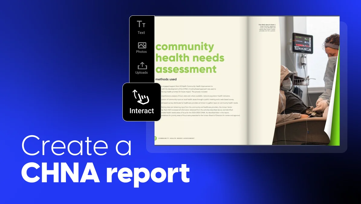
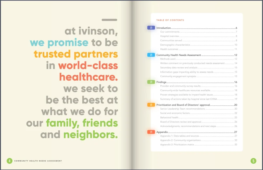
It’s easier to picture the structure when you can see a finished one. Ivinson Memorial Hospital’s Community Health Needs Assessment shows how a formal CHNA report can work as a digital flipbook. It has clear sections, visual findings, and a path from community input to approved priorities.
What to borrow: a clear report structure
The table of contents makes the report easy to scan before readers dive in. It separates the introduction, the assessment process, the findings, the ranking, the board approval, and the appendices. Use the same logic in your own report. Help readers move from context, to data, to priorities, to next steps, without searching through a long document.
What to borrow: scannable findings
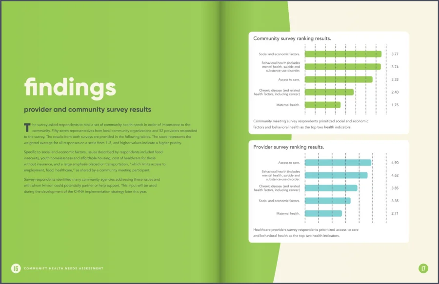
The findings page turns survey results into simple visual rankings with a short note, which beats dropping raw data in with no read on it. When you present your own findings, pair charts or tables with a plain-language takeaway so readers see what the numbers mean.
What to borrow: transparent prioritization
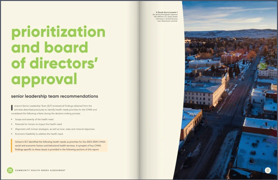
The ranking page explains the prioritization criteria used to pick the final health needs. These include severity, feasibility, alignment, and the group’s ability to make an impact. This is one of the most important parts of a CHNA report. Readers should see not only what priorities were chosen, but why.
Use this example as a reference point, not a layout to copy page by page. Focus on the practical details: how the report is organized, how the data is explained, how the priorities are justified, and how the final document helps the public see what happens next.
Common mistakes to avoid
Even a well-researched community health needs assessment can fall flat in the report. Here are the mistakes that weaken reports most often, and how to avoid each one.
- Defining the community too vaguely. If readers can’t tell exactly who and where your community is, the rest of the report loses focus. Define it clearly by geography and population before you present any findings.
- Treating community input as a box to check. Gathering a few survey responses and moving on isn’t real engagement. Seek input from a broad range of residents, especially those most affected, and show whose voices you heard.
- Dumping raw data with no synthesis. Pages of tables don’t tell readers what matters. For every set of numbers, say what it means and why it counts. Then let the data back you up.
- Skipping a clear prioritization method. If needs seem to be ranked at random, readers won’t trust the priorities. Name the criteria you used, such as severity, urgency, and equity impact, so the ranking is transparent.
- Recommendations that aren’t tied to the data. Every recommendation should trace back to a specific finding. If a proposed action doesn’t connect to a documented need, either link it clearly or leave it out.
- Locking the public report behind a login or password. The report is meant to be public. A version that needs an account, a password, or personal details defeats the purpose. Keep the final public version open to everyone.
- Forgetting downloads and paper copies. Some readers will want to save, print, or request a copy. Make sure people can download the report freely, and keep it open to anyone who asks.
- Publishing without thinking about reader experience. A dense report may look complete. But if readers can’t navigate it easily, the findings are less likely to be used. Add clear sections, visual summaries, links, and a format that works well on mobile.
CHNA report checklist before you publish
Before you publish, run through this checklist. It helps make sure your report is complete, credible, and easy for everyone to reach. Each item reflects something readers or reviewers will look for.
Content
- The community is clearly defined by geography and population.
- Community input was broadly solicited and documented.
- The methodology is complete, with sources, methods, and dates.
- All data is cited.
- Priorities are justified with clear criteria.
- Progress since the last assessment is included.
- Community resources and partners are identified.
- Limitations are disclosed honestly.
- Every recommendation ties back to a documented need.
- The implementation strategy is included or linked.
Approval
- The report has been reviewed and formally adopted by the right authority.
Accessibility
- Accessibility is enabled, with page titles and descriptions reviewed.
- Images and charts are described for screen readers.
- Links are clearly labeled.
Public access
- The public version is free to view, with no login, fee, or personal details required.
- Readers can download and print the report.
- A free copy is there for anyone who asks.
Tick every box and your report is ready to publish: complete, transparent, and open to the community it serves.
Turn your assessment into a report people actually read
You’ve done the hard work of learning your community’s health needs, so don’t let it disappear into a static PDF. Build your community health needs assessment report in Flipsnack, then publish a digital version your whole community can open, read, and share.
The format does some of the work for you. A flipbook opens right in the browser, works well on a phone, and lets people jump straight to the part they care about. Add the link to your website, your email footer, and your social posts, and hand out the QR code at community events. The more ways people can reach the report, the more the findings get used. And when the next three-year cycle comes around, your template is ready to go.
Frequently asked questions
Yes, for nonprofit and charitable hospitals. Under the Affordable Care Act, the IRS requires these hospitals to conduct a community health needs assessment to keep their tax-exempt status, under Section 501(r). Other groups, such as public health departments and nonprofits, often do one by choice, since it guides planning and strengthens grant applications even when the law doesn’t require it.
A CHNA must be completed at least once every three years. Between assessments, groups are expected to monitor progress on the priorities they set and the strategy they adopted. A three-year cycle also lets you reuse your report structure and data sources each time, which makes every new assessment faster than the last.
Beyond meeting the rules, a CHNA gives everyone a shared, evidence-based picture of what a community needs most. That shared view aligns partners, backs funding and grant requests, cuts wasted effort across groups, steers resources toward equity, and builds trust with the community. Done well, the report becomes a working tool for planning, not just a document that sits on a shelf.
They’re three linked but distinct things. A community health assessment (CHA) is a broad look at a community’s overall health. A community health needs assessment (CHNA) is the specific assessment and written report tied to hospital rules. And a community health improvement plan (CHIP) is the action plan built afterward, to tackle the priorities the assessment found.
They’re often confused, but they’re not the same. A survey is one tool for gathering data: a set of questions sent to residents or stakeholders to capture their input. The report is the full written document that pulls together all your data, including survey results, and presents the community’s needs, priorities, and plan. The survey feeds the report; it doesn’t replace it.