Education Website Design: Best Practices and Inspiring Examples for 2025
In 2025, an educational institution’s website serves as its digital front door, often making the first and most lasting impression on prospective students and their families. Whether you’re a prestigious university, a K-12 school, or a specialized academy, your website must do more than simply exist—it needs to engage, inform, and convert visitors into enrolled students.
This comprehensive guide explores the best education website design practices, showcasing real-world examples from top institutions and providing actionable strategies you can implement regardless of your school’s size or budget.
Table of contents
- How student behavior has changed: the 2025 landscape
- Essential elements of effective education website design
- Higher education website design: university and college examples
- K-12 School Website Design: Elementary and High School Examples
- Must-have features for education websites in 2025
- Beyond your website: comprehensive school communication strategy
- Conclusion
How student behavior has changed: the 2025 landscape
Before diving into design principles, it’s crucial to understand how prospective students interact with educational websites today. According to the 2025 E-Expectations Trend Report by RNL, student behavior has decisively shifted toward “stealth shopping”—researching institutions while protecting their anonymity.
Key findings that should shape your website strategy:
- 56% of students now begin their journey on social media to assess campus culture and “vibe” before visiting your official website
- 91% still consider the website the most trusted resource, but it now serves as a validation tool rather than an inquiry point
- Only 31% will complete a “Request More Info” form, preferring anonymous AI chatbots (68% usage) or simply abandoning their search if information isn’t publicly accessible
- Universities now spend an average of $2,849 in marketing costs to enroll a single student, with major institutions like Southern New Hampshire University utilizing budgets in the hundreds of millions
What this means for your website: Make all critical information—costs, program requirements, campus life details—publicly visible without login gates. Your website must earn trust immediately and provide value to anonymous visitors who may never fill out a form.

Essential elements of effective education website design
Regardless of whether you’re designing a university website or an elementary school site, these core principles apply:
1. Mobile-first, responsive design
With mobile devices generating more than 60% of global web traffic and prospective students increasingly researching on their phones, your site must deliver a seamless experience across all screen sizes, with touch-friendly navigation and fast loading times.
2. Clear information architecture
Prospective students and parents should find what they need within three clicks. Organize content around user goals: admissions, academics, campus life, costs, and contact information.
3. Authentic visual storytelling
Stock photos don’t cut it anymore. Use genuine images and videos of your actual students, faculty, and campus. Video content, in particular, helps convey the “vibe” students seek before even visiting your institution.
4. Accessibility compliance
Your website must meet WCAG 2.1 AA standards at a minimum. This isn’t just about compliance; it’s about ensuring every prospective student can access your information.
5. Transparent information
Display costs, program requirements, and application processes upfront. You shouldn’t gatekeep this information behind forms.
Higher education website design: university and college examples
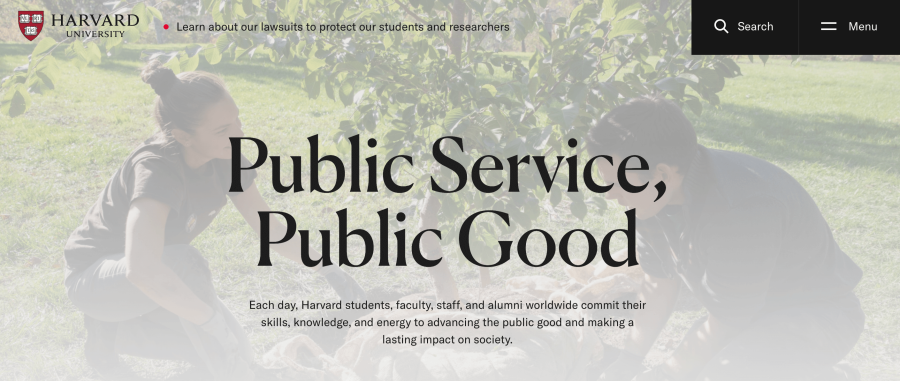
1. Harvard University: mission-driven storytelling
What makes it effective:
Harvard’s website demonstrates how even the most prestigious institutions prioritize clear communication over flashy design. The homepage features stories about community impact, service programs, and research—immediately conveying the university’s mission of developing leaders who make a difference globally.
Key design elements:
- “In Focus” feature: A weekly deep-dive into single important topics (like climate change or democratic processes) with curated content from across the university
- Video storytelling: Programs like the Family Van (improving healthcare access) and Project Swim showcase real impact through authentic video content
- Clear navigation: Six main categories (Academics, Campus, Visit, About, News, In Focus) make the vast university accessible
- Crimson branding: Harvard’s signature color (#A51C30) provides visual consistency without overwhelming content
Takeaway for your institution: Let your mission drive your homepage content. Instead of generic “welcome” messages, show what your institution does through real stories and authentic video.
2. Princeton University: research-focused homepage
Princeton’s homepage highlights faculty achievements (recent hires, awards), quantum science research, and humanities initiatives.
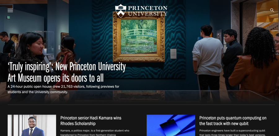
Observable elements:
- Faculty prominence: Homepage features new faculty and researcher profiles
- Research content: Quantum science, humanities projects, and breakthrough discoveries featured
- Princeton Orange: Pantone 158 used as accent color throughout
- Areas of study: Clear navigation to departments and programs
Takeaway for your institution: If research defines you, make discoveries and faculty achievements visible on your homepage.
3. Manhattan School of Music: program-focused structure
For specialized institutions like music conservatories, the website must convey the experience of attending, not just list program offerings.
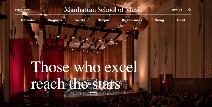
Design takeaways:
- Bold color psychology: Dark red accents create energy and passion—appropriate for a performing arts institution
- Dynamic homepage: Creative slideshow and hover effects provide a glimpse into campus life
- Visual storytelling: High-quality images of students performing create an emotional connection before prospective students read a single word
Takeaway for your institution: Let your unique culture drive design decisions. A technical university might emphasize innovation through interactive elements, while a liberal arts college might showcase diverse student experiences.
4. Sorbonne University: disciplinary color coding
Sorbonne’s approach to organizing a comprehensive university demonstrates how color can aid navigation across complex institutions.
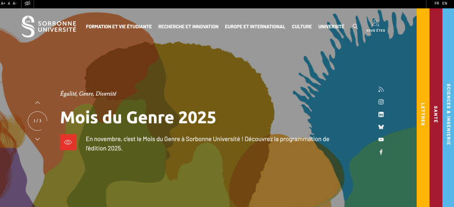
Design strategy:
- Faculty-specific colors: Yellow for Letters, blue for Sciences & Engineering, red for Medicine
- Navigation: Eye-catching menu design balances aesthetics with functionality. It also has accessibility features, which is a big plus.
- 21st-century positioning: Modern design choices reinforce their messaging about contemporary education
Takeaway for your institution: If you have multiple schools, departments, or campuses, consider using color coding as a wayfinding tool throughout your website.
K-12 School Website Design: Elementary and High School Examples
High school and elementary school websites serve a dual audience: students and parents making enrollment decisions. The best designs address both groups’ needs.
5. Thomas Jefferson High School for Science and Technology: functional innovation
This school’s website reflects its mission through advanced features that serve students and parents daily.
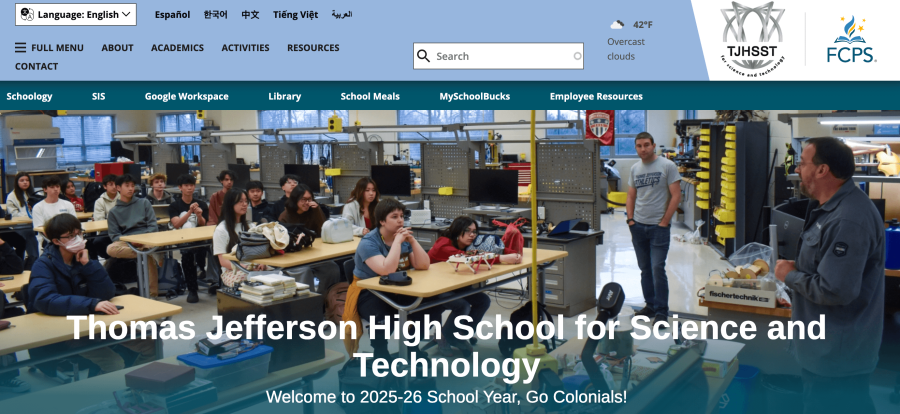
Standout features:
- Integrated systems: Direct links to SIS (student information system), library resources, and lunch menus
- MySchoolBucks integration: Students can pay fees and browse the school store directly from the website
- Clean announcements section: Facilitates student-parent-school communication without clutter
Takeaway for your institution: Your website can be a daily tool, not just a marketing brochure. Consider what recurring tasks parents and students perform and integrate those functions.
6. Abbotsleigh: Heritage meets modern design
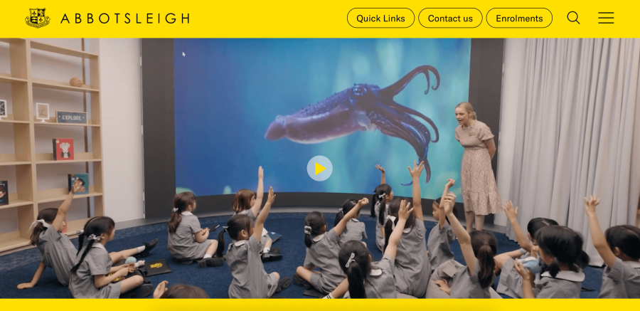
This 133-year-old Australian girls’ school demonstrates how institutions with long histories can create contemporary websites.
Design excellence:
- Full-width hero video: Homepage features large video player with authentic student imagery featuring different classes
- Professional aesthetic: Black and yellow color scheme maintains brand consistency and professional images of actual students in learning environments
- User-friendly navigation: Combined traditional menu with hamburger navigation for mobile
Takeaway for your institution: Bold color choices and clean typography can differentiate your school immediately. The yellow scheme is memorable and consistent with their 140-year heritage while feeling contemporary.
7. Little Dolphins By The Sea: personality-driven design
Elementary school websites can embrace playfulness while remaining professional—this Santa Monica school proves it.

Creative approach:
- Color-forward design: Vibrant, energetic palette reflects the joy of early education
- Boxed navigation: About, Curriculum, Enrichment, Community, Admissions, and other important website parts displayed in visually distinct modules
- Age-appropriate imagery: Photos and graphics appeal to both children and decision-making parents
Takeaway for your institution: Your website’s personality should reflect your student population and educational philosophy. Don’t default to corporate design for schools serving young children.
Must-have features for education websites in 2025
For universities and colleges:
- Virtual campus tours with 360-degree photography or video
- Program-specific landing pages optimized for search and paid advertising
- Student testimonial videos featuring diverse experiences and outcomes
- Clear ROI data showing graduate outcomes, employment rates, and salary information
- Financial aid calculator that provides estimates without requiring form submission
- Faculty research highlights demonstrating institutional expertise
For K-12 schools:
- Online enrollment system reducing administrative burden and parent frustration
- Calendar integration with automatic updates for events, holidays, and schedule changes
- Parent portal access for grades, attendance, and teacher communication
- Safety and security information prominently featured
- Extracurricular program showcases with photos, videos, and registration information
- Staff directory with easy contact options for teachers and administrators
Beyond your website: comprehensive school communication strategy
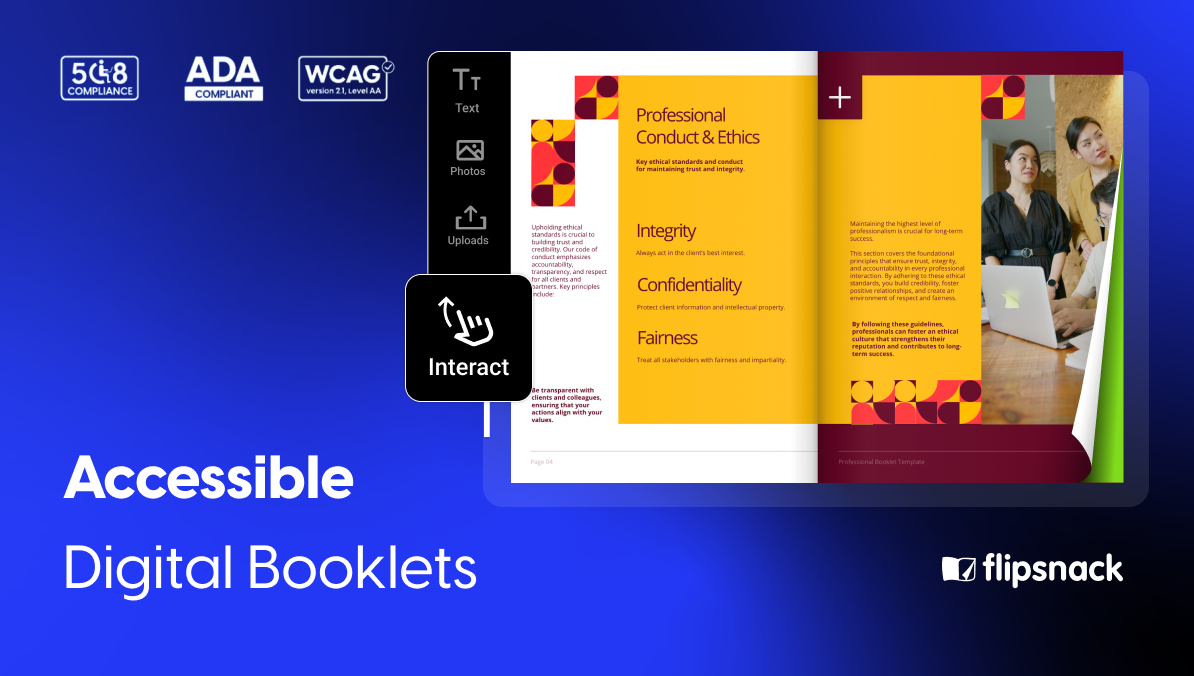
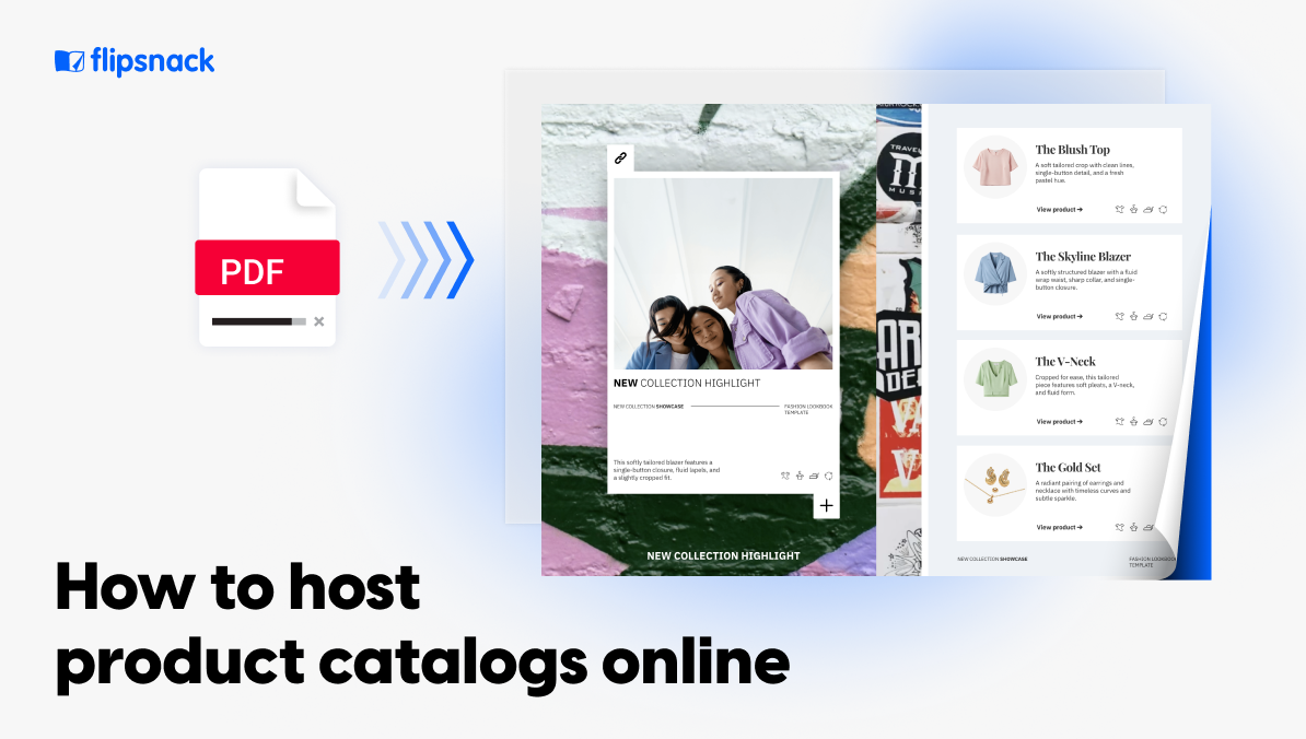
Your website forms the foundation of your digital presence, but a complete communication strategy requires additional tools to reach different audiences across multiple channels. Flipsnack helps educational institutions extend their reach and maintain consistent branding across all touchpoints. Here’s how schools and universities use the platform:
- Embed on your website – Showcase prospectuses, course catalogs, and program guides directly on your site without sending visitors to external links.
- Support student portfolios – Help students build digital portfolios that highlight their work and achievements throughout their academic journey.
- Send email newsletters – Keep parents, alumni, and prospective students informed about campus events, enrollment deadlines, and program updates with school newsletters.
- Share on social media – Distribute materials across your social channels to reach wider audiences.
- Track engagement with shareable links – Generate trackable links for recruitment campaigns to see which materials resonate with your target audiences.
- Collaborate across departments – Use team collaboration features and brand templates so multiple departments can create consistent marketing materials while maintaining your institution’s visual identity.
Here are some free templates to get you started:
Editable University Prospectus Template

Interactive Campus Recruitment Brochure Template
Undergraduate School Prospectus Template
Digital College Prospectus Example
Primary School Brochure Template
Conclusion
Your education website design directly impacts enrollment, shapes your institution’s reputation, and determines whether prospective students move forward in their journey or click away to a competitor.
Whether you’re leading a prestigious university with centuries of brand equity or a small K-12 school building your digital presence from scratch, the principles remain the same: prioritize user experience, embrace authenticity, make information accessible, and ensure your website reflects the quality of education you provide.
Remember, your website is never “finished”—it’s a living tool that should evolve with your institution and respond to changing student behaviors. Start with the actionable steps outlined above, and you’ll be well on your way to creating an education website that attracts, informs, and converts your ideal students.