How to make a digital brochure: a designer’s perspective on DIY brochures
Last updated: July 4th, 2025
In today’s digital age, attention spans are shrinking by the second. Grabbing your audience’s attention from the first moments is crucial. According to studies conducted by Microsoft in 2015, a person’s average online attention span is just eight seconds. It seems like there is very little time to engage with a new audience, but it can be done with the proper strategy.
So, when it comes to promoting your business or presenting your products and services, you need a powerful tool that can instantly captivate your audience. Enter the brochure – a timeless marketing asset thriving in the digital era.
But in a world where everything is going digital, why stick to the traditional method of brochure design? The answer lies in the versatility and impact of online brochures. Understanding the brochure design process is crucial for creating engaging marketing materials that can effectively reach and resonate with your audience.

In this article, I’ll walk you through the art of creating captivating flipbook-style brochures packed with expert tips from our designers. Whether you’re a business owner or a marketer looking to optimize brochure creation, get ready to add new layers to your creativity and create remarkable online brochures.
Table of contents
What’s the foundation of brochure design?
When making effective digital brochures, the basics of design comes first. A well-designed brochure can be a powerful tool in your marketing arsenal, as it helps streamline the brochure design DIY efforts, converting your audience into loyal customers. Mastering the nuances of the brochure design process enhances your ability to engage effectively with your target market.
Importance of a well-designed brochure
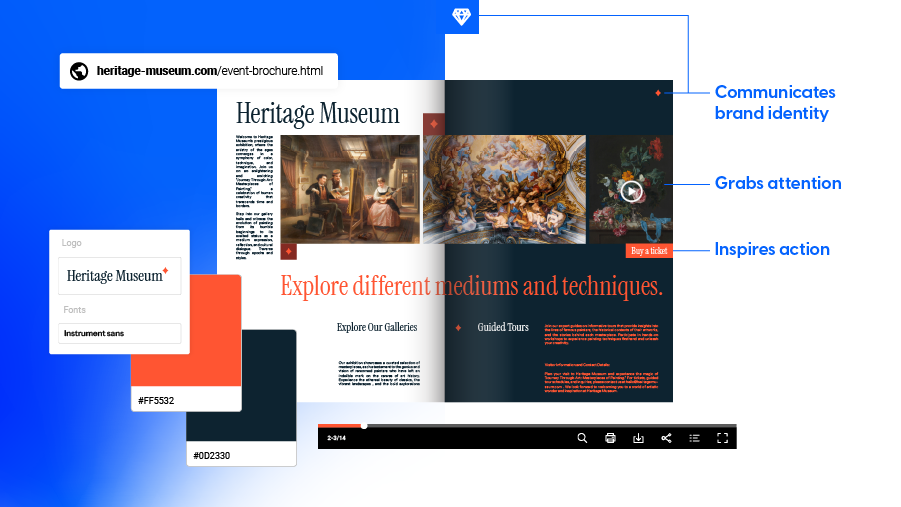
A strategically created brochure has an impact in at least three areas. First, it captures your audience’s attention in a way that other marketing materials can’t, especially when the brochure design includes eye-catching visuals and a clear layout. This approach is fundamental in motivating the audience to explore your offerings further. A digital brochure that stands out through funky fonts or illustrations can immediately spark curiosity and encourage the reader to explore further.
Secondly, it effectively communicates brand identity. Your brochure serves as a tangible representation of your brand. You can effectively communicate your brand’s values, personality, and unique selling points through thoughtful color schemes, imagery, and typography.
Lastly, it drives the desired actions of the audience. Ultimately, the goal of your brochure is to inspire action. Understanding how to create a brochure that aligns with your brand identity significantly elevates this goal. Every brochure’s design starts with what you’re trying to achieve with it and who you’re sending it to. Whether purchasing, visiting your website, or contacting your business, an effective brochure can influence the audience to take the desired steps.
Key elements of brochure design
I could write a completely separate article about the elements of brochure design since it’s a manifold subject. However, it covers three main branches: layout and structure, typography and fonts, and imagery plus graphics.
How to make a brochure: Step-by-step guide
Creating a digital brochure involves a systematic approach that combines creativity, strategy, and technical skills. Let’s walk through the process to ensure you craft a compelling brochure that effectively communicates your message and captivates your audience.
A. Designing the brochure layout: DIY brochure tips
1. Choose the design software & gather content
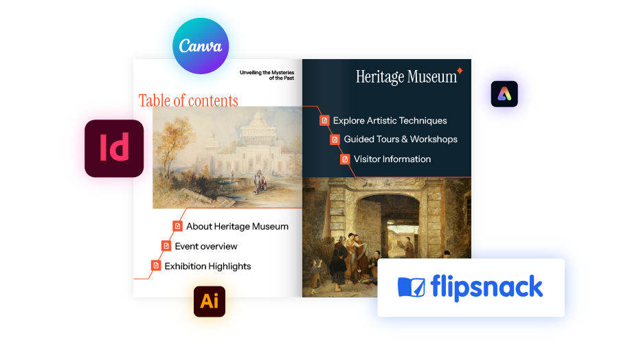
Selecting the right design software is the piece that brings your vision to life. Popular tools like Adobe InDesign or Flipsnack offer a range of features and templates to streamline the design process. Choose a platform that aligns with your skill level, design preferences, and project goals. Each tool has its limitations, so it is useful to be aware of them before getting started.
From point zero, make sure you have the content and information that you will add to this brochure. Create the outline for the brochure’s structure to have a clear idea of the creative process from the start. Focus on clarity and context, leaving only the information that is absolutely necessary and relevant to your audience.
2. Research and create moodboard
Before diving into making brochures and the actual design process, it’s essential to conduct thorough research and gather inspiration to inform your creative decisions. Start by understanding your target audience, their preferences, and what resonates with them. Explore competitors’ brochures and industry trends to identify successful design elements and areas for differentiation. Additionally, assembling a moodboard can be incredibly helpful in visualizing the desired aesthetic and guiding the layout process.
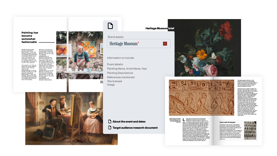
Collect images, color palettes, typography samples, and other design references that align with your brand identity and messaging. A well-curated moodboard serves as a roadmap, ensuring cohesiveness and clarity throughout the design journey. Taking the time to research and assemble a moodboard lays a solid foundation for creating a brochure that effectively captures attention and communicates your message.
3. Create wireframes or mockups
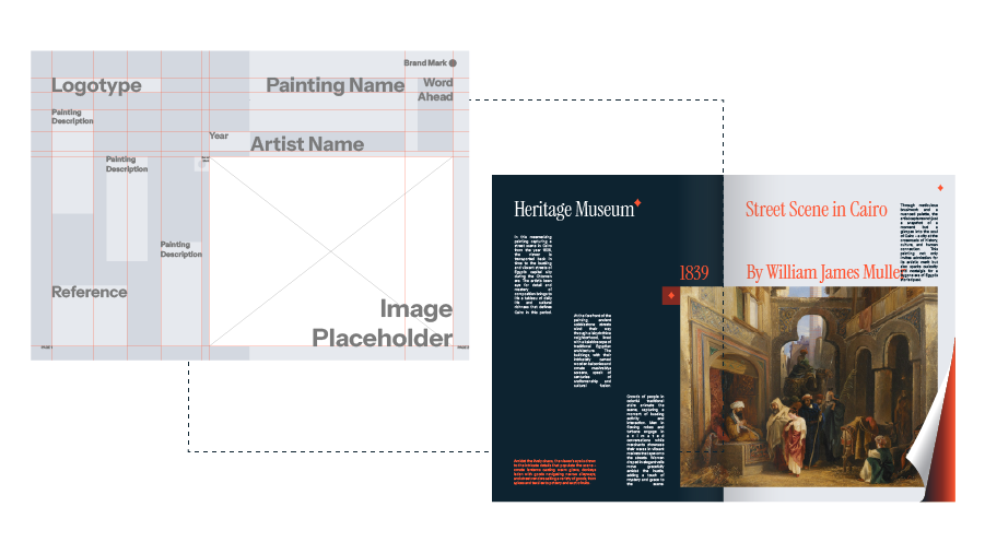
Once you pick out the design tool for your project goals, and decide on the layout, create wireframes or mockups to visualize the design in more detail. Wireframes help you define the placement of text, images, and other elements, ensuring a cohesive and well-organized design. If you’re looking to create a shorter brochure, you can skip this step and go straight to designing it freestyle.
B. Adding content and visuals to a digital brochure
1. Optimize the content and make it compelling
What most brochures lack is engaging copy that resonates with the target audience and conveys key messages effectively. Keep your language clear, concise, and persuasive, focusing on your products or services’ benefits and value propositions. Compelling headlines grab attention and attract the right readers. Come back to the content you initially picked out for this brochure, proofread it and eliminate anything that wouldn’t resonate with your core message.
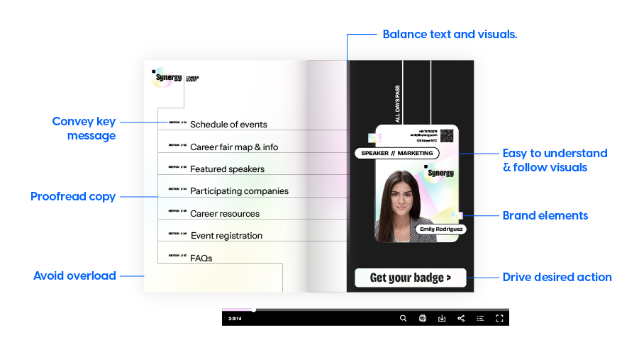
When creating a brochure and combining copy elements with different types of visuals, make sure they are easy to understand and to follow. In the end, this step is crucial for driving the desired actions from the reader. Avoid information overload.
2. Select high-quality images or design from scratch
Visuals play a crucial role in capturing attention and conveying information. Choose high-quality images and graphics that align with your brand aesthetic and complement your content. Alternate between static and dynamic visuals such as videos, photo slideshows, or other interactive elements that help your brochure stand out. Use the visual elements to establish a certain look and feel, and send the desired message through carefully picked visual elements.
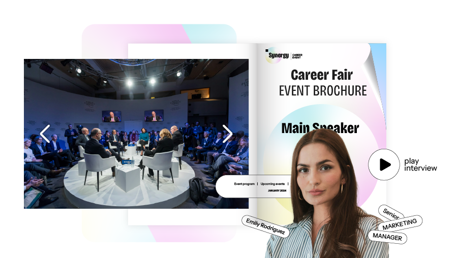
When designing visuals from scratch, select appropriate color schemes, typography, and visual elements (images, icons, illustrations) that align with the brand identity and theme. Ensure visual consistency and hierarchy throughout the brochure to maintain the brand’s consistency, which brings us to the next point.
3. Incorporate branding elements
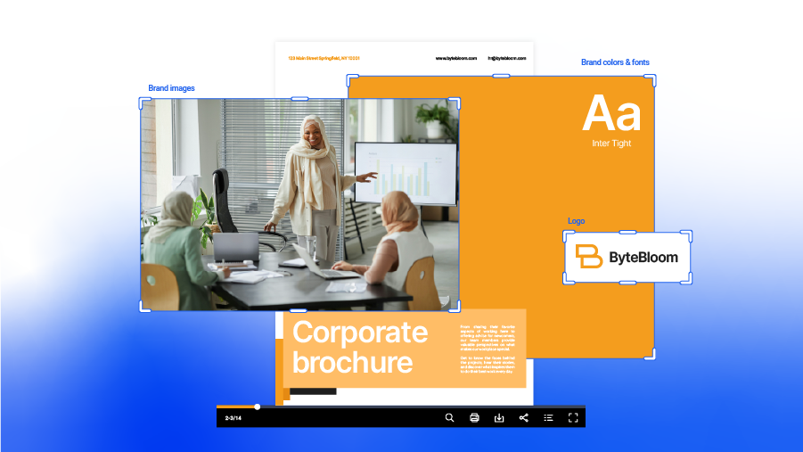
Any process of how to make a brochure includes brand elements. Maintain consistency with your brand identity by incorporating logos, colors, and other elements into your brochure design. Consistent branding reinforces brand recognition and helps establish a strong visual identity. Ensure your branding elements are prominently featured and seamlessly integrated into the design. Flipsnack allows you to completely customize the reading experience by branding the brochure’s background and the player accent’s color to align with your identity.
And lastly, but most importantly, make your brochure accessible to every reader online. Using our accessible AI brochure enhancer you can automatically generate alt text summaries for each page, making the content visible to screen readers. Using keyboard navigation, people online will be able to browse through your products or services in a logical order, with clear labels and names for each existing element. Other AI solutions include translating text boxes or entire flipbooks to reach more diverse audiences. Put your precious time to better use and let Flipsnack take part of the load off.
To read more about what should be included in a brochure, dive into the anatomy of a good brochure article we already have written on this topic. By following these steps and incorporating best practices in brochure design, you create impactful marketing materials that effectively communicate your message and appeal to the right people. Ultimately, it’s far more beneficial to have less traffic with strong leads than to have millions of people reading your brochure but no conversions.
Tips for digital brochures (travel brochure, real estate brochure, and event brochure)
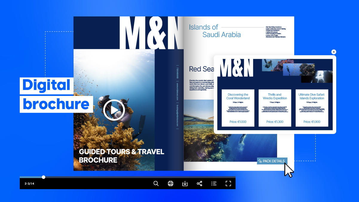
Travel brochures are designed to transport readers to exotic destinations, presenting breathtaking landscapes, vibrant cultures, and enticing experiences. They highlight tourist attractions, accommodations, and activities tailored to adventurous travelers, enticing them with vivid imagery and compelling descriptions.
Event brochures serve as invitations to memorable occasions, featuring event schedules, venue details, and engaging content designed to inform attendees. They create excitement and anticipation, inviting guests to immerse themselves in one-of-a-kind experiences.
Real estate brochures offer a glimpse into the world of property ownership, showcasing homes, condos, and commercial spaces with stunning photography, detailed floor plans, and essential information. They aim to entice potential buyers or renters with the promise of a dream lifestyle or lucrative investment opportunity.
Let’s explore some expert tips for creating brochures tailored to specific purposes, along with templates and interactive elements to elevate your designs.
Understanding the target audience beyond surface-level
For the sake of providing specific examples, I will talk about understanding the target audience in the context of a travel brochure. Of course, the same principle applies to any kind of brochure you’re creating, so roll up your sleeves and dive into the audience data you probably already have. There are two main aspects to consider in our travel brochure:
1. Research traveler demographics and preferences. For travel brochures, understanding the demographics and preferences of your target audience is key. Conduct market research to identify potential travelers’ interests, travel habits, and preferences. Tailor your content and visuals to appeal to their specific interests and desires.
Moreover, creating a brochure layout design that is intuitive and easy to navigate plays a critical role in keeping potential customers engaged. The overall structure should lead them through your offerings seamlessly, guiding them from one aspect of your services to another without confusion. Incorporating interactive elements, such as links to further details or calls-to-action enhances user experience and encourages readers to take the next step. Focus on usability since it is often what differentiates successful brochures from those that leave little impact. As you steer your design strategy, ensuring that your layout aligns with these best practices can result in brochures that are functional and effective in converting leads into customers.
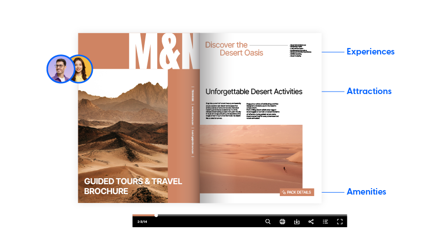
2. Highlight unique selling points. Showcase the unique attractions, experiences, and amenities that set your destination apart from others. Designing your brochure with these unique selling points in mind helps to differentiate your travel brochure and entices travelers to choose your destination for their next adventure. However, the same tip can be applied to a real estate brochure or the next event your company is organizing. Think about what sets your properties apart from the competition and focus on that.
Including interactive elements (Brochure templates for businesses)
1. If you need convincing to start using interactive elements in your former printed brochures, I have gathered a couple of brochure templates with interactive elements. Incorporating elements such as interactive maps, videos, photo slideshows, or augmented reality (AR) can enhance the user experience and provide valuable information dynamically. For example, a travel brochure could include QR codes linking to virtual tours or AR experiences of popular landmarks.
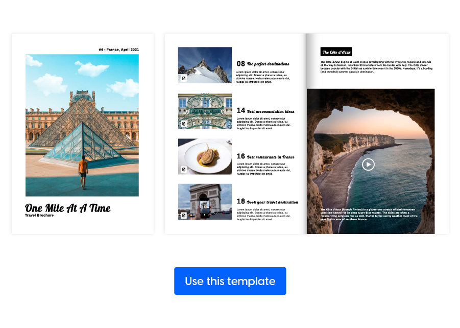
Interactive travel brochure template
Stay ahead of the competition with the help of this interactive travel brochure template that you can edit in no time. Flipsnack’s Design Studio allows you to personalize it to your brand. Write about your best offerts, insert the most breathtaking photos, and add interactions such as links, videos, virtual tours, or any other fitting element.
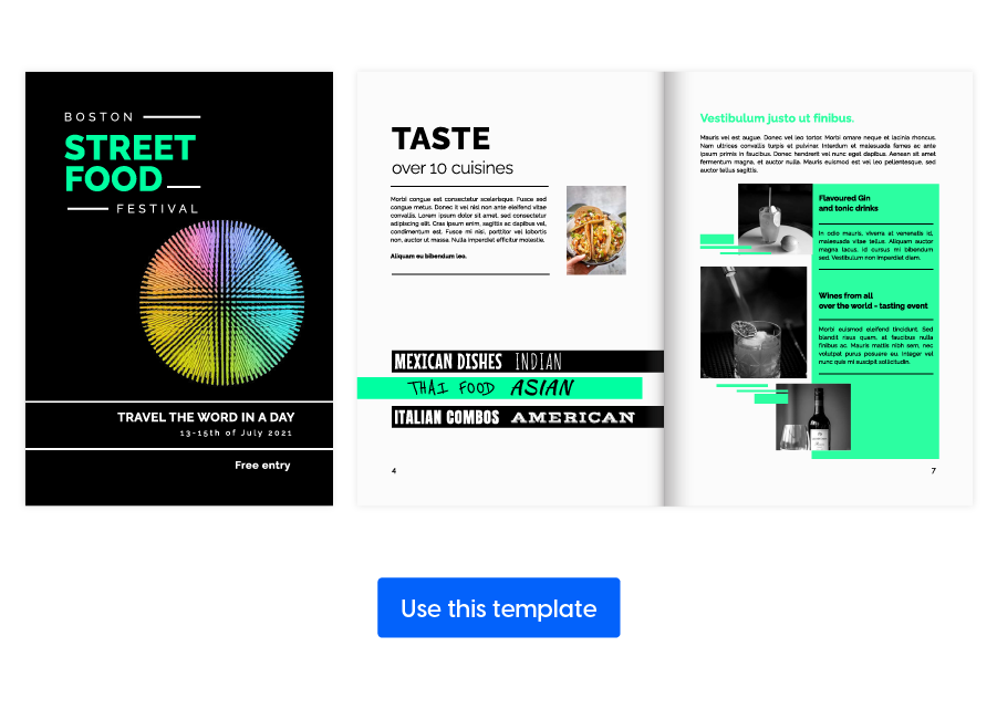
Interactive festival brochure template
If you’re looking for the best way of attracting as many clients as possible this festival season, then you must come up with something extraordinary. This interactive festival brochure template from Flipsnack is indeed the right choice for you. Take it and customize it with your own information in just a few minutes. But go the extra mile and add some interactive elements such as videos, gifs, links, or even photo slideshows to increase your audience’s curiosity.
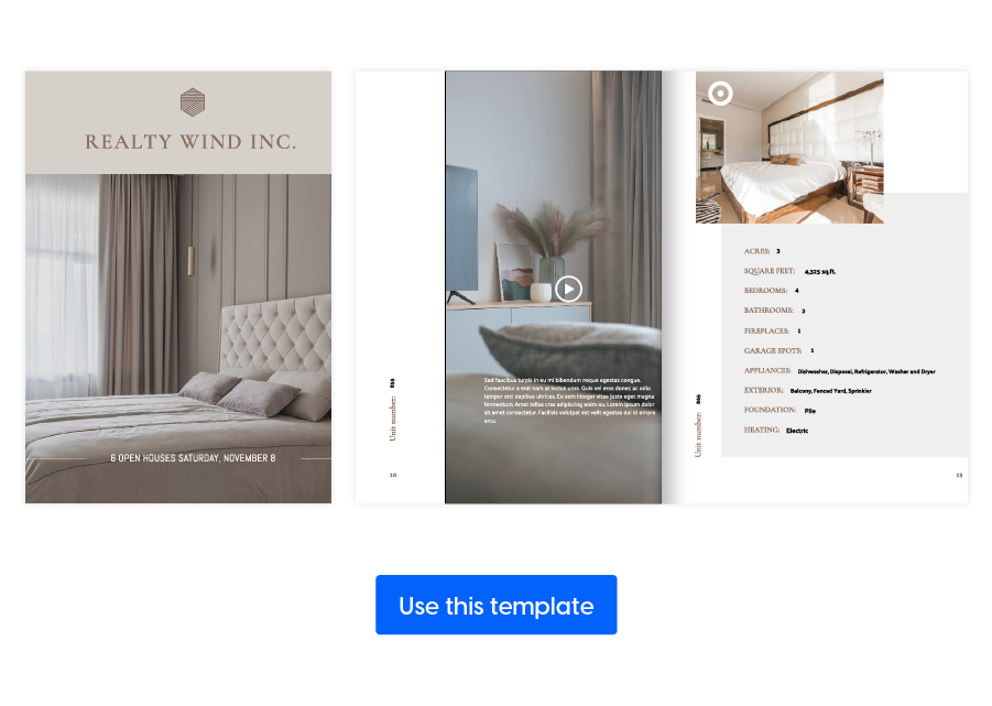
Real estate smart brochure template
What’s a better way to present your listings than by using this interactive MLS real estate brochure template? It shortens the design process by a lot, leaving you with more time to answer your clients’ questions. When opening this template, you will notice that it uses the same identifiers as the RESO system, which means you can easily upload your own identifiers for each property. In one click you have your details replacing the original text. Add your brand kit, interactive elements like a virtual tour, a map of the property location, or a button for booking a home view.
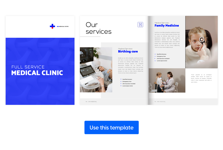
Interactive medical brochure design
Ever since the pandemic, the need for trustworthy sources of information arose. Use this interactive medical & healthcare brochure design as the foundation for your medical insights. Add interactions such as photo slideshows with various medical services you offer or vaccine centers your employees work at. Visuals contribute a lot to a feeling of trust and care, so make sure you use enough videos and images from your center. Present the team as a final incentive for new patients and make sure you share it on different channels, for maximum reach.
2. Incorporating digital elements while maintaining print functionality. I understand that in most cases, there is a need to create a twin printed brochure of the digital counterpart. That’s why balancing digital and print functionality is essential when incorporating interactive elements into brochures. Ensure that the design remains visually appealing and functional in both digital and printed formats. Consider factors such as readability, usability, and compatibility with different devices. However, in the case of more dynamic interactions, such as a virtual tour of a property, consider creating a separate brochure for the prospects who will read it digitally.
3. Inspiration for integrating technology to enhance user engagement. Get creative with integrating technology to enhance user engagement in your brochures. For instance, just like I already exemplified, real estate brochures could feature interactive floor plans or 360-degree virtual tours of properties. Event brochures might include interactive schedules or links to RSVP forms.
Additional resources for DIY brochures
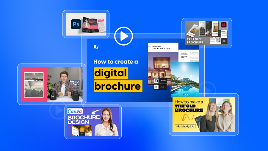
I have put together a couple of links to brochure design tutorials that I believe can help you get started with your first promotional material of this kind. Take a look at how you can create a digital brochure with Flipsnack or Canva; or learn more about basic design principles that can help you tackle this task with no prior experience.
Relevant design tutorials for beginners and intermediate
Digital brochure tutorial using Flipsnack
Digital brochure tutorial using Canva
Brochure design process using Adobe Illustrator
How to make a trifold brochure using Canva
Making a tri-fold brochure template in Photoshop
Creating a tri-fold brochure in InDesign (Step-by-step)
Recommended reading on brochure design principles
Basic design principles explained
Closing remarks on how to make digital brochures
In conclusion, we’ve covered a broad guide on brochure design, exploring key concepts, tips, and examples to create impactful marketing materials. I encourage you to go beyond this article and delve deeper into the world of design. There is a lot of exploring left to do and experimenting with your own creative ideas. Your feedback and success stories from implementing these tips are valuable to us, so feel free to reach out with any inquiries.

I believe you gained insights and practical advice for crafting professional and visually appealing brochures by following this guide. Brochures not only contribute to your brand’s image but also effectively communicate your message and engage your audience. Whether promoting travel destinations, real estate properties, or events, mastering the art of brochure design can elevate your marketing efforts and get the desired outcomes. So, let your creativity express itself through digital brochures and watch them captivate and inspire.
FAQs on brochure design
Standard sizes include 8.5″ x 11″ (letter size) or A4 (international standard). Other common sizes are 8.5″ x 14″ (legal size) and 11″ x 17″ (tabloid size).
Consider the amount of content and desired layout. Bi-fold is simple, tri-fold offers more panels, and z-fold is versatile for multi-section brochures.
Opt for digital printing for small quantities or offset printing for larger runs to save costs. The most cost-effective brochure type is the half-fold option. Two of the most popular finished sizes for a half-fold brochure are 5.5″ x 8.5″ and 8.5″ x 11″.
To differentiate from competitors, utilize eye-catching visuals, unique layouts, and compelling messaging. These principles can also apply to choosing design software with interactive elements such as videos, links, or photo slideshows.
Prioritize mobile-friendly design elements like legible fonts, clear imagery, and concise content for optimal viewing on smartphones and tablets. This also means checking before incorporating dynamic elements and ensuring they work the same regardless of the device used.
Maintain consistency in branding, colors, fonts, and design style across all marketing materials to reinforce brand identity and professionalism. Some software allows for locking brand elements in different brochures so other teammates can’t accidentally delete or resize them, ruining the brand’s visual identity.

Well All very interesting
Great tips. Now I can try this out myself to male a brochure.