How to Create an IKEA-Style Product Catalog That Converts
Last update: February 19, 2026
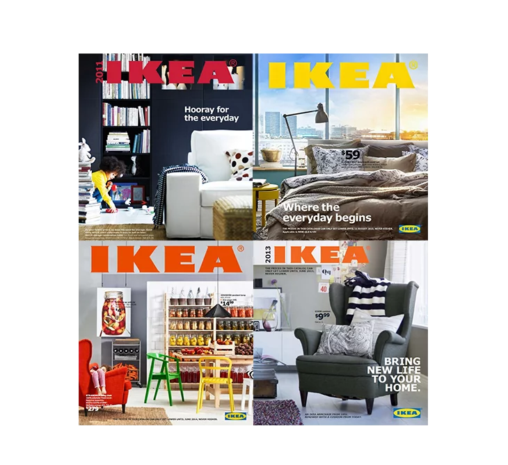
For decades, the IKEA catalog wasn’t just a product brochure; it was one of the most powerful sales tools in retail history.
Millions of copies were distributed worldwide. Entire collections were introduced through it. And customers didn’t just browse it, they planned purchases around it.
Personally, I’ve always enjoyed shopping at IKEA, and the catalog plays a big part in that. It makes browsing feel effortless. It helps you visualize. It makes you want to explore more. At Flipsnack, we understand the power a well-crafted catalog holds, how the right structure and presentation can completely change the way people perceive and buy your products.
But here’s what most brands get wrong: IKEA’s success wasn’t about beautiful pages. It was about strategy.
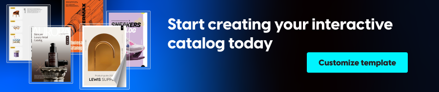
If you’re looking to create a product catalog like IKEA, the goal shouldn’t be to copy the design. It should be to understand the structure behind it and then upgrade it into a modern, interactive digital catalog that actually drives measurable results.
In this guide, you’ll learn how IKEA structures its catalog, how to apply the same principles to your own brand, and how to transform a traditional catalog into a powerful digital sales tool.
What makes the IKEA catalog so effective?
IKEA never treated its catalog like a simple product listing. It treated it like a lifestyle magazine and, at the same time, like a carefully engineered sales tool.
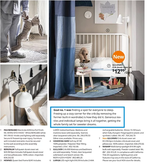
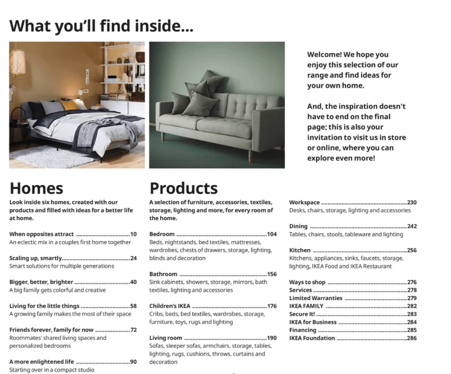
Instead of organizing products by SKU or warehouse category, IKEA organizes them by how people actually live. Living rooms. Kitchens. Bedrooms. Workspaces.
This structure allows customers to see products in context. A sofa is never shown alone. It appears in a complete room, surrounded by complementary items such as rugs, lamps, storage units, and decorative elements. Everything is subtly cross-sold without feeling forced.
This approach inspires customers, simplifies decision-making, and naturally increases average order value. Instead of asking, “Do I need this chair?”, the catalog encourages a different question: “Do I want this entire setup?”
But that’s only part of the story.
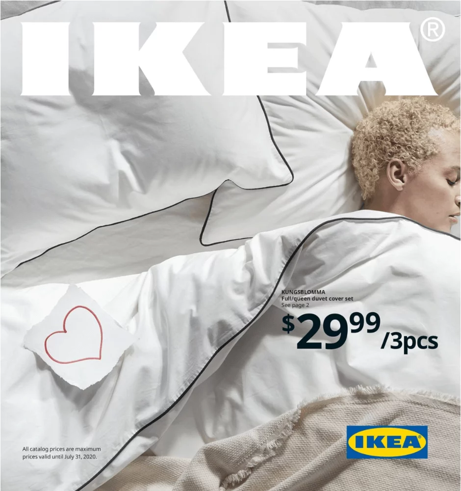
The photography plays a major role. Large, immersive visuals dominate the page. Text and pricing information support the image, not the other way around. The catalog feels aspirational rather than transactional.
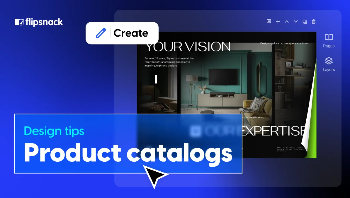
If you’re designing a digital version of this type of catalog, consider using an image slideshow or gallery feature for lifestyle spreads. Instead of overcrowding a single page, you can showcase multiple angles of the same setup, different room perspectives, close-up product details, or alternative styling options, while maintaining a clean, immersive layout.
You can also enhance these scenes with interactive product tags. Rather than listing items separately below the image, clickable tags allow readers to explore each product directly within the visual context. This keeps the layout clean while making the catalog instantly shoppable.
However, inspiration alone doesn’t sell.
If you look closely, you’ll notice that IKEA maintains a strict structure underneath the creativity. Pricing blocks are consistent. Product references are clearly labeled. Product description is controlled and highly scannable. Even dense product pages feel organized rather than overwhelming.
There’s also a strong psychological layer at work. IKEA uses entry-price anchors to make rooms feel accessible. It mixes premium-looking setups with affordable price tags. It guides the eye through visual hierarchy, leading from hero products to supporting items. And it reduces friction by showing how everything fits together, eliminating uncertainty.
In other words, the IKEA catalog combines emotion with logic.
It inspires desire, but it also removes hesitation. It tells a story, but it makes purchasing easy.
That balance between emotion, structure, merchandising strategy, and buying psychology is what truly makes the IKEA catalog design so powerful.
The 4-step “IKEA-Style” blueprint
If you want to create a catalog like IKEA, don’t start with layout. Start with strategy.
IKEA’s catalog doesn’t work because of how it looks. It works because of the thinking behind it.
The layout is simply the execution of a clear idea.
Here’s how to approach it the right way.
Step 1: Define the core strategy
Before you design a single page, define the central idea of your catalog.
IKEA never builds around inventory. It builds around a concept. One year it focused on sleep. Another on small-space living. Other editions revolved around sustainability or everyday routines. The theme dictates everything that follows.
Ask yourself: what is the unifying idea behind your products?
Are you promoting comfort? Efficiency? Modularity? Performance? Seasonal change? Innovation?
This central idea becomes your strategic filter. Every product included should reinforce it. Every section should support it. Without this clarity, your catalog will feel like a product dump rather than a curated experience.
Only after this is clear should you move forward.
Step 2: Shape the narrative and structure
Once the strategy is defined, you decide how to translate it into a story.
IKEA doesn’t sell a bed. It sells the experience of better sleep. It doesn’t just show a sofa. It
shows a living room that feels lived in.
Products are placed in context because context reduces uncertainty and increases desire.
Now you begin thinking about structure, not visual layout yet, but conceptual structure.
How will customers move through this idea?
By rooms? By routines? By use cases? By solutions?
If you sell furniture, you may structure it by rooms.
If you sell fashion, by complete looks.
If you sell industrial equipment, through workflows or installations.
If you sell wholesale collections, by merchandising displays.
This structural thinking comes before layout design. It defines how the reader journeys through the catalog.
Only now does layout enter the conversation. And here’s where flexibility becomes essential.
To execute this properly, you need a platform that allows you to build immersive spreads, product grids, comparison pages, and detailed specifications, all within the same experience. You need the freedom to shift between inspiration and structure without being locked into rigid templates.
Step 4: Turn the catalog into an interactive buying experience
Once your structure and design are in place, the next step is to make the catalog actionable.
In a traditional catalog, product references are static. In a digital environment, they can become clickable.
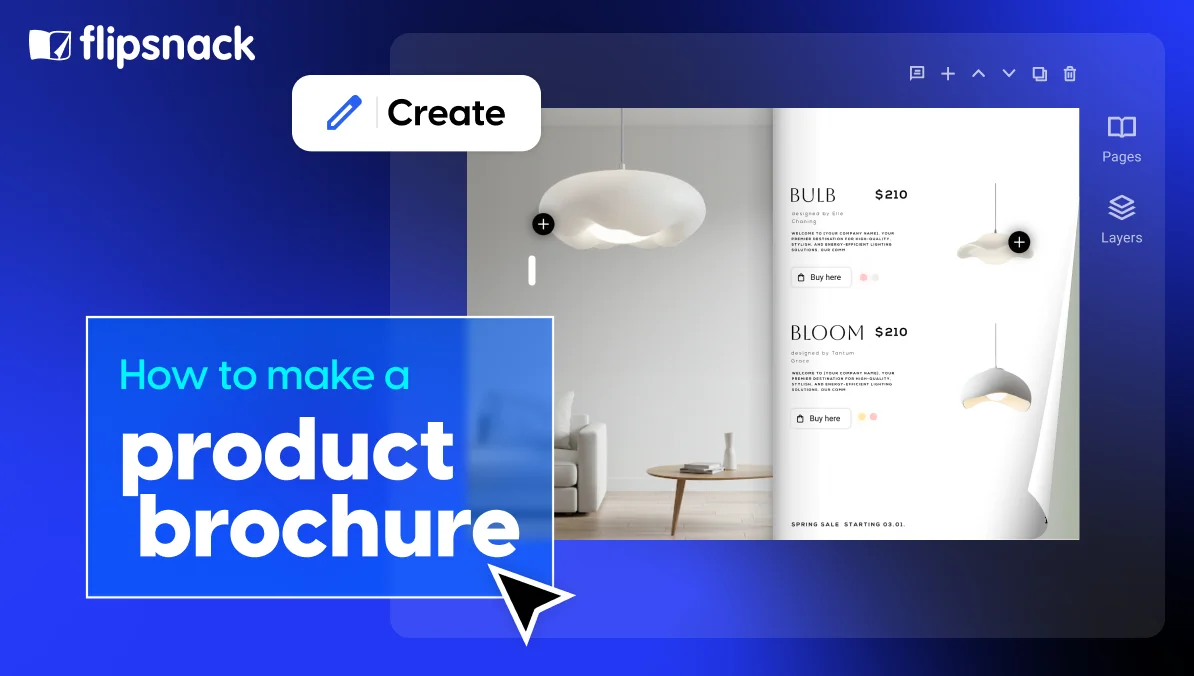
Interactive product tags can be layered directly on top of items within lifestyle images. Instead of searching for a product code at the bottom of the page, readers can click on the item itself to see pricing, variants, specifications, or even go directly to a product page.
For brands managing large inventories, SKU detection technology can automatically recognize product codes from a PDF and convert them into interactive tags. This reduces manual work and keeps tagging consistent across hundreds of products.
Flexibility becomes even more important when pricing or availability changes. By connecting products to a spreadsheet or inventory feed, updates can happen dynamically, without redesigning the entire catalog. This is particularly valuable for companies handling seasonal pricing, multi-location inventory, distributor networks, or extensive SKU databases.
Interactivity also transforms the catalog into a sales tool.
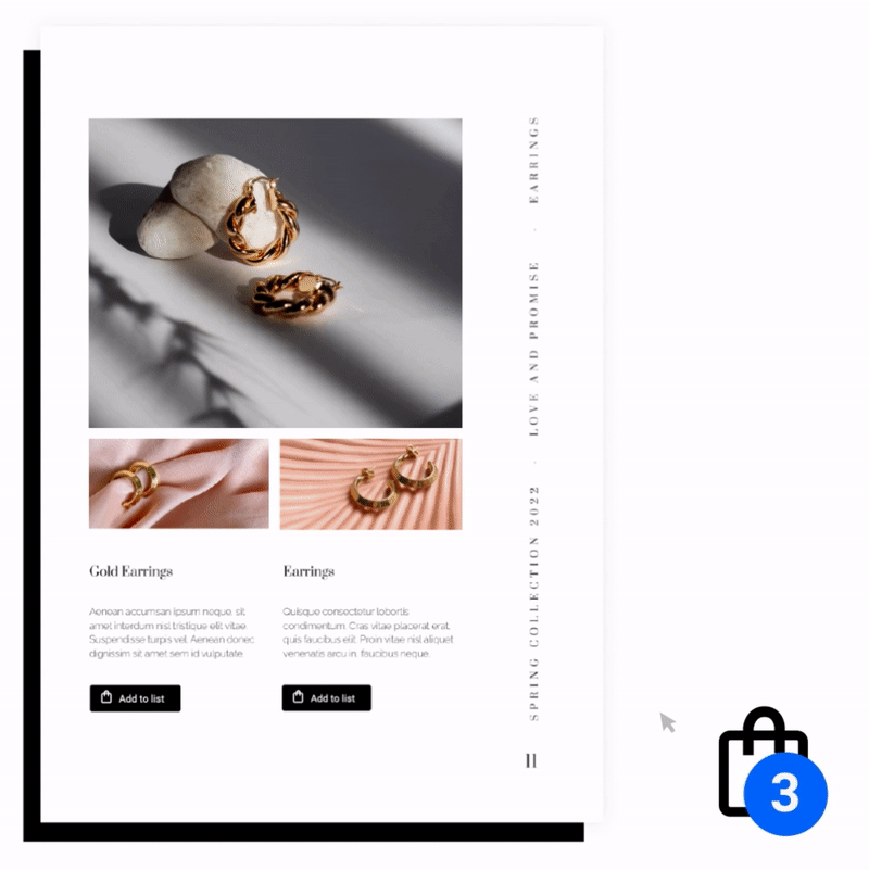
Wholesale buyers can create shopping lists directly inside the catalog, and this helps boost your sales. Sales teams can share private versions tailored to specific clients or regions. Instead of exchanging multiple documents, everything lives inside one controlled, trackable experience.
And unlike print, a digital catalog generates performance data. You can see which spreads attract the most attention, which products receive the most clicks, how long readers stay engaged, and where interest drops.
That insight allows you to continuously refine both your layout and your strategy.
Because in a modern environment, a catalog shouldn’t just look good.
It should perform.
How to create an IKEA-style digital catalog with Flipsnack
If you want to build this kind of interactive catalog without complex development work, Flipsnack allows you to:
Step 1: Create the foundation (template, PDF, or CSV)
You can start in three ways, depending on your workflow.
If you want a fast start, choose one of Flipsnack’s product catalog templates, especially useful for furniture, retail, or collection-based layouts. These templates are already structured for scene-based spreads and product sections.
If you already have a designed catalog, simply upload your PDF. It will automatically convert into a digital flipbook while preserving your layout.
And if you’re working with structured product data, you can use the Catalog Generator to import products directly from a CSV file. This allows you to automatically generate catalog pages based on product information, images, pricing, and descriptions, making it ideal for large inventories or seasonal collections.
Instead of editing hundreds of pages every time something changes, you maintain a single source of truth. Update your connected CSV or Google Sheet once, and pricing or product details update across the entire catalog instantly.
With dynamic templating built into the Catalog Generator, there’s no need for a designer to manually format every page. Your data feeds into consistent, structured layouts that keep your catalog clean and cohesive, while still allowing you to highlight hero products or high-margin collections strategically.
Start with the format that aligns with your internal process. The goal isn’t perfection from day one.
It’s flexibility, efficiency, and the ability to scale without manual rework.
Step 2: Add interactivity
Once your catalog is in place, you enhance it.
You can add interactive product tags directly onto items within your images, making products clickable instead of static. These tags can display pricing, descriptions, or link to product pages.
You can also:
- Add videos to showcase products in action
- Insert clickable table of contents links for easier navigation
- Highlight specific pages or collections with buttons
- Automatically detect SKUs in uploaded PDFs and convert them into product tags
This transforms your catalog from a viewing experience into an engaging one.
Step 3: Enable buying directly from the catalog
Now you remove friction.
Depending on your sales model, you can add checkout links, connect products to your e-commerce store, or enable shopping lists directly inside the catalog.
Instead of treating your catalog as a preview tool, you turn it into a buying environment.
Flipsnack supports multiple checkout options for digital catalogs. You can link products directly to your existing online store, integrate add-to-cart functionality, or use built-in checkout flows depending on how your business sells. This flexibility allows you to adapt the catalog to your current commerce setup, rather than changing your setup to fit the catalog.
For B2B and wholesale brands, shopping lists are especially powerful. Buyers can select products while browsing and generate a structured list without leaving the catalog. This list can then be exported, shared, or used to streamline order processing.
Instead of browsing first and buying later, the experience becomes continuous.
Inspiration leads directly to action — without switching tabs, downloading PDFs, or emailing spreadsheets.
Step 4: Share and track performance
Once your catalog is ready, you control how it’s distributed.
You can embed it on your website, share it publicly, or generate secure private links for distributors, sales teams, or enterprise clients.
And because it’s digital, you can track performance. See which pages attract the most attention, which products are clicked most often, and how readers interact with your catalog.
If pricing or product data changes, you don’t need to redesign everything. With connected spreadsheets or generated catalogs, updates can happen quickly, without rebuilding from scratch.
Instead of creating a new catalog every season, you improve and evolve the one you already have.
Conclusion: The strategy behind the success
IKEA’s catalog was never just about design; it was about clarity, psychology, and guiding customers from inspiration to decision without friction. It blended storytelling with structure and emotion with sales strategy, which is why it worked.
At Flipsnack, we’ve seen the same impact with brands like Electrolux, Pandora, and Melissa & Doug: when a catalog is built around a strong idea, structured around real-life use cases, and enhanced with interactive functionality, it stops being a static document and becomes a strategic asset.
You don’t need to be IKEA to build an IKEA-level catalog; you need a clear strategy, thoughtful structure, seamless buying experience, and the flexibility to evolve continuously. Because today, a product catalog shouldn’t just showcase products, it should sell, track, update, and improve them.