Pamphlet design – ideas, examples and tips
How do you make an eye-catching, professional pamphlet? In this article we will cover everything you need to know about pamphlet design. We’ll share useful tips for beginners and we’ll show you some creative leaflets, flyers and brochures in different sizes that will inspire the most advanced designers.
What does pamphlet mean
But before we get into that, let’s start with the pamphlet definition. That way we can make sure we all have the same understanding of the word.
A pamphlet is a small booklet containing information or arguments about a single subject. You may refer to it using other words, like leaflet, brochure, flyer, handout or booklet.
It’s a loose definition, so it covers many types of printed and digital materials, on various subjects. Typically pamphlets don’t have many pages, but they come in many shapes and sizes.
Pamphlet examples and sizes
Because pamphlets vary so much in shapes and sizes, we decided to show you an example of pamphlet for each of the most used sizes in print.
Double sided flyer DL / rack card flyer (2 panels)
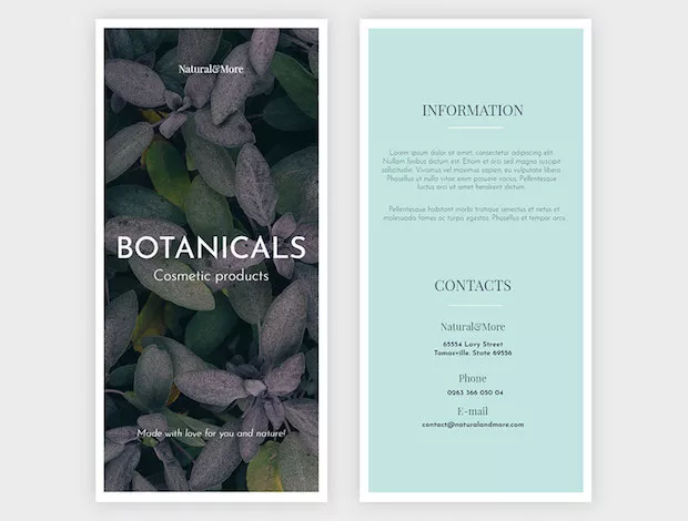
This is an example of a very basic and simple flyer, that looks modern. It’s very easy to copy and you can play with a different image, color and fonts to get unique results.
Bi-fold brochure (4 panels)
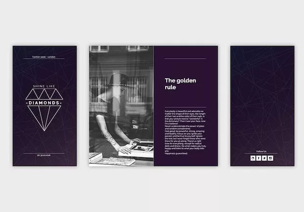
You can pack more information on a bi-fold (or half-fold) flyer because you get to use more space. It’s one of the most used formats for print brochures, because it’s very versatile, perfect for simple presentations. The paper size can vary, from narrow to wider pages.
Tri-fold brochure (6 panels)
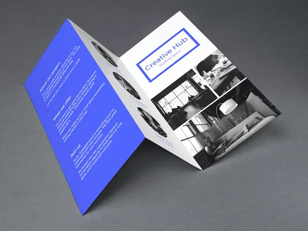
There are more things that you should consider when you design a tri-fold brochure, including fold lines and the 3 page layout. It’s a bit more challenging to design, but tri-fold brochures are widely used in print.
Square

The example of pamphlet features above has more layouts. Click on the image to view the entire digital booklet. Square pamphlets are an excellent option, and they can have as many pages as you want.
Half page / A5 or US letter/ A4 (Portrait)
This is a modern brochure example that can be adapted to be printed on any of the sizes mentioned above, because they all have a similar ratio aspect. If you like this template you can download it for free from us.
Other sizes (Landscape)
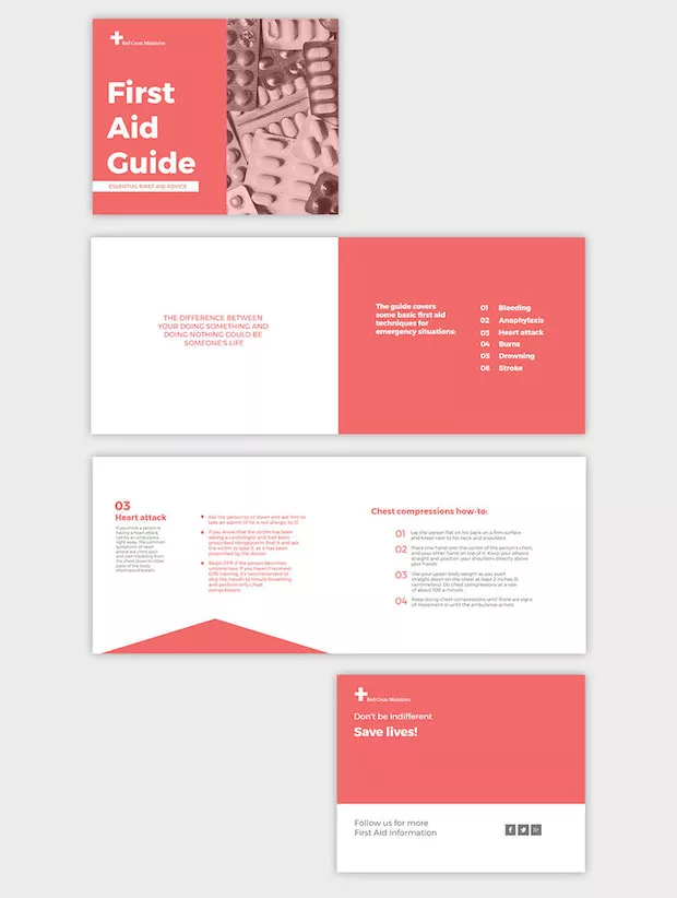
I think that we’ve proven our point: pamphlets can look so different!
Hoping that these examples have inspired you, we will move on to the next section, in which I’ll share some tips with you that are particularly useful for non-designers who want to make beautiful pamphlets easily.
Pamphlet design ideas
Start with a purpose
The first thing that you need to understand is the purpose of your pamphlet. There are so many reasons why you could be making a booklet or flyer:
- Promote a sale
- Present a product
- Offer details about an organisation
- Advertise an event
- Inform readers about a particular topic
- Make a tutorial
The purpose of your brochure is the most important thing, so you need to know what it is before you start. That purpose needs to be reflected in your design. Whoever sees it should be able to tell what the pamphlet is about just by looking at it briefly. If you’re designing for an event, for example, you will want the name of the name, the date and the place to stand out. You’ll also know that you should make the schedule easy to scan.
All these details become very important when you design a pamphlet that will actually help spread awareness about an event, product, topic or organization.
Know the audience
This next thing is equally important: know your audience. It’s somehow related to my previous tip, but it’s not exactly the same thing.
Consider your audience’s age, gender, interests, profession. If you’re designing something that needs to attract the attention of young children, you should make a colorful, fun design featuring a beloved cartoon or disney character. A pamphlet for children shouldn’t have a lot of texts. It’s main feature should be photos or illustrations.
For teens you can do something bold, unconventional, crazy and fun.
But corporate design is entirely different. It should be simple, formal and neatly organized.
Use grids
Think about the grid as an invisible skeleton that holds your design together. It brings a certain rhythm and balance in your layouts, that makes the content look more accessible. Without a grid, you’ll have floating elements on chaotic looking mess. In most of the cases you don’t want the mess. Instead, you want a leaflet that the viewer can easily read and which doesn’t require effort on his part to comprehend.
Start by establishing a grid before you place other design elements on page and you will do yourself a favor. All your elements will seamlessly fit in together if you have a structure laid out for them.
Work with fonts that go well together
When it comes to typography, the most important rule is work with no more than 3 fonts/ pamphlet. Having too many fonts is a big mistake, that will hurt the aesthetics of your design in more ways. It will look amateurish, cluttered and hard to read. You can pick an interesting typeface for titles, but for the rest of the text you need to use something more neutral, that’s very easy to read.
Choose fonts that go well together and stick with them throughout your pamphlet. It’s usually a great idea to pair contrasting typefaces: thick and thin, serif with sans serif, handwriting with straight.
Don’t be afraid of colors
We can’t talk about pamphlet design without talking about color, because it’s one of the most important elements in a design. Colors evoke feelings and they will set the mood of your design.
The purpose and the target audience should play a big role when choosing a color palette.
If you don’t know where to start you can create a moodboard that evokes a feeling that you want to get across through the pamphlet.
Colors are so impactful, that by simply making a few adjustments in hue or saturation you can obtain a completely different look.
It’s alright to make a black and white or neutral design, if your purpose is to make a conservative, formal or vintage inspired pamphlet. You can also make a modern looking black and white layout, with typography playing the main role in your design.
Be bold
Make attention grabbing pamphlets, that get noticed by viewers. Marketers want you to make these pamphlets so that people will take and read them. But nowadays we are so flooded with marketing materials and there are so many interesting things to see, that if something doesn’t stand out we don’t pay attention.
Your job as a designer is to make something that stands out in a sea of marketing materials. Take it as a challenge for the next pamphlet you design.
Tips for easy pamphlet design
Start from a pamphlet template
Editing a pamphlet template is much easier that creating the entire design from scratch, and it’s also much quicker. This is why templates are a great solution for beginners and for advanced designers. It’s like using a smart shortcut.
You can have a look at the free pamphlet templates that are available in our online editor. They are designed by professional designers. You can publish an online version for free with our tool, but you will have to upgrade to a paid plan to download your pamphlet as PDF for offline use or for print.
Use an easy pamphlet design software online
Most tools for professional editorial design are not that easy use. If you’re not familiar with them, it will take you a lot of time to learn their functionality. It’s really not worth it to invest a lot of time in learning how to make a pamphlet for school project. Especially when there’s a better way!
So why not use a shortcut? Make it online, using a pamphlet maker free, that has many integrated templates, ready to be customized! Flipsnack is very intuitive, featuring a simple drag and drop editor that allows you to create digital pamphlets. Do you need them on print? No problem! Upgrade to a paid plan to create and download as many pamphlets, booklets and magazines as you want.
Want a little extra inspiration? Check out this video we made about how to create your own brochure pamphlet. It’s quick, easy, and before you know it, you’ll have an incredible looking pamphlet.

This is an interesting idea for pamphlets. Thank you for sharing!
Thanks for sharing pamphlet designs with examples. Tips are also really good
Thanks for the pamphlets designs idea. Pamphlets still one of the best marketing way that everyone shouldn’t miss!
Thank you for the tips, our english teacher just told us to make a tempate to advertise our school,if that is not hard enough, imagine doing it with a partner. You should be proud; with your tips you´ve made an 8th grader develop an interest, curiosity and understanding for english.