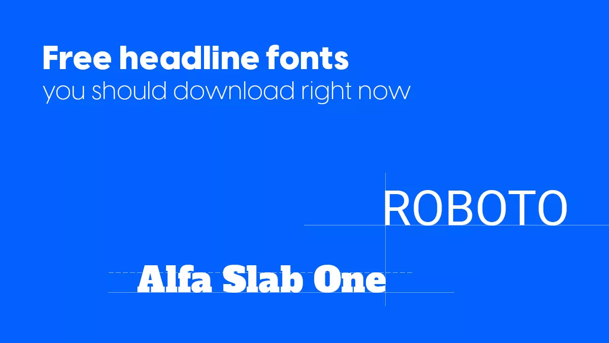
Free headline fonts you should download right now
In our day and age, the online medium is a battleground, and having the right headline fonts to showcase your work or ideas is paramount.
We’re not talking about details here. Finding the best font pairing to complement your ideas isn’t just an option. It’s an absolute necessity. Words may have the power to change things, but it definitely helps if they can also turn around some heads.
So, if choosing the right font seems like a walk through a deep dark forest, this article will serve as your flashlight.
Below we’ve put together a complete list of free headline fonts that you can, and should, download right now. But, before going there, let’s start small:
What font is most appealing to the eye?
A great question! The answer will largely depend on your needs and the specific of your business.
For instance, if you run a blog specialized on travel, then a font like Pacifico will do great. If you cover politics and news, then this font will fail you, as you wouldn’t want your readers to envision parrots when thinking about foreign affairs.

That being said, let’s take a look at some of the classics of the font world:
- Abril Fatface
The Godfather when it comes to choosing a headline font, Abril is a larger than life font family, which includes 18 different styles. We want with Fatface, as it can suit most (if not all) headlines, regardless of topic.
Download Abril Fatface.
- Roboto
Simple, elegant and incredibly eligible. Roboto is a must for any font arsenal. We’re not fortune tellers, but we can almost guarantee you that there will come a moment when Roboto will prove handy.
Download Roboto.
- Josefin Sans
This font was designed with one idea in mind: to be used for large scales. It’s characterized by simplicity and elegance, while also retaining a modern look thanks to its slightly geometric nature.
Download Josefin Sans.
- Alfa Slab One
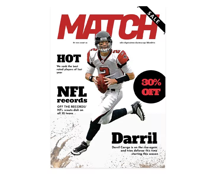
A mammoth of a typeface, Alfa Slab One is ideal if you want to steal away the show with your headline. You’ve probably encountered it before when reading your favorite sports magazine, as it works incredibly well for that. Here’s our example below.
Download Alfa Slab One.
- Oranienbaum
This is a font well suited for both headlines and body text. Unlike Alfa Slab One, Oranienbaum is more subtle, with pronounced serifs and a mixture of hard right angles and fluid lines.
Download Oranienbaum.
- Croissant One
No, we didn’t find this font in some elf village, it really does exist, and it really does have something special to it. With rounded shapes and a close to handwritten style, it’s designed to evoke that Parisian cafe spirit, making it ideal for the more bohemian types of publications.
Download Croissant one.
- Lexend Exa
Incredibly easy for the eyes, this font primarily focuses on reading comfort and legibility. If you write long articles, then this is the font for you. Your readers will thank you, and their ophthalmologists will curse you. But such is life.
Download Lexend Exa.
- Eagle Lake
Another Hobitton-like headline font, Eagle Lake was kidnapped from its magical realm and brought forth to add a little flair to your headlines. Legible, fluid, elegant, it has all the ingredients for a great choice.
Download Eagle Lake.
Summarizing,
What fonts are used for headlines?
Although we can’t point at one font particularly, we can say that sans-serif fonts are more popular when it comes to headlines.
Roboto, Poppins, Ubuntu, are all great choices, mainly because they are very clean and easily readable.
Note: Always consider legibility before anything else. Fonts are there to add style to your writing, not make it more heavier than the Titanic!
Free headline fonts for your inspiration
Here’s a collection of free fonts that will look good as headlines in your publications. Type is very important in design and using the right headline fonts in your project can have a huge impact.
This is why we recommend using an interesting, special headline font that will grab the attention of your readers, and most importantly, a headline font that is most suitable for your content.
Like I’ve mentioned earlier, the above eight are amongst the most popular free headline fonts out there. But popularity isn’t everything. The Internet is filled with hidden type gems, so let’s start scratching the surface!
- Staatliches
If you feel like something is a bit off with this font, then don’t worry about it. My initial reaction was the same, and it has to do with the awkward proportions that this headline font presents. But it’s precisely that awkwardness that makes it a highly effective eye-catcher.
Download Staatliches.
- Prompt
This simple geometric font redefines what we understand by a “people-pleaser”. Prompt works great for almost any headline imaginable, and although it isn’t necessarily a jaw-dropper, it is precisely this universal application that it has, which makes it an inspired choice.
Download Prompt.
- Ramabhadra
Like Prompt before it, Ramabhadra is also an excellent choice for posters, headlines, titles, and so on. Initially developed as Arimo, this new style has now more rounded letters, making it more versatile and a complete all-arounder.
Download Ramabhadra.
- Vidaloka
This headline font just gets better and better the more you look at it. Just take a look at that “Q”! When a font makes you obsess over the use of a letter, then you know it’s the real deal. The curliness of some letters, combined with an overall arching elegance, make Vidaloka ideal for any type of serious headline.
Download Vidaloka.
- Nexa
Nexa exemplifies one of the most fundamental graphic design basic when it comes to fonts: kerning. With a focus on spacing, Nexa ensures a highly cursive reading experience, tangled up in a bit of a geometric flair.
Download Nexa.
- Intro Cond
The Intro family comprises 50 different typefaces, so you can be certain that whatever your graphic design challenge may be, this family has you covered. The Cond sibling possesses excellent kerning, a well-balanced geometry, and a roundness that would make even the more scrupulous of your readers gaze with joy.
You can download the font here.
- Sevillana
The name and style of this headline font is highly evocative of the latino spirit. Inspired by Spaniard folk tales, Sevillana really stands out and is an excellent choice for restaurant menus, posters and, you guessed it, spectacular headlines.
Download Sevillana.
- Lexend Peta
The Lexend family was specifically developed to improve reading proficiency so, if you plan on writing extensive articles, then definitely check this one out.
Download Lexend Peta.
- Gidugu
Ideal for large sized ideas, Gidugu has been seen to work great for posters, invitations and headlines.
You can download the font here.
- Trochut
Now this one is amongst the funniest ones out there! Informal, and yet extremely elegant, its easy-going nature makes it perfect for magazine headlines, posters, and webpages.
You can download the font here.
- Smokum
With this headline font, I would like to take a moment to pause and applaud the career of Clint Eastwood. He’s given us much, including the inability to think of anything else other than him when seeing a font like this. For a Wild West style design, definitely add Smokum to your already expanding collection.
- Mr. Bedfort
A highly calligraphic font style, Mr. Bedfort emphasizes grace and elegance above all else. Leaned slightly on the left, this typeface makes us yearn for the past, making it ideal for more biographical, journal-like publications.
You can download the font here.
- London & Chelsea
Both fonts are free for personal and commercial use. Antonio Rodrigues is a graphic designer who created these fonts and more to use them in his designs and later shared them with the rest of the world.
You can download and install all his beautiful fonts, not just the 2 we mentioned. You can also make a donation for the author of these fonts, on the website: http://antoniorodriguesjr.com/fonts.html
- Blenda
Blenda is another beautiful type that would look great in your headlines or in posters. It is a bold vintage script that can really add a wow effect to your publications when used properly.
You will need to subscribe to download and use this font for free (personal and commercial purposes both accepted). You will receive the download link by email.
- Baron
Baron is a classy uppercase display typeface, free for personal use only. So if you’re making a publication for yourself it’s ok to use this headline font. Otherwise, you should contact the owners.
Download Building.
- Building
As the author describes it on his Behance page, the Building font was designed as a character title and it has a strong visual impact for readers. This type is also free only for personal use.
- Nooa
This is a modern, demi-serif uppercase font. If you’re looking for a nice, clean type, go ahead and download Nooa.
- Luthier
Download this gorgeous free font. You will be asked to enter your name and email. Next, you will need to enter the price you want to pay. If you want to download it for free, just write 0 and it will work. Of course, you can also enter a different value and pay. It’s up to you.
- Maxwell
The Maxwell font is free for you to use for any purpose, commercial or not. It looks perfect for titles, headlines and other types of graphic design. Download it from here.
- Aventura
Another fantastic font that is free for commercial and personal use. The presentation of the type looks fantastic and you will find the download link here.
- Frontage Outline
Ok, this one is not fully free. You have to pay with a tweet to download it, but it’s worth it. Also, if you want the full type to create a cool layered version go to creativemarket.com and download it from there.
The free online “font markets” to inspire your next headline choice
Below we’ve compiled a short list of great free online resources to get you going on your freed font download spree. Some headline fonts will be present on all of them, while others only on some. So feel free to juggle with them. Our nominees are:
The Internet is full of great free resources, the ones above being just some examples. Albeit, qualitative ones.
Sometimes it’s unclear if an investment in fonts is worth it from the start. There are plenty of free options out there for you to test with. Go for them! See how your audience responds to your creative choices, and maybe afterwards think about further upgrading to more premium headline fonts.
We recommend using these in your publications as headline fonts. Please don’t use them in text paragraphs – it would be too much. Pair them with simple fonts for a well-balanced, organized design.
If you know any other cool free headline fonts, let us know in comments. The other readers of this blog will appreciate it.


