
Flipbook Table of Contents Design: 20 Visual Templates to Learn From
Published on: April 20, 2015
Last update: March 2, 2026
Web-based tables of contents are built for fast navigation on websites, blogs, or help centers. They often sit at the top of the page or float in a sidebar. They help readers jump straight to what they’re looking for without scrolling endlessly.
But what about interactive digital publications like flipbooks, brochures, or online magazines?
A completely different experience. Unlike a webpage, digital flipbooks mimic the feel of printed publications. They’re often viewed in full-screen mode, shared as standalone links, or embedded into websites. With these kinds of publications, readers can either be scrolling or flipping through pages.
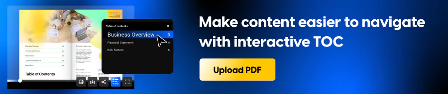
This is where a clickable, well-placed table of contents becomes essential.
In digital documents, the TOC usually appears in the first few pages and is built with internal links that jump to specific sections or chapters. It has to work on desktops, tablets, and phones, and it has to look good doing it. Navigation needs to feel seamless within the flow of the publication.
This guide covers how to design a table of contents that works inside digital documents like flipbooks, brochures, and digital magazines with practical design tips and ready-to-use templates to get you started.
Table of contents
Quick comparison: choose your ideal table of contents template
| Template Name | Primary Department | Best For (Company Size) | Main Focus | Key Benefits |
|---|---|---|---|---|
| Digital Company Magazine Template | Corporate communications | All sizes | Company magazine navigation | Clean white layout with a modern classic feel; clickable titles and page numbers for instant navigation; oversized chapter numbers and a vertical label create strong hierarchy without clutter. |
| Impactful Digital Magazine Template | Marketing | Mid market to enterprise | High contrast magazine index | Bold Index title sets the tone fast; neon accents and strong headings improve scanability; clickable icons add interaction; two page structure keeps long contents readable. |
| Artistic Magazine Template | Brand marketing | Mid market to enterprise | Cinematic split spread contents | Split layout blends editorial column with full bleed imagery; strong contrast boosts readability; clear vertical page links support fast navigation; dramatic header creates impact. |
| Digital Company Insights Magazine Template | Corporate communications | All sizes | Minimal grid table of contents | Neat row alignment for titles and page numbers; thin dividers make scanning easier; subtle arrow icons add structure; vertical Index label uses space efficiently. |
| Editable Business Technology Magazine Template | Content marketing | Startups to mid market | Editorial contents with playful accents | Circled page numbers stand out immediately; clear vertical list with short descriptions; hand drawn highlights add energy; full page photo balances the content list. |
| Customizable Tech Magazine Template | Product marketing | All sizes | Tech focused grid navigation | Bold numbers and headings create clear hierarchy; two column grid keeps items distinct; product imagery and blurbs support fast choices; teaser visual encourages deeper browsing. |
| Interactive Employee Benefits Magazine Template | HR | Mid market to enterprise | Benefits guide navigation | Clean, professional structure for quick scanning; all caps headings and arrow icons guide the reading path; two column layout adds context without crowding; vertical Contents label adds personality. |
| Interactive Design Magazine Template | Creative team | Small teams to mid market | Modular editorial contents layout | Balanced grid that mixes type, visuals, and space; staggered blocks create movement; preview images help readers choose sections faster; oversized header adds drama without feeling busy. |
| Interactive Digital Marketing Magazine Example | Marketing | Startups to mid market | Digital native contents grid | Two column structure supports fast scanning; high contrast typography improves readability; consistent page labels guide attention; minimal dividers keep the page structured. |
| Digital Design Magazine Template | Design | Small teams to mid market | Boxed sections with storytelling flow | Each section gets its own block for clarity; visuals and blurbs make topics easier to pick; vertical label reinforces the theme; bold editor note area creates a strong finish. |
| Interactive Course Catalog Template | Learning and development | Mid market to enterprise | Course catalog navigation and overview | Dark mode look with bright accents for focus; compact numbered list keeps navigation quick; aligned page references support scanning; facing page leaves room for intro text and key benefits. |
| Cookware Wholesale Catalog Example | Sales | All sizes | B2B catalog index with visual callouts | Image backed cards help buyers browse categories faster; clear headers supported by large product photos; quick highlights reduce effort for first pass browsing; built for scanning on the go. |
| Fashion Wholesale Catalog Template | Merchandising | Small teams to mid market | Streetwear catalog navigation | Grid based sections stay organized while keeping attitude; icons reinforce categories; strong visuals support the collection vibe; bold accents add personality without overwhelming the layout. |
| Interactive Online Fashion Magazine Template | Brand marketing | Mid market to enterprise | Fashion editorial table of contents | Classic serif type and monochrome palette signal premium editorial tone; vertical contents list with generous spacing improves legibility; short descriptions add clarity; strong imagery anchors the spread. |
| Tools Wholesale Product Catalog Template | Sales | Mid market to enterprise | Tools and machinery catalog navigation | Bright color blocks and large product visuals make categories easy to spot; page number badges speed up navigation; high contrast type supports quick scanning; playful elements keep heavy content approachable. |
| Beauty Products Catalog Template | Marketing | Small teams to mid market | Beauty and lifestyle catalog contents | Pastel gradient creates a calm mood; thin lines and light typography guide scanning; essentials only list keeps it readable; product names and page numbers are easy to spot. |
| Editable Wholesale Product Catalog Template | Sales operations | All sizes | Minimal catalog index | Clean typography and monochrome icons keep it professional; generous spacing gives each entry room; two column structure balances long lists; icons support navigation without stealing attention. |
| Security Company Profile Brochure | Sales leadership | Enterprise | High trust profile navigation | High contrast layout builds authority fast; bold statements and stats reinforce credibility; compact icon driven contents supports quick jumping; sharp callouts keep the message focused. |
| Interactive Hotel Promotional Brochure Template | Hospitality marketing | All sizes | Hotel brochure navigation with a luxury feel | Elegant typography and deep blue tones set a premium mood; clean column list improves legibility; soft icon accents guide scanning; full bleed image supports the escape theme. |
| Digital IPO Prospectus Template | Investor relations | Mid market to enterprise | Prospectus and investor report contents | Direct formal structure that stays easy to follow; subtle lines separate titles and page numbers; soft gradients make the layout feel more approachable; supporting context area helps frame key points. |
What customers say about Flipsnack templates
The best flipbook tool I have used
Flipsnack is easy to use and offers all the features a small business needs, at a very affordable price. There are plenty of templates to choose from to speed up the project. Each template is easily tailored to your needs. The support is good and fast through the chat function, and they also provide a phone number (infrequently these days) in case you prefer a phone call.
Leonardo Soto, President of SotoNets Cloud Solutions
Reviewed on G2
Content page design examples from ready-to-use templates
Here are some table of contents examples that show how to hook readers and help them navigate your content with ease.
1. Digital Company Magazine Template
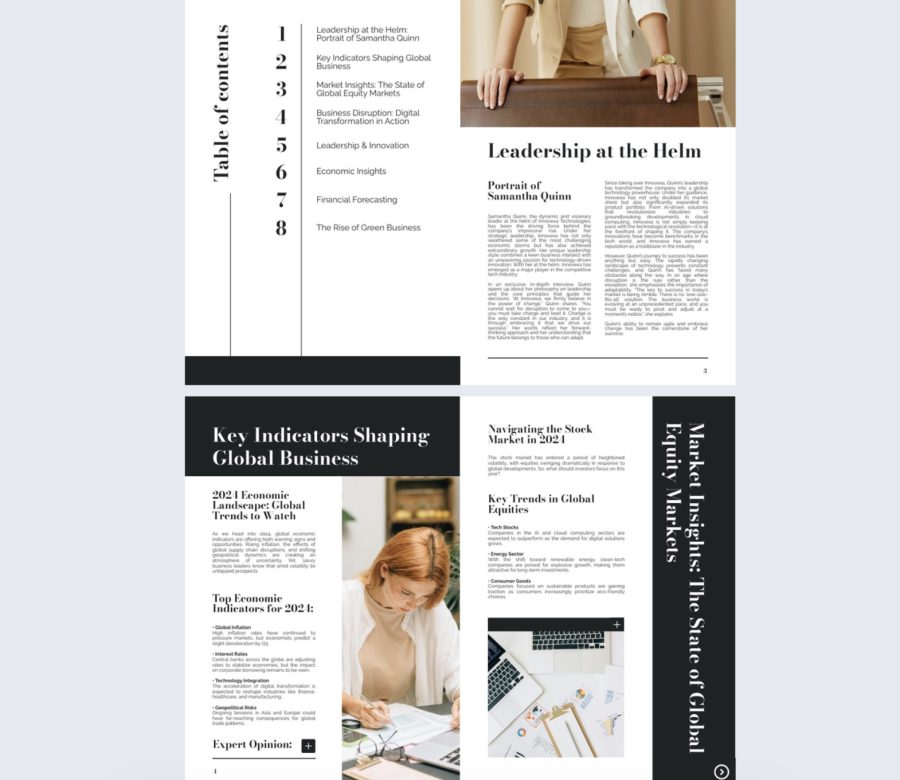

A clean table of contents works best when it sets expectations fast and stays out of the way. This one does that with a white background, classic spacing, and clickable titles and page numbers.
Best for: Company magazines for any size team, especially corporate communications, internal comms, and executive updates.
Real-world application: A comms team can publish a quarterly company magazine where readers jump straight to CEO notes, department wins, and milestones from the first page. The clickable contents reduces “where do I find this” messages.
The layout includes a vertical “Table of Contents” label and oversized chapter numbers that pull attention without clutter. Keep section titles short so the links stay easy to scan.
Common mistake to avoid: Do not cram in every minor item. If your contents list runs long, group items into clear chapters and keep the first page focused on the biggest sections.
Share it with a public link for broad audiences, or use password protection when the magazine includes internal results or people updates.
2. Impactful Digital Magazine Template
This table of contents example feels like a statement. The bold “Index” title, strong contrast, and clickable icons make navigation feel intentional.
Best for: Marketing magazines, innovation reports, and brand publications for mid sized and enterprise teams.
Real-world application: A marketing team can publish a trend report where each section has an icon link for fast jumps. Splitting the contents across two pages also keeps the list readable on mobile.
The layout includes neon accents, right aligned page numbers, and oversized section numbers that make scanning quick. Use the quote and icon areas to add rhythm, but keep them consistent.
Common mistake to avoid: Overusing neon accents makes the page noisy and hurts readability. Pick one accent color role and stick to it.
Share it as a link in email campaigns, and track which sections people open first to learn what topics pull attention.
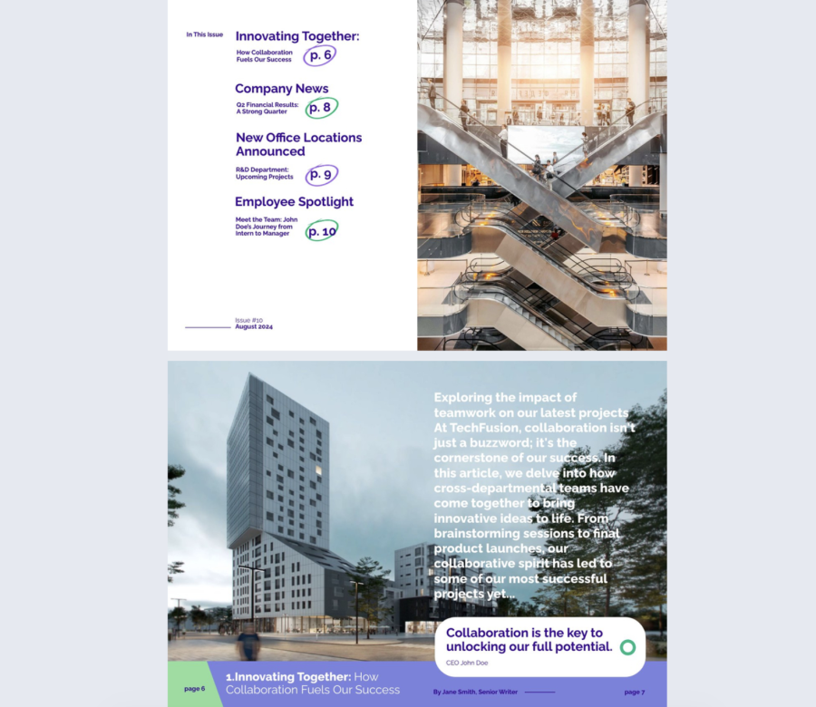
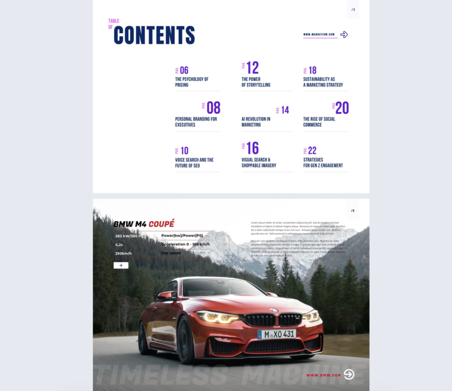
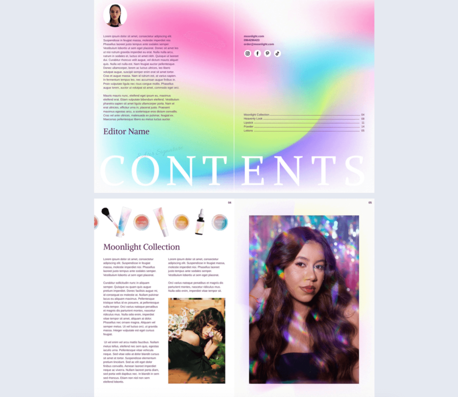
3. Artistic Magazine Template
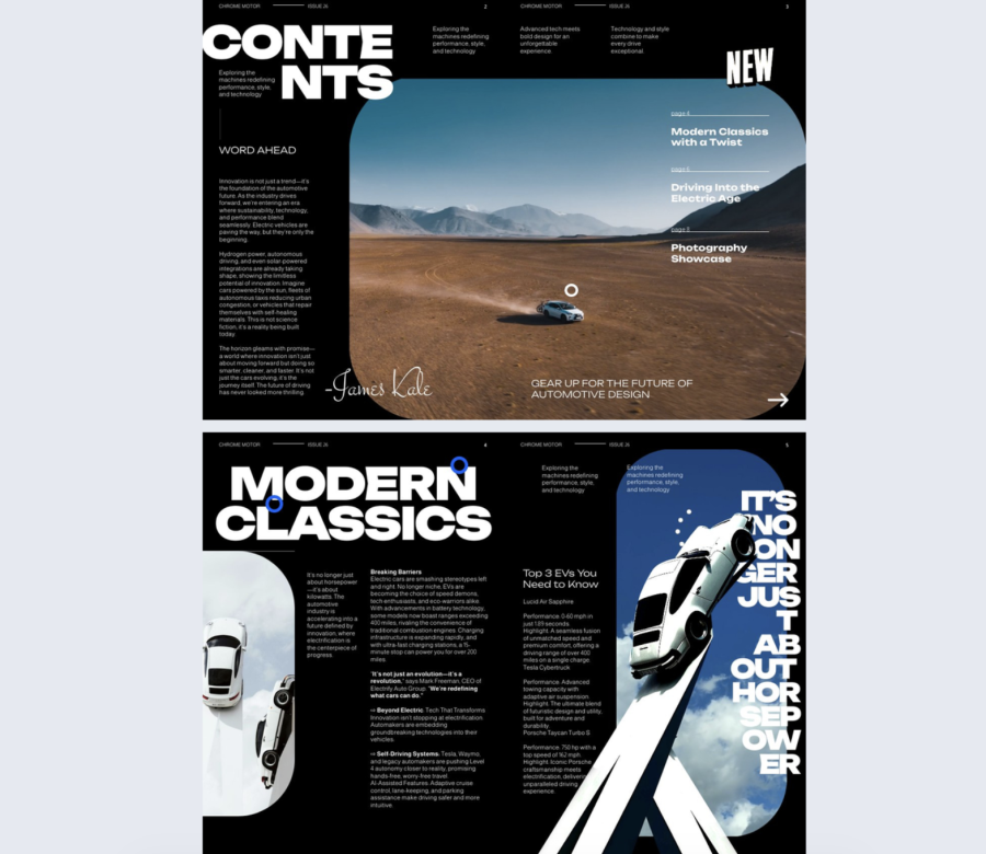
This table of contents design is built for impact, not subtlety. The split page layout and big “CONTENTS” headline create a cinematic entrance to the publication.
Best for: Automotive, tech, and innovation magazines where visuals and storytelling matter, usually for mid sized and enterprise teams.
Real-world application: A product marketing team can open a launch magazine with a strong hero image, then use the floating contents links to send readers to features, specs, and customer stories.
The layout includes a dark editorial column, a full bleed landscape visual, and a clean vertical list of links. Use an image with enough contrast behind the links so they stay readable.
Common mistake to avoid: Choosing a busy photo that fights the text. If the image is detailed, add a subtle overlay behind the link list so the text stays clear.
Share it as an embedded flipbook on a campaign landing page so the cover spread makes sense in context.
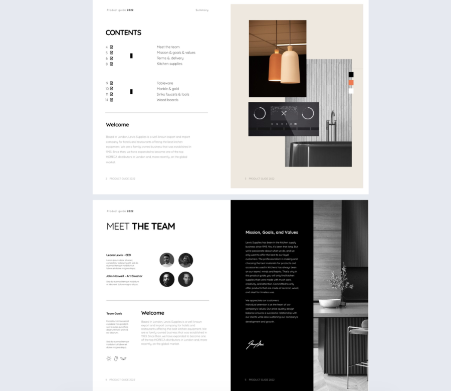
4. Digital Company Insights Magazine Template
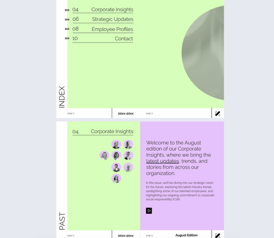
This table of contents design is for people who want order. The grid structure, thin lines, and calm color keep the focus on clarity.
Best for: Internal publications, guides, and structured magazines for any company size.
Real-world application: A people team can build an internal handbook where each section lines up cleanly with its page reference, which helps readers find policies without hunting.
The layout includes a soft green background, aligned titles and page numbers, thin separators, and small arrow icons. Keep typography consistent, and do not mix too many styles.
Common mistake to avoid: Adding decorative elements in every row. Use icons as cues, not as filler.
Share it through your intranet, or add it to a bookshelf when you manage multiple guides for different teams.
5. Editable Business Technology Magazine Template
This content page design feels casual and energetic on purpose. The circled page numbers and hand drawn accents make the contents page feel less corporate, while the structure stays clear.
Best for: Business tech magazines, internal newsletters, and culture focused content for startups and mid sized teams.
Real-world application: A recruiting or employer brand team can publish a “life at our company” issue where readers jump to teams, perks, and stories without scrolling.
The layout includes bright circled numbers, strong headings, short descriptions, and a full page photo that balances the text list. Keep the descriptions to one or two lines so the page stays clean.
Common mistake to avoid: Making the circles and highlights inconsistent. If the styling looks random, it stops feeling intentional.
Share it with a link on social channels, and use analytics to see which departments or stories get the most clicks.
6. Customizable Tech Magazine Template
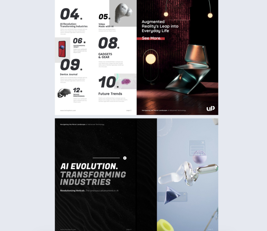
This is a tech centered contents page design that uses structure and visuals to guide attention. The grid makes each item feel distinct, which helps when your content is feature heavy.
Best for: Product marketing, product updates, and tech publications for startups through enterprise.
Real-world application: A SaaS company can publish a quarterly product magazine where each section pairs a short blurb with a visual anchor so readers pick what matters to them.
The layout includes bold numbers, large headings, a two column grid, and imagery that supports each section. Treat blurbs as teasers, not summaries.
Common mistake to avoid: Writing blurbs that are too long. If the contents page turns into a wall of text, people stop scanning.
Share it with segmented links per audience, and send different teams to the sections that match their needs.
7. Interactive Employee Benefits Magazine Template
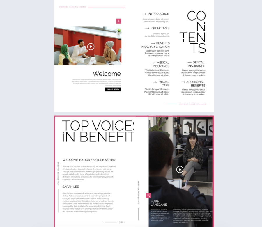
This table of contents is for corporate clarity with a small twist. The all caps headings and arrow icons create a clear path through the page, while the vertical “CONTENTS” wordmark adds style.
Best for: HR benefits guides, proposals, internal briefings, and marketing decks, mainly mid sized and enterprise teams.
Real-world application: An HR team can send a benefits guide before open enrollment and reduce repetitive questions by linking directly to the sections people care about.
The layout includes two columns, short context text under headings, and simple directional icons. Keep the subtext factual and short so the headings stay in control.
Common mistake to avoid: Stuffing policy details into the contents page. Save detail for the sections and keep the contents focused on navigation.
Share it with password protection when benefits include internal rates or documents meant only for employees.
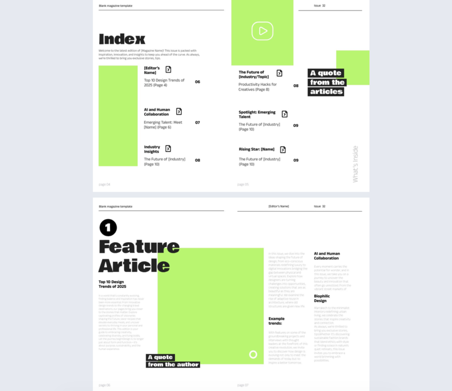
8. Interactive Design Magazine Template
This contents page is built for creative pacing. The modular grid, staggered blocks, and oversized header make the spread feel editorial without becoming messy.
Best for: Creative publications, student issues, studio magazines, and design led content for small teams and mid sized organizations.
Real-world application: A design team can publish a quarterly inspiration issue where preview images help readers choose which stories to open first.
The layout includes varied content blocks, some with images, some with short descriptions, arranged in a grid that still feels controlled. Keep image styles consistent so the page does not look improvised.
Common mistake to avoid: Mixing too many image types and sizes. Set a simple rule for previews and follow it.
Share it as a portfolio piece, and use heat and click data to learn which topics trigger deeper reading.
9. Interactive Digital Marketing Magazine Example
This table of contents design is direct and digital native. Strong typography, a two column grid, and consistent page labels make it fast to scan.
Best for: Marketing reports, trend decks, and thought leadership publications for startups and mid sized teams.
Real-world application: An agency can deliver a quarterly insights report where clients jump straight to channels, case studies, and results without flipping page by page.
The layout includes a heavy “CONTENTS” headline, all caps headings, minimal dividers, and page labels that guide the eye. Keep section titles concrete so scanning stays quick.
Common mistake to avoid: Using all caps for everything. Reserve it for headings, otherwise readability drops.
Share it as a download alternative on a report page, and measure which sections get the most attention.
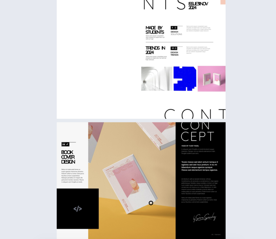
10. Digital Design Magazine Template
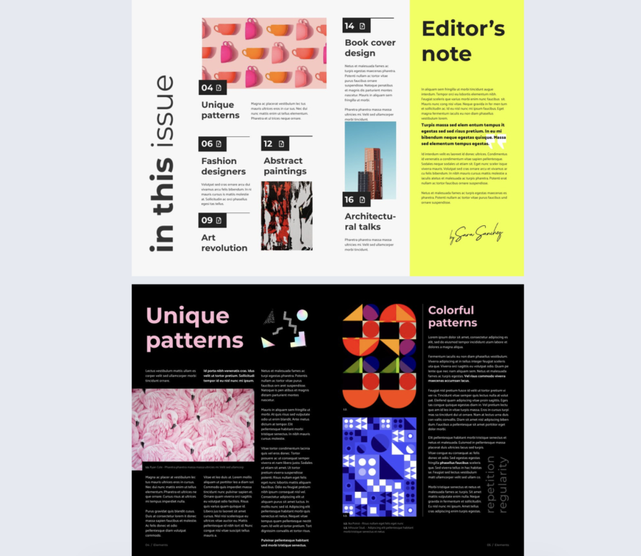
This contents page uses boxes and visuals to give each topic its own space. The structure supports storytelling, while the design keeps energy in the layout.
Best for: Design magazines, studio publications, and storytelling led content for small teams and mid sized organizations.
Real-world application: A creative studio can publish a seasonal issue where each boxed section points to a project, an interview, or a process breakdown.
The layout includes boxed entries, short blurbs, a vertical label, and a bold editor note area that can carry a key message. Keep the boxes evenly spaced so the page does not feel cramped.
Common mistake to avoid: Adding too many boxes and shrinking everything to fit. If you have too many sections, create a second contents spread.
Share it as an embedded piece on your studio site so the editorial layout shows as intended.
11. Interactive Course Catalog Template
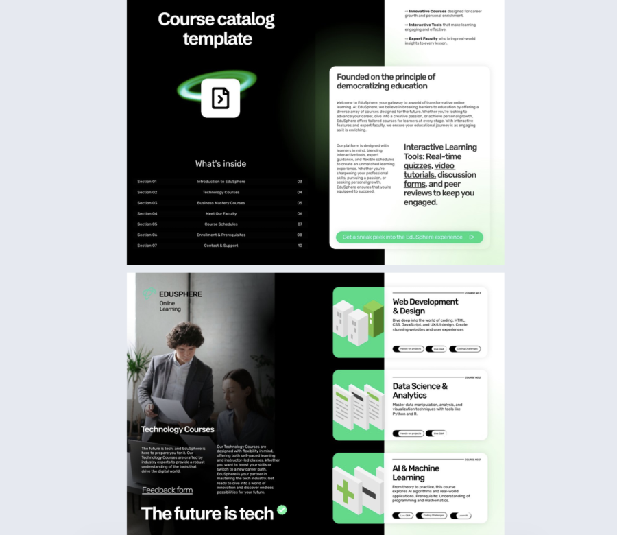
This is a modern catalog approach with a dark mode look and bright accents. The table of contents keeps navigation tight while still giving room for an intro and benefits on the facing page.
Best for: Course catalogs for mid sized and enterprise training teams, education providers, and internal academies.
Real-world application: A learning team can launch a training catalog where employees jump straight to onboarding, compliance, and role based tracks without searching.
The layout includes a compact numbered list with aligned page references and a clean intro page with rounded containers for key points. Keep course names short and consistent.
Common mistake to avoid: Mixing naming styles across courses. If one course is a sentence and another is two words, the list becomes harder to scan.
Share it in your onboarding emails, and track which tracks get opened most so you can prioritize content updates.
12. Cookware Wholesale Catalog Example
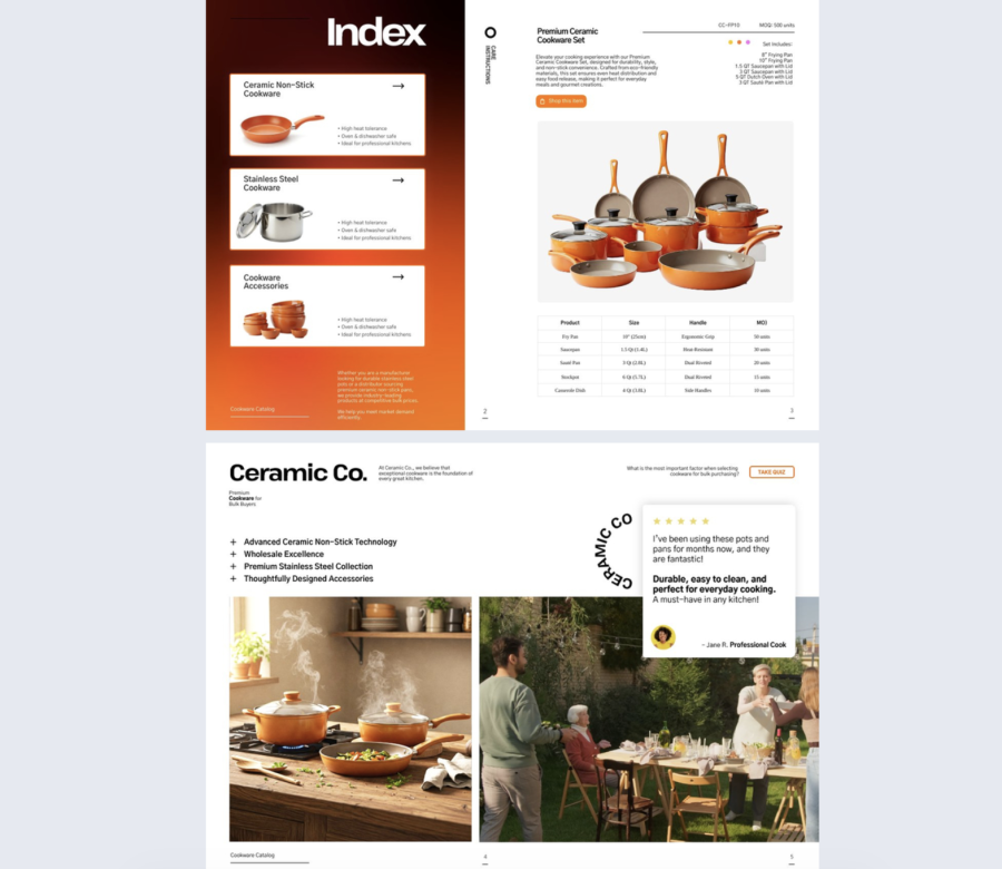
This contents page is built for browsing, not reading. Image backed cards and large product photos help buyers move fast.
Best for: B2B catalogs and wholesale presentations for any company size.
Real-world application: A cookware wholesaler can send buyers a catalog where the contents works like a menu, guiding them to categories and key product lines in seconds.
The layout includes a contents page with visual cards, quick feature highlights, and clear headers supported by large photos. Keep highlights short and specific, like “nonstick sets” or “stainless pans”.
Common mistake to avoid: Using small, low quality product images. If the first impression is weak, buyers will not explore deeper.
Share it with a trackable link per buyer account so your sales team sees what each buyer clicked.
13. Fashion Wholesale Catalog Template
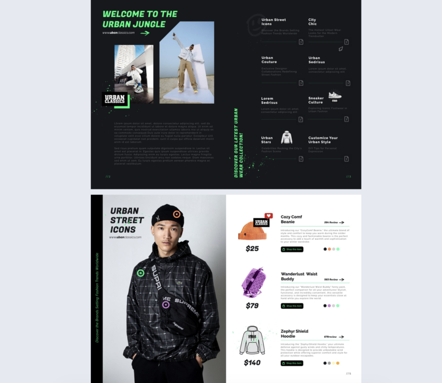
This is an attitude driven table of contents page that still stays organized. The gritty visuals and icons support the streetwear tone while the grid keeps navigation clear.
Best for: Fashion catalogs, youth culture lookbooks, and seasonal wholesale lines for small teams and mid sized brands.
Real-world application: A streetwear brand can publish a season drop catalog where buyers jump to categories like outerwear, accessories, and footwear without losing the vibe.
The layout includes a right side grid of sections, short descriptions, icons, and strong imagery on the left. Keep descriptions tight so the grid stays readable.
Common mistake to avoid: Adding too many effects, splashes, and stickers. One strong motif is enough.
Share it as a digital lookbook link after launch, and use analytics to see which categories pull the most interest.
14. Interactive Online Fashion Magazine Template
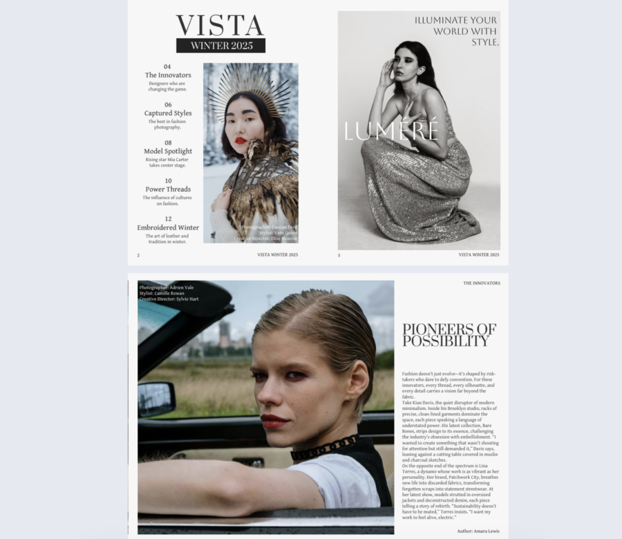
This table of contents design leans into classic editorial authority. Serif typography, monochrome styling, and generous spacing make the contents feel premium and calm.
Best for: Fashion magazines, seasonal lookbooks, and art directed brand publications, mainly mid sized and enterprise.
Real-world application: A boutique brand can create a seasonal issue where readers jump to collections, styling notes, and interviews, while the imagery sets the mood.
The layout includes a vertical contents list, short descriptions, and strong full page visuals that carry the brand tone. Keep descriptions helpful, not poetic.
Common mistake to avoid: Writing long descriptions that destroy spacing. If the layout depends on breathing room, protect it.
Share it through email and on brand pages, and use section click data to learn which themes land.
15. Tools Wholesale Product Catalog Template
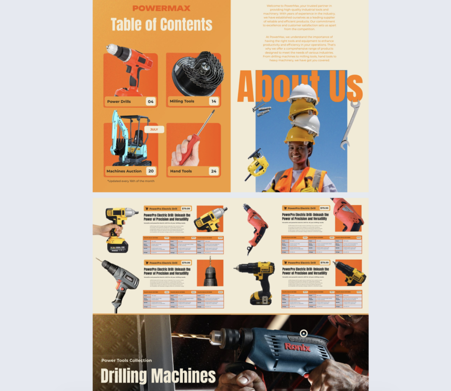
This table of contents page design is loud in a useful way. Bright blocks, big product photos, and page badges make it easy to navigate equipment heavy catalogs.
Best for: Tools and machinery catalogs for mid sized and enterprise sales teams.
Real-world application: A distributor can send a catalog to procurement teams where buyers jump straight to categories like power tools, accessories, and safety gear.
The layout includes bold category visuals, page number badges, and oversized typography that is hard to miss. Keep category names consistent and avoid clever labels.
Common mistake to avoid: Forgetting performance. Big images can slow load times, so compress assets and keep the page responsive.
Share it via a sales follow up link and track the categories each buyer spends time on.
16. Beauty Products Catalog Template
This contents page is calm and minimal. The pastel gradient sets the mood, and the list stays focused on essentials.
Best for: Beauty and lifestyle catalogs for small teams and mid sized brands.
Real-world application: A skincare brand can publish a product catalog where readers jump to routines, bestsellers, and ingredient focused sections fast.
The layout includes a large “CONTENTS” anchor, thin guiding lines, delicate typography, and a clean column of product names and page numbers. Make sure text contrast stays readable against the gradient.
Common mistake to avoid: Using light text on a light gradient. If readability drops, the design stops doing its job.
Share it as a link on product pages, and use clicks to learn which lines people want to explore.
17. Editable Wholesale Product Catalog Template
This contents page design minimal and professional, with just enough icon support to guide navigation. It works when you need clarity more than flair.
Best for: Product catalogs, professional guides, and lookbooks for any company size.
Real-world application: A kitchenware brand can create a clean catalog where buyers jump to categories using icons next to page references.
The layout includes two columns, generous spacing, clean typography, and monochrome icons that support scanning. Keep icon style consistent across the page.
Common mistake to avoid: Mixing icon sets from different styles. That small mismatch makes the whole page feel off.
Share it with a private link when pricing is included, and publish a public version without pricing for broader distribution.
18. Security Company Profile Brochure
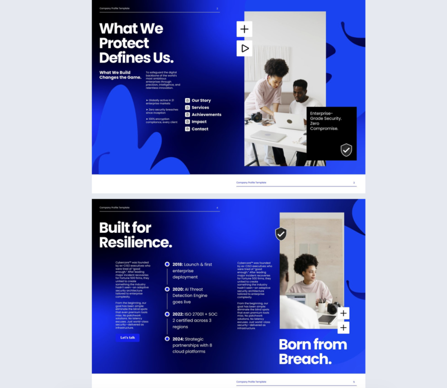
This is built for trust and authority. High contrast messaging and an icon driven contents page make the reader feel guided and reassured.
Best for: Enterprise company profiles, cybersecurity decks, and high trust industries.
Real-world application: A security firm can use this for sales outreach and RFP responses where stakeholders need to find capabilities, compliance, and case studies fast.
The layout includes bold statements, visible stats, clean visual callouts, and a compact contents list that supports quick jumps. Keep claims specific and backed up.
Common mistake to avoid: Dropping big numbers with no context. If a stat matters, add a source note or a short explanation inside the section it belongs to.
Share it with role based links so buyers, technical reviewers, and executives can land where they need to start.
19. Interactive Hotel Promotional Brochure Template
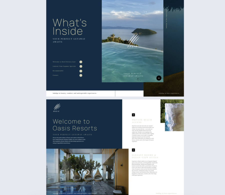
This content page design sells the feeling first, then gives structure. Deep blue tones, elegant type, and a calm list make the contents easy to scan.
Best for: Hotel and travel brochures for any size hospitality team, especially premium properties.
Real-world application: A resort can send a brochure where guests jump to suites, dining, spa, and activities, while the full bleed image reinforces the escape theme.
The layout includes a clean column list, soft icon accents, generous spacing, and a strong hero image. Keep copy minimal and let visuals carry the mood.
Common mistake to avoid: Using generic imagery that does not match the property. If the image is weak, trust drops.
Share it in booking emails and partner outreach, and track which amenities get clicked most.
20. Digital IPO Prospectus Template
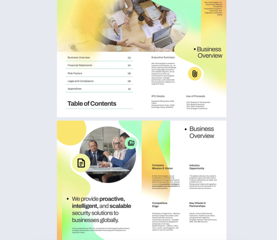
This contents page keeps finance content approachable without losing structure. Soft gradients and clean typography help the document feel modern, while the layout stays formal.
Best for: Investor reports, company profiles, and IPO overview style documents for mid sized and enterprise teams.
Real-world application: A finance team can publish an investor report where readers jump straight to business overview, risk factors, financials, and market sections without digging.
The layout includes left aligned section titles, page numbers separated by subtle lines, and a companion area for context and key points. Keep section naming consistent with the document headers.
Common mistake to avoid: Letting the tone get too casual. Investor content needs clarity, precision, and consistent terminology.
Share it as a controlled link for investor groups, and use engagement data to see which sections raise the most interest or questions.
Now, let’s see how to create a table of contents.
How to create a table of contents in Flipsnack
Flipsnack makes it easy to add a clickable table of contents to your flipbooks, whether you’re uploading a PDF or starting from scratch.
1. Import from a PDF
If your uploaded PDF already includes a well-formatted TOC, Flipsnack can automatically detect it. Just make sure the file isn’t exported as spreads and that the TOC is properly structured (especially if you’re using tools like InDesign or Acrobat Pro). When detected, the table of contents will be active by default in your flipbook’s navigation bar.
2. Create a TOC manually
If your PDF doesn’t have a built-in TOC or you’re building your flipbook in Flipsnack, you can create one from scratch:
- Go to the Customize page.
- Click Table of contents in the left-hand menu.
- Activate the feature, then click Add new to insert chapters or subchapters.
- You can assign names, link them to specific pages, and reorder or remove them at any time.
2.1 Edit or update anytime
You can access and update your TOC from three places:
- The Main Dashboard (Customize > Table of Contents)
- The Details Page under your flipbook preview
- Directly from the Design Studio via the Customize Preview button
Chapters are linked to pages, not static numbers, so if you rearrange or delete pages, the TOC will stay synced or let you fix broken links easily.
2.2 Make the TOC open by default
To help readers find content faster, you can choose to have the table of contents open automatically when someone views your flipbook:
- Go to Customize > Table of contents
- Check Start with table of contents open
- Optionally, save this as a default for future flipbooks
This is especially helpful for longer documents or complex layouts.
Design tips for better content page design
Based on the templates above, here’s what we can learn about designing TOC pages that actually do their job: getting people to the content fast, while reinforcing the style and tone of the publication.
1. Start with structure
Design isn’t decoration. If your TOC doesn’t help people find what they’re looking for, it’s failing. The best layouts keep things aligned, easy to scan, and logically grouped. Two-column layouts work well when there’s more content, while single-column designs let each section breathe.
2. Typography drives hierarchy
Headings should stand out. Oversized numbers, all-caps titles, and contrasting fonts make it easier to scan the page. Serif fonts can signal elegance and tradition, while clean sans-serifs feel more modern and efficient. Whatever you choose, be consistent and don’t overload the page with styles.
3. White space is useful
Crowding every inch with content or visuals makes navigation harder. A little breathing room around each element improves legibility and makes the whole layout feel more intentional.
4. Use color to guide, not overwhelm
High-contrast colors can make headings pop and clickable elements more obvious, but too many bright tones at once compete for attention. Soft gradients or muted palettes can add mood without stealing focus. Choose one visual direction and stick to it.
5. Icons and visuals should earn their place
Icons can make a layout more intuitive, but only if they’re used consistently and clearly. Avoid mixing styles. Full-page photos or illustrations work best when they balance the layout, not when they dominate it. Visuals should support the content, not distract from it.
6. Interactivity makes navigation easier
In digital formats, clickable page numbers or section titles are a no-brainer. It’s also worth adding subtle hover states or animations—just enough to signal that something’s interactive, not so much that it feels like a game.
7. Think about rhythm, not just layout
The best TOCs create a visual rhythm. This could be done with alternating blocks, staggered sections, or variations in typography. It keeps the reader moving down the page instead of zoning out halfway through. Similarly, if you’re tasked with summarizing a lengthy document efficiently, a guide on how to write a precis can help you condense key points and maintain the original flow, much like how well-structured TOCs guide readers seamlessly.
8. Let the content set the tone
A tech catalog shouldn’t look like a spa brochure. A fashion lookbook doesn’t need to feel like a financial report. Every design choice—type, color, spacing, layout—should support the content it introduces.
Conclusion
Whether you’re creating a flipbook, brochure, or digital magazine, your TOC should be functional, intuitive, and visually aligned with the rest of your publication.
With the right structure, smart design choices, and tools like Flipsnack, building a TOC that actually helps your audience isn’t complicated.
Why visitors still make use of to read news papers when in this technological globe all is available on net?
It’s the size of the newspaper, a large page let’s my eyes decide what to read next.i can fully joy the layout of the different types of text and the graphic layouts. Reading on a lap top or phone gives me no enjoyment. Which is more uplifting to look at a typed term paper or good magazine? In my world a great magazine wins all the time.
Do you have any video of that? I’d like to find out
more details.
Not yet, but we’re planning a tutorial
Is there a way to search the contents of multiple magazine issues?
Sorry, but you can only search in one magazine at a time.