6 medical brochure examples (and what makes them work)
Published on: 24th September, 2026
Most medical brochures fail in one of two ways. Either they read like a data sheet, dense, technical, written for someone who already understands the product. Or they read like nothing’s changed since 2004: a stock photo, three columns of small text, a fax number nobody uses anymore.
Bad content – as we’ll go over in a bit – contributes to this, but it isn’t the main culprit. That unenviable title goes to design choices. Luckily, every one of them is fixable once you’ve seen a brochure that gets it right. For nurses, patients, and buyers alike, fusing well-optimized content and design is key.
Here are six real, published medical brochures, built by a hospital system, a nursing school, a medical association, and two health-tech vendors selling into hospitals. Each one solves a different version of the same problem: complex, high-stakes information that has to land with a reader who didn’t ask to read a brochure.
In this article, you’ll discover:
- What a medical brochure needs to include, regardless of audience
- How a patient-facing brochure differs from one aimed at doctors or hospital administrators
- Six real examples across patient care, higher ed, and B2B health-tech, and what to borrow from each
- What B2B health-tech brochures need that patient brochures don’t
- How to build your own without starting from a blank page
Table of contents
- What is a medical brochure?
- 6 medical brochure examples worth studying
- What should a medical brochure include?
- Patient brochures vs. brochures for doctors and administrators
- Print vs. digital medical brochure
- What B2B health-tech brochures need that patient brochures don’t
- How to build your own medical brochure with Flipsnack
- Which brochure approach fits your organization?
- Make your medical brochure with Flipsnack
- FAQ about medical brochures
What is a medical brochure?
A medical brochure is a short-form publication that explains a health-related service, product, or program to a specific reader, whether that reader is a patient, a prospective student, or a hospital administrator evaluating a purchase.
Unlike a general marketing brochure, it usually has to balance plain language against real clinical or technical accuracy, and it often needs to satisfy accessibility expectations a consumer brochure never has to meet.
6 medical brochure examples worth studying
1. WVU Rockefeller Neuroscience Institute, by WVU Medicine

WVU Medicine’s RNI brochure introduces a hospital system’s neuroscience program to patients and referring clinicians in one document. It leans on real photography of the facility and researchers rather than generic medical stock imagery, which is what makes a specialized program feel tangible instead of abstract.
Borrow this: use real photos of your actual people and space. A specialized clinical program earns more trust from one real photo than from ten polished stock images.
2. Nursing program brochure, by the University of Windsor
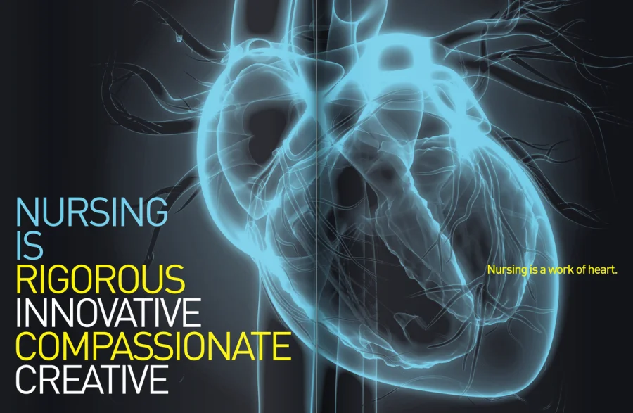
The University of Windsor’s nursing brochure is a recruitment piece aimed at prospective students, not patients, which is a useful reminder that “medical brochure” covers more than clinical care. It’s built as an interactive flipbook rather than a static PDF, matching the expectations of a digitally native applicant.
Borrow this: match the format to the reader’s habits. A prospective student expects a digital, shareable experience, not a scanned pamphlet.
3. VeriCre, by the American Medical Association
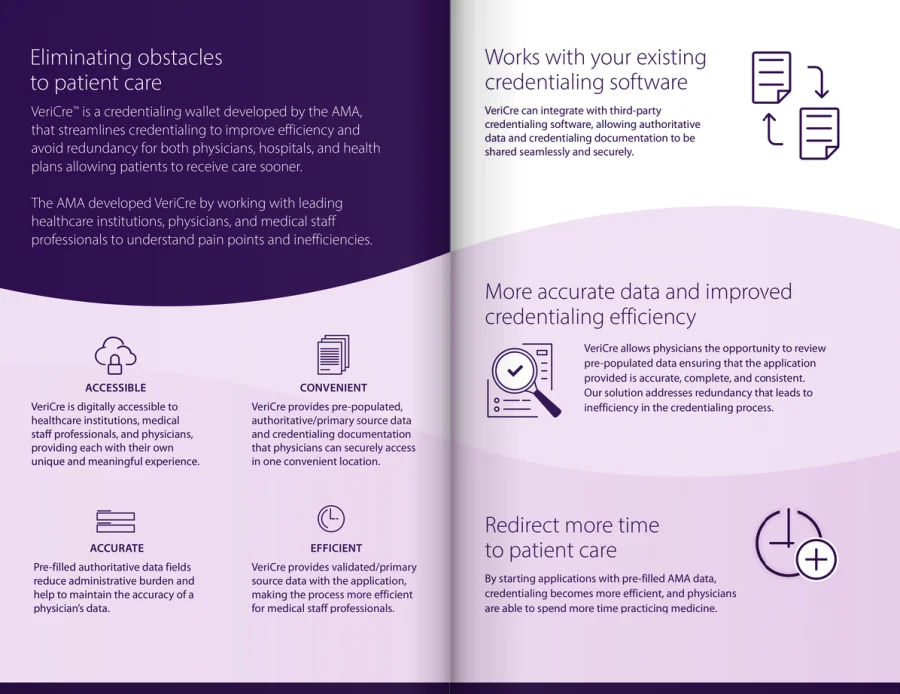
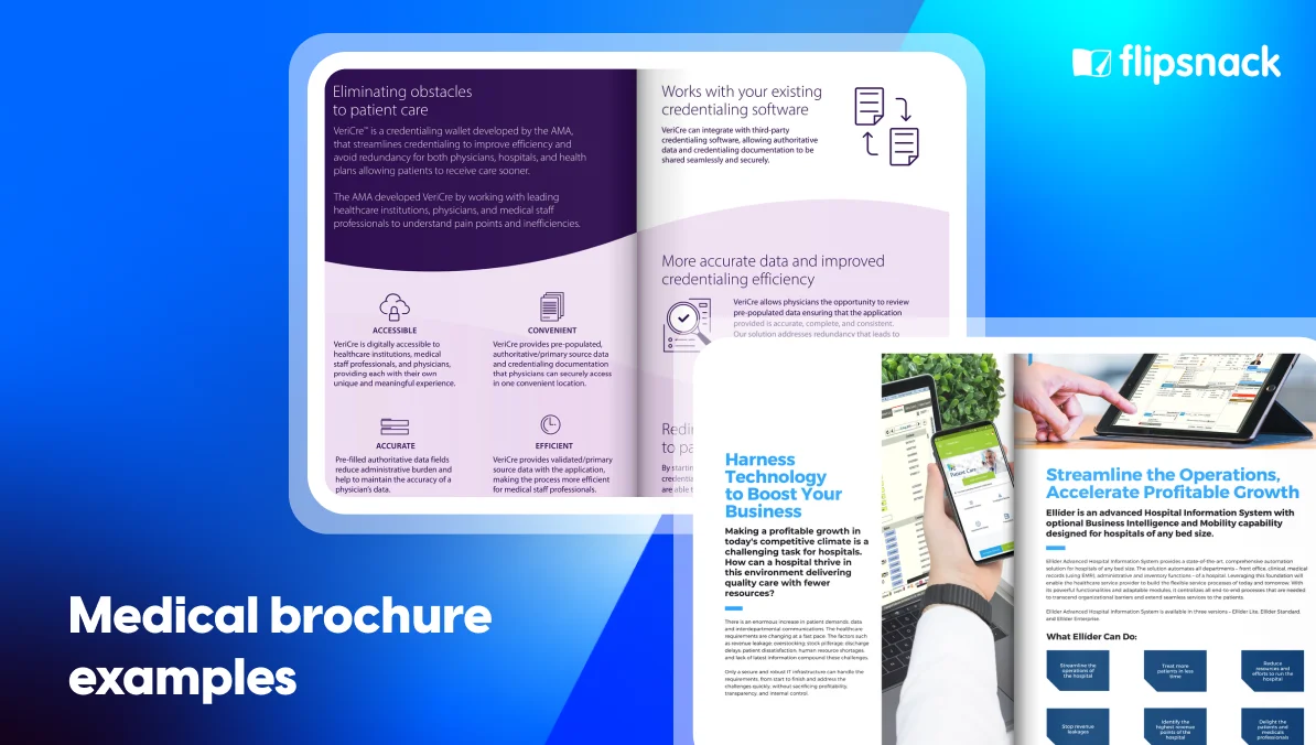
The AMA’s VeriCre brochure introduces a credentialing product to healthcare organizations, a B2B audience evaluating a specific operational tool. It states plainly what VeriCre is and where it sits in the AMA’s product family, rather than opening with a mission statement.
Borrow this: name the product and its category in the first line. A B2B reader is deciding whether this is relevant before they read a single benefit.
4. Tacera nurse call system, by Austco
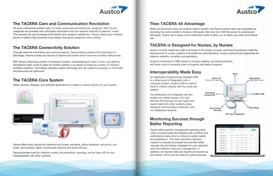
Austco’s Tacera brochure sells a clinical communications platform to hospital administrators, a reader who needs to understand flexibility and workflow fit, not marketing language. The brochure states what the system does for “the way your caregivers work,” binding the feature directly to an operational outcome.
Borrow this: tie every capability to the specific workflow it changes. A hospital buyer isn’t evaluating features in the abstract, they’re evaluating fit with how their staff already work.
5. Ellíder Hospital Information System, by Datamate Infosolutions
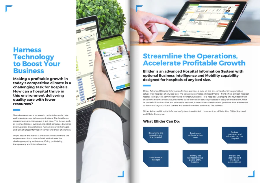
The Ellíder brochure positions a hospital information system as scalable “for hospitals of any bed size,” addressing a real buyer objection (will this work for a facility our size) in the brochure’s own framing rather than leaving it for a sales call.
Borrow this: name the objection your buyer is already thinking and answer it in the brochure itself, not three calls later.
6. Mental Wellness, by Amicus Patient & Professional Advocacy
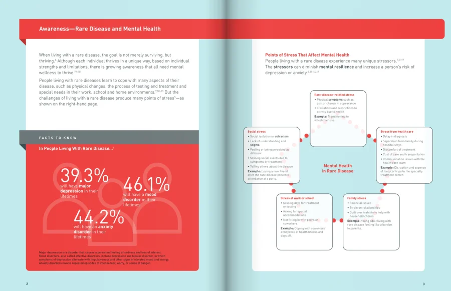
Amicus’s Mental Wellness brochure covers a sensitive subject for a patient and professional advocacy audience. Its interactive, page-turning format gives a heavier topic room to breathe across multiple pages instead of compressing it into one dense panel.
Borrow this: give sensitive subjects space. A longer, paced format reads as more respectful of the topic than a cramped single page trying to cover everything at once.
See more brochure templates for healthcare →
What should a medical brochure include?
This builds on what every brochure needs as a baseline, then layers on what healthcare changes.
The short answer: Every medical brochure needs a clear headline, plain-language content, real imagery, a clean layout, contact information, and a specific next step. Healthcare adds two more: accessible design and, wherever a claim or testimonial appears, an honest disclaimer.
- A headline that states the point. Not a tagline, the actual subject, stated plainly enough that a reader knows what they’re looking at in two seconds.
- Plain-language content. Specialist language belongs in the footnotes, not the headline, especially when the reader is a patient rather than a clinician.
- Real, relevant imagery. A generic stock photo of a stethoscope tells a reader nothing. A real photo of the facility, product, or program does.
- A clean, scannable layout. Sections, subheadings, and a table of contents on anything longer than a single page.
- Contact information a reader can act on. A phone number or form that reaches an actual person, not a general inbox.
- A specific call to action. Request info, book a tour, request a demo, whatever the next real step is.
- Testimonials or endorsements, honestly sourced. Named, attributed, and never invented.
- Disclaimers where they’re legally or ethically required. Any clinical claim, any patient testimonial, any pricing or coverage detail needs the disclosure that goes with it.
- HIPAA-aware handling, whenever PHI enters the picture. Patient-specific material needs real access controls and a signed Business Associate Agreement with whatever platform hosts it, like Flipsnack’s healthcare compliance software.
Patient brochures vs. brochures for doctors and administrators
A patient brochure explains. A B2B health-tech brochure justifies a purchase. That single difference changes almost everything else about the document, down to the words on the page and where it ends up getting sent.
Most roundups of medical brochure examples treat this as one audience, folding patient handouts and product sheets together without distinction. Splitting the two matters here, since the checklist above and the CTA below differ depending on which reader you’re building for.
What a patient or prospective student needs
This reader has seconds, no background knowledge, and rarely a reason to be reading a brochure before someone hands them one. A waiting-room handout or a recruitment packet needs a headline that states the point immediately, real photography over stock imagery, and plain language a stranger could act on without a medical dictionary.
Three examples below write for exactly this reader: the WVU Rockefeller Neuroscience Institute brochure, the University of Windsor’s nursing recruitment piece, and Amicus’s Mental Wellness brochure. None of them try to close a sale. They orient someone toward a next step: a referral, an application, a program.
What a hospital administrator or IT buyer needs
This reader has time, technical fluency, and a budget to defend to someone else. A brochure aimed at procurement has to survive that conversation: naming the product category in the first line, tying every feature to a specific workflow, and answering the objection a buyer is already forming before they finish the page.
VeriCre, Tacera, and Ellíder below are all written for this reader. Each reads less like a pamphlet and more like the opening argument in a sales conversation, because that’s the job it’s actually doing.
Mixing up which reader you’re writing for is the fastest way to lose them in the first paragraph. Know which one you’re building for before you write a single line.
Print vs. digital medical brochure
For general format and sizing guidance that applies beyond healthcare, see standard brochure sizes.
| Capability | Print brochure | Digital medical brochure |
|---|---|---|
| Updates | New print run required | Same link, updated instantly |
| Reader tracking | None | Page views, clicks, drop-off |
| Accessibility | Fixed font size, no screen-reader support | Responsive text, screen-reader-friendly templates |
| Distribution | Physical racks, mailers | One link, QR code, or embed |
| Interactivity | None | Video, forms, clickable sections |
A print brochure works exactly as well the day it’s designed as it does two years later, which is the problem. A digital one keeps adjusting: to the update, to the device, to what the platform tells you readers actually looked at.
That tracking gap is exactly why a hospital-administrator brochure, where someone is deciding whether to follow up on a demo request, benefits from digital in a way a waiting-room pamphlet might not need.
What B2B health-tech brochures need that patient brochures don’t
Three of the six examples above, VeriCre, Tacera, and Ellíder, are selling into a hospital’s procurement process, not to a patient. That reader needs a few things a patient brochure doesn’t:
- A clear product or service description. What it is, and what category it belongs to, stated in the first few lines.
- Technical specifications or integration details. A hospital IT buyer needs to know what the product connects to before they’ll take a meeting.
- Credentialing or compliance context. Where relevant, what standards or certifications back the product.
- A path to a demo or a named contact, not a generic “learn more” link.
None of that belongs in a patient-facing brochure, and dropping it into one is how a document meant to reassure a patient ends up reading like a spec sheet instead.
How to build your own medical brochure with Flipsnack
Step 1: Start from a healthcare template or your own layout
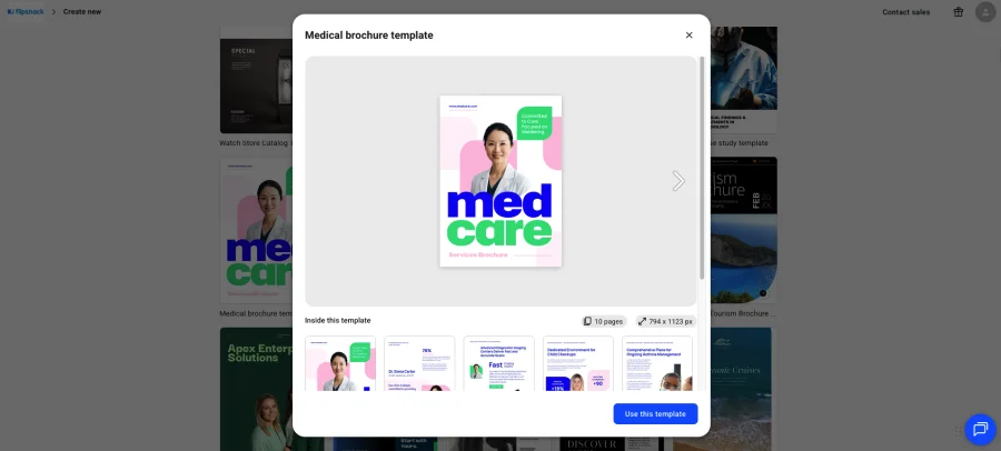
Pick a medical or healthcare-specific template, or upload your own design as a PDF and convert it into an interactive flipbook. This is one of the easiest ways to build a brochure without a designer.
Step 2: Write for the actual reader
Decide upfront whether this brochure is for a patient, a student, or a hospital buyer, and match the language, length, and level of technical detail to that reader.
Step 3: Add interactive elements
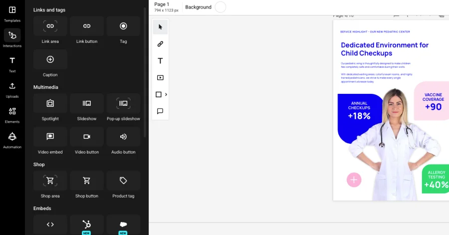
Embed video, clickable sections, or a request-info form directly into the brochure, so a reader can act without leaving the page.
Step 4: Apply your brand and check accessibility
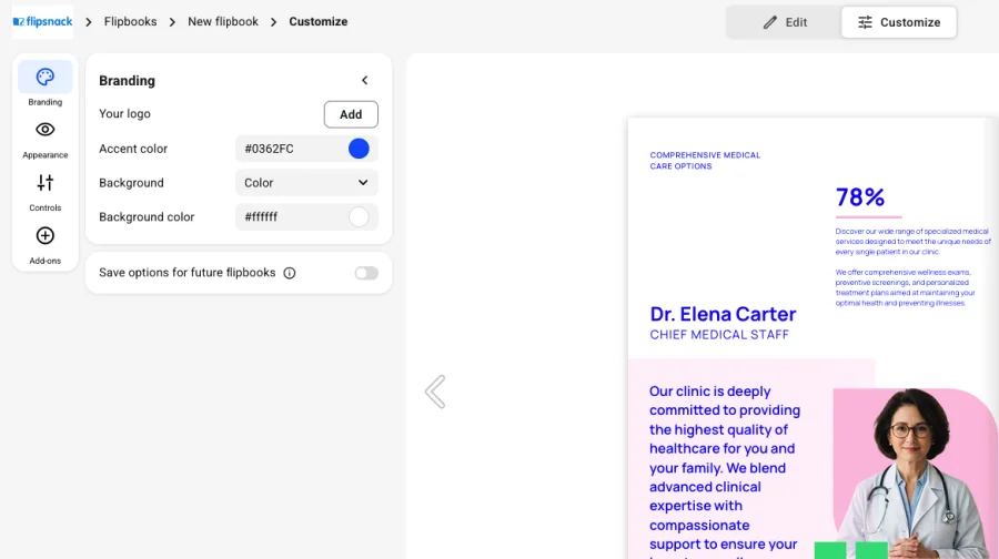
Lock your brand colors and fonts across the document, and use accessible templates and AI-generated alt text so the brochure works for screen readers.
Step 5: Publish one link and track what happens
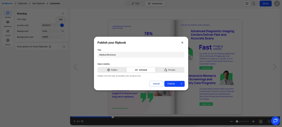
Share a single link, QR code, or embed. Built-in analytics show which pages get read and where a reader stops, so follow-up isn’t a guess.
Which brochure approach fits your organization?
Still weighing platforms? Compare brochure design software before you commit to one.
| Organization type | Recommended approach | Why |
|---|---|---|
| Hospital or health system (patient-facing) | Digital brochure with real photography and accessible templates | Builds trust fast, meets accessibility expectations |
| University or health-sciences program | Interactive recruitment brochure, shareable link | Matches how prospective students expect to browse |
| B2B health-tech or medical device vendor | Brochure with product specs, credentialing, and a demo CTA | Answers a procurement-stage reader’s real questions |
| Patient advocacy or nonprofit | Longer-format interactive brochure with paced sections | Gives sensitive topics room without overwhelming one page |
Most organizations fit one row cleanly. If you’re doing both patient outreach and B2B sales, as some hospital systems do, build two separate brochures rather than one trying to serve both readers at once.
Make your medical brochure with Flipsnack
A medical brochure works when the reader it was written for can act on it immediately, book an appointment, request a demo, apply to a program, without needing anyone to translate it first.
The six examples above solve six different versions of that problem. None of them get there with more content. They get there with the right choices for the right reader.
Study the one closest to your situation, then build yours to match.
Start your medical brochure free →
Frequently asked questions
Healthcare organizations generally aim for WCAG 2.1 AA alignment, readable fonts, sufficient color contrast, and screen-reader compatibility, since patient-facing materials often serve readers with a wider range of needs than a typical consumer brochure.
Any clinical claim, patient testimonial, or coverage detail typically needs a disclosure or disclaimer attached to it. The exact requirement depends on your organization’s legal and compliance guidance, so treat this as a design principle, not a substitute for that review.
A trifold works well for a short, single-topic patient handout. A longer program or product brochure, like several examples above, benefits from a digital, multi-page format that gives complex information room to breathe.
Most brochures break down into a headline, an introduction or problem statement, the main content or offer, supporting proof such as testimonials or data, and a call to action with contact information.
Start with the one thing the reader needs to know or do, state it in the headline, then support it with only the details that reader actually needs, cutting everything else.
Follow the same principles as a brochure at a smaller scale: one clear topic, plain language, a single call to action, and, if it’s patient-facing, a design that holds up for a reader who may only glance at it once.
Only when it carries protected health information, not simply because the subject is medical. A general service or program description usually sits outside HIPAA’s scope entirely; the moment a brochure includes patient-specific details, distribution needs authorization, access controls, and a signed Business Associate Agreement with whatever platform hosts it.