How to create custom business flyers perfect for any industry
Business flyers are perhaps one of the most simple forms of advertisement out there. But, just because they’re simple doesn’t mean they’re not effective. Companies create flyers for business because people enjoy the simplicity of a flyer, which is why creating one can work out to your advantage.

That being said, in this article, I am going to offer you some information about why business flyers work and some tips and tricks on how to create one that stands out from the rest. Have I made you curious? Great! Fasten your seat belts, everyone, it’s time to get this show on the road.
Why do business flyers work
Before the days of the internet, almost every business relied on flyers to promote their brand. Despite numerous other marketing strategies, they are still useful today. Let’s see the main reasons why business flyers still work today:
- Business flyers are low cost
- They can be used for different purposes
- Business flyers can be easily shared
- They target the right audience
They are low cost
In comparison to the other marketing strategies, flyers are probably amongst the cheapest ways to promote your business. The associated costs are related to the design, printing, and sharing, but there are ways to reduce them.
You could either hire a person or a company to design your flyers, or you could do it yourself. Flipsnack could b a great flyer maker app. Why? You could use one of our large selection of flyer templates and then edit them, or you could use them as a source of inspiration, and design your business flyer from scratch.
The process is simple and intuitive. With Flipsnack, you can create stunning marketing materials without having any design experience. Choose a template, then customize it to your will.

If you intend to print your flyers, then the high-quality paper is the way to go. Sure, it might cost you more, but business flyers on high-quality paper will last longer, will have a more professional look, and the design will look better on it, as well. People will physically touch them, so it is important to make a great first impression. If you really want to save money, then the best way to share them is online. It is free unless you plan on using an automation platform.
They serve different purposes
Another advantage flyers bring is the fact that they serve a variety of purposes. Let’s see the different ways they can help a business.
For instance, they are excellent for promoting a new business. You’ve just opened a new place, what better way to share the news with the world than with the help of a flyer? You can spread the news online, but you also can mingle with people for a personal touch, share some flyers, and exchange some words.
Moving on, a few months down the road, you introduce a new product. Once again, you can share that information through a flyer: “Test our latest product!”.
Or maybe you host an important event at your physical location, and you want to invite people there. A well-designed event flyer will help you do that. And who knows, in the future, you’ll also have special sales such as 25% off or Black Friday. It would be a great opportunity to make and share a flyer for these special events, as well.
As you can see, there are different ways you can use a business flyer. It can inform people, keep them updated, raise awareness, educate them, and the list could go on.
They are easy to share
Whether we’re talking about digital flyers or printed ones, they are easy to share. If you plan on sharing them offline, it is a matter of handing them to people. There are different approaches to this situation: you could either attend business-related events or share them randomly with people.
In the former case, the audience is already interested in what you sell, but attending these events can be costly, and they might be rare. In the latter case, you can share them anytime with anyone. This method is cheaper, but the target audience might be wrong.
Make sure that you have a strategy, that you share your business flyers in strategic places. Without this strategy, you could lose money.
You need to find the perfect balance between the two, and see which situation works best for you.
In case you prefer to share them digitally, you could do so on social media, or through email newsletters. The online method has pros and cons as well. You won’t spend money on printing, but it might be difficult to do an effective job. Posting on social media should be done regularly, and email newsletters should be well thought-through before getting them going.
However, in the age of the internet, information is at your disposal for free, so with a few tutorials and videos, you could learn one useful tip or two. If you afford it, you can hire a specialist to take care of his part for you.
The best thing to do is to share them both online and offline. Don’t see the two methods as opposite means, consider them as complementary to each other. They work best when paired.
They draw attention
Whether you’re using flyers to advertise your business, to promote an event or a cause, flyers can grab attention. However, for this to happen, your design should be on point, and on top of everything, it should stand out from the rest. You should make your business flyer unique, and there are certain ways to do so.
- Experiment with colors
Colors influence our emotions and the way we perceive messages. A message written in red has a different impact than one written in blue. Red represents urgency, while blue is a calmer color. In case your brand doesn’t have an established color palette, you can try different color combinations for your flyer. There is the ever-popular orange and cyan option, gray and lime, black and yellow. Do some research, and see which ones you find the most interesting.
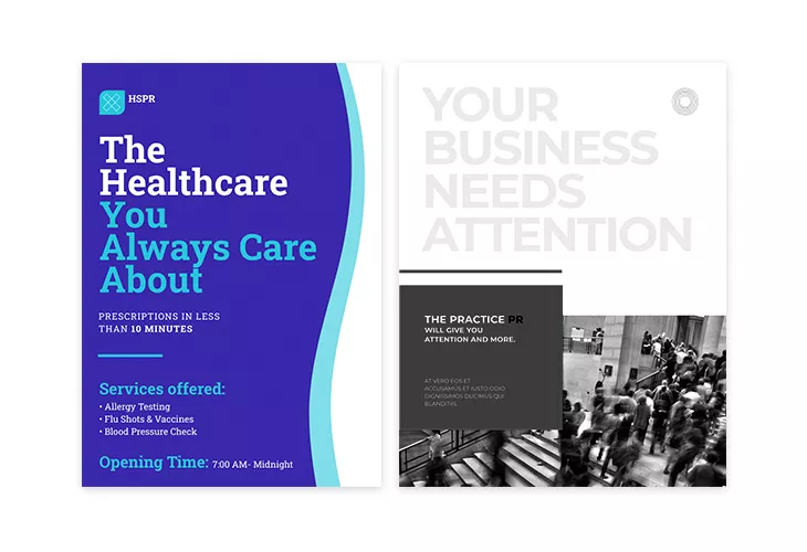
On the opposite side, your business flyer could be made entirely in black and white, which works great for certain types of businesses, and in certain situations. Test them and see which works in your favor.
- Test fonts and typography
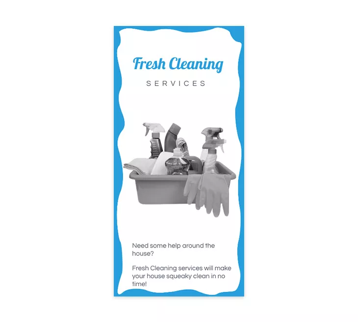
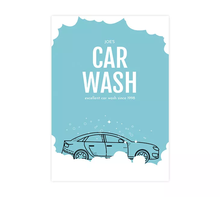
Fonts and typography (yes, they are different!) play a huge role in a business flyer’s design. There is a wide selection of fonts you can choose from, so try and use one which works in your favor. Choose a font that works well with the imagery, and the overall message. Here is an example of a cleaning service flyer: the font choice and the colors work great, as they resemble water. Perfect for a cleaning business.
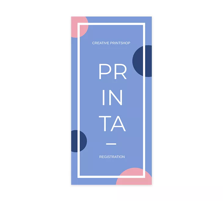
The typography has a heavy influence on the flyer’s overall design as well. The font’s weight should be just right, the letters should be evenly spaced, the text should be readable. Here is an excellent example. A printing company’s business flyer with the words being displayed in an interesting way. Just perfect for a creative print shop.
How to make a business flyer that stands out
Now that I’ve covered the reasons why flyers are still a viable promotional tool, let’s see how to create a business flyer that stands out from the crowd.
- Have your audience in mind
- Focus on the message
- Remember the brand identity
- Get straight to the point
- Add must have elements
In what follows I’m going to offer some detailed information about each of these tips. Let’s get things started.
1. Have your audience in mind
Before you create a business flyer, consider who your target audience will be. This is an important step because if you try to aim your flyer at multiple audiences, the information you provide might be too vague or the flyer might be too overwhelming.
Once you are aware of your audience, you can start planning your flyer’s design. This will allow you to customize the flyer’s text, images, and overall appearance. If your business is used by different audiences, create different flyer versions.
For example, a flyer made for businesses, one you might share at business conferences, should have a different design than one shared for a party event. The colors, the tone, the image to text ratio will probably be different.
Here’s what I mean: here we have an advertising flyer template and a Halloween party costume flyer template. The business one has a more serious tone. The visuals are darker, more serious.
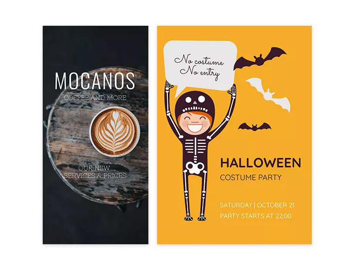
On the other hand, we have a Halloween party flyer. It is simple, it features an amusing visual, the date, and location. Overall it features a relaxed atmosphere.
Remember that the flyer is focused on your customers. With that said, avoid using words like “we” and “us” and use words like “you” instead. This will give off a very personalized feeling, and it’s a big draw-in for a lot of customers. The message is an important part of any flyer. Speaking of which…
2. Include the benefits in your message
A flyer’s message is influenced by its intended audience and purpose, and as I’ve already mentioned, a flyer can be used for different purposes. Regardless of the case, the flyer should include some benefits. How are people rewarded if they read your flyer?
A business flyer announcing a grand opening will feature a different message than one that promotes an event for an existing, established company. The audience will be new to your businesses in the former case, so the message needs to hook and keep them engaged.
The purpose is to make them aware of your new business. The subject will be focused on sharing some information about your company. As a benefit, you could share the way your business could help their problem. Highlight a problem, and offer a solution for it.
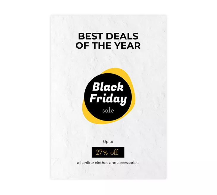
In the latter, there are odds that people are already aware of your business, so the only purpose is to inform them on the subject, which is the event in this case. As a benefit, offer 15 or 20% off to people who come with the flyer to your event.
Regarding the message itself, the copy is very important. Use simple words, and keep your sentences short. Make sure that the flyer doesn’t contain grammatical or syntax errors. It might seem superfluous, but it will look bad if the text has errors and it will cost you to reprint thousands of flyers. Regarding the text’s length…
3. Get straight to the point
When you create flyers for business, you want to get all the necessary information into your flyer, but you also don’t want to overcrowd the reader. If someone sees tons and tons of text, it can be a turn-off. Remember, you should make all efforts to be convenient to the reader. You want them to be able to quickly read about your product or service and walk away with their questions answered.
Include only text that offers something valuable. Avoid adding words just for the sake of it.
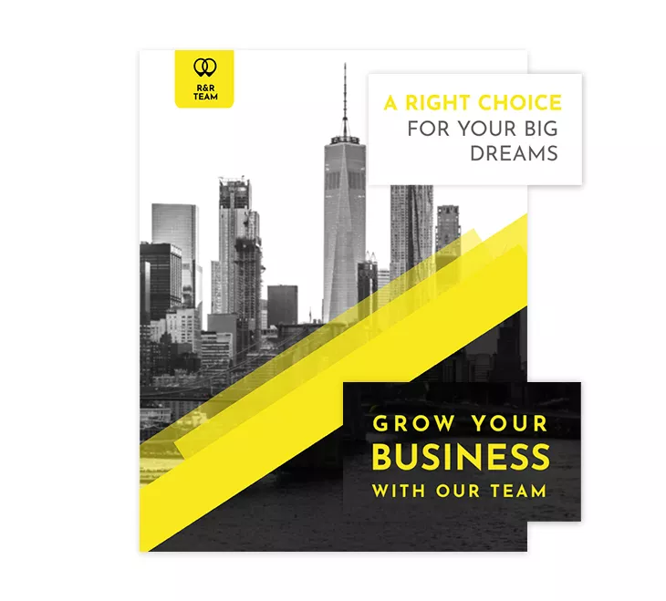
Think about the last time you visited a website and it was hard to navigate. Maybe there was too much going on, and you got distracted, or you couldn’t find what you were looking for. You probably became frustrated and lost interest. The same thing happens with a flyer. The idea is to grab and hold their attention, not grab it and force them to lose interest.
The truth is that people don’t actually have short attention spans for content: They finish three hour Joe Rogan episodes and they binge fourteen hour Netflix shows. What they have is short consideration spans: they must be hooked quickly. To do so, ensure your first minute is incredible.
Source
This quote refers to a different subject, but it can be applied to any situation, including flyers. Sometimes less is more!
4. Remember the brand identity
Branding is the process of giving a meaning to a specific organization, company, products or services by creating and shaping a brand in consumers’ minds.
Source
Before the meaning, there is the association, from a visual point of view. People see the visual elements, and they then associate them with the company. They then associate the company with its services, products, and values. Visuals -> Brand -> Values.
A great way to start your brand’s journey is with the help of a branding kit, which is a collection of these visual elements: logo, fonts, typography, colors.
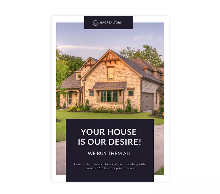
With Flipsnack, you have different branding options to choose from, and once those are set, you can apply them to your business flyers. To maintain brand consistency, it is advisable to choose a style and stick to it. If you have set typography rules, use them constantly. The same goes for the brand colors. If your company is associated with a certain color combination, use only those colors.
Add your brand logo to each business flyer, as it is your calling card after all. As advice, it is useful to place it in the upper part of the flyer, as this way it is more visible.
5. Add must have elements
To maximize the chances for your business flyer to make an impression, there are certain elements it should include. Let’s start with the first one.
Call to action
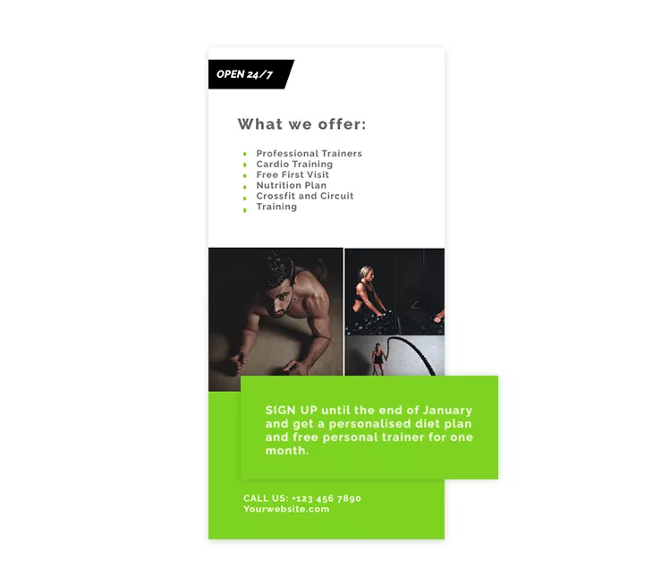
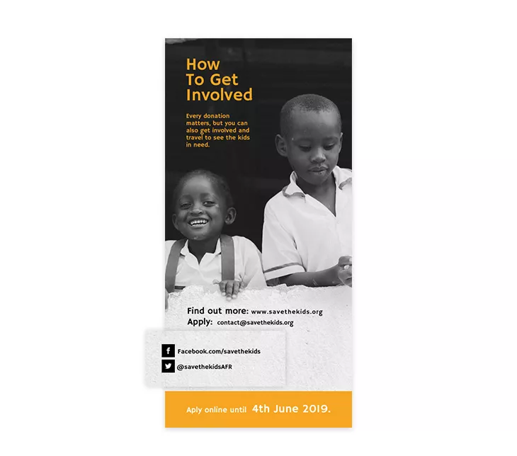
It is advisable to include a call to action into your flyer, and on top of that, it should represent an engagement incentive for the reader. Always include a reward along with the CTA: a reason why people should do what you ask them to do. Here is a great example: a gym business template featuring a call to action to sign up. If you sign up before a certain date, you get a personalized diet plan and a trainer.
There are all sorts of incentives you could add: free stuff, discounts, additional information, and so on. Just make sure that you offer something worthwhile for the reader.
Contact details
Contact details are a must because you need to offer an opportunity for the readers to reach you. There are different elements you can add here: physical address, phone number, email. If you share your business flyers digitally, there are additional things you can add, as well.
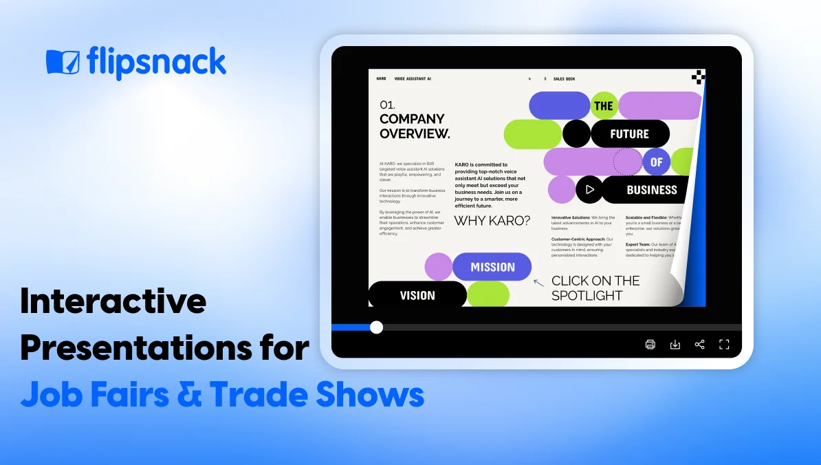
You can include social media buttons that redirect the user directly to your social accounts, or a similar website button. There are different interactivity features you can take advantage of when creating your flyer in Flipsnack.
Complementary visuals
Needless to say, visuals play a huge role in the flyer’s design, and for this reason, you need to put some thought into it before choosing them. The visual elements should be on point. Add only images that are related to the subject at hand.
Also, the visuals should complement the text, if you can skip saying in text what you can do through images, do it. The visuals are influenced by the flyer’s size and style. As I already mentioned, the text to image ratio is important. Sometimes you will need to include more text, other times the image will do the talking.
Business flyers design templates
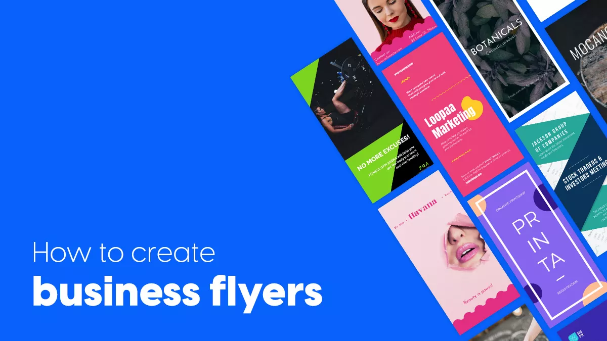
Now that I’ve shared some tips on how to create a custom business flyer, it is time to put things into practice. If you are interested in some business flyers ideas, then look no further, as we have a variety of business flyers templates to choose from.

Business Flyer Template
Let’s take a closer look at this business flyer template. Starting from the top, we have the company logo and a catchy headline. From a visual point of view, the flyer features a black and white background combined with black and yellow elements. As I already mentioned, this is a great color combination.
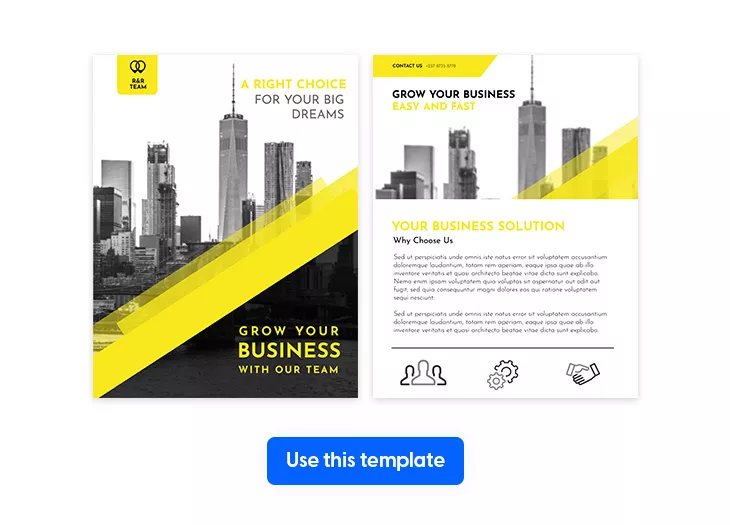
Moving along, we have the contact information, the main text, and at the flyer’s end, we have some icons. If the flyer is shared physically, they have a strictly aesthetic role, but if it is shared digitally, you could place some useful links there: social media, official website, and so on. The flyer is the perfect choice for a marketing business.
Modern Business Flyer Template
This modern business flyer template promotes an investors meeting conference. What stands out is the color combination of green and blue, but if you have a branded color combination, you can use that with ease.
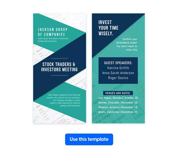
Did you notice the background image? It is an image of stock information. As I said, one rule is to make the image complementary to the text, and this template follows the rule. The flyer also provides information regarding the time and the location of the event. It is the perfect choice for a trading company.
Simple Corporate Flyer Template
This simple corporate flyer template has an interesting color combination. The background image is black and white, but it is juxtaposed with a brown banner. The flyer features the logo, and some useful information such as the contact information, and a summary of the services the company provides.
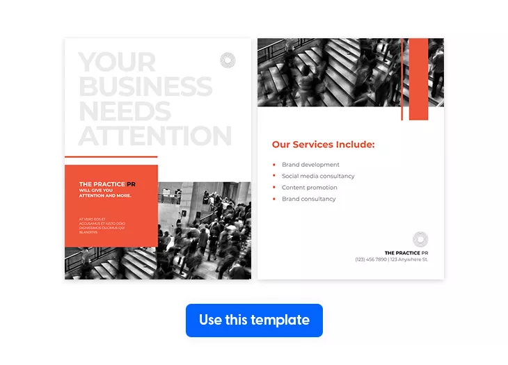
Once again, the colors, the logo, can be changed, and interactive elements can be added if you plan on sharing the flyer digitally. The template is perfect for a PR company.
Pink Marketing Flyer Template
This pink marketing flyer template is different from the rest, as it features an unusual choice of colors. However, this is exactly what makes it stand out. The color draws your attention, and it makes you want to keep on reading. You have the option of changing the colors to your branded ones, of course.
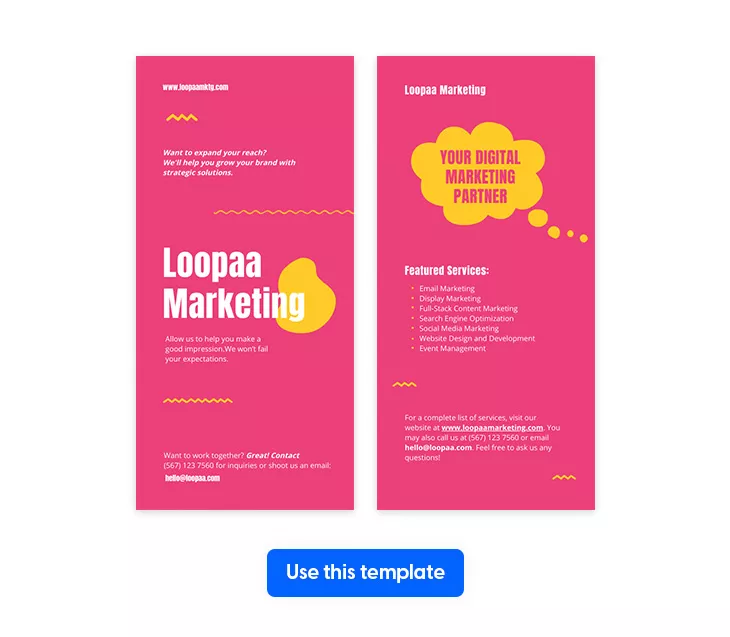
This business flyer also contains the contact details, information about the company, and a call to action: if you visit the website, you receive extra information about their list of services. This business flyer template is perfect for a marketing company that wants to stand out from the others and position itself as a bold, brave and creative agency…
These were just 4 of our business flyer examples that you can use as a source of inspiration. If you are interested, you can browse our business flyer templates selection to discover more. Keep on reading to discover…
How to use Flipsnack to create flyers for business
With all the details that you need to include in your business flyer, you might think that creating one will be difficult. With Flipsnack it isn’t, as you will see.
- Log in to Flipsnack and choose one of the business flyer templates from our gallery.
- Open it in our Design Studio and edit it as you wish.
- Edit the text, change the fonts, the typography rules.
- Replace the background color and the image. Use a custom image or a stock photo from our Unsplash, Pexels, or Pixabay library.
- Use our interactivity features. Add contact details, social media buttons, or a call to action.
- Once you are done with the editing part, click on the Publish button.
- Here you have different options: choose a background color, include a lead form, add your logo, and more.
- Click on the Save & share button, add a title, a description, and choose one of our privacy options.
That is it. Once you’re satisfied with the way your flyer looks, you can either print it or share it online.
To sum things up
Flyers are still important for a business. They can help you generate leads, they can raise awareness, inform, and they are affordable. You don’t need a large budget to achieve great results with a business flyer. With Flipsnack, you can create astonishing business flyers with ease. Keep in consideration the tips I mentioned and design your business flyer today.
