
How to Structure a Business Brochure That Converts + Examples
Last updated: July 18th, 2025
Brochures are content marketing gold. In a single, easy-to-share format, they allow businesses to showcase products, communicate brand values, and educate customers. And they’ve come a long way from the static, print-only formats of the past. Thanks to modern tools, today’s brochures can be interactive, trackable, and tailored to each audience, without requiring design or technical expertise.
All you need is a clear goal, a good understanding of your target audience, and the right platform, like Flipsnack – the #1 flipbook maker, to bring it all together. In this guide, we’ll walk you through how to create a digital brochure that stands out and help you skip a lot of steps. You’ll learn how to structure your content effectively, craft compelling visuals and headlines, and integrate your brochure into your customer journey for maximum impact.
We’ll also share practical design tips, examples, and templates you can use to get started, plus smart ways to ensure your brochure gets seen by the people who matter most.

What is a brochure?
A brochure is a marketing and sales tool used by brands to communicate key information to their audience. It can promote a company, highlight products or services, present research findings, act as an event guide, or support virtually any type of messaging aimed at customers or prospects.
To truly understand the impact of your marketing materials, it’s essential to grasp what a brochure is and its intended purpose. In simple terms, a brochure is a tool used to advertise a company’s offerings in a visually appealing and structured format.
Brochures come in several shapes and sizes. They can be as simple as a single folded sheet, like a bifold or trifold brochure, or a multi-page bound booklet. Regardless of format, they typically combine visuals and concise text, so a professional layout is key to catching the reader’s eye and holding their attention. Using design tools like a tints and shades generator can also help enhance the color palette, making the brochure even more visually appealing.
These materials can be produced in both print and digital formats. While printed brochures offer a tactile, hands-on experience, digital brochures provide far greater flexibility, interactivity, and distribution potential.
Plan before you design your brochure
Before jumping into layout and headline ideas, it’s essential to step back and define your strategy. Knowing what to do before designing a brochure ensures that your content and visuals align with your brand and truly resonate with your audience. A well-planned brochure it’s purposeful, consistent, and effective.
Know your brand
Before designing your brochure, it is important to know everything about your brand: its story, its mission, and its values. Knowing all of this information will allow you to create and uniformly deliver all your marketing materials, thus maintaining brand consistency. Whether you’re a web design company or a real estate agency, your brochures should reflect your brand’s identity in every aspect of their design and messaging. It is important to maintain brand consistency across all channels, so you need to make sure that all promotional materials (brochures in this case) follow the same branding guidelines.
Your brochures should promote your brand’s image. This means using the same brand elements across all publications including the logo, and the font, and maintaining the same overall aspect. Sure, the overall design will vary depending on particular cases, but as long as these branding kit elements are properly used, your brochures will deliver a consistent message. If you’re creating a new logo or updating your visuals, using an AI logo generator can help you design something that aligns perfectly with your brand identity. Think of these branding elements as your signature. They represent what you are, as a company.
Know your audience
Understanding your target audience is very important because it shapes your messaging, visuals, layout, and even the brochure format itself.
Is your brochure intended for C-suite decision-makers? A niche B2B audience? Affluent consumers? A clearly defined audience allows you to tailor your brochure content to their expectations, preferences, and pain points.
For example, a luxury real estate brochure targeting high-net-worth individuals should feel elegant and exclusive, using premium finishes (if printed), minimalist design, refined typography, and aspirational language. In contrast, a corporate sales brochure aimed at enterprise buyers might focus on clarity, performance data, value propositions, and client testimonials, presented in a clean, professional format.
Compare this to a brochure created for the education sector, where a lighter tone, friendly visuals, and colorful layouts are more appropriate. What works for one audience may feel completely off-brand to another.
Your brochure structure should also align with expectations:
- For professional audiences: use a logical content hierarchy, consistent formatting, and credible visuals (e.g., charts, data visuals, brand photography).
- For luxury markets: focus on elegance, minimal copy, high-resolution imagery, and whitespace to emphasize prestige. Nowadays, tools like AI image generators can also help create high-quality visuals that match a premium brand aesthetic.
In short, your audience influences everything, from tone of voice and visual aesthetics to the brochure layout and CTA. Understanding them isn’t just a step in the process; it’s the lens through which every design decision should be made.
Define the purpose of your brochure
Every effective brochure starts with a clear objective. Before drafting a single line of copy or selecting design elements, ask yourself:
What specific action or outcome do I want this brochure to drive?
Your brochure’s purpose is the anchor for every decision that follows, from the brochure layout and tone to the distribution method and format.
Here are some common strategic goals for high-impact brochures:
- Generate qualified leads at trade shows, conferences, or client meetings
- Showcase a new product line with detailed specs, benefits, and case studies
- Introduce your brand to new markets or verticals
- Educate customers on complex services or multi-step processes
- Drive traffic to your website, product catalog, or eCommerce platform
- Increase event attendance or RSVPs for webinars, summits, or launches
- Support sales teams with collateral tailored to different buyer personas
By anchoring your brochure to a strategic purpose, you maximize its potential to engage, inform, and convert your audience. So, before diving into the design details, take the time to set your goal. It’s the first and most critical step toward creating a brochure that delivers results.
Choose the right brochure type
Once you’ve defined your brochure’s purpose and distribution method, whether you plan to share it digitally or print it for in-person delivery, the next key decision is the format. And it’s not just about looks.
Your chosen brochure type affects the available space, and that shapes how you present your content. A bifold brochure, for example, has fewer panels and less real estate, so it requires sharp, focused messaging. A trifold, on the other hand, allows you to break your story into clear, logical sections across more panels.
The type of brochure you choose directly impacts your brochure layout, how much content you can include, and how that content flows from panel to panel. In other words, your brochure’s structure should enhance your message, not restrict it.
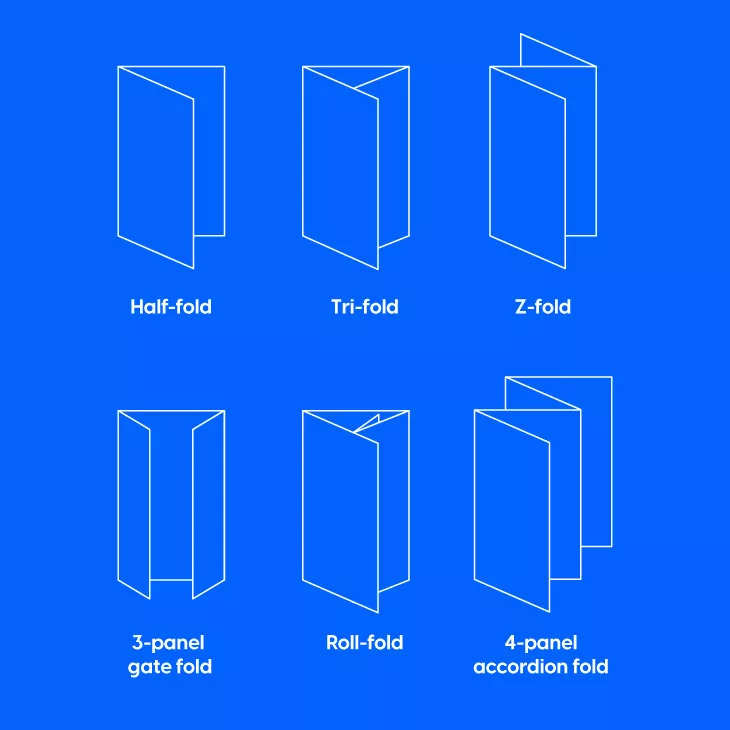
Some of the most commonly used formats include:
- Bifold – A simple, four-page layout that’s ideal for product showcases, service highlights, or promotional content. It’s clean, professional, and easy to skim.
- Trifold – Divides content into six panels, making it perfect for storytelling, educational content, or step-by-step information.
- Z-fold – Offers a visually dynamic layout that’s great for brochures with lots of imagery or multiple sections that need equal emphasis.
Each type serves a distinct function, depending on how much information you need to communicate and how you want readers to interact with it.
What should be included in a brochure?
When designing a brochure, you should know where each piece of information should be placed.
Think of your brochure as a carefully crafted story: your cover makes the first impression, the inside pages develop your message, and the back cover seals the deal. Whether you’re designing a bifold, trifold, or multi-page brochure, every element needs to support the goal you’ve already defined.
So, what makes a good brochure? At its core, every brochure should contain the following six essential components:
- A compelling headline
- High-quality, purposeful visuals
- Clear and concise text
- Consistent branding elements
- Contact information
- A persuasive call to action
Let’s explore each one in detail.
1. A compelling headline
Your headline is the first thing your audience will see, so it has to make an impact instantly. That’s why it should be quick and concise. It should grab the attention of the reader in no time and deliver the right information in just a few seconds. There are different ways you can do so.
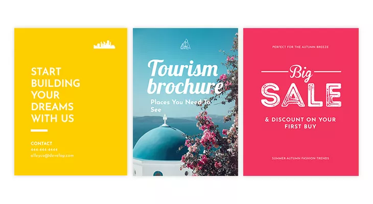
For example, you could ask a question: “Where would you travel today?” as a headline for your travel brochure. Or, you could use the headline to make it clear that you will offer a solution: “How to buy a house in 5 easy steps”. You could invite people to an event: “Come see your favorite band”.
When creating a headline for your brochure, you have to be sure the chosen font is legible, clean, and complementary to your brand image. With Flipsnack, you can even upload your font and use it in your publications. This will allow you to maintain the so-important brand consistency across your brochure.
Don’t be afraid to use “power” words like free, quick, easy, results, exclusive, proven, etc. What they lack in originality, they make up for in ineffectiveness.
2. High-quality, purposeful visuals
While your headline draws initial attention, your cover image is often what compels the reader to engage; it’s the visual handshake of your brochure. For companies in competitive industries, where first impressions matter, this image must be deliberate, high-quality, and fully aligned with your brochure design and brand identity. Visual consistency across every panel builds trust and reinforces your positioning.
Beyond standard photos, consider incorporating visuals that not only enhance scannability but also reinforce your message with precision and clarity:
- High-resolution product shots – Showcase your offerings in detail and build trust with quality visuals.
- Clean, well-designed icons – Help readers navigate content and highlight key takeaways at a glance.
- Data-driven infographics – Simplify complex information and make it more digestible for analytical audiences.
- Custom illustrations – Custom illustrations add a unique, branded touch that sets your brochure apart from competitors.
Ask yourself: Does each image reinforce your key value proposition? Is it on-brand? Will it resonate with your ideal customer? Avoid filler visuals or overly generic stock imagery, especially if you want to maintain a premium, credible presence. If a custom asset library isn’t available, carefully curated stock visuals can work, but they must feel authentic and contextual.
For instance, a consulting firm might feature its leadership team or client case study snapshots; a travel business may showcase immersive destination scenes; and a luxury manufacturer could lean on minimalistic, stylized photography to project sophistication. In every case, your imagery should not just decorate the page; it should elevate the content, enhance the reading experience, and strengthen the emotional connection with your audience.
3. Product/Service Information
The heart of any good brochure is its ability to clearly communicate what you offer and why it matters, making it a vital tool for impactful business communication. This is where your product or service information comes in—not just as filler content, but as a strategic storytelling tool. Instead of relying solely on general, concise text, think of this section as the core of your value proposition.
Start by answering these questions:
- What does your product or service do?
- Who is it for?
- What problem does it solve?
- Why is it better or different from alternatives?
This section should include feature highlights, core benefits, technical specs, use cases, or key differentiators, depending on your audience and industry. If you’re creating a brochure for a B2B SaaS product, for example, focus on performance metrics, integrations, or scalability. For retail or hospitality, spotlight your offering’s visual appeal, ease of use, or customer experience.
Avoid cramming multiple messages into one panel. If your brochure promotes multiple services or product lines, give each one its own section or page. Stick to a consistent tone of voice that aligns with your brand: whether that’s friendly and casual, elegant and high-end, or technical and data-driven. Think of this as your chance to convince your reader that what you’re offering is worth their time, and maybe their money. You don’t need to say everything, but you do need to say the right things in the right way.
If you’re building a digital brochure in Flipsnack, this is where your brochure can truly shine. Instead of cramming all your product details into static text, you can improve clarity and engagement with interactive elements that tell your story more effectively.
Use this section to embed:
- Product demos or explainer videos that showcase functionality
- Clickable spec sheets for easy access to in-depth details
- Interactive product tags to highlight key features
- Image slideshows or galleries to bring your offerings to life visually
These features do more than just make your brochure look good—they help people really connect with what you’re offering, understand why it matters, and feel inspired to take the next step.
4. Consistent branding elements
Strong branding is non-negotiable in brochure design. Your brand identity should be instantly recognizable and consistently reflected across every asset, including brochures. This isn’t just about placing a logo; it’s about reinforcing brand perception through every visual and textual element.
Start with the basics: your logo, colors, and fonts. These should appear clearly and cohesively within the layout. A common mistake is inconsistent placement or scaling, which dilutes professionalism. To avoid this, especially in team environments, tools like Flipsnack’s Design Studio allow you to lock branded elements, ensuring logos, fonts, and colors stay fixed in position, size, and style across every publication.
Consistency across all touchpoints is what builds brand equity. That’s why in Flipsnack, you can enforce brand control through:
- Brand kits – Upload your custom colors, fonts, and logos for easy access during design
- Locked templates – Prevent misplacement or distortion of brand assets by teammates
- Branded URLs – Remove third-party branding by hosting flipbooks on your domain
- Branded email sharing – Customize subject lines, preview images, colors, and sender identity
- Profile branding – Add your logo, favicon, and social handles to align every customer-facing detail
Whether you’re building brochures for marketing campaigns, internal presentations, or customer outreach, keeping every detail on-brand reinforces trust and communicates polish at scale.
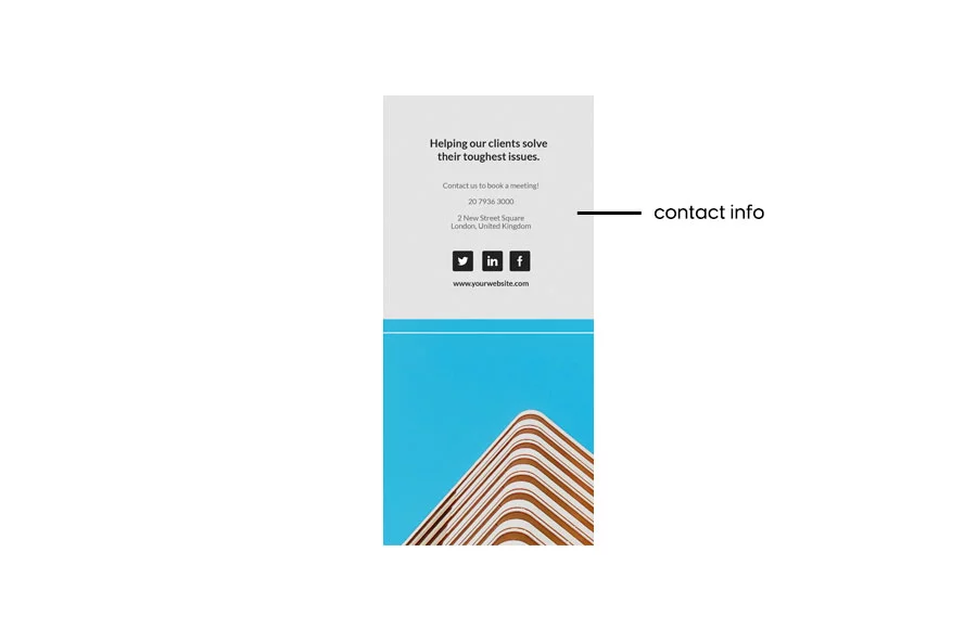
5. Contact information
You should include your contact information in the brochures you share. If your brochure is a physical one, the contact options are standard: website link, a physical address (if it is a viable option), business email, and a phone number. As a rule, try to include at least two kinds of contact information to make sure that you can be reached in different ways.
In the case of print brochures, however, your options are limited to static details like a website URL, business email, phone number, or physical address. While essential, these static contact points rely entirely on the reader taking an extra step, typing in a URL, dialing a phone number, or copying information manually. In today’s fast-paced world, that extra friction can lead to missed opportunities, particularly if contact details aren’t immediately visible or get buried in the layout.
You should always aim to include at least two contact methods, but with print, interaction ends there. This is where digital brochure design significantly raises the bar. With Flipsnack, your contact section becomes interactive and actionable. Rather than passively displaying information, you can embed clickable phone numbers and email addresses, interactive maps to show your location, and social media buttons that let readers follow or contact you with a single tap, all without leaving the brochure.
You can even add lead capture forms directly inside your digital brochure, collecting emails and inquiries in real time, and contact your customers more easily and quickly.
6. A persuasive call to action
Now that you’ve managed to grab your audience’s attention with a proper headline and text, it is time to include another important element of any brochure: the call to action.
Calls to action push the viewers to the verge of following the desired action. You should carefully select the call to action based on the brand. If you run a charitable organization, your call to action would be related to donations or volunteering; similarly, if you are a mentor, then your call to action will be something about downloading your guide.
A powerful call to action does not just tell the readers what to do, but it also gives them the right motivation to do so.
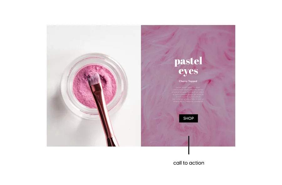
In the case of product brochures, you can offer something for free, or maybe a discount. People love free stuff, and that might be the extra motivation they need to get in touch. Don’t think of it as something scammy, as a trick to convince people of doing something. Think of it as an opportunity for people to sample the products or services you offer. Make it worthwhile for your readers to take action.
Put some thought into creating the CTA message and make it stand out from the rest. Make the text bigger than the rest, and use a message which makes the reader understand what you are offering. A suitable message would be “Find a house today!” or something of that manner for a real estate company. Choose a concise, well-written call to action and let it do its magic for you!
Brochure design essentials
Now that you know what content your brochure should include, let’s talk about how to structure and present it effectively. For many marketers, especially those without a design background, this can feel overwhelming. That’s why having a strong layout foundation is essential.
Traditionally, brochures followed print-specific formats like bifold or trifold layouts, which came with content constraints. But today, brochures have evolved.
Digital brochures offer far more creative freedom; you’re no longer limited by panels or page counts. Instead of squeezing everything into fixed sections, you can structure your content around your message and brand story.
Even better, with tools like Flipsnack, your brochure becomes more than a static handout. You can add interactive elements like:
- Virtual tours, maps, and more
- Clickable CTAs
- Embedded videos
- Slideshows and image carousels
- Shopping links and product tags
- Lead capture forms
- Virtual tours, maps, and more

While creating your digital brochure, keep in mind that the design principles here apply to most formats, whether you’re going digital or sticking with print.
To make things simple, the following layout is based on a classic trifold brochure structure. It’s a proven format that works well for guiding readers through your message in a clear, engaging way. The content blocks below outline what each panel should ideally include:
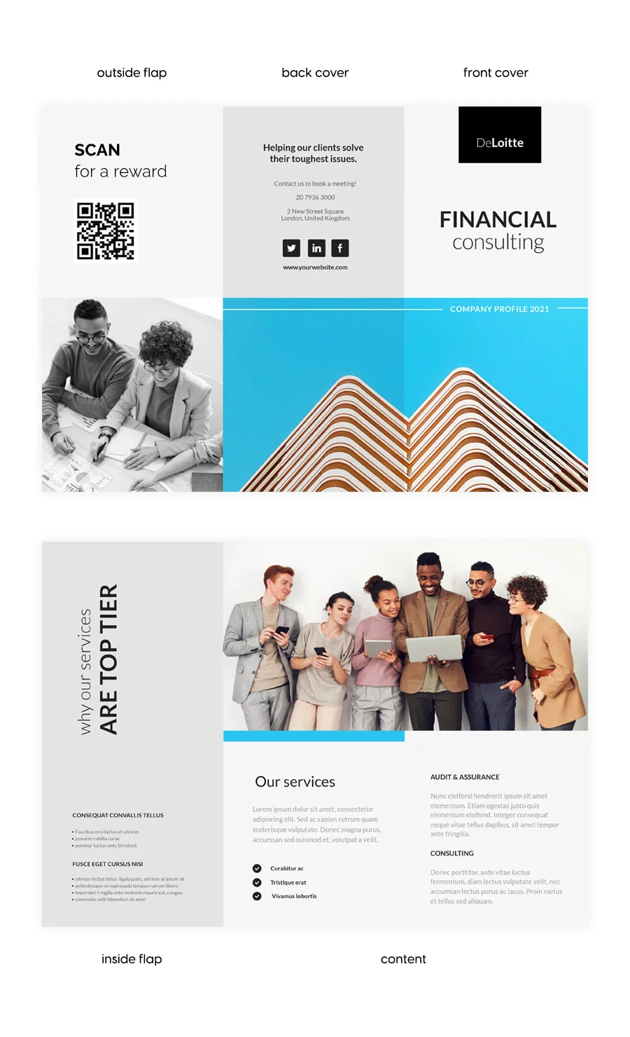
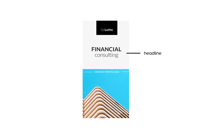
The Front Cover
The brochure cover is one of the crucial components of the brochure. Its purpose is aimed at grabbing the attention of the audience and fabricating an emotional bond that compels the audience to read the brochure. This is where you should place the headline and the cover image, for obvious reasons. The cover should also contain your company’s name to make it stand out and allow people to remember you even if they don’t open the brochure.
Hopefully, that is not the case, the headline and the visual managed to accomplish their purpose, and people opened the brochure. The next thing they will see is…
The Inside Flap
This section is also called the inside cover, and its role is to explain how your business can help potential customers. It should provide solutions to their problems, it should raise awareness regarding a cause, it depends on the brochure’s purpose.
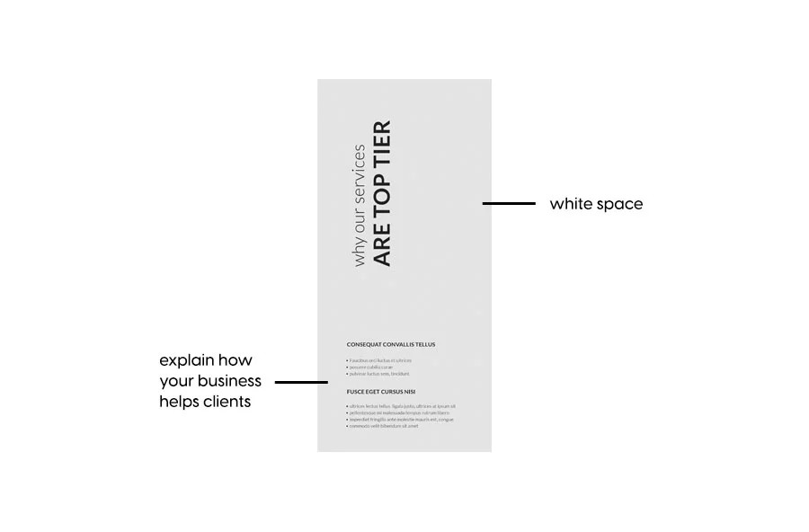
The inside flap is often considered the brochure’s most important page, as it should “hook” people into reading more information. For this reason, make sure there is enough white space or negative space around the text to let the brochure breathe; a crowded copy would be difficult to read.
The Content
The content, also known as the body, or the interior, is a brochure’s main section. If the cover is designed to gain attention, the inside flap to make them interested, and the content should provide all the necessary information regarding the brochure’s purpose.
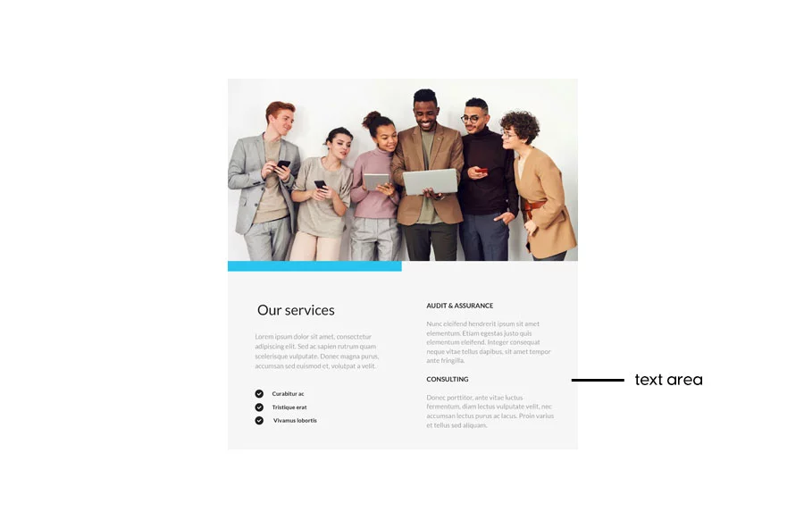
This is the section that delivers your branding message, it offers information about your product, your company, and your event. Due to the limited space, the text should be concise and clear; it should deliver only necessary information which can be understood in one reading. As I mentioned in the copy section if a piece of text does not add anything of value to the reader, remove it. If it is difficult to understand, rewrite or paraphrase it with the help of online tools like UndetectAI or Editpad, you can also use Humanizer AI, which not only humanizes content but ensures it reads naturally and is engaging..
Put some thought into this section’s design, both regarding the text and the imagery. Use subheadings for the text and structure it into small pieces. Use high-quality pictures complementary to the text.
The Outside Flap
While the inside flap is used to hook the readers into keeping on reading the brochure, the outside flap is often used to reward them for doing so. This section usually contains a “reward” for the readers, and in most cases, it is a discount of some sort, but it can also include a list of tips & tricks that help the readers.
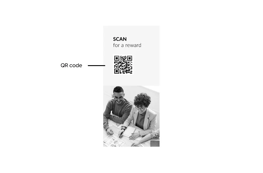
Maybe a discount coupon, or a scannable QR code for a free item. Or, offer a discount if people come into the store with the brochure. You could include a lead form in your digital brochure, so people can subscribe to your emails for some benefits. As I mentioned, make it worthwhile for them as well.
The Back Cover
Finally, the brochure’s last page: the back cover. This section has the purpose of making people engage with your business in different ways: convince them to make a purchase, donate to your cause, visit your event, or follow you on social media.
What goes on the back of a brochure?
This page contains different elements and we’ll go through them one by one. Now that you have given the reader all the information they need, it’s time to bring it home with a call to action. As I already mentioned, the call to action should be clear, and engaging, and it should stand out visually.
The back cover should also contain the contact information I previously went through. Once again, a physical brochure is limited in regards to the amount of information you can add. If you want to add more than a phone number or an email address, a digital brochure is the better option.
This is the common practice for a trifold brochure design, but the same rule applies to any type of brochure. Of course, you can make slight adjustments if you need to. Now that you know how to structure your content, the next step is bringing it to life, professionally and efficiently. The good news? Designing a standout brochure doesn’t require advanced tools or design experience.
With Flipsnack, you can easily create on-brand, interactive brochures from scratch or start with an existing PDF. The process is fast, intuitive, and made for marketers who want results without the complexity.
Examples of digital brochure templates that work
Now that I’ve covered which information should be included in the brochure, and what makes a good brochure design, let’s take a look at some examples.
If you are interested in some brochure design ideas, Flipsnack offers a wide selection of brochure templates you can use as inspiration. Here are 3 of our template examples to get you started.
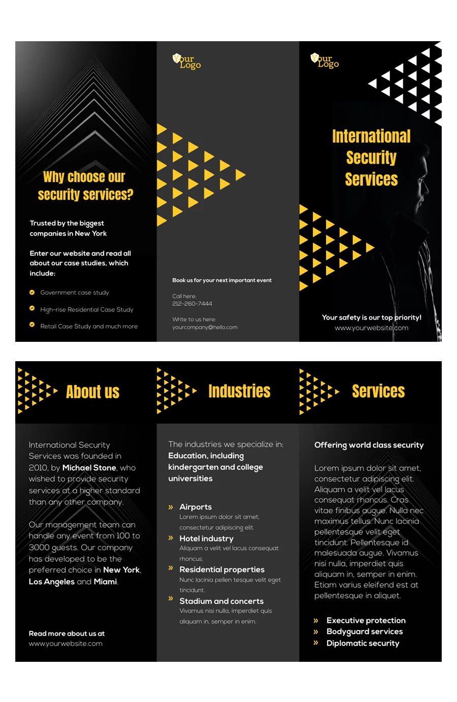
Hotel promotional brochure example

This hotel promotional brochure template from Flipsnack is clean, modern, and built to convert. It features a well-structured 10-page layout perfect for showcasing special offers, seasonal deals, and booking details. Easily customize it with your logo, brand colors, and fonts to keep everything on-brand. Add interactive elements like virtual tours, maps, or videos to give guests a more immersive experience. Plus, with Flipsnack’s analytics, you can track engagement and optimize for better results. Ideal for marketing teams looking to boost bookings with professional, polished content.
Editable MLS realty brochure template

This MLS-friendly real estate brochure template is built for speed, automation, and professionalism. Fully editable and designed with RESO standards, it allows agents to upload property details and instantly populate the layout by clicking “Use listing.” The clean, image-focused design keeps listings easy to scan while maintaining a polished look. You can rearrange or resize any element and apply your full brand kit, including logo, fonts, and colors, to stay on-brand across every listing. Add interactive features like virtual tours, embedded maps, video walkthroughs, and photo slideshows to create a truly immersive digital experience.
Once ready, share your brochure via an unlisted link or embed it directly on your website to expand reach. It’s a seamless, modern solution for real estate pros who want consistency, efficiency, and visual impact.
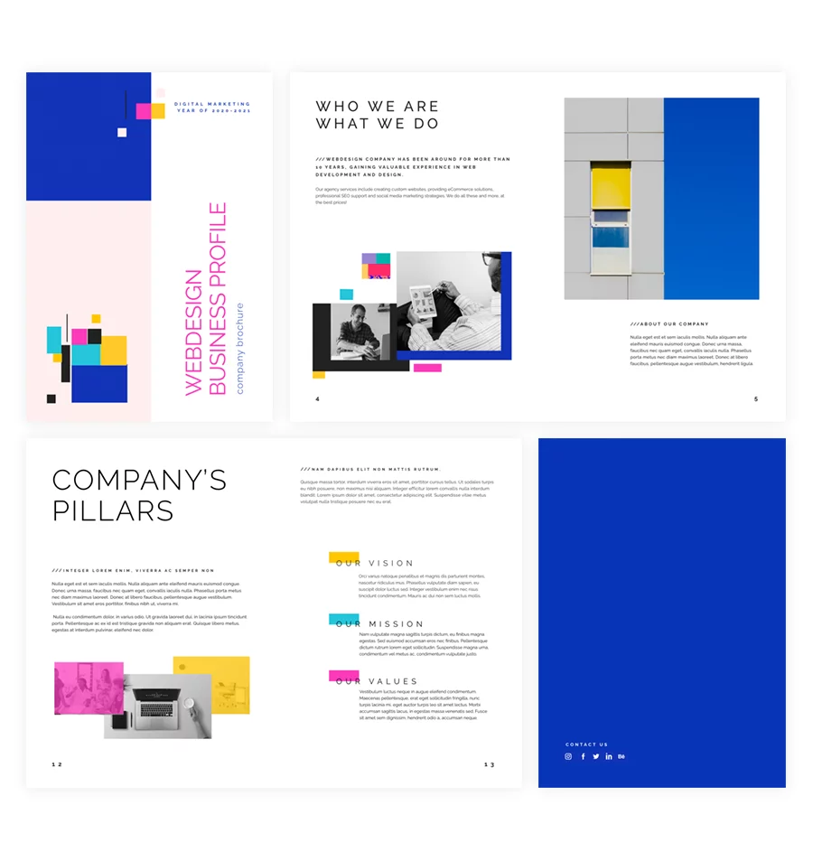
Editable business brochure template
This editable brochure template is a smart choice for businesses looking to create polished, branded marketing materials without starting from scratch. Its clean, corporate design is versatile enough for product catalogs, service overviews, or company profiles.
Easily customize every section with your logo, colors, and fonts to maintain brand consistency, and rearrange layouts to fit your messaging. Perfect for B2B teams, internal communications, or event collateral, it also supports interactive elements, like clickable links, CTAs, and embedded videos. so you can turn a simple brochure into an engaging, results-driven asset. Ideal for any business that values professionalism, flexibility, and speed.
Design digital brochures with Flipsnack
Brochures have come a long way from static, folded printouts to interactive digital experiences that connect with audiences in more dynamic ways. Today, a great brochure isn’t just well-designed, it’s responsive, engaging, measurable, and accessible anywhere.
With Flipsnack, creating digital brochures is not only easy, it’s smart. You can bring your content to life with videos, product tags, slideshows, lead forms, and real-time analytics, all while keeping your design on brand. Whether you’re showcasing products, explaining services, or supporting your sales efforts, Flipsnack helps you build brochures that don’t just look good, they perform. You can try most of the premium features during the free 14-day trial. We also have a free plan if you only need basic PDF interactivity and plan to create up to three flipbooks.
You now know what makes a good brochure and what to include, from structure and visuals to messaging and interactivity. The only thing left is to create yours.
Brochure Design FAQ
What is the best brochure design?
The best brochure design is one that aligns with your brand identity, communicates your message clearly, and speaks directly to your target audience. A well-designed brochure includes:
- A compelling headline
- Purposeful visuals
- Clear, concise copy
- Strong calls-to-action
- Consistent branding elements
What is the best program to create a brochure?
Here are some of the top tools, each suited to different needs and skill levels:
- Flipsnack – Ideal for creating interactive digital brochures. Upload PDFs or start from templates, add videos, lead forms, product tags, and share/track performance. No design skills needed.
- Canva – A user-friendly drag-and-drop design tool with free and paid templates. Great for beginners and quick print designs.
- Adobe InDesign – The industry standard for print-ready brochures. Best for advanced designers with full control over layout and typography.
Each platform has strengths. For example, Flipsnack excels at interactivity and distribution, while InDesign offers high-end customization for complex layouts.
What is the best format for a brochure?
The best format depends on how you plan to use and distribute the brochure. Here are the most effective formats:
- Bifold brochure (4 panels)
Clean, easy to navigate, and perfect for corporate overviews or service highlights. - Trifold brochure (6 panels)
One of the most popular formats, offering distinct sections for storytelling—ideal for events, services, or brand presentations. - Z-fold brochure
Visually dynamic, great for step-by-step processes, product showcases, or design-forward layouts. - Gatefold brochure
Premium, elegant, and immersive—often used for luxury products or formal invitations. - Multi-page brochure/booklet
Best for in-depth catalogs, real estate listings, educational materials, or annual reports.
If you’re creating a digital brochure, interactive formats like Flipsnack’s flipbook layout are ideal. They offer a real page-turning experience, support rich media (videos, embeds, links), and make it easy to share and track performance, perfect for modern businesses.
How to make a brochure look professional?
To make a brochure look professional, focus on clarity, consistency, and brand integrity. Use your brand’s fonts, colors, and logo across all pages to maintain a cohesive identity. Stick to high-resolution visuals, readable typography, and a clean, grid-based layout with ample white space.
Great article! Your breakdown of essential elements like catchy headlines, purposeful visuals, and a strong call to action is spot on. As a graphic designer, I couldn’t agree more with your emphasis on visual appeal and brand consistency.
Brochure design heavy relies on using high-quality images and maintaining brand consistency—these ensure the brochure not only stands out but also effectively communicates the intended message.
For anyone diving into brochure design, remember that it’s a fantastic opportunity to showcase your graphic design skills and create something memorable for clients. Keep up the great work and keep sharing these valuable insights!
Hey Jemma, we’re glad you found these tips valuable!
This is the most useful article we have seen regarding brochure design. Thank you for providing such supportive information!
This article has given me all the informations I nèeded known about brochures in General. Thanks.
Hey Augustus,
I am glad to hear this article provided useful information for you, I appreciate you took the time to read it!