
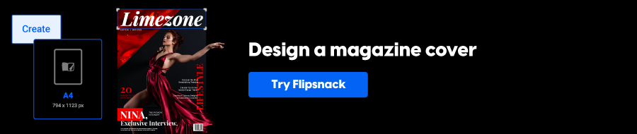
The 10-step guide to creating eye-catching magazine covers
Creating an eye-catching magazine cover is essential in this fast-paced digital world. Visually appealing covers will attract readers’ attention from the beginning, increasing your magazine subscriptions as a result.
We’re here to help you create the best digital magazine cover you can. First, we’ll discuss a common design strategy to create a good cover. Then, we’ll show you how to create a magazine cover in Flipsnack by following 10 easy steps. And we have a surprise for you: valuable tips to share from our designer.
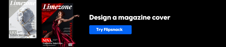
Table of contents
- What must a magazine cover have?
- How to design a magazine cover from scratch
- 1. Place the masthead in the most obvious place
- 2. Work with grids and layouts
- 3. Be consistent with your cover design format
- 4. Decide on a focus point and build everything else around it
- 5. Optimize font pairings
- 6. Emphasize powerful words
- 7. Learn to use color & contrast
- 8. Place a portrait on the cover
- 9. Avoid busy backgrounds
- 10. Give illustrations a chance
- Conclusion
- Frequently asked questions
What must a magazine cover have?
Before we tackle more complex questions like how to create a magazine cover, let’s learn the basics and discuss the elements of a good magazine cover to see their impact on your audience. Because, as you are probably aware, the cover of your magazine encapsulates the current issue’s subject matter.
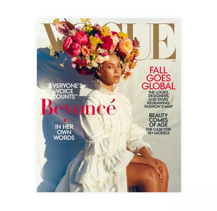
Below, there’s a cover from the pioneer of magazine covers – Vogue. We’ll use it as a terminology glossary to see what elements a magazine cover design should contain.
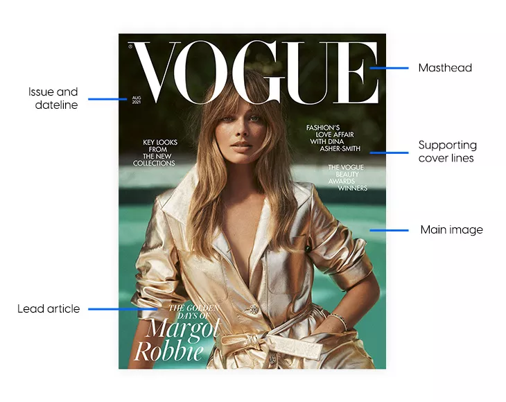
What are the elements of a magazine cover?
- Masthead
- Issue and dateline
- Main image
- Lead article
- Supporting cover lines
- Bar code
Let’s take them one by one and get into more details of a magazine front page. We’ve also prepared magazine templates that showcase each element — all of them to inspire you.
Masthead
Of course, we have to start with the most important one. The masthead represents the name of the publication and is the most crucial aspect of your magazine cover design. Professionally designed magazine covers make the mast head stand out besides the other elements. Therefore, it’s good practice to set it right in the center and make it as big as possible. It will also help people to recognize your magazine among all the others.
So follow what magazine designers do and use a big and bold font for the masthead. Also, don’t forget that the masthead’s color has a crucial role in making it pop even more. Therefore, it’s helpful to adapt the title’s color to match the image and theme you’ll use on the front cover.
Designer’s tip: The masthead uses the largest font size of all the elements on the magazine cover. Be consistent with the placement and size of the text throughout all the issues, and change colors to accommodate the different themes.
Issue and dateline
This section contains the publication’s date, month, year, and issue number. Some magazines, like Vogue, only specify the month and year, as they only publish one issue monthly. Other magazines also use this section to add the price of the magazine.
Look at this issue and dateline design – discreet, yet strategic.
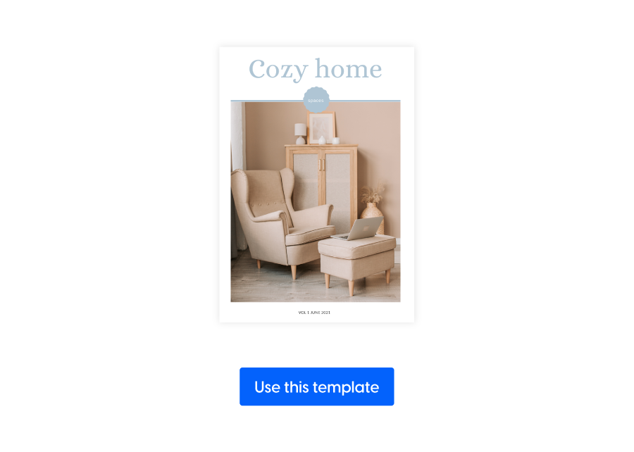
Designer’s tip: You can make this section as discreet as possible to not overcrowd the magazine cover with secondary elements.
Main image
The focal point of a magazine cover is always the main image. This is the element that represents the essence of the issue. Big magazines typically portray a well-known celebrity or a visually appealing illustration that easily triggers an emotion. However, more recent magazine issues have also gone the abstract route with their main image.
You should keep one thing in mind when designing your magazine cover, though – use professional images. Investing in high-quality photos and having a cover image that stands out improves your chances of gaining more subscribers. For enhancing your images, consider using tools like Depositphotos, which offer excellent resources for upscaling and refining your photos. Furthermore, the image you use will draw readers in and pique their interest in learning what the latest issue is about.
Here’s a beautiful magazine cover inspiration you can use as a starting point:
The main image is the focal point; it stands out and foreshadows the issue’s main topic.
Designer’s tip: Choosing the right image is an essential aspect when it comes to designing your magazine cover. Make sure it reflects the content within the magazine the best. Always use high-quality images, and be mindful of the background – keep it light and simple.
Lead article
The lead article reflects the central issue of the magazine. Maybe an interview with an artist, an expert on a subject, or any other matter you know will emotionally impact your audience.
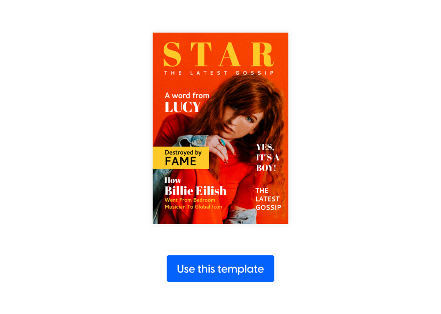
Here’s a template you can use if you want to have good inspiration for your lead article.
Designer’s tip: Make sure you use a unique font for the lead article title to let the readers know the issue’s theme and main story. This will make it stand out and grab your readers’ attention.
Supporting cover lines
The supporting cover lines are topics that can revolve around the same subject matter or differ entirely from the issue’s central theme. When it comes to placing them on the magazine’s cover, balance is key.
Look how well these supporting cover lines are working together to bring out the information covered in this issue of the magazine.
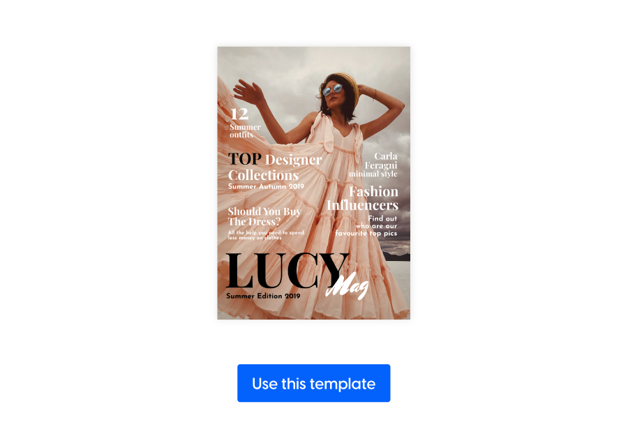
Designer’s tip: Try to make supporting cover lines clear, short, and concise. Also, go for a more subtle font and choose a smaller size to avoid distracting the reader from the lead article.
Bar code
The printing house you are working with is usually responsible for creating this particular section of your cover. However, it’s helpful to plan ahead for it and keep it in mind when designing your magazine cover.
Here’s a placement idea for your magazine’s bar code
Designer’s tip: Leave a little space for the bar code in the corner area. You can shuffle the placement from issue to issue, or you can keep it in the same place at all times. Just don’t forget about it when you design your magazine cover.
And now, without further ado, let’s dive into the most exciting part and learn how to create a magazine cover from scratch!
Disclaimer: no design skills needed!
How to design a magazine cover from scratch
Now that we’ve covered the most important elements of your magazine cover, let’s just get down to the nitty-gritty. Using one of our magazine templates is easy and doesn’t need any additional explanations. So, in what follows, we’ll discuss the 10 steps to creating an eye-catching magazine cover, and our designer will show you how to do it effortlessly in Flipsnack. By the end of this, you’ll have a good idea of what the process of creating a great magazine cover structure looks like, and you’ll be able to do it on your own.
Here are the 10 golden rules of magazine cover design:
- Place the masthead in the most obvious place
- Work with grids and layouts
- Be consistent with your cover design template
- Build the cover design around a focal point
- Optimize font pairings
- Emphasize powerful words
- Color & contrast go hand in hand
- Place a portrait on the cover
- Avoid busy backgrounds
- Give illustrations a chance
Let’s start with the first one!
1. Place the masthead in the most obvious place
We’ve already covered how important the title/name/masthead is. That’s why you should start your magazine cover design by adding the magazine’s name in the most visible place. Placing it right at the top and in the middle of the cover will ensure that your readers will recognize it immediately. You should organize the overall layout of the magazine cover around your magazine’s name.
And speaking of visible titles, take a look at the image below. See how the flower crown hides quite a few letters from the title, but you can still tell it’s Vogue? Everything screams Vogue, starting with the image, font styles, colors, and layout design.
As a matter of fact, Vogue became such a big brand thanks to recognizable elements they share on all their platforms – website, social media accounts, printed magazines, etc.
Let’s get back to our masthead and discuss color. Since we were speaking about building a brand, giving your masthead the color that best represents yours is advisable for consistency purposes. But you don’t have to use the same color all the time. You can always switch things up according to the issue’s particular theme, especially if it’s something special – this is common practice for fashion magazines.
Let’s start designing our magazine cover using Flipsnack’s Design Studio. If you follow our designer, you’ll have created your own magazine cover by the end of this article! Below is our designer’s idea:
Designer’s tip: magazines usually have names that are either 1 or 2 words. Make it the most prominent feature of the cover. Make it big, bold, and as visible as possible.
2. Work with grids and layouts
Next on our list are grids and layouts. They are your friends when it comes to organizing and aligning your magazine cover elements in relation to each other. Layouts are responsible for giving the cover a visually appealing look and maintaining balance from page to page. Grids are the backbone of these layouts; they act like a skeleton of sorts, meant to help you create clear and consistent layouts.
Grids and layouts are helpful, especially when you plan to print the magazine. Professional designers and print studios use them to know exactly where the safe margins are and where the printed pages of the magazine should be cut. However, even if you just want to have a digital magazine, they’re also essential to help improve the overall design comprehension of your magazine cover.
Below, you can see how our designers placed each element using grids and layouts to give themselves some safe margins.
Designer’s tip: Try to balance your magazine cover elements to create cohesiveness and clarity. Grids and layouts will help you maintain a crisp, clear cover design.
3. Be consistent with your cover design format
Now that you have your grids and layouts ready and the masthead location and style set, think of them as a template for future issues. We’ve discussed that the masthead can change color, but everything else about it should stay the same because consistency is key! Keeping the same cover format for your following magazine issues helps your readers get used to your specific magazine layout and easily recognize it.
And most big brands do this! They mainly change the image cover, keep the name in the same place, and only adapt the colors to match the image. This is a tried-and-true method that works wonders. Just look at Vogue’s magazines front page!
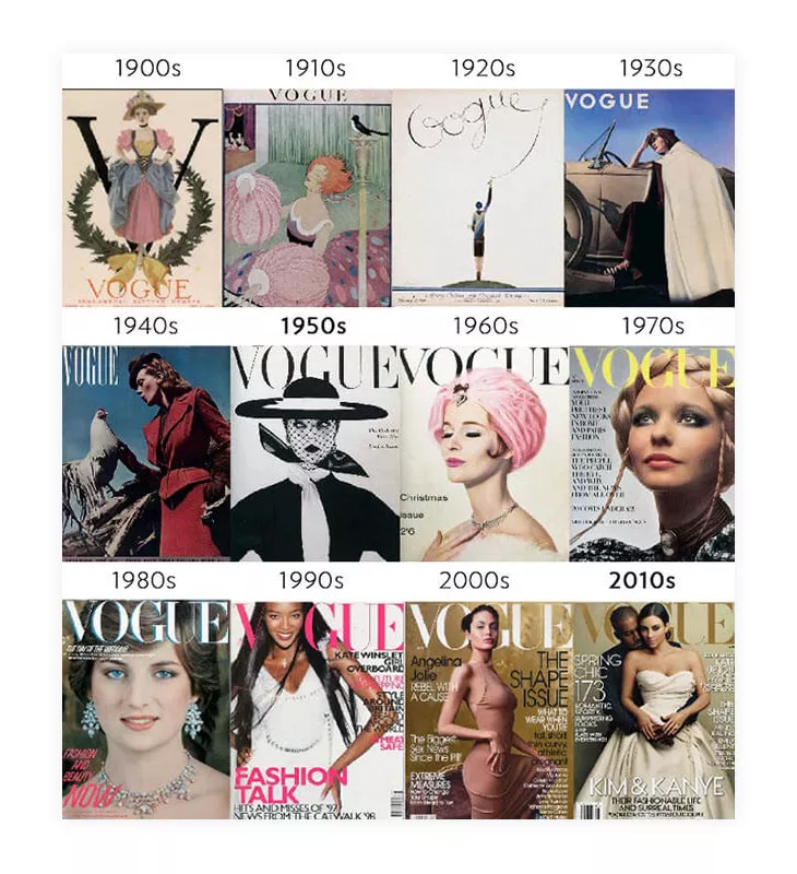
As depicted in the Vogue covers above, consistency doesn’t mean every issue of your magazine should look precisely the same. That’s counterproductive. In fact, the layout of your magazine cover is the only thing that shouldn’t be changed. It’s the positioning of the elements that must be consistent, not the elements themselves.
Now let’s see what different variations of our masthead look like in Flipsnack:
Designer’s tip: When you’re planning your magazine cover layout, think about the type of content you have inside the magazine. Then, pick out the information that’s usually on the cover (article highlights, quotes, etc.) This is going to help maintain consistency throughout your magazine issues.
4. Decide on a focus point and build everything else around it
Now that the magazine cover template is ready, it’s time to decide on a focus point that will help you find a balance between content and design. You’re here because you’ve already decided on the main subject of your magazine. Whether it’s fashion, nature, cooking, business, or whatever else, the focus point of your magazine cover will help bring every other element together.
What do I mean by that? The focus point of the cover should be the main attraction – it should grab attention while still respecting the material that’s inside the magazine. This is why you should do your research on your audience beforehand. It’s important to cater to their needs, but developing something that will hook them instantly is also necessary.
So make sure you choose the focus point, and then try to build the entire cover design starting from there. Figure out when to be subtle with your supporting cover lines and when it’s okay to give more information to your audience. Let’s see our designer’s take on this:
Designer’s tip: The magazine cover’s focus point should be chosen with your audience in mind. Think about what would attract them — what would instantly catch their eye.
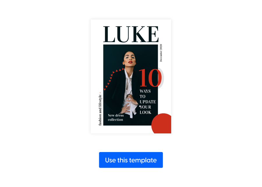
5. Optimize font pairings
Font styles also play a significant role in how a magazine cover looks; sometimes, they can make or break your entire magazine cover design.
Magazines feature the headlines of the most important stories on the cover, and using suitable font pairings can make a big difference in how the audience perceives them. Combining font styles can help you balance out the magazine cover design. Let’s see how they work together below:
We recommend using a maximum of three different fonts for consistency purposes. Choose an impactful one for your headlines, and then play around with the text block. You can use bold for headlines, serif for elegance, light, or italic – depending on the type of information you’re delivering. Whatever font style you use, make sure the text is easy to read to ensure accessibility and legibility in digital formats like magazine covers.
And if your magazine is in a different language than English and uses diacritics, prioritize finding a font that has them.
Designer’s tip: Your chosen fonts should match the look and feel of your magazine cover style. If it’s a fashion magazine, use a serif font; if it’s a more somber type of magazine, use a sans-serif.
6. Emphasize powerful words
We’ve talked about how the primary purpose of the magazine cover design is to sell the stories inside. Emphasizing powerful words is another great way to achieve this. The short teasers reflected through supporting cover lines are the elements that can provoke the reader’s curiosity the most.
So, don’t neglect the value of using specific words that usually appear in headlines. In the past, magazines used words like “NOW,” “FREE” and “EXCLUSIVE,” but today, you can generate more powerful words using new technology. You could use ChatGPT VPN to find new words for your magazine cover.
You’ll see this practice of using buzzwords in many fashion magazines. And even graphic design experts emphasize these words by adding a 3D effect or by playing with backgrounds to make them pop more. Let’s see what our graphic designer’s take is on this one:
Designer’s tip: People buy on emotion! Use words that people will feel connected to and match them with appropriate colors. Using powerful words increases your chances of having a perfect magazine cover that will quickly sell itself through all the ever-changing graphic design trends.
7. Learn to use color & contrast
Every element on your magazine cover should be selected with a clear purpose, and the colors and contrast should be no exception. You first have to decide the image you’re going to use, the focal point of your magazine cover, and starting from there, make use of colors and contrasts to allow elements to stand out.
A common practice among designers of magazine covers is to use green the least and red the most. But if you look at more recent magazine covers, you can tell that your dominant color doesn’t matter too much. The important thing is to use contrast wisely to help you highlight your magazine cover elements – the masthead, the lead article line, and the supporting cover lines. In the end, color schemes differ depending on magazine genre (e.g. business vs. entertainment).
Designer’s tip: make sure you pick the colors on purpose. They WILL affect the overall feel of your magazine cover. So, based on your focal point and brand identity, use colors and contrast to bring out the best in your magazine cover design.
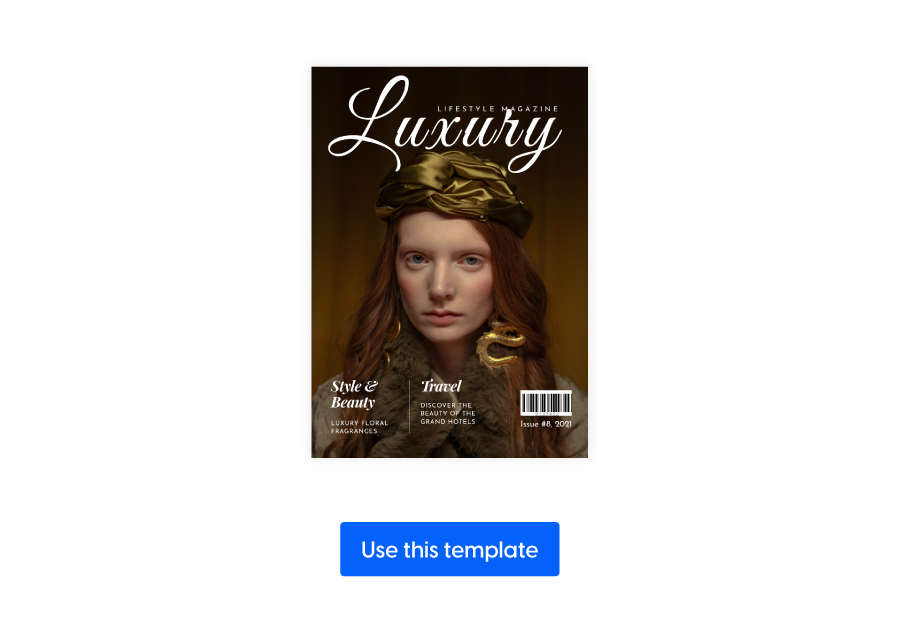
8. Place a portrait on the cover
Most magazines feature people on their covers. There is a straightforward logic behind it – people are curious to know about other people, especially if these other people are celebrities. If they’re curious about it, they’ll buy it.
But it’s not just about the WHO; it’s also about the HOW. The way the person is portrayed on the cover is important; they have to create some sort of emotional connection with your audience. The standard practice is to have the person stare into the camera when they are photographed for the cover. Eye contact is vital to creating the emotional connection I mentioned.
Of course, you won’t always have a celebrity on your cover; it’s unnecessary. But if and when you have a person on your cover, pick a good photo that can rile up some sentimental feelings in your readers. Here’s our designer’s take:
Designer’s tip: You don’t need Beyonce on your cover to have success; you need great content. But a great image on your magazine cover is definitely the most important thing!
9. Avoid busy backgrounds
Busy backgrounds can dilute the message you’re trying to convey to your readers. So, keep the magazine cover elements light and well-organized to achieve a professional look. An airy look is always better appreciated.
If your magazine cover design has many supporting lines and 3D texts, avoid making the background very busy. It’s essential to balance how much text and how many background elements you have on your cover design.
Designer’s tip: keep your magazine cover elements balanced! If the background is heavily patterned or mixed-colored, the cover will look too cluttered, which might confuse readers. You, then, risk not selling your magazine because of a busy background.
By this time, if you followed our designer, you should have your magazine cover done and looking good! We have an additional step, but it’s more of a bonus, as it’s something you might want to do for a special occasion – a celebratory issue, maybe.
10. Give illustrations a chance
Historically speaking, photos do better than illustrations on the cover page. But, throughout time, there have been numerous publications that have used illustrations very wisely and had great success. A special magazine issue might be worth switching things up and using an illustration instead of your regular photo on the cover.
Since this is a bonus step, we won’t create a new magazine cover in Flipsnack. Let’s instead analyze the most creative magazine covers and see what design tips we can draw from them.
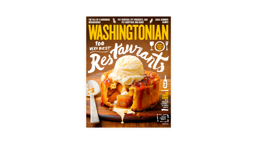
For instance, this Washingtonian magazine cover can surely catch the eye quickly. It has a mix of good photography and a fun font choice that perfectly complements the photo of the food. It also looks like they had fun with their font choice, creatively surrounding the focal point—the apple pie with a scoop of ice cream on top—with the hand-written font style.
Regardless of your magazine’s subject matter, try to play around and get creative; dare to be different and bold. Illustrations can be a great way to complement the other elements on your magazine cover.
Last but not least, when you’re happy with the design, save it and share it directly from Flipsnack with your audience. You can start by sharing your digital magazine cover on your social media platforms, to give your readers a preview of what’s to come.
Conclusion
If you got to this point, then you already have your cover design ready and looking sharp. We hope our design input was valuable! And thanks for staying with us for so long! We know that when you are assigned to design a magazine cover, your main job is to make it shine and sell itself.
Following good practices and having a pinch of creativity is the trick! If you can, get as creative as possible to reflect the magazine’s content best. Don’t forget to choose the right fonts, use colors and contrast appropriately, and always pick out a great photo to complement the look and feel of the magazine cover.
Get inspired by everything around you and take a look at magazine pioneers – you will surely find great inspiration there! And remember that a great image is key to a great magazine cover!
Ultimately, it’s all about balance – find that beautiful line and follow it through to the end.
*Magazine covers are copyrighted by their respective publications.
Frequently asked questions
Magazine covers that are poorly designed can be a result of various factors such as cluttered backgrounds, inconsistent typography, unattractive colors, and contrasts that fail to grab the reader’s attention. Moreover, if the cover’s message does not align with the magazine’s content, it can confuse readers and alienate potential customers, as they may not get a clear idea of what the magazine contains.
An attractive magazine cover should have a balanced layout, eye-catching typography, and harmonious color schemes to catch the viewer’s attention. It should also align with the magazine’s content, giving a glimpse of what’s inside to spark the reader’s curiosity and create a strong connection between the cover and the publication’s theme.
When selecting a magazine cover photo, it’s important to remember your target audience and the theme or content of the issue. You should also consider the emotional impact you want to convey and choose a photo that not only visually represents your magazine’s content but also resonates with your readers and entices them to pick up the publication. The right magazine cover photo can make a huge difference in the success of your magazine.
Magazine covers serve different purposes: celebrity covers feature well-known personalities; even covers align with different holidays or events; and thematic covers are related to different seasons or topics. Special edition covers are designed to appeal to a specific audience segment and cater to a wide range of reader interests, frequently focusing on collector’s items or limited editions.
There are multiple apps out there that can help create magazine covers, including tools like Canva, Adobe InDesign, and Flipsnack. They offer various templates and design tools to customize covers. Choosing the right app depends on your design skills, budget, and specific requirements, so it’s essential to evaluate each option to find the most suitable one for your project.
A successful magazine cover must have a visually captivating image, a compelling headline or main feature, and an engaging tagline or subheadline to entice potential readers and communicate the magazine’s content at a glance. Additionally, it should incorporate the publication’s branding elements, such as logos, fonts, and color schemes, to maintain a consistent and recognizable look.
To create a magazine cover mockup, you can use design software like Adobe Photoshop or specialized mockup generators available online. You’ll typically need to upload your magazine cover design, and the tool will turn it into a realistic magazine template, allowing you to showcase your cover design in a professional and appealing manner.
The standard size for a magazine cover in the United States is typically 8.5 x 11 inches (or 215.9 x 279.4 millimeters), but it can vary depending on the publication’s format and design preferences. It’s important to confirm the specific size and any bleed requirements with your printer or publisher to ensure the cover is properly formatted for production.
The size of a magazine cover can vary depending on the publication, but a common standard in the United States is 8.5 x 11 inches (or 215.9 x 279.4 millimeters), which provides ample space for engaging visuals and content. It’s essential to check with your printer or publisher for their specific size requirements, as variations can occur depending on the magazine’s format and design preferences.
Thank you, this was very helpful!
I am very glad to hear you enjoyed this article!
This is awesome sause man
thes eis soa coooal and neace thanlk yoy sfo muach for wthis
this* is* so* cool* and* nice* thank* you* so* much* am this*