Digital Catalog Design: Best Practices for Creating High-Converting Catalogs
Last updated: March 30, 2026
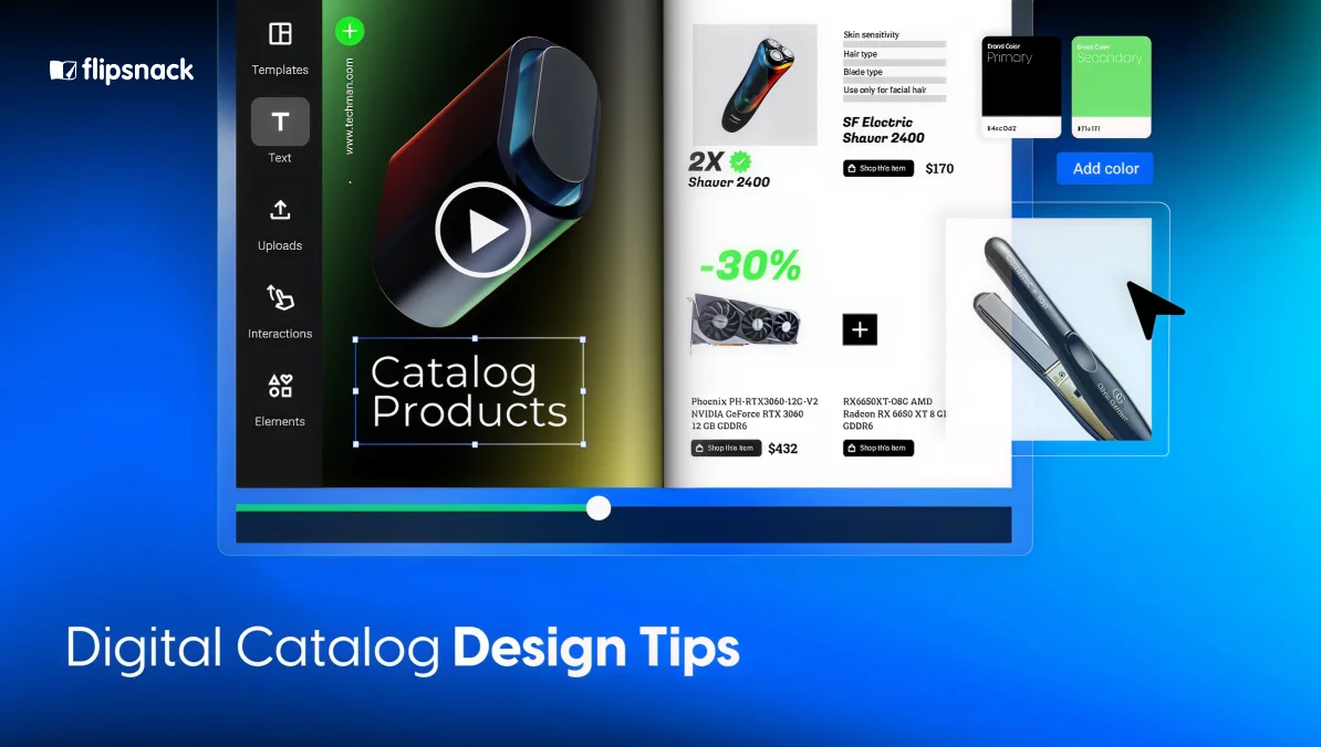
Digital catalog design is about more than making products look good on a page. It’s about creating a catalog that feels easy to browse, supports buying decisions, and reflects your brand in a polished, professional way.
Today’s buyers expect more than static PDFs. They want product catalogs that are visually engaging, simple to navigate, and accessible across devices. Whether you’re selling to retailers, distributors, procurement teams, or direct consumers, your catalog should help people find what they need faster and interact with your content more naturally.
That’s where strong design and the right platform come together. A well-designed catalog uses visual hierarchy, thoughtful layouts, white space, typography, and clear scanning patterns to improve usability. And with a platform like Flipsnack, businesses can take those design principles even further by turning static layouts into interactive, branded, and trackable digital experiences.
In this guide, we’ll explore the most important product catalog design tips, catalog UX design principles, and catalog layout best practices, plus how Flipsnack can help bring them to life.

Table of contents
- What are digital catalogs, and why do they matter?
- Interactive elements to create a sales-driven catalog design
- Technical considerations for seamless catalog design
- How to design a digital catalog in Flipsnack
- Build a professional digital catalog design with Flipsnack
- Frequently asked questions about digital catalog design
What are digital catalogs, and why do they matter?
A catalog is often one of the most important sales and marketing assets a business creates. It helps showcase product lines, communicate value, support branding, and guide customers toward action.
But a catalog’s success depends on more than the products inside it. If the design feels cluttered, confusing, or outdated, buyers may lose interest before they ever reach the products that matter most.
Good digital catalog design helps businesses:
- present products more clearly
- improve navigation and readability
- strengthen brand perception
- support product discovery
- reduce friction in the buyer journey
- create more engaging experiences than static documents alone
In other words, good design helps a catalog perform better.
And when that catalog is published through a digital catalog platform like Flipsnack, it can do even more. Instead of stopping at presentation, businesses can add interactivity, improve accessibility, share catalogs more easily, and track engagement over time.
Product catalog design tips that improve usability
A well-designed catalog should be visually appealing, but also easy to use. These product catalog design tips can help you create a more effective experience for your readers.
1. Start with a strong catalog cover
Your catalog cover is the first thing a buyer sees, and it shapes their first impression of everything that follows. A strong cover should display your company name and logo prominently, include essential contact information, and feature a high-performing or visually compelling product. If you have a seasonal offer or promotion, the cover is also the right place to put it front and center.
Treat the cover as a design decision, not an afterthought. It sets the tone for the browsing experience before a reader ever turns the first page.
2. Use visual hierarchy to guide attention
Visual hierarchy helps readers understand what matters most on a page. It directs the eye through content in a logical order, making it easier to process product information quickly.
You can create visual hierarchy through:
- larger headlines
- bold product names
- contrast in color or size
- spacing between content blocks
- stronger emphasis on featured items
- clear CTA placement
Without a visual hierarchy, every element competes for attention. With it, readers know where to look first.
If you have already designed your catalog in InDesign or another design tool, Flipsnack helps preserve that hierarchy after upload. Then, it adds digital layers like product tags, buttons, pop-ups, and videos that can reinforce key actions without redesigning the whole catalog from scratch.
3. Build on a clear grid system
Grid systems are essential for creating balanced and organized layouts. They help align product cards, text blocks, pricing, and imagery across pages so the catalog feels structured and professional.
A strong grid improves:
- consistency
- readability
- alignment
- side-by-side product comparison
- page-to-page cohesion
Grid systems are especially useful in catalogs with many SKUs, categories, or repeated product modules.
Advanced editorial layout creation may still happen in tools like InDesign, but Flipsnack supports that structure by allowing teams to upload finished layouts, keep them intact, and then enhance them digitally. For teams creating catalogs directly in Flipsnack, reusable templates also help maintain consistency across pages and future editions.
4. Use white space to reduce clutter
White space improves focus and readability. It gives products, headlines, and supporting details room to breathe, making pages feel cleaner and easier to understand.
It can help:
- separate products clearly
- reduce visual overload
- highlight key offers
- make premium catalogs feel more refined
- improve the overall browsing experience
Trying to fit too much onto one page often hurts usability more than it helps.
Flipsnack makes it easier to keep pages clean, even when you need to add more information. Features like pop-up frames, product tags, and slideshows let you move secondary content off the main layout, so pages stay uncluttered while still offering rich product detail.
5. Create the right image-to-text ratio
The image-to-text ratio matters because buyers need enough visual context to evaluate a product, but enough text to make a decision.
Too much text can feel overwhelming. Too little text can leave readers without the details they need.
The right balance depends on your audience:
- B2C catalogs often lean more heavily on imagery
- B2B catalogs may require more technical specs
- Wholesale catalogs often need both visual appeal and practical product data
The goal is to let images do the visual selling, while text supports decision-making.
Where your product line allows it, consider going beyond flat photography. 360-degree product images, which let buyers rotate and inspect a product from every angle, have been shown to drive significantly higher conversion rates than standard images. For categories like furniture, footwear, electronics, or accessories, giving buyers that extra visual confidence can directly reduce hesitation and cart abandonment. Flipsnack supports embedding rich media like this alongside your existing catalog layouts.
6. Make typography work harder
Typography shapes readability, tone, and structure. It should help readers distinguish between product names, section titles, descriptions, pricing, and technical details without effort.
Strong catalog typography should:
- match your brand tone
- remain readable on desktop and mobile
- use clear size contrast
- create a hierarchy between content types
- remain consistent from page to page
Flipsnack supports branded catalogs with custom fonts, reusable templates, and consistent design systems. That makes it easier for teams to maintain a cohesive typographic style across multiple catalogs, especially when scaling content production.
However, catalog design is closely connected to knowing your audience. To effectively tailor your digital catalog to your target audience, start by conducting comprehensive research to understand their preferences, values, and purchasing behaviors. Utilize tools such as surveys, the Likert scale, customer feedback, and market analysis to collect relevant data.
Analyzing this information helps pinpoint the most effective ways to connect with your audience. For example, promoting your catalog on LinkedIn rather than Facebook might be more effective if that’s where your audience primarily engages. Similarly, the language and tone of your catalog should resonate with your target demographic’s educational level and interests to ensure credibility and engagement.

Catalog layout best practices for modern digital catalogs
A strong layout is what brings all catalog elements together. It influences readability, product comparison, page flow, and conversion opportunities.
Group products logically
Buyers should understand why products are shown together. Grouping by category, collection, use case, industry, or price tier can improve clarity and support cross-selling. Logical grouping also helps build rhythm into the catalog and makes browsing feel more natural.
If your products are organized in a spreadsheet, Flipsnack can use categories and subcategories to group them automatically in the catalog. This makes it easier to create well-structured catalogs, especially for large or frequently updated product assortments.
Keep calls to action visible and contextual
Calls to action should feel like a natural next step, not a disruption. Depending on your sales flow, that might mean:
- Shop now
- Add to list
- Request a quote
- Learn more
- Contact sales
CTAs should appear where users are ready to act. Unlike static PDFs, Flipsnack allows you to place clickable buttons, product tags, and shopping-list functionality directly inside the catalog experience, making it easier to connect browsing with action.
Add social proof where decisions happen
Product pages in a digital catalog aren’t just display surfaces — they’re decision points. Adding trust signals at those moments can meaningfully improve conversion. Consider incorporating:
- Customer reviews or star ratings alongside featured products
- Testimonials from known clients or industry names, particularly useful in B2B contexts
- “Best seller” or “Most popular” badges to guide buyers toward high-confidence choices
- Case study snippets for complex or high-value products
Use consistency to build confidence
Consistent layout patterns, spacing, fonts, and navigation elements reduce effort for readers. The more predictable the structure, the easier it is to focus on product evaluation rather than page interpretation.
For teams producing recurring catalogs, this is a major advantage. Flipsnack supports branded templates and repeatable design systems, helping companies maintain consistency across teams, campaigns, and catalog versions.
Interactive elements to create a sales-driven catalog design
Flipsnack is known for its powerful interactivity features, as many of them provide companies with built-in solutions to offer a smooth shopping experience for buyers.

Adding interactive features not only enhances the user experience but also helps guide attention to key elements and encourages more profound engagement with your content. Here are some design-enhancing interactivity ideas to make your catalog stand out:
1. Product tags for instant details
Product tags turn your digital catalog into an interactive shopping experience. With clickable tags, customers can view product names, prices, descriptions, and even add items directly to their cart. This seamless product discovery reduces friction, helping both B2B and B2C buyers make faster purchasing decisions, all without leaving the catalog.
2. Embedded videos for storytelling & demos
Bring your products to life by embedding videos directly into your digital catalog design. From product demos and how-to guides to brand storytelling, videos capture attention faster than text alone. They also boost engagement and help potential buyers better understand your products. This makes them perfect for wholesale catalogs, product launches, and more. And with Flipsnack’s AI Animate feature, you can turn any static product image into a cinematic video clip in one click, no video editor or production team needed.
3. Photo slideshows for multiple product angles
Why settle for just one image? Photo slideshows allow you to showcase multiple angles, product variations, or close-up details in the same space. By doing this, retailers and wholesalers can easily keep their digital catalog design clean and the user experience seamless. This feature is especially valuable for fashion catalogs, furniture catalogs, and product lines with extensive visual content.
4. Pop-up frames for extra information
With pop-up frames, you can deliver more product details without overcrowding your catalog pages. Whether it’s technical specs, size charts, or even a limited-time offer. These expandable elements give your audience the information they need while keeping the design visually appealing and clutter-free.
5. Shopping lists for faster bulk orders
For buyers, speed matters. A built-in shopping list feature allows customers to add products directly to an order list, which can be instantly shared with suppliers. This eliminates the back-and-forth communication often required with wholesale ordering. It also helps businesses streamline their purchasing process and improve sales efficiency.
By incorporating these interactive features, your catalog not only captures attention but also keeps users engaged and actively exploring. These design-enhancing elements make your catalog more than a simple showcase—they transform it into an engaging experience with a sales-driven approach.
Technical considerations for seamless catalog design
Mobile optimization and responsive design
With 44% of shopping journeys starting online and 77% of shoppers using mobile devices to search for products, creating a mobile-friendly catalog is crucial. By implementing responsive designs, your catalogs will adjust dynamically to various screen sizes, ensuring a seamless browsing experience. It’s important to tailor your content not only to the platform but also to the audience’s preferences. Ensuring that your catalog shared on social media platforms is visually appealing and interactive can significantly increase engagement and conversions. Now, let’s see how else technical considerations can invite customers or deter them.
SEO and accessibility considerations
Your copy, text, headlines, or CTAs are more than just words you use throughout your digital catalogs. They are a means to ensure your catalog reaches your target audience. Effective SEO practices involve incorporating relevant keywords into your catalog’s text to enhance its visibility on search engines like Google or Bing. This is especially important when targeting specific markets, such as luxury jewelry buyers, where phrases like “luxury jewelry on sale” can attract the right customers.
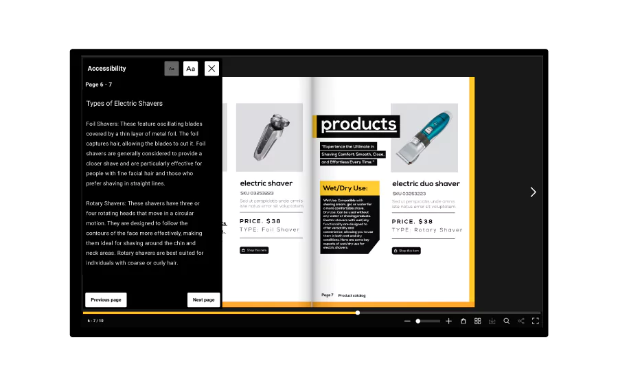
Additionally, in order to invite all potential customers to your catalog, make sure your catalog is accessible to all users, including those with disabilities. This is not only a legal imperative but also expands your market reach by justly giving everyone access to your products. Compliance with Web Content Accessibility Guidelines (WCAG) includes using alt text for images and ensuring keyboard navigability, which enhances the user experience for all customers. Accurate labels will also improve navigation through the different interactive elements included in your catalog.
Use Flipsnack’s AI accessibility solution to automatically generate those alt text summaries for each page in minutes. Explore other useful AI solutions like translating text boxes or entire flipbooks to reach even more diverse audiences through your catalog.
How to design a digital catalog in Flipsnack
By far, the best thing about digital catalog design is that all the elements described above can be easily implemented through Flipsnack. The process is simple, straight-forward and doesn’t require any coding or design experience, just a willingness to try an intuitive platform design to transform any print ready PDF into an interactive experience for your customers.
For this, we have three methods of creating digital catalog flipbooks that you can choose from depending on how creative and imaginative you are.
1. Upload a PDF catalog, edit it, start from scratch, or use a template
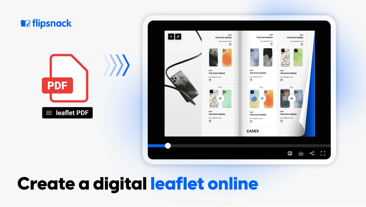
Upload your PDF catalog to Flipsnack and turn it into an interactive flipbook that you can further edit and enhance. You can also start designing from scratch on our platform or choose a professional digital catalog template from our collection.
2. Add your company’s branding elements to your digital catalog design
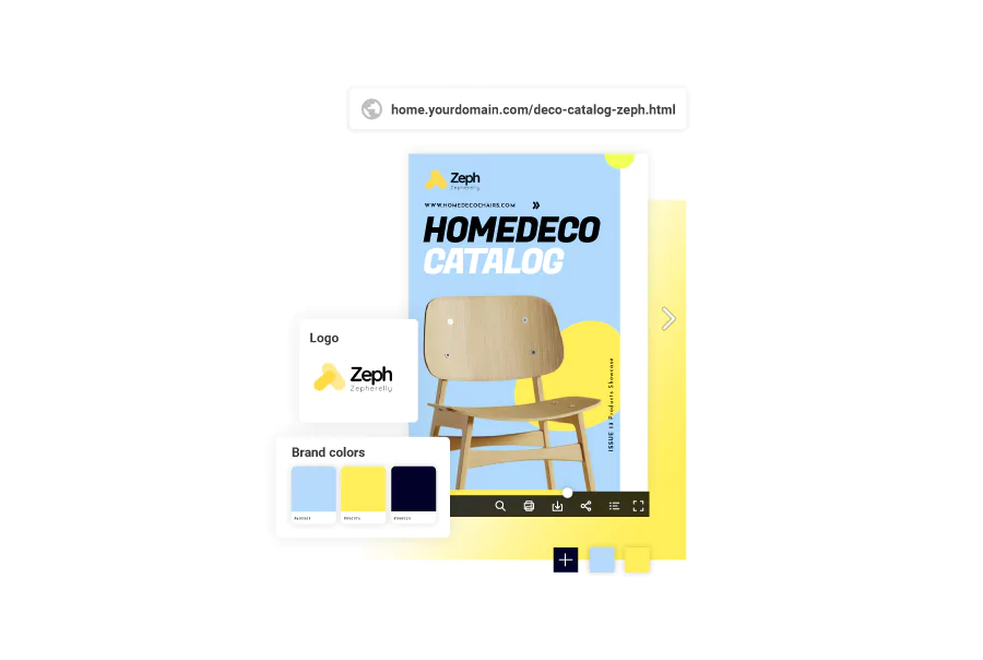
In Flipsnack, it’s easy to maintain a cohesive digital catalog. Just apply your brand’s fonts, colors, and logo to every page with an easy drag-and-drop. Maintain brand consistency across all your catalogs by saving and reusing your branded templates in Flipsnack.
3. Customize your digital catalog with interactive elements
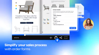
After placing your company’s branding elements, embed videos, add multiple images with photo slideshows, and captions for detailed product descriptions. Embrace our shopping list feature and empower your customers to place orders directly from the digital catalog. You’ll receive the order in your company’s inbox, just like in the GIF below.
Strategically placing call-to-action buttons within your digital catalog’s design can significantly improve conversion rates. So guide your buyers toward the next step—whether it’s making a purchase, requesting a quote, or contacting sales.
Optimizing button placement ensures a seamless user experience, making it easier for buyers to engage with your products and move through the sales funnel efficiently.
4. Publish and share your digital catalog design
Finally, to ensure your catalog reaches the audience you are targeting, share it accordingly. Public sharing options include a simple link, social media platforms, website embeds, email, and QR codes, which all give access to an interactive experience for your customers. If you need to share catalogs privately, you can either publish them privately so that even search engines can’t find them, share them through a restricted email list or with readers only, or protect them with a password that will limit access to the catalog to those who know the password.
5. Track your digital catalog’s performance with analytics
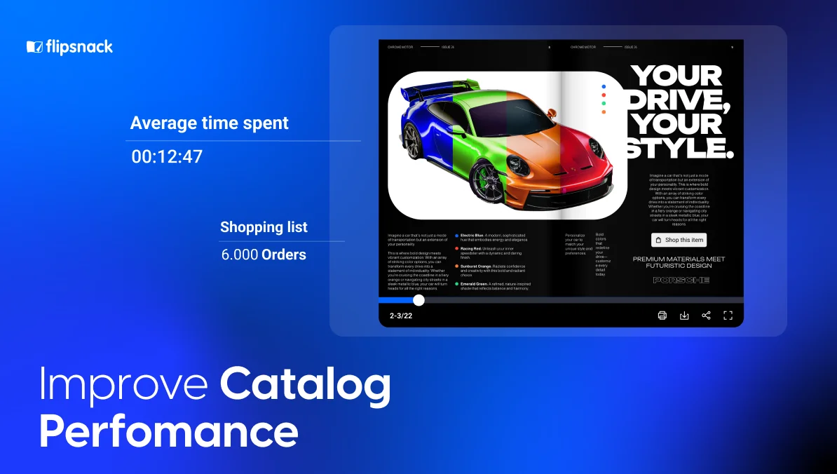
Gain valuable insights into how your digital catalog is performing with Flipsnack’s built-in analytics. Track views, clicks, time spent per page, and engagement rates to understand buyer behavior and optimize your catalog for better conversions. With real-time data, you can identify which products attract the most attention, refine your content strategy, and make data-driven decisions to boost sales. Turn insights into action!
Build a professional digital catalog design with Flipsnack
Digital catalog design offers a multifaceted advantage for modern marketing, enhancing visual appeal, broadening audience engagement, and providing cost-effective solutions for businesses. Transform traditional browsing experiences into interactive journeys through rich multimedia interactions that captivate and engage users effectively. By adopting these innovative tools, companies can revolutionize their marketing strategies and create a seamless shopping experience that meets the evolving needs of today’s digital consumers.

To truly harness the power of digital catalogs, businesses must explore and utilize various digital marketing tools that align with their specific needs and can help them reach desired results. Start designing your digital catalog today to capitalize on these benefits and elevate your marketing efforts. Whether you aim to increase sales, showcase new products, or enhance brand awareness, the strategic use of digital catalogs can set your business apart in a competitive marketplace.
Frequently asked questions about digital catalog design
The most effective design elements in a digital catalog include high-quality images and videos, interactive features like clickable links and hover effects, and dynamic content such as animations or 360-degree views of products. Ensuring a clean, easy-to-navigate layout with consistent branding elements like color schemes and typography also significantly enhances the user experience and professionalism of the catalog.
Absolutely, typography and color choices are crucial in affecting the success of a digital catalog. Typography should be legible and accessible, enhancing the readability of product descriptions and other information. Color choices can evoke emotions and associations that significantly impact user engagement and brand perception. Consistent use of brand colors reinforces identity, while contrasting colors can highlight calls to action, making them stand out and encouraging user interaction.
Data analytics influences digital catalog design through insights into user behavior, preferences, and engagement patterns. By analyzing this data, designers can identify which parts of a catalog are most engaging, where users spend the most time, and which products receive the most attention. This information allows for targeted improvements, such as optimizing the layout, rearranging content to highlight popular items, or adjusting navigation to enhance user experience.
By organizing products in clear and logical categories, you can simplify catalog navigation and cross-selling opportunities can be achieved by grouping related products on a single page. Pagination can also simplify navigation by numbering the pages of the catalog and editing when designing an interactive table of contents that takes customers to their desired page with one click.
When it comes to legislation, the impact it has on digital catalog design comes into play through accessibility reglementations. Laws such as the Americans with Disabilities Act (ADA) mandate that digital content must be accessible to people with disabilities. Failing to adhere to this law can result in discrimination lawsuits based on a lack of access to information. Section 508 also mandates that all digital content on governmental websites be accessible. This includes providing text alternatives for non-text content, ensuring that all functionalities are available from a keyboard, and using colors that are accessible to those with color blindness. Designing with accessibility in mind not only complies with legal requirements but also expands the potential customer base to include those with various disabilities.
