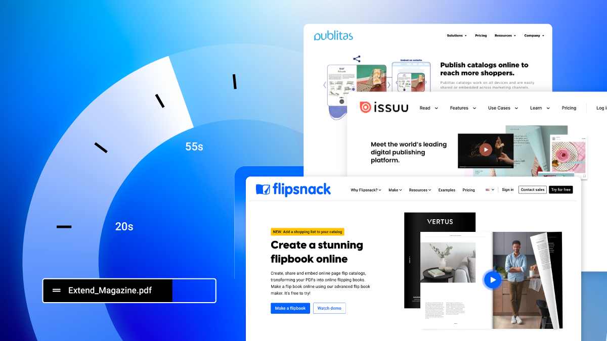
Roxana Vidican2024-02-01T17:24:37+02:00Best flipbook software on the market – 5 fastest tools comparedBy Roxana Vidican|2024-02-01T17:24:37+02:00June 15th, 2022|Updates|
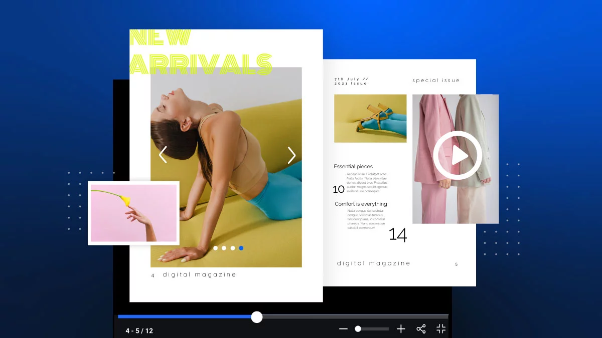
Zach McDaniel2024-01-17T17:10:50+02:00Skip the print! How to create digital magazines todayBy Zach McDaniel|2024-01-17T17:10:50+02:00May 17th, 2022|Digital Publishing|
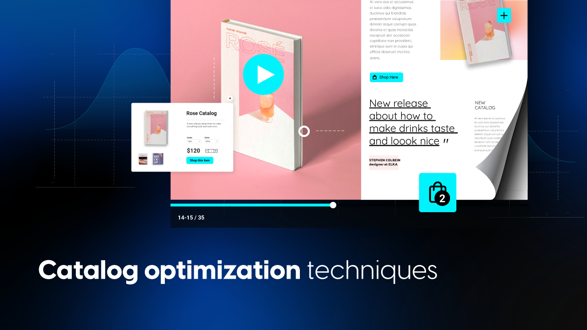
Diana Herdean2024-04-10T15:08:22+03:005 ingredients that make product catalog optimization effectiveBy Diana Herdean|2024-04-10T15:08:22+03:00December 14th, 2023|Ecommerce Marketing, Marketing|
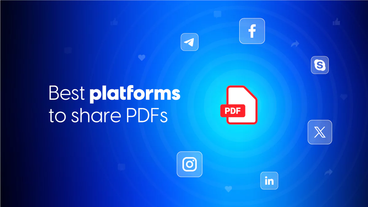
Roxana Vidican2024-04-23T16:51:47+03:00Send PDFs via Social Media and IM Platforms: The Ultimate GuideBy Roxana Vidican|2024-04-23T16:51:47+03:00December 7th, 2023|Business, Digital Marketing, Digital Publishing|
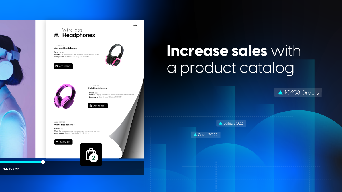
Diana Herdean2024-04-10T14:56:12+03:00How to increase sales with a product catalog By Diana Herdean|2024-04-10T14:56:12+03:00November 24th, 2023|Ecommerce Marketing, Marketing|
Roxana Vidican2024-04-23T16:51:47+03:00Send PDFs via Social Media and IM Platforms: The Ultimate GuideBy Roxana Vidican|2024-04-23T16:51:47+03:00December 7th, 2023|Business, Digital Marketing, Digital Publishing|
Diana Herdean2024-04-10T14:56:12+03:00How to increase sales with a product catalog By Diana Herdean|2024-04-10T14:56:12+03:00November 24th, 2023|Ecommerce Marketing, Marketing|
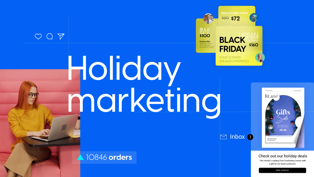
Zach McDaniel2024-03-26T15:31:03+02:00How to prepare for holiday marketingBy Zach McDaniel|2024-03-26T15:31:03+02:00October 19th, 2023|Marketing|
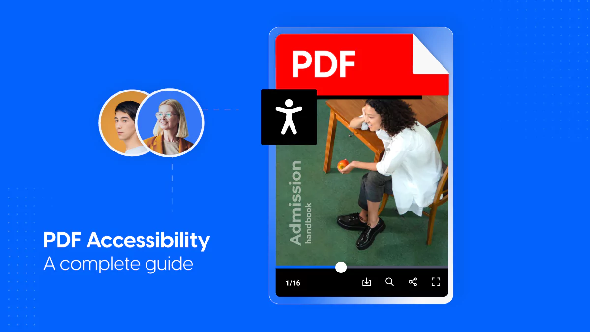
Diana Herdean2024-04-24T16:19:36+03:00PDF Accessibility – A complete guide for any user2024-04-24T16:19:36+03:00By Diana Herdean|Business, Interactive Documents|
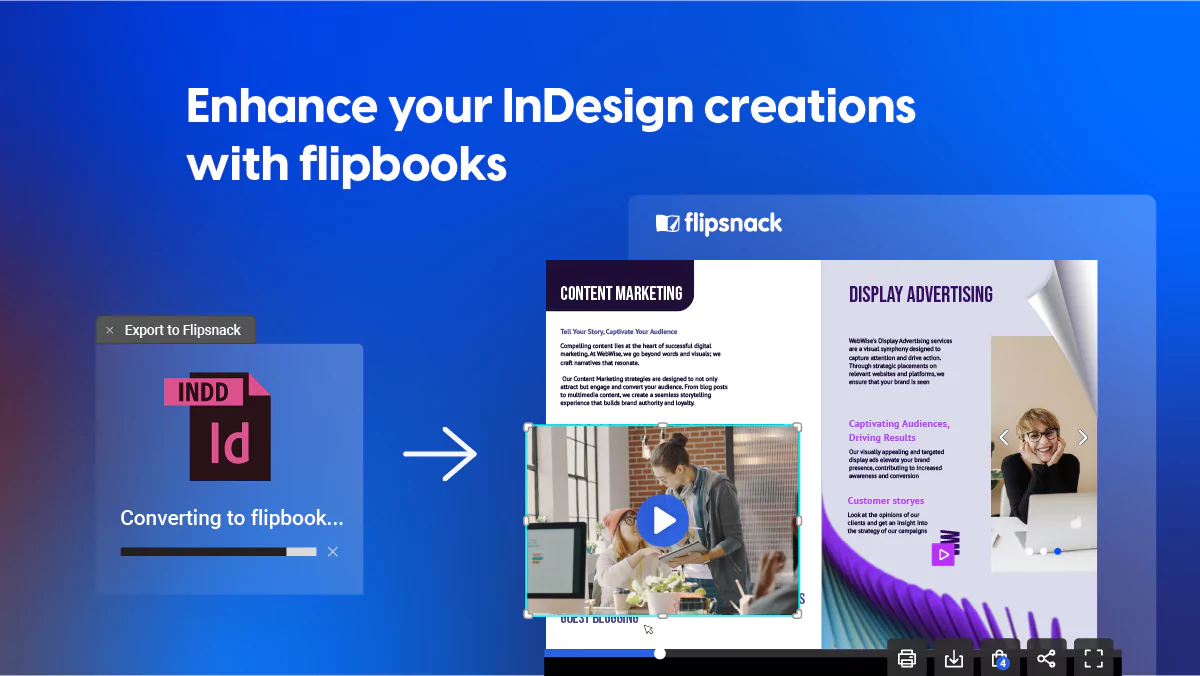
Debora Grosu2024-04-02T13:47:13+03:00InDesign flipbooks: step-up strategies for your designs2024-04-02T13:47:13+03:00By Debora Grosu|Digital Publishing, Interactive Documents|
Roxana Vidican2024-04-23T16:51:47+03:00Send PDFs via Social Media and IM Platforms: The Ultimate Guide2024-04-23T16:51:47+03:00By Roxana Vidican|Business, Digital Marketing, Digital Publishing|
Diana Herdean2024-04-24T16:19:36+03:00PDF Accessibility – A complete guide for any user2024-04-24T16:19:36+03:00By Diana Herdean|Business, Interactive Documents|
Debora Grosu2024-04-02T13:47:13+03:00InDesign flipbooks: step-up strategies for your designs2024-04-02T13:47:13+03:00By Debora Grosu|Digital Publishing, Interactive Documents|
Roxana Vidican2024-04-23T16:51:47+03:00Send PDFs via Social Media and IM Platforms: The Ultimate Guide2024-04-23T16:51:47+03:00By Roxana Vidican|Business, Digital Marketing, Digital Publishing|
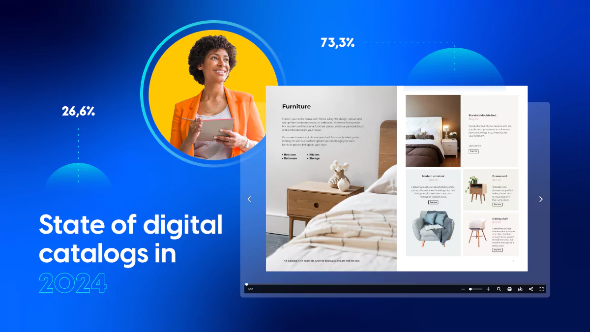
Debora Grosu2024-04-03T12:02:21+03:00Digital catalogs in 2024 – How retailers navigate the new digital eraBy Debora Grosu|2024-04-03T12:02:21+03:00January 31st, 2023|Ecommerce Marketing, Marketing, Recommended|
Debora Grosu2024-04-18T12:47:39+03:00How to write a good newsletter for your companyBy Debora Grosu|2024-04-18T12:47:39+03:00January 3rd, 2022|Business, Recommended|
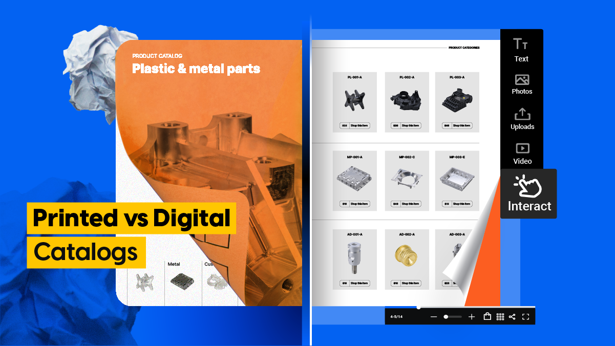
Andreea Tilibasa2024-04-17T11:02:25+03:00Printed vs digital catalogs – from paper to online success2024-04-17T11:02:25+03:00By Andreea Tilibasa|Digital Publishing|
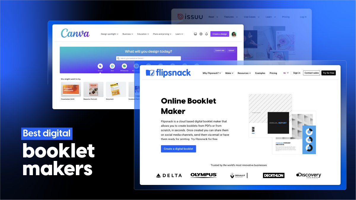
Isabela Boncila2024-04-02T11:30:10+03:00Best 10+ digital booklet makers: tested & compared2024-04-02T11:30:10+03:00By Isabela Boncila|Digital Publishing|
Debora Grosu2024-04-02T13:47:13+03:00InDesign flipbooks: step-up strategies for your designs2024-04-02T13:47:13+03:00By Debora Grosu|Digital Publishing, Interactive Documents|
Andreea Tilibasa2024-04-17T11:02:25+03:00Printed vs digital catalogs – from paper to online success2024-04-17T11:02:25+03:00By Andreea Tilibasa|Digital Publishing|
Isabela Boncila2024-04-02T11:30:10+03:00Best 10+ digital booklet makers: tested & compared2024-04-02T11:30:10+03:00By Isabela Boncila|Digital Publishing|
Debora Grosu2024-04-02T13:47:13+03:00InDesign flipbooks: step-up strategies for your designs2024-04-02T13:47:13+03:00By Debora Grosu|Digital Publishing, Interactive Documents|
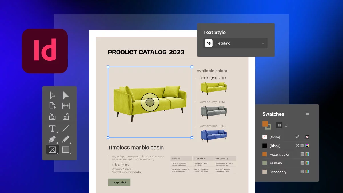
Debora Grosu2024-04-10T14:48:13+03:00How to create a catalog in InDesign: designer tips for a smooth process from start to finish2024-04-10T14:48:13+03:00By Debora Grosu|Design, Design Basics|
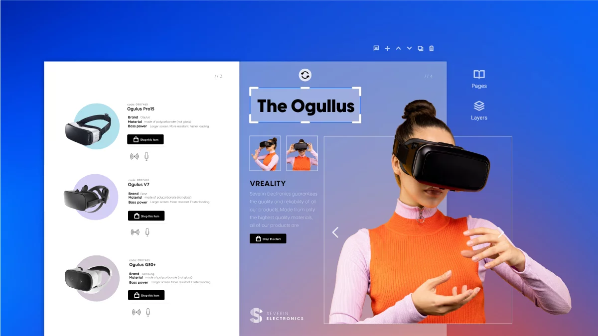
Sergiu Vidican2024-04-10T14:57:23+03:00E-catalogs. Your guide to creating electronic catalogs2024-04-10T14:57:23+03:00By Sergiu Vidican|Design Basics, Ecommerce Marketing, Marketing|
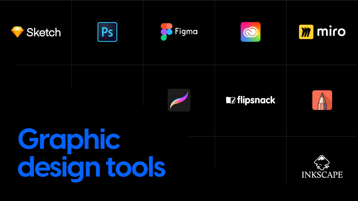
Silvana Costa2024-02-27T13:34:40+02:009+ graphic design tools that work wonders in 20242024-02-27T13:34:40+02:00By Silvana Costa|Design, Design Basics, Digital Marketing, Marketing|
Debora Grosu2024-04-10T14:48:13+03:00How to create a catalog in InDesign: designer tips for a smooth process from start to finish2024-04-10T14:48:13+03:00By Debora Grosu|Design, Design Basics|
Sergiu Vidican2024-04-10T14:57:23+03:00E-catalogs. Your guide to creating electronic catalogs2024-04-10T14:57:23+03:00By Sergiu Vidican|Design Basics, Ecommerce Marketing, Marketing|
Silvana Costa2024-02-27T13:34:40+02:009+ graphic design tools that work wonders in 20242024-02-27T13:34:40+02:00By Silvana Costa|Design, Design Basics, Digital Marketing, Marketing|
